 Designing a compelling advertising agency website is a complex proposition. There are multiple objectives and target audiences: future and current clients and employees, pitch consultants, the press and even your competition. Some agencies lead with their work, some with their agency philosophy and some with specific services and category expertise. Regardless, the goal for agency websites should be to funnel the visitor to the contact page so a conversation can begin. Or so you would think.
After reviewing hundreds of agency websites for my Pinterest agency directory, I have come to the conclusion that the art of instigating contact is often missing from the advertising agency sales equation. Agencies put a great deal of thought into their website’s design and copy to deliver their agency’s smart brand positioning, famous work and cool office photographs. However, given all of this attention to detail, they often fall short when it comes to creating an enticing contact section. To make matters worse, a high percentage of agencies fall into lockstep behind a standard set of non-competitive contact designs. This is a missed opportunity.
I see this failure in two key areas.
First, way too many agency contact pages share the exact same graphical elements and approach. This is best observed in many agencies’ de rigueur passion for maps. Hundreds of contact pages proudly display large maps as if an agency’s exact location is critical to agency branding. Even local retailers don’t seem to share the same passion for maps. These map-based pages compound a rather cold contact experience by only listing very dry email and telephone information. Here are three contact pages from Boston agencies — although I could have made the supporting selection from any U.S. city.
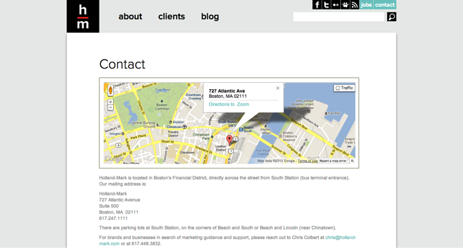
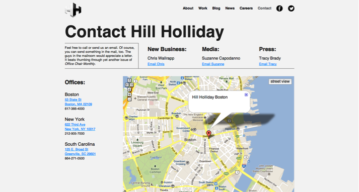
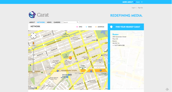
Why aren’t any of these agencies trying to use the contact section to create some brand distinction? Did they all run out of creative juice by the time they designed the contact experience? What a lost opportunity to look and sound different on one of the most critical sections of the website. These are strategic Boston agencies, yet they all employ the same exact contact solution as the agency down the street. Would an agency ever recommend that its clients look exactly the same as the competition?
My second observation is what I call the “chill factor.” It is obvious that these map-based contact pages are bereft of warmth. Yet, while I understand the utilitarian nature of the contact experience, I don’t know why so many contact pages don’t employ any sense of humanity. Again, you’ve done a brilliant job introducing your agency and funneling the visitor to make contact, but then what? All most agencies do at this point is provide the interested party with an email address. To make matters even worse, most of these email addresses are of the anonymous “info@” variety.
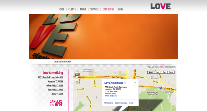
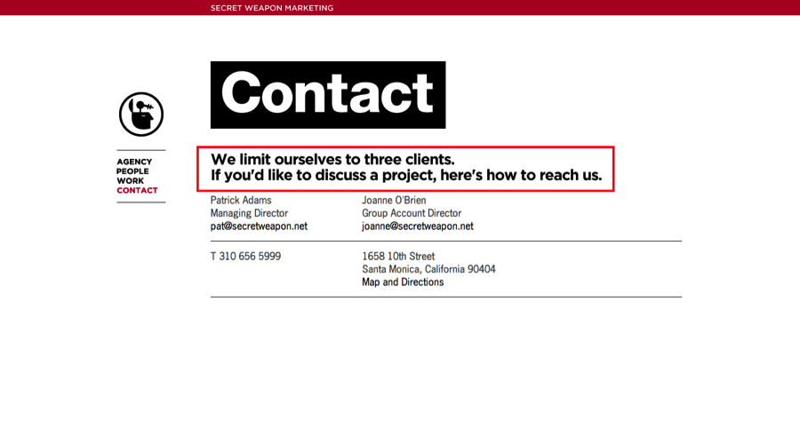
To highlight this point, even “love” agencies (these range from agencies named “Love” to agencies that sell the idea of “love,” like Saatchi & Saatchi’s “Lovemarks”) don’t show the visitor any love. Here is just one example:
I am not telling you to go overboard and get excessively emotional. But I am going to suggest that the contact section be a chance for an agency to demonstrate some personality and real interest in actually making contact.
Based on client-agency selection criteria, we know that chemistry is a critical factor in agency selection. Why not use the contact section to deliver a sense of agency personality and even introduce the CEO or business development director? Why not sound friendly? I’ve gotten occasional pushback on this point because some agencies are worried about receiving too much incoming interest from unqualified clients. However, the first goal of the website must be to do everything possible to get incoming interest from the right prospect.
Adding some personality to the contact equation isn’t difficult. Here is how Toronto’s very personable john st. does it. You can see that john st. actually says “hello.” They aren’t afraid to list personal contact information. Sure, the creative director might get a lot of emails from design students, but one of those students could be the next Alex Bogusky, while other direct contact could be from a client who cherishes creative and wants to go right to the source. I like john st.’s open-arms approach.
By the way, as long as we are talking love, there is even anti-love. In this case, I’m trying to imagine a P&G marketing director’s response when he gets to this anti-contact page.
Agency websites have morphed in the past few years from one-visit brochures to eclectic Flash experiences to repeat-visit websites driven by sophisticated social media strategies. As such, I think that the agency website has become an increasingly important element in most agencies’ business development matrix.
Building the master website and then feeding the content beast is hard work. Therefore, once you’ve gotten the prospect’s interest, why not use your contact page to actively begin a relationship? Why be passive — or worse — why look and sound just like all of the other agencies in your competitive set? Contact is a great opportunity to stand out, start building chemistry and — yes — actually ask for the order.