
This post originally appeared on the Marketing section of Inbound Hub. To read more content like this, subscribe to Marketing
Perhaps today was a rough day. Maybe you woke up late. You missed your workout, then your bus, then closing elevator doors at work. Maybe that project of yours is getting you down and if one more person tells you tomorrow is another day you're going to scream.
But seriously, tomorrow is another day. And this one? It's not such a big deal after all.
All of those promises that "this too shall pass" become even more undeniable when laid out in an interactive, digital representation of time as done by White Vynal Design on the site Here Is Today. It's a site I have bookmarked for moments of embarrassment or rebuke that can find their way into any life and can shatter your focus.
But why does this digital representation of "this too shall pass" work so much better than knowledge of the fact alone? It all comes down to perspective.
How Metaphor Facilitates Understanding
In 1980 Cognitive Linguists George P. Lakoff and Mark Johnson published Metaphors We Live By. The groundbreaking book examined the way cognition is built on an extensive system of metaphorical jumps between concepts. For example, we associate time with distance. We say "over three hours" or "across time" even though time has no geographical basis. We associate the concepts of happy and sad with the spatial references of up and down, for example, "He's down in the dumps" or "cheer up."
Science journalist Samuel McNerney explains, "Our cognition is influenced, perhaps determined by, our experiences in the physical world. This is why we say that something is “over our heads” to express the idea that we do not understand; we are drawing upon the physical inability to not see something over our heads and the mental feeling of uncertainty."
We do all of this to create a sort of roadmap for our minds. We use the vocabulary of a familiar place to help us understand an unfamiliar one. In each of the above instances we've applied features that are visually perceivable to concepts that are more abstract.
Visualizations just take this practice a step further. Instead of the roadmap living in our minds, it becomes a physical object we can manipulate -- all thanks to technology and design. Below are a few complex concepts that visualizations easily explain.
It Shows Scale
The universe is vast. Anyone who's ever looked up at the stars and felt a sudden sweeping insignificance can tell you that. But getting a true sense of that vastness can be hard. There are entities, large and small, that are just beyond the grasp of our imagination -- unless, of course, a visualization helps you take cognitive baby steps.
Nikon's Universe Scale
An illuminating interactive, Nikon's Universe Scale attempts to give viewers an "infinite yardstick" by which to understand the relative scale of objects large and small. It starts with commonly known objects -- a ball, an ostrich -- then allows the viewer to pan out to entities as large as the group of galaxies to which the milky way belongs and those as small as quarks. The movement between items allows for a sense of distance between their relative sizes and helps the viewer grasp the scale of the wildly vast and the infinitesimally small.
A Million Lines of Code
When Healthcare.gov first launched, a common number cited was that it contained 500 million lines. It was a number that sparked a lot debate. Was 500 million lines a lot? Was that even accurate? It's a hard number to get your head around.
So a team over at Information is Beautiful set out to give us a sense of scale. They created an infographic that compared the volume of code comprised in everything from a simple iPhone game to a high-end car computer. Did you know, for example, that there are more lines of code in Facebook than in the root software for CERN's Large Hadron Collider? Mind boggling, but the visual display helps us imagine it.
Map of the Internet
Lines of code is one way to think of the internet, but what about the reach and influence of each site? In 2012, Ruslan Enikeev set out to chart the expanse of the internet, treating each side as a planet of trackable size and proximity. Enikeev explains:
The Internet map is a bi-dimensional presentation of links between websites on the Internet. Every site is a circle on the map, and its size is determined by website traffic. The larger the amount of traffic, the bigger the circle. Users’ switching between websites forms links, and the stronger the link, the closer the websites tend to arrange themselves to each other.
It Underscores Trends
Change, like scale, can be a hard concept to fully grasp. Often change happens slowly, consistently, and without much affair. Even sweeping change can be so gradual you can hardly discern it is taking place. By collapsing change into a single graphic, or speeding up the passage of time, data visualizations help us better see the trends at play.
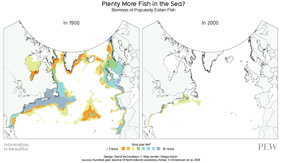
Plenty More Fish in the Sea?
A visualization doesn't have to be complex to be high-impact. Commissioned by The Pew Charitable Trusts as part of European Fish Week, "Plenty More Fish in the Sea?" shows the drastic reduction in the population of popularly eaten fish in one striking image. It doesn't take much to look at this image and conclude that something significant has happened here.
Geography of a Recession
In Geography of a Recession, Latoya Egwuekwe uses a short animated visualization to show the spread of the 2008 recession across the United States. By overlaying time, data, and geography, she is able to display both the rapid progression of unemployment and the regions hit hardest. Symbolically, the country visually turns darker as unemployment spreads. This effect of time-lapse on visualization is key to provoking insight from the viewers.
In a Harvard Business Review article on a telling better stories with data, Andrew Devigal explains this approach, "By pacing through the years, the audience is able to consume the data as a visual narrative, one frame at a time."
It Brings a Concept Home
Sometimes you can't understand a situation until you're placed in it. To help people walk a mile in the proverbial shoes of a situation, some data visualizations give the controls to the viewer. These visualizations are interactive in nature, enabling the viewer to actively choose different views of the data.
Budget Puzzle: You Fix The Budget
In this interactive visualization, the New York Times helps the viewer experience the difficult choices behind balancing a national budget. "Today, you’re in charge of the nation’s finances," they tell you. "Some of your options have more short-term savings and some have more long-term savings. When you have closed the budget gaps for both 2015 and 2030, you are done." The viewer is then given choices like, "Reduce Navy and Airforce Fleets," "Cut Farm Subsidies," and "Raise Taxes." With each choice you get to see how big or little of an impact each choice has.
The NSA Files
When the Snowden Reports initially broke detailing NSA surveillance activities, some people expressed minimal concern saying they didn’t have to worry about surveillance if they weren’t doing anything wrong. To help people see the impact of surveillance from a more personal angle, The Guardian built a data visualization into a larger story they created on the Snowden files. They explained:
You don't need to be talking to a terror suspect to have your communications data analysed by the NSA. The agency is allowed to travel "three hops" from its targets ... Facebook, where the typical user has 190 friends, shows how three degrees of separation gets you to a network bigger than the population of Colorado. How many people are three "hops" from you?
The Jobless Rate for People Like You
"Not all people feel the recession equally," starts the New York Times in this interactive graphic. The visualization enables people to display unemployment data differently based on criteria like age, race, geographic region, and gender. In addition to giving people a more personal viewpoint, the visualization highlights stark differences between the unemployment rates of different groups.
It Shows How Things Work
Sometimes to understand a complex situation, you have to break it down into parts. These visualizations help the viewer deconstruct an idea to build an understanding of it piece by piece.
Inside the Large Hadron Collider
Let’s say you’ve been theorizing for decades about the existence of a tiny particle, one that unlocks many of the mysteries of the universe. This particle is so small that no one has ever seen tangible evidence of its existence. Then 200 scientists from across the world decide that the best way to “see” this particle is by creating a high-speed collision between larger particles in a tunnel that is 17 mi (27 kilometers) in circumference.
Simple right? You with me? Maybe this visualization will help. Created by Vu Nguyen and others, this graphic helps you to understand scope of the Large Hadron Collider and the reactions that occur within it. By breaking it down into a graphical representation and diagrammed phases, the graphic enables us to better understand the complex mechanics and theories at play.
Key Players And Notable Relationships in the Middle East
To say that the relationships in and surrounding the Middle East are complex would be a sizable understatement. It is impossible however to fully understand the political climate, decisions, and points of conflict that exist in the Middle East without having a sense of the relationships that inform them. This still-evolving interactive visualization from David McCandless and UniversLab attempts to map the relationships among the nations and groups that shape the Middle East. Clicking on a country or group reveals its known allies and foes.
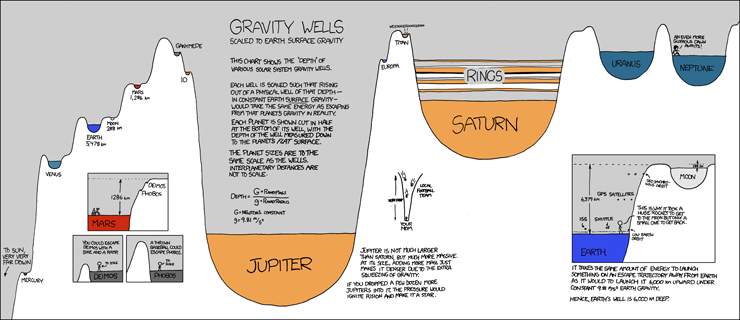
Understanding Gravity
Gravity is such a constant it's easy to forget how much it shapes our experience. Randall Munroe, creator of the webcomic XKCD took this as a challenge. With a straightforward illustration, he compares the relative “depth” of various solar system gravity wells. Each well is drawn in such a way that it represents the relative amount of energy it would take to escape from that planet or celestial body's gravitational pull.
The study and practice of data visualization has grown significantly over recent years as technology has made it easier to map data in more sophisticated ways. As data visualization has grown, it has opened up more possibilities for they way we communicate complex ideas and help viewers experience stories. As Andrew DeVigal writes, "Interactive graphics encourage people to lean forward and participate in the storytelling. By adding layers of information and the mechanics to view the data in varying perspectives, you’re essentially allowing your audience to fill in and add their own narrative."
The examples featured here are just the tip of the iceberg. Most of these visualizations are vast and many are interactive, so if you can, spend some time with each. As you come across other visualizations that break down complex ideas, I'd love you to add them in the comments below, too.
Data Visualization


