Reporting on your marketing and sales efforts is not easy. On the marketing side, you're held accountable for everything you do—from your website's visits and leads generated to your landing pages' conversion rates. Not to mention, revenue goals are likely in your thoughts, right? In Sales, you're tracking your meetings, calls, and deals --- plus, your ever-present monthly quota. As much as we wish otherwise, there's no silver bullet, no single metric that sums it all up. It can be overwhelming to keep track of all your data.

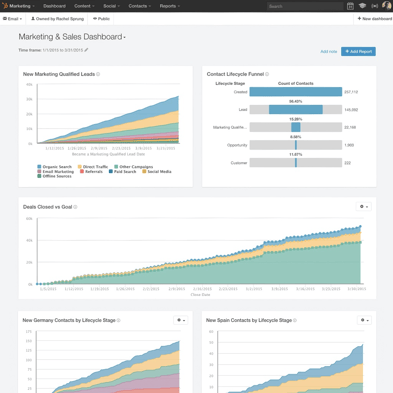
With that in mind, at our Inbound conference last year, HubSpot launched the Reporting Add-on to help marketers and sales teams centralize and organize their data into dashboards. While you may have read some of our early documentation outlining the basics of the new tool, we wanted to give you an exclusive peak at some of the low-hanging fruit within the tool. Below, find six quick and powerful tools that can be accomplished with just a few clicks.
1. Dashboard Notes
Reporting rarely happens in a vacuum. Reports are rarely used by only one person. When you're presenting your data, it's vital that it be digestible and accessible to everyone in your organization. Sometimes, that means sharing the back story behind your dashboards. What is the dashboard used for? What subset of data does it cover? What are some things to look for when using the dashboard? With a recent update, the Reporting Add-on now allows users to add simple notes as modules to their dashboards. The notes are editable, movable, resizeable, with easy drag-and-drop. To make collaboration easy, you can @-mention any of your colleagues, and they'll automatically receive an email alert. Use dashboard notes to ask a colleague a question, highlight a big win to your team, or explain an outlying data point to your boss.
How it works:
To add a note to the dashboard, just click the Add Note button to the left of the Add Report button. You'll be able to edit or remove your note by clicking its Edit Note button.

2. Funnel Reports
At HubSpot, we take user feedback very seriously. You’re probably thinking, “Any company can say that”—and rightfully so. At HubSpot, we put our money where our mouth is. Funnel reports are a prime example of that. One of the most common requests we heard from HubSpot customers over the last few years was for the ability to more easily visualize the movement of leads through the buying process. For marketers, Lifecycle Stages are the key indicator of funnel movement; on the sales side, Deal Stages tell the story. With the Reporting Add-on, it’s now possible to create custom funnel reports for both marketing and sales, based on either Lifecycle or Deal Stages. These simple-to-build charts empower you to quickly identify the bottlenecks in your lead flow, allowing you to streamline your processes as you go.
How it works:
To create a funnel report, navigate to any of your dashboards, and click Add Report on the ensuing page of templates > Funnels [under HubSpot Recommended, left-hand nav]. If you'd like to chart your marketing funnel, click Add to Dashboard [under the Contact Lifecycle Funnel]. If you're looking to report on Sales funnel movement, choose the Deal Stage Funnel instead.

Pro tip: Out of the box, the Funnel report shows only the most commonly used stages. If you'd like to see additional granularity in your data, add the in-between stages to your chart by navigating to your dashboard, clicking the gear above the funnel report then "Edit," and checking off any additional stages you'd like to include.
3. Additional Dashboards
Not every stakeholder in your organization values the same KPI’s, and not every team focuses on the same goals. With that in mind, each team needs its own home base for reporting, to track what’s most important to their own unique needs. In the Reporting Add-on, you can create up to twenty custom dashboards; each dashboard can include up to ten report tiles. How you decide to divide up your dashboards is up to you. As an example, at HubSpot, one of our sales managers set up two dashboards—one to track the performance of his reps over time, and the other to track quota goals and deal forecasts, to measure his team’s impact on the company’s bottom line. If you’re not sure how many dashboards to create, we’d recommend starting with one each for your marketing and sales teams. If you find you need more granular data as your team grows, create another!
How it works:
Adding a new dashboard is easy. From the Reporting Add-on, click New Dashboard. Give your new dashboard a name and a permission set, and you're good to go.
4. Email Reports
While we’d like to think you’re spending your whole day in HubSpot, we appreciate that you and your team have other things on your plate. As you’re performing your day-to-day marketing activities, it’s pivotal for you to keep track of your most marketing performance from wherever you are. The ability to set up email schedules for your reporting dashboards brings the power of the Reporting Add-On to your team members' inboxes. Email your CEO an executive dashboard on the first every month, or give your VP of Sales a series of MQL reports biweekly—in just a few clicks.
How it works:
To set up an email report, navigate to any dashboard and click the Email dropdown at the top right of the dashboard. Select Send, and fill in the options. You'll have the ability to control who receives the email report, the frequency (daily, weekly, or monthly) and the day/time.
 The email itself is clean and simple, with a visual of every report on the dashboard, along with a link to click through to the underlying dashboard in HubSpot.

5. Goal Lines
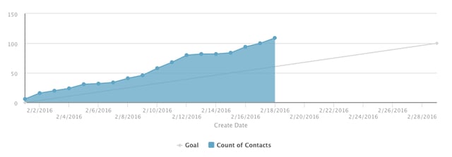
So your graph is heading up and to the right—fantastic! However, just because your numbers are increasing doesn't mean they're in line with your team's expectations. In configuring reports, it's critical to benchmark your data against your goals. The Reporting Add-on makes this easy. For any of your line or area graphs, you can add a monthly goal seamlessly. If your organization doesn't yet have specific benchmarks, we'd recommend starting by reverse-engineering an MQL goal for your marketing team or measuring your team's productivity on the Sales side.
How it works:
In the Reporting Add-on, edit any of your reports by clicking the associated gear icon on your dashboard, then Edit. From there, select the Include Monthly Goal checkbox to add your goal line. Note that plotting a goal line is only possible when viewing a current date range in area and line charts.

6. View and List Filters
It's constructive to see data reflecting your entire database—but it doesn't tell the whole story. In many cases, it's necessary to segment your data into more targeted chunks. For example, let's say you just finished running your first webinar campaign, and wanted to get a better understanding of the makeup of the registrants. While an aggregate view of contact growth over time gives you a piece of the reporting puzzle, it's necessary to deep dive into the specific registrant list in order to complete the picture. On the sales side, sales reps need the abillity to filter deal and engagement reports around their own territories and deals—without that ability to slice and dice the data to their circumstances, the reports lose meaning.
In the Reporting Add-on, we've made it easy to filter your reports around your Lists from HubSpot Marketing, and your sales team's Views from HubSpot CRM.
How it works:
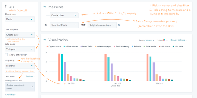
Edit any of your reports, and use the "List" and "View" dropdowns on the left-hand side to filter your data any way you choose.

Ready to dive in? Jump into your Reporting Add-on now. Not yet explored the new tool? Sign up for a no-strings-attached ten-day trial to get a taste of the tool for yourself.


