Albert Einstein once said "If I were given an hour to do a problem upon which my life depended, I would spend 40 minutes studying it, 15 minutes reviewing it and 5 minutes solving it."
That quote defines why Einstein would have been a great conversion optimizer.
Keep reading to explore a conversion optimization project that shows that one of Einstein's principles still rings true even for your everyday web marketer.
Let's take a look back at an optimization project in my past. The client was an info-marketing site in the financial industry. The client sold daily market updates and guidance to people who wanted to learn more about the stock game.
Our goal was simple, figure out how to get this client more leads from the traffic they already had.
Brief disclaimer: This example of optimization has been made anonymous to protect client information. The forms and data you see have been modified. So, as you read this, focus more on the research and process we're sharing because best practices and user learnings are different for everyone.
Let's Optimize
We decided to start by optimizing the form on their primary landing page. You can see the form below. As expert optimizers we knew that this form was asking for way too much information. Asking a new visitor what stocks they own and want to learn more about? Asking them about their volatility? No way.
Users want a short and simple form that asks for minimal info. The one thing this form does right is have a blank comments field at the bottom for free form feedback. Users love that.

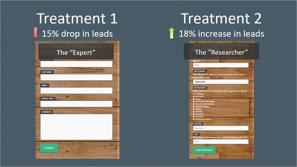
So, we put our heads down and came up with a new form. Something simple, short and respectful of the client's user's privacy. Take a look below.
The new form is much shorter with only five fields versus the nine fields in the original. We kept the basic info that was a must-have and let users fill in comments on their own to submit any extra information.

Feeling good we put this new form live and did a split test against the original form. The test ran for roughly five weeks before we had enough data to make a call.

What!? Our new and improved form actually lost conversion! The new form averaged a 15% LOWER conversion rate than that big long form we knew was causing problems. Not good.
Time to regroup with some research
This time we run form analytics to see exactly what was happening on the forms as well as running a small user testing group to get some qualitative feedback.
Check out the original form below. The thumbs-down were fields with low engagement and poor user testing feedback. The fields with the thumbs-up were high engagement and viewed favorably by users.

A few notable callouts, users didn't like giving their postal codes. They also were confused by the comments field. Even though the comments field was not marked as required, users thought it was required and were unsure what to do.
On the positive side, the fields about user's portfolios and preferences actually had the highest engagement on the form. It goes to show, people still love to talk about themselves.
Take a look below at the failed alternate form we created the first time. We removed all of the high engagement fields and left only the low engagement fields. We could not have created a more unfriendly form for users.

Let's try that again
Luckily we had a client who understood the iterative nature of conversion optimization and was willing to give us another chance with onew research backed insights.
This time we eliminated as many unfavorable fields as possible and loaded up the top of the form with high-engagement portfolio question fields.
We added some reminder text to the first name field to help prompt people. One piece of feedback we got from the user testing was that people didn't like providing their email. We addressed this by adding helper text to the email field that said "This is how we'll send you the technical trading guide PDF." Helping people understand why they need to provide certain information can help smooth out conversions.
Finally, we made a change to the submit button switching it from saying "submit" to "send the guide" to make it a little more friendly and remind users of the payoff.

Thoroughly researched new form in hand, we hit start and ran the split test again. Five or so weeks later, the results were in. The new and improved V2 of the form actually lifted conversions by 18% for the page!

Why we should have listened to Einstein
So, why did the first treatment perform so poorly, while the second increased conversion by nearly 20%?
Well, it comes back to what Einstein said. The first time around we didn't take any time at all to research or analyze the problem, we just jumped headfirst in prescribing solutions based on whatever best practices we reflexively rely on. We basically went in blindfolded throwing darts at the best practices board. We came in as "experts" and got soundly humbled.
On the second test, humbled, we took the time to actually do some research and establish what the problems were on that form. Armed with a solid understanding of what the site users liked and didn't like, we were able to attack the problem from a productive and informed place.

What's next?
So how do you apply this lesson to your own business? Well, it starts with research. When you as a marketer are putting together your plans to dominate your niche and convert more leads, do not forget to do your research first. You can't solve a problem you don't understand.
Now that you've read this slow down, before you even start thinking about what new content to create this month or how to upgrade your landing page, take some time to do research and let your analytics and customers tell you what they want. This is the very essence of customer first marketing. Hubris is one of the downfalls of the digital marketer and research is the vaccine. Only when you truly understand your visitors, your site and the problems they face can you effectively solve them.
Remember: "If I were given an hour to do a problem upon which my life depended, I would spend 40 minutes studying it, 15 minutes reviewing it and 5 minutes solving it.". Thanks, Einstein.