If you're an email and conversion rate geek, you're always looking for new places to test to improve your marketing and sales funnel. The transactional email is a piece of email marketing that doesn't get as much attention as it deserves. Keep reading and we'll talk about what transactional email is, areas to optimize, and wrap up with examples and commentary of some high quality emails.

How do you know if your email is transactional? U.S. law defines it as any email with a primary purpose "to facilitate, complete, or confirm a commercial transaction that the recipient has previously agreed to enter into with the sender." Transactional email can include receipts, event confirmations, welcome emails, terms of service changes, account information and more. Transactional emails while limited in use, have a more engaged audience than your typical marketing email. You can use this valuable real estate to help move your leads and customers further into your funnel post conversion.
If you're a HubSpot user, here's how to use transactional email in HubSpot.
Testing Tips
Test The Basics First
Before you get crazy with it, make sure to check what you're doing on the basics of the email itself. Subject Line, CTAs, From Name and Preview Text are all good early spots to optimize for conversions in your funnel. Many email marketers target open rate as their first major optimization push because it feeds the funnel for all other email conversions.
Subject Line: When sending transactional email, it can be easy to fall back on simple and practical subject lines. Revisit your subject lines with an optimization mindset. Post sale and post conversion are two high engagement moments you should be taking full advantage of. Use A/B testing in the HubSpot platform for this.
CTA: If your business sends update email, there’s a good chance you’ll be adding some kind of CTA. This is a good place for early optimization and testing. For example, if a car dealership is sending inventory update emails to interested shoppers who have test driven, they could work on optimizing the CTA in said email toward driving phone calls for test drives. Try using smart content to tailor the CTA to your audience. The A/B testing tool in HubSpot email can help you hone in on the perfect CTA.
From Name: Do you know if a renewal email does better when it comes from a customer's rep vs. an accounts email? Me neither! You can test this though. The answer may be a 5-10% response rate increase for that transactional email. You won’t know until you try. You can also use your from name for branding. For example, Impact@YourNonProfit.org. From name can be altered and tested within HubSpot.
Preview Text: Make sure you're utilizing the inbox real estate you own via preview text. What's the most impactful or useful thing you can provide someone in that post subject line space? Tracking number, order name, expected delivery. The world is yours. Test out a few different options and see which work best for your audience. Preview text can be tested with the HubSpot email A/B testing tool.
Humanize
Just because your emails came from a robot, doesn’t mean they need to feel like they did. Make sure your company and team's personalities shine through in your transactional email. Transactional email is typically a little deeper in the funnel, so it's a good opportunity to put a face to the company name.
Test things like more relaxed language, including Twitter handles for your assigned sales rep, adding some self deprecating humor or even letting your more creative employees brainstorm some Easter eggs.
Optimize for Engagement
Because transactional email is often sent post engagement or purchase, the recipients will be in a higher state of receptivity than usual. Use this as a moment to cement your relationship with them. Customers are great, but we also want to focus on converting them into promoters and fans.
Consider testing things like social sharing for fun purchases, NPS survey embeds to temperature check new customers, or short surveys to learn more and better segment your database.
Good engagement can even generate new leads. For example, referral offers are a great way to give your new customer or lead a freeby in exchange for a share. If done right this is a mutually beneficial exchange, and both parties leave happy.
You can test these various engagement points in the email testing tool available to all professional and enterprise level HubSpot users.
Examples of Transactional Emails
We hear you loud and clear, you love examples. Let's take a look at a few quality transactional emails, and think about what we can learn from them and take to our own businesses.
FilterEasy
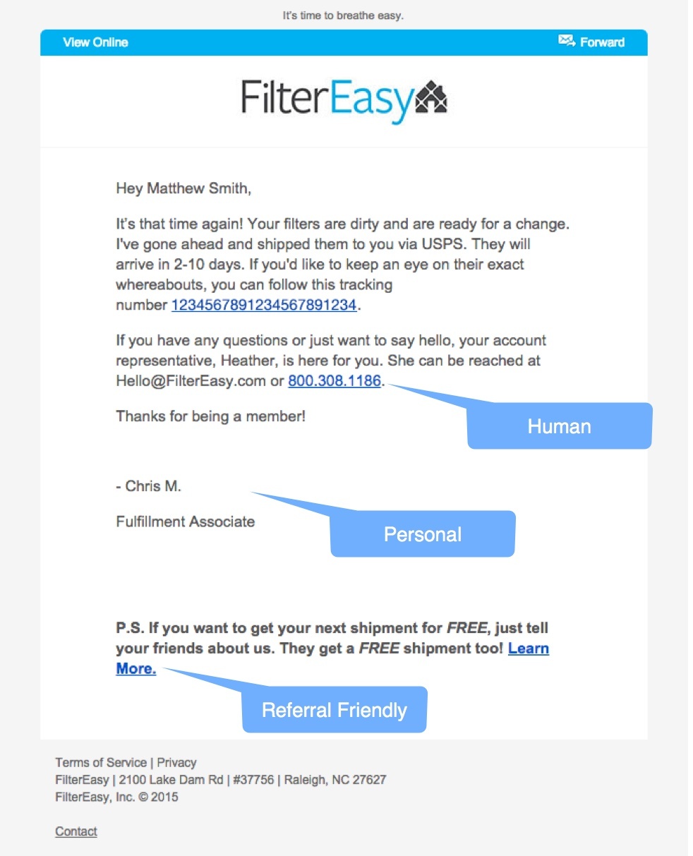
Human: In this simple service notification, FilterEasy takes the time to be very clear about who a customer can ask for support. Sometimes all it takes is a reminder of who is there to help to get a new customer to speak up.
Personal: Points for the simple personalisation of including a signature from a real person.
Referral Friendly: By providing a valuable and easy to use referral option in the transactional email, FilterEasy creates more opportunities to attract new customers via their satisfied current customers.
SkillShare
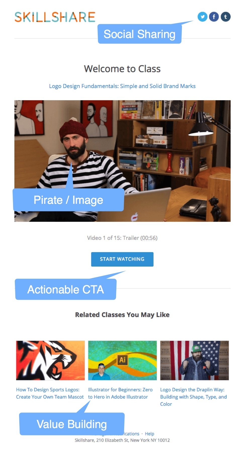
Social Sharing: A running theme here is going to be easy and actionable social sharing at a delightful point in the customer journey. The moment when someone is pumped about an offer is a great time to ask for a share. Here on HubSpot Academy we have good results from people sharing at the moment when they are awarded new marketing certifications.
Big friendly image: Give a preview of what you’re talking about. People have a lot going on, respect that and make it easy to figure out what you're emailing them.
Actionable CTA: I can’t be alone in saying that even when I sign up for content offers, often I never actually download and read them. By increasing CTA conversion, you as a marketer help make sure the value is realized for your customer or lead by encouraging them to actually read or watch what you’re sending.
Value Building: By adding related classes Skillshare is highlighting other services or content that compliment what their customer has already opted in for. This is a great way to grow the relationship in a low touch fashion.
Slides
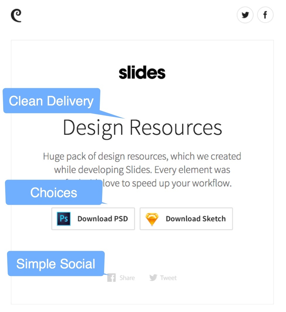
Clean Delivery: This seems simple, but the design in this email is very minimal and focused on the offer. The average inbox is very noisy, and points of clarity and calm go a long way in driving engagement.
Choices: Loving what Slides did here. If the content you send can be viewed in several formats, why not give your audience the choice of what they prefer?
Simple Social: Even these minimal gray share icons can have a big impact especially when in a clean and minimal email like this. This is an opportunity to use a delivery of goods or services to also generate leads and build social presence.
Trunk Club
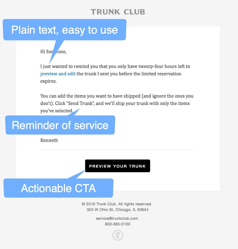
Plain Text: One thing we hear a fair amount in these blogs is that the examples we use are beautiful, but a lot of marketers feel like the design barrier to entry is daunting. This transactional email shows that even plain text looks great and functions well when done right. With the flood of image heavy and over optimized emails most people are receiving it can be refreshing to receive a simple email. If you’re not using plain text for anything, test it out.
Reminder of Service: Sometimes your readers need a little reminder of what you’re providing. Trunk Club is taking the opportunity in this simple transactional email to remind their customers what is being offered.
Actionable CTA: Keeping a bold and clear CTA in transactional emails can help keep the business relationship moving. Trunk Club went with a strong and bold black CTA to move users forward and keep them engaged.
Uber

Personal Preview Text: The preview text for this receipt email is personalized and grateful, something that is nice to see in the inbox.
Simple Service Summary: Whatever it is you sell, use the receipt as a chance to remind your customer of the valuable service you gave them.
Breakdown of Transaction: This is an interesting one. Depending on what kind of business you have, it may be better to have a detailed breakdown, but then, it may also be better to provide a simple summary. You won’t know until you test.
Easy Feedback: Uber makes it very simple to provide quick feedback on the quality of service directly from the receipt email. From an account management perspective, this feedback can be invaluable. What if you were able to catch low satisfaction ratings as quickly as a receipt is received? You have an immediate opportunity here to service and fix any relationships that aren’t up to standards.
Simple Referral: Without being pushy, Uber gives a simple and easy to use referral code. Customers can be your best salesmen so test different ways to enable them to spread the love.
Thanks for reading, leave a comment below and we'll jump in to discuss.
Examples sourced from ReallyGoodEmails.com.
