By now, it’s likely that you’re already taking a mobile-conscious approach to design and marketing. Your customers are relying upon smartphones more and more when it comes to making business decisions and conducting research, and as a result, mobile responsiveness has become a key concern of marketers and salespeople everywhere.

This is where media queries come in. Using media queries, you can set specific rules for your web pages based on the size of the viewer's screen. If the screen is big, your content can look one way; if the screen is small, your content can adapt so that it shines regardless of device size.
Best of all? You won’t need to learn HTML and CSS in depth to set up your media queries. This is because when you simplify media queries to a few basic components, you can use them quickly and expertly to create truly remarkable campaigns.
Below, we'll walk through what a media query is and how to implement one within HubSpot, and then we'll look at some examples of common media queries you can copy and paste into your own stylesheet, template, or page.
Anatomy of a Media Query
My background is not in design. In fact, my degrees are in English and Sociology, so when I first encountered media queries as an independent content marketing contractor, I went a little cross-eyed. At first glance, media queries looked to me to be coding monsters, and I secretly hoped that none of my clients would ask me to use them in an effort to optimize their content.
I didn’t start to wrap my mind around what media queries actually were or what they did until I realized that they’re basically the CSS version of if-then statements.
Take this media query as an example:
|
@media (max-width: 768px) { .example-class { |
I know it might look like I’m recanting my promise that you wouldn’t have to learn HTML and CSS, but if we instead think of this as an if-then statement, you can break it down like this:
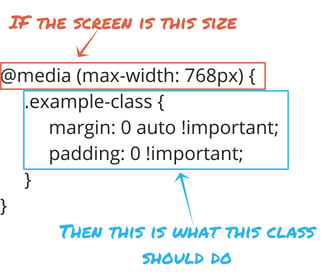
Essentially, all this tells us is that, if the screen is less than 768px wide, then we need to center the “.example-class” class and remove its padding. Let’s break this down further:
@media
This portion of the media query tells the browser that the rules that follow are a part of a media query.
(max-width) or (min-width)
Here is where you can tell browsers what screen size you’re working with.
- “Max-width” rules tell the browser that the rules that follow are to be applied to screens smaller than the pixel value you specify.
- “Min-width” rules tell the browser that the rules that follow are to be applied to screens larger than the pixel value you specify.
Note: Not sure what pixel value to use for your screen sizes? Check out this article on CSS-Tricks for common screen sizes
Class
This is the name given to the element you want to style. To keep things simple and avoid conflicting class names, these should be unique from the styles included in your stylesheet. Personally, I like to create class names that are straightforward and descriptive. For example, if I wanted to write a media query to center an image on mobile and remove text wrapping, I’d name the class something like “centered-mobile-image.”
Implementing Media Queries
When you want to use a media query to style your content, there are basically two steps that you’ll need to take: adding the media query to your website’s styling and assigning a class to the items you want to target. This can be done in either order by following the guidelines below.
Adding a media query to your website’s styling
To add a media query to your website’s styling, there are a couple of options, and each method has its own benefits.
The most common method is to add your media queries to your website’s stylesheet. Using this method, your media query is going to be applicable to any page that’s linked to your stylesheet. So, if you often find that you’re needing to adjust things like text wrapping around images across multiple website pages, this will be your best bet. Once your media query is added to the stylesheet, then you’ll just need to apply the relevant class to the elements you want to target.
Alternatively, you can also add your media queries to your template’s head or your individual page’s head by putting it inside <style> tags in the HTML head, like this:
|
<style> @media (max-width: 768px) { .example-class { </style> |
One caveat here: the media query will then only be used on the individual pages where it's applied. So, if you end up wanting to apply the same style rules to multiple pages and a variety of templates, you’d have to replicate this each time. For consistency across your website and to save yourself time, the stylesheet is going to be a better option.
Template-level or page-level media queries can also be helpful if there are conflicting style rules inside the attached stylesheet. This is because a page-level rule is going to take precedence over a stylesheet-level rule when a web page is loaded (commonly referred to as CSS specificity). As you get more comfortable with media queries, you can use this to your advantage in some situations.
Assigning classes to your content
Once again, you have a couple of options for how to assign a specific class to your content. You can do this either at the template level (especially if you want the rule to apply to an entire module or group of modules) or at the page level. Keep in mind that adding a rule at the template level will apply that change to all pages using that template.
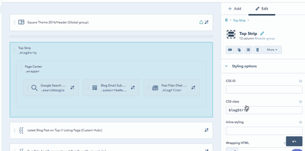
To add a CSS class to a template in HubSpot, you’ll simply need to click on the module or module group and add it to the CSS class field on the right-hand side of the screen.
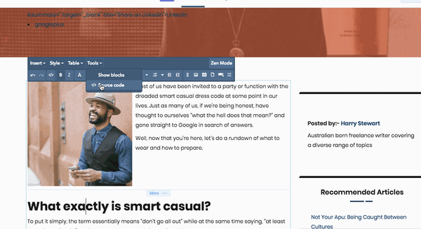
To add a media query to an individual page, which is really helpful for things like blog posts or pillar pages—which have both text and media inside a rich-text module—you’ll need to access the page's source code. You can do this by clicking into your module to make edits, selecting Tools from the editing toolbar, and then Source code.
From there, all you have to do is identify the element you want to target (usually inside a <div>, <span>, or <img> tag) and add your class by typing class=”name of class” inside the appropriate tag.
Common Media Queries
Here’s where I’m going to keep my promise that you don’t need to master HTML and CSS to be able to use media queries.
Below are some commonly used media queries that you can copy and paste into your stylesheet, template, or page. Keep in mind that you may need to adjust the name of the CSS classes being used, and you'll need to make sure you apply these classes to the appropriate parts of your content after adding them to your stylesheet.
To remove text-wrapping for an image on mobile:
|
@media (max-width: 768px) { |
If you have a module or image that is too wide for mobile (e.g., part gets cut off):
|
@media (max-width: 768px) { |
Hiding an element on small screens:
|
@media screen and (max-width: 600px) { |
Media Query Tips and Tricks
Even as you get comfortable with media queries, keep in mind that they’re not going to solve 100% of your website’s mobile behavior. If you’re building a template or looking to redesign your website, media queries can help you make sure that both your desktop and mobile versions of your pages look good, but great responsive design requires you to be more in depth from stage one.
It’s also important to remember that if you’re not a professional designer, it’s best to keep it simple. Media queries can be far more complex than the ones discussed in this blog post, and keeping them as straightforward and simple as possible is best in case you need to go back and edit them.
Finally, if you apply a media query correctly but don’t notice a change to your page on mobile, it may be that there are conflicting styles at play, which is causing something else to take precedence over your media query. In a case like this, you may want to try adding “!important” to your style rule (for example, padding: 10px !important;) to ensure that the rule within your query is the one that takes precedence. While this can be handy in a pinch, the "!important" tag should be used sparingly since it can cause a headache later on if it’s overruling other styles.
With a mobile-first approach, you can ensure that visitors using desktops, tablets, or phones will be delighted with your site layout. By keeping your layout clean across all device sizes, you'll be able to build pages that emphasize your content.
Hungry for more design? Learn how to add a full-width image banner to your site page or read more tips and tricks from our support specialists on designing within HubSpot.
Hubspot Support Series
![How to Size Images for Your Blog Content [HubSpot Support Series]](https://53.fs1.hubspotusercontent-na1.net/hubfs/53/375_Size%20Images.png)
![Creating a Custom Date-Based Property Report [Support Series]](https://53.fs1.hubspotusercontent-na1.net/hubfs/53/Support/HubSpot%20Support%20Series%20Horizontal-603978-edited.png)