I don’t consider myself a technical person, but over the years, I’ve learned to love what metrics like pageviews, new visitors, and traffic sources can tell me about my site visitors.
Not only that, but they also opened my eyes to new business opportunities — which is gold for freelancers like myself.
In this guide, I’ll be covering everything you need to know about web analytics, so you can truly understand which data points mean what, interpret your findings correctly, and make data-backed decisions for your website and business.
We’ll be covering the following points below — click on any of the jump links to skip to that section:
There are tons of data you can collect to understand how people interact with your website and identify opportunities for improvement.
You can track overall traffic, bounce rate, traffic sources, new and returning visitors, time spent on site, and much more.
Let’s take a closer look at why web analytics is important below.
Importance of Web Analytics
Web analytics is critical to the success of your business. Here are some specific ways it can benefit your website.

It provides audience insights.
One reason web analytics is important is that it gives you better insight into your site visitors.
For example, one web analytics metric is traffic source. This data tells you not only through which channel your visitors are finding your website but also their geography.
You may think your customers are based on the West Coast and find you through LinkedIn, but your web analytics may show you that a majority of your visits come from mobile searchers in the Northeast.
It improves user experience.
In my experience, web analytics enables you to better understand your site visitors and use those insights to improve their experience on your site.
For example, if you discover that the majority of users on your site are using a mobile device, then you can focus on making your website more mobile-friendly.
Or, if you see that a specific page gets a lot of traffic, you can make sure the page is optimized for the information visitors need.
You can also move the page navigation to a more prominent spot on your website to make sure it’s easy to access.
It guides your SEO strategy.
Web analytics can also shape your content and SEO strategy. By looking at your top-viewed posts, you can begin to identify what types of content and topics perform best with your audience.
For example, if you notice how-to WordPress tutorials make up the majority of your top viewed posts, then you might shift and narrow your focus from definition articles about anything web-related to how-to WordPress tutorials.
Or, maybe you look at your site’s traffic sources and notice that organic and email traffic are your top drivers and paid channels are your lowest. In that case, you might shift resources to invest more in your organic strategy than paid.
Now that we have an idea of web analytics and why it’s important, let’s look at some key metrics you might track to measure progress against — and eventually meet — overarching business objectives, like increasing traffic, leads, and revenue.
Pro tip: Want to quickly see how your website ranks? Use our Website Grader to find out what your website rating is and how to improve it.
What is web analytics used for?
Web analytics is used to improve your website so you can better meet visitors' needs, improve conversions, and ultimately generate more business.
The amount of data can be overwhelming at first. That’s why I think it’s important to identify a few key metrics, particularly as you’re getting started.
For example, you might start by focusing on the bounce rate for a few key pages on your site.
If visitors are quickly bouncing from your homepage, then that indicates they’re not finding the information they’re looking for quickly or easily enough.
From there, you can identify possible next steps, like redesigning your website navigation.
Before you read on, I want to note that various analytics tools may have slightly different definitions of the following terms. It‘s best to consult your particular tool’s documentation to understand exactly how each is calculated.
Pageviews
Pageviews are the total number of times a page was viewed on your site. A pageview (or view) is counted when a page on your site is loaded by a browser.
So, if a person were to view a page on your site and reload the page in their browser, that would count as two views.
If a person viewed one page, viewed a second page on your website and then returned to the original page, that would count as three views.
Pageviews can give you an idea of how popular a page on your site is, but my experience has taught me it’s important to look at this number in context with other metrics — something a traffic analysis tool can help with.
A page with a high number of views for a post isn’t necessarily popular since a small group of visitors could be responsible for a lot of those views.
A high number may also indicate that a page was confusing and required visitors to return to it multiple times.
Unique Pageviews
Unique pageviews are the total number of times a page was viewed by users in a single session. In other words, a unique pageview aggregates pageviews that are generated by the same user during a session (which I’ll define below).
So, if a person viewed the same page twice (or more times) during an individual session, unique pageviews would only count that pageview once.
Unique pageviews discount instances in which a user reloads or visits the same page in the same session.
That's why this metric helps you get a better understanding of how many visitors are viewing pages on your site and how popular individual pages are.
Sessions
A session is a group of interactions — including not only pageviews, but activities such as call-to-action (CTA) clicks and events — that take place on your website within a given time frame.
The timeframe of a session varies by web analytics tool. For example, sessions in Google Analytics and HubSpot’s traffic analytics tools last 30 minutes by default.
A session ends, and a new session starts for a user when either:
- A) there has been 30 minutes of inactivity and the user becomes active again
- B) the clock strikes midnight, or
- C) a user arrives via one traffic source, leaves, and then comes back via a different source.
That means if a user lands on your site, leaves, and returns within 30 minutes, Google Analytics and HubSpot will count it as one session, not two.
On the other hand, if a user is inactive on your site for 30 minutes or more but then clicks on a CTA or takes another action, Google Analytics and HubSpot will count it as two sessions, not one, even if the user never left your site.
New Visitors
New visitors — also termed new users, unique visitors, or new visitor sessions, depending on the web analytics tools — are the number of unique visitors on your website.
As the name implies, a new visitor is an individual who visits your site for the first time. Healthy websites will show a steady flow of new visitors over time to make up for those who lose interest.
These individuals are identified by a unique identifier. For example, when using HubSpot, the HubSpot tracking code is installed on your site. Then, visitors to your site are tracked by the cookie placed in their browser by this tracking code.
Two important notes to keep in mind: First, a single visitor can have multiple sessions and pageviews on your site.
Second, unique visitors are not an entirely accurate metric. That’s because most web analytics tools use cookies to track visitors, which doesn’t always distinguish new visitors from returning ones (which I’ll define below).
For example, if a person visits your site via their mobile phone and then on their personal computer, they'll be counted as new visitors on both occasions.
Returning Visitors
Returning visitors (or users) is the number of visitors on your website who have visited before. Not all web analytics tools include this metric, but some — including Google Analytics — do.
In Google Analytics’s Audience reports, you can look at behaviors to see the ratio of new to returning users on your site.
In my opinion, looking at both new and returning visitors metrics is great for getting a sense of how well you're retaining your visitors and how effective you are in attracting net new visitors at the top of the funnel.
Your ratio of new to returning visitors will depend on several factors, including your industry, how long you’ve been around, and whether you offer incentives to return to your site.
But, if you’re an established website that’s seeing returning (or new) visitors top 80% of your traffic, attempt to balance this out by attracting more new visitors or retaining old ones.
Again, keep in mind that this metric won’t be completely accurate if the web analytics tool uses cookies to track visitors.
Traffic Sources
Traffic sources show where your site visitors are coming from. Like visitor information, this metric is usually collected via the tracking code on your site.
The number of traffic sources you can track will vary depending on the web analytics tool. HubSpot’s traffic analytics tools track multiple categories, including:
- Organic search.
- Referrals.
- Organic social.
- Email marketing.
- Paid search.
- Paid social.
- Direct traffic.
Ideally, you want to increase all sources of traffic. But, your biggest focus should be organic search, which is traffic that comes from non-paid search results in search engines like Google.
This source has the potential to drive huge amounts of traffic to your site. Plus, I’ve found improving this channel often improves other channels, like referrals and social.
Bounce Rate
Bounce rate is the percentage of visitors that leave your website after viewing a single page.
You can look at bounce rate as a site-wide metric or a page-level metric. At the page level, bounce rate is the percentage of sessions that started on the page and did not move to another page on your site.
Generally, a bounce rate of 40% or lower is considered good, 40% to 70% is average, and anything above 70% is considered high.
If your site’s overall bounce rate is high, it might help to identify individual pages with high bounce rates.
A high average page bounce rate might indicate there’s a problem with the page’s loading time or that external links are not opening in a new tab or window, among other reasons.
To learn what actions you can take to reduce your bounce rate, check out our 6 Steps to Reduce Your Bounce Rate.
Web Analytics Best Practices
Many aspects of web analytics are specific to your business: what metrics you track, how you build out website analytics reports, and what tools you use.
However, there are some best practices that can help anyone collect, analyze, and report website data more effectively. Let’s look at a few.
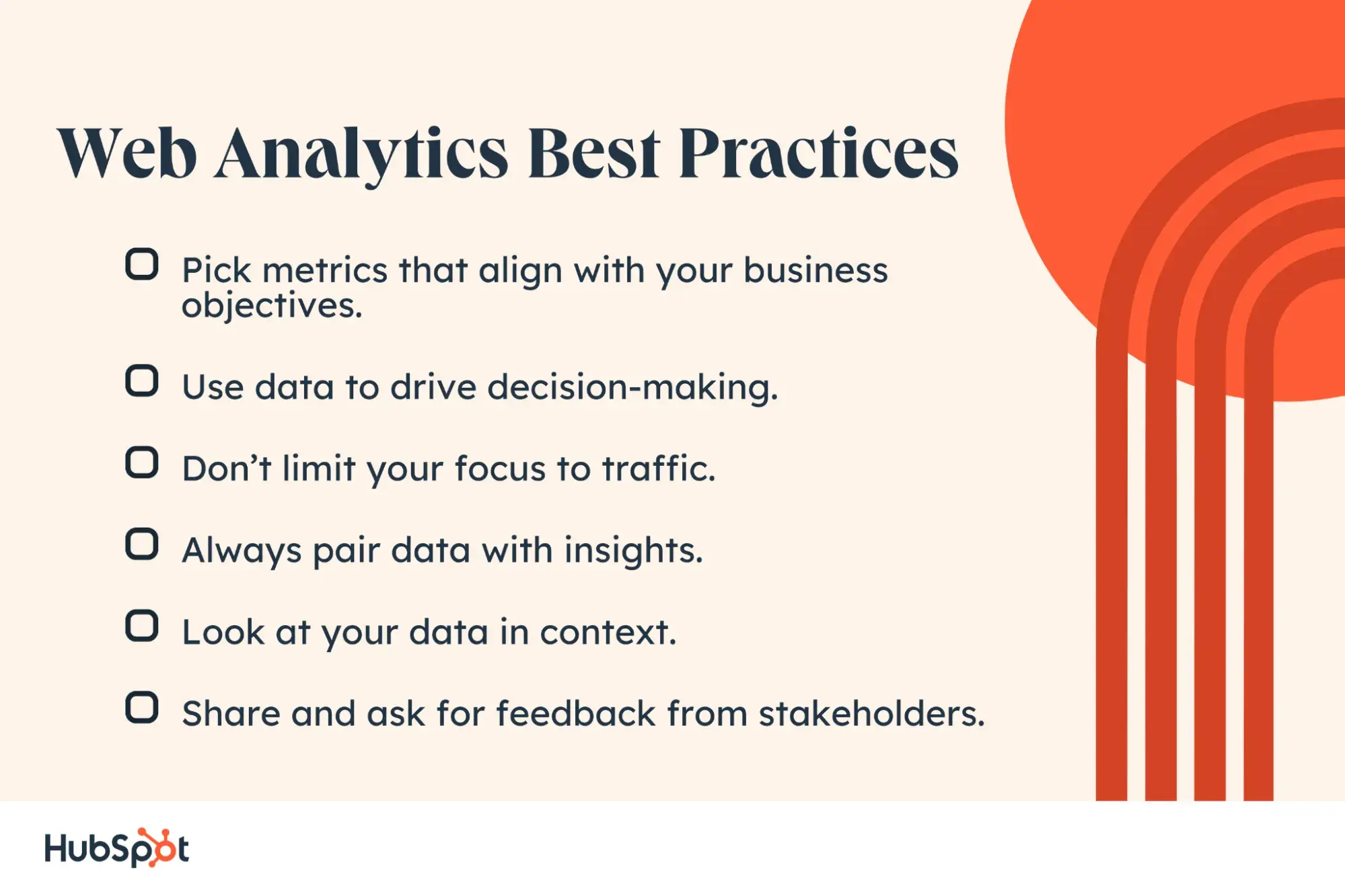
1. Pick metrics that align with your business objectives.
Focusing on only one or two metrics won’t provide enough insight into how visitors are interacting with your site, but tracking every single metric might provide too much information to be actionable.
To ensure you’re focusing on the right metrics, start by plotting your business objectives. Think about your website's top priorities.
Do you want to lower your site bounce rate? Are you looking to attract more new visitors or better retain existing ones?
Once you have one or more objectives in mind, I recommend come up with specific strategies you’ll implement to achieve them.
These may include fixing broken links and images, changing your site’s copy, or better optimizing for your mobile audience, which probably makes up around half of your traffic.
You’re now ready to narrow down what metrics will help you track your progress toward achieving your goals and, ultimately, your business objectives.
2. Use data to drive decision-making.
After collecting your data, determining whether or not you met your goals is only the first step. The next — and arguably more important — step is using that data to test, experiment, and make changes on your site.
For example, say you identified some high-value content, like your Services and Pricing page, through user testing and feedback in your web design process.
However, these pages aren’t getting much traffic.
In this case, you might move the navigation links for these pages to a more visible part of your site or implement SEO measures on these pages to rank higher and capture more organic search traffic.
3. Don’t limit your focus to traffic.
Understanding and reporting traffic data — including pageviews, top traffic sources, and most viewed pages — is important. But it’s just one piece of your website performance. High traffic doesn’t necessarily mean success.
For example, if you’re getting millions of pageviews but no conversions, then you’re probably not meeting all your business objectives.
Or, if new visitors consistently make up a high proportion of your traffic, consider why that might be and how you can attract return visitors more effectively.
4. Always pair data with insights.
If your web analytics report shows that your website received 1 million unique pageviews and 400,000 new visitors this month, that doesn’t mean all that much.
Reporting only the numbers provides an incomplete picture of your website performance. For all we know, these numbers could indicate:
- An increase from last month.
- A decrease from last month.
- Little to no change in pageviews or visitors month-over-month.
- An increase last month but a major year-over-year decrease.
That’s why you must pair your data with insights.
If you instead report that your website got 1 million unique pageviews, which exceeded last month’s unique pageviews by 20% and also showed a significant increase year over year, then the data is much more meaningful and actionable to you and your fellow stakeholders.
5. Look at your data in context.
While collecting and analyzing data, I recommend you think about it in context.
What variables or larger forces could be impacting the numbers? For example, algorithm updates, seasonality, and bots can all have a major impact on your traffic and other metrics.
Imagine that a few pages on your site saw major spikes in traffic. These posts weren’t updated recently, so you look where this traffic came from.
If the traffic mostly came from one country where you usually don’t see much traffic, this was likely malicious bot traffic, which accounts for a quarter of all internet traffic.
In my experience, viewing your data in context can help you better understand, analyze, gain insight, and make informed decisions with your data.
If you find analyzing data overwhelming, I suggest checking out an advanced analytics consulting service. They can help you uncover insights that drive your strategy so that you can achieve your business objectives more effectively.
6. Share and ask for feedback from stakeholders.
As an analyst, you want to provide information to stakeholders in a way that is understandable and actionable. You also want to ask for information and ideas from these stakeholders.
They can provide valuable feedback on how they use the data, what else they want to see or understand about their users or website, and how they think they can improve the user experience or other issues the data uncovers.
Web Analytics Tools
Measuring organizational success requires more than one metric — and more than one tool. Let’s take a look at some web analytics tools you can combine for high-quality data.
1. HubSpot Marketing Analytics & Dashboard Software
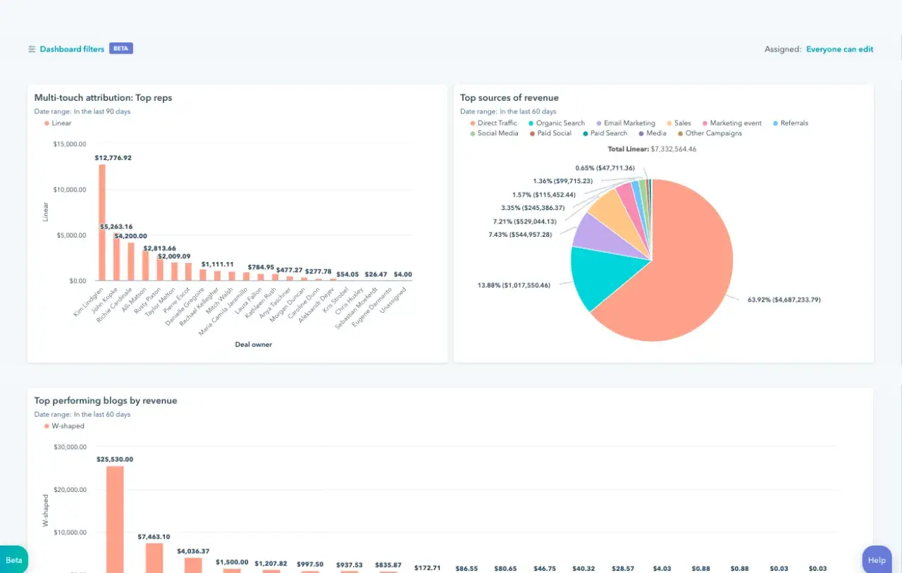
Get HubSpot's Free Marketing Analytics Software
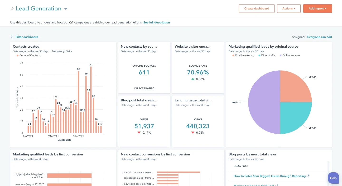
With HubSpot’s free marketing analytics and dashboard software, you can measure the performance of all your marketing assets.
This includes website and landing pages, emails, blog posts, social media accounts, CTAs, and more — all from one dashboard.
I like that you’re able to track your customers’ complete lifecycle, measure traffic overall or on a page-by-page basis, and add multiple reports to your dashboard so you’re tracking your most critical metrics in one easy-to-access place.
You can even break down reports by user characteristics for more fine-grained analysis.
HubSpot’s free tool is ideal for anyone looking for built-in analytics, reports, and dashboards so they can make smarter, data-driven decisions.
What I like: Analytics is fully integrated into everything you do in HubSpot, ensuring you always have the right data available when you need it. There’s no more digging through spreadsheets or datastreams — with HubSpot, everything is accessible and actionable, whether you’re a beginner or a seasoned expert.
2. Google Analytics
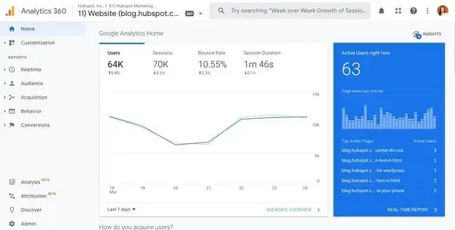
Used by over 28 million websites, Google Analytics is the most popular web analytics tool.
With it, you can track pageviews, unique pageviews, bounce rate, traffic channels, user retention, average session duration, sessions by country, sessions by device, and more.
You can also build reports about your audience, acquisition channels, engagement, and conversions.
Understanding the value, flexibility, and popularity of Google Analytics, some platforms offer unique integrations with this tool.
Analytics Amplifier, for example, is a HubSpot app that allows users to match HubSpot customer behaviors — including “hot leads” and “deal amount” — with real-time Google Analytics data.
If you want to learn more about this tool, check out our Ultimate Guide to Google Analytics.
However, I think the sheer amount of metrics, reports, and integrations that can be tracked or created using Google Analytics might be overwhelming.
Users without SEO or technical expertise, like content creators, may find it difficult and prefer a Google Analytics alternative.
What I like: Google Analytics is unmatched in popularity. It gives website owners an all-encompassing view of their site activity and is relatively easy to set up and link to any live site. Plus, Google Analytics offers many powerful capabilities for free.
3. Crazy Egg
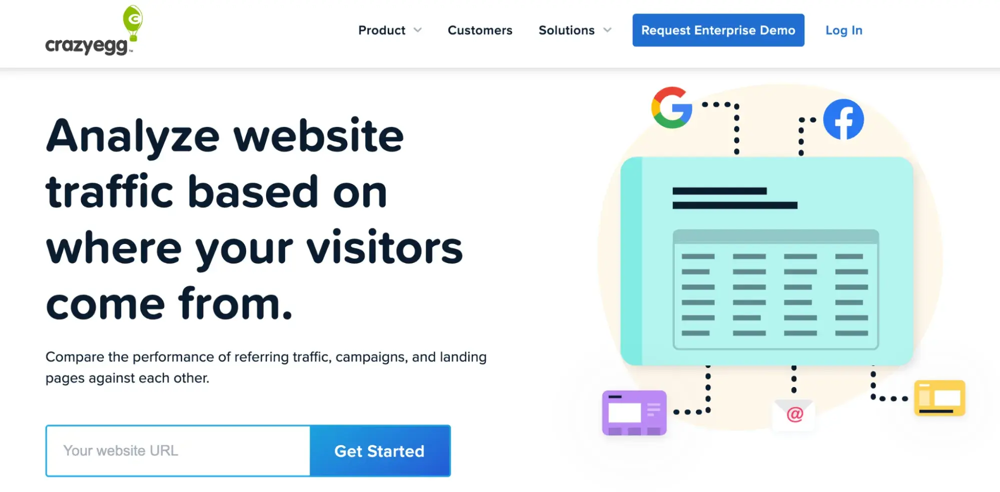
Used by over 300,000 users, Crazy Egg is a unique web analytics tool that provides heatmaps, scroll maps, and other visual reports to show you exactly how your visitors are interacting with your site.
Thanks to Crazy Egg's tracking code, you’ll be able to watch what visitors are hovering over and clicking on in real time via heatmaps.
Crazy Egg also offers comprehensive A/B testing so you can test various content variables like color, copy, and content placement. You can then see how it affects the user experience and conversions.
In my opinion, this makes Crazy Egg an ideal alternative or supplement to Google Analytics for users interested in conversion optimization.
What I like: I like that Crazy Egg is a user-friendly tool for conducting heatmap and scroll map testing, A/B testing, and screen recordings of user interactions. These are great means to better understand users in qualitative and quantitative ways and gain insights to improve the user experience on your site.
4. Semrush

Semrush is a comprehensive SEO tool for keyword research, website audits, competitive research, backlinks, and more. In my experience, these are important elements that contribute to your website and content visibility.
Best for: If one of your website or business goals is to improve your search traffic, then using a tool like Semrush or Ahrefs is essential. Not only do these tools help you understand how you rank in the search engine results pages (SERPs), but they also show you how to improve your website content and technical SEO aspects.
5. Hotjar
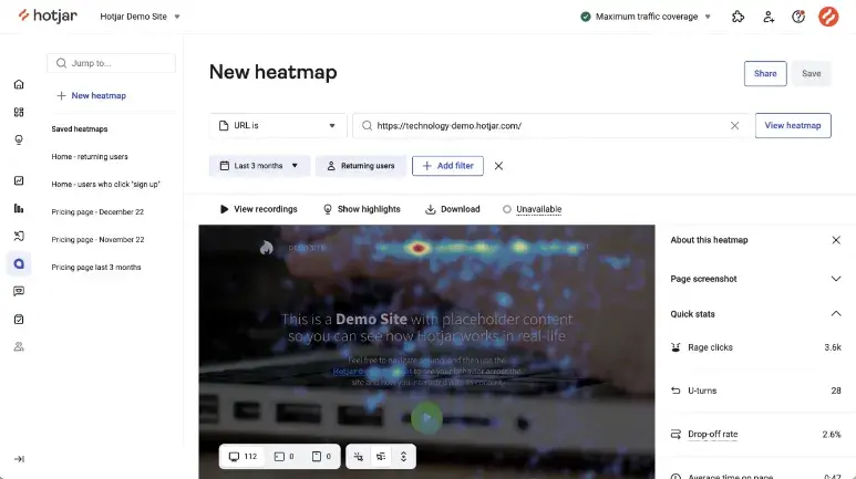
Hotjar offers visual behavior insights through surveys, funnels, and heat maps.
The heat maps specifically include mouse movement tracking, which I think is a game-changer for web analytics.
Not only does this data tell you which links and pages visitors are hovering over or clicking on the most, but it also lets you know which content they’re most interested in and how long they spend looking at it.
Pro tip: Hotjar has a free forever plan, so if you’re new to web analytics or on a budget, this option is invaluable.
6. Chartbeat
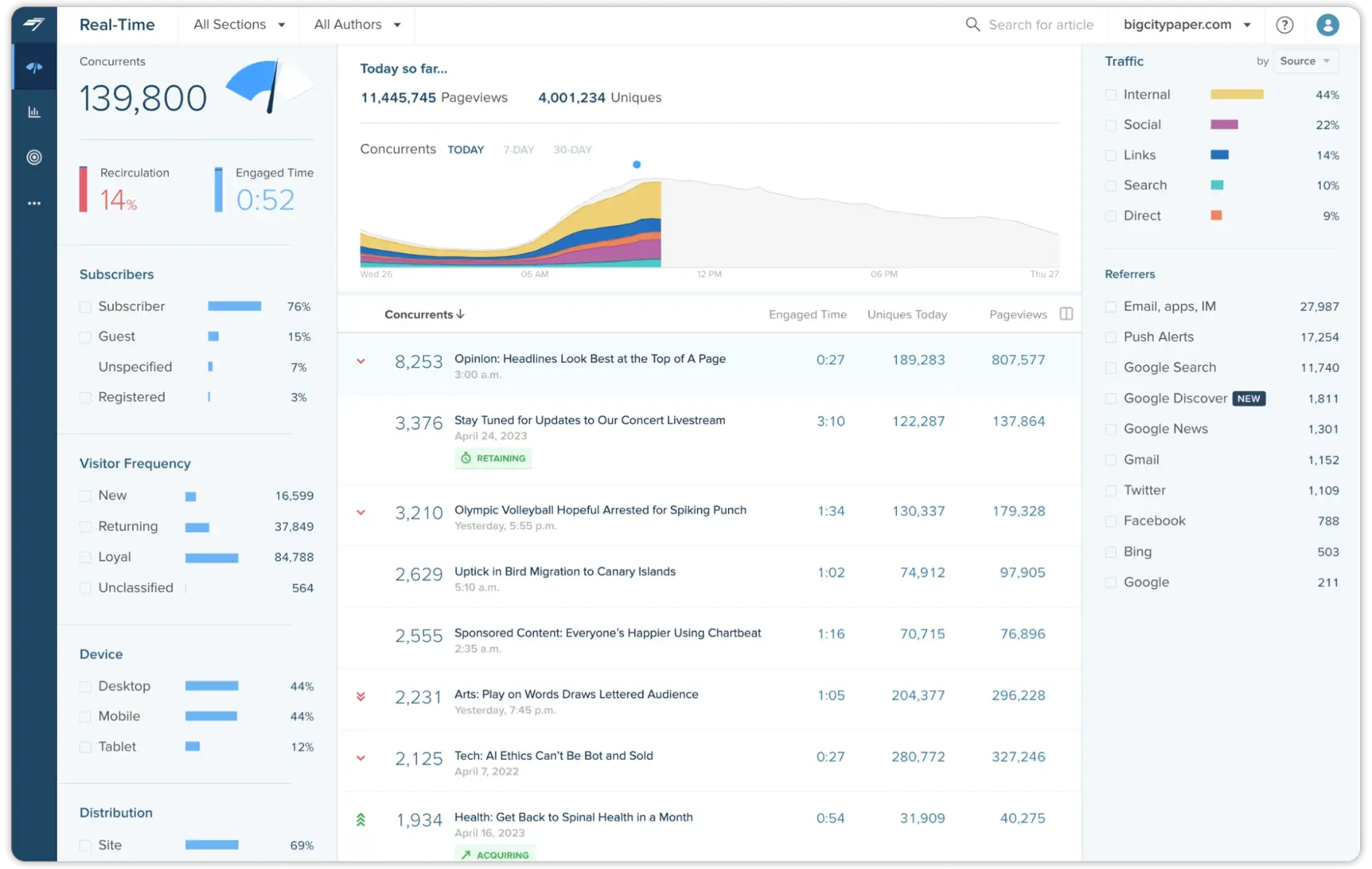
Chartbeat is a content analytics software for content publishers. It offers intelligence and real-time analytics features to enable media websites to understand what content their audience engages with.
Chartbeat’s goal is to help publishers grasp what keeps their audiences reading and scrolling within their online publications.
What I like: One of Chartbeat's most popular features is its real-time dashboard. As a former journalist, I know how quickly trends and stories emerge. It’s essential to have insights into real-time web analytics that tell you how readers are reacting to new content.
7. SimilarWeb
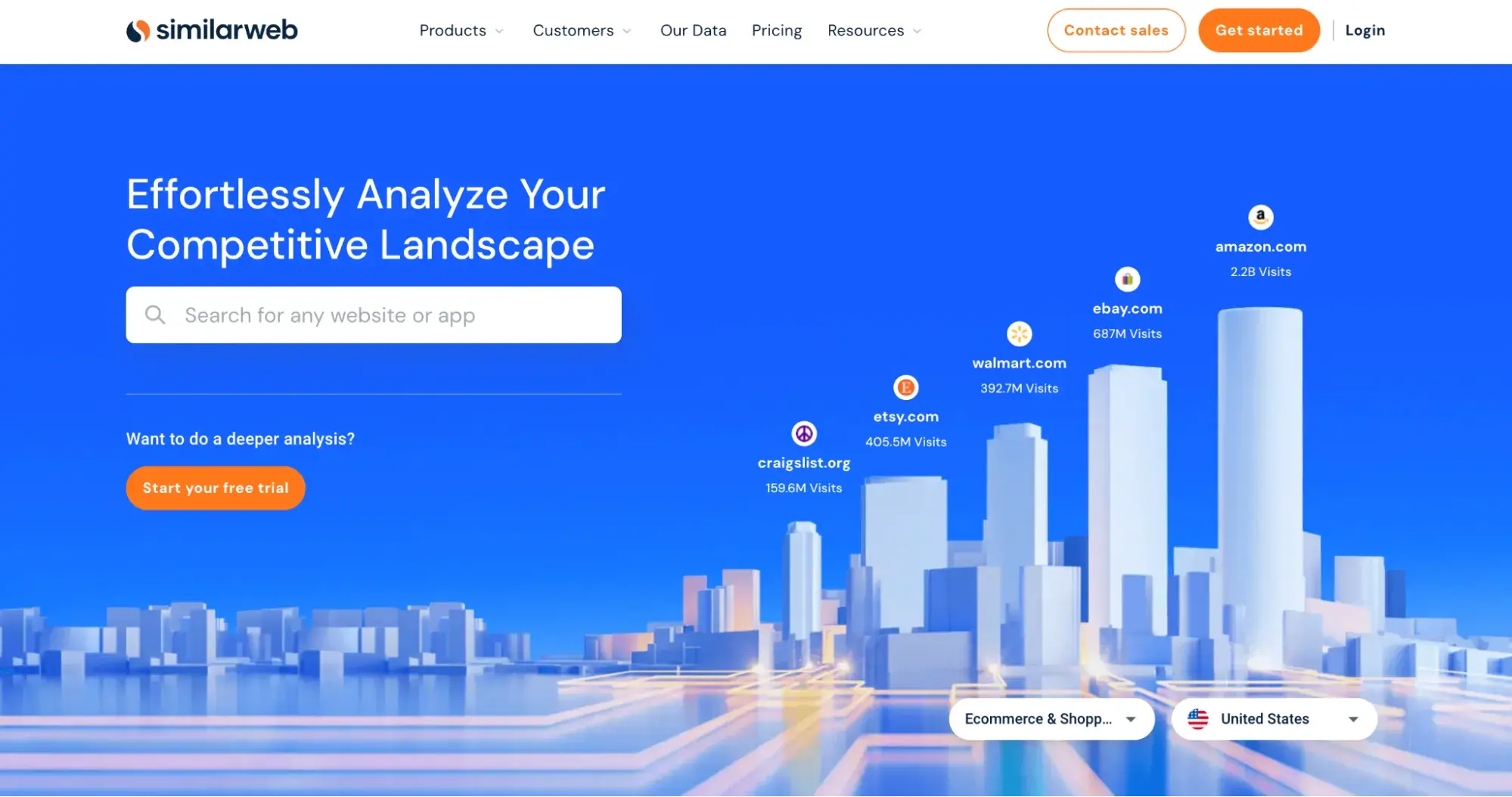
SimilarWeb is a competitive landscape analysis tool that enables you to compare your website with one of your direct competitors.
Not only can you see how competitors rank in the search results, but you can also track their performance — such as traffic and engagement — over time.
Best for: If you know who your competitors are and you’re actively competing for the top spot in the search engine results page, then I think this tool is essential.
Web Analytics Pitfalls to Avoid
Like anything else, web analytics can come with its challenges. If you aren’t careful about what you’re tracking (and why), you can easily find yourself in a pitfall.
Here are some potential issues you may experience.
Tracking Too Many Metrics
I’m certainly guilty of this. Whether I’m checking my own web analytics or digging into a client’s, it’s tempting to want to analyze all of them.
But not every metric is important to your overall goals. To get the most out of your web analytics, it’s important to focus on a few key metrics that contribute to your website’s and business’s success and don’t get distracted by the rest.
Inaccurate Data
While most web analytics data is accurate and helpful, not all of it is correct.
For example, one of the most frustrating challenges of web analytics is spam traffic, which is traffic from bots or inaccurate sources. While you can try to set up website blockers that prevent this, it’s best to ignore data that seems inaccurate.
Plus, considering that we’re already on the path towards a cookieless internet and more people are opting out of letting their website activity and behavior be tracked, it’s easy to assume that not all of the data is accurate.
Relying Too Much on the Data
I’ve shared the many ways tracking web analytics can be useful for your website and business goals. But another pitfall you can potentially run into is overreliance on this data.
Your web analytics are only one small part of your website’s overall visibility, performance, and role in the business. The worst thing you can do is make major business decisions based purely on what your web analytics is pointing to.
Instead, web analytics should be used as insights to inform your website’s role and strategy in your company.
Using Web Analytics to Improve Your Website
Whether you’re a small business, ecommerce site, or enterprise company, web analytics can help you and your company grow.
I’ve personally found that web analytics data can uncover new opportunities for both your website and the business as a whole. But it doesn’t tell the entire story.
I recommend focusing on a few key data points relevant to your goals and doing your best to ignore the rest.
When you track the right ones, web analytics can vastly improve your website content, user experience, and overall site ranking.
Editor's note: This post was originally published in July 2014 and has been updated for comprehensiveness.
Web Analytics



![How Many Visitors Should Your Website Get? [Data from 400+ Web Traffic Analysts]](https://53.fs1.hubspotusercontent-na1.net/hubfs/53/how-much-traffic-does-website-get.png)


![What Is the Average Time Spent On a Website? [+ How to Improve It]](https://53.fs1.hubspotusercontent-na1.net/hubfs/53/GettyImages-1356122303%20copy.jpg)

![6 Steps to Reduce Your Bounce Rate [+ Platform-Specific Tips]](https://53.fs1.hubspotusercontent-na1.net/hubfs/53/decrease-bounce-rate.jpg)
