Automated reporting is the process of using software to collect, analyze, and distribute business data without manual work. By replacing spreadsheet exports and manual updates with always-on dashboards, automation eliminates human error, speeds up decision-making, and keeps every team aligned with real-time information.
Learn More About HubSpot's Sales Hub Enterprise Software
For most organizations, manual reporting is one of the biggest hidden time drains. Teams regularly spend 10–20 hours per week pulling data, fixing formatting issues, and rebuilding the same recurring reports.
Automated reporting tools replace that cycle with scheduled updates, integrated data, and standardized performance views across marketing, sales, and service.
This guide explains how teams can automate reporting processes across marketing, sales, and service, as well as why automated reporting matters, how it works, the challenges to expect, and how to implement reporting automation using HubSpot’s reporting tools, dashboards, and CRM integrations.
Table of Contents
- What is automated reporting?
- Key Benefits of Automated Reporting
- Best Practices for Automated Reporting
- Common Challenges When You Automate Reporting (And How to Solve Them)
- How to Implement Automated Reporting
- Types of Automated Reporting Tools
- Best Automated Reporting Tools
- Frequently Asked Questions About Automated Reporting
What is automated reporting?
Automated reporting is the use of software to generate business reports on a recurring or real-time basis — without manual data collection, spreadsheet manipulation, or slide rebuilding. Instead of recreating the same weekly, monthly, or quarterly reports, automated reporting connects directly to data sources, applies predefined logic, and updates dashboards and summaries automatically.
Automated reporting works by integrating a business’s CRM, marketing automation, website analytics, and other data systems into one reporting environment. The software then pulls data at set intervals or in real time, formats it, applies consistent filters and calculations, and publishes dashboards or sends scheduled report summaries. This eliminates human error, reduces reliance on spreadsheets, and ensures that every stakeholder sees the same, standardized version of the truth.
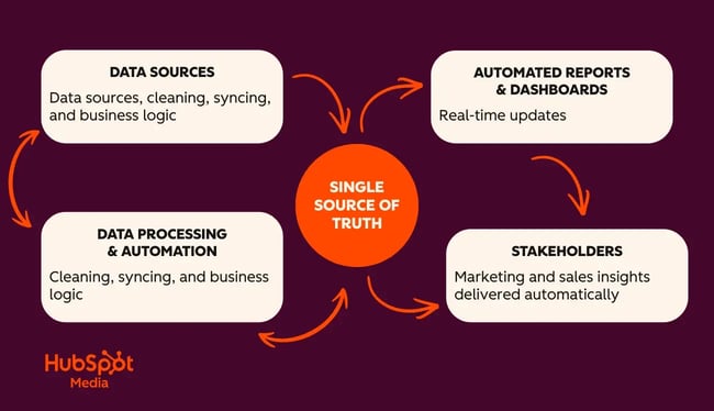
What Automated Reporting Includes
- Automated data collection: Pulling CRM, marketing, sales, service, and financial data into a centralized reporting layer.
Automated calculations and logic: Applying consistent formulas, filters, lifecycle stages, and KPIs every time a report runs. - Real-time or scheduled updates: Dashboards refresh automatically, or reports send via email on daily/weekly/monthly intervals.
- Multi-stakeholder reporting: Different dashboards can be configured for executives, marketing teams, sales managers, and service leaders — all using the same underlying data.
Why Automated Reporting Matters
Automated reporting processes eliminate manual data collection and report creation, reduce human errors in data entry and calculations, and provide real-time visibility into performance. It also enables scalable reporting for multiple stakeholders, ensuring every department works from the same source of truth.
Free Sales Software
Built for productivity, powered by relevance.
- Sales Automation
- Call Tracking
- Lead Prospecting
- And More!
Key Benefits of Automated Reporting
Automated reporting reduces manual data collection, eliminates errors, and gives teams real-time access to business performance. For most organizations, it saves 10–20 hours per week, accelerates decisions, and ensures every stakeholder works from the same single source of truth. These benefits compound over time, especially for marketing, sales, and service teams that rely on fast, accurate insights that can be found in automated marketing reports.

1. Saves 10–20 Hours Per Week on Manual Work
Manual reporting drains operational capacity. Teams often spend hours each week exporting CSV files, fixing formatting inconsistencies, rebuilding the same reports, and tracking down missing data. Automated reporting removes this workload entirely by refreshing dashboards without human intervention.
Why it matters:
- Eliminates copy/paste workflows.
- Frees operations, revenue, and marketing teams for higher-impact analysis.
- Reduces lag time between data updates and decision-making.
- Improves predictability — reports arrive on schedule every time.
This is one of the clearest ROI drivers of automated reporting. When reporting time drops, strategic work increases.
2. Improves Data Quality and Reduces Errors
Every manual step introduces risk. Copying data between spreadsheets, adjusting formulas, and combining datasets opens the door to discrepancies and inaccurate insights. Automated reporting ensures data is pulled consistently from a trusted source, using the same rules, filters, and calculations.
Why it matters:
- Removes human error from data entry and formula manipulation.
- Ensures KPI definitions stay consistent across reports.
- Reduces duplicate records and mismatched fields.
- Builds organizational trust in dashboards and performance metrics.
This is especially important when reporting to leadership or external stakeholders who expect reliable, repeatable insights.
3. Delivers Always-On, Real-Time Insights
Automated reporting gives teams access to live or near real-time performance data — without waiting for monthly or quarterly updates. Dashboards update as data changes, allowing faster decisions and more agile responses.
Why it matters:
- Marketers can optimize campaigns daily.
- Sales leaders can monitor pipeline health in real time.
- Service teams can track ticket volume and SLA compliance instantly.
- Executives gain immediate visibility into revenue, retention, and performance trends.
Real-time reporting is one of the most valuable components of modern operations, especially when teams are distributed or scaling.
4. Enables Scalable, Multi-Stakeholder Reporting
As companies grow, reporting complexity multiplies. Manual reporting struggles to scale across departments, regions, teams, and leadership layers. Automated reporting solves this by building once and distributing everywhere.
Why it matters:
- Dashboards adapt to each audience — executives, managers, reps, and partners.
- Teams view performance through the same single source of truth.
- Reduces “version conflict” between spreadsheets or manually updated decks.
- Supports recurring automated report delivery (daily/weekly/monthly).
Automated reporting simplifies data and standardizes insights across the entire organization.
Best Practices for Automated Reporting
Effective automated reporting requires more than connecting tools. Delivering actionable insights necessitates clear goals, consistent data, standardized KPIs, and a reporting process that is aligned end-to-end across the entire organization.
Before automation can work, teams must agree on how data is captured, how metrics are defined, how reports are structured, and who each dashboard is designed for. When data, workflows, and reporting processes operate in sync, automation becomes accurate, scalable, and easy to maintain.
Start with clear questions and KPIs.
Automated reporting is most valuable when it aligns with specific business decisions. Before building anything, define the purpose of each report, the KPI it represents, who needs it, and how frequently it should update.
What to define upfront:
- What decision does this report support?
- Which KPIs matter most?
- Who needs this data (exec, manager, specialist)?
- What timeframe is most meaningful?
- Should this be a dashboard or a scheduled recurring email?
This step prevents dashboard overload and ensures every automated report serves a strategic purpose rather than becoming a data dump.
Centralize and govern your data in a single source of truth.
Automated reporting only works when data is consistent and accessible. Centralizing your data in a CRM or unified system ensures every report pulls from the same trusted source rather than spreadsheets or siloed platforms.
Best practices for centralized data:
- Consolidate marketing, sales, service, and website analytics in one system.
- Standardize naming conventions for fields and properties.
- Use data validation and formatting rules to maintain clean records.
- Integrate disconnected tools to reduce manual imports.
- Build automations that sync and clean data continuously.
When all automated reporting runs off the same CRM, teams get consistent, reliable insights with no conflicting metrics. HubSpot’s CRM, for example, unifies all customer data from marketing, sales, and support in one platform.
Standardize metrics, definitions, and filters.
Inconsistent metric definitions are one of the biggest barriers to actionable reporting. Automated reporting requires clearly defined KPIs and filters so reports stay accurate and decision-ready.
Where standardization matters:
- Lead vs. MQL vs. SQL criteria.
- Deal stage definitions.
- Attribution windows and channel definitions.
- Date filtering (e.g., rolling 30 days versus calendar month).
- Pipeline rules and lifecycle stages.
- Consistent naming conventions for assets and campaigns.
When definitions are aligned across marketing, sales, and service, automated reporting removes confusion instead of amplifying it.
Design role-based dashboards for adoption.
The best automated dashboards are tailored to how teams work — not how data is stored. Each stakeholder should see only the insights that help them do their job faster.
Strong role-based dashboard patterns:
- Executives – high-level KPIs, revenue, CAC, ROI, retention.
- Marketing teams – campaign performance, lead flow, attribution, conversion rates.
- Sales leaders – pipeline health, forecasts, activity reports, deal velocity.
- Service teams – ticket volume, SLA performance, CSAT/NPS, backlog.
- Ops teams – data quality, routing, integration performance.
Designing dashboards by role ensures clarity, reduces overwhelm, and increases adoption across the organization. HubSpot’s dashboard and reporting software allow teams to create custom dashboards for each team member and stakeholder.
Common Challenges When You Automate Reporting (And How to Solve Them)
Automating reporting introduces new efficiencies, but it can also expose weaknesses in a business’s data, processes, and definitions. Most challenges fall into four categories: (1) disconnected systems, (2) poor data quality, (3) unclear metrics, and (4) dashboards that don’t match how teams actually work. Fortunately, these challenges are solvable, in large part by aligning tools, standardizing data, and tightening the reporting process before automation begins.

Disconnected Data Across Tools
When marketing, sales, service, website analytics, and operational tools live in separate systems, automated reporting struggles to pull clean and consistent data. Teams often resort to manual exports, which defeats the purpose of automation.
- Connect your marketing platform, website analytics, service desk, ecommerce, and ad platforms.
- Use integrations or tools like HubSpot for Google Sheets™ to sync data continuously.
- Map fields consistently so reporting filters behave the same across sources.
- Remove worksheets, CSV uploads, and ad-hoc imports wherever possible.
Once data flows into one place, automated reports become accurate, reliable, and refreshable. HubSpot’s reporting software serves as a single source of truth by connecting CRM data to marketing, sales, and service data.
Poor Data Quality and Inconsistent Fields
Automation magnifies inconsistency. Duplicate records, missing fields, bad formatting, and inconsistent naming create broken dashboards, inaccurate KPIs, and misleading metrics.
Solution: Implement data quality rules and governance inside your CRM.
- Use validation rules, formatting controls, and required fields.
- Standardize naming conventions for campaigns, assets, and lifecycle stages.
- Clean duplicates and incomplete records regularly.
- Apply automated workflows to maintain cleanliness (e.g., formatting, routing, enrichment).
- Use HubSpot’s data quality tools to enforce consistency.
Clean data = clean automated reporting.
Over-Complex Dashboards That No One Uses
A common failure for automated reporting happens when teams build dashboards with too many charts, complicated filters, or metrics that don’t map to real decisions. Automation cannot fix dashboard bloat. Instead, teams will end up with plenty of fresh data they cannot use effectively.
Solution: Design purpose-built, role-based dashboards.
- Focus each dashboard on a single audience: execs, sales, service, marketing, ops.
- Limit dashboards to the KPIs a user needs weekly or daily.
- Use intuitive layouts with clear labels, goals, and “why it matters” context.
- Use templates for consistency, and archive unused (or redundant) reports.
Clean design improves adoption and ensures automated reports drive action. HubSpot’s data quality software automatically finds and fixes data problems with AI-powered tools that keep the database clean, consistent, and reliable.
Limited Reporting Skills and Change Management
Even the most automated dashboards fail if teams don’t understand how to use them. Many companies underestimate how much training, onboarding, and process adjustment reporting automation requires.
Solution: Support the rollout with training and ongoing iteration.
- Start with simple dashboards and scale complexity over time.
- Offer internal training on reading dashboards and interpreting KPIs.
- Assign a “dashboard owner” or data champion.
- Create a feedback loop to refine dashboards every 30–60 days.
- Use HubSpot Academy courses for reporting, workflows, and CRM adoption.
Training turns automation into a sustainable habit, instead of a one-time project that teams abandon.
How to Implement Automated Reporting
Implementing automated reporting starts with clarifying reporting goals, centralizing data, and building standardized dashboards that update automatically. In HubSpot, this process involves auditing current reports, setting up clean data and property structures, creating custom reports, organizing dashboards, and scheduling delivery. When data, filters, and metrics are aligned end-to-end, automated reporting becomes accurate, reliable, and easy to maintain.
Step 1: Audit your current reporting workflow.
Before automating anything, document what each team is already reporting and where gaps exist.
Audit checklist:
- Which reports are built manually each week or month?
- Who uses each report — and what decisions does it support?
- What data sources power each report?
- Which reports should be dashboards vs. scheduled emails?
- Where are manual tasks slowing your team down?
Following this process helps teams identify and prioritize high-value, high-frequency reports.
Step 2: Define core metrics, filters, and data sources.
Automated reporting only works when every metric is clearly defined. Gather stakeholders from marketing, sales, service, and ops teams to discuss and align on:
- KPI definitions (e.g., MQL, SQL, deal stages, ticket types).
- Attribution windows (last touch vs. multi-touch).
- Filters (rolling 30 days vs. last full month).
- Lifecycle stages.
- Naming conventions for campaigns and assets.
Getting buy-in from key teams early in the process creates the foundation for dashboards that refresh accurately and can actually be used for insights that help the whole organization.
Step 3: Set up data and properties in HubSpot.
Before building automated reports, ensure the CRM is structured correctly.
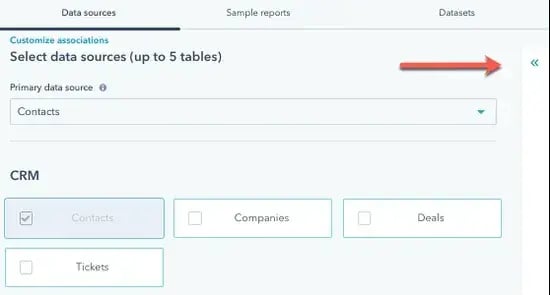
In HubSpot:
- Configure the objects you’ll report on (contacts, companies, deals, tickets, custom objects).
- Standardize lifecycle stages and deal stages.
- Create or update properties needed for segmentation or filters.
- Use validation rules and formatting controls to enforce clean inputs.
- Integrate your marketing, service, ad, and website tools.
A clean CRM equals clean automated reporting.
Step 4: Build custom reports using HubSpot’s custom report builder.
HubSpot’s Custom Report Builder is where automated reporting starts to take shape for teams.

How to build a custom report in HubSpot:
- Navigate to Reports > Reports.
- Click Create report.
- Choose Custom report builder.
- Select your data sources (contacts, deals, emails, website analytics, etc.).
- Add fields to your report using drag-and-drop.
- Apply filters (date ranges, lifecycle stages, pipelines, ticket types, etc.).
- Choose your visualization: bar, line, area, pie, pivot table, or combination.
- Save your report and choose a folder/location.
Every saved report can now update automatically based on the underlying data.
Step 5: Build dashboards to organize automated reports.
Dashboards turn individual reports into a complete, always-on picture of performance, giving stakeholders the data they need to make informed decisions.

To build a dashboard in HubSpot:
- Go to Reports > Dashboards.
- Click Create dashboard.
- Choose a dashboard template or start from scratch.
- Add your custom reports or use pre-built HubSpot reports.
- Arrange tiles using drag-and-drop.
- Resize modules for clarity.
- Set user permissions (team-specific or private dashboards).
Dashboards become a “home base” for automated insights across the organization.
Step 6: Automate report delivery to stakeholders.
Automated reporting works best when insights are proactively delivered so stakeholders don’t have to chase them down.
HubSpot’s automation options include:
- Scheduled recurring report emails.
- Scheduled dashboard emails (daily, weekly, or monthly).
- Slack notifications using workflows.
- Automated exports for specialized teams.
This ensures teams see fresh, accurate data without ever needing to log in or pull reports manually.
Step 7: Extend reporting with HubSpot for Google Sheets™.
For teams that need spreadsheet-based models or custom logic, HubSpot for Google Sheets™ adds another layer of automation.
Use HubSpot for Google Sheets™ to:
- Sync CRM data into Google Sheets automatically.
- Refresh spreadsheet-based reports without manual exports.
- Build custom calculations not reflected in the CRM.
- Prepare layered analysis or QA dashboards.
- Sync updates back into HubSpot.
It’s the best option for teams that rely on hybrid spreadsheet + CRM workflows.
Step 8: Iterate, optimize, and govern the reporting system.
Automated reporting isn’t a one-time project. Instead of checking the box as done, teams should view it as an evolving system that must be maintained to ensure it operates optimally.
Review your dashboards every 30–60 days:
- Remove unused reports.
- Add new KPIs as strategies evolve.
- Refine filters and standard definitions.
- Ensure new team members can read and interpret dashboards.
- Monitor data quality and adjust workflows.
Continuous improvement ensures reporting stays aligned with the business.
Types of Automated Reporting Tools
Automated reporting tools fall into three main categories: built-in CRM reporting platforms, business intelligence (BI) tools, and integration or automation tools that sync data across systems. Each serves a different purpose, from real-time operational dashboards to complex multi-source analytics. Understanding these categories helps teams choose the right mix of tools for their reporting needs.

Built-In CRM Reporting Tools
Built-in CRM reporting tools provide automated, native reporting directly in the CRM, enabling teams to build dashboards with real-time customer, marketing, sales, and service data.
What they’re best for:
- Funnel tracking.
- Lifecycle stage reporting.
- Sales activity and pipeline analytics.
- Marketing and campaign performance.
- Real-time operational dashboards.
- Reporting across the customer lifecycle.
Common examples:
- HubSpot Reporting & Dashboards
- Salesforce Reports
- Zoho Analytics (CRM-native reports)
Why teams choose this category of automated tools: CRM-based reporting tools are the most accessible and the fastest way to build automated dashboards without exports, spreadsheets, or complex modeling.
Business Intelligence (BI) Platforms
BI tools connect multiple data sources to generate automated reports, allowing deeper modeling, advanced visualizations, and more sophisticated performance analysis.
What they’re best for:
- Multi-source reporting.
- Data modeling and transformations.
- Complex calculations and hybrid metrics.
- Executive-level dashboards.
- Department-wide performance insights.
- Cross-channel attribution analysis.
Common examples:
- Power BI
- Looker Studio
- Tableau
- Databox
- Domo
Why teams choose BI tools: BI platforms help organizations go beyond CRM data alone — especially when reporting requires financial, product, usage, or external data sources.
Integration, Automation, and Data Sync Tools
Integration, automation, and data sync tools connect multiple systems, sync data automatically, and enable custom reporting workflows.
What they’re best for:
- Syncing CRM data into spreadsheets.
- Building custom models or forecasting sheets.
- Reducing manual exports.
- Connecting marketing, sales, service, and website tools.
- Triggering reporting-related workflows.
Common examples:
- HubSpot for Google Sheets™ (Google Extension)
- Zapier
- Make (formerly Integromat)
- Data Hub data sync tools
- Supermetrics
- APIs + custom connectors
Why teams choose these tools: They offer flexibility when organizations need hybrid spreadsheet + CRM workflows, data clean-up pipelines, or automated exports for ops-heavy teams.
Best Automated Reporting Tools
Automated reporting tools range from CRM-native dashboards to advanced BI platforms and lightweight data-sync connectors. The best choice depends on a company’s reporting needs, data sources, and team structure. Below are five leading report automation software options to consider, starting with HubSpot’s reporting ecosystem, which unifies marketing, sales, and service data into a single, easily automated reporting foundation.
1. HubSpot Reporting & Dashboards
Best for: End-to-end automated reporting across the customer lifecycle.
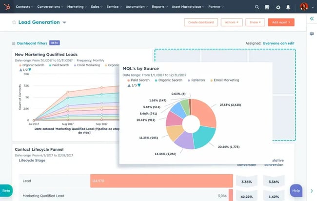
HubSpot Reporting consolidates marketing, sales, service, and website analytics into one unified reporting environment. The platform includes customizable dashboards, hundreds of prebuilt templates, and a custom report builder that combines CRM, website, ad, and campaign performance data. Reports refresh automatically and can be delivered through scheduled emails, Slack notifications, or dashboard sharing.
Key Features:
- Custom report builder for multi-object reporting across contacts, companies, deals, tickets, campaigns, and website analytics.
- Prebuilt dashboards for marketing performance, pipeline health, forecasting, service reporting, and attribution.
- Real-time refresh for all dashboards and report components.
- Automated delivery through scheduled emails or internal share links.
- Role-based dashboard permissions for teams and business units.
- Cross-lifecycle reporting, from acquisition to retention.
- Attribution reporting for paid, organic, and multi-channel campaigns.
Pricing: HubSpot offers free reporting for basic dashboards, with advanced reporting features included in Marketing Hub, Sales Hub, Service Hub, and Data Hub subscriptions. Paid plans start at $9 per user/month, billed annually.
2. HubSpot Data Quality Tools
Best for: Clean, accurate data powering automated reports.
Automated reporting is only as strong as the data behind it. HubSpot’s Data Quality tools enforce clean inputs, prevent duplicate creation, standardize formatting, and maintain data health at scale. These features ensure dashboards refresh accurately and consistently without manual cleanup.

Key Features:
- Duplicate management with automated merge suggestions.
- Property validation rules (dropdown enforcement, required fields, formatting rules).
- Data cleanup suggestions for inconsistent or incomplete fields.
- Workflow-based data formatting (capitalization, date normalization, lifecycle updates).
- Data Hub data sync for unified, two-way data between tools.
- Automated enrichment where available.
Pricing: Many data quality features are available in Data Hub (Starter, Professional, and Enterprise), with advanced property validation in higher tiers. Paid plans start at $9 per user/month, billed annually.
3. HubSpot for Google Sheets™ (Google Extension)
Best for: Lightweight automation for spreadsheet-based teams.
HubSpot for Google Sheets™ automatically syncs CRM data into Google Sheets and refreshes it without manual exporting. It’s ideal for teams that still rely on spreadsheet forecasts, custom calculations, or hybrid analysis workflows.

Key Features:
- Automatic syncs from HubSpot to Google Sheets.
- Pull any CRM object: contacts, companies, deals, line items, tickets.
- Custom query builder for filtered syncs.
- Live CRM sidebar inside Google Sheets.
- Great for forecasting, QA checks, and spreadsheet-based dashboards.
- Supports syncing cleaned data back into HubSpot.
Pricing: Free on the Google Workspace Marketplace.
4. Databox
Best for: Standalone dashboarding tool with HubSpot integration.
Databox connects to HubSpot and dozens of other sources to create visually rich automated dashboards. It’s a strong option for teams wanting pre-built KPI templates across marketing and sales performance.

Key Features:
- 200+ prebuilt dashboards.
- Easy HubSpot integration.
- Daily, weekly, or monthly automated report delivery.
- Mobile dashboards for on-the-go KPI tracking.
- Goal setting + performance alerts.
Pricing: Free tier available; paid plans start at $159/month for unlimited users, metrics, and dashboards.
5. Microsoft Power BI
Best for: Advanced multi-source analytics and modeling.
Power BI is a full-featured business intelligence platform capable of handling complex analysis across large datasets. It’s ideal when reporting spans CRM, finance, product usage data, and operational systems.

Key Features:
- Connects to hundreds of data sources.
- Powerful data modeling with DAX.
- Automated refresh when connected to cloud datasets.
- Rich visualizations and drill-down capabilities.
- Paginated reporting for finance and operations teams.
Pricing: Free desktop version; Pro and Premium tiers for sharing, automation, and enterprise-scale modeling.
Frequently Asked Questions About Automated Reporting
Teams ask lots of questions about automated reporting based on specific situations. Below are four of the most frequent.
What is automated reporting, and how does it work?
Automated reporting uses software to collect, analyze, and distribute business data without manual input. It works by connecting your CRM and other data sources, applying predefined filters and KPIs, updating dashboards in real time, and delivering scheduled reports automatically. This eliminates manual data collection, reduces errors, and ensures every stakeholder sees the same current information.
Why should I automate my reporting process?
You should automate your reporting process to save time, reduce human error, and access real-time performance insights. Automated reporting typically saves teams 10–20 hours per week, improves data accuracy, and ensures consistent KPI definitions across marketing, sales, and service. Automation also scales reporting across stakeholders and removes bottlenecks caused by manual spreadsheet work.
Which tools are best for automating reports?
The best tools for automating reports include CRM-native platforms like HubSpot Reporting & Dashboards, data quality tools that ensure clean inputs, extensions like HubSpot for Google Sheets™ to automate spreadsheet workflows, and BI tools such as Databox or Power BI for advanced, multi-source analysis. The right choice depends on data complexity and reporting needs.
How do I implement automated reporting in my organization?
Implement automated reporting by defining your KPIs, centralizing your data into a single source of truth, and building standardized dashboards that update automatically. In HubSpot, use the custom report builder to create multi-object reports, organize them into dashboards, set automated email delivery, and extend capabilities with tools like HubSpot for Google Sheets™. Support ongoing success with training, governance, and regular dashboard optimization.
Build automated reporting that scales with your business.
Automated reporting eliminates manual data collection, reduces errors, and provides real-time insights that help teams operate with clarity. When data is centralized, KPIs are standardized, and dashboards are built around clear decision paths, reporting becomes faster, more accurate, and easier to maintain. The tools an organization selects — CRM-native dashboards, BI platforms, or integration connectors — should support a single reporting foundation that refreshes automatically across marketing, sales, service, and operations.
High-impact reporting automation begins with identifying which dashboards matter most to leadership, marketing managers, sales directors, and service teams, then establishing consistent definitions and automation rules. From there, scheduled delivery and regular dashboard reviews help keep insights aligned with evolving business priorities.
My experience: Automation only works when everyone buys in and maintains the system.
In practice, like so many things, automated reporting isn’t just a technical upgrade. It’s an organizational shift in terms of mindset and process. I’ve seen automation deliver huge results, but only when every stakeholder agrees on the data structure, the metrics that matter, and the reporting workflows that support the entire buyer and customer journey.
Without alignment, dashboards fall out of sync, data quality erodes, and teams stop trusting the reports. With alignment, automated reporting becomes one of the most valuable, scalable systems in your business.
So what’s the point? Automated reporting offers a clear, reliable, and always-on view of performance, so teams can make better decisions, faster.
HubSpot offers automated reporting tools for marketing, sales, and service, and its platform integrates reporting automation across the entire customer lifecycle — from first touch to renewal. Give them a try now.

Free Sales Software
Built for productivity, powered by relevance.
- Sales Automation
- Call Tracking
- Lead Prospecting
- And More!
Marketing Automation

