I want you to read them, too, and pick up brilliant writing ideas to buff up your copy.
Brew a cup of tea and prepare for the roundup with 27 solid picks, from websites and ads to product pages and social posts.
Some are loud, some are subtle, but they all do one thing right: they work.
Table of Contents
- Marketing Copy
- Sales Web Copywriting
- Sales Product Copywriting
- Sales Brand Copywriting
- Sales Social Media Copywriting
- Sales Ad Copywriting
- Sales Page Copywriting
Examples of Marketing Copy
- Mejuri
- Cards Against Humanity
- Who Gives a Crap
- Primary
1. Mejuri
Why I like it: Mejuri’s copy makes everyday jewelry feel like an act of self-expression, not a luxury splurge. Lines like “Everyone wants these, so make them yours” create urgency without pressure.
And then there’s “Get lost and feel found” from the Found Objects collection, which turns accessories into tiny stories. It’s poetic, but still shoppable.
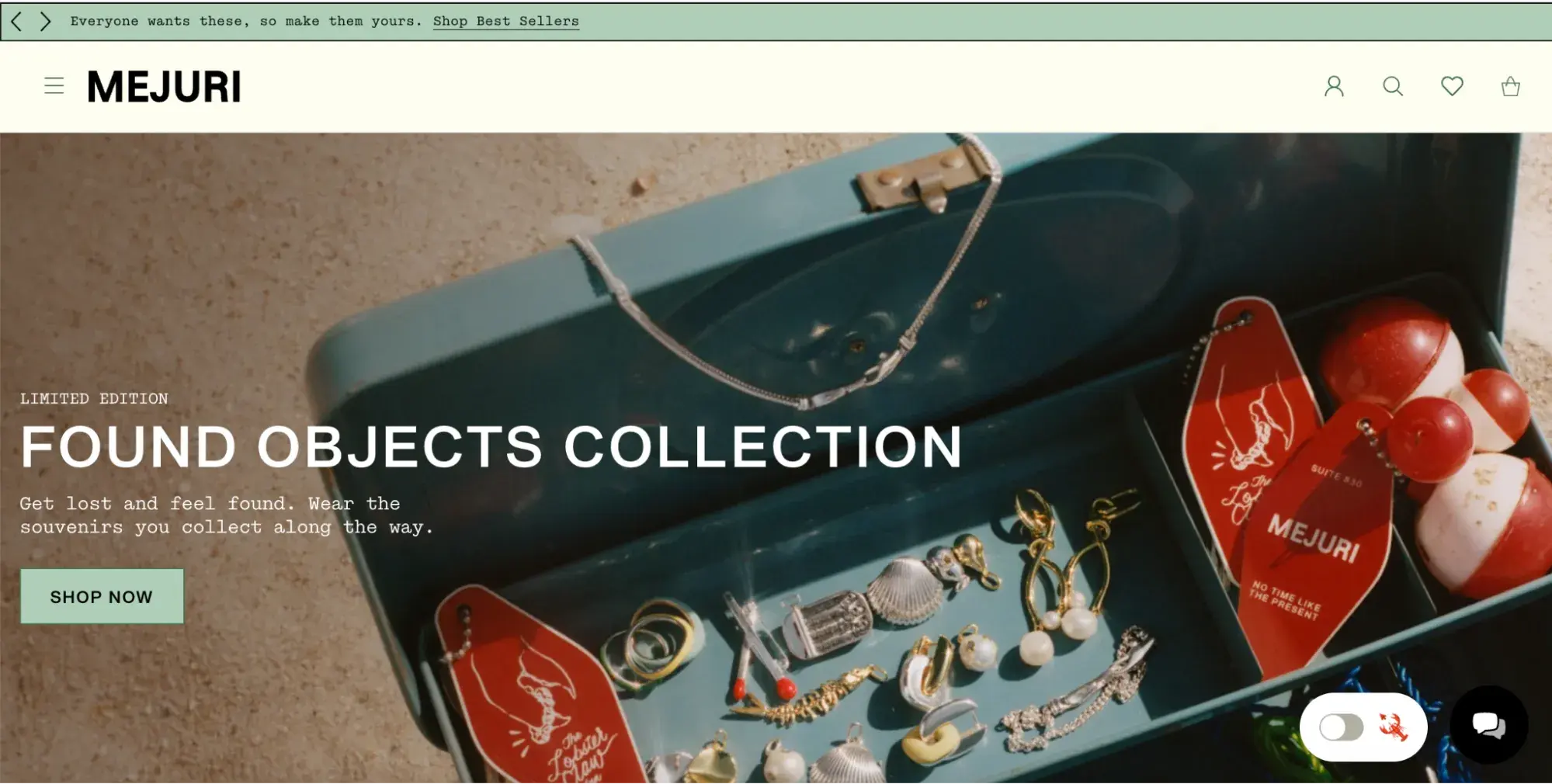
What I like most is their tone of voice: calm, confident, and reserved, always speaking to women as decision-makers, not as recipients of gifts. Phrases like “transform fine jewelry into everyday moments” show how the brand positions its pieces as tools for self-worth, not just style.

The copy doesn’t just describe jewelry, it frames it as a ritual. The lifestyle.
2. Cards Against Humanity
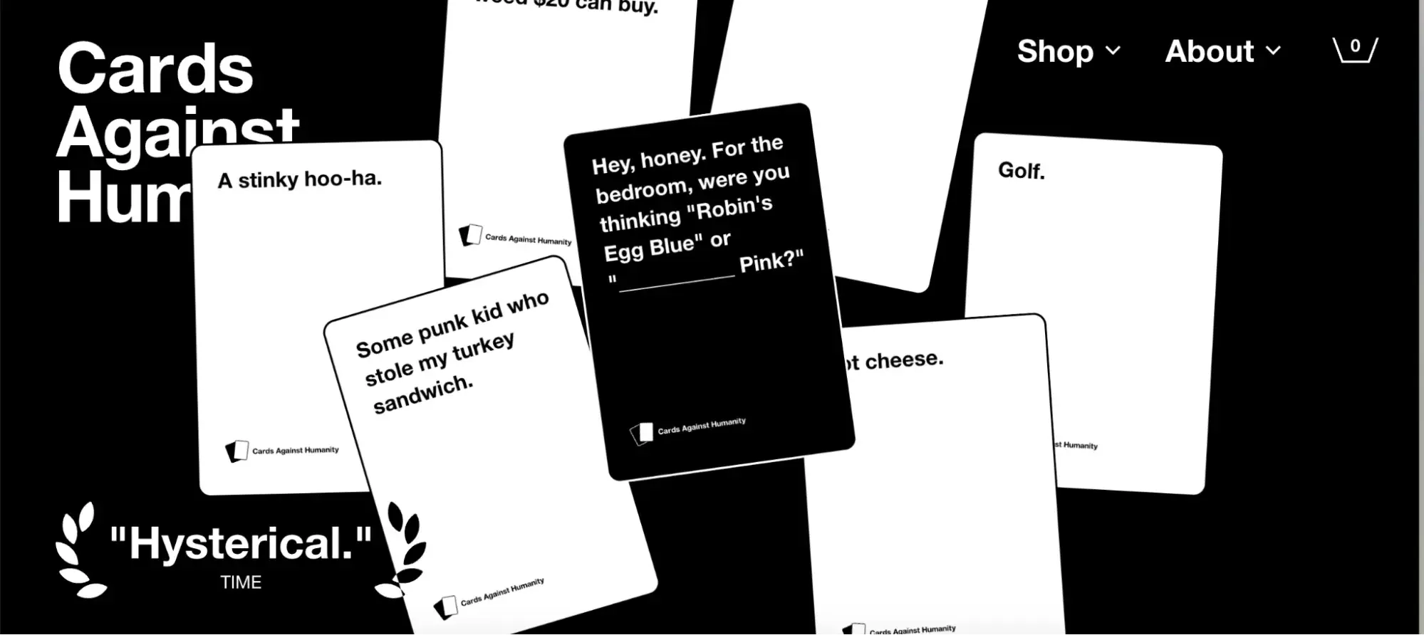
Why I like it: Cards Against Humanity calls itself “the party game for horrible people,” and the writing on the cards is hilariously inappropriate. Their copy is abrasive and a little offensive — exactly what fits their brand and audience.
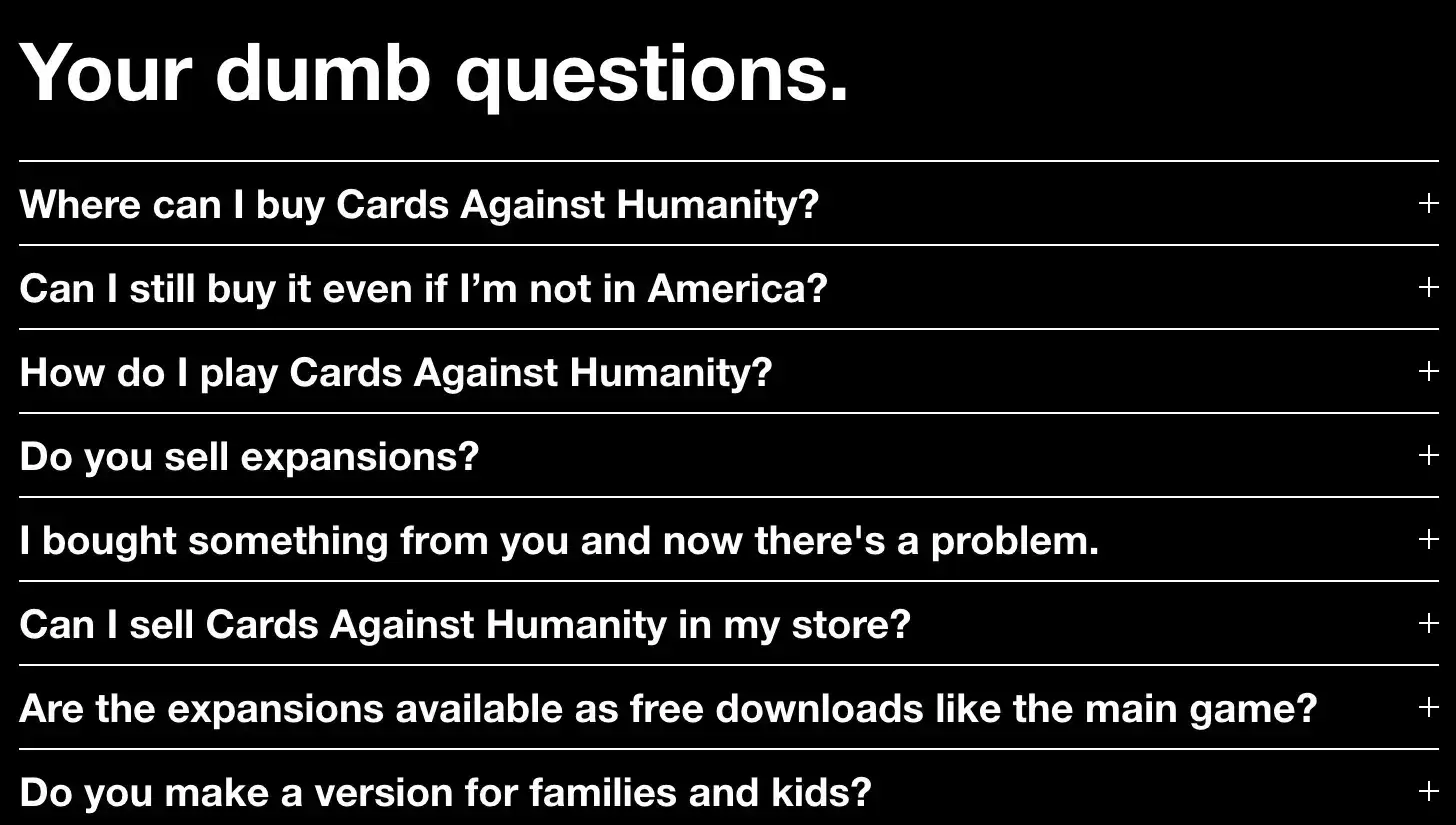
The brand voice is bold and unapologetic, and that’s the point: They’re not trying to please everyone, just the right people. One glance at their FAQ and you’ll get my point:
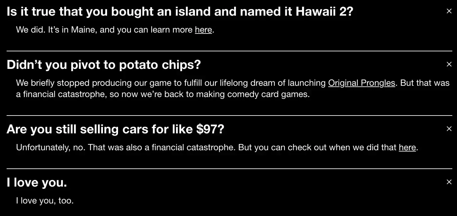
Here‘s a sneak peek at some answers to these questions. You’ll see they make fun of both themselves and the reader, which is exactly what the card game is about.
3. Who Gives A Crap
Why I like it: Who Gives A Crap turns something as boring as toilet paper into a fun, mission-driven story. The brand leans hard into toilet humor but never loses sight of its purpose — donating 50% of profits to build toilets around the world. Their copy is cheeky, clever, and full of heart.
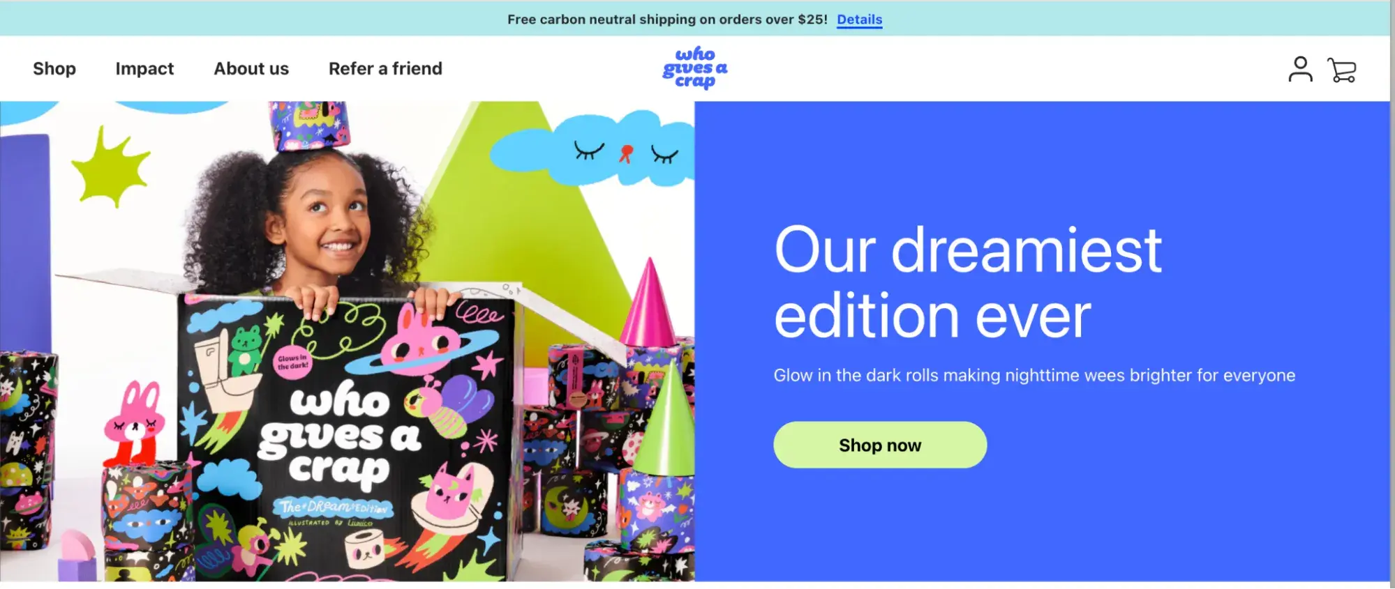
I especially admire their commitment to saving trees as “doing good without compromises” and going for eco-friendly, recycled materials.
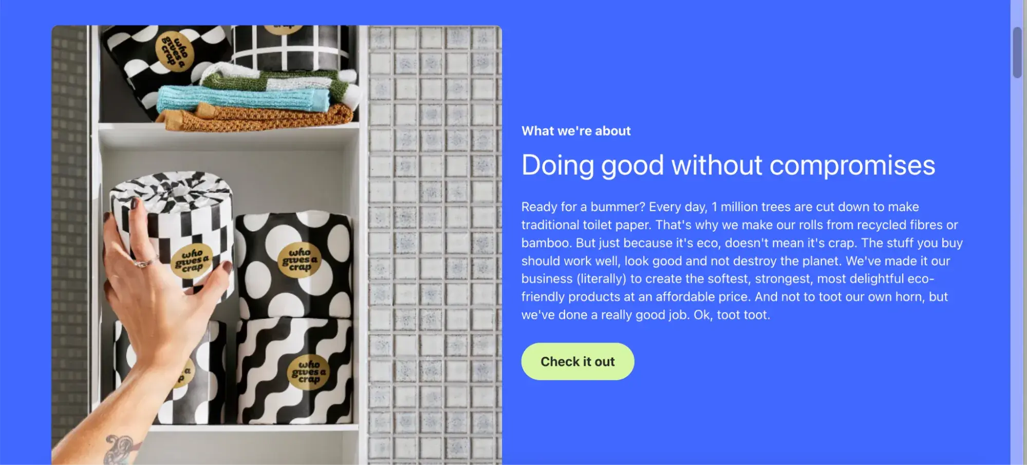
Then they explain complex global sanitation issues using simple, funny lines like: “Just because it’s eco, doesn’t mean it’s crap.”
I’m in love with product descriptions like:
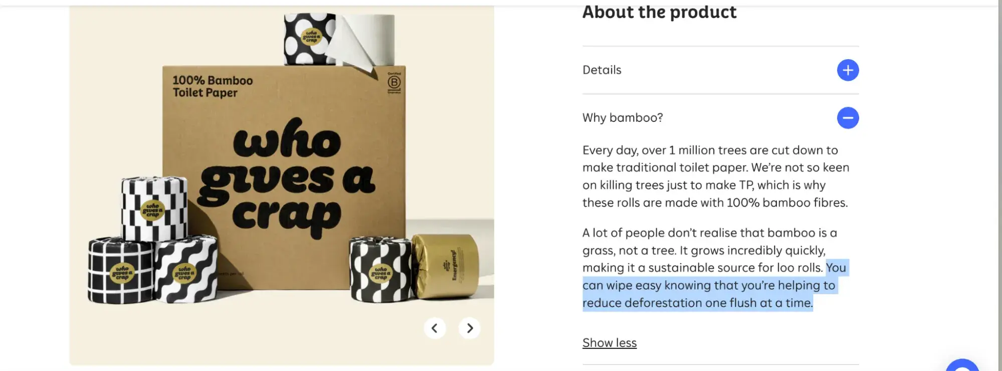
This copy is memorable and actually makes you feel good about buying (and using) toilet paper — and even showing off on Instagram, X, or TikTok.
I also can’t get enough of the insanely cool design they use to back up all these bold statements. It’s a little silly, but absolutely genius.
4. Primary
Why I like it: Primary’s copy is clear, empowering, and incredibly warm — like getting a pep talk from a fellow parent who gets it.
Instead of loud slogans or gimmicks, their words reflect their actual product: simple, inclusive, and made for every kid. The tone is honest, kind, and mission-driven without sounding corporate or preachy.
For instance:

It’s short, but powerful. This one line communicates their values of inclusivity, simplicity, and gender-neutral design. It doesn’t try too hard, it just feels right.

In one breath, they explain what they sell (basics) and what they stand for (freedom of expression, no stereotypes).
“Quality promise” statement highlights real, parent-relevant benefits. It focuses on durability, comfort, and ease.
“Inclusivity” statement does a lot with a little. It signals modern values without over-explaining, and backs up their visual merch — you won’t find gendered sections on the site, just clothes for kids.
Examples of Sales Web Copywriting
- Basecamp
- Honey Copy
- Death to Stock
5. Basecamp
Why I like it: 43% of readers skim the content — that’s why bold headers and bite-sized lines matter. Basecamp gets it.
Honestly, their landing page takes some pretty bold swings. They literally cross out all the popular project management tools — Asana, Slack, Notion — and surround them with people panicking and asking all kinds of stressed-out questions.
I’m just that blonde girl screaming at Notion, “I don’t know where to put that!”
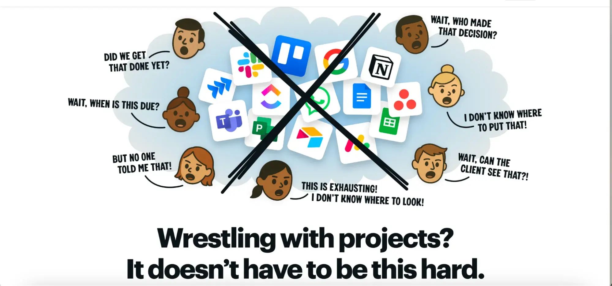
And this line: “Wrestling with projects? It doesn’t have to be this hard.” It just strikes a chord.
“Famously no-nonsense” isn’t there just to sound cool, either. It’s a promise.
Another huge bonus is the FAQ that actually sells. It comes with 25+ buyer objections answered with mini-mic drops. You see those same bold moves in how they handle their FAQs:
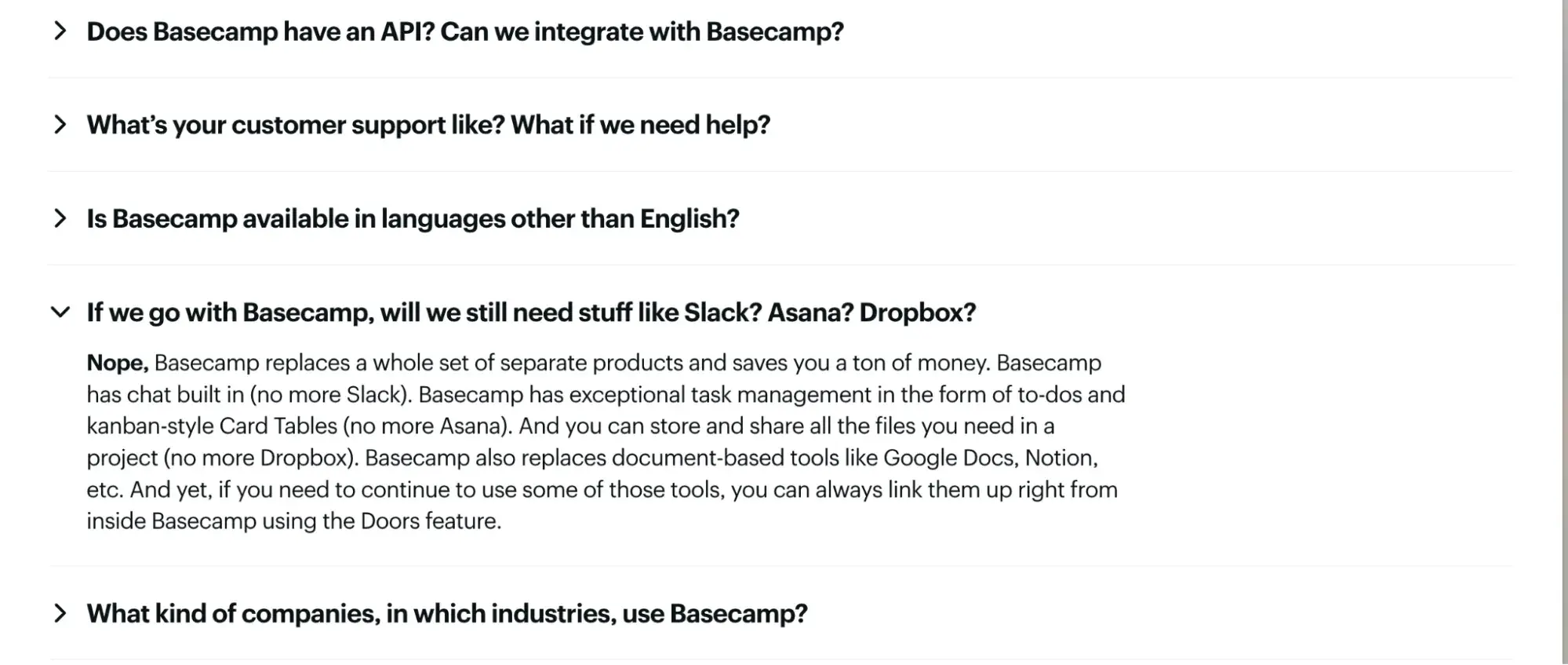
I enjoy how their copywriters tied back every line of copy to the core idea: less chaos, more control. From client management to real-time messaging, everything is wrapped in one message — Basecamp brings calm to the storm.
6. Honey Copy (by Cole Schafer)
Why I like it: Honey Copy doesn’t just write copy, they romance it. Short, emotional lines. Lots of mood. You scroll, and suddenly you’re sold on copywriting without realizing it.
Give it a go. Read. You feeling that, too? Like I’m about to hit the Contact button.
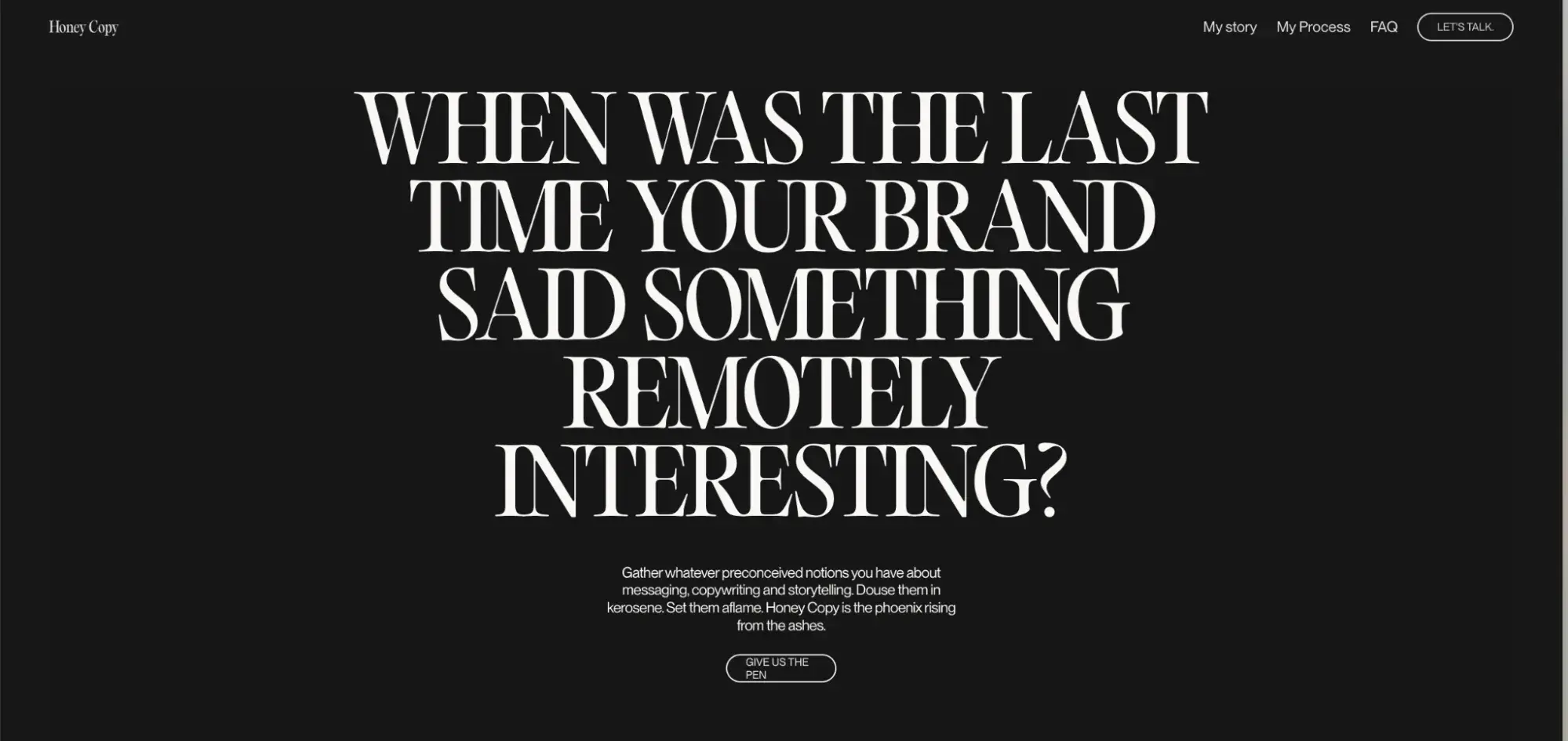
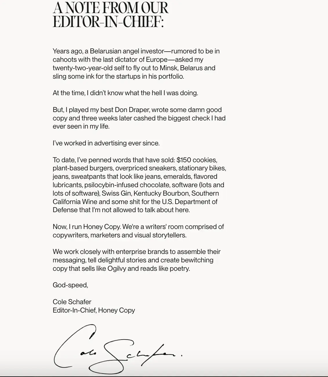
I am particularly intrigued by the backstory and the About page. It begins with Cole Schafer being flown to Belarus by a shady angel investor and concludes with him selling everything from $150 cookies to psilocybin chocolate and government contracts he “can’t talk about” through powerful copy.
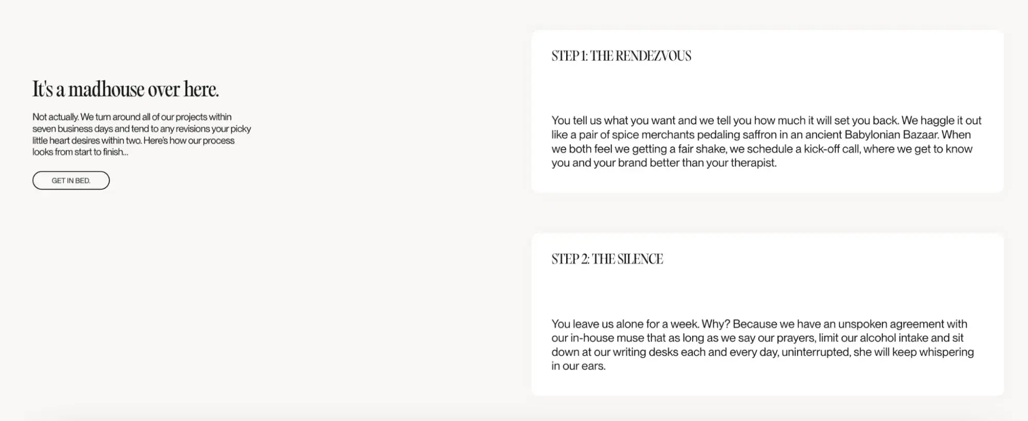
Even the process page, which usually bores people to tears, reads like a sexy novella. The kickoff call? That’s “The Rendezvous.”
The writing period? That’s “The Silence,” where the muse whispers only to the disciplined.
Revisions? They’ll turn them around in 48 hours unless they’re “hit with hangovers, holidays, or seasonal depression.” I don’t like this conclusion, by the way, but it has to do the work.
7. Death to Stock
Why I like it: Death to Stock’s copy punches hard and smooth. You’re not “browsing assets,” you’re entering a visual universe. It’s stock for people who hate stock. If you know, you know — and if you don’t, you’re not their customer.
What makes it irresistible, in my opinion? They sell with swagger: “All visuals and creators are exclusive to our platform.” You want in? Claim your membership.

See how grotesque they go about the package options when you find the perfect visual.
“No commitment issues; let’s get married.”
That line alone sells better than most full-page product descriptions.
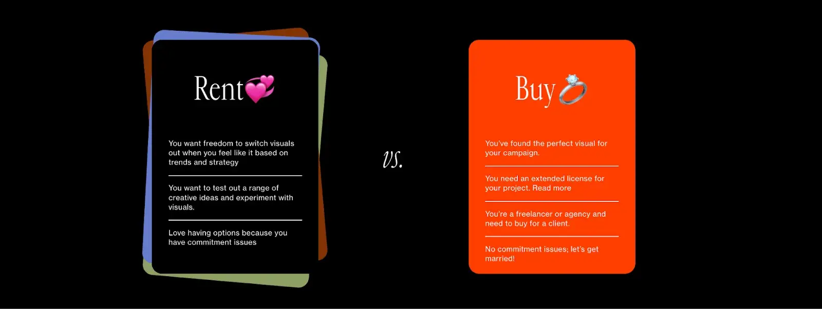
Every scroll feels intentional, every line has teeth. And when they say, “Trends aren’t patterns, they’re leverage,” you believe it. DTS doesn’t try to convince you. They just hand you the keys and dare you to catch up.
Examples of Sales Product Copywriting
- Going.com
- BeeLove
- Blume
- Otherland
- Magic Spoon
- Databox
- Wynter
8. Going.com
The team at Going positions itself as travel industry insiders, offering handy pro tips and down-to-earth lingo.
Why I like it: Their product copy is particularly strong because it delivers the value right away — cheap flights, no searching. The promise is clear, emotional, and backed by real numbers like saving $550, which makes it instantly compelling.
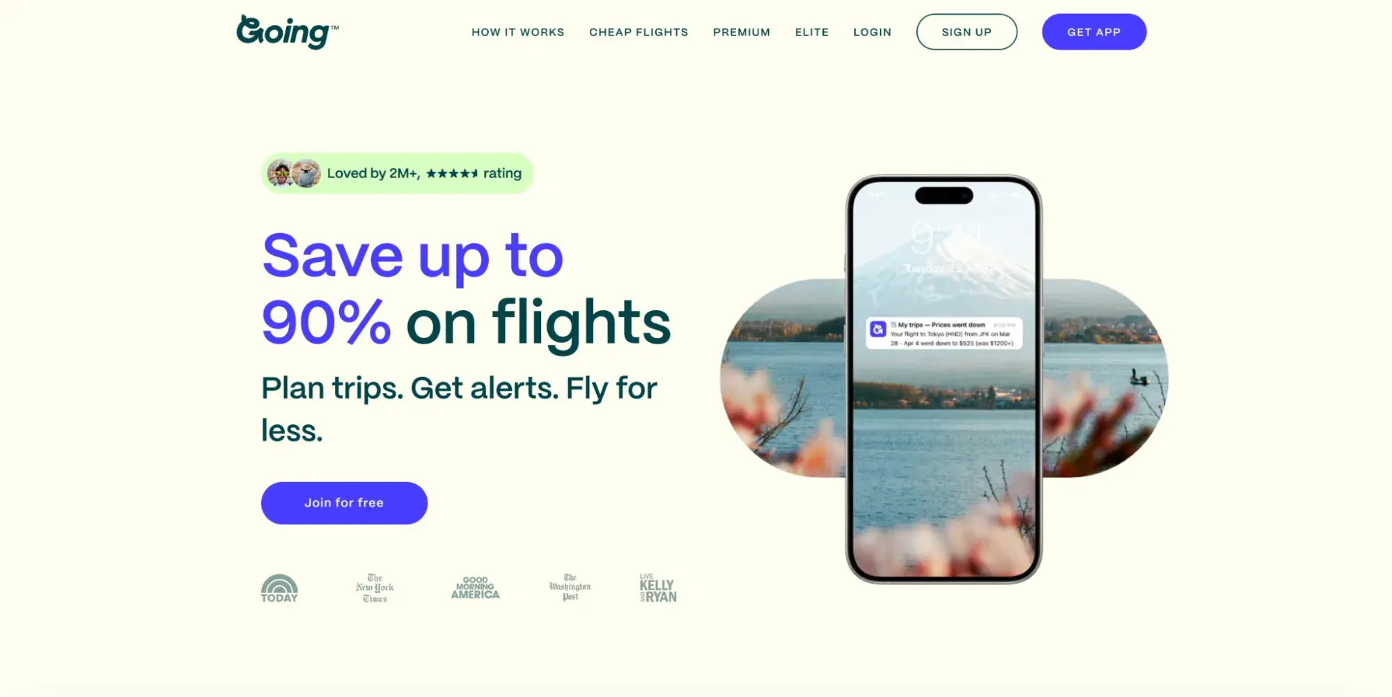
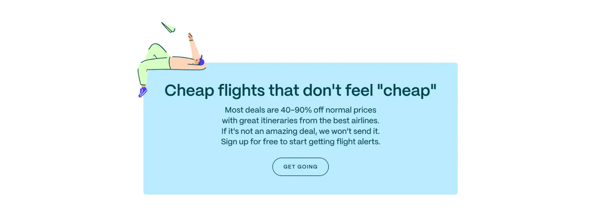
It also builds trust with casual, confident language like “flights that don’t feel ‘cheap’” and “we won’t send it if it’s not amazing.”
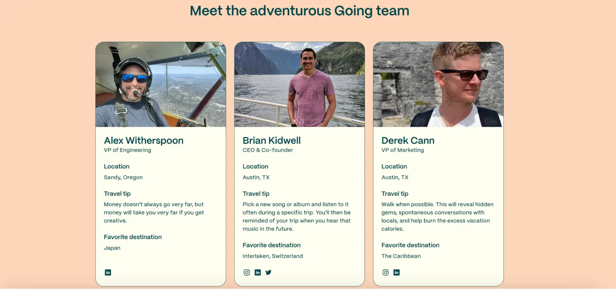
Also, thanks to their “Meet us” section, members feel like they’re getting information from seasoned experts. I like this small but useful addition that builds a connection with site visitors and improves the company’s credibility.
9. BeeLove
Why I like it: Not all copywriting has to be catchy or tongue-in-cheek to be memorable or good. But BeeLove does both with succinct, powerful words that seek to inspire.
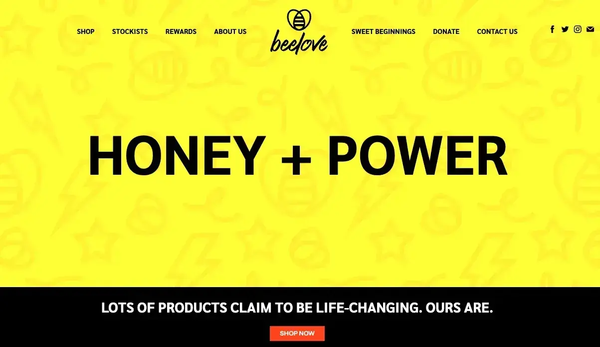
The product descriptions feel warm, intentional, and customer-centered. For instance, check this one:
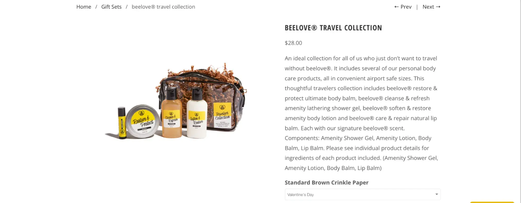
It’s not about selling soap, it’s about maintaining comfort, routine, and a bit of self-care even when you’re not home.
The product details are crystal clear without sounding clinical. Instead of dumping a bullet list, the copy gently flows through what’s included, all while using verbs like “restore,” “refresh,” “soften,” and “repair” — each tied to a real, tangible benefit.
10. Blume
Why I like it: Blume’s homepage copies are clean, confident, and straight to the point. “We make going all natural second nature” is a memorable and promising slogan.
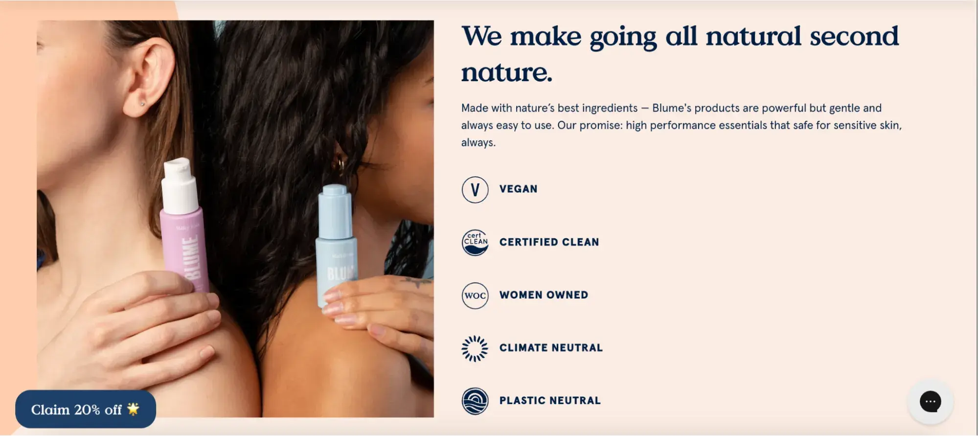
What I also love is how they back it all up. The site shows badges for vegan, climate neutral, women-owned, and plastic neutral — it’s all laid out.
Plus, there’s a quote from a dermatologist explaining why the products work. It’s not overdone, it just feels like: here’s what we stand for, take it or leave it. That kind of “quiet confidence” is what makes me pay attention.

The product pages also have catchy copy. For instance:
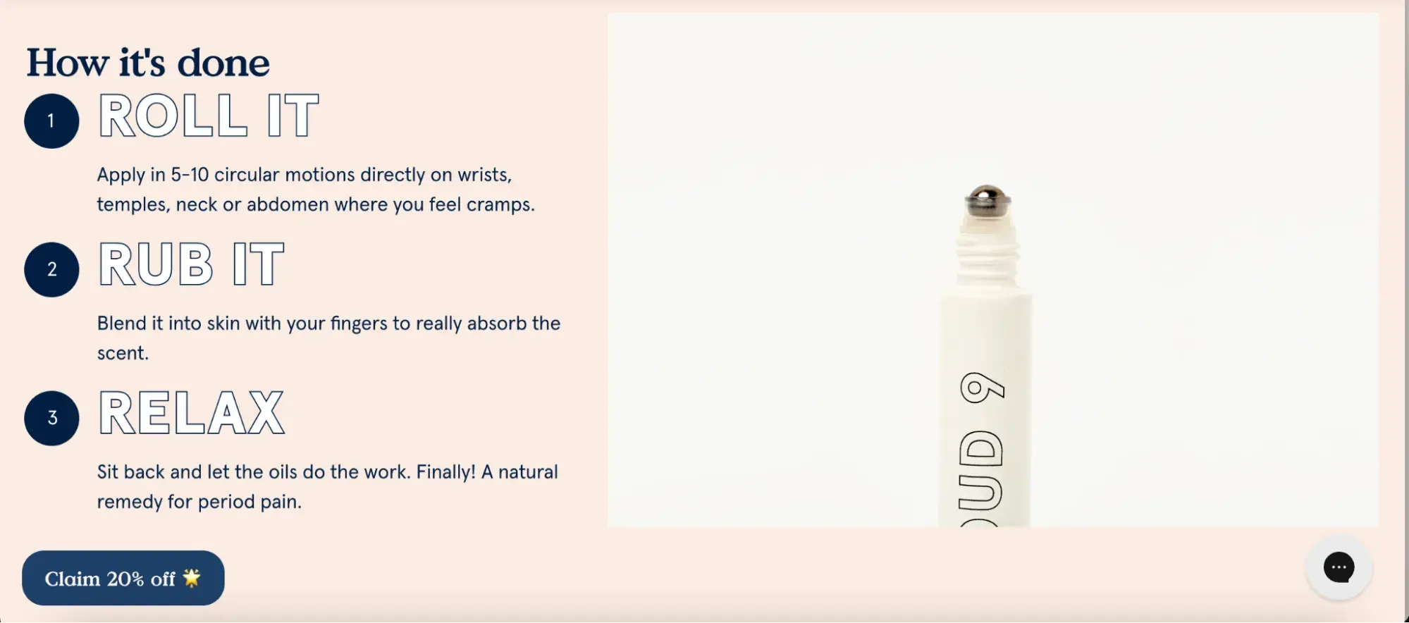
“This soothing blend of essential oils is a natural remedy for cramps, mood swings, cravings, and bloating.”
I also like how the step-by-step process is described in a short, punchy way. It makes it feel super easy to apply — quick, not time-consuming at all, meaning I’m sold.
11. Otherland
Why I like it: Otherland’s copy instantly sets a mood. Right from the “beachside getaway, without the airfare” line, I’m pulled into this vibe that feels way more like a lifestyle than just a candle brand.
The scents are described like memories — Cape Cod chips, briny hats, summer dew. It transports you somewhere, and the copy does that without needing big, flowery paragraphs.
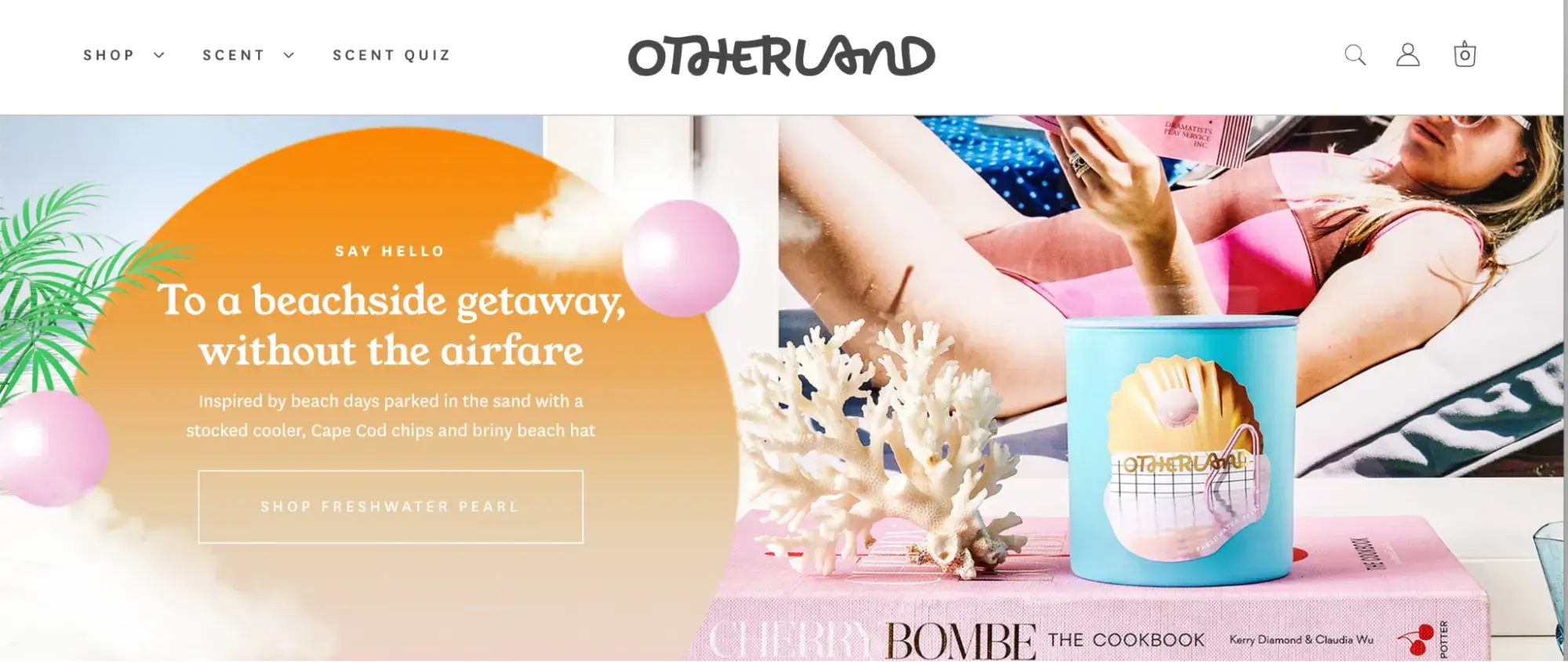
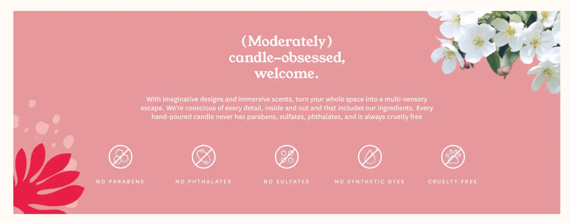
The tone feels cool, confident, and just self-aware enough — like the line “(Moderately) candle-obsessed, welcome.” It made me smile because it sounds like how I talk to my friends.
Even the scent descriptions are tight and visual — “Champagne. Saffron. Leather.”
And they back all that up with clear values. The copy casually drops in that the candles are clean, cruelty-free, and free of parabens, sulfates, and dyes.
Besides cool product descriptions, the CTA for the About Us page is also pretty catchy.
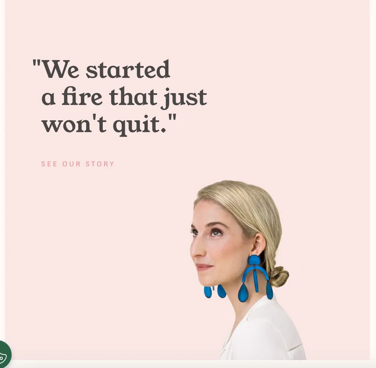
It shows passion and momentum. It ties back to candles while making the brand feel alive and unstoppable.
12. Magic Spoon
Why I like it: It nails the emotional hook and the value prop in one line: “Childhood classics. Grown-up ingredients.”
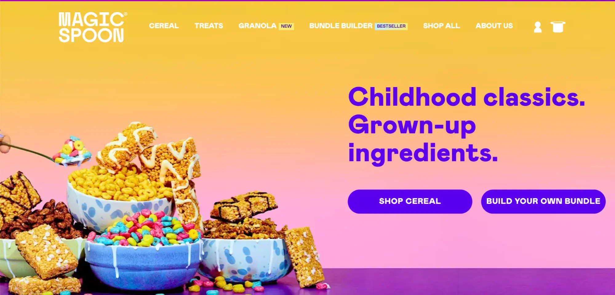
It’s nostalgic without being cheesy, instantly making you crave cereal, but feel good about it. The layout flows like a shopping assistant: pick your flavors, build your bundle, save money, get perks.
It also builds trust without trying too hard. You get short, punchy health claims (“12g protein,” “0-2g sugar”) right next to playful copy, “Crispy. Puffy. Crunchy.”
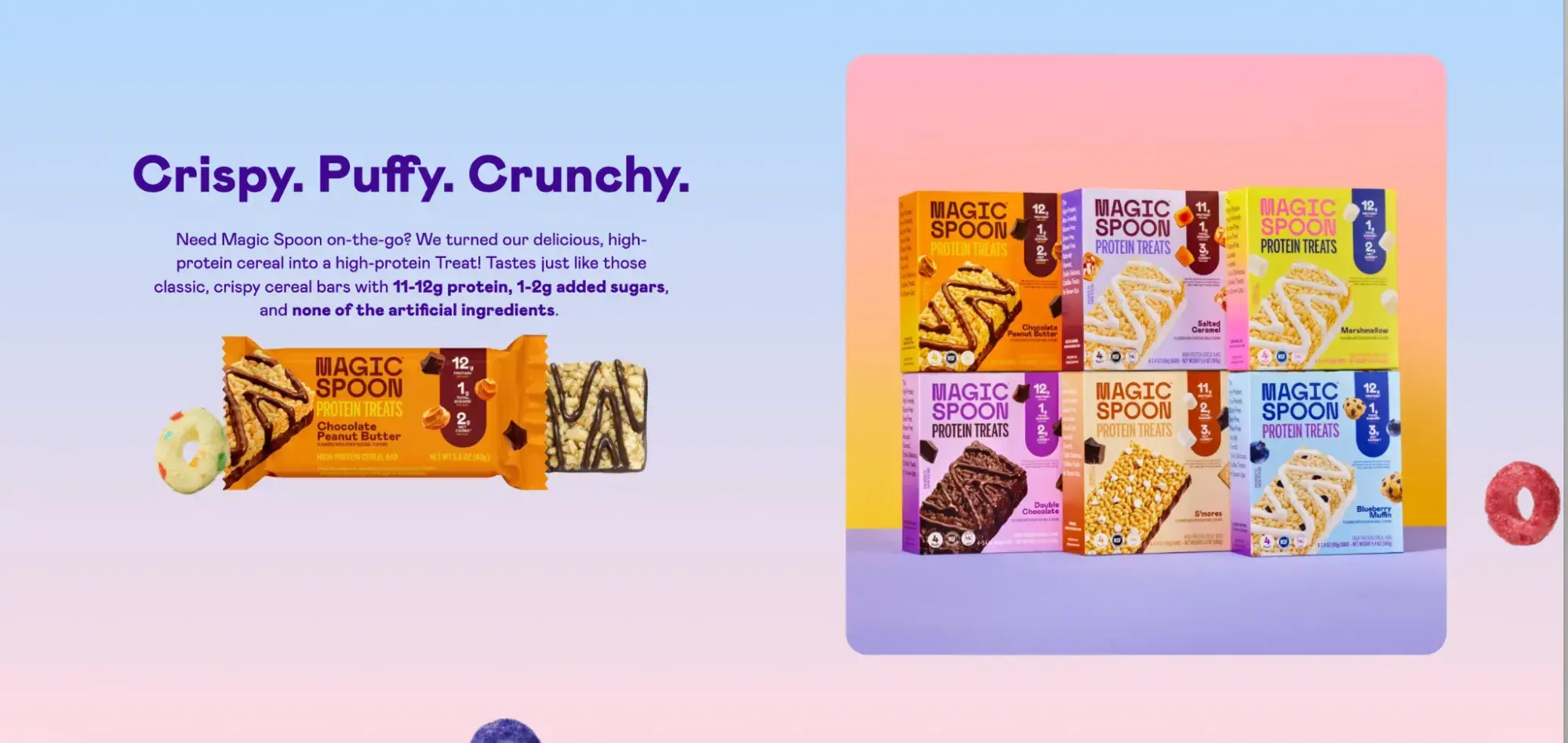
The cherry on top for me is real reviews and expert shoutouts from Forbes and nutritionists.
13. Databox
Why I like it: The headline says exactly what I need to hear: “An easy-to-use analytics platform for growing businesses.” No jargon, just a promise that feels doable.
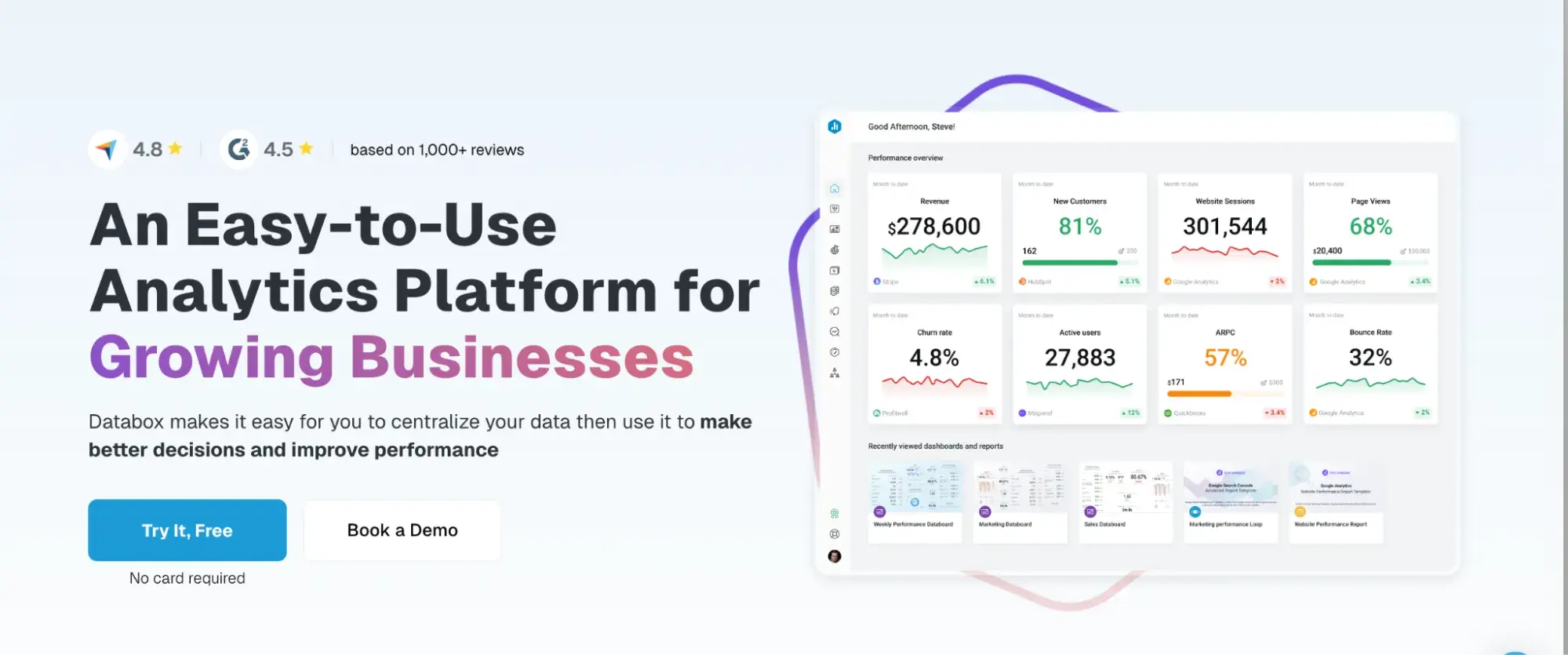
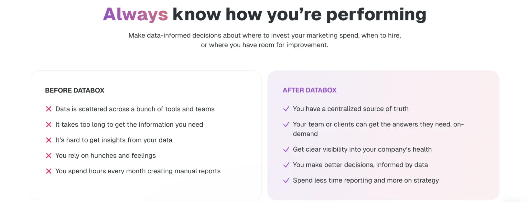
The “Before vs. After” section is probably the best part of it.
Before Databox? Scattered data, gut decisions, manual chaos. After Databox? Clarity, confidence, speed.
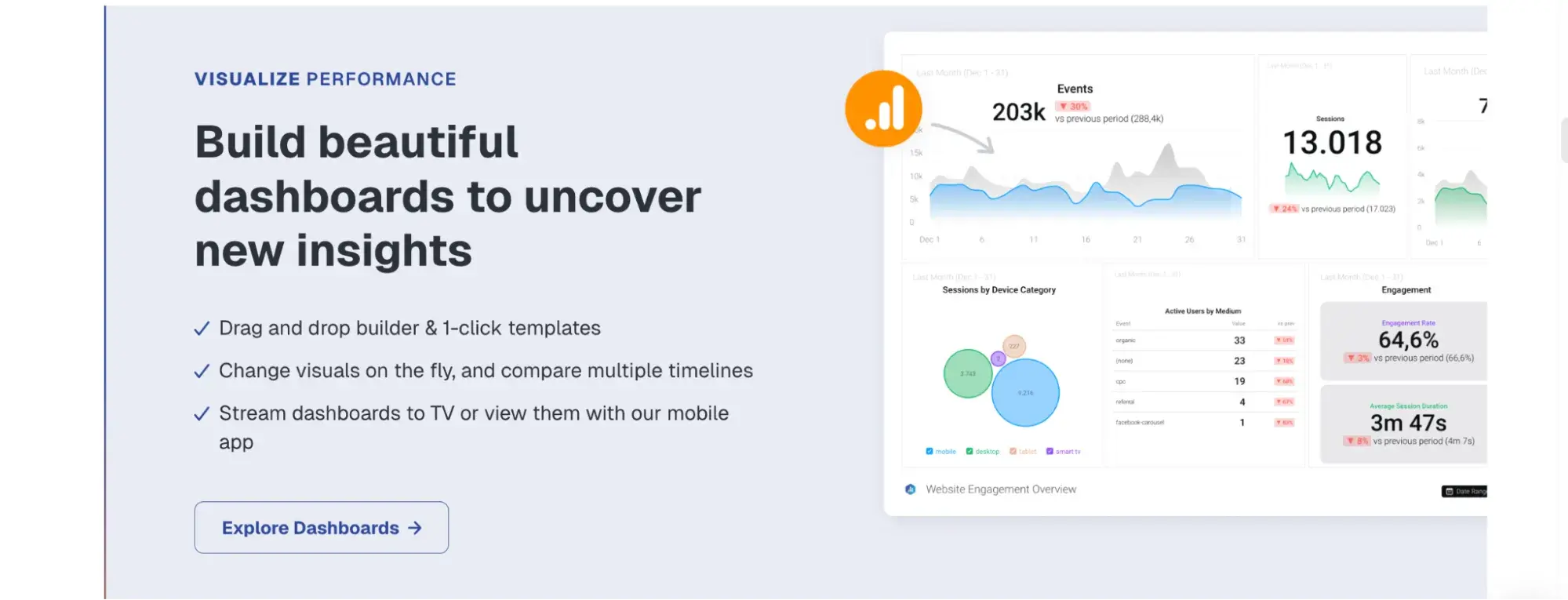
Every section flows like a story — here’s the problem, here’s the solution, and here’s what you’ll gain. Plus, the examples aren’t abstract. They show exactly how metrics become goals, how dashboards connect to reports, and how benchmarks drive decisions.
Even the trust signals are handled smartly. They don’t scream “BUY NOW,” they quietly drop in names like eBay and PwC, and G2 badges that back up the quality. It gives me the feeling that I can trust that vendor.
14. Wynter
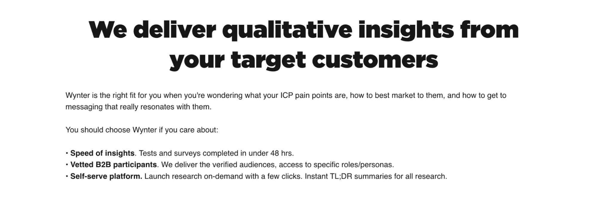
Why I like it: How focused it is. “Responses from your exact ICP in under 48 hours” is all I needed to hear.
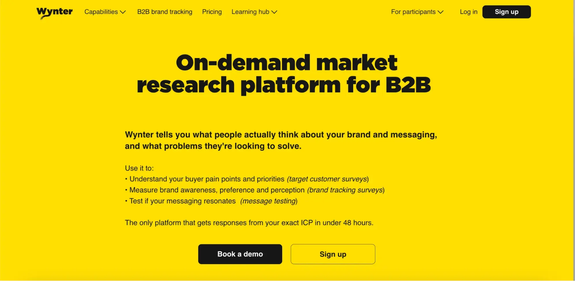
The fluff-free copy tells me what I can do: test messaging, run brand tracking, figure out what my market actually wants. Then, it’s strengthened by their customer results, like Appcues got a 73% boost in signups, Cognism improved demo conversions by 40%.
I’m not reading vague promises — I’m seeing proof.
Examples of Sales Brand Copywriting
- Trello
- Slack
- Zoom
- Canva
- Patagonia
- Gong
- Reformation
15. Trello
Why I like it: How fast it gets to the point. “Escape the clutter and chaos — unleash your productivity” hits a real pain. The copy keeps everything easy to scan and act on. It reads like a tool made for people who don’t have time to think twice. That’s why it works.
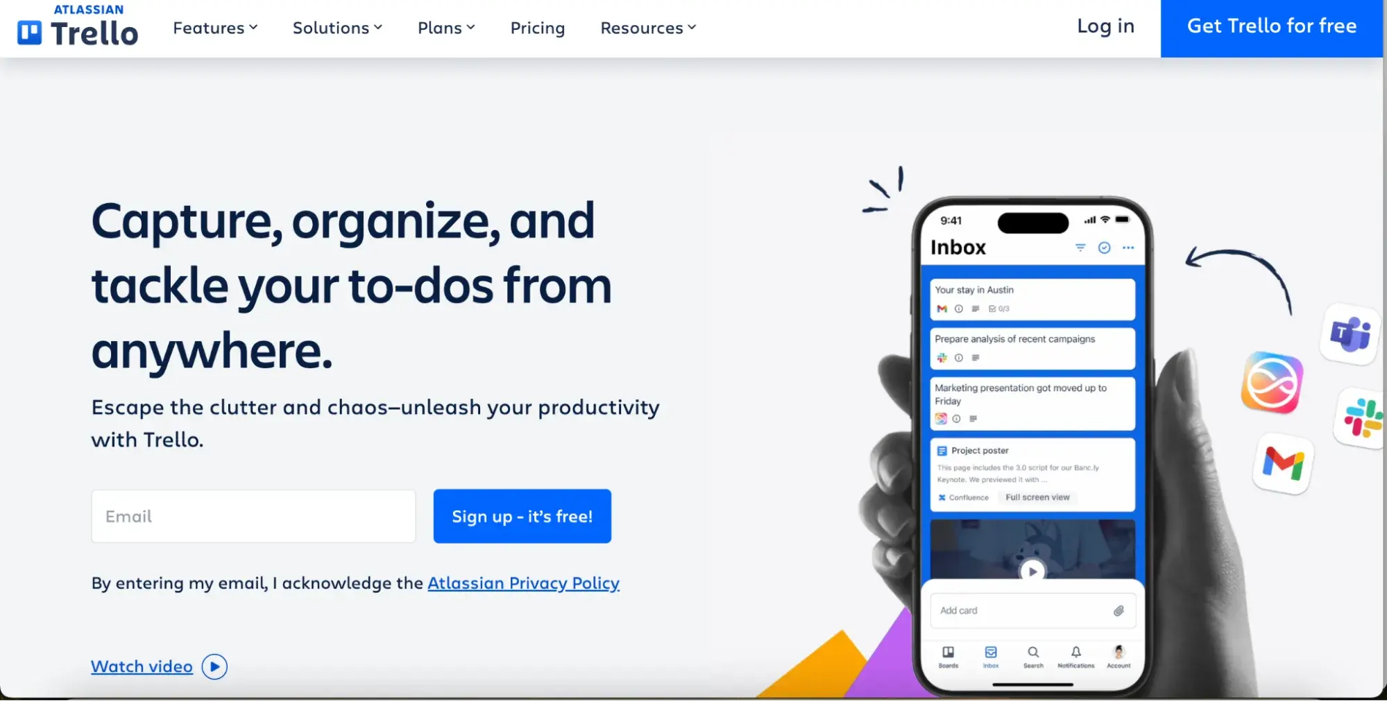
Then it immediately shows how: Inbox, Boards, Planner. Each section has a short, clear explanation — what it does and why it matters.
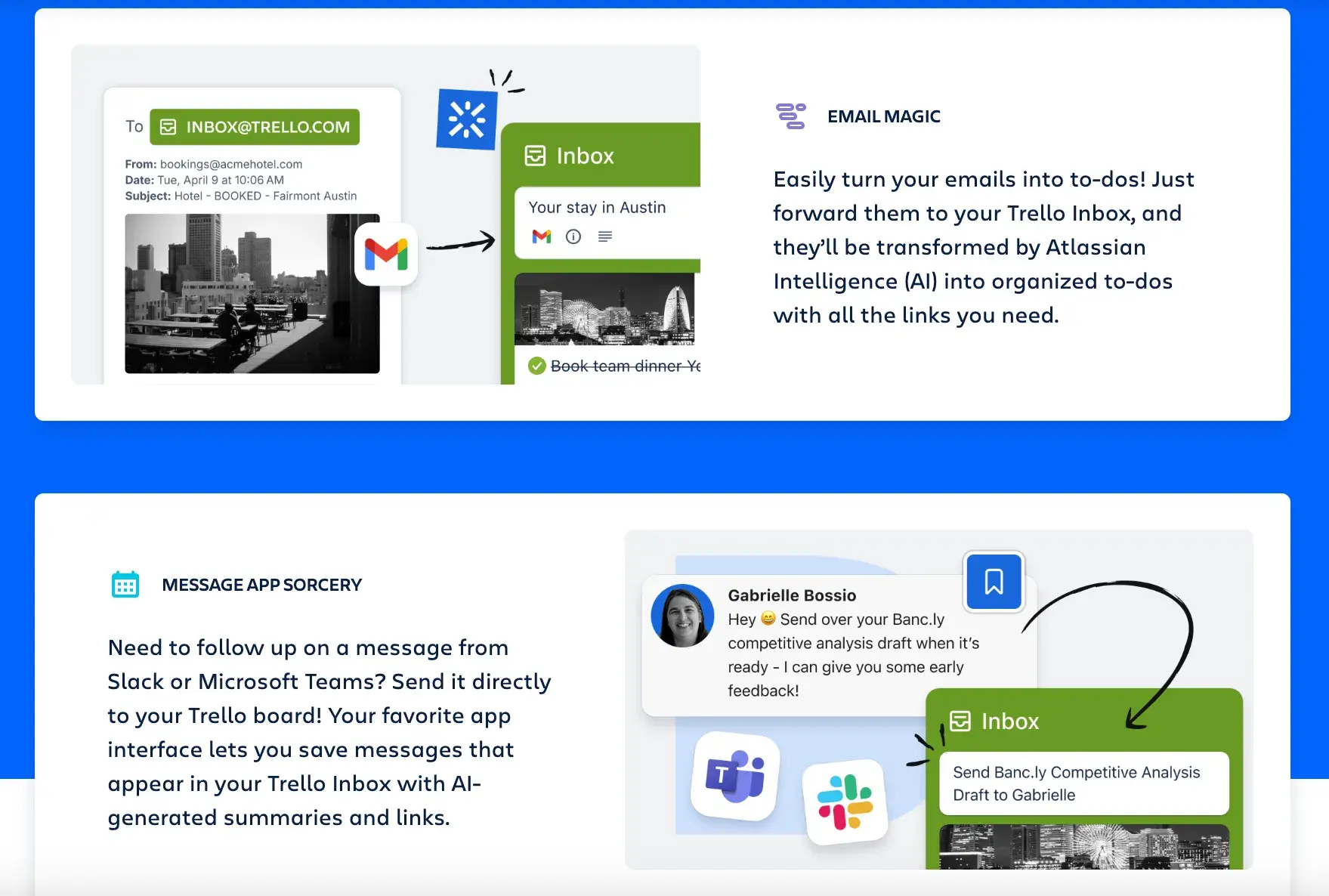
“Drag, drop, get it done” is plain language, but effective. Turning emails or Slack messages into tasks sounds boring, but Trello makes it sound useful — “Email magic” and “message app sorcery” are super catchy.
16. Slack
Why I like it: It nails the brand voice and purpose in one line: “Share it. Discuss it. Get it done. Side-by-side with AI agents.” It’s a mission statement that sells.
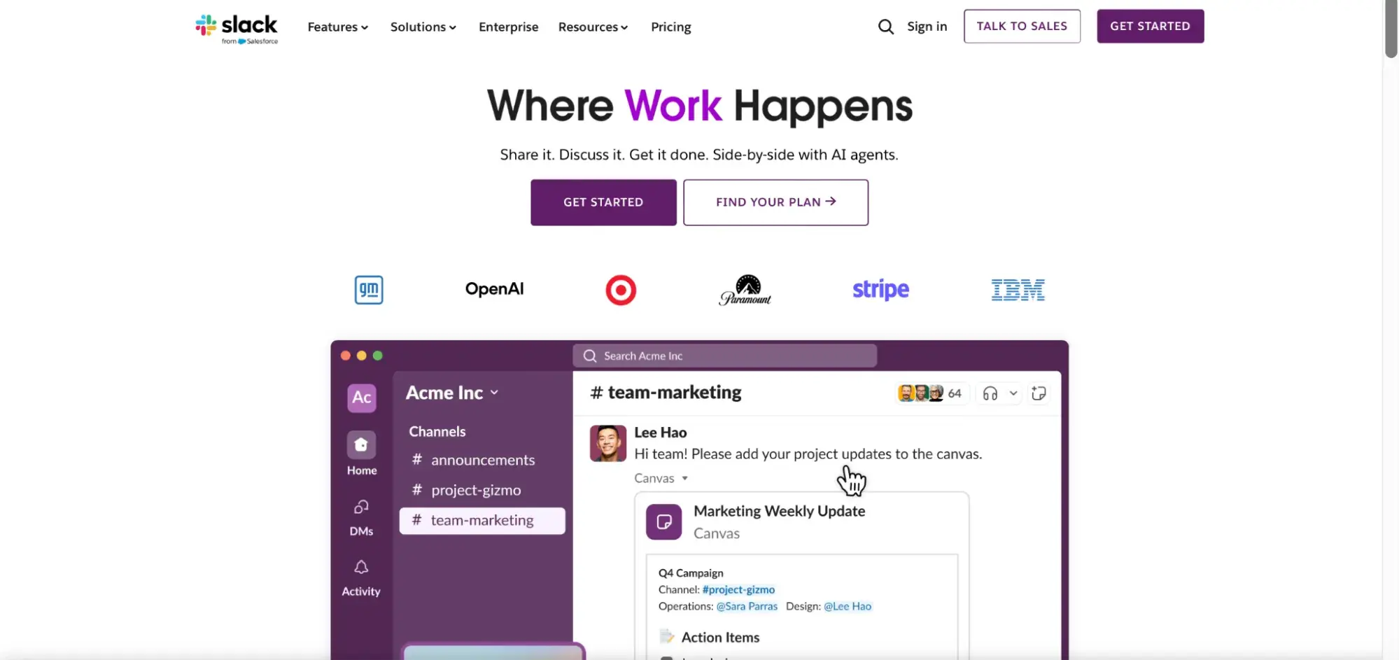
It tells exactly what Slack is for, without explaining the interface or features right from the start.
“Search your entire company history,” “turn messages into tasks,” “get daily recaps” — it’s all outcome-driven. This is what I want to hear as a prospective customer.
Even stats are used well: 97 minutes saved weekly with Slack AI. That’s a result I can feel and desire.
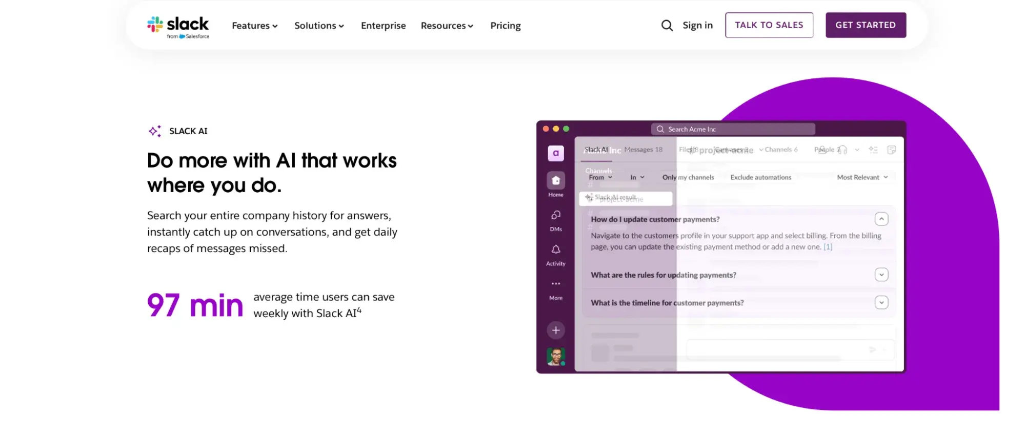
It also uses tone to make complex tech feel usable. “There’s an AI agent for everyone in Slack” makes automation sound personal, not corporate.
I’d summarize that Slack demonstrates its understanding of the pace of modern work across all copy and positions itself as the place where work gets done.
17. Zoom
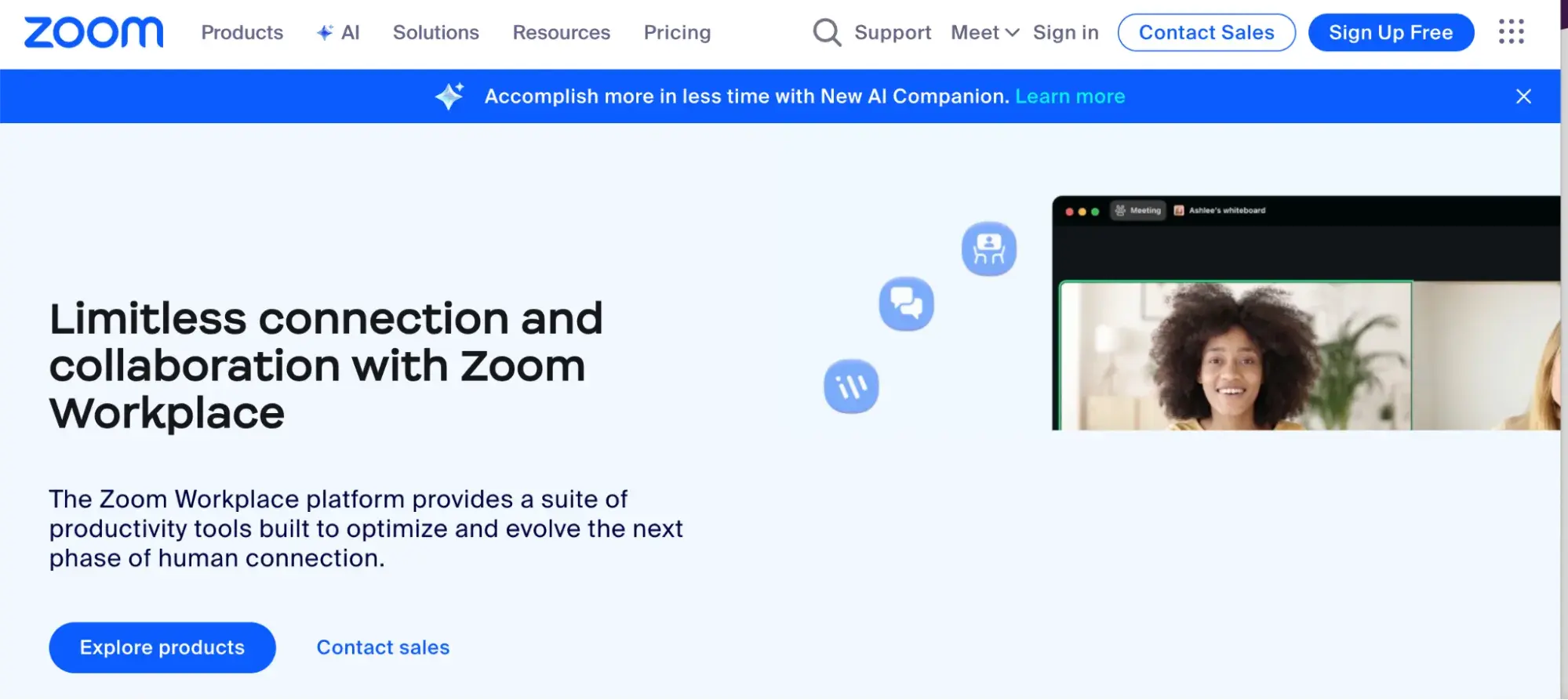
Why I like it: The copy frames Zoom as a partner, helping you connect with people. It is consistent and keeps reinforcing Zoom’s role in both connection and productivity, which makes the brand feel bigger than just video calls. That’s strong positioning right from the start.
18. Canva
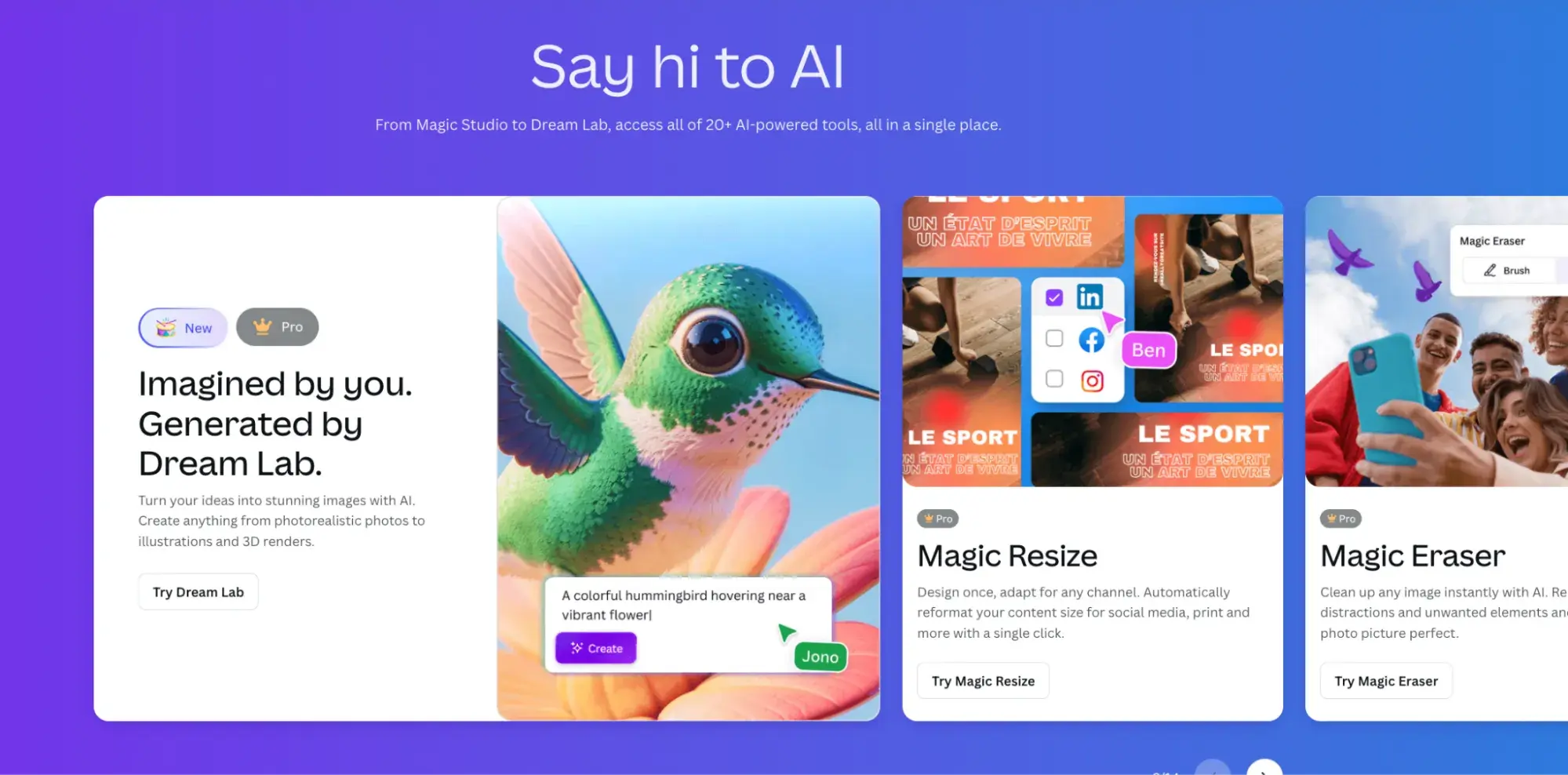
Why I like it: You know, I never buy tools where the copy doesn’t understand my pain point or speaks a vague language. But few tech companies get this. Canva’s copy makes pro-level design feel accessible and fast. “Design like a pro” taps right into what users want: to look professional without needing professional skills.
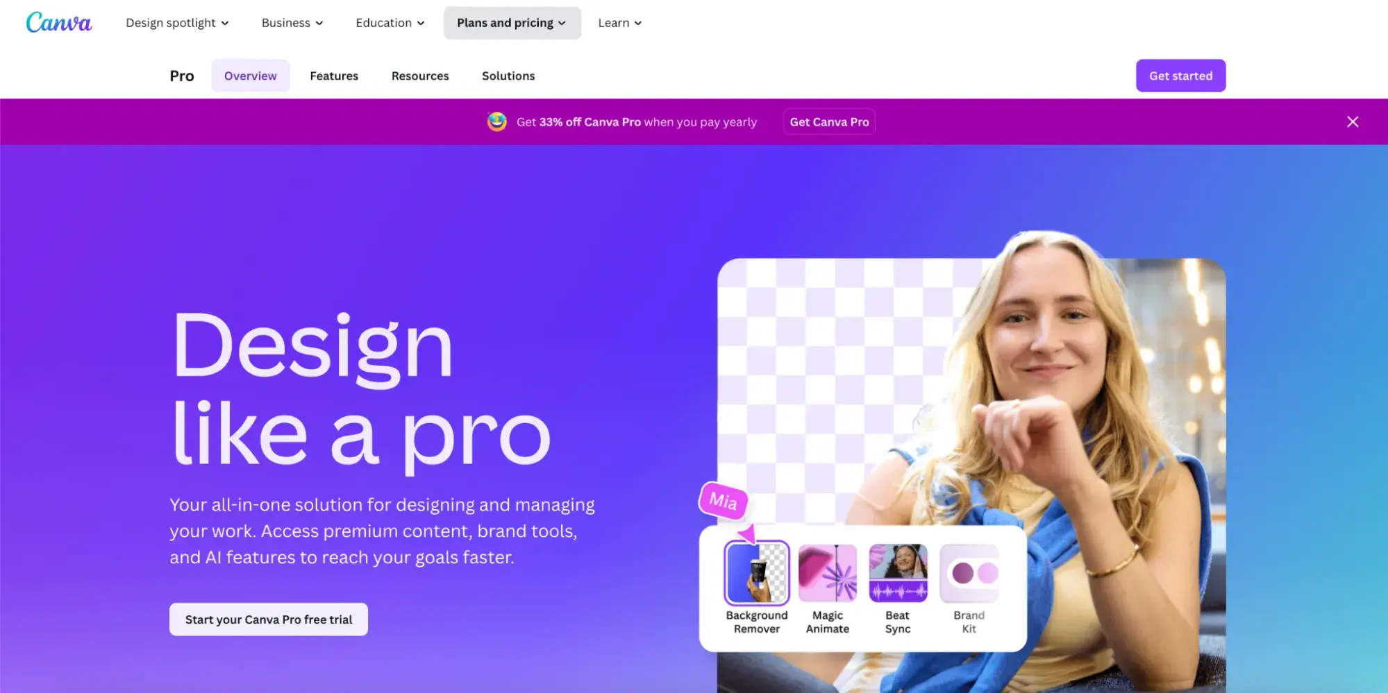
Lines like “Create, share, and grow — all in one place” and “Free up more time in your day” push clear benefits, while product names like Magic Eraser and Magic Write bring clarity and personality.
Even with 20+ AI tools, the copy avoids tech speak. Instead of explaining the backend, it just says what happens: “Describe the change you want, and watch your image adapt.” I love this magic promise.
19. Patagonia
I’m all about hiking, exploring nature, and buying all the good things for being active outdoors. So I couldn’t resist and compare copies of different outdoor brands. Patagonia definitely deserves a podium.
Why I like it: Lines like “First you have to get there” or “Earth is now our only shareholder” are so powerful. Sounds like a mission. And that’s the point. Patagonia doesn’t lead with product benefits; it leads with values and sparks your imagination.
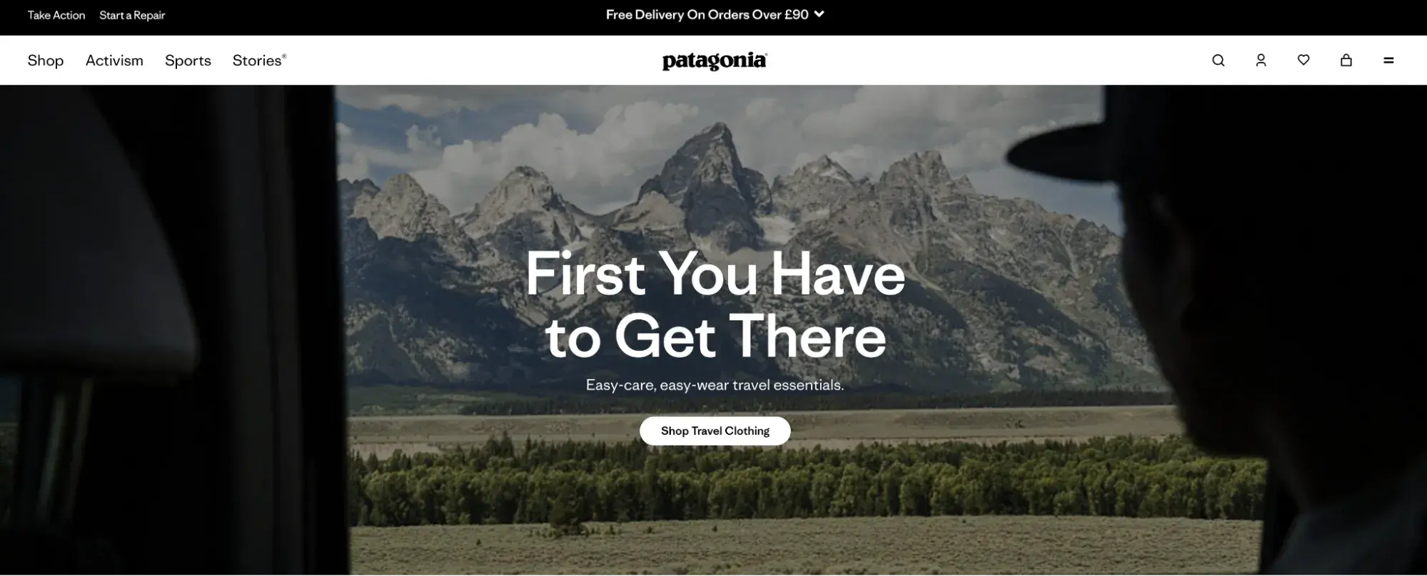
Their copy consistently connects what they sell to what they stand for: climate action, responsible consumption, and community resilience.
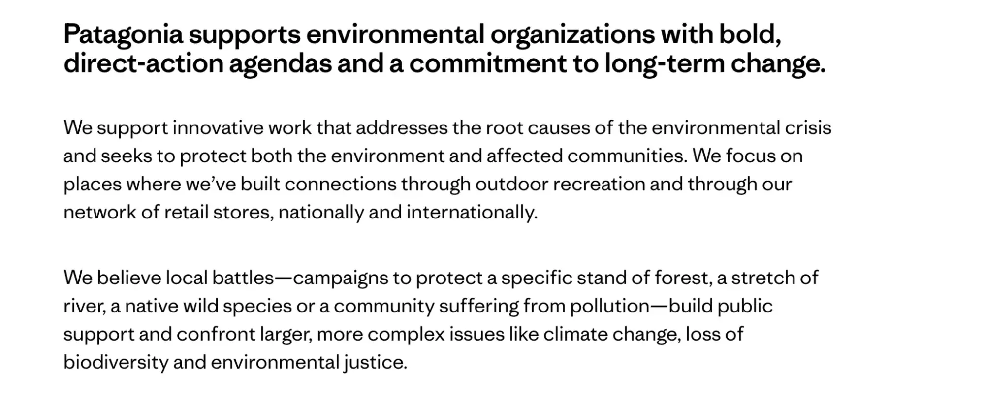
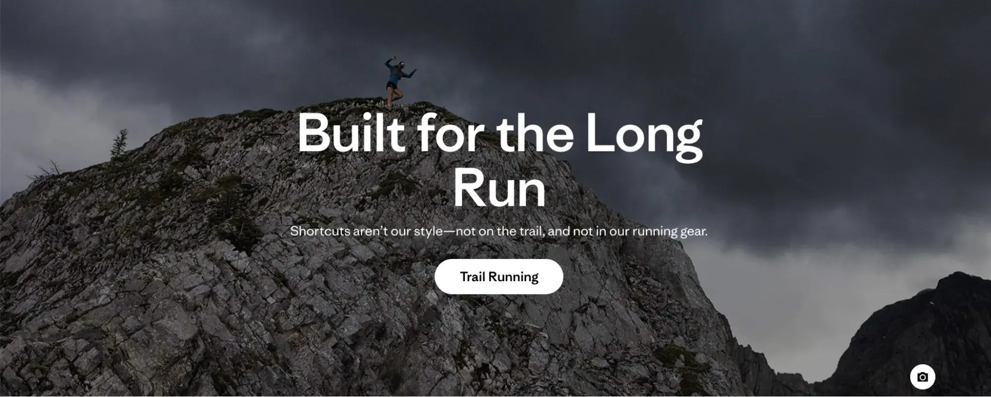
“Built for the long run” isn’t just about gear durability — it’s about a mindset. Everything reinforces the same core message: use less, last longer, fight for the planet. That’s brand copy with integrity.
20. Gong
Why I like it: Here’s a little controversy. I said I didn’t like vague descriptions, but I’m bringing Gong’s copy as a good example with the headline — “The #1 AI platform for revenue teams.”
Why so? You don’t land on Gong’s site out of the blue, so this line speaks to your search intent. You don’t need to sound crisp or bold all the time. You’ve got to know your audience and know what they want to hear.
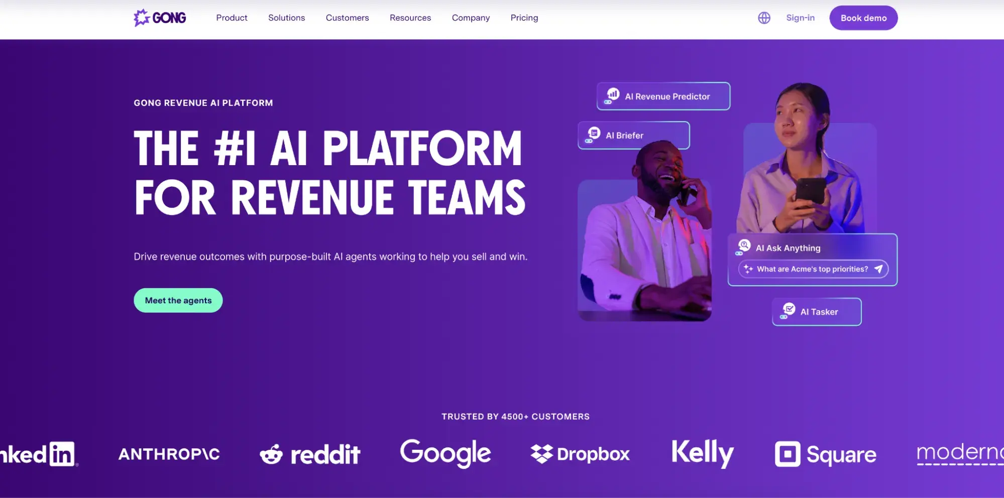
The subhead doubles down: “Drive revenue outcomes with purpose-built AI agents working to help you sell and win.”
Every phrase hits: “drive” — action; “revenue outcomes” — results; “while you sell” — zero friction. It speaks directly to busy sales leaders who want productivity without having to babysit software. Then, they speak to their buyer personas.
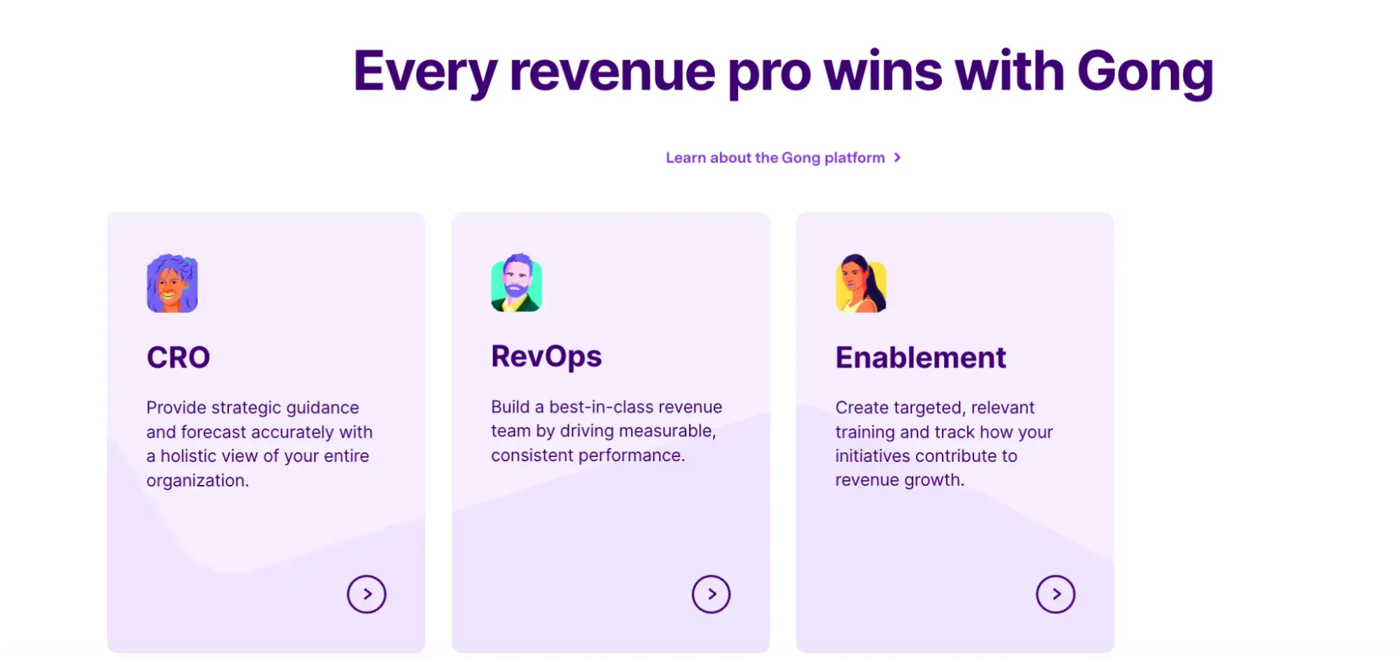
Ultimately, everything here is designed to say: We get your world. We’ve built for it. Let’s go. That’s what makes Gong’s brand copy tight, credible, and revenue-obsessed, but without much going into detail.
21. Reformation
Why I like it: Reformation’s copy is fearless and unmistakably them. Lines like “Being naked is the #1 most sustainable option. We’re #2.” hit hard and stick with you. Clever, bold, and immediately tells you this isn’t your average fashion brand.
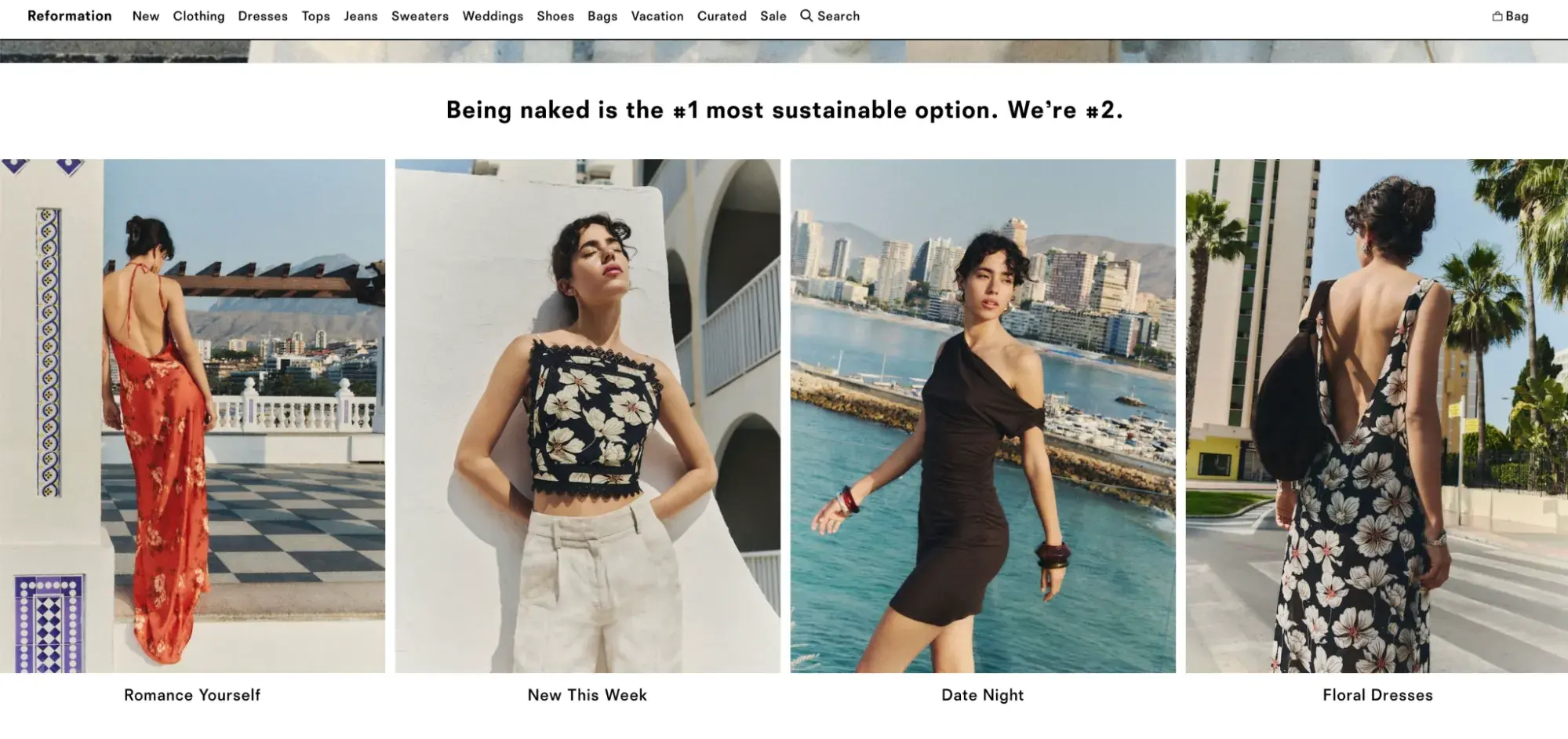
Naturally, I kept scrolling to see if they could back it up. I was pleasantly surprised that the brand has built a whole lifestyle around its language. Phrases like “Romance Yourself” and “What a view → You in these” are cheeky but elegant, making every product feel like part of a story you actually want to be in.

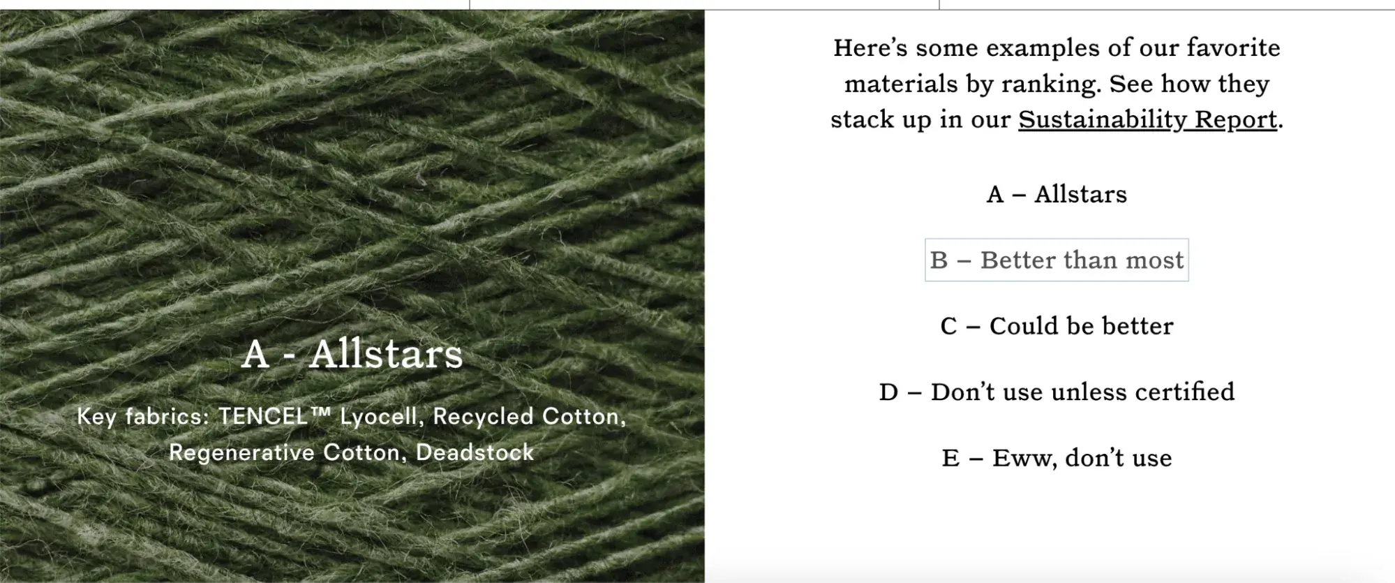
Even sustainability content is fun. They literally turned fiber grading into entertaining copy and still get you to care about raw material impact:
Examples of Sales Social Media Copywriting
- Semrush
- HubSpot
22. Semrush
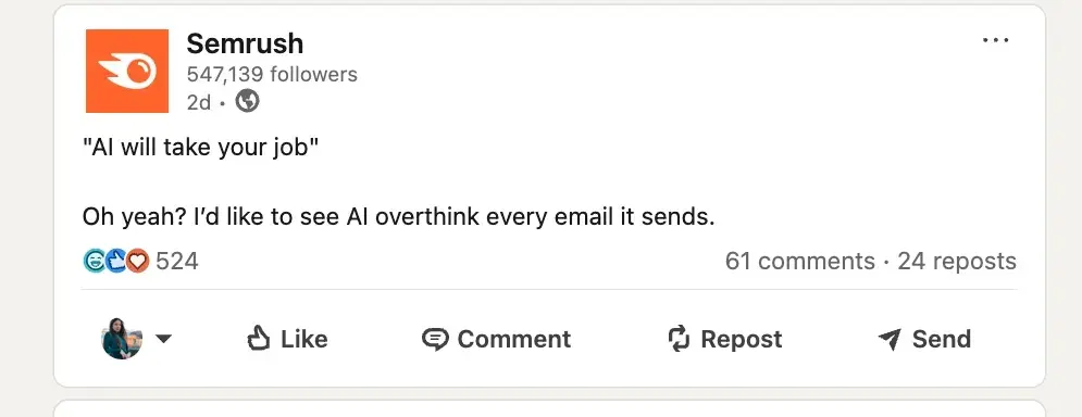
Why I like it: Semrush nails social media copy because it sounds like a savvy, funny marketer you’d actually want to talk to. Posts are short, clever, and painfully relatable. That kind of voice cuts through the feed instantly.
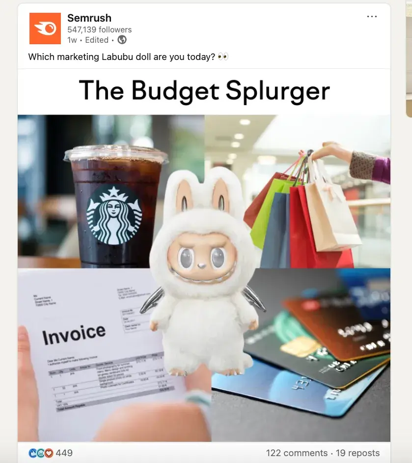
They’re also great at riding trends without losing their tone. The “Which marketing Labubu doll are you today?” post is a perfect 2025 example that plugs into internet culture but remains relevant to its niche.
And this is one of my favorite social media copies:
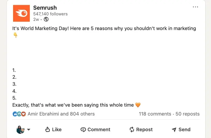
This kind of “anti-copy” works because the punchline is the silence, and they trust their audience to get it. That balance of sarcasm, warmth, and cultural awareness is what makes their social feed feel alive and super shareable.
23. HubSpot
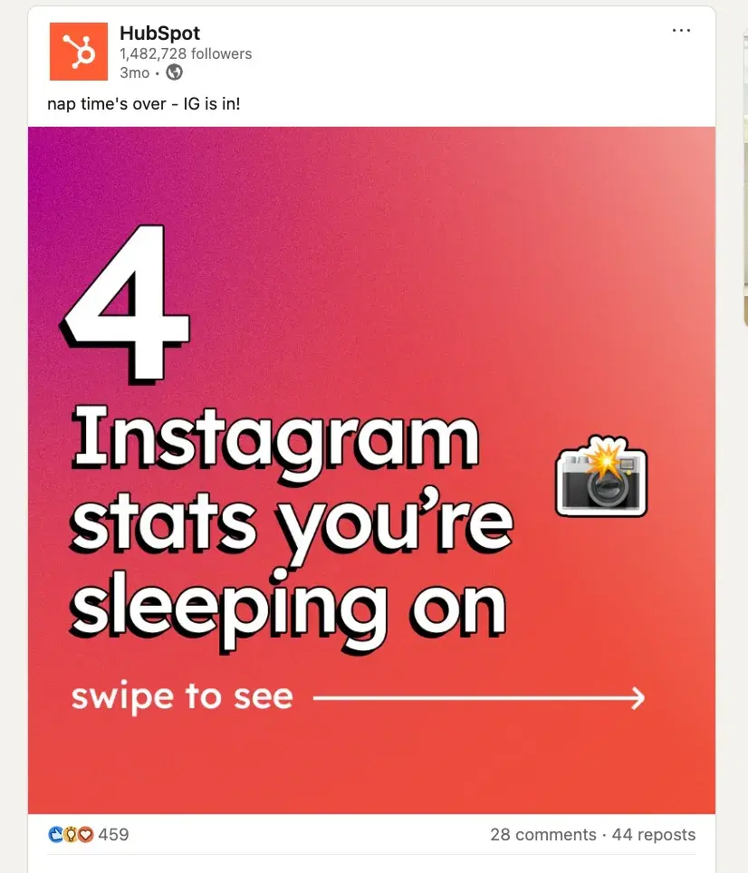
Why I like it: HubSpot’s social media copy rides the same trend. Or should I say, they invented that copywriting style for boring B2B?
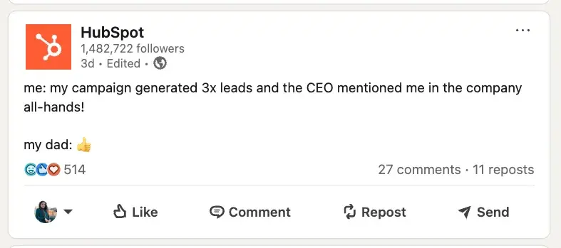
HubSpot social media copywriters know exactly where to hit. Take this one:
And then there’s this gem:

It’s clever, timely, and makes you grin because it’s just so true. HubSpot’s voice works because it’s not selling — it’s nodding along with you. That kind of “yep, been there” energy turns casual scrollers into real followers.
But what really sets HubSpot apart? They post serious stuff with lightness.
They regularly post about SEO, inbound strategy, data, social media, and sales systems — and it’s never dry. The hooks are strong, the tips are legit, and the formats (carousels, quick explainers, bite-sized videos) make the content super digestible.
Examples of Sales Ad Copywriting
- Happy Socks
- Monday
24. Happy Socks
Why I like it: This Happy Socks copy is concise yet effective. “Discover New Styles” feels more inviting than “Shop now.” It promises something new, and I love that.

The quick list of sock types — dress, casual, athletic, & cozy — makes it easy for anyone to find themselves in the offer.
The second line, “Enjoy unmatched comfort & quality with every step,” sells both the feeling and the function. “Every step” is a nice final touch because it ties the benefit to everyday use without overexplaining.
25. Monday
Why I like it: This Monday.com ad copy leads with emotion, not just features. “The Most Lovable Work Platform” is an unexpected phrase in the B2B world. It makes me pause and think, “Wait, lovable?”

It’s a clever way to stand out in a sea of boring productivity talk. And “Made for work, Designed to Love” feels like a perfect blend of practical and feel-good.
Then they follow it up with “Loved by 245K+ customers” — quick, solid social proof that adds credibility without dragging it out. The tone is confident, clean, and totally human. I bet it works for lead generation.
Examples of Sales Page Copywriting
- Foundr+
- 10x Emails
26. Foundr+
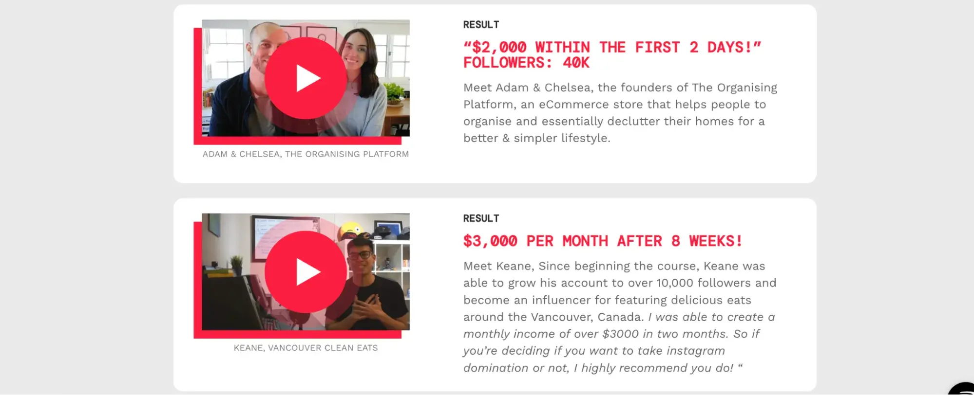
Why I like it: This sales page is laser-focused on outcomes. Every section is built around real, measurable results — sales, followers, growth. It’s “$1M in sales,” “sold a $250K truck,” or “121K followers.” That kind of specificity builds instant trust and keeps me hooked.
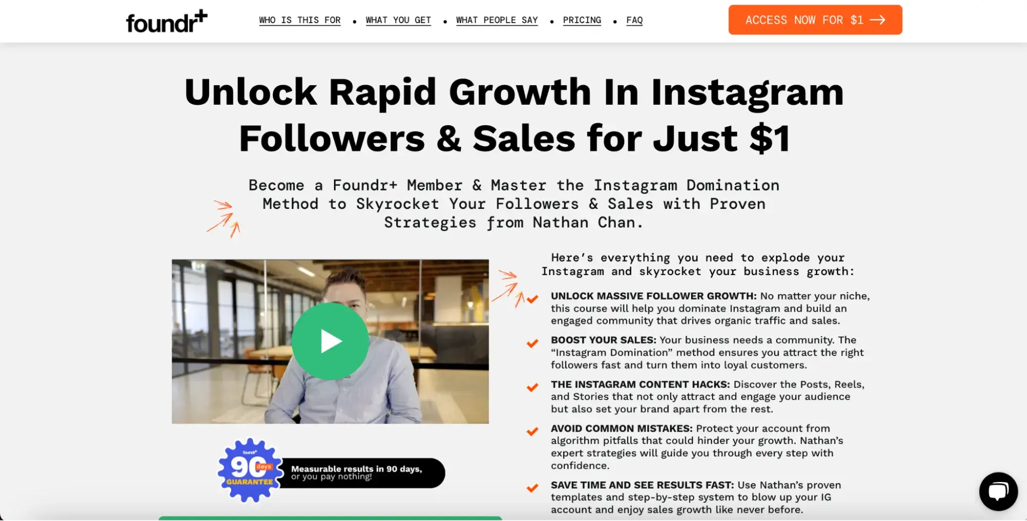
However, I don’t like the hook “for Just $1.” I have no trust in cheap products. Exploring further down, I came to the conclusion I was right. The price isn’t $1, but it’s trial access. Then, you would pay $99/month.
On one side, it removes the biggest friction point — price. But I don’t recommend hiding the real price like that. It’s a turn-off for me, but maybe a nice catch for someone else.
But the student stories make it all believable. They’re not overly polished or vague — they’re raw, numbers-based, and niche-diverse.
27. 10x Emails (by CopyHackers)
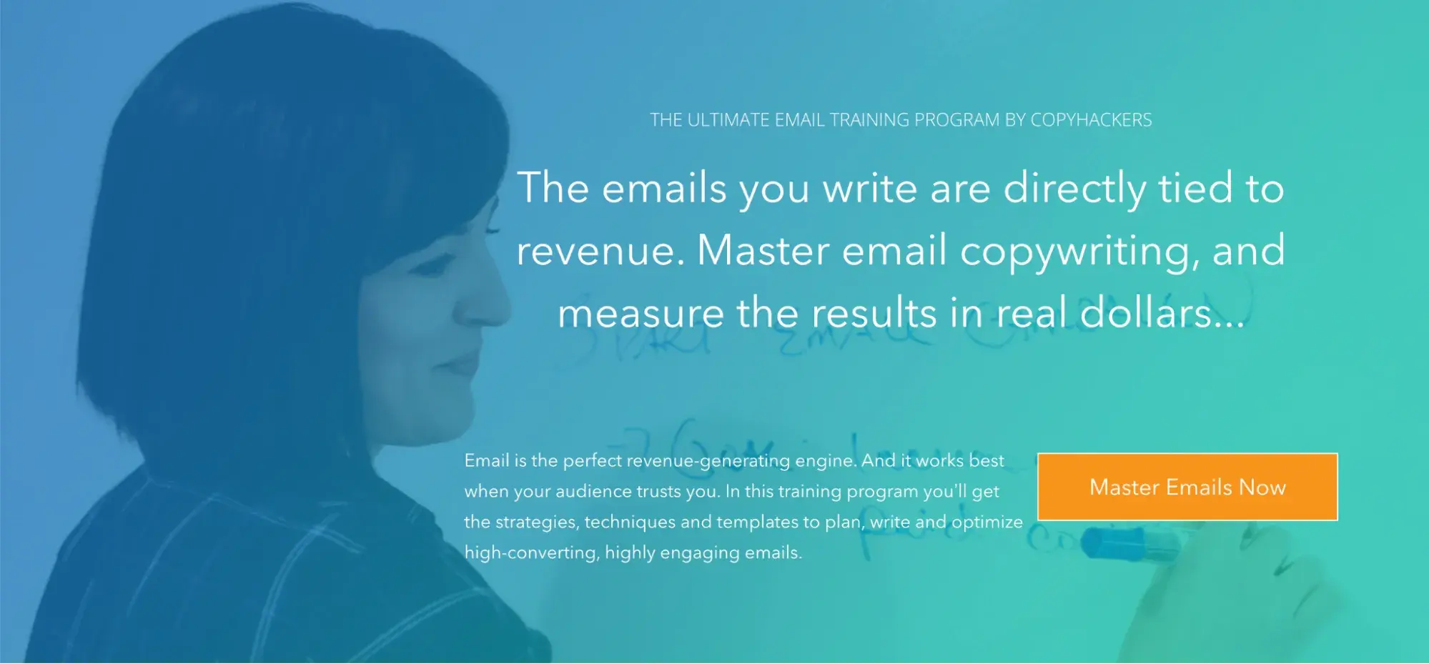
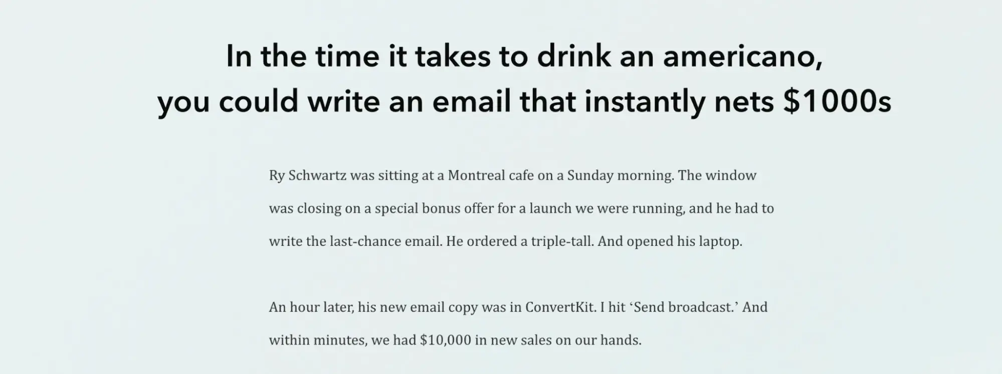
Why I like it: From the first line, it reframes email writing as a revenue skill, not just a creative task. I won’t be learning to write emails; I’ll be learning to make money on demand. Irresistible.
The storytelling is sharp. The “Montreal cafe” anecdote isn’t just fluff — it delivers a $10K result in 60 seconds. It’s memorable, specific, and aspirational. And it contrasts perfectly with the usual “long game” of marketing.
It also does an excellent job of de-risking the buy. You get a seven-day guarantee, a monthly payment plan, and practical bonuses like templates, short videos, and a certification badge.
Take This With You
Great copy doesn’t just sell — it makes people feel something, remember your brand, and maybe even laugh out loud. These 27 copywriting examples show that whether you’re writing for toilet paper or tech tools, the right words can turn browsers into buyers.
So next time you’re stuck staring at a blank page, revisit these brands. Steal their structure. Analyze their tone. Learn from what actually works — and then make it your own.
Editor's note: This post was originally published in January 2019 and has been updated for comprehensiveness.
Copywriting
.png?width=112&height=112&name=Image%20Hackathon%20%E2%80%93%20Horizontal%20(67).png)

.png)


