

Not to be dramatic, but they completely changed the way I work. Instead of obsessing over structure, I could focus on what really matters: clear copy, a strong offer, and a simple path to conversion.
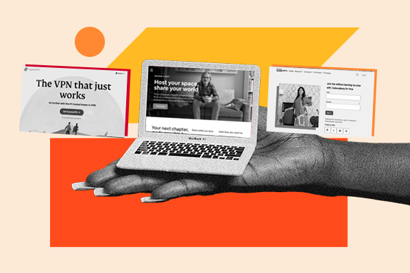
So to save you time (and a few headaches), I’ve rounded up 26 of my favorite high-quality landing page templates. I’ll walk you through what makes each one effective and share how I’d put them to use.
Table of Contents
26 Free Professionally Designed Landing Page Templates
A strong landing page can be the difference between a visitor who bounces and a lead who converts. I’ve seen conversion rates jump just by improving the layout and making the call-to-action (CTA) impossible to miss.
That’s why I love using templates. They give you a proven structure to start from, so you’re not reinventing the wheel every time. Instead, you can put your time and effort into tailoring the page to your audience and offer.
But don’t just take my word for it — let’s take a look at some professionally designed landing page templates that are built to perform. By the end, you’ll see how much easier they can make your work.
Optimize Your Landing Pages
Learn the best practices for generating leads with high-converting landing pages.
- Landing Page Design
- Running A/B Tests
- Example Pages
- And More!
Download Free
All fields are required.
1. Fayette
Available on Squarespace
Fayette is an event landing page template designed for parties and RSVPs, and I really love the way it’s built. There’s not a lot going on, and that’s the point. The event itself is the star of the show.
You immediately understand everything you need to: what it is, when it is, and where it’s happening. I also like that you can be as detailed or mysterious as you want. There’s space for more information, but it’s broken down in a really digestible way, so it doesn’t feel overwhelming.
I think the best part about it, though, is that there’s only one clear call-to-action: RSVP. And guess what? It’s more likely that people actually will, versus if there was another button competing for their attention.

Pro tip: Another thing I really like here is that the RSVP button shows up twice — right at the top and again at the bottom. I’ve found that repeating a single CTA like this works well for events, because it gives people a chance to sign up the moment they land on the page or after they’ve scrolled through the details.

2. Click Through
Exclusively Available With HubSpot’s Free Landing Page Builder
Click Through is another simple but effective template design. And similar to the last one, it keeps the focus on just one action: subscribing. At the top, you’ll find a clean hero section with a headline, supporting text, and a single button that drives people straight to the form.
What I really like about this layout is the flexibility below the fold. You can add things like customer logos, short testimonials, or a content preview — all of which help build trust without distracting from the main goal.

Pro tip: Don’t skip the social proof. The logo section right before the fold is one of the best ways to reassure new visitors that they’re in good company. I’ve seen that little detail make a big difference in convincing people to hit subscribe.
3. Simple Conversion
Available on HubSpot
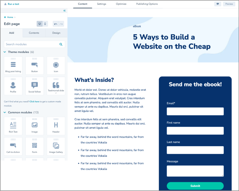
This Simple Conversion template is as straightforward as it gets. It includes a headline, a short description, a few bullet points, and a form. That’s it. Sometimes the best landing pages aren’t flashy, they just tell you what’s on offer and make it really easy to get it.
I personally like how the layout balances text and form side by side. Visitors don’t need to scroll or hunt around, they can see the value of the offer and sign up in the same glance. I often use this kind of setup for ebooks, guides, or any digital resource where clarity matters more than a flashy design.

Pro tip: Notice there’s no navigation bar here? That’s intentional. For some landing pages, removing navigation is the right move. It keeps people focused on your offer instead of wandering off to explore the rest of your site.
4. Blank
Available on HubSpot
This Blank landing page template is exactly what it sounds like ... a bare-bones landing page you can build into whatever you need. I like this option when I want full control over the design without being boxed into a pre-set structure.
You start with a clean slate, and from there, you can add your own sections, forms, and images. It’s great if you have a specific vision for your landing page or if you need something a little different from the typical lead-gen or download layouts and don’t want to start from scratch.

Pro tip: Use this template when you already know what you want your page to do and just need the flexibility to make it happen. I’ve found that it works best for unique offers or campaigns where a standard layout feels too limiting.
5. Video
Exclusively Available With HubSpot’s Free Landing Page Builder
A Video template is a great choice when you want to lean on visuals to do the heavy lifting. This one opens with a clear headline, supporting copy, and a form right next to an embedded video, which is a smart way to give visitors context without asking them to read a wall of text.
For me, this layout works well for events, product demos, or anything where seeing is believing. The video helps answer questions up front, while the form is always visible as the next step.

Pro tip: Keep your video short and focused. I’ve found that two minutes or less is the sweet spot — long enough to explain the value but quick enough that people still feel motivated to fill out the form right after watching.
Free Landing Page Builder
Create and test beautiful landing pages that generate leads and look great on any device.
- Build landing pages.
- Turn visitors into leads.
- Optimize for SEO.
- And more!
6. Session
Available on HubSpot
The Session template is one I like for offers that need a little more breathing room. It’s still simple, but it gives you space to add details without overwhelming the page. At the top, there’s a clean headline, a form, and a spot for an image — everything someone needs to quickly understand the offer.
What I especially like is how the form placement works alongside the content. Visitors don’t have to scroll far to see the value and take action. And if they do keep reading, you can use the lower sections to expand on what’s inside the resource and why it matters.

Pro tip: I’ve seen this kind of template work best when you write the form headline like a benefit instead of just a label. For example, “Send me the ebook” feels much more inviting than a plain “Submit.” That small shift can make the experience feel more personal and increase conversions.
7. Focus
Available on HubSpot
Focus is a bold and attention-grabbing template, and I think that’s what makes it so effective. The bright background and large headline immediately draw your eye, while the form sits right next to it, impossible to miss.
What I like most about it is that it doesn’t waste time. The design is clean, the message is clear, and the CTA is front and center. It’s especially good for offers where you don’t need a lot of explanation and just want people to sign up or get in touch.

Pro tip: If you use a layout this simple, make sure the headline does the heavy lifting. A short, direct statement paired with an inviting CTA can be all you need to convert.
8. Marketing Conference
Available on Wix
This Marketing Conference template is built for conferences and summits, and I really like how much energy it brings to the page. It opens with a bold headline and clear CTA to get tickets, then flows into speaker highlights, sponsor logos, and even a spot for last year’s recap video.
What I love here is the way the design changes as you scroll. First you get a grid of photos, then text-and-image combos, then a clean block for sponsors. It keeps things dynamic without ever losing focus on the main goal: securing registrations.

Pro tip: If you’re hosting an event, don’t underestimate the power of showing your lineup. Adding speaker photos or partner logos can build instant credibility and make people feel like they’re signing up for something they can’t miss.
9. Site Launch
Available on Canva
This type of landing page is pretty niche, but at some point you’ll probably need a placeholder before launching something — whether it’s a product, a new site, or even just a big update. This Site Launch template from Canva is a great example of how to do it.
I like how simple and polished it feels. The neutral background and clean text keep the focus on one thing: your upcoming launch. There’s no clutter, no distractions, just a clear announcement, a short line of context, and one button to get notified.

Pro tip: Use the notify button as a chance to set expectations. A quick line like “We’ll email you when we launch” reassures visitors about what will happen next, which makes them more likely to hand over their address.
10. Sprocket
Exclusively Available With HubSpot’s Free Landing Page Builder
If you’ve made it this far, you’ve probably noticed there’s clearly a theme here that less is more, and Sprocket is no exception. The headline, a short description, and the form are all right there above the fold.
What I like about this template is that it doesn’t try too hard. It’s clean, it’s focused, and it makes the offer feel easy to say yes to. That’s why I think it works especially well for things like ebooks, free trials, or any resource where you just want people to sign up fast.

Pro tip: See how the form is as simple as possible, too? When you ask for less, you’ll usually get more. People are far more likely to hand over their details if you don’t make them give too much. I once had a form that barely converted, and after I removed the mandatory phone number field, submissions skyrocketed.
Free Landing Page Builder
Create and test beautiful landing pages that generate leads and look great on any device.
- Build landing pages.
- Turn visitors into leads.
- Optimize for SEO.
- And more!
11. Hales
Available on Squarespace
Hales is a template that shows how powerful a clean, well-organized ecommerce landing page can be. Right away, you can see the products (in this case: floral arrangements) laid out in a way that makes browsing feel effortless. I like that shoppers can filter between categories, like full arrangements versus bouquets, without getting lost in too many clicks.
What really makes it work are the photos. Beautiful product shots instantly communicate quality and value, which is especially important in ecommerce. Instead of needing to read through long descriptions, you can almost imagine how these flowers would look in your own home.

Pro tip: In my experience, clarity beats cleverness when it comes to ecommerce. Make your categories simple to navigate and let your photos tell the story. The easier it is for someone to find what they’re looking for, the faster they’ll make a purchase.
12. Startup
Available on Wix
If you’re launching a startup or tech product, this Startup template is a great choice. It gives you space to cover all the essentials like what your company does, how it works, who you’ve worked with, and how people can get in touch — without ever feeling overwhelming.
The design has a modern edge with bright colors and parallax scrolling, which keeps the page engaging as you move down. And since the form is built right into the layout, you’re collecting leads while people are still interested, instead of making them click away.

Pro tip: On longer pages like this, it helps to add a CTA at the top that auto-scrolls to the form at the bottom. That way, if someone doesn’t make it all the way down, the option to convert is still right there when they’re ready.
13. Volunteer
Available on Canva
This Volunteer template from Canva is a great example of how to use a landing page to drive action for a cause. It opens with a striking visual and headline that instantly communicates the mission, then follows up with sections that explain the “why” behind the work.
I like that it balances inspiration with credibility. You see the mission, then the proof — from stats about volunteers and impact to photos of people doing the work. That mix makes it easy for someone to decide if they want to get involved.

The CTA is also consistent throughout. Whether you’re at the top of the page or you’ve scrolled through to the bottom, you’re reminded to “Volunteer Today.” For a mission-driven page, that repetition works in your favor.

Pro tip: If you’re creating a volunteer or nonprofit page like this, use your own photos wherever possible. People connect more deeply when they see real volunteers and real communities instead of generic stock photography.
14. Atlas
Exclusively Available With HubSpot’s Free Landing Page Builder
The Atlas template is designed with gated content in mind — think ebooks, playbooks, or whitepapers. Everything about it is built to support that exchange: a bold headline that spells out the value, a visual of the resource itself, and a form right beside it.
What I like about this layout is that it makes the offer feel real. You’re not just asking people to “download something,” you’re showing them exactly what they’ll get. Pairing the ebook cover with the form side by side creates a clear connection between the promise and the action.
Plus, we’ve found that offering ebooks in exchange for signing up works 55% of the time — at least, it does for HubSpot.

Pro tip: When you’re building a landing page for gated content, make sure the resource feels tangible. Add a mockup, cover design, or even a sneak peek of what’s inside. The more concrete it feels, the higher the chance people will hit “submit.”
15. Bogart
Available on Squarespace
Bogart, a group sign-up landing page template, shows how simple and effective a community-focused landing page can be. The design is clean and welcoming, with one clear CTA: “Contact Us.” I like that it doesn’t try to do too much; it just invites people in.
For groups, clubs, or organizations, a page like this works really well. It gives you a dedicated space to point potential members, without overwhelming them with extra navigation or unrelated content. Visitors know exactly what the group is about, where it’s located, and how to take the next step.

Pro tip: For community landing pages, clarity matters more than persuasion. Keep the copy short, use an image that captures your group’s energy, and make the CTA feel approachable. That way, you’re encouraging people to connect instead of intimidating them.
16. Luxury Real Estate
Available on Wix
This Luxury Real Estate template shows how luxurious properties should be marketed online: with visuals that do most of the talking. The full-screen photography makes you stop and stare, which is exactly what you want if you’re selling homes at the higher end of the market.
I like how minimal the design is. The headline, the property image, and a simple “Contact Us” button are all you really need to spark interest. The font choice even feels expensive. When you’re showcasing something like this, the less copy the better — it lets the property shine. And with properties like these ... you can definitely let them speak for themselves.

Pro tip: If you’re building a real estate landing page, invest in high-quality photography. Beautiful images of the space will do more to convince someone to reach out than paragraphs of text ever could. Keep the CTA prominent and let the visuals carry the rest.
17. Accelerator
Exclusively Available With HubSpot’s Free Landing Page Builder
The Accelerator template is straightforward in the best way. It puts the offer on one side and the form on the other, so the CTA is impossible to miss. I’ve used this kind of layout for quick-turn campaigns where I didn’t have time to design something elaborate, but still needed a page that converted.
What I like most about this template is how easy it is to customize. Because the design is minimal, you can swap in different headlines, visuals, or offers without worrying about breaking the layout.

Pro tip: Pages like this are perfect for testing. If you’re running ads, create a few variations of the same template with different headlines or offers. It’s a fast way to see what resonates without spending weeks redesigning.
18. App Launch
Available on Wix
There are plenty of App Launch templates out there, but this one caught my eye because of how clean and fun it is. Right above the fold, you get everything you need: a bold headline, a quick blurb, clear download buttons, and a mobile preview (or in this case, illustration) that instantly shows what the app looks like in action.
What I like is that it doesn’t waste time. If someone is curious about your app, they can download it in one click. But if they want to learn more first, the template has space below for key features, testimonials, and an extra CTA at the bottom to seal the deal.

Pro tip: Always include the app store buttons above the fold, even if you repeat them further down. For mobile audiences especially, those few seconds of convenience can make the difference between a download and a bounce.
19. Memos
Available on Webflow
Memos is a sleek, modern landing page template built for apps and tech products, and I love how bold it is. The dark background makes the copy and visuals pop, and the built-in animations keep you engaged as you scroll. It feels just as polished as the product it’s promoting.
What really stands out to me is the sticky waitlist button at the top. No matter how far down you go, that CTA is always visible. It makes the product feel exclusive while giving people a constant nudge to sign up. That little design choice can make a big difference in conversions.

Pro tip: If you’re marketing a product that’s in beta or pre-launch, a waitlist is one of the best ways to build hype. Keep the form short, make the button visible, and lean into the exclusivity factor to get people excited.
20. Portfolio
Available on Webflow
This Portfolio template is proof that personal landing pages can be just as polished as product ones. I really like how it opens with a bold “Hello there” and it immediately feels approachable and human. From there, the design flows into sections where you can highlight your work, your services, and even add reviews to build credibility.
What makes this template stand out to me, though, is how flexible it is. Whether you’re a designer, consultant, or freelancer, you can tailor it to put your strengths front and center. It balances personality with professionalism, which is exactly what a great portfolio landing page should do.

Pro tip: If you’re building a portfolio landing page, lead with something personal like a friendly headline, a fun fact, or even a simple greeting. It helps visitors feel connected right away, before they even get into your work.
21. Webinar
Available on Unbounce
This Webinar template nails one of the hardest parts of landing page design: keeping things simple and persuasive. Right above the fold, you get a bold headline, a clear CTA, and a short description that sets the right tone. There’s also space later on to spell out what attendees will gain from the event, which is a smart design choice that works for any kind of webinar or workshop.
From experience, I’ve seen that when people land on an event page, they don’t want to scroll through walls of text, they just want to know “what’s in it for me?” and “how do I sign up?” This template answers both instantly. The way it lays out the learning takeaways in a clean, icon-based format is a nice touch, too.

Pro tip: Even if you swap in your own branding, keep the balance this template strikes between text and visuals. It makes the page approachable, which can lift signups compared to heavier, content-packed designs.
Optimize Your Landing Pages
Learn the best practices for generating leads with high-converting landing pages.
- Landing Page Design
- Running A/B Tests
- Example Pages
- And More!
Download Free
All fields are required.
22. Simple Monthly Newsletter
Available on Landingi
This Simple Monthly Newsletter template is a great reminder that you don’t need bells and whistles to drive signups — just clarity and focus. Right away, it spells out exactly what people are getting (“monthly tips and more”), then puts the signup form front and center. No distractions, no clutter, just a straightforward path to conversion.
What I like most is how it shows the “next steps” in a super simple way: fill out the form, then get the tips. Sometimes, people need that extra reassurance that they’re not signing up for a black hole of emails. It’s small, but it makes the process feel transparent and trustworthy.
From my experience, newsletter landing pages can easily become overstuffed with content, but that often backfires. Readers just want to know why they should subscribe and how. This template balances that perfectly with a quick value proposition section below the fold, giving you room to highlight key benefits without overwhelming visitors.

Pro tip: Remember to keep the form as short as possible. Like I said before, asking for just a name and email often lifts conversion rates compared to longer forms that demand too much information upfront.
23. Brilliant Dental Product
Available on Unbounce
This Brilliant Dental Product template shows exactly how to make one product really shine (pun intended).
The design puts the item front and center with bright, close-up visuals that feel fresh and professional. The clean blue-and-white color scheme reinforces the idea of health and trust, while the layout walks you through the essentials, from what’s in the box to why it matters and even related products you might want to try.

I like that it feels like a guided experience rather than a hard sell. Everything flows naturally, so by the time you reach the CTA, you already know what you’re getting and why it’s worth it.

Pro tip: For product-specific landing pages like this, let the visuals carry the weight. Pair high-quality photography with short, benefit-driven copy, and keep the design clean so the focus stays on what you’re selling.
24. Tantillo
Available on Squarespace
Tantillo is a restaurant reservation template that keeps things bold and direct, which is exactly what you want when the goal is to get people to book a table. The playful headline instantly grabs attention, and the booking form is front and center so visitors can act without scrolling or searching.
I like how the design uses big typography and a fun color palette to set a lively, approachable mood. It feels inviting while also keeping the process frictionless — just pick your party size, date, and time, and you’re done.

As someone who loves food and makes way too many reservations, this is exactly the kind of layout and user experience I appreciate.
Pro tip: Reservation landing pages work best when they minimize distractions. Keep the form visible, the CTA loud and clear, and let the design reflect the vibe of your restaurant so people know what to expect before they even walk in.
25. Headphones
Available on Wix
This Headphones template feels perfect for brands that want to make their product look as premium as it feels. I like how the design is divided into clean strips — it makes scrolling feel effortless while keeping each section distinct. That structure works especially well when you’re highlighting different features, benefits, or testimonials.
What really stands out to me is how the hero image does the heavy lifting. A sharp product photo at the top fold instantly sets the tone, and paired with a bold headline, you don’t need much else to hook people. I’ve seen firsthand how a strong visual backed by a simple, benefit-driven line can outperform even the cleverest copy when it comes to product landing pages.

Pro tip: If your product is tech-focused or design-driven, lean into high-quality photography and let the visuals carry the weight. Add concise copy for features and a testimonial or two, and you’ll strike the same balance this template nails.
26. New Year Sale
Available on Landingi
This New Year Sale template from Landingi nails urgency right from the top with its bold countdown timer. I love how the ticking clock instantly creates FOMO (fear of missing out) and nudges visitors to act fast. That kind of built-in urgency is perfect not just for New Year’s campaigns, but for any flash sale or holiday promo where timing is everything.
The design itself is clear and product-focused, with featured items laid out in a grid that makes browsing easy. Sale prices are highlighted in a way that feels obvious without being overwhelming, and the “Buy Now” buttons pop against the background.
What makes it effective is the combination of urgency plus clarity: Visitors know the deal is time-limited, they see exactly what’s on offer, and the path to purchase is friction-free. If you’re running seasonal promotions, this kind of page design is a great way to drive conversions quickly.

Pro tip: Pair a countdown timer with exit-intent popups or limited discount codes for even more urgency.
Landing Page Best Practices
The templates we’ve covered highlight a lot of tried-and-true landing page best practices. But if you want more inspiration, these landing page examples are worth a look, too.
In the meantime, let’s take a look at this landing page example from HubSpot:

It’s simple, effective, and follows the exact principles that make landing pages convert. The headline and visuals immediately draw attention, the CTA is clear and action-driven (“Get the trends”), and the copy gives just enough context to spark interest without overwhelming the reader.
Here are a few best practices you’ll notice at play that you can borrow for your own pages.
Keep navigation off the page.
High-performing landing pages often skip navigation bars. Too many links can distract visitors and lead them away from your main offer. I’ve tested both versions, and the “no nav” version almost always converts better.
Use strong visuals.
Visuals can make or break engagement. Whether it’s a sharp product photo, an ebook mockup, or a short video, they help communicate value quickly. HubSpot’s report page does this well by showing a preview of the resource itself.
Lead with value.
The offer should be front and center. If it isn’t clear why someone should sign up, they won’t. I’ve seen conversion rates double just by reframing the resource to highlight the real-world benefits instead of generic features.
Keep it simple.
A good landing page answers two questions right away: What is this? and Why should I care? If someone only spends 10 seconds skimming, they should still walk away knowing exactly what they’re getting.
Minimize form fields.
I said it before and I’ll say it again: Every extra field adds friction. Unless you truly need more details, keep forms short — usually just name and email.
Use AI to get unstuck.
AI tools like HubSpot’s Campaign Assistant are great for drafting landing page copy when you’re staring at a blank page. I’ve used it to generate first drafts quickly, then refined the copy to match brand tone and specifics. It’s a serious time-saver.
Start with templates.
I’d honestly be surprised if I haven’t convinced you by now that designing from scratch isn’t always necessary. Templates give you proven layouts so you can focus on customization. Starting with a solid template has gotten me most of the way there and helped me launch faster more times than I can count.
To learn about other landing page best practices, check out this comprehensive guide.
Craft the best landing page for your business.
At the end of the day, no two businesses need the exact same landing page. I’ve seen stripped-down, text-only pages crush it in one campaign, while flashy, image-heavy designs worked better for another. The “best” landing page isn’t about chasing trends — it’s about knowing your audience and giving them the easiest possible path to say yes.
What I have learned, though, is that the little details make all the difference. Even when I start with a template (and I often do), I’ll always tweak the layout, colors, or copy until it feels right for that specific campaign. Those small adjustments are usually what turn a page that just looks good into one that actually converts.
And if your first draft doesn’t convert like crazy? Totally normal. Swap a headline, shorten a form, try a new visual. Landing pages aren’t set in stone — they’re more like living documents. And trust me, I’ve broken enough pages (and then fixed them) to know that iteration is where the real wins come from.
Editor’s note: This post was originally published in May 2019 and has been updated for comprehensiveness.
Free Landing Page Builder
Create and test beautiful landing pages that generate leads and look great on any device.
- Build landing pages.
- Turn visitors into leads.
- Optimize for SEO.
- And more!


![Why You Need to Create More Landing Pages [Data + Tips]](https://53.fs1.hubspotusercontent-na1.net/hubfs/53/create%20more%20landing%20pages.png)
.png)