The answer: Great landing page design.
Table of Contents
- How to Design a Landing Page
- Landing Page Design Best Practices
- Landing Page Design
- Responsive Design
- Landing Page Design Software
- Landing Page Designs to Inspire You
Landing Page Design
Landing page design is the process of creating an enticing site page for your target audience and website visitors. It should encourage them to convert from leads into subscribers or customers.
Effective landing page design is on-brand, includes your product or service and company information, and incorporates relevant offers and calls-to-action (CTAs).
Why is landing page design important?
In a world where pretty much every business has a website, and where most of us spend a little too much time online, you’re competing with a market that’s immense and a user who doesn’t have a lot of time or attention (or sleep, probably).
Landing page design can help meet user intent and it can drive your conversion rates — probably a lot more than you think. We ran an A/B test at HubSpot in 2024 that removed a single line of company logos — our social proof — from a product page.
That tiny tweak? 20% more conversions.
Of course, not every tiny change in landing page design will boost conversion rates by double digits, but our experiment underscores just how important design is — for your users and your bottom line.
Responsive Design
Responsive web design is a must. Smartphones account for around 60% of web page views worldwide — that’s traffic nobody can afford to lose.
A web page with responsive design is automatically viewable via any device. That is, web pages change to fit any screen or device, whether you’re on a desktop, laptop, tablet, or smartphone.
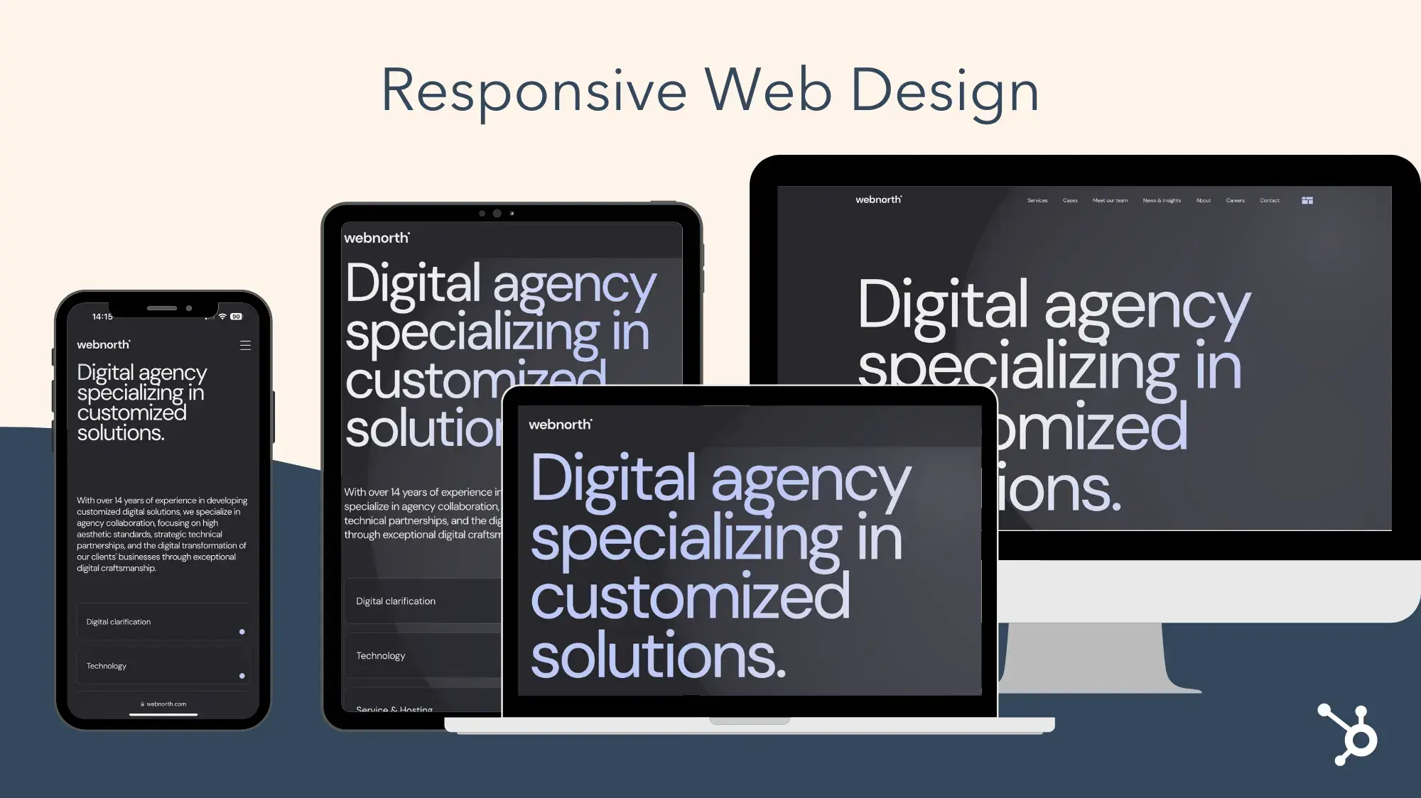
Again, this is the first page every visitor interacts with and sees when they open your website, outstanding user experience (UX) is crucial and responsive web design is critical.
Web pages without responsive design can make for a frustrating visitor experience — images and text that won’t fit their screen, making them much more likely to abandon your site completely or visit a competitor’s site instead.
Note: Most landing page design software (we’ll cover some options shortly) includes responsive design, but it’s something to double-check.
In addition to having a responsive design, there are many other aspects of creating and designing a landing page that impact your ability to convert visitors into customers and enhance UX. So, let’s review some of the most important steps for you to consider while designing your landing page.
How to Design a Landing Page
- Identify your target audience and their needs.
- Ensure the landing page has a specific purpose.
- Choose a landing page design software.
- Write enticing landing page headers.
- Make the landing page beautiful and helpful.
- Publish and test the landing page design.
1. Identify your target audience and their needs.
No matter which part of your business you’re working on, you should think about who your target audience is and how you can resolve their pain points — and designing your landing page is no exception.
While planning your landing page design, think about what your target audience expects and needs when they open your site. Ask yourself the following questions to help you with this:
- What questions does the landing page immediately need to answer for your audience?
- How can you brand your landing page so your audience knows they’re in the correct place?
- What attention-grabbing headline, relevant content, and CTA can you include on your landing page to efficiently and effectively meet the needs of your audience?
- How can you ensure your landing page is unique in comparison to those of your competitors?
- How can you prove the value that your company, products, and services provide to your audience?
If you need additional help defining your target audience, try creating buyer personas for your business.
2. Ensure the landing page has a specific purpose.
For your landing page design to be successful, it needs a clear purpose. When visitors come to your landing page, they should immediately know why the page exists.
For example, you can use landing page design to clearly define the purpose of your page in the following ways:
- Increase conversions by sharing relevant CTAs
- Enhance brand awareness by including an email newsletter sign-up form
- Boost sales by displaying your top-selling product
- Develop greater interest in your product or service by incorporating information about how they solve your visitors’ pain points
Without a defined landing page purpose, your visitors may feel confused about what to do once they’ve landed on the page or uncertain whether they’re in the right place. This may cause them to lose interest and abandon your page entirely. So, use your design to ensure your landing page has a clear purpose.
3. Choose a landing page design software.
There are dozens of software options to help you build and design a landing page. The key is finding one that works for you. Review the five software options we recommend below and the various features they each offer below.
4. Write enticing leading page headers.
The purpose of a header is to catch your visitors’ attention and/or make them want to do something — meaning, headers should be enticing, impactful, and action-oriented.
This is most likely one of the first (if not the first) things your website visitors will have read about your company. For this reason, your landing page headers should also complement the tone and copy everywhere else on your site (and your meta description).
When you use enticing and value-driven vocabulary in your landing page headers, you ensure your visitors know that converting and spending time on your site is worth their time and energy.
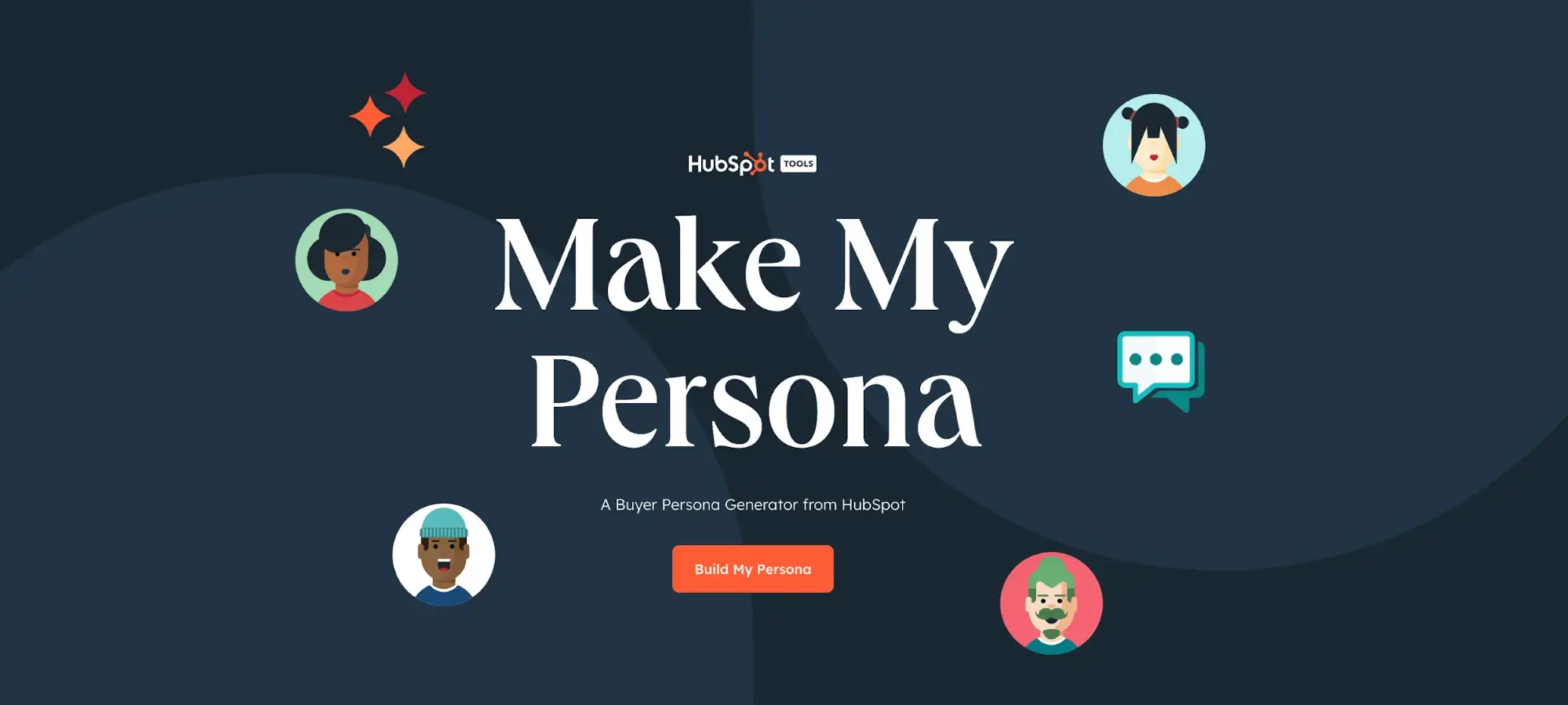
For example, look at HubSpot’s Buyer Persona Generator landing page. The headline says, “Make My Persona - Free Buyer Persona Template Generator (2025).” Visitors know where they are, what they’ll get out of visiting the landing page, and that it’s a tool that’s updated and maintained.
5. Make the landing page beautiful and helpful.
In addition to compelling headers and language, your page should also be beautiful and helpful. After all, it’s the first introduction to your brand for some visitors.
Make your landing page beautiful by:
- Incorporating consistent, on-brand colors and fonts
- Keeping your page organized
- Remembering less is more while designing
- Including aesthetically-pleasing visuals (images and/or videos)
- Designing obvious and exciting CTAs
Make your landing page helpful by:
- Incorporating content that pertains to your target audience’s needs and challenges
- Designing CTAs that provide visitors with value
- Including information that tells visitors why they should convert
- Making sure visitors know how to convert
- Ensuring visitors have easy access to your contact information
6. Publish and test your landing page design.
Once your design is set, it’s time to publish and test it among your audience members. After your landing page is published, you can A/B test different design elements (e.g., colors, CTA buttons, phrases, font, etc.) to see what leads to the most conversions.
This way, you can ensure your landing page meets your audience’s needs while guaranteeing you’re getting the best results that will impact your business’s bottom line.
In addition to keeping these landing page design steps in mind, consider these landing page best practices. You’ll notice some of these best practices are also directly tied to the specific steps we’ve just reviewed above.
Landing Page Design Best Practices
- Identify your target audience and their needs.
- Write a compelling and helpful headline.
- Include unique and engaging visuals.
- Keep it simple.
- Make sure it has a responsive design.
- Keep it on-brand.
- Optimize it with CTAs.
- Add your contact information.
- Include live chat on the landing page.
- Use A/B testing to determine which design works best.
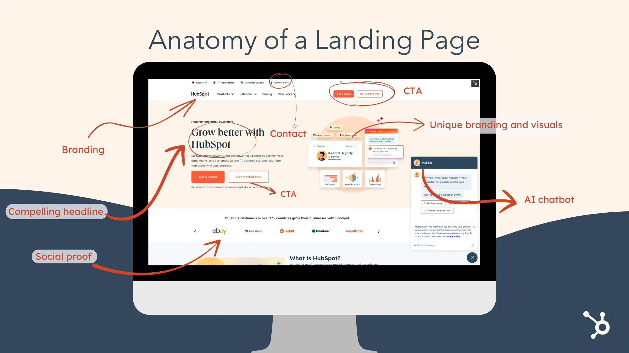
While we review the following best practices, we'll be referencing the following annotated image of HubSpot's landing page:
1. Remember your audience throughout the design process.
As we reviewed above, the first part of designing your landing page is identifying your target audience — remember to keep them in mind throughout the design process. This way, you’ll create a design and incorporate content that resonates with your audience. By doing so, you’re more likely to convert visitors.
2. Write a compelling and helpful headline.
Add a compelling headline to your landing page to immediately grab your visitors’ attention. A great landing page headline should be eye-catching, descriptive, and helpful.
For example, HubSpot’s landing page says, “Grow better with HubSpot.” This gets visitors in the HubSpot mindset and suggests that our software is something they need to improve and expand their business.
Additionally, “grow better” is a slogan that HubSpot uses throughout all marketing materials. It’s something the company works toward every day — to help other businesses grow better.
3. Include unique and engaging visuals.
Include engaging visual content on your landing page. Whether it’s a photo, video, or animation, you want your landing page design to pique your visitors’ interest.
The HubSpot landing page’s visual content is unique to the company, with a distinct design and color scheme that doesn’t take attention away from the written content.
4. Keep it simple.
Although you want to include a headline, written content, CTA, and visual content on your landing page, that doesn’t mean you want your design to be too busy. In fact, you want the opposite.
Remember: Less is more when it comes to the design of your landing page (and your entire website, for that matter). This keeps your site clean, organized, and simple to understand and navigate for your visitors.
As you can see on HubSpot’s landing page, although the visual takes up a lot of the page, the headline, written content, and CTA are organized in a simple and aesthetically pleasing way.
The navigation at the top of the page is minimalist and the live chat on the bottom right can collapse to make the landing page appear even cleaner for visitors.
5. Make sure it has a responsive design.
Remember, there’s a high chance that your website visitors, leads, and customers are on a mobile device or tablet. Ensure your landing page has a responsive design that automatically changes format based on the device it’s being viewed on.
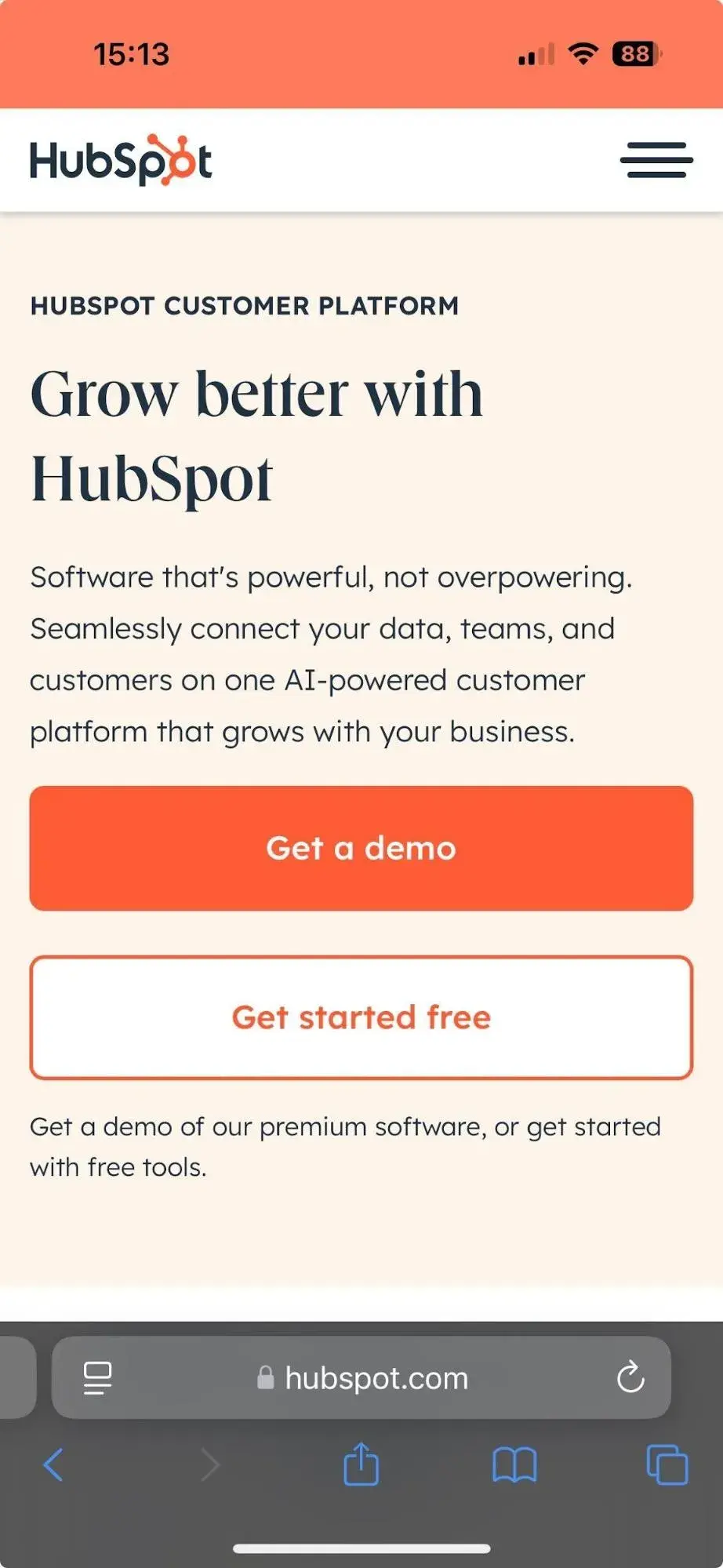
For example, here’s what HubSpot’s landing page looks like via my iPhone. As you can see, all of the content is the same and it includes the same CTA and visuals, but it’s organized and formatted in a way that fits my screen.
6. Keep it on-brand.
When a visitor comes to your landing page, they should immediately know it belongs to your business. Brand your landing page in a way that complements the rest of your marketing content, logo, and colors.
HubSpot’s landing page does this well and adheres to our brand guidelines. The HubSpot logo lives at the top of the landing page.
7. Optimize your landing page with CTAs.
Your landing page should include at least one relevant CTA, located above the fold (i.e., visitors can see it without scrolling), so visitors can come to your landing page and convert within seconds.
This CTA might be used to learn more about your product or service, purchase your product, sign up for a special offer, or subscribe to your email newsletter.
HubSpot’s CTA button is one of the most obvious features on the landing page. The CTA button clearly states what visitors get out of converting.
Since the CTA button has the word "free” in it, it becomes even more enticing … who doesn’t love free? Lastly, it’s located above the fold, so it’s visible to everyone the moment they open it.
8. Add your contact information.
Visitors may come directly to your site in search of your contact information or determine they want to contact you for assistance or support after spending some time on your page.
To avoid wasting their time and causing them any unnecessary frustration while trying to locate your contact information, place these details on your landing page. This keeps the process of contacting you as simple and straightforward as possible for your visitors.
HubSpot has contact information listed under the navigation bar at the top of the landing page. This is a great option if you’re looking to keep your landing page as minimalist as possible.
9. Include live chat on the landing page.
If possible, include a live chat or AI chatbot on your landing page. This way, visitors can get the immediate assistance they want and need from the moment they open your page.
HubSpot’s landing page has an AI chatbot for easy access to immediate support. The location of the collapsible chat box keeps the page looking organized.
Once you’ve designed your landing page, don’t feel locked in — this is an iterative process. For instance, test your designs with your target audience to determine which colors, CTA buttons, headlines, visuals, and written content resonate the best (and result in the most conversions).
To do this, you may conduct A/B or multivariate tests with different designs. After reviewing your results, you'll know which design works best for your target audience and increases conversions.
Stick with that design until you have a new and improved design to share, your product line changes, or your branding is updated — then, start this process again.
Next, let’s take a look at the software options you have to get your landing page up and running so you can begin converting more visitors into customers.
Landing Page Design Software
There are many landing page design software options to choose from, all of which can help you design your entire website (not just your landing page). The following five options simplify the design process and don’t require you to have any previous web or design experience.
1. HubSpot Free Landing Page Builder
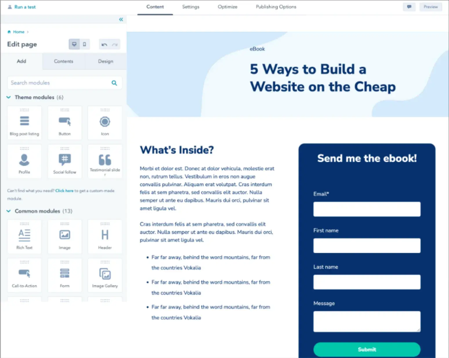
HubSpot's free landing page builder helps you create multiple landing page designs for free. The software includes a free built-in library of responsive landing page templates and an on-page editor for adding images and copy.
Plus, our AI-powered Campaign Assistant allows you to create effective and customized copy in just a few clicks.
When you upgrade to a paid plan, you can also create personalized CTAs, content, and forms for visitors to help you boost conversions. HubSpot also provides you with the ability to test and analyze the performance of your landing page design so you can make improvements.
2. Instapage
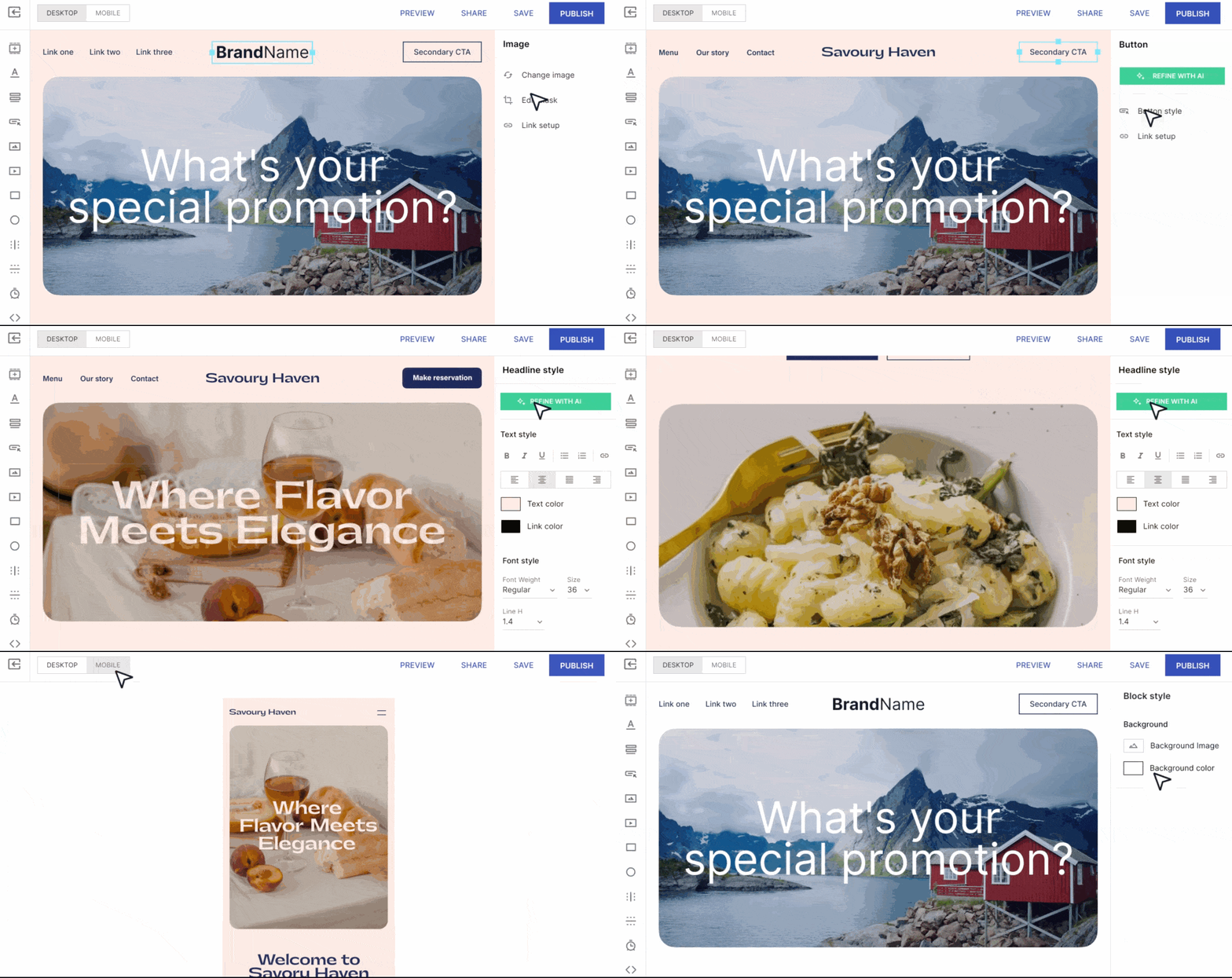
Instapage allows you to design and publish custom post-click landing pages with a variety of template options.
The page builder is easy to use and offers the ability to A/B test different designs to determine which works best for your audience.
The software also helps you optimize your landing page with dynamic text replacement so you can automate the opt-in content on your page.
3. Unbounce
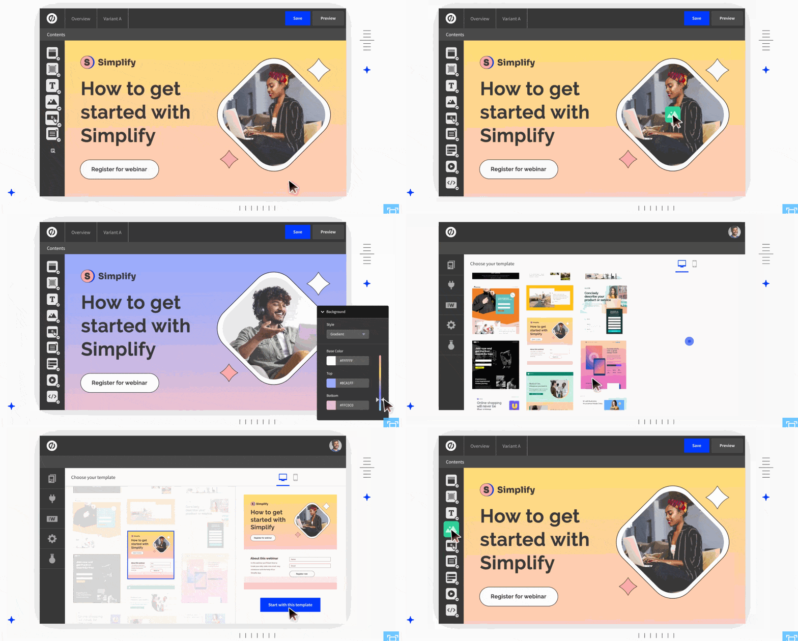
Unbounce has a landing page creator with over 100 templates to choose from so your design complements your brand and content. Templates are organized by business type and include options for SaaS companies, agencies, and ecommerce businesses. Unbounce landing pages are responsive and completely customizable.
4. Mailchimp
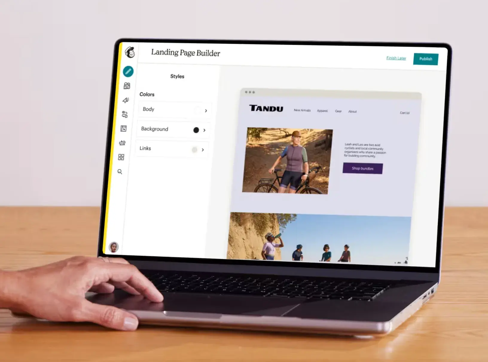
Mailchimp allows you to design your landing page in minutes, thanks to its drag-and-drop page builder. You can also set up your other website content to populate your landing page, further simplifying the design process.
Add custom CTAs to entice your target audience to convert or sign up. And, if you need help personalizing your landing page, review and reference the variety of tutorial videos Mailchimp provides users.
5. Leadpages
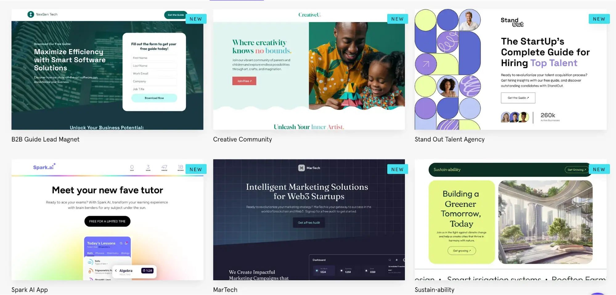
Leadpages is a landing page design software with a drag-and-drop builder that makes it easy to customize your landing page to suit your brand, and you can A/B test your designs with the software to efficiently determine which option converts the most visitors.
As you begin thinking about your landing page design and working through the details we’ve provided in this guide, you may feel as though you need additional design inspiration. If this is the case, check out our blog post on great landing page design.
Landing Page Designs to Inspire You
1. HubSpot
Hey, look, it’s us! This is a different landing page than the one I used in an earlier example, but it has the same elements.
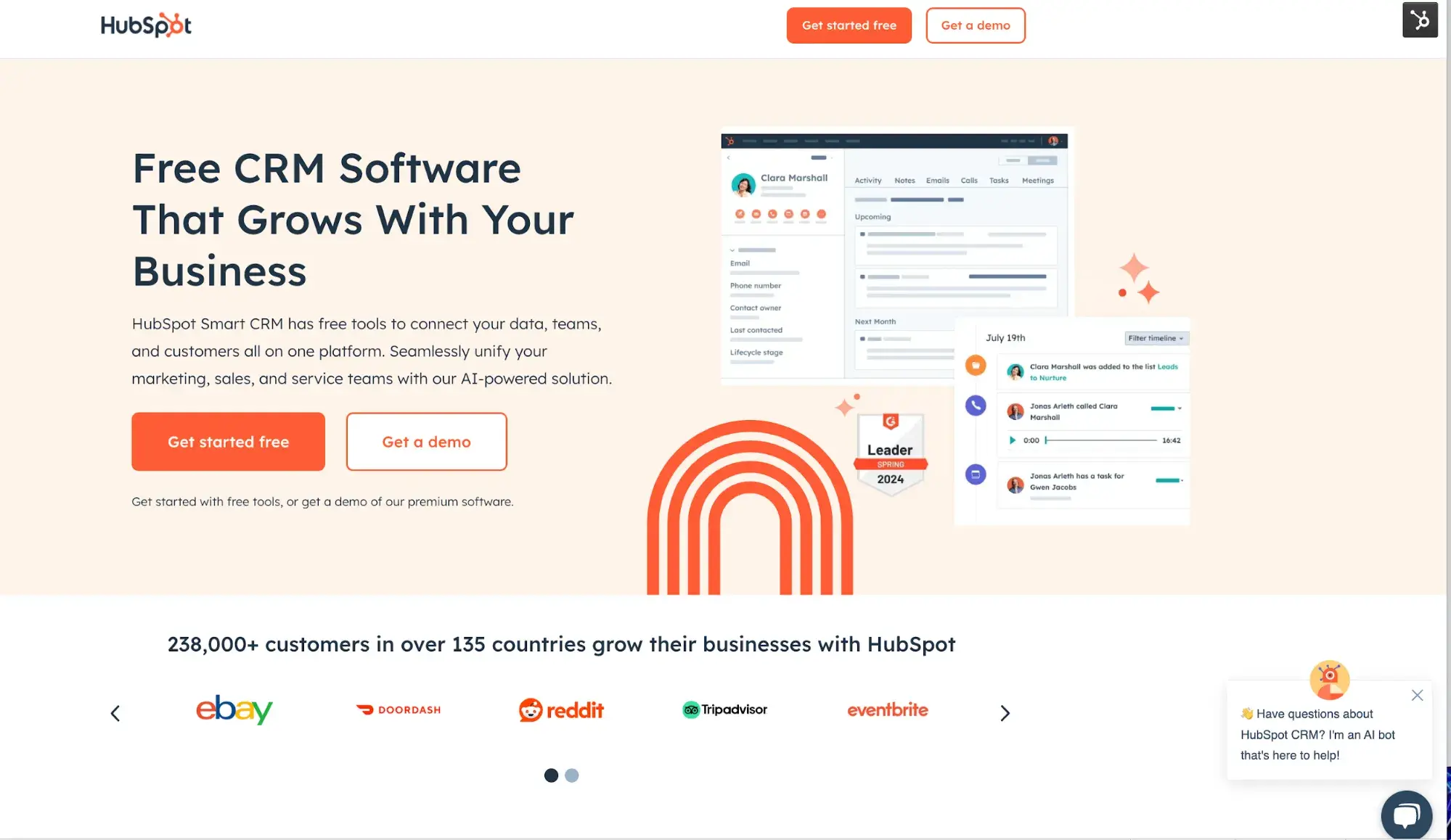
You’ll notice that this landing page lacks something: a top nav bar. My colleague Curt del Principe wrote a fantastic post about how one small tweak led to 20% more conversions.
What we like: Removing the top nav bar reduces visual clutter, in keeping with the “less is more” mindset. Yet it still has the familiar branding and design that you see across all HubSpot products.
2. Shopify: Website themes
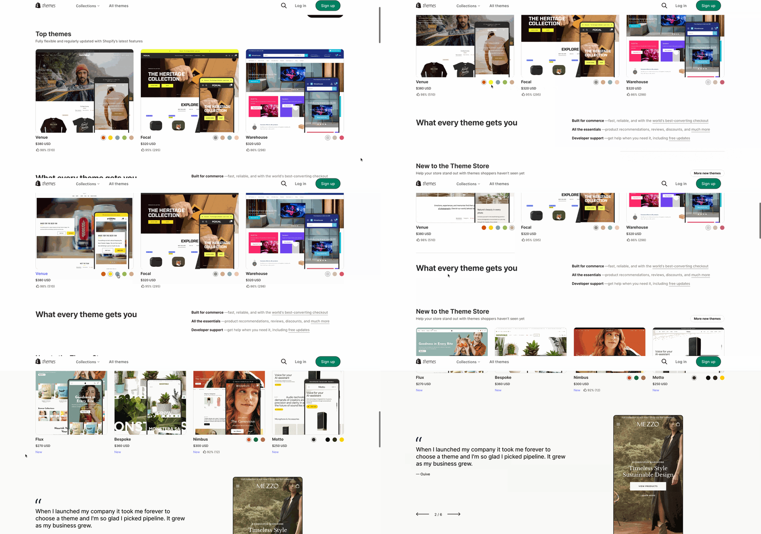
Shopify fits a lot of info above the fold by relying heavily on visuals. It’s probably thought a lot about visitor intent — if I were looking to build a new website or refresh an existing one, I’d want to see what my options were.
What we like: Shopify doesn’t gate its themes. You can browse all its themes with filters for free/paid, catalog size, industry, and other features. With younger consumers conducting 60% of their buyer journey before ever engaging with a sales rep, Shopify has given its target audience the ability to do deeper research on its product before converting.
3. Netflix
Netflix doesn’t beat around the bush: Its website is a landing page. It centers, literally and figuratively, a signup box and not much else.
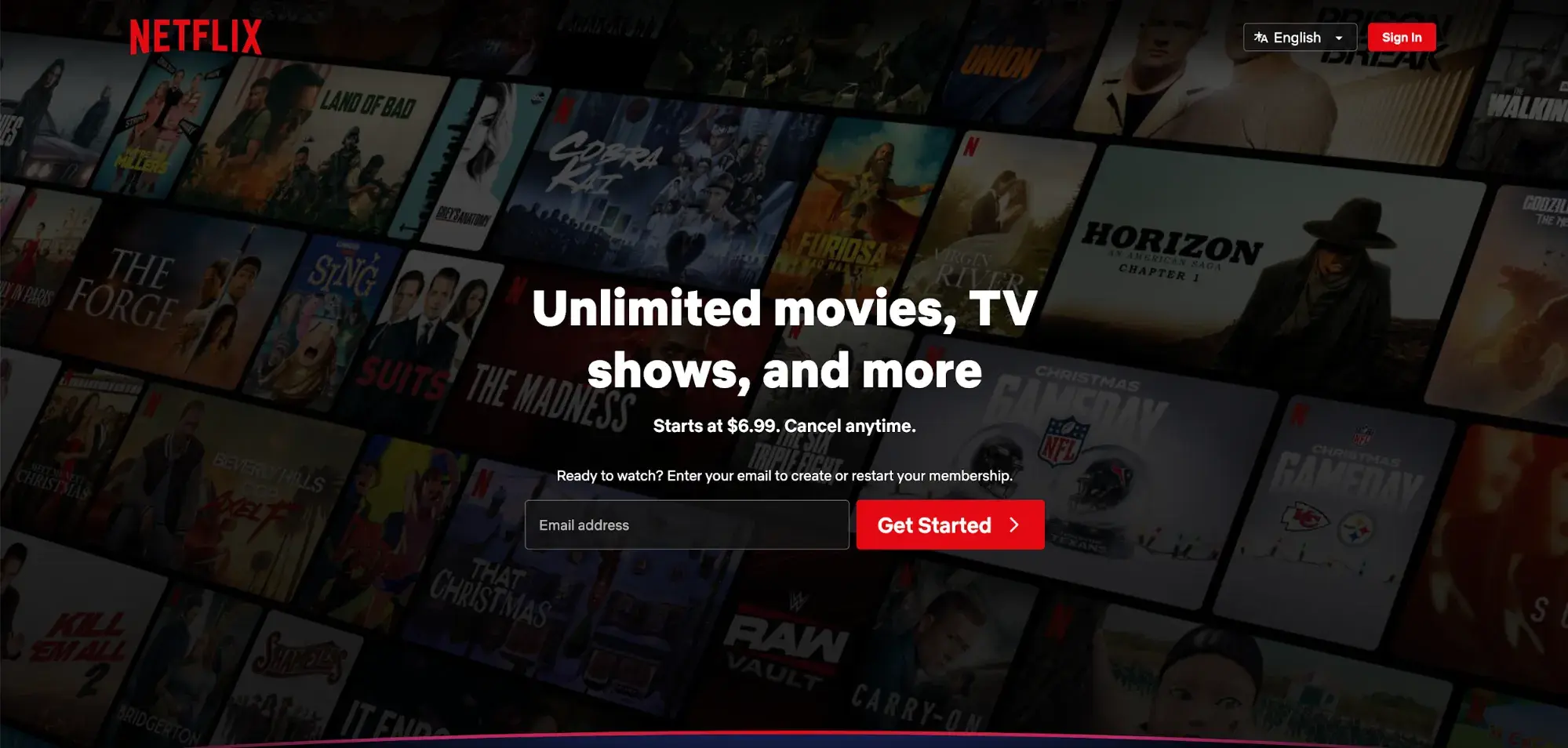
The background, although it has a dark filter to keep you focused on handing over your email address, still gives a peek into the breadth and depth of Netflix’s offerings.
What we like: I admire how direct and to-the-point Netflix is. If you’re on its landing page, there’s a strong chance you’re thinking about subscribing, so all the visual focus above the fold is on the signup box. There aren’t hamburger menus or any visual clutter to distract you from typing in your email address.
4. Eufy: Robot Lawn Mower
Eufy goes bold with a full-bleed photo on the landing page for its robot lawn mower.
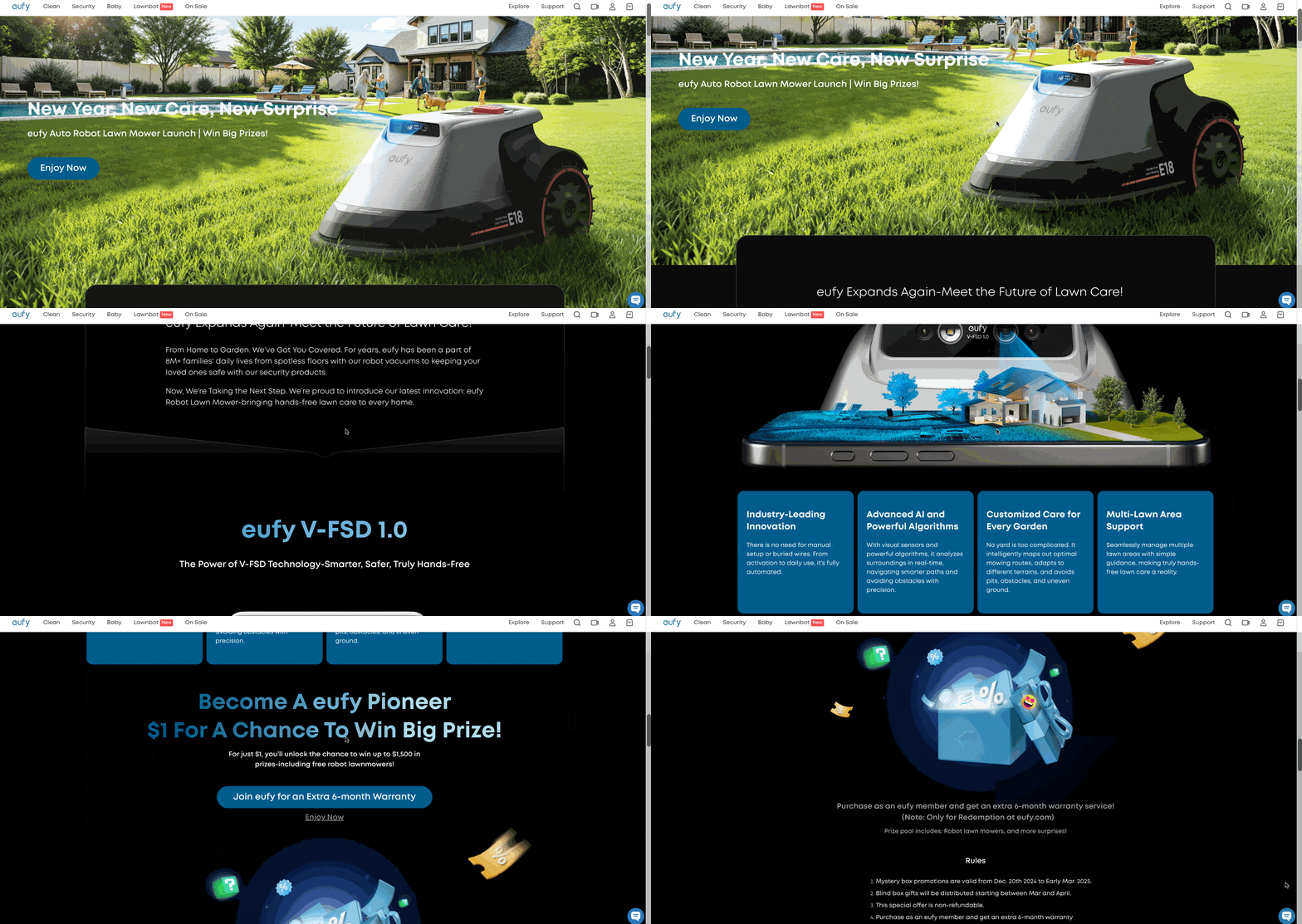
As you scroll down, you’ll get more info and tech specs on the product, but even those are designed with lots of space, so visitors aren’t overwhelmed with a lot of technical information.
What we like: Eufy’s CTA is a little different from what I’d expect for a new product: it says “Enjoy Now.” “Enjoy” conveys a sense of luxury — I can sit back with a margarita and watch my little robo mower do all the work. “Now” conveys a sense of urgency, making me want to click that little blue button.
5. Trello
Atlassian, which makes Trello, has reliably good web design.
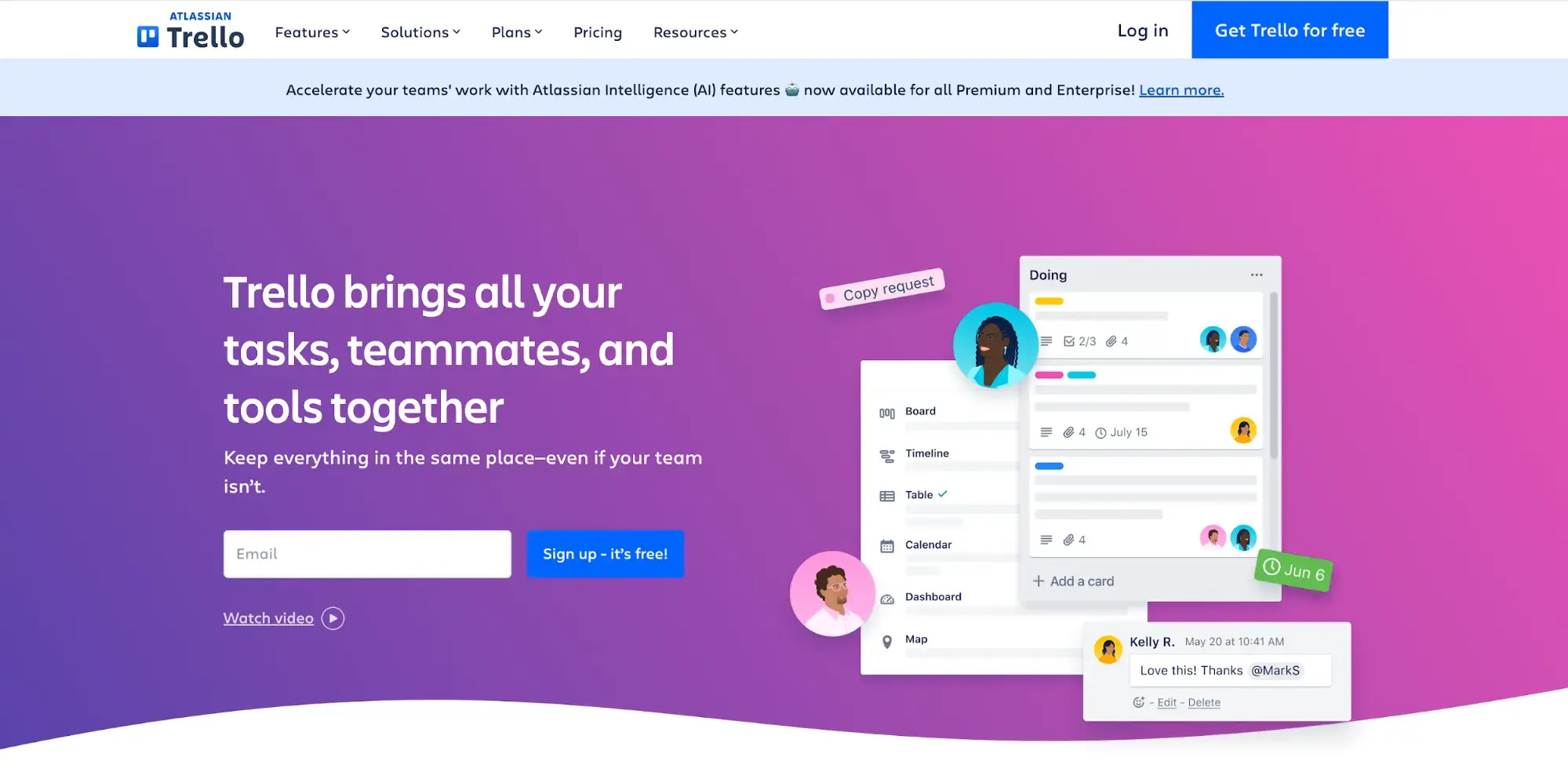
This is another great example of “less is more.” The design relies heavily on the bold, bright gradient background, a descriptive headline, and a few graphics. There’s an option to watch a video, but it’s not embedded, so it doesn’t take up any room.
What we like: I’m a big fan of that background — it’s so eye-catching, and because it’s so vibrant, Trello can use simple graphics that don’t distract from the CTA.
6. Adobe Illustrator
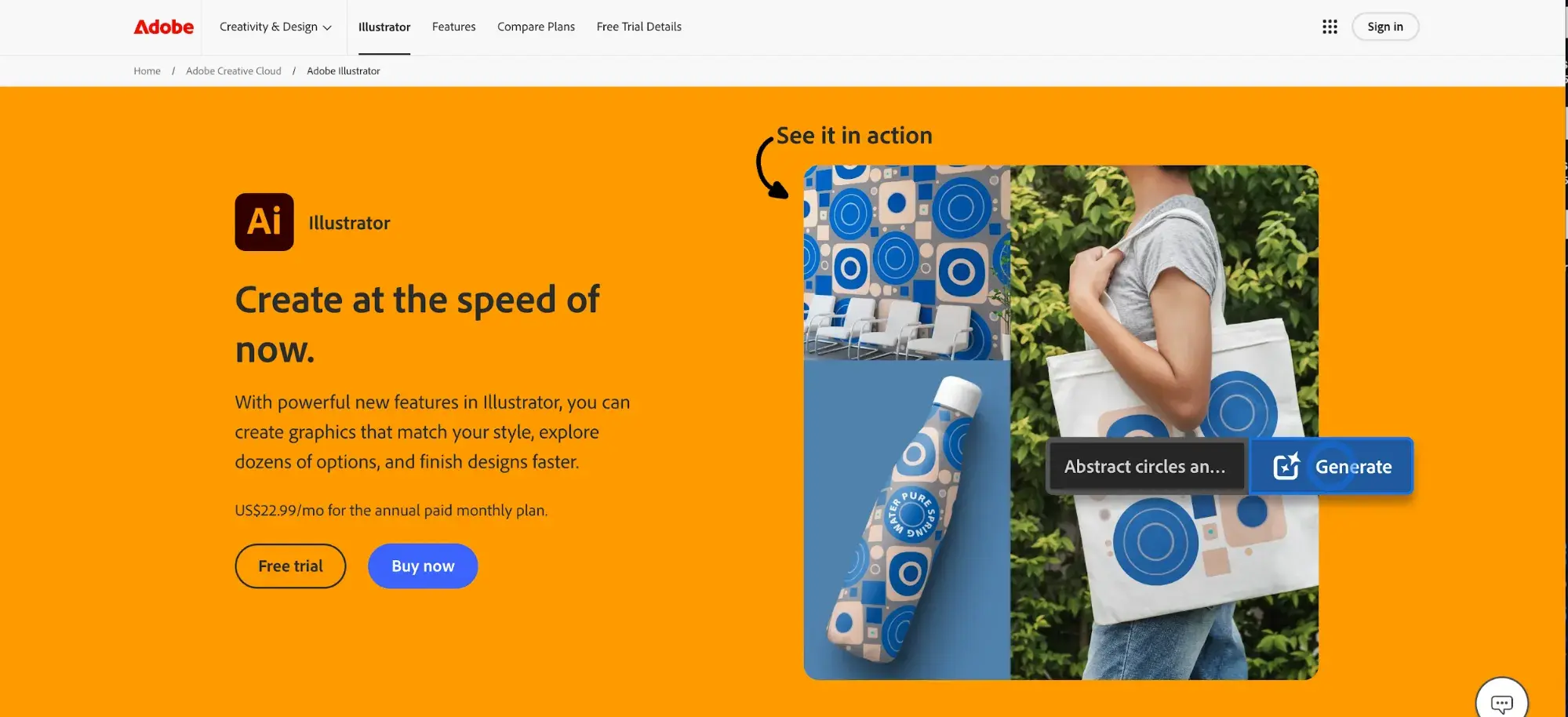
Adobe also uses bold colors, relying on two complementary shades to keep the design from getting overwhelming. That also makes the “Buy now” CTA button really stand out.
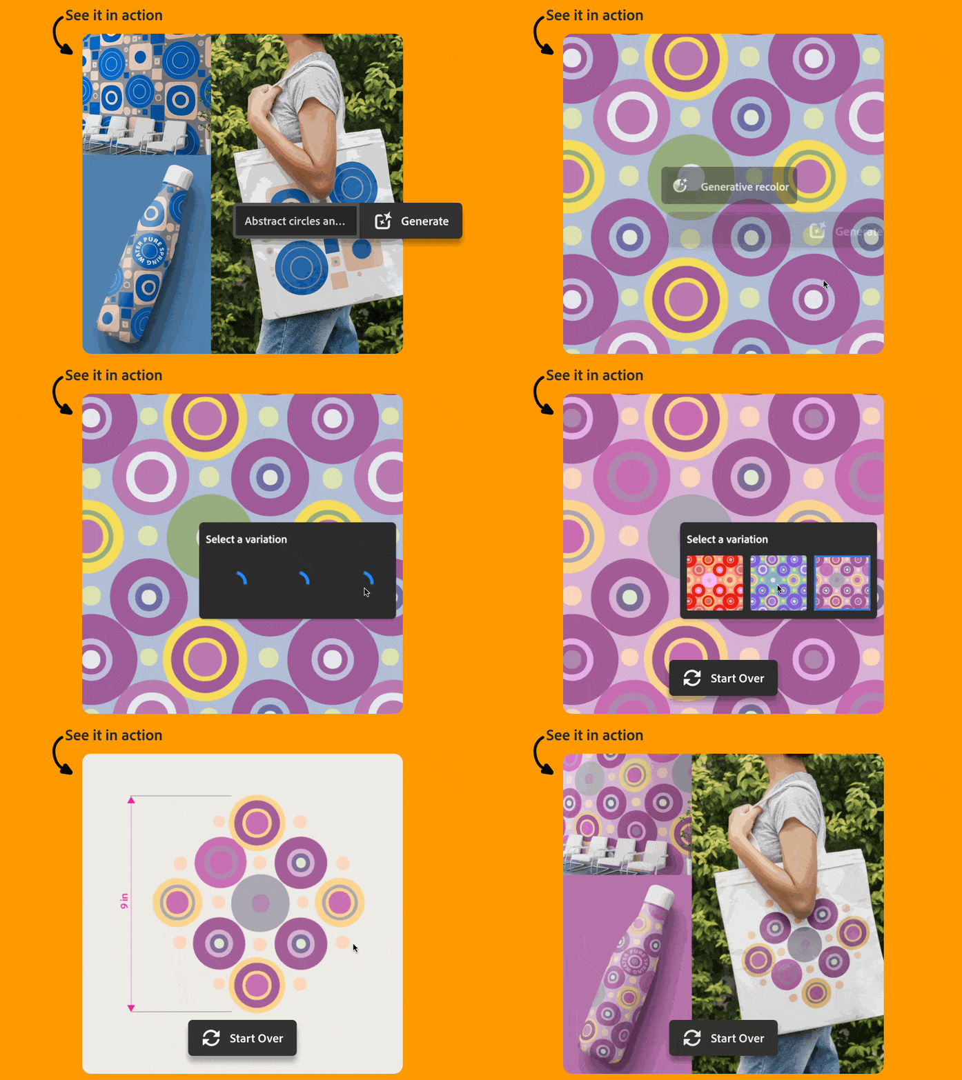
What we like: I love that there’s effectively a product demo the moment you open the page. It gives visitors the opportunity to see what benefits the product can offer them, and they don’t have to click to another page to do it. Here’s what happens when you click on “Generate”:
7. 6Sense AI Email Agents
6Sense has another good example of a “less is more” landing page:
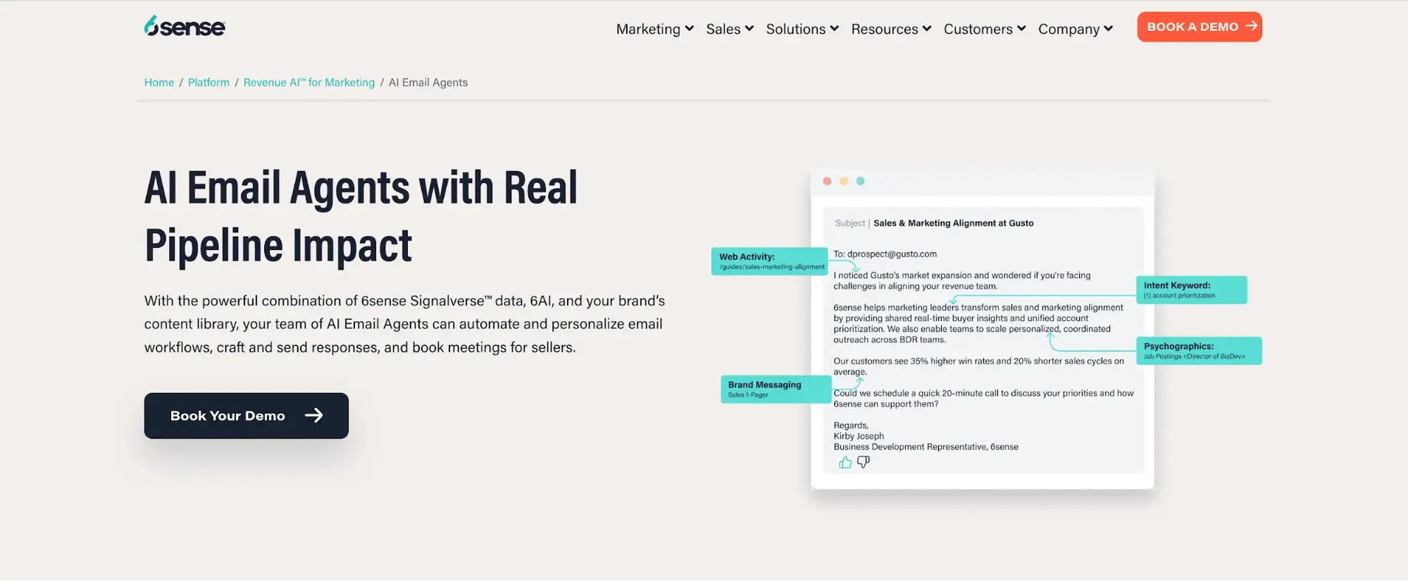
The annotated email is effective in part because it’s so simple — your eyes go straight to the product’s benefits.
What we like: 6Sense really wins with this color scheme, in my opinion. There’s really only two colors: the bright orange on the “Book a Demo” CTA button, and the bright turquoise on the annotated email. Everything else is neutral or black, so your attention immediately goes where 6Sense wants it to.
8. 1871 Innovation Labs
1871, a Chicago nonprofit digital startup incubator (it’s named for the year of the Great Chicago Fire), makes a bold choice on the landing page for its Innovation Labs: autoplay video with sound.
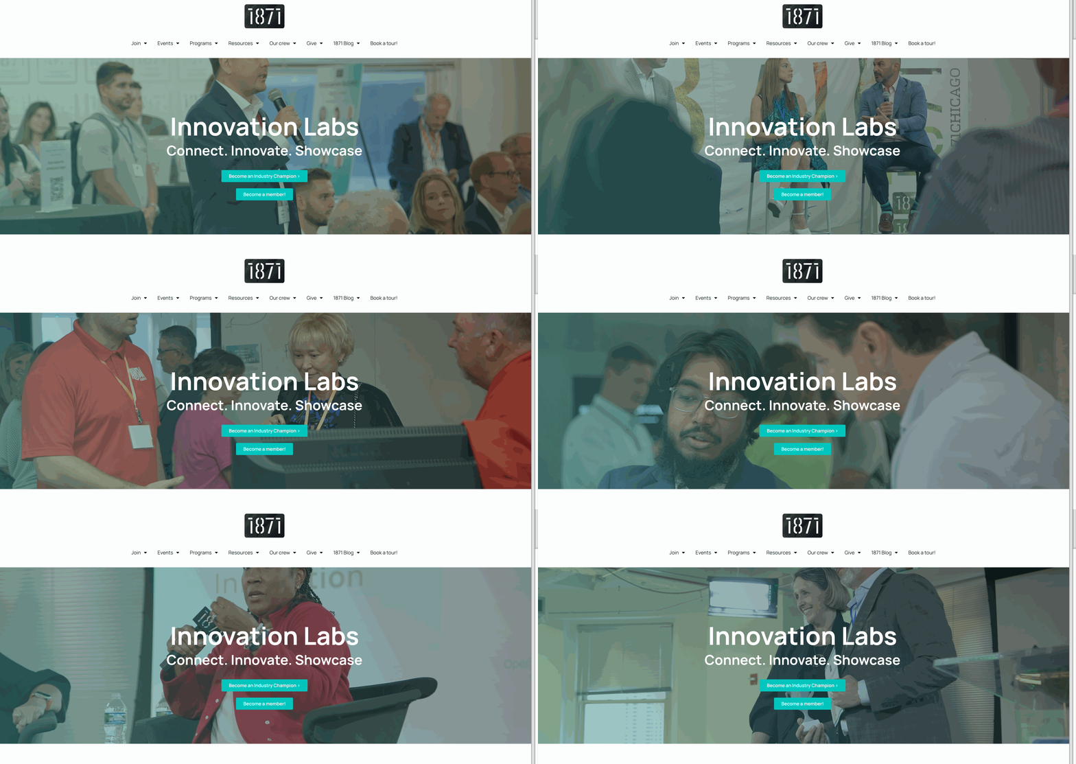
This certainly isn’t for everyone — there’s a real risk of annoying your target user. But 1871 knows what questions its visitors will have, and it uses video and audio to answer them without the user having to click anything.
What we like: Instead of using a slick, highly produced video, 1871 uses footage from its events. The result feels less like you’re watching a commercial and more like you’re in the room with fellow entrepreneurs.
9. Dropbox
Here’s what the landing page looks like for Dropbox’s eponymous product:
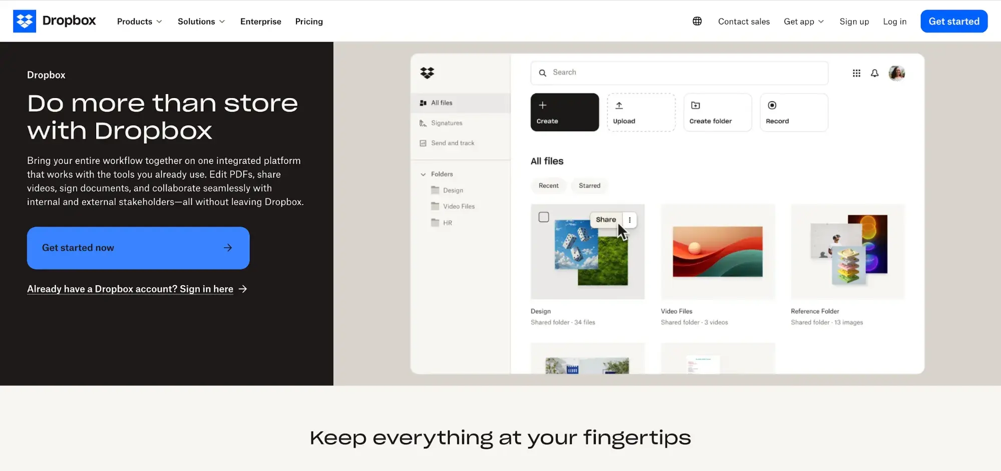
It ticks all the boxes for good landing page design: simple but effective color scheme, bold CTA buttons, a contact button, a descriptive and grabby headline, and a simple visual of its signature product.
What we like: I like that two-thirds of the space on the landing page is dedicated to a product image. It keeps the overall design uncluttered while still giving visitors a lot of information about what Dropbox can do for them.
10. Canva
Canva, like many other SaaS companies, has multiple tiers for subscribers. Here’s the landing page for its free tier:
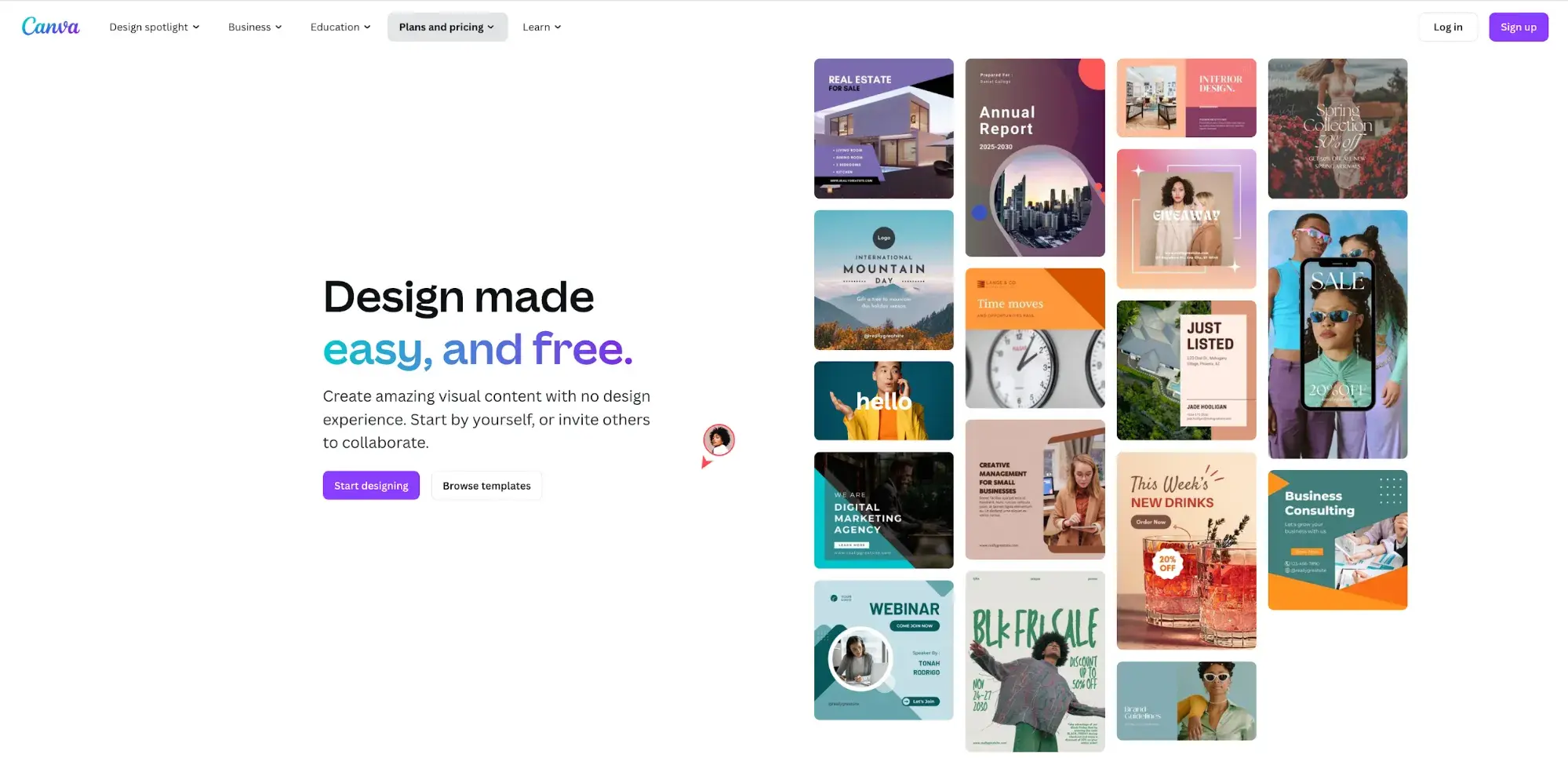
The focus is on “easy and free,” which shows that Canva has put some thought into user intent. And since Canva is a graphic design tool, it uses half the landing page to show off its capabilities.
What we like: By creating separate landing pages for each of its subscription tiers, Canva can zero in on the user intent for each tier. Subscribers know what they’re signing up for, unlike some companies that are less transparent about what’s included at each level.
Begin Designing Your Landing Page
Your landing page is every visitor’s first impression of your website — maybe even their first impression of your business as a whole.
A great landing page has the power to help you generate more leads, close more deals, enhance your website’s user experience, impress visitors, and ensure your site has a professional, on-brand feel.
Work through these landing page design steps and best practices above to ensure your landing page accurately represents your business and makes your leads want to become customers.
Editor's note: This post was originally published in August 2017 and has been updated for comprehensiveness.

.png)
.webp)
![How to create a landing page with high ROI [+ expert and data-backed tips]](https://53.fs1.hubspotusercontent-na1.net/hubfs/53/%5BUse-2.webp)
![Signs it's time to redesign your website [+ 15 steps to follow]](https://53.fs1.hubspotusercontent-na1.net/hubfs/53/phaseswebsiteredesign%20copy.png)


![How to start a blog (the right way) and write posts people actually want to read [+ free templates]](https://53.fs1.hubspotusercontent-na1.net/hubfs/53/how-to-start-a-blog-2.webp)
![What is a lead magnet? 20 lead magnet ideas and examples [+ step-by-step]](https://53.fs1.hubspotusercontent-na1.net/hubfs/53/lead%20magnet%20represented%20by%20a%20magnet.webp)
![15 best AI SEO tools & how I use them [new data]](https://53.fs1.hubspotusercontent-na1.net/hubfs/53/ai-seo-tools-1-20260313-9008245.webp)