A great graphic design portfolio doesn’t do the work for you, but as an ever-running marketing tool, it can change your life by reeling in new opportunities.
AI-generated design as well as online design platforms like Canva are impacting graphic design hiring, making your portfolio more important than ever before.
So whether you‘re a full-time graphic designer or dabbling in graphic design as a freelancer, it’s critical to create a tailored graphic design portfolio to showcase your work to potential clients.
To that end, I've created a list of over 20 impressive graphic design portfolios, instructions on how you can create your own, and tips to curate the perfect space for your unique work.
Table of Contents
- What is a graphic design portfolio?
- Graphic Design Portfolio Website Examples
- Where to Find Inspiration for Your Design Portfolio
- How to Make a Graphic Design Portfolio
- Graphic Design Portfolio Ideas
- Graphic Design Portfolio Tips
What is a Graphic Design Portfolio?
A graphic design portfolio is one of the most important elements a client or employer needs to see when choosing a graphic designer. A portfolio should include a selection of a graphic designer’s best work, as well as professional samples from client projects.
It’s important to note that while there’s definitely still a place for physical portfolios, graphic designer websites can really offer a host of advantages when done well.
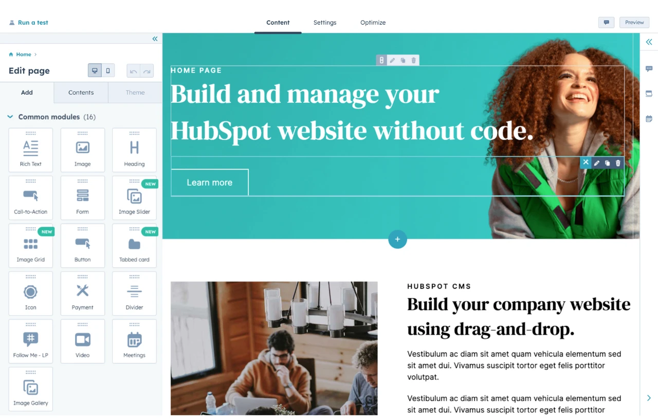
HubSpot's Free Website Builder
Create and customize your own business website with an easy drag-and-drop website builder.
- Build a website without any coding skills.
- Pre-built themes and templates.
- Built-in marketing tools and features.
- And more!
With a decade in the floral design industry, I know from experience how quickly you can share your expertise and create a great impression with an online body of visual work at hand. Mine is simple and has ads on it, but the landing page represents my abilities in pavé design, wedding work, and high style.
Whatever your design industry, a portfolio is essential for proving your skills. It's also a chance to:
- Share your design process.
- Talk about design or industry specialties.
- Showcase your unique style.
- Demonstrate your range of design skills.
A graphic design portfolio, like a resume, will also include contact information. It may also feature case studies from past employers.
Why do graphic designers need a portfolio website?
Most portfolios are graphic designer websites now. Beyond just sharing your work, it’s a 24/7 branding opportunity that works while you sleep or hit the streets with your physical portfolio.
These websites also create ways to connect with clients, help graphic designers build communities, and share their work with potential fans around the world. In many ways, it’s a major advantage to get one set up, and you can start with any site builder from ContentHub to Wix.
What to Include in a Graphic Design Website
So what does a graphic design portfolio website need to include to stand out?
Your portfolio is much more than proving you know how to use Photoshop. Many graphic designers will include logos, typography, print design, or web design in their portfolios, too.
Some of the best graphic design portfolios often also include:
- Motion graphics
- Video
- Original illustrations
- Animation
- Product design
- UX design
- Ad campaigns
- Storyboards
- Brand identity
As you'll see below, the most powerful graphic designer portfolios balance personal vision with standout client samples.
Graphic Design Portfolio Website Examples
- Jessica Walsh
- Morag Myerscough
- Heather Shaw
- Mike Mills
- Mohamed Samir
- Gail Anderson
- Gleb Kuznetsov
- Stefan Sagmeister
- Lotte Niemenen
- Luke Choice (Velvet Spectrum)
- Sophia Yeshi
- Eduardo Nunes
- Stefanie Brüeckler
- Chip Kidd
- Ryan Dean Sprague (Pavlov)
- Kim Dero
- Alex Trochut
- Leandro Assis
- Peter Tarka
- Tobias van Schneider
- Aries Moross
- Ling K
- Nisha K. Sethi
Let’s look at some graphic design portfolio website examples to inspire and motivate your portfolio development. Whether you’re a traditional graphic designer or experimenting with new media, there’s something here for everyone.
1.Jessica Walsh
The design industry is highly competitive. It takes eye-catching imagery and typographic finesse to create a portfolio that draws top clients like Apple, Benefit, and Levis.
This portfolio comes from a designer who's been named one of Ad Age’s “Top 10 Visual Creatives,” among many other accolades. Currently a design professor, creative director, and head of creative agency &Walsh, this designer's portfolio on Behance makes great design the focus.
Why I love this graphic designer's website:
- Walsh’s approach to type is bright, graphic, and complex.
- Lush, colorful photography and illustrations.
- This graphic designer is an expert with negative space.
- Uses careful visual composition to draw the eye and make a statement.
2.Morag Myerscough
Bright graphics, animations, and clean design make this an exceptional graphic design portfolio.
This approach is great for designers who lean into the art of design. It also works for designers who take on more experimental or site-specific projects.
Why I chose this graphic design portfolio:
- Myerscough’s aesthetic is unique and this image-focused site quickly communicates her style. I love that she was able to marry the site’s visual design with her own aesthetic.
- Short sections of copy connect her visual brand to her background, professional experience, and personal philosophy.
- The combination makes the site feel like it shows the whole designer, not just a visualization of the work she does for clients.
3. Heather Shaw
This graphic design portfolio website includes samples of book and website designs, branding, and more. It’s good for designers who work in many different media but want to present a cohesive portfolio.
Why I chose this graphic design portfolio:
- Heather Shaw’s portfolio is super clear and easy to navigate.
- It shows a wide range of skills and approaches to solving client problems, but it’s also visually consistent when the variations could easily have been disjointed.
- The designer also uses text effectively to explain each project and to encourage further engagement with the work.
4.Mike Mills
Mike Mills is a talented designer, artist, and filmmaker, known for his punk aesthetic and original style.
His portfolio is a reflection of his diverse interests and skills. The website offers a quick lesson in clean design, with easy-to-understand headers, professional photography, and crisp layout.
Why this is a great example of a graphic design portfolio website:
- Mills has found a way to include samples of design that span from the 90s to today. This could easily feel disjointed or overwhelming. Instead, it's a beautiful and cohesive portfolio with exceptional attention to detail.
- When you’re a design beginner creating your first graphic design portfolio, you quickly learn the importance of editing. A logo for your first-year graphic design class might have been your best work then. It shows that you know how to use Illustrator or other design software alternatives. But five years later, you have to ask — does that logo belong in a professional portfolio?
- As your body of graphic design work grows, you'll find yourself making tough decisions about what to include, and just as important, what to leave out of your portfolio.
5.Mohamed Samir
Samir’s work includes branding, typography, posters, and print design. So, this graphic design portfolio zeros in on a tight collection of award-winning designs.
This graphic design portfolio is on Behance. This makes it a good fit for graphic designers who want an online presence without designing their own website.
Why I love this graphic designer's website:
- Besides the high quality of the design work, this portfolio shows a diverse range of approaches to typography and style.
- It also shows a consistent vision and passion for visual communication.
- The printed design work is also well-photographed. While the designer could have added a digital file instead, the photographs give you a better sense of the final polished design.
150+ Free Content Creation Templates
Access ebook, blog post, CTA, case study, and more content templates.
- Ebook Templates
- CTA Templates
- Blog Post Templates
- And more!
Download Free
All fields are required.

6.Gail Anderson
Image quality matters. And if your portfolio pieces include a lot of detail, you may get stumped with your online portfolio design.
This graphic design portfolio website has a simple left-hand navigation.
So, with each click, you have a chance to see detailed posters, book covers, and more at a scale that shows how they look for print while also being easy to scroll on a mobile phone.
Why I chose this graphic design portfolio:
- Anderson's work is smart and timeless. Each piece shows her dedication to the depth and value of design thinking, technical skill, and passion for design.
- The side navigation leaves lots of room to enjoy high-resolution images of her highly detailed works.
7.Gleb Kuznetsov
Kuznetsov’s portfolio combines product design, user experience, and graphic design to create something entirely new.
This Dribble-hosted portfolio has over 50 images, which could be overwhelming. But they're split into seven easy-to-understand projects.
This makes it a great graphic design portfolio example for designers who want to show long-term or complex projects.
Why this is a great example of a graphic design portfolio website:
- From the images to his brief “About” statement, this designer makes his unique vision and personality part of the work and its presentation.
8.Stefan Sagmeister
Sagmeister is a legend in the design world, and his website reflects the curiosity and power of the designer.
The home page features a grid of images with text that appears as you scroll over each image. With a click, you're presented with images and/or videos that show the details of each project.
The site is a mix of collaborations, art projects, and more traditional design, like the corporate identity for the Jewish museum.
Why this is one of the best graphic design portfolio websites I’ve ever seen:
- This portfolio site doesn't just show the quality and technical ability of the designer. It also gives any client working with Sagmeister a sense of what the design process might be like.
- The “answers” section of the site is full of useful advice for no matter where you are in your designer journey.
9. Lotte Niemenen
Great designers often let the work do the talking. That's certainly true here, with a streamlined graphic design portfolio that calls attention to client deliverables.
When text is present, it adds to the value of the work, like sharing what parts of the design process their team completed. This is a great portfolio format for designers doing graphic design work like:
- Logo design
- Branding
- Packaging
- Product design
Why I chose this graphic design portfolio:
- This group of work is simple and to the point. It also shows off a wide range of skills and tactics with a consistent vision.
- Be sure to take a closer look at the website navigation — it’s clean and exciting while adding to the functionality of the site.
10.Luke Choice (Velvet Spectrum)
3D animation is an exciting design form that‘s growing in popularity. But if you’re a client who's not in the market for an animated billboard, it may be difficult to figure out how you might use this creative form for your business.
This site is a great example of a portfolio that educates with simple text, graphics, and video. It gives both a quick look and a deep dive into how this designer approaches his art form.
Why I chose this graphic design portfolio:
- If you‘re doing something interesting and new, it may be a selling point. Truly new ideas can also challenge or frustrate people who don’t feel “in the know.” This means that your portfolio can‘t just sell your designs. It also needs to teach viewers about the new format you’re using and why you think it's important.
11.Sophia Yeshi
A clear header and tile design emphasize work samples from this powerful graphic designer. Major brands, including Google, Nike, and Comcast, use Yeshi’s unique illustrative voice to speak for their brands.
While the tiles emphasize the designer’s unique style, you can click on each tile to get the full details about each project. This is a great approach for designers who want to share the deeper story behind each project while still making the site easy to navigate.
Why I love this graphic designer's website:
- A distinct style is important in graphic design. That said, it can be tough to show how many ways you can apply that distinct style in a business context.
- This website portfolio makes that point clear, while still making graphic design the focus.
12.Eduardo Nunes
Designers often have a muse — someone or something that inspires and motivates them when the designing gets tough.
Sometimes that inspiration can serve as a starting point for your portfolio design, as it did for this design portfolio example.
The landing page starts with a quote from Ansel Adams, “There is nothing worse than a sharp image of a fuzzy concept.”
Then, using clean motion graphics and fresh design, Nunes points to a central theme, a philosophy that guides his design approach. This leads every site visitor on a journey through his portfolio.
Why I chose this graphic design portfolio:
- This portfolio shows intense work, focus, practice, and care.
- It‘s an excellent model for anyone who wants to show the world what they’re creating and why.

150+ Free Content Creation Templates
Access ebook, blog post, CTA, case study, and more content templates.
- Ebook Templates
- CTA Templates
- Blog Post Templates
- And more!
Download Free
All fields are required.

13.Stefanie Brüeckler
This portfolio includes packaging design, illustration, and web design as well as graphic design and branding work. It’s one of my favorite graphic designer websites because it’s clean and easy to navigate.
This makes it a great example for designers who aren’t sure how to organize all the work they want to include in their portfolio.
Why I love this graphic designer website example:
- Brückler’s graphic design portfolio focuses on the tiniest of details to create an excellent user experience.
- From the simple page-loading animation to the thoughtful use of motion graphics, this designer hones in on the stunning details.
- It also shows a lot of different examples of work at a glance.
14.Chip Kidd
Book cover designer Chip Kidd’s graphic design portfolio website uses lightbox-style pop-ups. Popups make it easier to focus on each book cover.
This is a smart way to narrow in on the visuals with a graphic design site while still making it easy to see all the work in one place.
Kidd uses a range of different styles for book covers, and it’s edited in a way that makes this range look natural and exciting instead of chaotic.
Why this is a great example of a graphic design portfolio website:
- The dark background makes this graphic designer’s style pop.
- The simple side navigation gives users a quick path to learn more about the designer and his work.
15.Ryan Dean Sprague (Pavlov)
This Texas designer‘s style is heavily influenced by music, so his portfolio features illustration and design work that’s bright, evocative, and fun.
This portfolio website shines because it keeps the UX and site structure super simple. This puts the focus on a tight curation of exciting design samples.
Why this is a great example of a graphic design portfolio website:
- This graphic design portfolio is a vivid display of individuality that also shows clients how this designer can help them sell their product or brand.
- If you have a distinct illustration or design style, how “good” your work is may be the tough sell for your portfolio. Instead, you may need to focus on showing the client how you can do your best work for their needs.
16. Kim Dero
Hands down, I think Kim Dero does a stellar job of making his website portfolio look yummy. It’s such a smart choice because it’s the perfect backdrop for his focus on food and beverage design.
Try the contact page — even the satellite dishes look juicy.
Why I love this graphic designer website example:
- Kim Dero takes full advantage of his international flair, leaning into a citrus and foliage aesthetic that carries through to teas, alcohols, and sugars on his Work page.
- He makes sure to highlight the smaller design details, such as the various mandalas, that could be looked over in larger product images so you can see them more closely.
17.Alex Trochut
This graphic design portfolio is also a home for Trochut’s product design, animations, music, and NFTs.
It’s a great example for multimedia artists who want to present their work on a single website. It also works for creators with a big collection of work to show.
Why I love this graphic designer website example:
- The four-column layout of this site shows image thumbnails of varying sizes. Each column moves at a different pace as you scroll down the page.
- This motion feels dynamic and exciting and reinforces this designer’s original takes on color, type, and layouts.
18.Leandro Assis
Sometimes a graphic design portfolio isn‘t just about a style — it’s about a vibe. This exceptional portfolio comes from designer Leandro Assis.
From brand identity to hand lettering to package design, this portfolio displays a wide range of design skills and original style.
Why this is a great example of a graphic design portfolio website:
- This portfolio is enticing to the eyes. It's fun, bright, and a little wild.
- What makes this portfolio excellent isn‘t just the quality of the work, it’s the experience. Fun icons, engaging UX, and lots of white space make this bold and playful site a pleasure to peruse.
19.Peter Tarka
If you're a self-taught graphic designer, you might have less guidance on where to start with your portfolio website. Look no further for inspiration than the interactive design portfolio for Peter Tarka.
Best known for captivating 3D motion graphics like the ones featured in the video below, Tarka started with a love of architecture and vector graphics that's grown to a career working with top brands like Spotify, Google, and LG.
Why I love this designer's website:
- The fewer clicks it takes to show people what you‘re doing the better. This site isn’t just low-click, it's no-click.
- A simple scroll shows you the work, client, and completion date for 15 exceptional portfolio pieces.
- If you want to see more, a quick click at the top-right brings you to more work samples, links to other portfolio sites, and contact information.

150+ Free Content Creation Templates
Access ebook, blog post, CTA, case study, and more content templates.
- Ebook Templates
- CTA Templates
- Blog Post Templates
- And more!
Download Free
All fields are required.

20.Tobias van Schneider
This graphic design portfolio website uses a range of type sizes and contrasts to emphasize the ideas it communicates. This is a great approach for entrepreneurial designers. It's also smart for anyone who collaborates in their design work.
Why I love this graphic designer's website:
- A sticky header and big blocks of color and text make this graphic designer website interesting to explore.
- This site also uses scale well. It combines big images with both big and small text to emphasize each client project.
21. Aries Moross
There are many ways to play up a unique style, and this graphic design website highlights this designer’s recent work as well as a full project archive. This is a great example for designers who also do illustration.
Why I chose this graphic design portfolio:
- Moross uses space effectively on this site.
- It’s easy to get an immediate sense of the designer’s distinct style.
- The simple navigation helps users refine their search to target a specific type of work, like hand-drawn fonts or editorial design.
22.LingK
LingK's portfolio features their latest project while also showing other industry niches. The structure of the website helps prospective clients quickly decide if they want to work with this designer.
Why this is a great example of a graphic design portfolio website:
- It can be tough to convey how campaign materials for a complex event, like a wedding or conference, work together.
- This designer effectively shows the breadth and depth of work for each project and makes it easy to see the value of each deliverable.
23.Nisha K. Sethi
Sethi’s portfolio is simple and straightforward. It puts the spotlight on each design project. The “About” section also tells a clear story that encourages further questions and conversation.
It can be tempting to tell an audience everything on your website. But a great portfolio should offer enough samples to entice clients to reach out and learn more. You don’t want to add so much that it overwhelms. This website is a great example of offering just enough.
Why I love this graphic designer website example:
- This graphic design example combines hand-lettering, printmaking, and other media with digital design.
- While this designer works in a range of media, their portfolio shows a strong voice that is effective across many channels.
Where to Find Inspiration for Your Design Portfolio
Looking for more design portfolio inspo? Grab the Hubspot Design Lookbook (it’s a free download) for over 70 examples of incredible websites, landing pages, and blogs.
Then, explore this list of successful designers and design studios. They are all great design resources for your personal portfolio website. You may find a perfect model to emulate or smaller aspects you’d love to incorporate.
Paula Scher
Paula Scher is one of the heavy hitters in graphic design, having shaped brandwork for Microsoft, Adobe, Tiffany & Co., Citibank, and the list goes on and on.
Her work is smart while still being accessible, and she likes to inhabit the space between fine art and pop culture. Her ability to make work that is both recognizable and bold have won her hundreds of awards in the industry.
Michael Bierut
Michael Bierut lives on the academic side of great design and is currently a senior critic for graphic design at the Yale School of Art.
He has worked for such legendary brands as Mastercard, Saks 5th Avenue, The New York Times, and Princeton University. He served as the President of the American Institute of Graphic Arts (AIGA) from 1988 to 1990, and later won the AIGA Medal itself in 2006.
Chermayeff & Geismar & Haviv
Chermayeff & Geismar & Haviv specialize in trademark and identity, focused on idea-driven design since 1957.
They’ve created some of the best known trademarks around the world, such as the Animal Planet elephant above, the NBC peacock, The Warner Brothers shield, and National Geographic’s yellow rectangle.
Wolff Olins
Wolff Olins is a global brand consultancy that has snagged the attention of a number of contemporary brands and delivered world-class branding.
Their clients include the growing social media giant TikTok as well as Uber, Instacart, and The Met. They are passionate about doing the best work of their lives, driving impact, and making a positive change in the world with their clients.
Milton Glaser
Milton Glaser is the powerhouse mind behind the typeface of New York Magazine and the perennial I (Heart) NY campaign. Milton Glaser Inc. more recently contributed key artwork for the final season of Mad Men.
Since the 1970s, Glaser and his visionary crew have designed and illustrated over 300 posters for clients ranging from publishing to commercial products to civil enterprise.
David Carson
David Carson is known for taking the rules and scattering them to the winds in pursuit of great design from the standpoint of, “Why not?”
In 2014 he was awarded the AIGA gold medal, and has an innovative approach of using typography as the art itself instead of just as writing.
He pulls inspiration from urban art forms such as graffiti and rap, and has worked with a seemingly endless array of clients from American Airlines to MTV and Prince to Xerox.
How to Make a Graphic Design Portfolio
- Curate your best work and show a wide breadth of skill.
- Choose the right platform to showcase your work.
- Include a professional case study or client recommendations.
- Integrate your personality.
- Describe the creative process.
- Show non-client work or side projects.
1. Curate your best work and show a wide breadth of skill.
Lindsay Burke, a HubSpot poduct designer, emphasizes the importance of quality over quantity when it comes to curating a graphic design portfolio.
She says, “I recommend selecting your strongest projects and making these the primary focus of your portfolio website.”
Ideally, your portfolio will feature your sharpest, most impressive 10-20 designs — undoubtedly, someone pursuing your portfolio won‘t have the time to look at more, and if your first couple of projects are impressive enough, they shouldn’t need to.
But it‘s equally critical you show potential clients your versatility. If you’ve dabbled in logo design as well as video animation, it's good to include both kinds of projects in your portfolio.
2. Choose the right platform to showcase your work.
Investing in a quality website with a custom domain URL will pay off in the long run by demonstrating your professionalism to potential clients.
Having your own website helps you organize your portfolio to suit all your business needs — for instance, perhaps you'll include Projects, About Me, and Contact sections so visitors can peruse your content and then contact you without ever leaving the site.
Take a look at this list of the best website builders if you need help choosing a platform for your portfolio.

HubSpot's Free Website Builder
Create and customize your own business website with an easy drag-and-drop website builder.
- Build a website without any coding skills.
- Pre-built themes and templates.
- Built-in marketing tools and features.
- And more!
3. Include a professional case study or client recommendations.
Lindsay Burke told me it's incredibly valuable to write out a case study to complement any website visuals.
She says, “Through a written case study, your site visitors can get a sense of your project's background, the problem you were aiming to solve through design, and the process you took to arrive at a final deliverable.”
To cultivate a strong case study, consider including the background of the project, the problem, the process, your deliverable, and any next steps.
In the process section of your case study, Burke suggests including research, experience mapping, persona development, wire-framing, sketching, usability testing, and iteration.
Plus it will impress future clients if you can include recommendations from prior employers, which allows you to display a level of professionalism.
4. Integrate your personality.
As you can see in the examples in the above section, each portfolio is drastically different depending on the artist‘s unique style.
Someone checking out Tobias van Schneider’s portfolio will expect something vastly different from someone looking at LingK's site.
Make sure your portfolio — including layout, background, and website title — reflects who you are as a designer.
5. Describe the creative process.
Each designer has a unique process when working with clients — and the sooner a potential client can learn about your process, the better.
It's important you include context, so visitors can get a sense of how you handle challenges, and how your designs solve real-world problems.
Plus, including a description of your creative process can help a potential client figure out whether you're capable of handling the scope of their project.
For instance, they might be unsure of your ability to handle graphic designs for mobile until they read how you single-handedly brainstormed and created the designs for another client's mobile site. In this case, context is critical.

150+ Free Content Creation Templates
Access ebook, blog post, CTA, case study, and more content templates.
- Ebook Templates
- CTA Templates
- Blog Post Templates
- And more!
Download Free
All fields are required.

6. Show non-client work or side projects.
Amanda Chong, a former HubSpot designer, says, “Side projects are a great way to demonstrate your will to take initiative and your ability to balance multiple things at once. They're also a great way to show some of the more experimental, creative ideas that you might not be able to show through your day-to-day work.”
If you‘re just starting out, it’s acceptable to include side projects or non-client work so potential customers can get a sense of your ability and style.
Consider incorporating school work, a logo you designed for your aunt's company, or an internal design you created for your current company — ideally, your designs will negate any concerns potential clients have over your lack of career experience.
Graphic Design Portfolio Ideas
- Help a local business or startup with its design and brand.
- Create content for your own personal brand.
- Redesign an existing website.
- Create graphic design materials for a made-up company.
- Design a logo for a brand you love.
- Create a stock theme for WordPress.
- Take part in a design challenge.
1. Help a local business or startup with its design and brand.
One of the easiest ways to begin building your client base is by contacting nonprofits or local businesses in your area.
Perhaps you think a local restaurant needs a new menu logo, or you want to help a gift shop with their online marketing materials.
Projects like these will help you better understand local marketing challenges and give you time to develop your skills in those areas. You never know what a pro-bono project could lead to next.
2. Create content for your own personal brand.
As you build personal brand content, take the time to make sure your marketing materials are cohesive and sleek.
Design a unique logo for your brand. Next, start building your website, and add that same design across various materials, including your business card and resume.
This is also a great time to start a branded social media account, and to create posts that show off your design skills and interests.
Clients are more likely to work with you if they can see the type of high-quality work you're able to create for yourself.
3. Redesign an existing website.
Don’t wait for your dream client to give you a call. Instead, create a complete website redesign for a well-known brand to prove your skills to future clients.
This is a well-known strategy already used by plenty of designers — just take a look at some of the impressive Behance mock-ups for brands like RyanAir.
When I spoke to Amanda Chong about this tactic, she told me, "If you‘re creating mockups for established brands to use as part of your portfolio, it’s important to pair this with a case study or description of the process that helped you arrive at your proposed design.
Chong added, “Mockups are great at showing your visual design skills, but don't necessarily demonstrate your ability to work in a real-world context, so you'll want to take the time to explain how you would have approached it in a true business setting.”
4. Create graphic design materials for a made-up company.
If your designs are impressive enough, potential clients won't care that you created them for a fictitious company. In fact, you could impress them with your innovation and creativity.
Consider showing your skills by putting together a creative brief for a fake company, complete with wireframes and sketches. Other projects you can create for imaginary companies include:
- Branding
- Style guides
- Posters
- Billboards
- Social media ads
- Apparel graphics
- Wrapping paper
- Brochures and email newsletters
- Simple GIFs
- Animated infographics
- Trade show booths
- Branded wall art
- Pitch decks
- Book covers
- Packaging
In due time, real companies will take notice.
5. Design a logo for a brand you love.
Stick to the type of content you enjoy designing. If you're particularly adept at making logos, and are often inspired by the logos used by real brands, consider designing an alternative logo for a brand you like.
For example, take a look at these inspiring reimagined NFL logos. While these NFL teams probably won’t make the shift, they‘re great examples of the designers’ skills and creativity.
6. Create a stock theme for WordPress.
WordPress, a popular content management system, allows users to develop stock themes. Best of all, if your theme is approved, you can sell it as a premium theme for extra cash.
Begin by studying WordPress's most popular themes, and consider how you can create an impressive alternative. Take a look at WordPress's Theme Review Requirements and this overview of how to create a child theme to learn more.

150+ Free Content Creation Templates
Access ebook, blog post, CTA, case study, and more content templates.
- Ebook Templates
- CTA Templates
- Blog Post Templates
- And more!
Download Free
All fields are required.

7. Take part in a design challenge.
To get inspired, practice your skills, or interact with other designers in a community and build your portfolio at the same time, think about participating in a design challenge.
Design challenges can also help you uncover skills you didn't know you had by forcing you to step outside your design comfort zone.
There are various daily, weekly, or monthly challenges that will send you prompts on things to design — for instance, try checking out the Daily UI Design Challenge or The Daily Logo Challenge.
Graphic Design Portfolio Tips
- Make it clean and easy to navigate.
- Display your unique personality.
- Show your versatility.
- Display your best work.
- Include case studies.
- Prominently display contact information.
You’ve done the work, and now you’re pulling together your graphic design portfolio. Try these tips to make your graphic design portfolio stand out.
1. Make it clean and easy to navigate.
Design is about more than visual skills: it’s about communicating. So, the format of your portfolio — whether it’s printed or online — should be clear and simple to scan.
This point is especially important for graphic designer websites. It can be tempting to build a website that shows off the latest trends or to add Easter eggs that people need to hunt for.
There’s a fine line between art and design, and those approaches can be super inspiring. But building a complex site can also mean that clients in a hurry could miss some of your best work.
For example, a graphic designer once sent his portfolio to a creative director friend of mine. Although the director liked the designer's drawings, they couldn't find the graphic design or web work mentioned in the resume.
With a little digging, they found a URL in one of the sketchbook drawings that led to the designer's website.
This hide-and-seek process made it clear that the website was not easy to navigate, potentially causing the designer to miss out on an opportunity.
The same idea applies to the website’s design itself. Don’t go overboard to make your website unique — that may only confuse potential clients.
Stick to web design conventions. These are standardized design practices that users are accustomed to and expect to see when visiting new websites.
Some examples include the usual horizontal navigation bar at the top portion of the screen, or having your logo on the top-left corner — which also doubles as a back button.
Hiding all your navigation menu items behind a hamburger icon on desktops, for instance, will throw users off and likely make them miss important details about your work. At the same time, too many menu items packed in mobile viewports will make your site a pain to navigate.
In other words, your website must be easy to use for both mobile and desktop visitors. Site builders like HubSpot’s Content Hub help you with just that — you can edit and preview your site's mobile and desktop versions to make sure your layouts are as user-friendly as possible before launch.
2. Display your unique personality.
Following web design conventions doesn’t mean you have to create a generic website, though. There are thousands of successful graphic designers out there, and you might be competing against some of them for your next client.
There are loads of other ways to make your portfolio really stand out. So, the best tip for a great one is to be yourself.
Whether you have a feel for typography, are talented with color, or have a way with words, show off the way that you see the world in your graphic design portfolio.
Think about every detail, and then execute to the best of your ability. Whether it’s the first version of your portfolio or the 200th, make it feel like something only you could create.
Just remember: find the sweet spot between function and aesthetics.
3. Show your versatility.
A portfolio should show a range of different works, so you want to highlight what you can do. Some clients prefer a more streamlined look, while others are looking for more experimentation.
If you have clients from different industries, include some work from each industry. Then, edit your portfolio based on the kind of client you’re showing your portfolio to.
For example, if you’re meeting with a client in real estate, show work samples from similar industries.
You’ll also want to show anyone who sees your portfolio what you can do. So, if you create design logos, books, and motion graphics, include a little bit of everything in your portfolio.
4. Display your best work.
That said, try to limit your portfolio to your best work. Don’t include a piece in your portfolio just to show that you can do it.
The way that you edit your portfolio shows that you understand your strengths and know how to play them up. So, edit your portfolio to include only your best work.
If you’re great with one skill set but not as good with another, edit your portfolio to spotlight that skill. If possible, create portfolio pieces that show many skill sets at the same time.
For example, if you love hand lettering, a poster could emphasize your graphic design skills alongside this unique ability.
5. Include case studies.
I can’t say it enough: include case studies. They tell the illuminating story of how you get your clients to their goals: their ideas, your ideas, your suggestions and why, the compromises that worked, and how you completed the work.
Every client is unique and will teach you something new, so as you continue to work with different clients, build up a collection of these stories.
In other words, they lay out in plain view what goes on in your big, beautiful brain to future clients.
Learn from my mistakes, and try not to throw anything away without documenting it. That page of thumbnails might not be much to look at on its own, but this kind of work in progress is a great way to show prospective clients how you solve problems.
When you present case studies in your portfolio, start with the initial problem your client approached you with. Next, show what the conversation and ideation process looked like over time.
As you pull your case study together, don't forget to include the solution you delivered.
6. Prominently display contact information.
If someone wants to talk to you, there are many places they can find you online.
But you want to make it easy for them. You don’t want to miss an important meeting because a client reached out to you with an email you don’t check anymore.
Most graphic designer websites have a contact page that has your contact information. Once you add this to your site, be sure to check that the links and forms are working.
The Best Graphic Design Portfolios are Never Finished
You’ve learned about the value of a graphic design portfolio and checked out some of the best portfolio examples.
You read about how to create your portfolio, then you scanned some smart ideas to build on the graphic design work you’ve already completed.
So what’s next?
Even the best graphic design portfolios need constant updates. Keep in mind that while your first graphic design portfolio may be complete, portfolio building won’t ever really end.
What do you want to tackle for your next project? Social media to promote your new portfolio? A new resume or professional bio to attract clients? The possibilities are endless.
Editor's note: This post was originally published in March 2019 and has been updated for comprehensiveness.
Discover our most popular offers.
-

HubSpot's Free Website Builder
-

Social Media Content Calendar
-

Marketing Plan Template


![Download Now: 150+ Content Creation Templates [Free Kit]](https://no-cache.hubspot.com/cta/default/53/5478fa12-4cc3-4140-ba96-bc103eeb873e.png)



![28 Graphic Design Terms Every Marketer Should Know [Infographic]](http://53.fs1.hubspotusercontent-na1.net/hubfs/53/graphic-design-terms.jpeg)