I really don’t want you to make the same logo design mistakes as past Rachael. They cost me time, money, and, perhaps worst of all, precious brainpower. That’s why I’m sharing logo design best practices, helpful tools, and a step-by-step guide to creating the perfect logo.
You’re about to learn how to design a logo that is instantly recognizable, memorable, and closely connected to your brand’s core values and ideas. Let’s go!
Table of Contents
What is a logo?
A logo is a visual symbol or mark that represents a company or organization, often used to identify and distinguish a brand from competitors. It typically consists of unique colors, shapes, and typography that convey the company’s identity and values.
150+ Free Content Creation Templates
Access ebook, blog post, CTA, case study, and more content templates.
- Ebook Templates
- CTA Templates
- Blog Post Templates
- And more!
Download Free
All fields are required.
How to Design a Logo
- Understand your brand.
- Brainstorm words that describe your brand.
- Create some sketches.
- Choose a sketch and refine it.
- Develop your logo’s layout on a free design platform.
- Choose your colors.
- Choose a font.
- Ensure scalability and versatility.
- Get feedback.
Designing a logo that embodies your brand can help you better attract your target audience — if you get it right, that is. That’s why I want to walk you through what to consider when designing your logo, step-by-step.

1. Understand your brand.
Before designing your logo, you must understand your brand. It may be tempting to rush to the finish line so you can start advertising your offering (I’ve been there, friend!), but I assure you, if you hired a design pro, they wouldn’t let you skip this part, and for good reason.
I’ve seen many businesses fall at this first hurdle, especially when taking a DIY approach to logo creation. They’ve jumped to opening Canva. They’ve even started sketching. But the end result has literally no relevance to their brand’s story or the specific values and emotions they want their logo to embody. It’s no surprise, then, that it doesn’t attract their target audience.
The real kicker? I’ve seen these same businesses having to spend more time, resources, and money down the line to actually factor their brand into the design. Now, don’t get me wrong, it’s totally okay to adapt your logo as your brand evolves. This is often a natural part of business growth. Still, this can be avoided, for the most part, at least, with a bit of forethought.
For this step, I suggest exploring your target audience, your buyer personas, and, most importantly, how you want people to feel about your brand when they see your logo. Or as my marketing BFF and head of marketing operations at Goose‘n’Moose, Hristina Stefanova, suggests, consider “Lovemarks thinking” from the very start.

In Hristina’s words, multinational advertising juggernaut, Saatchi and Saatchi, developed Lovemarks thinking, as a way to “make people love your brand.” And you can do this by attaching “positive emotions to a product, so people would love to be associated with it.” She closes, “Building a brand? Focus on position. Building a lovemark? Focus on emotions.”
“It’s through mistakes that you actually can grow. You have to get bad in order to get good,” shares graphic design icon Paula Scher, hitting the nail on the head.
Distilling your brand story into a logo will be a challenge, and you should expect mistakes along the way. As I said above, adapting your logo can be a natural part of your brand growing and evolving. So don’t be afraid to experiment and explore when conceiving a logo that matches your brand. BUT, don’t skip frontloading thought and care into the design at the very start. Doing this will give your brand a solid foundation to grow naturally, as your business grows.
2. Brainstorm words that describe your brand.
Now that you understand your brand on a deeper level, I suggest using tools like Thesaurus.com to discover synonyms and other words that describe your brand’s central theme. I recommend selecting around 5 to 10 words that describe your brand’s ethos and how you want your target audience to feel about your brand. You can then use these to keep you on track as you design your logo.
For example, if you’re in the clothing industry, you might simply type in “clothing.” You’d be surprised by how descriptive the synonyms are that appear. Now let’s say you have a specific clothing “niche,” maybe something like yoga pants. Do you want people to feel “relaxed,” “calm,” “motivated,” etc., when wearing them? Cool, write those emotions down.
Pro tip: Click on each result to open new searches that dive deeper into your branding words. This gives you a greater chance of capturing words that really describe your brand as you want the world to perceive it.

I also love to add these descriptive words into a word cloud so I have a point of reference to refer back to. I find word clouds are visually pleasing, and they help to get my creative juices flowing much better than a simple list.
3. Create some sketches.
Hopefully, now you really understand your brand, and you’re all in on creating a “Lovemarkable” logo. The next step I recommend is creating some rough sketches. Focus on your brand story and keywords as you draft some initial logo ideas.
On the actual design front, there’s no need to get into weeds yet. Let me tell you from experience, please, please, leave your perfectionism at the door. This is something I learned when I first started taking on client projects during my Illustration degree. I used to present near enough finished versions only to be asked to make a TON of changes after the fact. Oof, they were some painful early lessons.
The takeaway? Remember, these are your first drafts. The important thing is to get the ideas out of your head and onto paper. Embrace the imperfections. Trust the process and just let the ideas flow. You’ll have the opportunity to refine your ideas later, I promise.
Logo designer David Airey knows a thing or two about sketching, and in his words echo my sentiments above: “The beauty of a first draft lies in its imperfections; it’s the starting point for refining ideas and finding the perfect balance.”
As you’re sketching the concepts for your logo, keep these tips in mind:
- Keep the shape simple. You’re in good standing if you can sketch the most symbolic components in seven seconds or less.
- Avoid any popular clip-art artwork or generic symbols like a globe, star, or similar icons that people identify from other places.
- Be strategic about your use of color. Consider today’s color trends as well as popular colors in your industry. As a general rule, choose no more than three colors. Choose a color or group of colors that will make you stand out from your competition. But please, for the love of marketing, don’t use the whole rainbow for branding purposes.
4. Choose a sketch and refine it.
“Design is thinking made visual,” says graphic designer Saul Bass.
Now that you have some sketches, pick the one that speaks to you most. I recommend returning to your brainstorming words and brand story while visualizing your thoughts. You’ll want to focus on refining your logo sketch in a meaningful way. It should be a relatable design that reflects your brand’s core values.
Easier said than done, I know, but this is where the heavy lifting comes in. Although it shouldn’t feel as heavy if you’ve sketched out your design first — aka given yourself a framework to build from.
Here’s a neat little trick I recommend: Negative space logos are a creative and strategic approach to logo design. But what does it all mean, I hear you ask? These logos naturally use the empty space within or around a symbol to form secondary images or hidden meanings. The reason this is so popular (and why I personally love this approach) is that it improves visual storytelling. Long and skinny? It will make your logo more memorable and engaging.

A ton of heavy-hitting brands — like the USA Network example above — use negative space to create clever, dual-meaning designs that add depth to their identity. This method is particularly effective for minimalist and modern branding. Check out this negative space logo design guide to learn more and to get a glimpse of some nifty examples for reference.
5. Develop your logo’s layout on a free design platform.
If you’ve been working on paper until now, it’s finally time to boot up your digital device of choice and create a layout. (I know, you’ve probably been itching to do this from the start.)
In case you don’t know, a logo layout maps out how each element is organized and positioned in relation to the other. If you’re in content marketing, this kind of works the same as a content brief. It gives you different points of reference to “hang your hat on,” so to speak, as you start to add detail to the logo design.
Here are some free tools you can use to scan your sketch and start creating a layout:
I suggest prioritizing proper alignment of your logo. Nope, it doesn’t need to be perfectly symmetrical. Yep, it should definitely appear visually balanced.
I also recommend focusing on whitespace. It’s the “nothingness” part of a design that allows the “somethingness” elements of your logo to really POP. I mean, “nothingness” is a diminishing way to describe the unsung hero of design, really, but you get the point. Perhaps Wojciech Zieliński puts it better: “Whitespace is like air: it is necessary for design to breathe.”
Alignment and whitespace will help you create a crisp, balanced logo where everything feels like it’s in the right place.
Pro tip: If your design looks great in black and white variants, then you know you have a well-balanced logo.
150+ Free Content Creation Templates
Access ebook, blog post, CTA, case study, and more content templates.
- Ebook Templates
- CTA Templates
- Blog Post Templates
- And more!
Download Free
All fields are required.
6. Choose your colors.
The color palette you choose for your logo says a lot about your brand. If, like me, you struggle to dial it back when it comes to colors (I literally want to use ALL the crayons in the crayon box, everywhere, all the time, all at once), then spend time researching color psychology. This will give you a starting point to help you narrow down colors that truly represent the brand you’re building.
For example, blue communicates trustworthiness and maturity, while red shows passion and excitement. Once again, consider your brand story and the keywords you brainstormed earlier when choosing your logo colors. They are your north star!
Product designer Nick Babich drops some wisdom about the three-color rule in design: “When you choose a new color palette, 60% of the palette should be dedicated to one color (usually, it’s a neutral color), another (complementary) color makes up 30% of the palette, and a third color (accent) is used for the remaining 10% of the design.”
You don’t need to choose multiple colors for your logo. But if you decide to go the multicolor route, keep everything harmonious by following this design principle.
You can also use tools to help you color-match. I really love Canva’s color palette generator feature for this. It automatically suggests color pairings based on an existing color in a design. You can also use a tool like Khroma to help you generate a color palette, too. (More on using these tools later!)
7. Choose a font.
Now it’s time to combine text with imagery. I think we take font choices for granted when we look at a well-designed logo. But that’s because designers make these choices look easy. In reality, your font choices can say a lot about your business. Yes, they can even influence how people feel about it, too.
Something else I’ve discovered throughout the years: If you decide on a wordmark or lettermark logo as opposed to a symbol, your font choice matters even more.
You can choose a font that’s either serif (with stems on each letter) or sans serif (no stems) — also known as classic or modern, respectively.

When choosing a font, I recommend asking yourself, “What would this look like if my company name ever needed to stand alone without the visual of a logo?”
I also suggest avoiding generic fonts that come standard on every word processor. Think fonts like Times New Roman, Lucida Handwriting, and Comic Sans. Most of us see these fonts most days. In my experience, this will work against you and your company because your brand will be much less memorable.
In my humble opinion, designer and typography guru Laura Worthington hits the nail on the head regarding the importance of font selection. She says, “Display type is a visual voice. Without reading, it imparts its message.”
Your font choice goes beyond just conveying information as text; it is a key aspect of your design and how you want people to feel when they interact with your brand.
8. Ensure scalability and versatility.
Why do scalability and versatility matter? Your logo will represent your brand across many platforms — in print, on your website, on each of your social media business pages, and across the internet as your business grows.
You want a logo that can be blown up super large for a billboard or scaled down for screening onto the side of a pen. That’s why every part of your logo should be legible, regardless of the logo’s size.
Further, each of those platforms may require a different file type or image format. For example, for physical print, you’ll need a high-quality PDF (file type). Meanwhile, for your website, you’ll typically want to use an SVG (file format) because it is scalable, and it won’t slow down your website’s speed. For social media, a high-quality PNG with a transparent background is typically best.
I also recommend factoring color models into your logo design for different media. For example, print media requires CMYK (Cyan, Magenta, Yellow, Black) while digital screens require RGB (Red, Green, Blue). Most design software offers the option to change the color models of your designs retroactively, depending on your needs.
Why am I saying all this? Enter more painful lessons I learned as a baby illustrator, stage left. Choosing the correct file type and design format in the first instance matters. Yes, you can convert file types and image formats using whip smart technology. But as I learned firsthand, doing this after the fact can ruin the integrity and quality of your design.
Also, there is nothing worse than creating a complete design and realizing you haven’t accounted for a transparent background. Speaking from experience, you may even have to go back to the design board completely. Cry. So, another consideration I highly recommend here is making sure you have your logo background as a separate layer while designing. This makes it so much easier to create a transparent background when needed.
Finally … don’t send away a business card design with your logo on to be printed in RGB. I did this for an event for my own business and wasted a ton of money. The colors, bleh, the colors. They were so off.

HubSpot's Free Website Builder
Create and customize your own business website with an easy drag-and-drop website builder.
- Build a website without any coding skills.
- Pre-built themes and templates.
- Built-in marketing tools and features.
- And more!
9. Get feedback.
“There are three responses to a piece of design — yes, no, and WOW! Wow is the one to aim for,” says the famous graphic designer Milton Glaser.
Once you feel your logo design is ready, I suggest sharing it with others and seeking constructive feedback.
Before you do this, though, here is my genuine two cents about the feedback process:
- Not all feedback is created equal. If you can loop an experienced designer into the mix, please do. Feedback from someone with a trained eye will outweigh input from Doris down the street. (Sorry, Doris, it’s nothing personal, I’m sure you’re great.)
- Don’t take anything personally. When you’ve made something yourself, even if it’s “just for business,” it can still feel personal when someone offers (hopefully!) constructive criticism. Try not to take the feedback as a personal attack. This is as much a reminder for me as it is for you.
- Take what you like and leave the rest. Everyone has an opinion. Some of it may be based on design knowledge and experience. Some of it may be subjective. Take what resonates with you and leave the rest. Otherwise, you will be dancing, spinning plates, and juggling balls to try to fit everything in. I can tell you from experience, all that leads to is a headache and a cluttered logo design.
By the way, you can seek input at any point in the process. As I mentioned earlier, sometimes it’s better to receive formative feedback before delving too deeply into the details of your design. Doing this will save you time in the long run. That said, it’s important to get people’s reactions to your fully realized vision and iterate from there.
Whew — still with me? I know this might seem a little overwhelming, but take it slow and don’t rush yourself.
In my experience, it’s better to follow the process through to completion and end with a remarkable logo. Because the opposite = starting from scratch a few months later due to a design error or change of heart.
Types of Logos
- Emblems
- Pictorial Marks (or Logo Symbols)
- Wordmarks (or Logotypes)
- Monogram Logos (or Lettermarks)
- Abstract Logo Marks
- Mascot Logos
- Combination Marks
With millions of logos worldwide, you may be surprised that they all fit into one of seven main categories.
Each logo type has its characteristics, strengths, and weaknesses, so choose the variety that best aligns with your brand values and goals when designing your logo.

1. Emblems
An emblem is a logo incorporating text within a symbol for a cohesive image, often conveying formality and tradition. It is strong and impactful, yet challenging to separate for integration, and may not reproduce well in small sizes.
2. Pictorial Marks (or Logo Symbols)
Pictorial marks, also known as logo symbols, are logo types that rely on a single image to represent a brand. These logos can be iconic and memorable and are effective at conveying a brand without text, yet may pose challenges in establishing brand recognition and connecting to the brand’s purpose without words.
3. Wordmarks (or Logotypes)
Wordmarks are text-based logos that use typography to turn the brand name into a logo, ideal for companies with unique names. They offer simplicity and integration ease, but may struggle to stand out or suit longer, less distinctive names.
4. Monogram Logos (or Lettermarks)
Monogram design takes shape through monogram logos, also called lettermarks, which use initials to create a concise logo suitable for companies with longer names. They are easy to remember and scale, but may require displaying the full brand name initially for recognition, and could be confused with other brands if the initials are similar.
5. Abstract Logomarks
Abstract logos, such as the Pepsi logo, are unique representations of brands using geometric forms and colors instead of real-life images. They are inherently unique and capable of communicating complex ideas through simple shapes and colors, but may be open to misinterpretation due to their abstract nature and unclear meaning for unestablished brands.
6. Mascot Logos
Mascot logos feature illustrated characters to personify a brand with a fun and friendly image, ideal for brands seeking a light-hearted and family-friendly appeal. They offer an inviting and controllable brand storytelling approach but may not suit serious or corporate brands, and their complex design can pose challenges for reproduction at smaller sizes.
7. Combination Marks
A combination mark integrates text with an icon, offering versatility by combining a brand name with a memorable symbol. This type of logo provides clarity in brand messaging but may become overly busy if not carefully designed, and could face challenges in scaling down for smaller applications.
Logo Design Best Practices
1. Keep it simple.
Simplicity is key in logo design. Honestly, this is something that I constantly have to remind myself when it comes to logo design, specifically. I do a lot of abstract painting — I use ALL the colors and get really into the weeds with complexity and details. These creative traits do not typically apply to logo design. On the contrary, following the “Keep It Simple, Stupid” (KISS) design philosophy does.
With that in mind, I recommend aiming for a clean, uncluttered design that communicates your brand identity as straightforwardly as possible. Remember: The goal is for viewers to recognize and understand your logo instantly.

Nike’s logo is one of my favorite examples of this. Its simplicity makes it iconic. There’s a reason they haven’t updated it since 1995.
2. Prioritize versatility.
As I mentioned in step 8, “Ensure scalability and versatility,” you will inevitably place your logo on multiple things, both digital and physical (i.e., a printed business card). For example, you might screen print your logo on a t-shirt for an event, or add it to a digital flyer that you circulate around social media.
That’s why your logo needs to be versatile enough to work across various backgrounds and colors. I love accounting for this because it gives me much more freedom when I’m designing other marketing materials.
Pro tip: I recommend testing your logo against multiple backgrounds and mediums to make sure it’s legible and gives clarity in all possible scenarios. That means you should have alternate color palettes and logo orientations to suit any situation.
3. Design for your audience.
Keep your target audience in mind when you design your logo. To achieve this, I suggest getting super clear on buyer personas. This means researching demographics, interests, and what motivates your target audience(s) to invest in products or services.
In my experience, this is one of the best ways to serve their expectations and needs in your design. And maybe, just maybe, create a Lovemark brand for your customers. As head of marketing operations at Goose‘n’Moose, Hristina Stefanova, reminds us, “The most certain way to uncover a lovemark is asking ‘Would you get a tattoo of it?’”
Now I don’t think you should literally expect your customers to tattoo your logo on themselves. But it’s a good thought exercise. Plus, it will help you keep your logo design consistent with how you perceive your brand and, if applicable, how your customers already perceive it. And most importantly, how you want customers to feel about your brand.
150+ Free Content Creation Templates
Access ebook, blog post, CTA, case study, and more content templates.
- Ebook Templates
- CTA Templates
- Blog Post Templates
- And more!
Download Free
All fields are required.
4. Be original.
If you want to differentiate your brand from the competition’s, your logo needs to stand out. You don’t need me to tell you that nearly every market is saturated with competition and options. In my experience, a well-designed and original logo is as vital to carving out your niche as creating a unique value proposition.
That’s why I suggest avoiding generic logo designs. I’d also go a step further and stay clear of cliché symbols that are easily spotted elsewhere. For example, globe-based logos are a dime a dozen:

5. Be timeless.
Trends come and go, which means a logo “of its time” can quickly look dated. But white space and simplicity? They are forever. And in a similar vein to good copywriting, logos shouldn’t try to be clever, unless they are first and foremost, clear.
If you follow the above steps, you have a chance to create a logo that is both iconic and timeless. Easy enough, right? Epochal logos like Coca-Cola’s are as rare as they are significant, but that doesn’t mean you can’t aim for a timeless logo as well.

Logo Design Tools
In this section, I highlight 12 logo design tools that I’ve used in the past, or am live testing for the first time, right here, right now!
1. HubSpot Logo Maker

Get started with HubSpot’s Logo Maker
HubSpot’s Logo Maker can assist you in designing and customizing the ideal logo for your brand, offering a wide range of professionally designed templates that eliminate the need to start from scratch. So let’s take it out for a test spin, shall we?
First, I liked that I could get started by providing my company name, industry, and slogan (optional). This made the process quick and easy — win!

I was then asked to select an icon that best represented my business. I picked a trusty megaphone. I totally didn’t regret that decision later…

Next, it was time to pick a primary font. One thing I will say here is that while I do appreciate that this tool is made for folks with even minimal design skills to jump in and create a logo, I would like to see the names of the fonts I’m choosing. This is the same thought I had about the color section (to follow).

The next step was picking a color. I really appreciate that the tool provided me with automated color matching based on the primary color I chose. As I’ve mentioned before, narrowing down colors is not my strength.

Once I’d input all the variables, the logo maker provided me with a bunch of different options. First thoughts? Why’d I choose the megaphone? I don’t like it, but that’s on me. Second thoughts? The designs are quite basic. That said, they would be ideal for a small business that just needs to get the ball rolling on its brand with a basic logo.

Another thing I liked about the tool is that you can customize your brand kit with new icons, fonts, colors, and layouts. So, if, like me, you picked a megaphone and experienced regret, you can just switch up the icon in post. Nice!

Best for: Beginner designers and small business owners who desire a hands-on approach to logo creation.
Pricing: Get started for free.
2. Canva

Hey, I’m a marketer, and unsurprisingly, I use Canva in my work all the time. I love it because it’s an all-in-one, web-based graphic design tool that I can use to design anything I can think of. Yep, including logos.
I have formal design training and a ton of work experience behind me. But anybody can use Canva’s intuitive drag-and-drop interface and extensive library of templates and design assets. As someone who has been using the platform for years, Canva is one of the most accessible logo generators out there. I also know many folks without a formal degree or training in design who are out here making professional graphics in Canva.
And my favorite aspect is that you can use pre-existing colorways to create a more visually appealing and aesthetic logo.
I also love that you can upload your own font to make your logo truly unique. For example, I recently downloaded TC Kuareen from Type Colony.

To upload the font, I clicked on the “new collection” template text, selected the font drop-down menu, and clicked “Upload a font.”

I highly suggest getting creative with custom fonts in Canva. Even if you use a logo template, it will make your design stand out from other people who use the same one!
Best for: Beginner designers and small business owners who desire a hands-on approach to logo creation.
Pricing: Free plans are available. Canva Pro costs $15 monthly. Canva for Teams costs $10 monthly for up to three users.
3. Adobe Illustrator

Adobe Illustrator is the industry-leading, vector-based graphics software from Adobe, the maker of other popular tools like Photoshop, Lightroom, and InDesign.
Illustrator has been a staple in my design toolkit since I studied my arts degree. I’ve used it to create professional logos and limitless other designs. That said, I am more of a fan of Procreate these days.
The thing I like most about Illustrator, specifically for logo design, is that it’s vector-based. In technical terms, this means graphics are made of points, lines, shapes, and curves based on mathematical formulas rather than a set amount of pixels. In logo design terms, this means Illustrator is one of the best platforms to make your logo versatile, aka scalable, across multiple formats.
I particularly love Illustrator for logo design because I can scale the end product up or down while maintaining image quality with minimal fuss.
Historically, I’d only suggest Adobe Illustrator to folks with medium to advanced design skills. It didn’t used to be much of a “plug and play” tool as such. That meant to get the most out of the design platform, you needed to know how all the tools and options worked. (I spent many, albeit fun, hours experimenting with all the features while studying my degree.)
That said, Illustrator now offers a generative AI option, allowing you to prompt the tool. In my experience, this has made Adobe Illustrator much more accessible to novice designers.
Best for: Experienced design professionals and agencies that require powerful features, ultimate customization, and control.
Pricing: Plans start at $22.99 monthly.
4. Shopify Logo Maker

Shopify Logo Maker is a logo-maker tool from Shopify. I really like that Shopify Logo Maker is fast and easy to use. I think it works best for people who already use, or are planning to use, Shopify for their business. This is because it’s already integrated with the platform, making for easy learning.
To get started, the tool asked me questions about my company’s industry, preferred visual style, brand name, and where I expected to use the logo (print, digital, etc.).
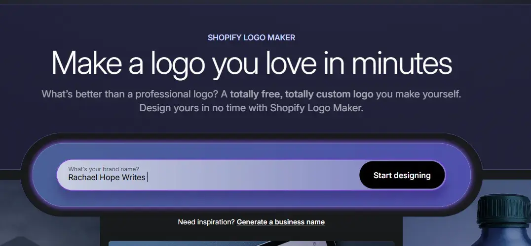
Using the information I provided, Shopify automatically generated a slew of logo options. For reference, you can select and further customize each one.

That said, there wasn’t an option for “marketing” as an industry, so I had to choose “services.” To be fair to the platform, I’m not sure how many marketers run a marketing business through Shopify, or if it’s even possible! I’m not their target audience at all, so why would they cater to me?
Best for: Entrepreneurs and small business owners looking to create a high-quality logo with minimal design effort quickly.
Pricing: Free.
5. Squarespace Logo Creator

Squarespace’s logo creator tool lets you quickly generate a clean-looking logo for your business. In my experience, at least, the logos that this tool helps folks to create are consistent with the modern and minimal aesthetic that Squarespace is known for.
I got started by inputting my business name, and Squarespace allowed me to serve it up in a beautiful font alongside an icon of my choice. I liked that the tool had thousands of vectorized icons and a curated selection of high-quality fonts for me to explore. That said, some of the logo templates are a little out of the box looking and basic for my personal taste.
Best for: Entrepreneurs and small businesses looking to quickly create a clean, minimal logo.
Pricing: Free.
6. Looka

Looka is a platform specifically for logo and brand design. It uses AI and machine learning to create designs based on your input.
Anyone can design a logo using Looka’s AI-powered logo creation engine. Input your brand name and industry, select your favorite colors, and pick some example logos that speak to you.
Based on your input data, Looka will generate an AI-curated selection of logos. Choose one and customize it to your heart’s content.
As for my test, I started it by entering an example company name and clicking “Get started.” From then on, Looka took me through a series of steps to help me create a logo.

The first step was to pick my industry. I was then prompted to select some logos I liked, followed by some colors.

The following steps were to add a company name (again, for some reason?), accompanied by a slogan, and then to choose some symbol types.
An observation: I liked that Looka gave me notes about my company name and slogan choices as I input them. This could be handy advice for beginners. Plus, you can also pick your own symbols if you want to be more hands-on with the design.

After that, Looka generated a few different logos for me. While they were competent logos, they were too “out of the box” for me and lacked the creative flair needed for brand differentiation. That said, I didn’t go too deep into customizing the logo options.

In my opinion, this tool excels more in presenting the designs than in the designs themselves. For example, I like that Looka provides design mock-ups so you can see how your logo will look on a business card, website, social media, and more.
Overall, I found the platform intuitive and easy to use. I like that Looka doesn’t use templates; rather, it generates each design based on your specific input. There’s also a wide range of font, layout, and color options. Sadly, the end results still have a template-like feel to them.
Best for: New businesses without the budget to work with a designer. Individual designers and design teams working specifically in branding.
Pricing: A basic logo package costs $20 for a one-time purchase. A premium logo package is a $65 one-time purchase.
150+ Free Content Creation Templates
Access ebook, blog post, CTA, case study, and more content templates.
- Ebook Templates
- CTA Templates
- Blog Post Templates
- And more!
Download Free
All fields are required.
7. CorelDRAW

CorelDRAW is a fully loaded, desktop-based vector design program that runs on Windows and macOS.
I’m not the biggest user of CorelDRAW, honestly. But designers I know and trust swear by it, so I figured it was worth revisiting for this piece. Overall, I think it’s a decent alternative to Adobe Illustrator that offers nearly all the same functionality. Plus, I like that it allows you to transform sketches and ideas into fully-fledged logos.
That said, I wouldn’t normally use CorelDRAW for logo design; I’d be more likely to use it for illustration or illustrative design. In which case, you’d likely find me spending endless hours on Procreate instead.
I do, however, like that you can purchase CorelDRAW outright instead of as a subscription, making it a more budget-friendly choice than Adobe. Plus, you have to have an Apple product to use the main Procreate app.

Best for: Professionals and experienced designers who require a complete design toolkit.
Pricing: Plans cost $22.42 monthly or $549 for a one-time purchase.
8. Affinity Designer
Affinity Designer is another fully-featured desktop alternative to Adobe Illustrator that runs on macOS, Windows, and iPad.

In my experience, it’s considerably more budget-friendly than alternatives. I also like that it features a slick, dark UI, fast performance, and all the features a professional designer needs to create logos and other design assets.

That said, I wouldn’t recommend Affinity Designer to non-design professionals. That’s because, unlike say, Illustrator, you can’t currently generate direct text-to-image or text-to-vector results through prompts.
Best for: Professional designers and agencies looking for a fully featured, budget-friendly alternative to Adobe.
Pricing: Affinity Designer is a $69.99 one-time payment.
9. Zoviz

Zoviz separates itself from the pack by providing a highly customizable logo design tool that surpasses the limitations of pre-made icons. As such, you can create entirely unique designs. Plus, each logo is both original and exclusive to the brand.
Similar to other tools, I could get started with Zoviz by heading to the logo maker portion of the tool and entering my business name.

I was then asked to describe my ideal icon in a few words. Full disclosure, my mind drew a complete blank here, so I fell on the clichéd sword that is… the mighty pen.

Then I had to select a word that explained my “brand vibe.” The tool then asked me to input a slogan. As with HubSpot Logo Maker, this section is optional. Speaking of similarities, to be honest, I made this tagline up to test the HubSpot Logo Maker, and I’m reusing it here.

After I gave Zoviz all the information it needed, the tool generated a few different logo results. The first one actually isn’t too bad. Considering I didn’t specify color choices, I don’t mind the one the tool picked. I also like the way the logo is presented. Similar to Looka, this presentation gives me a clear idea of how the logo would translate across different print media. But…

It’s kind of mostly downhill from here in terms of the actual designs.
I mean, do the following designs say “professional” and “B2B” to you? So based on the inputs that Zoviz asked me to give, I think, overall, it failed the brief. Although it’s not like I went really into the weeds with customizing the settings for the designs, and that seems to be the main selling point of the tool, so I will make allowances for that.

Out of curiosity, I did have a look at the settings. And Zoviz delivers here on its promise in terms of customizability. There are more options than other logo makers. Still, (and please correct me if I’m wrong), there is no more than Canva at first glance.

Also, I like that Zoviz supports multi-language logo creation, allowing businesses globally to design logos that seamlessly incorporate their brand name in various scripts and styles, including Latin, Arabic, Cyrillic, and other writing systems.
Furthermore, by using vector formats such as SVG and PDF, Zoviz guarantees that logos and brand assets maintain clarity and adaptability in both digital and print mediums. You can also scale the designs up or down without causing quality issues.
Best for: Entrepreneurs, startups, businesses, and freelance designers looking for a 100% unique logo design. It’s also suitable for those with little design experience or businesses in need of rebranding.
Pricing: Plans start at $19.99 for a basic logo kit.
10. Designs.ai
Designs.ai markets itself as an integrated Agency-as-a-Service platform powered by AI technology. And from what I can see, you can achieve a lot with the platform, including converting text to speech for voice-over content. That said, I’m here to test logo creation, so let’s go.

I kept it simple at first and worked with the “Choose from a template” option. If you’re a small business owner with budget constraints who isn’t skilled with design, there are many templated options to choose from. That said, the out-of-the-box options are a little too cartoony for me. Plus, they all seem to be designed in the same style, and I’m not sure how this would differentiate you from the competition.

None of the templates really excited me. The only one that caught my eye was the “Lake Walker, creative writing” design below. In an ironic twist of fate, by clicking the design, I realized you could use the platform’s AI capabilities to change the style of each logo. Yet this is the only one I wouldn’t want to change. Alas, this is also when I realized you need an account to test the full features, and my interest in Designs.ai waned.

Aside from the design templates being cartoonish and clunky, and the need to sign up to fully test the product (annoying!), I did find the platform easy to navigate.
My first thought was that if you’ve used Canva before, it won’t take you long to get to grips with the layout of the tool. But even if you haven’t, the Designs.ai platform is straightforward and intuitive. I can see most people being able to pick up this tool and run with it to some degree.
Best for: Large teams and agencies. Marketing consultants and freelancers.
Pricing: Beyond the free trial, plans start at $19 per month.
11. Khroma
I’ll level with you, you’re not going to leave Khroma with a fully fledged logo. That’s because Khroma is a tool that uses AI specifically to help you match your favorite colors into a series of palettes.
So why’s it included in my list? I mentioned earlier that color matching is a real pain point for me, so this is something I personally need assistance with and wanted to test a solution for. Also, unless your logo and brand palette are black and white, it’s something you’ll need to put thought into, too.

After I clicked “Generate,” I was prompted to choose 50 colors “to train a color generator algorithm” personalized to me. I dove right in and picked the colors that stood out to me at a glance. (50 seems like a lot, but before I knew it, I was “-9 colors” in.)

Aside from choosing the colors you like, Khroma also blocks the colors you don’t like from ever appearing in your palettes. I think that is a super cool feature!
After a short time, while Khroma used my color choices to train the algorithm, the results came in. I love, love, love the color pairings. And the way the tool lays the pairings out is beautiful. It really gets the creative juices flowing.

Another cool thing about Khroma is that you can visualize your color pairings across different templates, images, and gradients. For example, the image below shows how my palettes might look if used on an image. I think this function makes it much easier to see how the colors work together and envision them as part of a potential logo design.

I also love that when you click the information icon against each color pairing, Khroma provides you with the color codes. That will be such a time saver if you want to color-match in another design tool.

Best for: Individual designers and design teams looking to save time on color selection and pairing.
Pricing: Get started for free.
12. Adobe Firefly
Adobe Firefly is a generative machine-learning model made specifically for design. You can get it as part of the Adobe Creative Cloud within the Photoshop (beta) app or as a stand-alone tool. I decided to try the stand-alone tool for generating a logo from scratch.
My prompt: “Design a simple logo based on timeless design trends. The company is a marketing agency. The brand stands for excellent customer service, results, and value for money. The target audience are service providers in the Heating, Ventilation, and Air Conditioning industry. ”

The homescreen is kind of misleading. It’s not as simple as generating an image based on your prompt; you have to sign in. As I already had an account, it wasn’t too much to put me off. But, yeah, user beware.

Aaaaaand here’s another blocker. It seems that Adobe Firefly now requires you to consent to using partner models before you generate images. I mean, it’s helpful to know content isn’t used to train generative models. But is it ever truly “consent” if opting in is the only way to use a tool?

Now, finally, onto generating the logo. I mean, I don’t hate it. But I don’t love it, either? I like the color scheme: I think overall it does speak to the target audience. I also appreciate that, even though I didn’t include this in my prompt, Adobe Firefly adhered to the three-color rule for logo design. That said, I’m not sure I like the chosen icon. Is it a rocket? Is it an arrow?

Real talk, the whole process to get to this point has made me look at this logo and draw a blank. Like, I don’t even have the willpower to know what to change about the image. So, yeah, make of that what you will, reader. Although I will say, I have managed to do a lot with Firefly in this test for free.
Best for: Individual graphic designers, design teams, students, and teachers. Because it’s prompt-based (i.e., no templates), I honestly think you need some existing design aptitude to use this tool. In short? You need to know exactly what to ask for.
Pricing: Get started for free.
Designing a Logo for Your Brand
My honest take on most AI logo maker results: They kind of feel, for the most part, like flat-pack designs. (If that isn’t an existing phrase, I just coined it, remember where you were, people.) The auto-generated templates and the like just feel, well, soulless. If you use flat-pack designs, you risk flat, lifeless results for your brand, I guess.
When it comes to logo design, you’d really have to twist my arm to get me to suggest going it alone without any professional help. That said, I do understand that sometimes you just need something, anything, to get up and running. And, heck, you might not have the budget to outsource help. I sincerely hope this guide helps you get started with best practices for designing a logo that represents your brand.
Editor's note: This article was originally published in October 2023 and has since been updated for comprehensiveness.
150+ Free Content Creation Templates
Access ebook, blog post, CTA, case study, and more content templates.
- Ebook Templates
- CTA Templates
- Blog Post Templates
- And more!
Download Free
All fields are required.
![How to Create the Perfect Marketing Timeline [Template + Examples]](https://53.fs1.hubspotusercontent-na1.net/hubfs/53/project-timeline-template-1-20240919-3074583.webp)
![My Tips for Designing Great Website Imagery [With Canva, HubSpot, + 3 More Tools]](https://53.fs1.hubspotusercontent-na1.net/hubfs/53/Untitled%20design%20-%202025-02-14T161951.776.png)

![How to Make an Animated GIF in Photoshop [Tutorial]](https://53.fs1.hubspotusercontent-na1.net/hubfs/53/how-to-create-animated-gif_6.webp)