
 The new world of marketing is increasingly visual. It's no coincidence that the newest and fastest-growing social networks on the web -- like Pinterest, Instagram, and Snapchat -- are focused primarily on visual content.
So, how can marketers adapt to and leverage an increasingly visual social atmosphere? By implementing a strong visual branding strategy on social media.
Visual social branding refers to what your social media content looks like -- your profile picture, your cover photo, and especially your social posts. Great visuals on social media are important because the human brain is wired to read and understand images better and faster than words. Plus, visual content increases social engagement: Did you know that, according to a study by Socialbakers, images on Facebook constitute 93% of the most engaging posts compared with status updates, links, and even video?
The good news is that the four key ingredients of social media success -- consistent colors, fonts, imagery, and layouts -- are within your reach. In this article, I’ll talk about all four of these ingredients and how both new and established brands to implement them into their social media strategy.
The 4 Ingredients of Social Media Success
1) A consistent color palette.
If you look at the colors of any well known brand, you'll see that they use the same colors over and over again. In their logo, in their text, even their images. Take a page from their book: Choose two to four colors to use consistently throughout all of your social media posts and marketing. Using the same colors over and over again will help consumers become familiar with your brand.
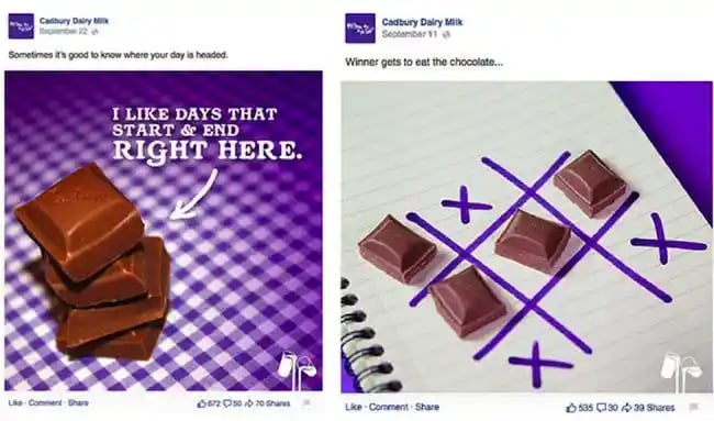
For example, notice how all of Cadbury’s social posts use its iconic purple color and white across its imagery, text, and logo.
Understanding color psychology can also help you reflect the feelings you want to evoke from your customers. For example, many tech companies -- like Facebook, Twitter, Dell, IBM, and HP -- use blue to symbolize trust, intelligence and progress. Virgin's vibrant red color scheme gives off bold and confident vibes, mirroring Richard Branson's own, distinct business methods.

The colors you choose should reflect your brand's. If you have a youthful brand, you might like to use bright colors, like the ones located on the outside of the color wheel. On the other hand, pastel colors work great for brands who want to be seen as welcoming and gentle.
Those of you who are designers mightbe familiar with the concept of color codes, or "hex codes." Design newbies: It's an important concept to learn. A hex code is a six-digit code that represents an exact color recognized universally by HTML and CSS. For example, Canva’s primary color is turquoise #00c4cc, shown on the color wheel below.

By knowing and using the same hex codes on your marketing, you'll be using the same colors over and over again.
2) Font pairings that match your brand’s personality.
Like your color palette, your font choices should reflect your brand’s personality. Do you want to choose a strong font or a simple one? Cute or elegant?
You should consider choosing three fonts for your brand and using them consistently throughout all of your materials: a font for your title/heading, a font for your subtitles, and a font for your body text.
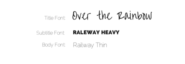
Your title/heading font should be the largest font in your design and is where you can display the most personality. If you want to use a script font or a handwritten font, your heading is the place to do it. In contrast, your Subtitle font and your Body Font should be easy to read.
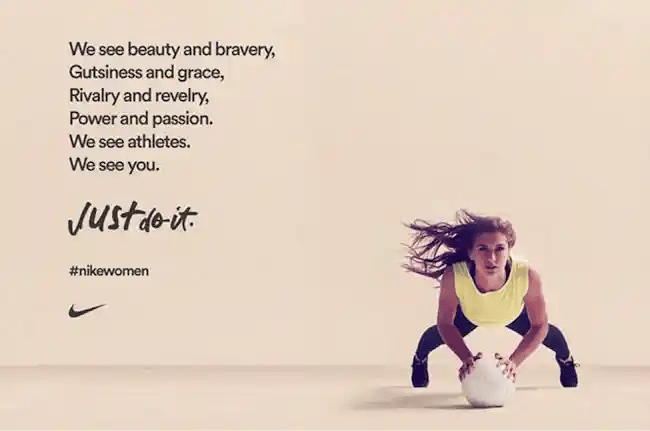
Notice how the Nike advertisement above pairs a bold sans serif font with a more playful script font for the "Just do it" tagline. Compare this to Zara’s thinner sans serif fonts and subtle letter spacing, which add to the feminine feel of the advertisement. (If you're confused about which is which, check out Typography 101.)

(For ideas on which fonts to pair with which, here's a handy infographic with a guide to pairing fonts.)
3) Appropriate imagery and filters.
Pick imagery that has a consistent theme. Canva 's free design platform caters for brands looking for great stock photography with a library of over a million images -- a great option if you’re on a budget. If you’re taking your own photos, make sure you keep your theme consistent, too.
Another important aspect of imagery is your brand filters. They add consistency to your graphics -- a big plus on social media. Take Corona for example, which uses a sun-drenched filter to give a "summery’ feel to its marketing graphics.

Like your other visual aspects, consistency is key. Iff you’re applying your filters in Canva, copy the unique filter code of your favorite option and add it to your style guide.
(Looking for more tips for better visual marketing with Canva? Check out this blog post.)
4) Social media templates to speed up the design process.
Do you have a template for your social media posts? Is your logo positioned the same way each time it's used? Coming up with a style guide will help make sure all the elements of your brand work in harmony.
An efficient way to create easy social media layouts is to create templates. For example, you might want to add a weekly tip, like we do at Canva, that you can share with your community. Notice how each tip has the same basic format.

Keep in mind that each social media platform has different ideal image dimensions, so make sure you cater your graphics to these dimensions. But keep your branding – the placement of your logo, colors and fonts – consistent across your designs.

Notice how the branding of the album cover design on the left has been adapted for the Facebook post on the right. The same background image has been used and stretched out, along with complementary fonts and filter.
Ready to put your skills to action?
Images, colors, fonts and layouts are all elements of graphic design that will play a huge role in making your brand image stand out. Considering up to90%of information transmitted to the brain is visual, it’s no surprise that people respond well to great design.
In the time it took you to read this article, approximately 500,000 new posts would have appeared on Twitter, 3 million on Facebook, 15,000 on Instagram and many, many more.
The social media advertising race is on, and your brand’s visual voice is what will get you ahead. So jump in and get started.


![Why Your Brand Needs A Strong Visual Identity [+ 5 Examples to Inspire You]](https://53.fs1.hubspotusercontent-na1.net/hubfs/53/artist-creates-brand-visual-identity%20(1).jpg)