Whether you're an organization looking to hire a graphic designer or are just starting your career in design, the following tips will help outline the foundation needed to succeed in the world of graphic design.
Graphic Design Tips
To effectively incorporate design elements into your current marketing tactics, it’s important to understand the main components of graphic design. There are eight pillars of graphic design, including:
- Color
- Form
- Imagery
- Line
- Shape
- Space
- Texture
- Typography
Each element is crucial in developing marketing collateral that will ultimately connect with your intended audience. To help you better understand how to utilize the eight pillars of graphic design, we’ve compiled a list of 20 tips focused on creating a solid foundation for new designers.
Let’s explore how the following strategies can help you deliver more effective and impactful designs.
Basics of Graphic Design
1. Utilize Space Effectively

Even though taking a minimalist approach is often a smart decision, that doesn’t mean you should only include one or two elements in your design. The Zara advertisement above does a great job of showing the importance of spacing by giving the text and image enough room to breathe while delivering a clear message.
2. Select the Appropriate Design Hierarchy
Hierarchy is one of the most important of the many techniques designers use to tell stories. In the image above, you'll notice that both designs portray a different message based on size. For example, the picture on the left gives the illusion that since the diver and whale are the same size, the animal must be far away.
However, once the diver‘s size is shrunken and the whale’s size increases, we have the perspective that both are swimming together.
3. Deliver a Clear Message Through Lines and Shapes

Many people assume that using lines means you need to use them for structure. However, as KFC has demonstrated in its logo design, lines can abstractly create a recognizable image. The lines surrounding the colonel lead customers to think of the food chain’s famous bucket of chicken.
4. Be Mindful of the Color Palette

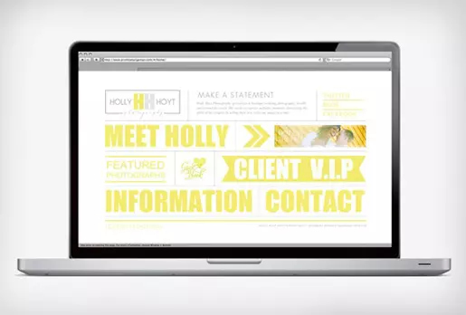
Whether you’re a seasoned graphic designer or just starting your design career, choosing the right color palette will make or break your design. As you can see in the image above, placing light colors on a white background becomes hard to read. The same issues can arise when using different shades of the same color for text and backgrounds.
5. Bring Designs to Life with Texture

The saying “A picture is worth a thousand words” is often true in graphic design, especially when capturing an important element's texture. For example, in the ad above for a junior basketball league, the designer ensured that anyone looking at the image could almost feel the basketball through the paper. This design is more impactful than a simple basketball flier.
Investing time and effort in your design to add texture can make customers remember your product more easily.
Design Tips for Beginners
6. Take a Minimalist Approach

As a graphic designer, it’s easy to get wrapped up in creating an amazing design with countless style ideas and colors. However, sometimes the most impactful designs are the ones that take a minimalist approach. Take the Puma ad above, for example. The ad uses minimal amounts of color and only uses three images to deliver an impactful message about its shoes.
7. Consistency is Key

While producing memorable designs for websites, social media, and magazines is crucial to being a successful graphic designer, it’s equally important to ensure all designs are consistent with the brand. Creating designs with the same color palette and font can help users easily distinguish your brand from others without seeing the company name.
Without consistency, it’s easy for audiences to question whether an ad is for your company or another brand, and it can even lead to a potential lost lead.
8. Don’t Fear White Space

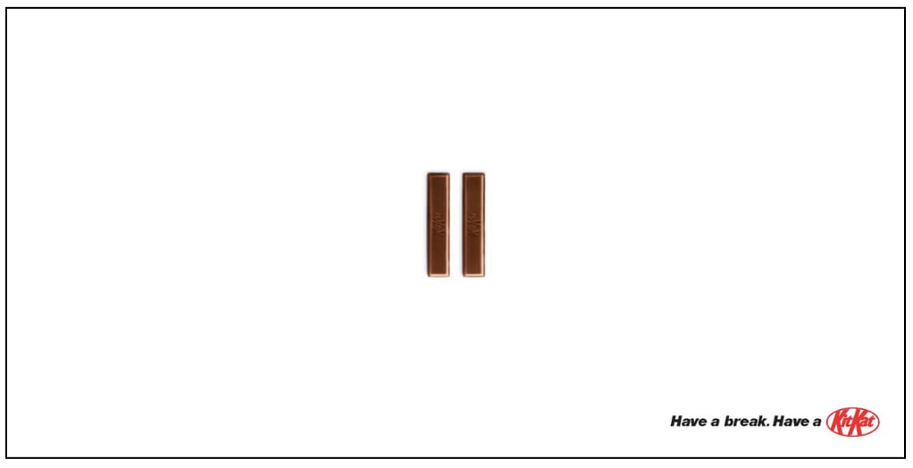
It’s easy to feel like your design doesn’t have enough components to it when you’re staring at a massive amount of white space. The good news is that white space can often help draw a customer’s eyes to a specific area of the advertisement when done correctly. For instance, Kit Kat relied on white space to quickly get the viewer to “have a break” before reading the copy.
9. Keep Current Events in Mind

With how quickly news spreads through social media and reporting outlets, it’s crucial to keep up-to-date on the latest happenings. Over the past couple of decades, there have been several instances where corporations have gone through with campaigns and didn’t stop to think of recent events.
For example, in 2017, Adidas emailed Boston Marathon finishers with the opening line, “Congrats, you survived the Boston Marathon!” In most cases, this would be completely normal, but in 2013 there was a deadly bombing during the marathon that killed three people and injured more than 250 people.
10. Let the Design Simmer

There’s such a thing as “too much design time.” Ultimately, it’s important to consistently take breaks throughout the design process to allow your mind time to decompress and relax. Revisiting a project after a few hours away can help you generate new ideas and see things with a fresh perspective.
Simple Design Tips
11. Start with a Mood Board

Before jumping into a new design project, starting the process with a brainstorming session is important. Gathering different types of ideas for fonts, colors, and imagery on a mood board will allow you to identify the stylistic direction you want to go. It can also help build consistency if you plan on creating multiple designs across various platforms.
12. Keep Typography Simple

With thousands of different fonts to choose from, selecting one that’s easy to read and conveys the appropriate message for your audience is essential. What you want to avoid is utilizing several hard-to-distinguish styles that make your design cluttered. As you can see in the example above, the designer missed the mark on simplifying typography and instead created a hard-to-read advertisement.
13. Icons vs. Text
Even though copy is important in most designs, there are instances when utilizing an icon can be just as impactful. For most consumers, it’s easy to quickly identify an icon associated with a social media platform or a mobile. This recognition makes it possible to eliminate sentences like “Check us out on Facebook.”
14. View the Design Through the Audience’s Eyes
Getting attached to your design is natural, but it’s important to take a step back and consider how your intended audience will interact with it. Asking yourself the following questions is a great way to ensure your viewing the collateral from the customer’s viewpoint:
- Is the message clear?
- Does the design align with brand standards?
- Can anything be simplified?
- What type of emotion does the design look to invoke?
15. Don’t Overthink the Design Plan
Design plans are an important part of the graphic design process. However, they shouldn’t be a point of stress for a designer. It’s easy to stress over every detail and forget that good design work comes from the heart. So, while you should use the design plan as a framework, giving yourself a little creative freedom throughout the project is also okay.
Graphic Design Tips
16. Stick to High-Quality Images

Securing high-quality images can be challenging, especially when your team doesn’t have access to a professional photographer. However, there are different ways to improve the resolution of photos without needing to buy an expensive camera. Software like Adobe Photoshop and Lightroom can help improve the overall appearance of your images.
17. Allow Letters to Breathe

By now, we’ve all seen examples of failed attempts at graphic design where there isn’t enough kerning, or letter spacing. The above box design for flickering lights is a constant reminder that you should always create a sample and have a second set of eyes review any designs before they go to customers.
18. Save Time with Flat Designs

In today’s design world, most graphic artists think they need to create elaborate 3-D designs with hidden meanings. However, some of the largest companies are starting to transition to more of a flat design approach. For example, Apple moved from a three-dimensional envelope to a completely flat design for their phones’ email feature.
19. Utilize Background Transparency to Support Text

Background images can make designs and branding pop out to customers. For instance, in the image above, New Belgium Side Trip made part of their logo transparent, allowing imagery to stand out on their cans. The finished product is appealing and immediately catches the eye of a customer shopping in the store.
20. Research the Competition
Research isn’t often the first thing a designer considers when initially starting a project. However, it’s an essential component to deliver compelling designs. By looking at how audiences interact with competitors’ designs and ads, you can adjust your plans to include the successful elements.
Using Graphic Design to Communicate Effectively
Technology has made the world much smaller in the sense that we’re all connected now. With instant access to potential customers, businesses and designers must understand how to communicate effectively through graphic design. Not every project will be the same, and many will require you to think outside the box.
To help inspire future projects, HubSpot offers a free content creation kit with more than 150 templates. Download your copy today and get a head start on your next graphic design project.
Editor's note: This article was originally published in May 2014 and has been updated for comprehensiveness.

Visual Content


![How to Make an Animated GIF in Photoshop [Tutorial]](https://53.fs1.hubspotusercontent-na1.net/hubfs/53/how-to-create-animated-gif_6.webp)


![How Visuals Will Impact Marketing in 2017, According to New Data [Infographic]](https://53.fs1.hubspotusercontent-na1.net/hubfs/53/00-Blog_Thinkstock_Images/how-visuals-impact-marketing-2017.png)
.jpg)

![10 Types of Visual Content Your Brand Should Be Creating Right Now [Infographic]](https://53.fs1.hubspotusercontent-na1.net/hubfs/53/00-Blog_Thinkstock_Images/Visual_Content_Types.jpg)
![How Images Make Content More Shareable on Facebook, Instagram & Twitter [Infographic]](https://53.fs1.hubspotusercontent-na1.net/hubfs/53/shareable-images.jpeg)