
But first, a grave warning …
Measure Twice, Cut Once
Before you go cutting content from your website, a word of warning:
“Yes, this works for us,” says Rebecca Hinton, CRO strategist and principal marketing manager at HubSpot. “But it may or may not work for you, so you always want to test it.”
Rebecca’s tests have helped my program hit triple-digit growth, so I’m going to politely insist you take her word on that.
At HubSpot, we never dive into changes without having the proof to back it up, and neither should you. Your audience could react very differently from ours.
The tactic I’m about to share came from the results of a rigorous experiment, and later on, I’ll show you how to run one just like it.
Okay, now onto the good stuff.
Free Landing Page Builder
Create and test beautiful landing pages that generate leads and look great on any device.
- Build landing pages.
- Turn visitors into leads.
- Optimize for SEO.
- And more!
What She Cut
The first change, surprisingly, was to stop sending paid ad traffic to our product pages. Why? Because those pages have too many jobs already.
“Your website has to appeal to all of your customer personas,” Rebecca explains. “People who are new, people who are seasoned, people who are already customers.”
That adds up to a lot of content. And for visitors who landed on your site via a paid ad, it's a lot of distraction.
To illustrate her point, Rebecca gives the example of a user clicking on an ad that says ‘Download our ebook.’
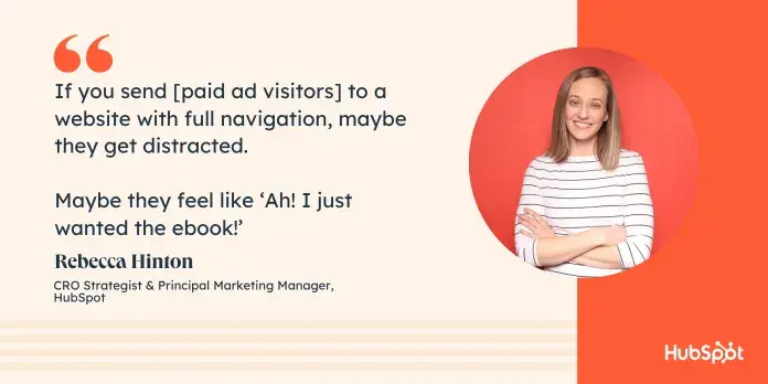
“If you were to send them to a website with full navigation, maybe they get distracted, maybe they feel like ‘Ah! I just wanted the ebook!’” She throws her hands up in the air in mock frustration.
“But with a dedicated landing page where the primary CTA is about downloading the ebook, now they’ve had a logical experience.”
So her team set out to make a dedicated landing page for each ad being tested. But, as I mentioned above, what’s on those pages isn’t nearly as interesting as what isn’t.
And what isn’t there is about 90% of our website’s navigational links.
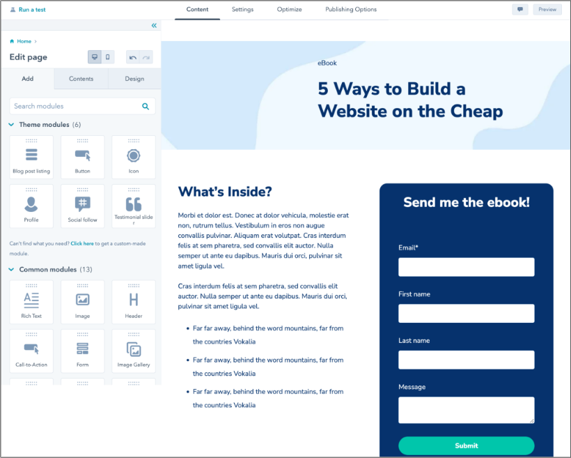
Here’s a screenshot of what one of our product pages currently looks like:
Like your Gran’s holiday dinner, there’s a little something for everybody.
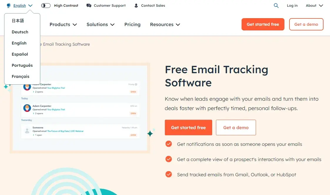
Now here’s the paid ad landing page for the same product:
If we stick with the food metaphor, this one would be a working lunch. You get exactly what you came for and you get it fast.
On the dedicated landing page, visitors can only sign up or request a demo. (Or leave, I suppose. But let’s think positive.)
“The point of a landing page is to focus users, so we don’t really want to be linking them out everywhere,” Rebecca says.
And the proof is in the results — which I’ve actually been underselling, because one regional market saw an incredible 83% increase in CVR.
Even if you’re not sold on nixing the nav, you should still be using dedicated landing pages. Rebecca explains why:
“If we send paid ad traffic to product pages, we can’t do any CRO testing. I don’t own those pages.”
Chances are, your team isn’t the only one with an interest in your product pages. That can limit what you’re allowed to change, add, or experiment on.
By creating a dedicated landing page, you’re also creating a sandbox you don’t have to share. (The dream of every middle child.)
“We’d call that a win even if the results were flat because it opened up green space for future testing.”
But now that I’ve covered what not to include, what should you put in those shiny, new green spaces?
How to Make Landing Pages that Land
Since the details depend on your business and what you’re advertising, you’ll need to do a little experimentation. But Rebecca’s got some tips to get you started — and they upend what I’ve always heard about A/B testing.
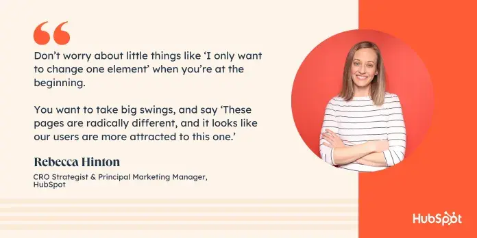
1. DON’T test one element at a time. Start with big swings and radical changes.
Most A/B testing guides tell you to pick one small change at a time. And if you’re just trying to optimize an already high-performing page, that’s sound advice. But to get these results, Rebecca tossed that out the window.
Start with wildly different versions that will quickly identify trends within your users’ preferences.
“You want to take big swings, and say, ‘These pages are radically different, and it looks like our users are more attracted to this one.’”
Once you’ve got a clear winner, then you can narrow in on smaller details like color choices, CTA language, image placement, etc.
2. Consider the journey, and not just the destination.
Many landing pages mistakenly swing to one of these extreme opposites:
- Marketers assume conversion will happen on its own, and include too little content.
- Marketers assume they need to convince every visitor and include too much content.
“Think about the journey starting from seeing your ad to taking the action you want them to take.”
While you want a clear path to the CTA, your landing page should also include content that helps guide that journey.
That may take the shape of testimonials, trust indicators, customer stats, or other kinds of social proof. It may be language that romances the call to action. It may even simply be basic company info.
“Set the stage before you dive into a specific product.”
The exact details will depend on what you’re advertising, but no matter what you include, make sure it creates a logical path to conversion.
But remember that the journey doesn’t stop at the conversion.
“What’s the post-conversion experience?” Rebecca asks. “Is it a thank you page? Is it a purchase confirmation?”
If the landing page is dinner, your post-conversion confirmation is dessert. Nail this, and your visitors will come back for more.
3. Don’t assume you’re going to get a winner.
I’m definitely guilty of this one. If you only have two choices, one of them is going to win, right?
Not necessarily. You could have an inconclusive test with equal results. You could fail to get statistical significance. Your visitors could reject both choices.
“If you have the traffic to support it, test a couple different landing pages,” she says.
More variants won’t necessarily guarantee a winner, but they will help you work through your options faster.
Just be sure you’re not spreading your traffic too thin. Which brings me to the next point …
4. Pay attention to statistical significance.
With too small an audience, your results could just be random chance. Did landing page two really convert better? Or did it just happen to get the visitors who were ready to click?
To know that, you need to make sure your test reaches statistical significance (the probability that your results are due to real factors and not chance.)
Without considering significance, Rebecca’s test may have sent us in the wrong direction entirely.
While her experiment increased the number of signups, it actually appeared to reduce the number of demos by 11.6%.
However, while the team was 99% confident in the signup conversion results, they only achieved 64% significance for the demo results.
(There’s no magic target for statistical significance, but the higher the number, the more confident the results. Imagine crossing the road if you were only 64% confident a car wasn’t barreling toward you.)
So if we hadn’t considered significance, we may have been spooked by the reduced demos and chosen the wrong landing page.

Okay, but how do you figure out what’s significant?
“That’s where you want to use a calculator,” Rebecca says. “I use Convert’s calculator. You plug in your weekly traffic, your weekly conversions, and what percent change you think you’re going to see.”
(For big swings, Rebecca recommends aiming for at least a 10% difference in results.)
The tool then suggests how long you should run your experiment to reach statistically significant results.
“Two weeks is our minimum. We don’t like to go under that. And we try not to go over eight weeks.”
5. Don’t assume that regional successes equal global successes.
In our case, regional testing refers quite literally to different geographic markets. For you, it may mean different store locations, different business units, or different products.
Either way, the lesson is the same: Don’t assume what works for one audience will work for all of them.
“When we get a win in our English-speaking region, we still test in our other regions,” Rebecca explains. “We know that all of them can perform differently, so we can’t just assume that because something won in EN, we can roll it out globally.”
Case in point, the same test saw an 83% increase in our Spanish-speaking market, but only a 33% increase in our French-speaking market.
And while it’s lucky this test enjoyed increases in all markets, it could have easily gone the other way, reducing conversion in one region. If we hadn’t tested it, that’s something we wouldn’t have noticed until we lost enough leads to raise red flags.
How to A/B Test Your Landing Pages
There are two main ways you can test different landing pages:
- A/B testing evenly splits your traffic between the variant pages.
- Lookback analysis means simply making the change and then comparing the results before and after.
“A/B testing is really the gold standard,” Rebecca advises. “But if you’re unable to do that — maybe you don’t have the traffic, maybe you don’t have the tools — a lookback is your next best option. And it’s certainly better than not testing at all.”
That’s because an A/B test makes sure that any external influences (think holidays, Google updates, kaiju attack, etc.) will impact each variation equally. But if Godzilla strikes during a lookback analysis, you’ll have to scrap your data and start over again.
Since Content Hub’s got a really top-notch landing page testing tool, I’ll show you how to do it there, but you should still be able to follow along if you’re using another tool like VWO or Optimizely.
1. Either create a new page or choose an existing page as the control for your split test.If you’re already running paid ad campaigns, you might as well test your existing landing page as the control. Even if it’s your product page.
Again, don’t just take my word for it. Try it out!
2. Click on the name of your page.
3. Click the “File Menu” and select “New” then “Run A/B test.”
This is an internal name that your audience won’t see, so instead of something editorial, choose something descriptive that will make sense to you long after you’ve forgotten the reason for the test.
Bonus points if you choose something that will make sense to stakeholders who want to peek in on the results.
5. Click “Create variation.”6. Edit the variation page with your big swings and radical changes.
To faithfully recreate Rebecca’s test, you’ll want to try a version with navigation and one without.
Other than removing extra content (like SEO inclusions and FAQs), that’s all that changed during this experiment.
“The goal was to match the landing page as much as possible,” Rebecca says. “So we did not change the copy and we tried to keep the layouts very, very similar. We wanted it to be an apples-to-apples comparison.”
However, if you’re just getting started with dedicated landing pages, here are some other big swings you might consider:
- Formatting content in paragraphs versus bullet points.
- Including videos versus static images.
- Showing customer logos versus testimonials.
Both variations will now be live.
Voilà! You’re ready to make marketing magic.
And if you don’t do what we don’t do, you just might get the results we got.
Free Landing Page Builder
Create and test beautiful landing pages that generate leads and look great on any device.
- Build landing pages.
- Turn visitors into leads.
- Optimize for SEO.
- And more!
Conversion Rate Optimization


![What is a CRO Test? [+ the 5 Steps to Perform Them Yourself]](https://53.fs1.hubspotusercontent-na1.net/hubfs/53/conversion-rate-optimization-tests_4.webp)