Table of Contents
- How to Close a Sale
- 18 Sales Closing Techniques
- What To Do After Closing a Sale
- Seal The Deal With These Techniques
How to Close a Sale
When it comes to closing deals, small tips can make a big difference. See the most helpful advice for closing deals below.
1. Identify customer needs.
First things first, be sure to clearly define the customer needs your product or service is intended to meet. Customers who aren’t a fit for what you offer don’t want to hear from you. Pursuing them will be a waste of your time and resources.
Once customer needs or pain points are clearly defined, you can find specific prospects and businesses with those needs. These potential customers will be interested in hearing from you.
2. Find the decision-maker.
Closing a sale starts long before a customer signs a deal. The first order of business is lead qualification.
Qualifying leads ensures you speak with decision-makers who play a key role in buying your product or service. To effectively do this, you need to develop an ideal customer profile (ICP).
When developing your ICP, include information like:
- Industry. Identify industries your product will best serve.
- Company size. Specify the number of employees a company should have.
- Location. State the locations of your audience.
- Revenue. Define a revenue range that makes a company a fit for your solution.
- Job title. List the common job titles of your ideal customer.
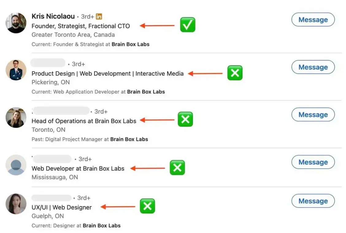
These qualification criteria let you narrow your search for leads. For instance, let’s say I sell a product that’s useful for software development companies. If I wanted to sell to Brainboxlabs, I’d contact Kris Nicolaou, its founder and CTO. That’s because Kris may be a power user of my product in his CTO role.

3. Initiate a conversation.
Once you’ve identified your lead, use tools like Hunter and Snov to find and verify their email address. This lets you send emails that won’t land in your lead’s spam folder.
After the email address verification, tweak, write, and send a brief cold email with a call-to-action that doesn’t sell your product. Your goal should be to get the potential client to schedule a call or respond positively to your email.
4. Explain your product’s benefits.
Having prospects hop on a call or respond to your email is only half the battle. The second half shows how your product impacts your prospect’s business operations.
Don’t make the mistake of selling prospects on features. Show them the benefits of using your product. When you do, they’ll see tangible results of using your product and the issues it fixes.
5. Create a sense of urgency.
You need to establish a sense of urgency to prevent your deals from stalling or falling apart. Urgency creates a reason for prospects to move forward with a deal.
You can create urgency by offering a time-limited discount, free onboarding, or anything that makes the prospect get instant value from your product.
When using this sales tip, ensure you’re offering something prospects truly need. There’s a thin line between creating a sense of urgency and pressuring prospects. Crossing that line could make you miss a deal altogether.
6. Anticipate and prepare to address objections.
Objections can be a good thing. When you get an objection, it shows your prospect wants to move forward, but something bothers them. Address these objections, and you will get one step closer to hitting your quota.
Some common objections you’ll get as a salesperson include:
- We don’t have time.
- We don’t have the money.
- Your product is expensive.
- We don’t need your product at the moment.
- I need to communicate with my partner or another decision-maker.
Preparing to respond to these objections is crucial to closing your sales deal. Doing so sets you up for success because you’ll confidently respond to concerns your prospect raises.
Now that you’re equipped with these sales closing tips, let’s go over 18 proven closing techniques and why they're so effective.
1. Now or Never Closes
This is where salespeople make an offer that includes a special benefit that prompts immediate purchase. This technique creates a sense of urgency and helps prospects overcome buying inertia. It's also a proven method for closing a sale over the phone because you have the prospect's undivided attention in real time.
Example
- “This is the last one at this price.”
- "We’ve got a 20% discount just for customers who sign up today.”
- “If you commit to buy now, I can fast-track you to the front of the implementation queue.”
2. Summary Closes
Salespeople who use this closing technique reiterate the items the customer is hopefully purchasing. They stress the value and benefits of their product to encourage prospects to sign a deal.
Example
“So we have the Centrifab washing machine with brushless motor, the 10-year comprehensive guarantee, and our free delivery and installation service. When would be a good time to deliver?”
By summarizing previously agreed-upon points into one tight-knit package, you help prospects visualize what they'd get from a deal.
3. Sharp Angle Closes
Prospects often request price reductions or add-ons when they have the upper hand in a deal. If you have approval from your sales manager, try the sharp angle close technique to catch these prospects by surprise.
Example
When they ask, "Could you add on a few extra hours of onboarding at a discounted rate?“ reply, ”Sure. But if I do that for you, will you sign the contract today?"
They won‘t likely expect this response — first, because you agreed to their request, and second, because you’ve proposed closing today.
4. Question Closes
To achieve the two goals above, reps must ask prospects probing questions. Effective salespeople focus on closing a sale as soon as a conversation begins. Through a series of questions, they develop desire in the client and eliminate purchase objections.
One can even close the sale in the form of a question, which allows the rep to address outstanding objections while gaining a commitment at the same time.
Example
“In your opinion, does what I am offering solve your problem?”
This question lets you know if the prospect is sold on your product while keeping the door open for further selling. If the answer is “no,” it remains their opinion (not yet the truth), allowing you to continue selling. If the answer is “yes,” then signing on the dotted line is the next step.
Here's another question close: “Is there any reason why we can't proceed with the shipment?"
This question asks either for closure or more information about why the customer isn’t quite convinced. It’s a win-win.
5. Assumptive Closes
This closing technique draws on the power of positive thinking. If you believe you will close this deal from the first piece of email outreach, it can have an incredible effect on the rest of the sales process.
What‘s important here is to closely monitor your prospect’s interest, engagement, and objections throughout.
Example
After a call or meeting, ask, "Did this presentation align with your expectations?“ If you've just provided them with new information about your product or service, ask, ”Does this sound like something that would be valuable to you? Does this meet a specific need or pain point?"
By keeping your ear to the ground — and assuming good intent from the start — you‘ll bring authority and direction to your sales process that wouldn’t be there otherwise.
6. Take Away Closes
Picture a kid.
If you give this kid a toy and you take it away, what would the kid do? They’ll cry in protest to get the toy back. You can use this psychological approach on your prospects.
Example
If they're balking on price, remove a feature or service and present the discounted offer to them. You can say, “Our product will perfectly fit your budget. However, we can only provide Feature 1 or Service 1 at the initial price. Does this work for you?”
Often, you’ll find that the prospect will think more about what you removed rather than the discounted price or their proposed price.
7. Soft Closes
The soft close lets you show the benefit of your product to prospects, followed by a low-impact question that ascertains their openness to learning more.
Example
"If I could reduce widget maintenance by 25% and increase widget productivity by 15%, would you be interested in learning more?"
You've clearly stated the benefits without making any demands or sudden requests.
If the example above still seems too direct, you could ask, "If I told you I could reduce widget maintenance by 25% and increase widget productivity by 15%, would that align with your company goals?"
This removes their need to commit to you and gives you more time to learn about their business needs.
8. The Alternative Close
Salespeople use this technique to present prospects with two or more buying options that can lead to a sale. Prospects may believe this puts them in the driver's seat and gives them the feeling of control over the deal.
In truth, it doesn’t. That’s because salespeople can suggest options but subtly direct prospects to the more expensive package they want prospects to choose.
Example
If your prospect is pushing back on price and wants certain features, you can say, “Would you get our Pro plan, which includes free onboarding and six months of free support, or our Basic plan, which starts at $30 per month but has fewer features and no free support?”
9. The Something for Nothing Close
The something for nothing close involves offering a gesture of goodwill. Salespeople hope prospects repay this gesture by signing a deal. This closing technique is great for companies that lack social proof and want to get customers fast.
It’s also excellent for companies who are trying to get prospects to switch from a competitor's product.
Example
Salespeople can say, “Alright. We know you have lots of data in your [software name], and migrating to ours will cost upwards of $1,500. If you sign today, we would migrate your data for free. Would you like that?”
10. Unique Offer Close
This closing technique is great for prospects with large deal sizes. When you have such prospects, and they develop cold feet, incentivize them by creating a special offer exclusive to them. It’s a win-win. The prospect gets a unique offer. You seal the deal.
Example
“If I ask my manager to offer you a discount, free trial, or free migration, would you be willing to sign a contract?”
11. Opportunity Cost Close
Use this closing technique when you know your prospect could lose something substantial without your solution. By highlighting their potential loss, you make the prospect rethink their decision about stalling a deal.
Example
“I wouldn’t like you to deal with [negative outcome 1] and [negative outcome 2] because you lacked the right [category of your product]. Would you like to forestall such outcomes by taking the next step?”
12. The Puppy Dog Close
The Puppy Dog Close is a more immersive approach to closing. It foregoes explanation in favor of experience — meaning it revolves around prospects testing a product or service firsthand as opposed to hearing about it from a sales professional.
Delivering on the method rests on some key factors and activities. For starters, you need to have a solid picture of how your prospect will demo your offering. Will you offer free samples? A dedicated free trial? A more involved but carefully observed test?
You‘ll also need to establish a firm, constructive timeframe that allows a prospect to get a meaningful perspective on your product or service without being too costly from your end. Finally, you need to underscore all of this with transparency. Don’t offer a free trial only to yank it out from under your prospect and hit them with hidden or surprise fees on a dime.
Example
“Would you like to try our product for 30 days free? If you like it after the trial, you can purchase any of our plans. If otherwise, you aren’t obligated to buy. What do you think?”
13. Objection Close
The objection closing technique works when you don’t know why a prospect is stalling. Often, the prospect still has a few objections. After you’re certain that your prospect knows what your product offers, ask if they have more objections.
Example
“Sam, is there any reason that’s holding you back from signing this deal today?”
By asking this question, you can address their objection instantly and get them to sign a deal quickly.
14. The Video Close
Nothing builds trust better than videos. When you use videos to address objections, explain pricing, or talk about a feature, prospects see your face and the effort you put in to close them.
When you use the video close technique, keep tabs on your email to know when your prospect views the video. Once they do, chat with them and address other objections in real-time.
Example
“Hi [first name]. I hope the video answered your question about [issue]. I’d love to answer any other questions immediately.”
15. The Columbo Close
Dubbed from an American TV series, the Columbo Close is based on a famous one-liner — “Just one more thing...”
This technique works best when prospects show they aren’t interested in your product. By stopping prospects in their tracks, you gain their attention with the one-liner and have another chance to re-pitch your product better (without mentioning what your prospect already knows).
16. The Ownership Close
In this closing technique, the salesperson speaks like the prospect has bought the product. This is a classic example of “future pacing,” where you make the prospect imagine how their future looks because they bought your product.
This technique works better when the salesperson has results or case studies to back their points.
Example
“When you start using your [product, for example, HubSpot CRM], you’ll save time by not juggling multiple software as you’ll have your all-in-one CRM. How would you spend the hours you save using [product] every month?”
17. Offering Competitor Close
In a last-ditch attempt to close a prospect, you can tell prospects the competitors they can try. Though unconventional, Lindy Drope says this closing technique works. “When a pricing objection comes up, I love to talk openly about my prospects' alternative options,” says Lindy.
“Most reps fear bringing up other players in their field, especially when their product is the most expensive,” Lindy adds.
Example
“Hey, it sounds like this type of product/service may be out of your range right now. That said, there are some options our current users checked out prior to signing up with us. Below are the cost savings associated with going with these alternatives.”
The prospect will appreciate your honesty and spend less time shopping elsewhere. Plus, they now know you’re confident about the value of your product and that you care about them. If they hit a roadblock with any product you suggested, they’d likely come running to you.
When using this closing technique, Lindy recommends you know your prospect's pain points and avoid this technique early on in the sales cycle so you don’t come off as demeaning or “too good” for the prospect.
18. The Ben Franklin Close
The Ben Franklin Close is one of the more involved, consultative closing techniques sales professionals can leverage. The strategy involves working with a prospect to create a pros-and-cons list about a given offering.
Its value is multifaceted. For one, it gives you a sense of where a prospect's values and priorities lie. Secondly, it gives you a forum to more clearly articulate your value proposition, specifically in the context of the values and priorities you unearth. It also offers you an opportunity to raise benefits that your prospect might not have considered.
You also run some risks with this method. There's a chance you might accidentally shine a light on some particularly “con-y” cons that a prospect might have otherwise ignored. You also might push a little too hard on certain pros, only to have your prospect see them as more detrimental than compelling.
What To Do After Closing a Sale
Once you‘ve closed the sale, it’s time to celebrate! But don't forget to tie up any loose ends before you high-five your team. Here are a few pro tips for what to do after closing the deal.
1. Log the deal in your sales software.
Trust us, your sales leaders will thank you for this. Logging your deal in your sales software will help keep your team on target for forecasting and help keep your pipeline up-to-date with all the information needed for your team and customer to proceed to the next step.
2. Provide an introduction to the next team.
Closing the deal is likely step one of the customer's journey with your business. From here, they may need to speak with customer success or support to get onboarded.
Set up an e-introduction to the next person taking over so that the customer has a smooth transition into the next step of the process.
3. Follow up with the customer in a few days.
Checking up on your new customer and asking how they feel about their purchase will go a long way when building trust and customer loyalty. If issues arise, you can quickly step in and help or find someone on your team who can.
Seal The Deal With These Techniques
Being skilled at closing is arguably one of the most important techniques a salesperson can master.
While your goal is to sell and hit your quota, it’s important to remember we’re all humans. Humans react based on how they are treated.
So remain friendly when using these sales closing techniques. Be empathetic. You can also find a mentor or fellow salesperson who excels at any of these techniques so they can help you implement these best practices.
Editor's note: This post was originally published in October 2019 and has been updated for comprehensiveness.
Sales Closing


.png)


![Sales Close Plan: The Best Tool to Close Way More Deals [Template]](https://53.fs1.hubspotusercontent-na1.net/hubfs/53/sales-close-plan-1-20241125-8524726.webp)

![How Close Rates are Shifting in 2024 [New Data]](https://53.fs1.hubspotusercontent-na1.net/hubfs/53/close-rate.webp)
![Sales Pros Say This Tool is Key to Driving Sales: How to Close More Deals With It [Data]](https://53.fs1.hubspotusercontent-na1.net/hubfs/53/85_Best-Sales-Strategies.png)


