Sales presentations: They either blow you away or induce a daydream. Why? Not everyone's a gifted speaker — but everyone can put together an effective sales pitch deck with the right guidance.
While many salespeople focus on making their sales decks flashy, fun, and exciting, I find they overlook the need for their presentations to address the prospect's top concerns and offer an irresistible solution.
As a result, many presentations are met with wishy-washy responses that drag along the sales process and waste valuable time. Your sales team can do better, but what exactly does a great sales deck look like?
I used to design corporate sales presentations. Let me show you some stand-out sales presentation examples. I’ll cover some common pitfalls to avoid to help you perfect the pitch. Let’s dive in!
Table of Contents
- What Is a Sales Deck?
- Sales Deck Examples
- Sales Deck vs Pitch Deck
- Example Sales Presentation
- Sales Deck Presentation Tips
- Sales Deck Template
- How to Find a Sales Deck Template
What Is a Sales Deck?
A sales deck is a slide presentation (e.g., PowerPoint, Keynote, etc.) used to supplement a sales pitch. The sales pitch, given by a salesperson to a prospect, often includes an overview of the product or service, offers a value proposition and solution for the prospect, and includes examples of success stories from other clients.
The primary purpose of a sales deck and presentation is to introduce a solution (i.e., your pitch) that ultimately leads the prospect to purchase from your company.
If you've done everything right during the discovery process — digging deep into your prospect's challenges and understanding exactly what they need — only to get a noncommittal response, then your presentation needs some major adjusting.
10 Free PowerPoint Templates
Download ten free PowerPoint templates for a better presentation.
- Creative templates.
- Data-driven templates.
- Professional templates.
- And more!
Download Free
All fields are required.

Sales Deck vs Pitch Deck
A sales deck is a pitch meant to convince a prospect to make a purchase by showcasing your product features, benefits, and value proposition.
A pitch deck, on the other hand, is usually created for investors who want to learn more about your company, vision, products, financials, and target audience. Think of the pitch deck more like a synthesized version of your business plan.
Ready to see some sales deck examples? I’ve collected some of the best for your inspiration, in no particular order.
Sales Deck Examples
- Leadnomics
- Strip
- QS
- Attention Media
- Freshworks
- Soraa
- Planetly
- Kibris Developments
- Leadgeeks.io
- Accern
- Airbnb
1. Leadnomics Sales Deck by Katya Kovalenko
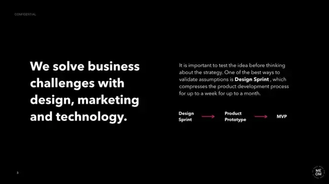
I think Leadnomics has done something few companies successfully do in presentations: Showcase their brand identity. The internet marketing agency hired a designer to create a sales deck that reflected their sleek, techie brand.
So, while prospects learn about Leadnomics and what it offers, they can also get a peek into what it represents as a brand.
What I like: The simple, high-contrast design of this pitch deck doesn't overwhelm viewers with excessive information and instead highlights a few key elements per page.
2. Stripe Sales Deck by Zlides
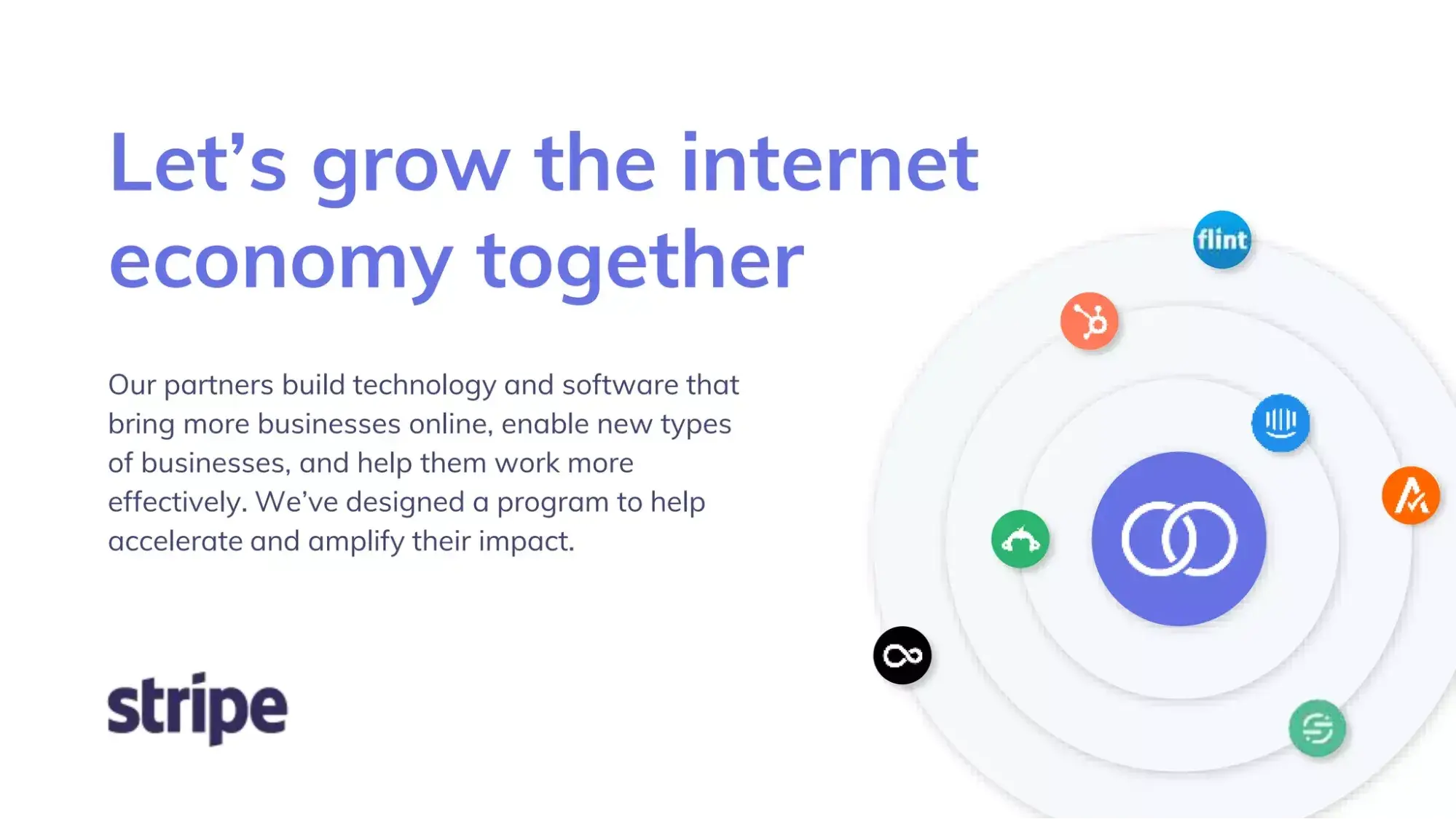
This slide deck for Stripe, Inc. starts with a very brief company summary, followed by a value proposition and a list of reputable companies that use the product. I like that it doesn’t overwhelm, which is a fatal flaw in presentation design.
“The biggest mistake I see in sales presentations is information overload, with too much text on slides or too many slides overall,” shared presentation designer Linda Tran.
“Sales presentations should be scannable: Try to use 3-6 points per slide and use imagery to help convey your key message effectively. If you have additional critical information, include it in an appendix section for easy reference, so you're prepared if asked about it.”
What I like: Some presentations are designed in a heavy-handed way with too many colors, words, and graphics per page. This feels light and airy to me, using graphics and icons intentionally.
3. QS Sales Deck by BrightCarbon

QS, a platform that ranks colleges and universities, effectively uses icons and visuals throughout its sales deck to communicate its messages. At just a few slides, this is one of the shortest sales decks featured on this list.
If you're going to make your sales deck short, I suggest making sure the information you include gets straight to the point, and be sure to front-load the most important information.
In terms of content, QS showcases its features, value proposition, and client impact.
What I like: The best sales decks are fluff-free, and QS embodies this with beautiful graphics that show rather than tell. While this is a brief sales deck, I appreciate how it paints a picture of a compelling sales narrative.
4. Attention Media Sales Deck by Slides

Attention Media, a B2B creative agency, hired a presentation design agency to create a sales deck that features statistics and reasons businesses should work with them. I like how key figures and messages are either in a bold, large, or bright font to make them stand out from the rest of the text.
While their slide deck is on the shorter side (the typical presentation is around 10 to 15 slides), they include intriguing visuals and statistics that grab attention and keep viewers interested. Presentations can be as short as 5 minutes as long as they're clear and effective.
What I like: Successful sales decks are specific and use data to tell a story. Attention Media does that beautifully with this sales deck design, in my opinion.
5. Freshworks Sales Deck by BrightCarbon

Freshworks is a B2B software platform that promises an all-in-one package for businesses. Its sales deck emphasizes simple text and organization. The problem and solution are introduced using graphics, which I think makes the text easier for readers to prioritize.
I like how they include a dedicated slide to their mobile app (which serves as a “solution slide”), one of the product's key differentiators and most salient benefits. The following slides provide a step-by-step walkthrough of how customers are onboarded and what they can expect on a regular basis.
Since the slides aren't text-heavy, the salesperson can easily elaborate and answer any questions the prospect might have.
What I like: I love that this sales presentation makes the customer's problem so clear and memorable (“the cloud is broken”) and then focuses on product features and solutions.
6. Soraa Sales Deck by BrightCarbon
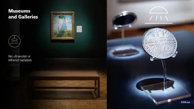
Soraa, a lighting company, starts its sales deck with a visually appealing table of contents that contains three items: “Quality of light,” “Simply perfect light,” and “Why Soraa?”
The brand then dives into what its prospects care about most: how the light will look in their spaces and how they can apply Soraa's offerings to their specific use case. It sprinkles in the benefits of using Soraa as a lighting supplier. And it does this all while maintaining its strong branding.
What I like: I appreciate that the value proposition on this sales deck is very clear and memorable. The best pitch decks focus on showing rather than telling, and this does so beautifully.
7. Planetly Sales Deck by OCHI Design
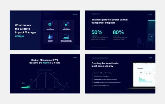
The first thing Planetly does in its sales presentation is present an eye-catching statistic about customers wanting more eco-friendly brands. Then, they present the reasons behind that data.
I like how the deck doesn't overwhelm prospects with too much text, opting for more graphics and visuals instead. It introduces a hard-hitting stat about the problem their prospect is facing, engages them by asking a question, and provides a solution to the issue.
The slide deck continues to outline specific product details and what sets the solution apart from others, ultimately leading to a slide that represents the expected outcome for the prospect.
What I like: Every presentation should include a strong call-to-action (CTA), and Planetly uses data to create a mic-drop CTA. The presentation cites the statistic that carbon management will be the norm in three years. Then, they push customers to act with the memorable CTA “Move first, gain the edge.”
8. Kibris Developments by Katya Kovalenko
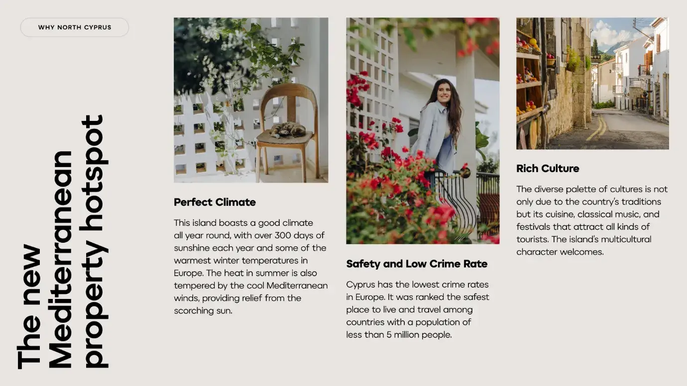
What you'll first notice when scrolling through Kibris Developments’ sales deck is that it's straightforward and easy to scan (not to mention stuffed with beautiful imagery and branding).
The brand kept it simple with its deck, making it easier for consumers to consume. On every slide, Kibris Developments has one main message with supporting information in smaller font. Too often, companies stuff their decks, and the result is viewers who are overloaded and stop listening.
What I like: While some brands don't include any photography in their sales decks, I love how this brand uses photography heavily to tell a story and compel viewers.
9. Leadgeeks.io Sales Deck by Paweł Mikołajek
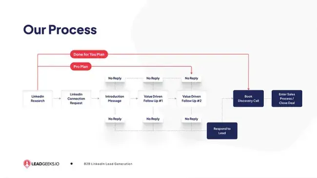
Sometimes, the best way to explain a concept is through a series of process maps and timelines. In this sales deck, Leadgeeks.io takes this approach to explain its product process and onboarding process.
I think this method helps consumers visualize how this software will help them reach their goals and how they can adopt it in their business.
What I like: Potential users will always wonder about the process of working together, and I like how Leadgeek's simple onboarding slide provides a clear answer to this question.
10. Accern Sales Deck by Katya Kovalenko
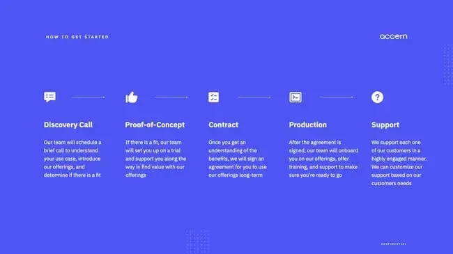
Similar to Leadnomics, software company Accern puts its branding at the forefront of the sales deck.
In addition to the use of design to make the sales deck stand out, Accern also highlights customer case studies in its deck, another form of social proof that shows the success other customers have found with this tool.
What I like: In my experience, the most effective sales decks will leverage customer success stories; this shows a beautiful way of achieving that.
11. Facebook
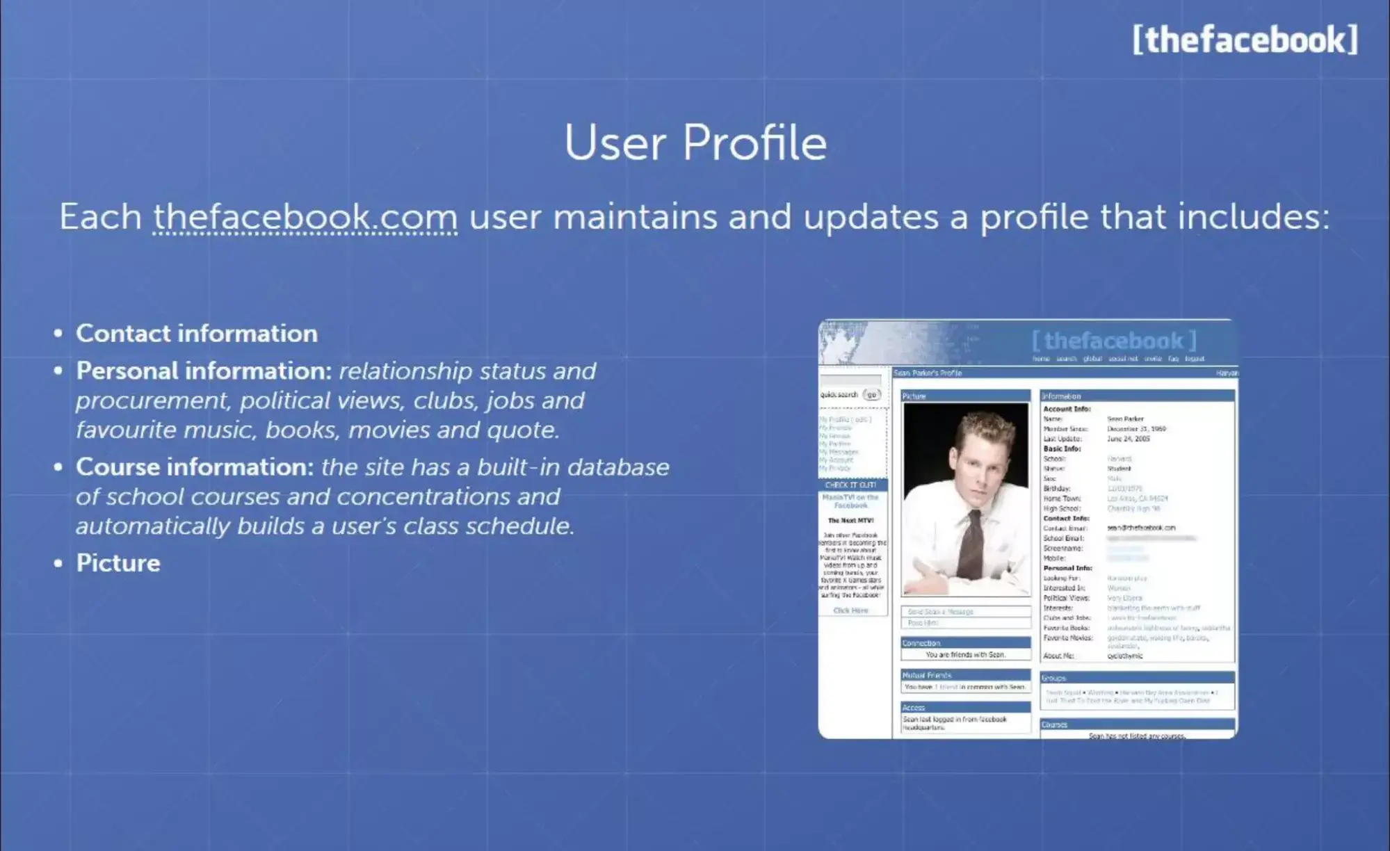
Prepare to feel ancient: Facebook‘s original pitch deck is 20 years old. What can a pitch deck old enough to vote teach us about selling to today’s market?
It's arguably one of the most successful sales decks we can study: This deck raised the money that turned Facebook into one of the most prolific companies in modern life.
This presentation isn‘t made of impressive graphics or flare; there are even some off-center elements that would make a graphic designer cringe (raises hand). It’s a simple sales deck that summarizes product impact, basic data, and a vision. It doesn't overwhelm with flashy visual elements but rather focuses on customer research and potential impact.
What I like: Instead of leading with impressive stats or their goals, this pitch deck creatively gets the audience's attention with a quote from the newspaper describing the frenzy surrounding the product.
12. Airbnb

So far, most of these examples have been beautiful, sleek slides designed to get the audience‘s attention and look professional. There’s value in great graphic design, but there's more value in the hard details and facts of your product or service. Nothing showcases that better than Airbnb's slide deck from 2008.
This is a presentation so basic it could've practically been handwritten on Post-it notes, and it puts 100% of the focus on the product concept and impact. I think it's a masterclass in clear communication.
We can learn a lot from the older generation of sales presentations. I think too many sales presentations start with flash and sprinkle product clarity on top as a final step, and it should be the other way around.
When you're designing your sales presentation, I recommend starting with bare-bones ideas and making sure the communication is spot-on before moving on to the pizzazz.
What I like: Ideas, product details, and data shine above all else in this presentation.
Each of these presentations provides a general overview of the products, problems, and solutions, and they can easily be tailored and customized to each prospective company. A custom presentation not only piques the prospect‘s interest but also increases the likelihood that they’ll buy from you.
Curious as to how you can word your presentation during your meeting with prospects? Below, I’ll go over the best examples I've seen so far.

10 Free PowerPoint Templates
Download ten free PowerPoint templates for a better presentation.
- Creative templates.
- Data-driven templates.
- Professional templates.
- And more!
Download Free
All fields are required.

Example Sales Presentation
While there are plenty of videos online on how to deliver a sales presentation, there aren’t quite as many live sales presentations to watch.
That’s because sales presentations are delivered in the privacy of a meeting between the sales rep and the prospect and are often not recorded with the intention of sharing online.
As a sales rep, though, you have an excellent resource for inspiration: explainer videos. Companies publish explainer videos to pitch their products to qualified leads. (Sound familiar?) I recommend using the below examples to hone your own pitch to buyers, and pay close attention to the structure of each video.
1. Leadjet
[Video: https://youtu.be/gjpXUD8Vz6I ]
This explainer video for Leadjet starts with an urgent problem: Finding leads on LinkedIn and moving them to a CRM loses valuable time and minimizes lead opportunities. Leadjet then presents its product as the solution.
The video jumps into the benefits users can enjoy, such as synchronizing conversations over both your CRM and LinkedIn, keeping the lead status updated, and adding custom details. In this video, Leadjet follows the ideal sales presentation structure: problem, solution, and benefits.
What works: Starting with the customer's pain point makes the product benefit clear and memorable.
2. Node Influencer App
[Video: https://youtu.be/W-f6F2gxrl4 ]
The Node influencer app allows small business owners to connect with influencers on social media. It starts its video with a simple question: “Looking to promote your brand with social influencers?” I like how the presentation effectively identifies and addresses the target market before pitching the product to viewers.
This presentation is more tutorial-based, making it ideal inspiration if you‘re creating a sales deck for someone who’s closer to making a decision. People most often want to see actionable demos when they're ready to choose a provider.
What works: Rather than telling viewers that this app is easy to use or explaining how it works, this video showcases that ease by putting the product itself on display.
3. UpSend
[Video: https://youtu.be/hAP2QF--2Dg ]
This explainer video from Upsend, a former customer service software, begins with a problem: Most customers want instant responses to their queries, but customer service systems can be expensive for new companies. Enter Upsend.
The presenter addresses the target market — startups and small businesses — while assuaging their concerns about budget. In addition, it covers the most important features of the platform and the end result for the user. If Upsend were still available, this would be a product a new business would immediately want to add to its tech stack.
What works: This is a fast-paced sales video that shows quick product demos without overwhelming the viewer.
4. Algoplanner
[Video: https://youtu.be/qDSlX4mWypY ]
Within a few seconds of the start of this presentation, Algoplanner drives home the critical urgency of adopting supply chain software. It uses a scary number to gran your attention, citing a possible “loss of millions of dollars” if you fail to adopt the right tool.
It then introduces its product with a breakdown of what the software can do for users. Plus, it provides powerful stats to back up its claims, including that users can reduce automation development costs by 80%. I think the CTA at the end is powerful and simple, telling viewers to schedule a demo.
What works: Algoplanner's sales video explains how their product benefits companies and individual users while creating urgency.
Sales Deck Presentation Tips
Have you ever watched an episode of Shark Tank where a great product flops because of the sales pitch? The reality is, there are more bad sales presentations out there than good.
Stick to these five simple sales presentation guidelines (recommended by Marc Wayshak) to help yours succeed.
1. Lead with solutions.
Have you ever met with a prospect who was excited about your product or service — and used your presentation to keep on selling? This is called over-selling, and it's the leading cause of death for sales presentations.
When you start your presentation, first lead with solutions. Don‘t talk about the benefits of your product’s features or tell the prospect how great your company is.
Simply dive into how you're going to solve the deepest frustration your prospect is facing right now. I think this Zillow presentation is a great example of a solution-oriented sales deck:
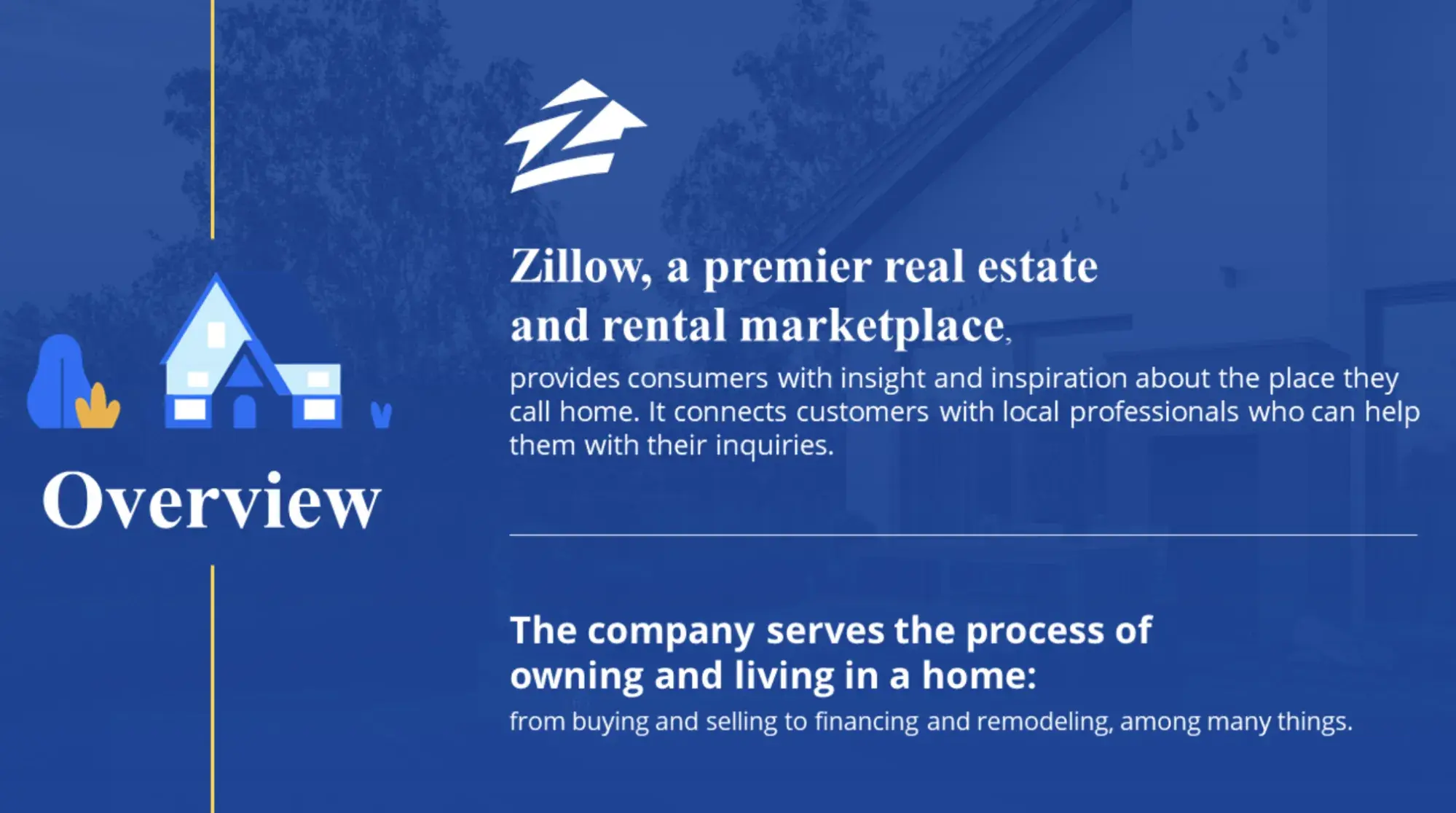
What I like: The mission slide starts this presentation off on a strong and memorable note.
2. Incorporate case studies.
Once you‘ve addressed the specific solutions you can provide to the prospect, it’s time to add some color to your presentation.
Turn your sales presentation into an engaging story by sharing case studies of similar prospects and the results they've achieved with your help.
In my experience, this step is important for building trust and credibility with the prospect. At the same time, case studies bring your solutions to life in the real world, making your presentation more engaging.
The below sales presentation template from Visme has a concise case study slide that introduces successful customers and details the product's impact on their lives:

If you don't have case studies, I recommend highlighting key data points instead to add authority to your claims. Data visualization makes presentations more engaging and helps contextualize your points, like the example below.
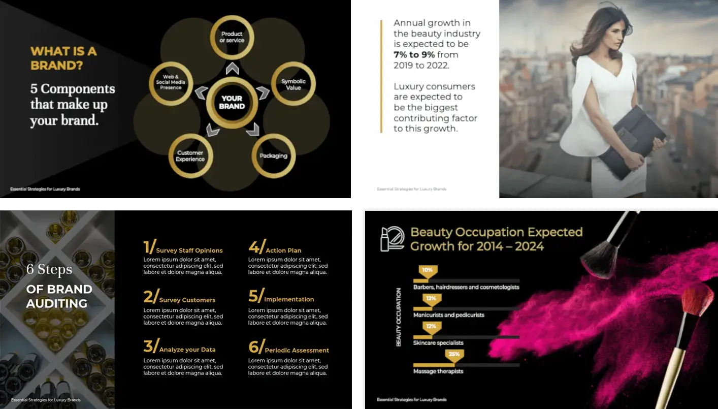
Why it works: Your audience members are asking themselves, “How can this product or service impact my life?” By including case studies in your presentation, you show that you understand them and can back up your claims with proof.
3. Ask for feedback throughout.
Most presentations are a one-way monologue by the salesperson. This approach is boring — and it's certainly no way to connect with a prospect.
Instead, ask short questions throughout your presentation, like “does that make sense?” or “can you see how this would work for you?” Asking for feedback periodically ensures your prospect stays on the same page.
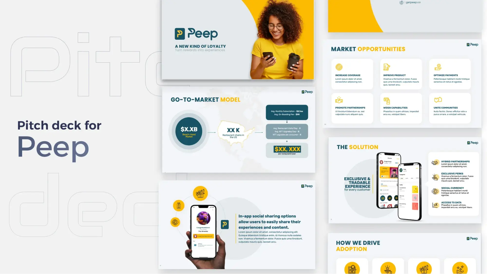
Pro tip: Having a text-heavy presentation makes this more difficult. If you're focused on reading out your slides, spontaneous questions are more likely to throw you off. Keep text on slides light to make you agile during your presentation.
4. Welcome interruptions.
If you want to close more sales, you have to care about what your prospect is thinking throughout your presentation.
Any interruption is the perfect opportunity to find out. Whenever a prospect interrupts you — either with a verbal remark or subtle shift in their facial expression or posture — stop immediately.
Acknowledge the interruption, and welcome the opportunity to explore it with the prospect. Never ignore signals just to stay on a roll and conclude your point. Invite prospects to ask their questions or share their concerns.
In my experience, the opportunity to respond to those concerns is always more valuable than whatever you were about to say.
5. Wrap it up quickly.
Your presentation should be ASAP: as short as possible.
It's natural for salespeople to get excited about what they have to share, but this causes most of them to ramble on for far too long.
Prospects only care about themselves and their challenges. Present the information they'll be interested in and nothing more. I suggest practicing your next sales presentation with a colleague or friend and asking for their honest feedback on its length.
Here's an example of a brief 6-slide presentation for Lyft:
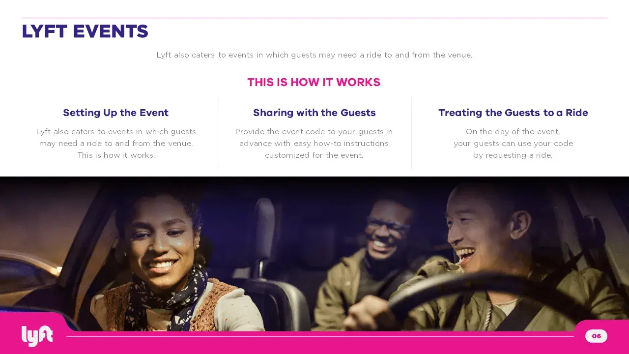
What I like: This sales deck prioritizes clarity with its use of imagery, icons, and text. The length leaves people wanting more, instead of leaving time for people to daydream and disconnect.
Sales Deck Template
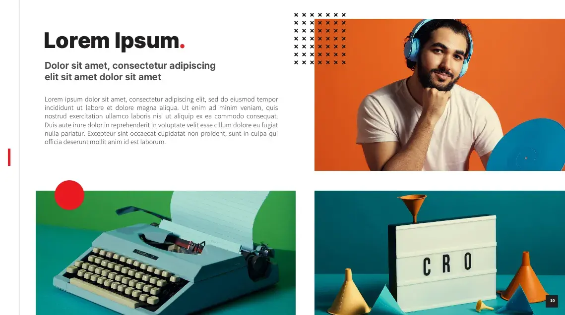
Ready to start creating your own sales deck? Get started with these free templates.
It includes 10 PowerPoint templates, each with a different focus.
How to Find a Sales Deck Template
Haven’t found what you’re looking for? Here are additional resources to find a sales deck.
Pitch
This presentation platform allows you to pick from hundreds of templates and fully customize the template you choose. The best part? It’s free and offers premium packages for teams who want analytics, multiple users, and live video collaboration.
Canva
On this graphic design platform, you can search through countless presentation templates and customize them. Canva also offers extensive collaboration features, such as file sharing and commenting.
Get Inspired With These Sales Presentations
What's your big takeaway from these sales presentation examples? Mine is that nothing sells better than simplicity. I hope these examples inspired you to refine your slides and simplify your offer into a no-brainer “yes” from your audience.
When delivering a sales presentation to a prospect, you can do so with the knowledge that thousands and millions of others have been in the same position as you. Luckily, we can see their work online to guide our sales deck creation process. Use these decks to structure your own, and you’ll be well on the road to closing more deals and exceeding your quota.
Editor’s Note: This post was originally published in April 2019 and has been updated for comprehensiveness.

10 Free PowerPoint Templates
Download ten free PowerPoint templates for a better presentation.
- Creative templates.
- Data-driven templates.
- Professional templates.
- And more!
Download Free
All fields are required.


![→ Free Download: 30 PowerPoint Presentation Templates [Access Now]](https://no-cache.hubspot.com/cta/default/53/2d0b5298-2daa-4812-b2d4-fa65cd354a8e.png)


![How to Make a Business Presentation in 7 Easy Steps [Free Business Presentation Templates]](https://53.fs1.hubspotusercontent-na1.net/hubfs/53/how-to-make-a-business-presentation.jpg)


