Table of Contents
- What is a sales pitch?
- How to Make a Sales Pitch
- Sales Pitch Ideas
- Parts of a Sales Pitch
- How to Start a Pitch
- Great Sales Pitch Examples
- Sales Pitch Presentation Examples
- Why a Short Sales Pitch is a Good Pitch
What is a sales pitch?
A sales pitch is a condensed sales presentation where a salesperson explains the nature and benefits of their business, ideally in less than one or two minutes. Sales pitches are often referred to as “elevator pitches” because they should be able to be delivered within the time constraints of a single elevator ride.
Salespeople are past the point of giving prospects hour-long presentations to sell products or services. Nobody has that kind of time and, to be honest, if you need an hour to relay your value proposition, you‘re doing it wrong. (Psst: If you need help creating a value proposition, we’ve got you covered.)
Remember: They're called elevator pitches for a reason. Ideally, if you're giving me one, I should be able to understand what you have to offer in the time it takes to get from the lobby to my floor. I need to be hooked by your opening line so I’m reluctant to leave the elevator because I’m so intrigued.
A good salesperson should be able to get their message across compellingly and concisely. If you can nail your sales pitch, odds are you'll have more time to talk down the line.
What is a product pitch?
A product pitch is not much different than a sales pitch, but it’s specifically focused on a product or service. When I pitch a product, I go in-depth and emphasize how the product works, how it will solve customers’ pain points, and the specific benefits it will bring to customers.
A sales pitch can be broadly focused. Let’s say I’m at a consulting firm that offers a wide range of services. I’m selling the business as a whole, rather than a specific product or service, like a CRM platform or accounting tool.
Parts of a Sales Pitch
If you have time to properly expand and work on a conversation, touch on points of interest. Here’s a framework you can use for building your pitch:
- Problem. Start with a statement or question about the problem you solve. You can present the problem using a personal anecdote, question, or eye-opening statistic. Answer the why.
- Value statement. Share a very clear, concise statement of value. Be action-oriented and outcome-focused. Avoid using jargon. Share benefits.
- How we do it. Highlight unique differentiators and explain what you do.
- Proof points. Provide clear reference examples and list recognizable achievements. Share industry validation and awards.
- Customer stories. Share customer examples and successes. Tell emotional and personalized customer stories. Make it real and tangible.
- Engaging question. Close the pitch with an open-ended question, creating a space to have a conversation.
Many companies use success stories in their pitches to ensure the sale. Name-dropping really works, so be sure to use that to your advantage. And if my product is small or light enough to keep in my pocket, I should always have one on hand to show prospects.
I always stress the need for a concise sales pitch. So keep it free of professional jargon, don't get into the weeds, and be sure to talk more about your prospect and their problems than yourself.
Nothing’s more off-putting than a bragging salesperson talking about themselves, their company, or their services. That’s what I call the “me monster.” The actor in your story is the customer, not you — period.
Distribution Matters
Lastly, presentation and distribution are everything. You need to deliver your sales pitch to the right person at the right time with the right tools on hand (like a demo, free trial, or presentation).
The sale starts with your list of contacts. Define your list and personas, know their correct contact information, get an introduction, and make sure you contact them at a time of day when they’re likely to respond.
How to Start a Pitch
Starting a sales call is arguably the hardest part of the pitch. You have to grab your prospect’s attention so that they actually want to hear the value of your product and how it can help their business. But before you can share the product’s value, you have to hook the prospect.
When starting a pitch, I make sure to do the following:
- Starting with the problem. I always start with the problem my offer solves. Unless customers know what my team can do for them, they won’t be open to hearing how our product is a solution.
- Tailoring the start of the pitch to their vertical. No one wants to hear a general pitch that would apply to any business. Instead, I research their vertical and use the information I find to personalize my pitch immediately.
- Offering stakes. If they don’t solve the problem using our solution, what do they have to lose? I don’t need to state it in such clear terms. However, alluding to the risks at the start of my pitch helps me secure buy-in straightaway.
Here are a few methods for starting a product pitch, but remember: Try to stick to thirty seconds, or one to two sentences if you’re delivering the pitch via email.
Start off with a personal anecdote.
I always start a pitch with what I know best — myself. While I don’t think you should focus solely on yourself throughout your entire pitch, starting off with a personal anecdote can help you speak with more authenticity and foster empathy.
The key here isn’t to focus on the product’s merits. How many product pitches start off with “This product helped me achieve X results in X amount of time”? A lot. And I’m already yawning. And no one cares about results unless they know the problem first.
Instead, my personal anecdotes focus on a problem that my offering can solve. Make it as excruciating as you’d like — and don’t forget to be genuine and connect your anecdote to their business.
Ask a question that relates to the problem you solve.
Oh, yes, the good old question. While it might verge on overused, it’s not to be dismissed. Asking a question is a highly effective way to start a pitch. The question should, again, focus on the problem.
I stick to yes or no questions and tailor them specifically to the business I’m pitching to. If I’m speaking to a real estate business, I craft questions that articulate a problem specifically experienced by real estate firms. If I’m selling a property management software, it could be as simple as, “Do you spend way too much time tracking individual property sales? That’s time better spent actually showing homes to prospective buyers.”
Start with a stat that resonates and offers stakes.
Starting with a stat can be effective — but it has to resonate with the audience and offer stakes. In other words, what does the stat have to do with the problem? How does it reflect a potential and critical downfall that could harm your prospect?
Let’s say that I’m selling yard maintenance services. Starting off with “50% of homes don’t use yard maintenance services” is a lazy and boring way to begin my pitch. Instead, I say that “50% of homes don’t use yard maintenance services, resulting in thousands paid to HOA every year.”
Now that you know how to start your pitch, it’s time to deliver the rest of it. Use the following tips to secure buy-in in less than three minutes.
How to Make a Sales Pitch
- Do your research.
- Make it short.
- Make it clear.
- Make sure you're speaking to them, specifically.
- Explain who your customers are.
- Explain the problem they're facing.
- Explain how your product addresses their needs.
- Describe what success with your product will look like.
- Provide social proof.
- Brace for objections.
- Follow up.
1. Do your research.
A thoughtful, effective sales pitch speaks to how your specific offering suits your prospect's specific circumstances … specifically — and in this context, specificity is the byproduct of thorough, thoughtful research.
Productive sales pitches are framed around a problem a prospect is facing. You can‘t identify potential gaps and inefficiencies in how a prospect’s business operates if you don't know their business.
Scour any public-facing resources the business has. That could be the information on its website, its bank of case studies, or list of customers. You also have to have a solid pulse on industry trends and insight into its competitive landscape.
One way or another, gather the perspective you need to deliver a thoughtful, relevant pitch. You don‘t have to rattle off every fact and figure you pull about your prospect, but you don’t want to speak in vague platitudes that would apply to just any business.
2. Make it short.
A sales pitch isn‘t a conventional presentation. You’re not going to have PowerPoint slides. You‘re not going to have complimentary pastries on a boardroom table. And, most of all, you’re not going to have your audience’s time and patience for long — at least not until they’re sold on your product.
3. Make it clear.
This ties in with the previous point. You don’t have the time to go on tangents or talk about anything but the message you’re trying to get across. Your pitch has to be lean and to the point. It has to register with your listener immediately. That means speaking with intention and clarity.
If I’m pitching a product, I want to ensure that I clearly communicate how it will solve the prospects’ pain points. My listeners should leave with a clear picture of how their day-to-day will improve if they decide to make a purchase.
4. Make sure you're speaking to them, specifically.
Remember that one time three points ago when I said sales pitches should be specific? I'm going to elaborate on that a bit more here.
Should your pitch be concise? Yes. Should that come at the expense of specificity? No. You don't want to speak vaguely, mentioning how “businesses” in general can benefit from your solution. You want your prospect to understand that your solution will work for them in particular.
Take the insight you‘ve gathered from your research. Understand their circumstances and pain points, and apply that knowledge via a pitch that shows you’re looking out for their specific interests.
5. Explain who your customers are.
Consider the picture you’re going to paint in your pitch. Give your listeners perspective on who’s buying your product or service. They want to know that you have a lucrative, engaged market in mind. Be specific in identifying who will be interested in your product. Then, try to convey why your listeners should be interested in them.
6. Explain the problem they're facing.
Cover why your customer base needs you. Your target market is only as valuable as the problems you can solve for them. Convey a problem they consistently face. If I’m pitching a spreadsheet software for accountants with functionality Excel doesn’t have, I could discuss how hard it is to bookkeep without my software's unique features.
7. Explain how your product addresses their needs.
At this point, you’ve established who you’re selling to. You’ve established why you’re selling to them. Now, you have to establish why they’d buy from you. What can you do better than your competition?
As mentioned above, you need to clearly explain how your product addresses their needs. Continuing with the accounting example, you could touch on how your unique data visualization features make busywork more efficient.
8. Describe what success with your product will look like.
Show the benefits of your product on a broader scale. In the example we’ve been using, I can talk about how accountants who use my software have more time to spend with important clients or the flexibility to spend time with their families. I can show how my product makes customers’ lives better as a whole.
Ideally, your pitch should be a one-liner summarizing what your company does, how they do it, and for whom. And this is not just a requirement for sales reps. Anyone in your company, from the CEO to sales consultants, needs to know your one-line sales pitch by heart.
9. Provide social proof.
If you can, think about sliding in a mention of how any of your prospect's industry peers have seen success with your solution. Prospects are typically more inclined to trust your customers more than they trust you.
After all, those companies don‘t have anything to gain from you winning your prospect’s business. You want to keep your pitch concise, so don‘t get too caught up listing off every organization in your prospect’s competitive landscape that leverages your solution — but a quick reference to one of your more successful, relevant customers can go a long way.
10. Brace for objections.
I keep mentioning this, but I‘ll say it again: Sales pitches are supposed to be concise. If all goes well, you’ll generate some immediate interest, but you won't have the space to address everything your prospect might want to know in your pitch itself.
You have to be prepared to field some questions, and your ability to answer those questions thoughtfully will stem primarily from experience and research. Familiarize yourself with the common objections you get from companies in your vertical.
Pull from your research to understand your prospect‘s unique circumstances, and be prepared to field questions relevant to those. And when you’re fielding objections, remain composed and non-confrontational. You're trying to frame yourself as a helpful, consultative resource for prospects — not as arrogant or argumentative.
11. Follow up.
A sales pitch sets a sales engagement in motion. Capitalizing on a thoughtful, well-executed one requires some persistence. According to a report from Invesp, 80% of sales require five or more follow-up calls — so if you want to make the most of your pitch, be prepared to conduct some additional outreach.
Sales Pitch Ideas
- Tell a story.
- Include a value proposition.
- Personalize the sales pitch.
- Switch up your pitch.
- Practice your pitch.
- Try not to use metaphors.
- Create a WOW moment.
- Appeal to emotions.
- Back it up with facts.
- Tap into their fear of missing out.
- Educate them.
How can you make your sales pitch the best it can be? Here are some sales pitch presentation examples and ideas.
1. Tell a story.
Keep your listeners engaged by telling a brief story. The story could be either about the company or how a customer found success through your product or service. In this latter example, I can start with the issue the customer was facing, lead into the solution, and end with the key results the customer achieved.
If you think storytelling is difficult, don’t fret. Just think of your favorite movies and TV shows — how did they keep you engaged? Try to emulate the same tricks as you try storytelling during a sales pitch. Use images and interactive elements to enrich the experience for your listeners, keeping in mind who your audience is and what their preferences are.
Pro-Tip
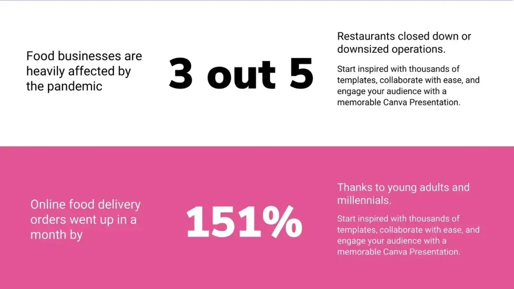
Your story doesn’t even need to be an anecdote. This sales pitch presentation example from a template deck I found in Canva demonstrates how to communicate a relevant industry statistic at the beginning of your pitch. In my opinion, data is a great way to tell a story.
2. Include a value proposition.
A pitch is a vehicle for you to convey why a prospect should consider your solution — making your value proposition the crux of your entire pitch. If you can‘t articulate your offering’s value, you can't give them a compelling “why”.
What value will you provide for this person or their company? While your pitch should be short and sweet, the value proposition is the core of your sales pitch. To offer the greatest amount of impact, your value prop should come after you identify the problem that your prospect faces in their day-to-day. The value prop is the proposed solution and is the make-or-break moment of your pitch.
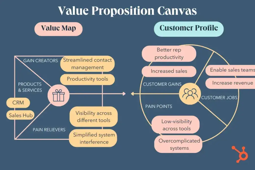
Create a value proposition canvas to guide the wording of your value prop. Remember that the gain creator and pain relievers connect directly to the customer's situation. Leveraging these two sections will help you create a pitch that directly speaks to your prospect and their needs.
Example
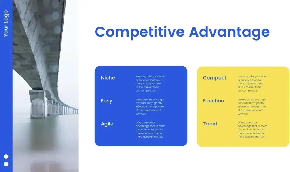
In this sales pitch presentation template, the company clearly outlines its competitive advantages as a way to communicate their value prop.
3. Personalize the sales pitch.
Who are you talking to? Make sure your sales pitch is relevant to them and piques their interest. You’ll be able to customize it so it addresses the items that are most important to the person you’re speaking with.
This idea applies to any pitching method or technique you use. No matter what, the sales pitch should speak to your prospect’s highly specific pain points and needs.
For instance, if I’m selling enterprise-level software to senior-level executives, I might adjust my tone and delivery to be more formal and poised. The scrappy owner of a startup, however, might appreciate more humor and levity. I recommend studying prospects to figure out the best pitching method for them.
Pro-Tip
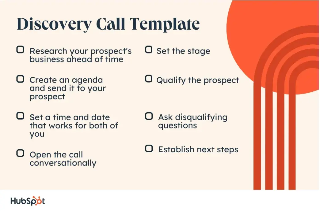
For personalization to have the most impact, you must have had a productive discovery call where you asked questions that uncovered your prospect’s most urgent needs. Leverage the information you found out during that process to hone your pitch.
Also, consider using dedicated sales software to store all your contacts’ details and leave notes next to each prospect with any information that helps you personalize your message — especially handy if you’re pitching at scale.
4. Switch up your pitch.
There are a variety of sales pitch types to choose from:
- The one-word sales pitch. Reduce the entirety of your value proposition and company mission to one word. For instance, at HubSpot, my one-word sales pitch might be “growth.”
- The question sales pitch. Opening your pitch with a question not only piques curiosity but also engages the end recipient. I may ask, “How much money does your company waste on manual sales activities that could be automated?”
- The rhyming sales pitch. Using rhyme can make your pitch more memorable to buyers and even incite a laugh. For instance, if I were pitching Sales Hub to a potential business, I might say, that Sales Hub covers every sales need from bottom to top and makes you an elite member of the sales automation club. I’m absolutely not a poet, though.
- The subject line sales pitch. If I’m primarily selling a product over email, I can craft a sales subject line that pitches the product to prospects.
- The X sales pitch. You don’t need to get on X (previously Twitter) for this one. Instead, think about how you’d word your pitch if you only had 280 characters to work with. What would you emphasize? What would you omit?
- The Pixar sales pitch. Place your ideal buyer persona, their key problem, and their solution in a story that more or less follows the familiar Pixar structure: Once upon a time _____. Every day, _____. One day _____. Because of that, _____. Until finally, _____.
Pro-Tip
Depending on the potential customer and situation, change up the type of pitch you use. Alternatively, as the sales process progresses, you can use different types of pitches and identify the ones that your prospect most effectively responds to.
5. Practice your pitch.
Practice, practice, practice. Once you've created your pitch, practice it so you feel comfortable presenting it in front of prospective clients. You can do this in a few ways: By simply standing in front of a mirror and practicing, by filming yourself using your phone or laptop camera, or by role-playing with a colleague.
I especially recommend the last option because you can get live feedback during or after the exercise. Role playing is a valuable sales training technique that has helped me build my pitching muscles while also putting me in situations where I have to think on my feet.
6. Try not to use metaphors.
Odds are your sales pitch isn’t happening in an English classroom. The idea of incorporating vivid, clever comparisons might seem effective in theory, but there’s a good chance you might confuse your prospect. Remember, you want to keep things clear.
If you feel compelled to use metaphors, keep them business-related or extremely familiar (like “it’s important to walk before you run” or “we should compare apples to apples”). Don’t use sports-related metaphors unless you’ve made a connection with your prospect on that basis — maybe they played baseball as a child like you did, or you’re both fans of the same sports team.
7. Create a WOW moment.
One way to ensure your pitch is memorable is by blowing the listener or recipient’s mind. You might do this by stating a fact that is counter-intuitive, demonstrating the product/service’s best-selling point in a shocking way, telling an outlandish story, or emphasizing your product’s most unique feature.
For instance, let’s say that I’ve established my company’s customer service as one of my key selling points. During an office visit, I might take the prospect on a tour of the customer service floor to show them the service team in action and even introduce them to the chief customer officer on a first-name basis. Talk about creating a positive impression! With that move, I cement the authenticity of my claims while delighting the prospect.
Pro-Tip
If you’re pitching virtually, you can use your sales pitch presentation as an opportunity to walk through a demo. Take a moment to think about some of the pain points or needs the customer has already shared so you can personalize your demo and share a feature that would meet their needs most.
8. Appeal to emotions.
Understanding your customers is central to consistently nailing sales pitches, and when you do, it’s good to convey that. One way to do so is to use empathy, revolve your pitch around their life experience, and find commonalities between you and them. Try to find out small tidbits about their career, their upbringing, or even their childhood so you can use empathetic statements and connect on a more personal level.
In my opinion, the sales pitch template below demonstrates one way to weave emotions into your presentation: by calling out and outlining customer pain points with clarity — and empathy.
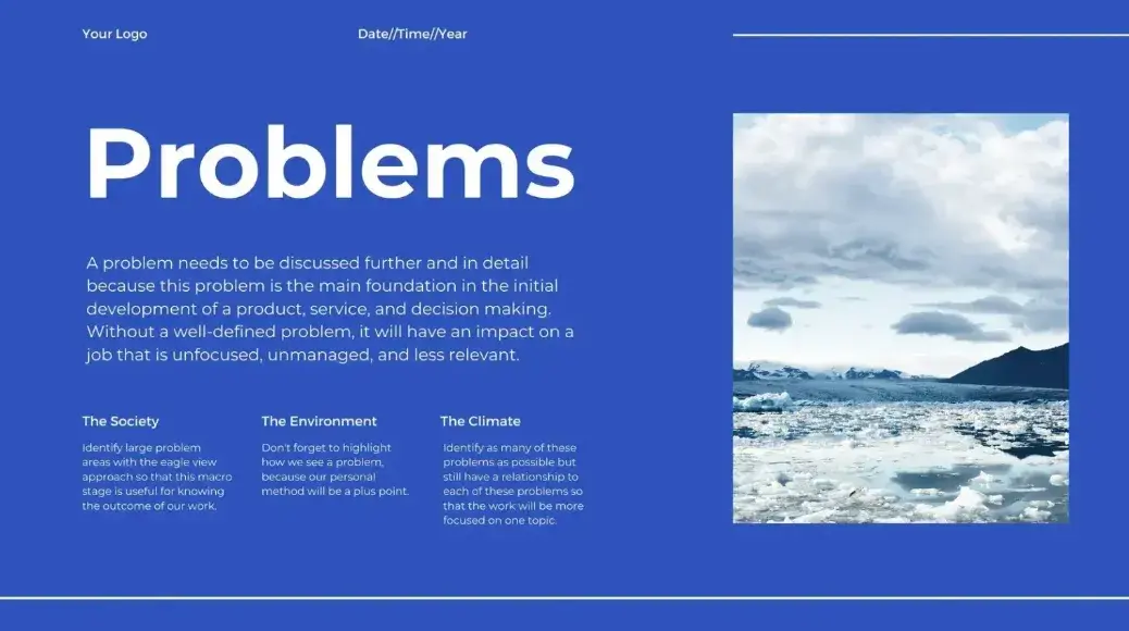
If you’ve both worked at startups in the past, for instance, you can appeal to your prospects’ emotions by mentioning how limited budgets can be during those early startup days. You can then either help them feel glad that they have a larger budget now or lead to the returns of your product.
9. Back it up with facts.
While consumers make decisions more often with emotion, they still need to rationalize the decision to themselves and/or other key stakeholders. By providing statistics or case studies that support the emotional appeal, you’re providing credibility that will help them feel as though they’re making the right decision.
For case studies specifically, I recommend incorporating a few into your sales pitch presentation. If there’s no time to cover the specifics, I usually include a QR code or shortened link where it’s easy for prospects to access our case study library.
Example
Here’s an example of how to briefly showcase customer testimonials or case studies in your sales pitch presentation.
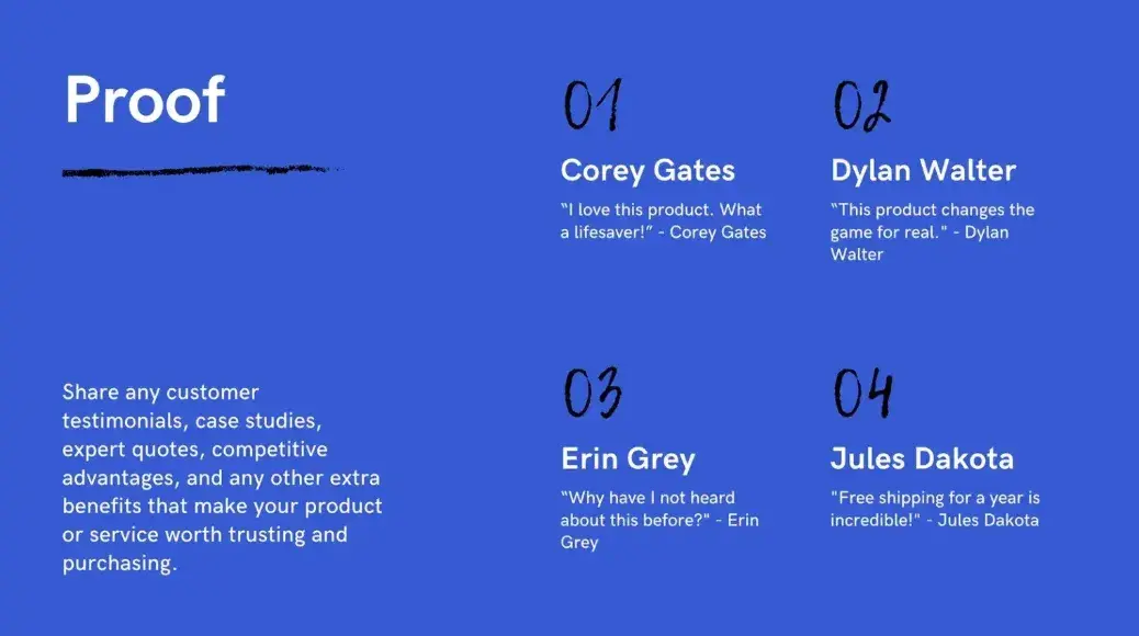
10. Tap into their fear of missing out.
Fear of missing out (FOMO) is a powerful motivator and can create a great sense of urgency. The last thing you want is for them to be dazzled by your sales pitch but procrastinate long enough for that feeling to fade away. Instead, get them to take action right away.
11. Educate them.
You want to establish yourself as an authority in your space. Some interesting, relevant facts can help grab your customers' attention and add a certain degree of legitimacy and trustworthiness to your pitch. In addition, provide more resources that the prospect can refer to as they continue exploring your company and your offerings. That way, they can find out more at their own pace.
It’s also important to provide supplemental information that doesn’t necessarily educate them about your product but about how they can do things more efficiently at their business. For instance, if you sell design software, you can send them links to resources that teach them how to design assets for social media platforms.
Great Sales Pitch Examples
If you’re in need of inspiration, take a look at the following sales pitch examples. They're short, focus on the customer, and effectively convey value.
1. Phone Sales Pitch
When I have an opportunity to pitch over the phone versus email, I feel like I’ve won the lottery.
That’s because making a sales pitch over the phone gives me the opportunity to establish a personal connection with my prospects and guide them to the next step in the buying process. This is one of the most powerful pitching methods because it happens in real time, allowing me to gauge interest and adjust my pitch accordingly.
Phone pitches are commonly done by cold calling but can also be used in warm calls to existing leads or even follow-up calls after initial contact. So, what does an effective phone sales pitch look like? Here’s an example:
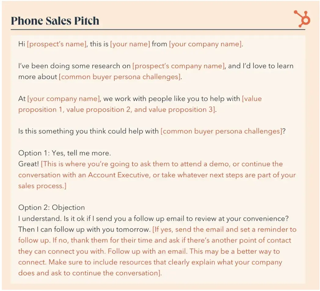
What I like: This pitch shows that I’ve done my research. I can remind the prospect of the pain points that they have. The script then provides a solution if the prospect objects to the offer.
Pro tip: Check out HubSpot’s sales call templates for more inspiration on how to create a winning phone sales pitch.
2. Voicemail Sales Pitch
While I love a phone pitch, I recognize that not every phone sales pitch goes as planned. The prospect may not pick up. In fact, 80% of sales calls go to voicemail. That’s why I always have a voicemail sales pitch on hand, just in case I end up in a game of phone tag.
When leaving a voicemail, you have the opportunity to make an attention-grabbing message that piques the curiosity of your prospect. A well-crafted voicemail pitch can create a sense of urgency and leave your prospects more motivated to return the call.
If you continue to have trouble getting in contact with a prospect, keep trying. The more you call them, the more likely they will pick up eventually — it just might take some persistence.
Check out this example of a successful voicemail sales pitch:
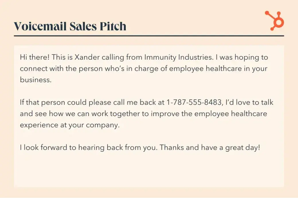
What I like: This voicemail states who I am and why I’m calling. I can then explain how the prospect could benefit by returning the call.
Pro tip: I can also use voicemail as a way to redirect your prospect to another channel, such as email. For instance, I could leave a message saying something like, “Hey Sarah, it’s Gabe from XYZ. No need to call me back. I’m calling to let you know I just sent you an email with some marketing statistics I think you’ll appreciate. Let me know what you think!”
For more examples on how to leave an intriguing voicemail, check out HubSpot’s free voicemail script templates.
3. Email Sales Pitch
When you have a large number of prospects to contact and don’t have the time to call each one, sales emails are a great way to connect. One of the major benefits of pitching via email is convenience. Emails can be accessed anywhere at any time, allowing your prospect to review the pitch whenever it works for them. Plus, it can be saved for future reference.
While it may be tempting to send out a generic pitch to all your prospects as a way to save time, it’s important that each email pitch is well-written, compelling, and tailored to each recipient. Emails that are too spammy and sales-y are more likely to end up in the trash and leave you on read.
Here’s an example of what an effective email sales pitch looks like:
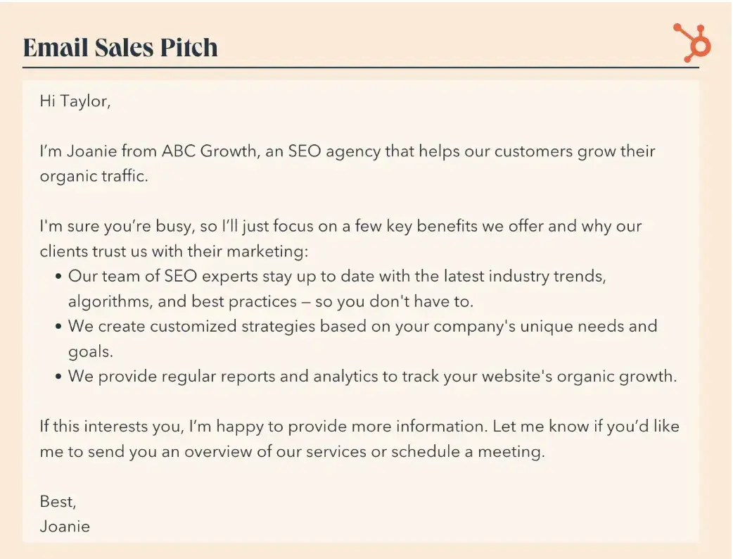
What I like: This pitch is clear and concise and allows me to acknowledge that the prospect is busy. I can quickly and clearly demonstrate value. From there, I can use skimmable bullet points to draw attention to the benefits of using the service.
Pro tip: There are tons of different ways to write an email pitch, especially since each prospect has their own unique needs and pain points. To save some time, check out HubSpot’s free sales email templates.
4. Sales Presentation Pitch
If I’m lucky enough to make a pitch in person, I always prepare a sales deck, which is a presentation used to enhance your pitch. Sales decks are often created with programs like PowerPoint, Google Slides, and Keynote. You can also find tons of pre-built templates in Canva if you’re looking for something polished that you don’t have to create from scratch.
A sales presentation pitch can be beneficial because it uses visual elements, like images, graphics, and charts, to showcase your product features, benefits, and value proposition. Plus, the structured format ensures a logical flow of key points and keeps the presentation focused instead of overwhelming your prospect with too much information.
Take a look at this sales deck pitch for UpstartWorks:
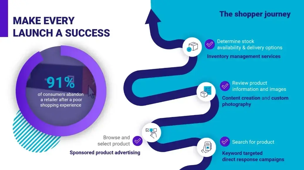
UpstartWorks utilizes an animated slide presentation to communicate with their prospects. Plus, they even have a PDF version of the slides to distribute when the presentation is over.
What I like: This deck lists all of the benefits of working with the company and uses data to communicate why ecommerce isn’t going anywhere. I like that the deck demonstrates expertise. Beyond that, it uses engaging visuals to capture the audience’s attention.
Don’t have time to create your next slide deck? HubSpot’s free powerpoint templates can give you the kickstart you need to create a visually compelling presentation.
5. Elevator Pitch
No matter what type of situation I’m in, I want to have a quick and easy sales pitch ready to go at any moment. Instead of ABC (always be closing), I have an ABP mindset (always be pitching). That’s where elevator pitches come in.
The idea is that I quickly and effectively convey the key value proposition, benefits, and unique selling points of my offering in 60 seconds or less — aka the duration of an elevator ride. An elevator pitch can come in handy at networking events, job interviews, industry conferences, or any situation where a quick and compelling introduction is needed.
Here’s an example of an elevator pitch that can be used for a sales opportunity:
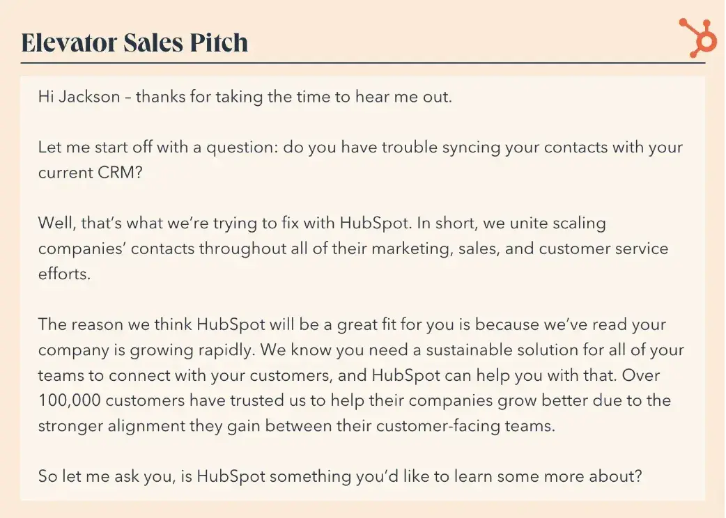
What I like: This pitch starts off with a question to grab the prospect’s attention. I can then remind them of a frequent pain point before providing a solution. I can then invite the prospect to learn more about the offering.
Pro tip: For more elevator pitches — including ones that can be used for networking and investment opportunities — check out HubSpot’s free elevator pitch templates.
6. Video Sales Letter
A video sales letter takes the key elements of any other sales pitch and presents them in video form. They can be used in various ways, such as on websites, landing pages, social media platforms, or sent directly to your leads.
The major benefit of going with a video sales letter is that videos provide an opportunity to tell a compelling story about your product or service in a way that you can’t with other mediums. By combining visuals, narration, and music, you can really capture the attention of your prospect, evoke emotions, and make a lasting impression that can help move the buying process forward.
Glorify’s video sales letter for their instant background removal is a great example.
What I like: The video immediately presents a common problem that ecommerce vendors and marketers deal with and offers a solution. Beyond that, the use of animated visuals and catchy audio make it engaging to watch. Plus, I can actually see how to use the tool.
7. Social Sales Pitch
Social sales pitches are tailored messages delivered to prospective customers through social media platforms, like LinkedIn. This process is often referred to as social selling.
Unlike traditional sales pitches that can be more direct and transactional, a social sales pitch aims to establish relationships and build trust with prospects by delivering valuable and relevant content. The goal is to increase brand awareness and drive conversions by aligning your sales message with the interests and needs of your prospects.
Here’s an example of social sales pitch that works when you have a mutual connection:
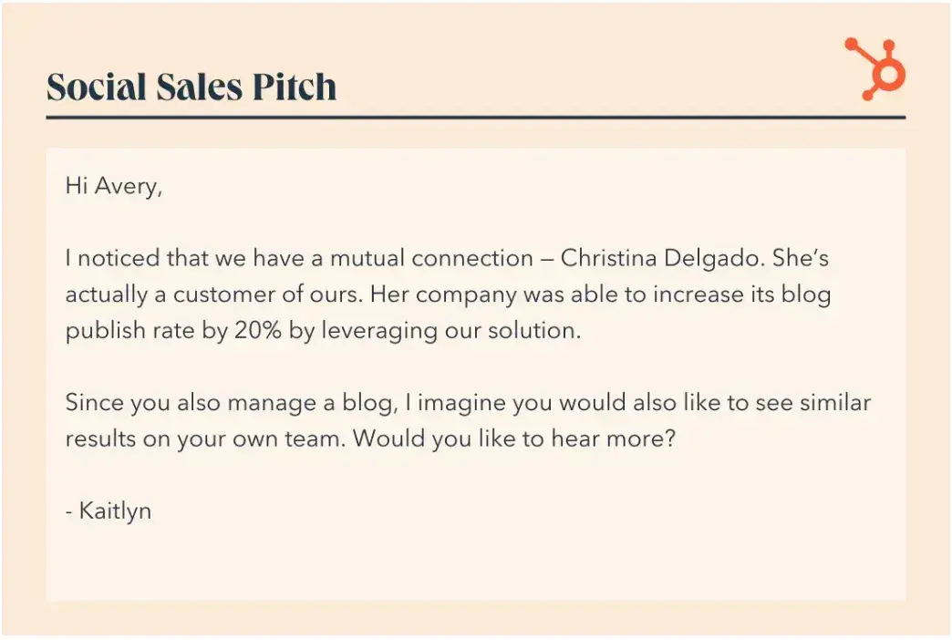
What I like: This pitch immediately establishes credibility. I can see how the product has worked for other customers. Them I have the chance to learn more.
Pro tip: Take your social sales pitches to the next level by using some of the tips in HubSpot’s free guide on social selling.
8. Website Sales Pitch
A website sales pitch refers to the persuasive messaging and strategic content displayed on a website to attract and convert potential customers. It aims to capture visitors’ attention, engage them with compelling content, and guide them towards taking a desired action, such as making a purchase, filling out a form, or contacting your business.
Compelling website pitches often include storytelling, product or service descriptions, customer testimonials, and persuasive elements like pricing incentives or limited-time offers.
Here’s a great example of a website sales pitch from LISNR:
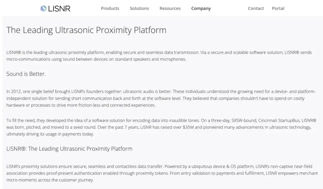
What I like: This website pitch uses the company’s origin story as a storytelling device. I can clearly see the company’s values. Then, I can see how the company has grown over time.
9. Follow-Up Pitch
So, what do I do if my prospect doesn’t respond to my first pitch? I follow up with them. A follow-up pitch gives me the opportunity to reignite the conversation, reinforce my value proposition, and address any questions or concerns a prospect might have.
Follow-up pitches can be delivered through a number of channels, but phone calls and emails are the most common. Ultimately, the goal of a follow-up is to continue nurturing your relationship with the prospect and convert them into a customer.
Here’s a great example of a follow-up after connecting with a prospect on social media:
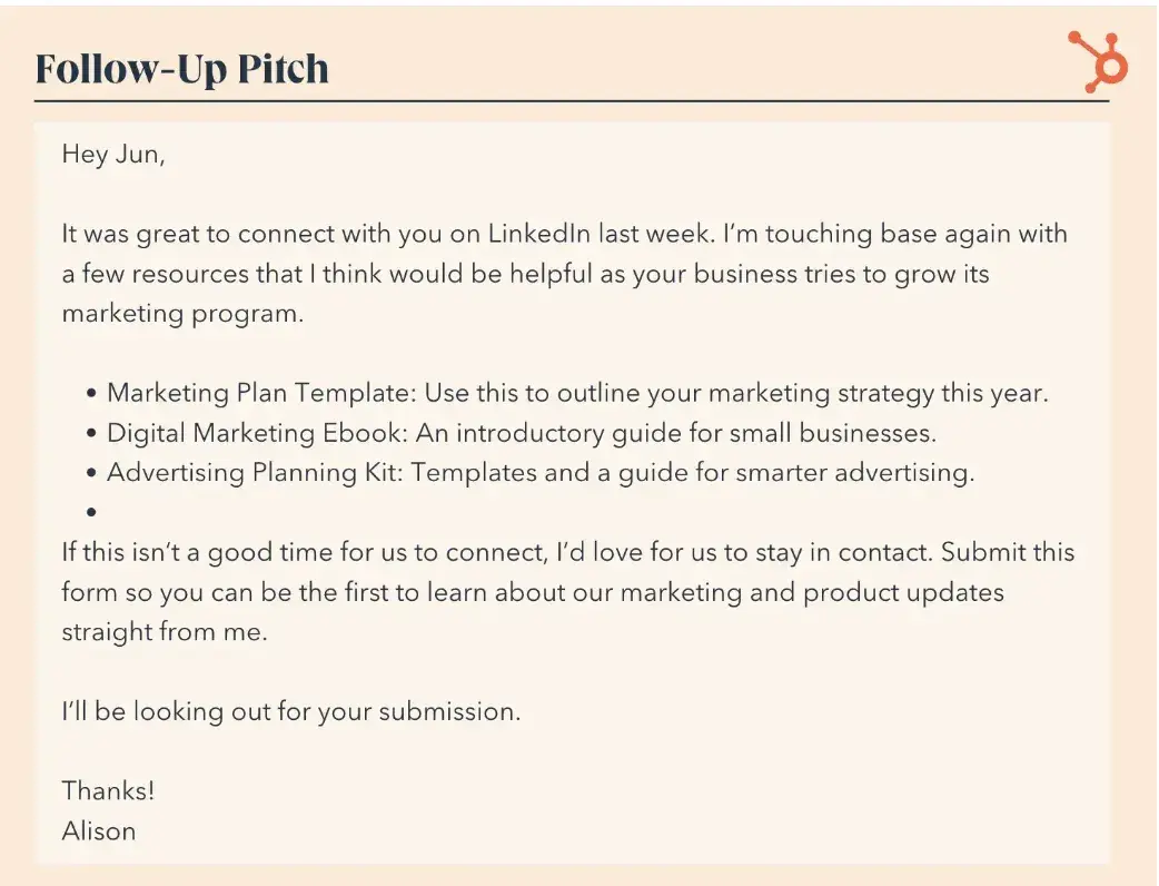
What I like: This pitch states how the sales rep and prospect initially connected. Then, it cuts to the chase. There’s also a call to action that asks the prospect to sign up for a newsletter.
Pro tip: Following up can feel awkward sometimes, especially when you’re new to sales. HubSpot’s follow-up email templates can help you create friendly follow-ups without all the stress.
Sales Pitch Presentation Examples
To pull everything together that we have discussed in this post, I would like to share three quick examples of sales pitch presentations. These video presentations showcase the attributes of a strong pitch — that includes telling a story, emphasizing your company’s value proposition, and solving for customers’ pain points.
1. Algoplanner.
In this sales pitch, Algoplanner — a supply chain SaaS company — uses a strong storytelling method. I like how they first set up a clear problem statement, tapping into prospective customers’ emotions (read: overwhelmed, overworked). Then, they position themselves as the solution.
2. UpSend
UpSend, a former customer service software, has a great sales pitch presentation here. I like how they focus on setting up the problem they are solving for — and then clearly illustrating how their product adds value.
3. Surfe (Previously leadjet)
The revenue workspace Surfe illustrates another strong sales pitch. They quickly tell the story of their prospective customers’ pain points and communicate a lot of understanding. Then, I like how clearly they illustrate how their product solves those pain points.
Bonus: HubSpot
This isn’t exactly a pitch presentation but instead a podcast episode with CTO Dharmesh Shah about how the company has grown over time. However, I included this episode in the list because Shah goes into the anatomy of HubSpot’s early sales pitch.
“What we said was, ‘By the way, everything you’ve done in marketing doesn’t work any more…’ When you’re selling to a VP of marketing, you’re creating an existential crisis in their head when you’re telling them everything they know how to do well is no longer relevant,” Shah says on the episode.
Then, Shah could recommend a change in direction with HubSpot.
Why a Short Sales Pitch is a Good Pitch
An important note to make about these sales pitches is that they are all amazingly optimized for a short conversation. (Notice how short the three pitch examples above are?) I can't stress enough how much brevity matters for a sales pitch. Talking too much, using filler words, and talking about your company for more than two minutes can easily kill a conversation. So, keep your sales pitch short, clean, and simple! Your customers will thank you.
Editor's note: This post was originally published in June 2019 and has been updated for comprehensiveness.
Sales Pitch


![23 Elevator Pitch Examples to Inspire Your Own [+Templates & Expert Tips]](https://53.fs1.hubspotusercontent-na1.net/hubfs/53/_category_page.png)
![12 best sales presentations to inspire your sales deck [+ 5 tips]](https://53.fs1.hubspotusercontent-na1.net/hubfs/53/sales-presentation-guidelines-1-20251024-8016063.webp)
.png)


.jpg)

.jpg)
