.png?width=112&height=112&name=Image%20Hackathon%20%E2%80%93%20Vertical%20(50).png)
Not every website visitor will ask themselves these questions consciously, but they're still getting answers and making conclusions about tech companies based on web design. So, what are the best tech websites, and what lessons can we learn from them about tech website design? Here are 17 of the best modern tech websites as examples to inspire your own design.
Best Tech Website Designs
- Avast Academy
- Dropbox
- Dribbble
- Moz
- GitHub
- Apple
- Airbnb
- Trello
- SoundCloud
- Canva
- Surfer SEO
- ChatGPT
- Blue Origin
- Carrd
- Elementor
1. Avast Academy
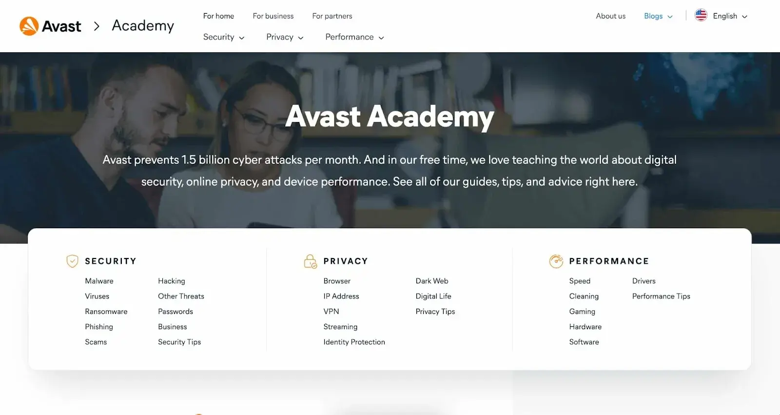
Avast Academy is the first website on the list because I think it serves as a good blueprint for other tech websites. Its mission is to provide cybersecurity and privacy without compromising performance. The website's homepage design immediately draws my attention to multiple navigation paths, each highlighting one of its services.
One quick scroll shows me all of its blogs designed to provide value to visitors and attract more business in the future. Normally, I think that a lot of text above the fold on a homepage is distracting, but Avast Academy is impressive with its number of features. I find it to be very effective.
What I like: Built with Content Hub, this website delivers a highly intuitive, replicable experience with a high conversion rate.
2. Dropbox
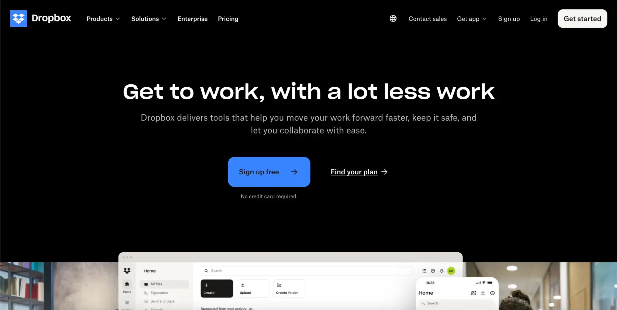
If you‘re unfamiliar with Dropbox, it’s a file storage service. Dropbox's website design is a great example of “less is more.” My eye is immediately drawn to the highlighted button on the homepage, directing me to their free plan option, which is a great way to increase conversion rates.
The rest of the clickable options on the page give me more information about the other services Dropbox offers. This website also maximizes its available space by using navigable menus that drop down when I hover over the button.
What I like: This website is a great example of how to implement efficient and intuitive design into your website. Everything has a purpose; even the white space is used to highlight a potential conversion path for their services.
3. Dribbble
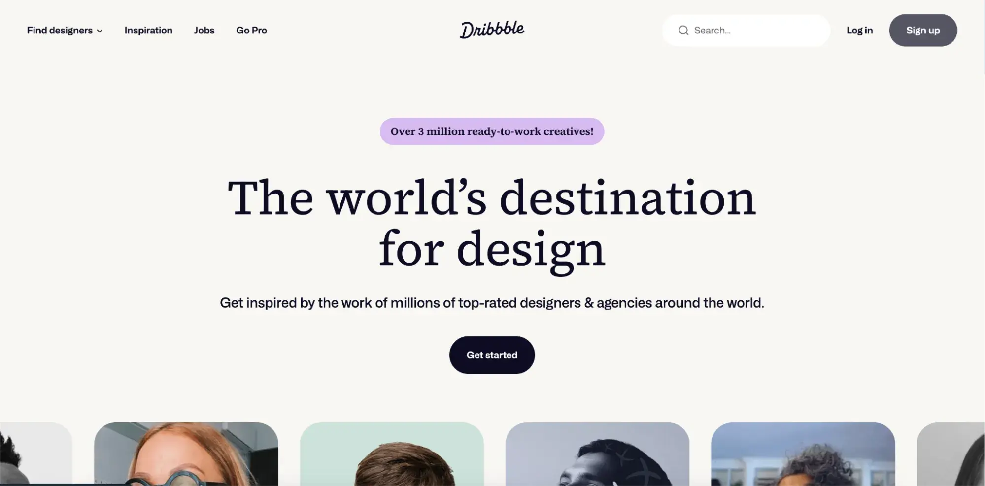
Dribbble is a website that allows designers to host their portfolios, so it's almost a necessity that it has a great website design.
Each button is clickable and displays examples of designs the website hosts. You can even use the website to check out other web designs for inspiration (after finishing this article). My eye is really drawn to the buttons, which use either color or contrast to stick out on the page. I love the neutral backdrop to this page and think it brilliantly focuses the viewer's eye.
What I like: This website's design doubles as beautiful and strategic. With each click, you are taken on an aesthetically pleasing journey that shows why people use this website. This is a website by designers, for designers, and that comes through in the homepage design.
4. Moz
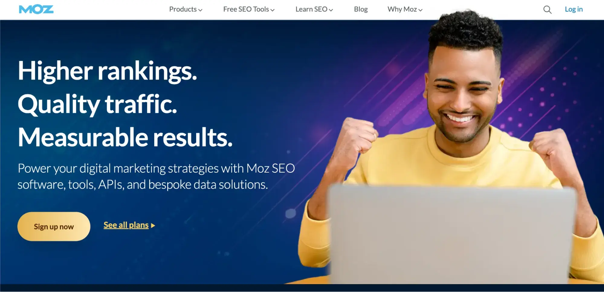
Moz is an internet company that helps businesses improve their search engine optimization (SEO) efforts to improve their rankings in search engines and gain more website traffic. If you haven't visited Moz in a while, then you might not even recognize it — it was almost famous for its old-school, minimalist design that lasted for years.
I really like their modern rebrand. The website menu has several drop-down buttons and makes the most of its whitespace by emphasizing the call-to-action (CTA) in the middle of the page.
This website also does an excellent job of engaging the visitor, as the first thing they see is, “Higher rankings. Quality traffic. Measurable results.” This simple introduction connects the user with Moz's mission instantly.
What I like: Moz's website gets right to the point. They show off their CTA, promise success, and have the social proof to back it up. This website is an excellent example of website design.
5. GitHub
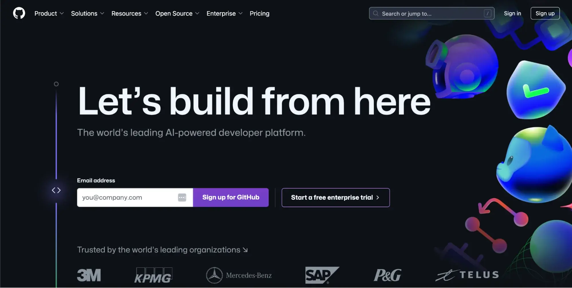
GitHub is a Git repository hosting service that lets you store coding projects on its website. This website tries to sell you the idea of endless possibilities. It starts with its almost alive-looking background graphic and a strong headline: “Let's build from here.” The encouraging tagline does a great job of including the user in the customer journey.
GitHub is powered by its user base and defined by its collaborative abilities, so this one slogan ends up emphasizing GitHub's core values.
Next, the CTA jumps out of the page, and users see social proof. There's a subconscious circular design to this homepage: as my eye moves over the page, I find myself circling back to the top and passing over the page again.
What I like: With a beautiful design, social proof, and a welcoming start to the customer journey, GitHub is a great example of how to pass along your company mission without blatantly stating it.
6. Apple
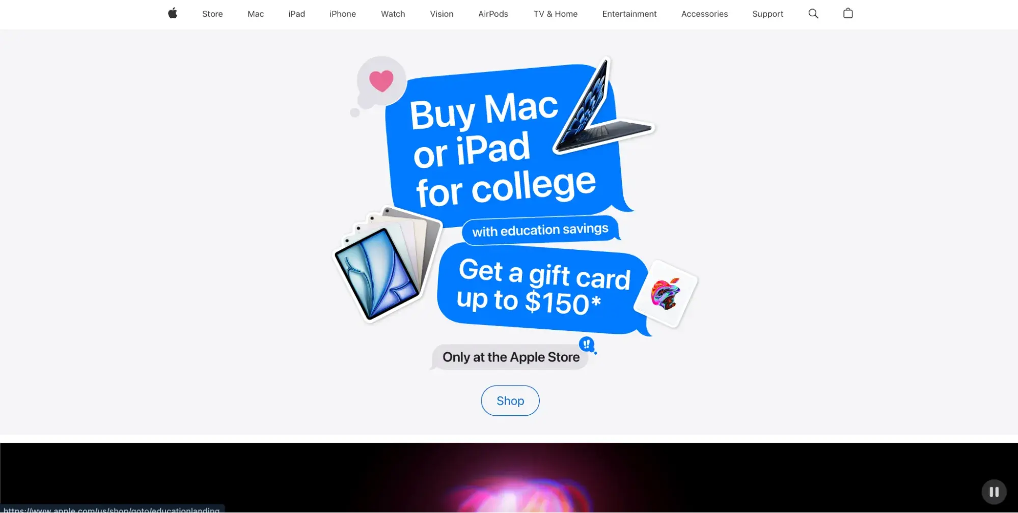
Apple has always been at the forefront of innovation and design, and its website is no less extraordinary. The first thing you see when entering the website is an offer to students, which showcases Apple's values: commitment to education.
As you scroll the homepage further, you see mesmerizing animated graphics and the products on display. Unlike the other websites on our list, Apple doesn't need a sign-up button or free trials. Apple simply needs to offer website visitors what they came for: browsing products.
As a pillar of the tech world, Apple's website can serve as a case study on how to build a website for an established customer base. The homepage is simple, stunning, and gets straight to the product with no other steps needed.
What I like: I love the effect around the product images. Apple added a white outline and then a shadow behind the iPad and Macbook cut-outs on the page. It creates a subtle dimension while remaining minimalistic.
7. Airbnb
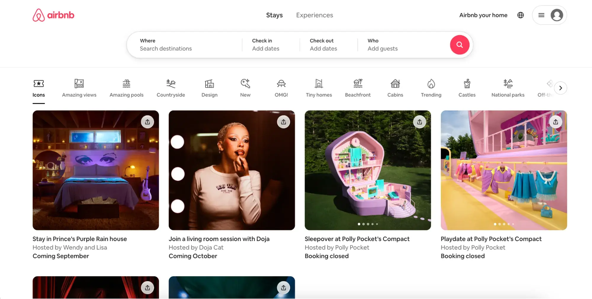
Airbnb has changed the landscape of rental homes and marketplace business by blending its customers and users into one and serving both. The homepage showcases this by immediately highlighting unique properties that you can rent (my eye keeps returning to the bright-pink Polly Pocket listing), but they also mix in bookable activities.
This is a relatively new feature, and it's wise to not dedicate the entire homepage to this feature since most users are opening up Airbnb to rent accommodations (not hang out with Doja Cat).
What I like: Airbnb is another great example of prioritizing products, using cards to display a variety of options in an orderly fashion. This is a great strategy for established companies where the business is self-explanatory, and people are really only visiting when they're ready to explore purchasing/renting options.
8. Trello
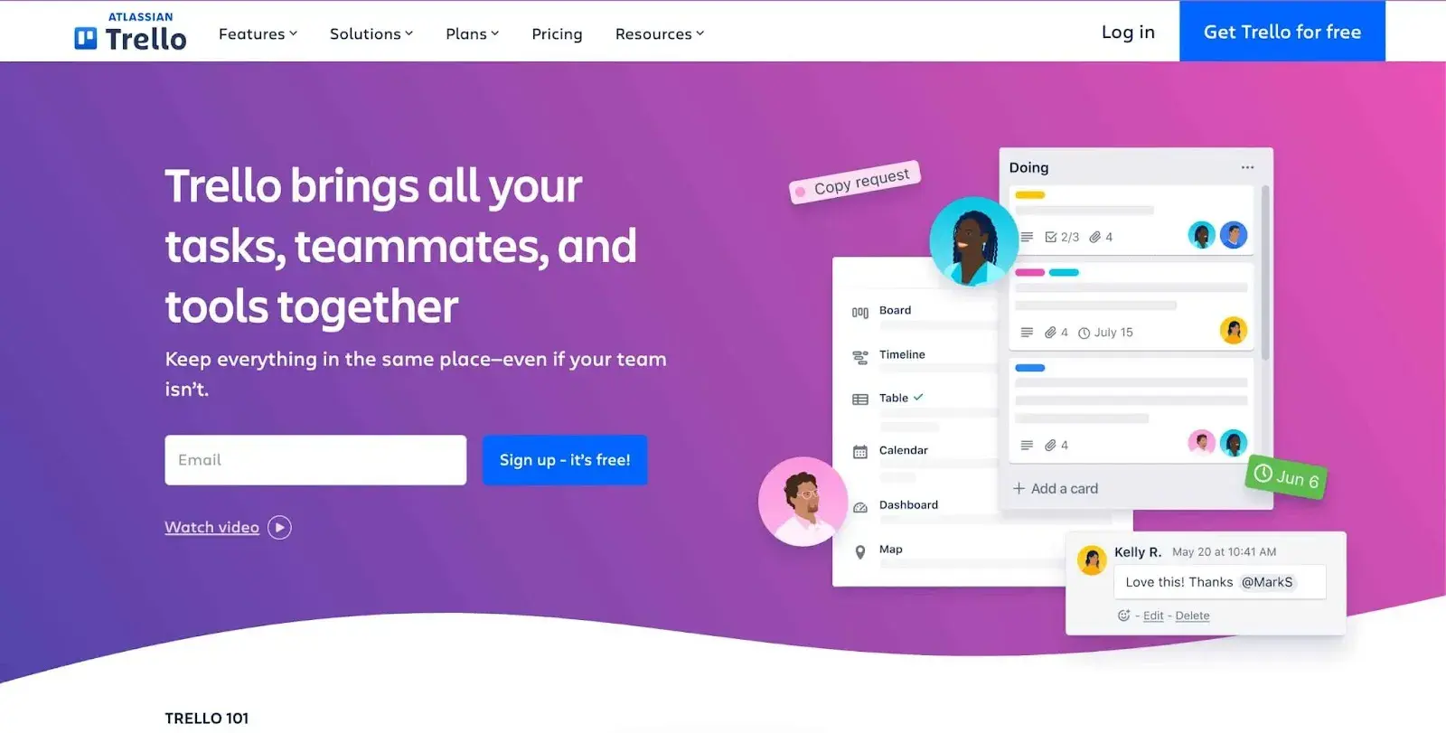
Trello is a task management software that aims to maximize productivity through an organized, card-based approach. This website's minimalist design helps draw user attention to the CTA in the middle of the screen, with an offer on the top right.
The clickable drop-down buttons at the top of the screen also help Trello provide as much information about its products as possible without compromising the website user experience.
Trello's website is beautifully designed, maximizes space, and puts emphasis on the CTA. By following all of the core design principles, Trello has designed an effective website that leads to conversions.
What I like: I‘m a longtime Trello user, and the simple graphic on the right-hand side of the homepage really summarizes the user experience. It’s a minor detail, but many tech companies oversimplify their products on their website, and I love seeing Trello hit the nail right on the head.
9. Google
Google's website embodies the old adage, “If it ain‘t broke, don’t fix it.” Google has been one of the most well-known internet companies for decades, and yet its homepage has remained mostly the same (but they did change their font back in 2015, and people freaked out).
.png)
Free Website Design Inspiration Guide
77 Brilliant Examples of Homepages, Blogs & Landing Pages to Inspire You
- Agency Pages
- Ecommerce Pages
- Tech Company Pages
- And More!
Download Free
All fields are required.
Form not available
There's a search bar in the middle of the screen with options to search by text, voice, or image. While Google has made tweaks and optimizations to its homepage, the core design principles are the same. Create a simple but memorable experience for visitors that keeps them coming back.
What I like: Google‘s homepage delivers value immediately. People know why they’re going to this website and so does Google, so it removes any barriers for people to find what they're looking for.
10. SoundCloud
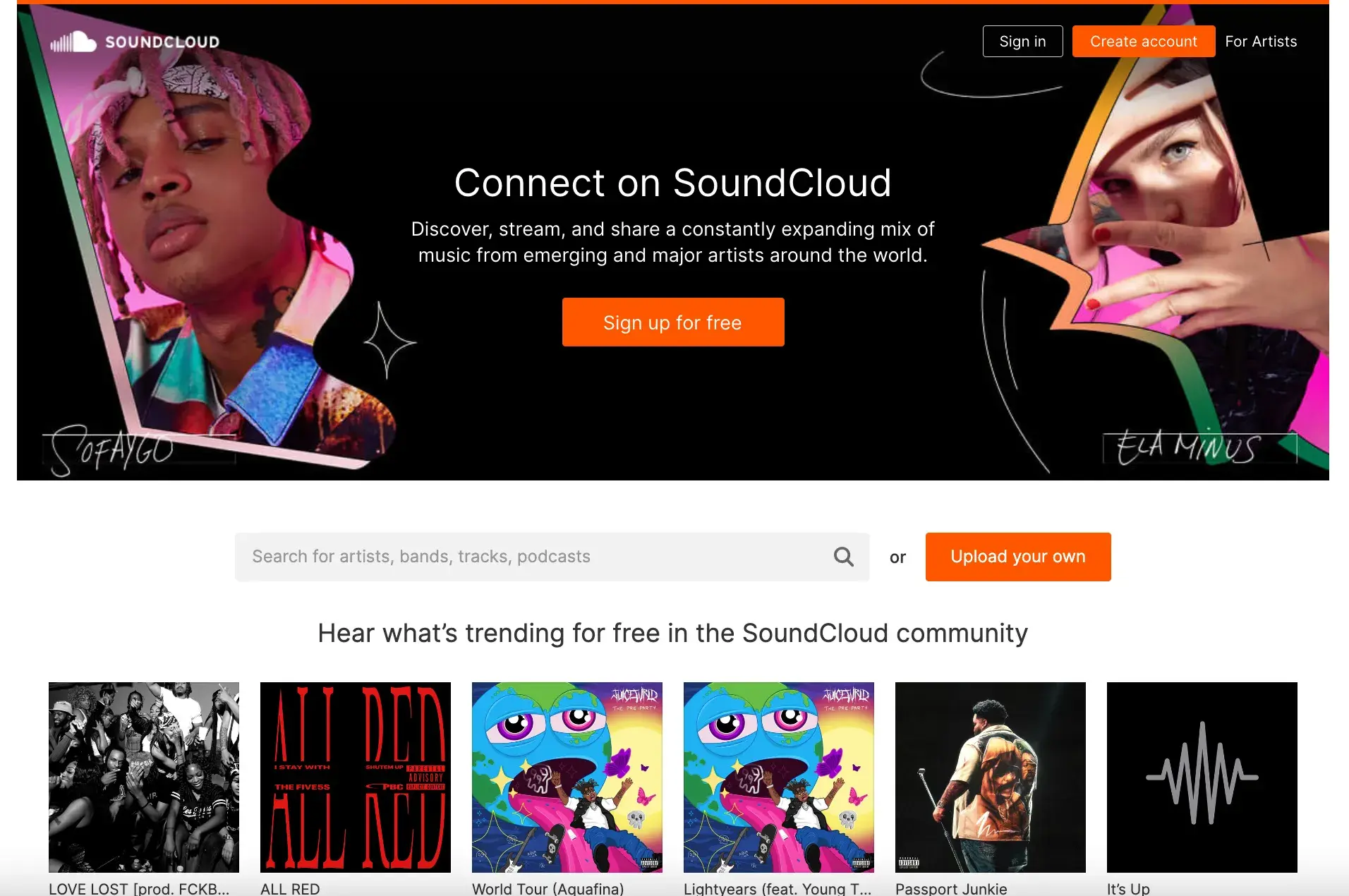
SoundCloud is a music hosting service that lets people upload and listen to music for free or pay a subscription for added benefits. SoundCloud's homepage emphasizes its CTA of a free trial, has a search engine, and features trending music and artists.
This website homepage is jam packed with easily accessible features to help its users get started right away. I can tell that SoundCloud has the utmost trust in its product, as its goal is to get people to try it right away.
My eye is very drawn to the orange button that says “upload your own,” which tells me that they‘re speaking to both listeners and artists. It’s hard for a design to speak to two different demographics without being cluttered, but SoundCloud nailed it.
What I like: SoundCloud is a great action-oriented website. Every aspect of the page allows the visitor to take action by uploading/searching for a song, creating an account, or just browsing available music.
11. Canva
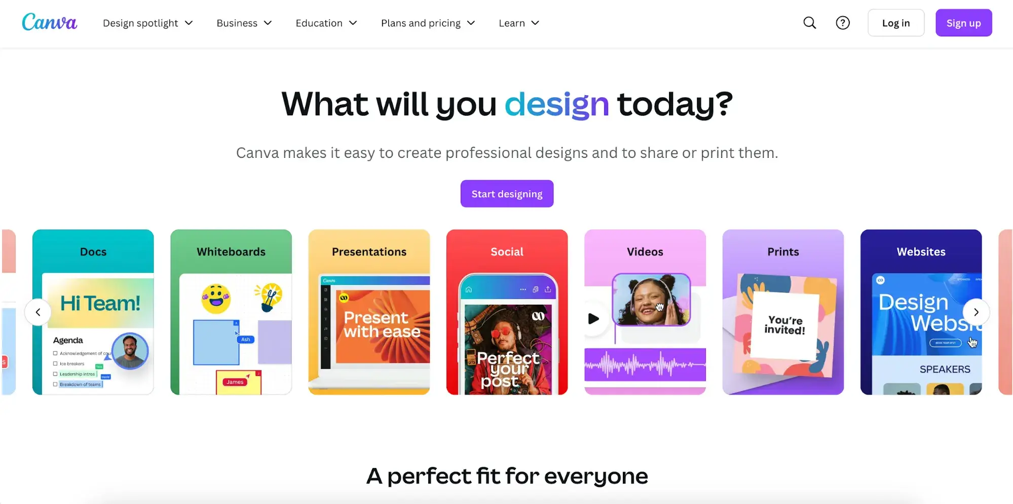
Canva is a graphic design software with a mission to become the most useful website on the internet. When you're shooting for the moon, you need a rocket — and Canva built one with a stunning, highly functional website.
Viewers immediately get a sense of Canva's brand with high-quality photos, bright colors, and an engaging CTA. One simple line greets viewers: “What will you design today?” followed by suggestions of what users can make. I'm already a longtime Canva user, and this design still tempts me to click on that purple “Start designing” button.
What I like: Canva is one of the most user-friendly technology websites, and it comes through beautifully in the design elements and website layout.
12. Surfer SEO
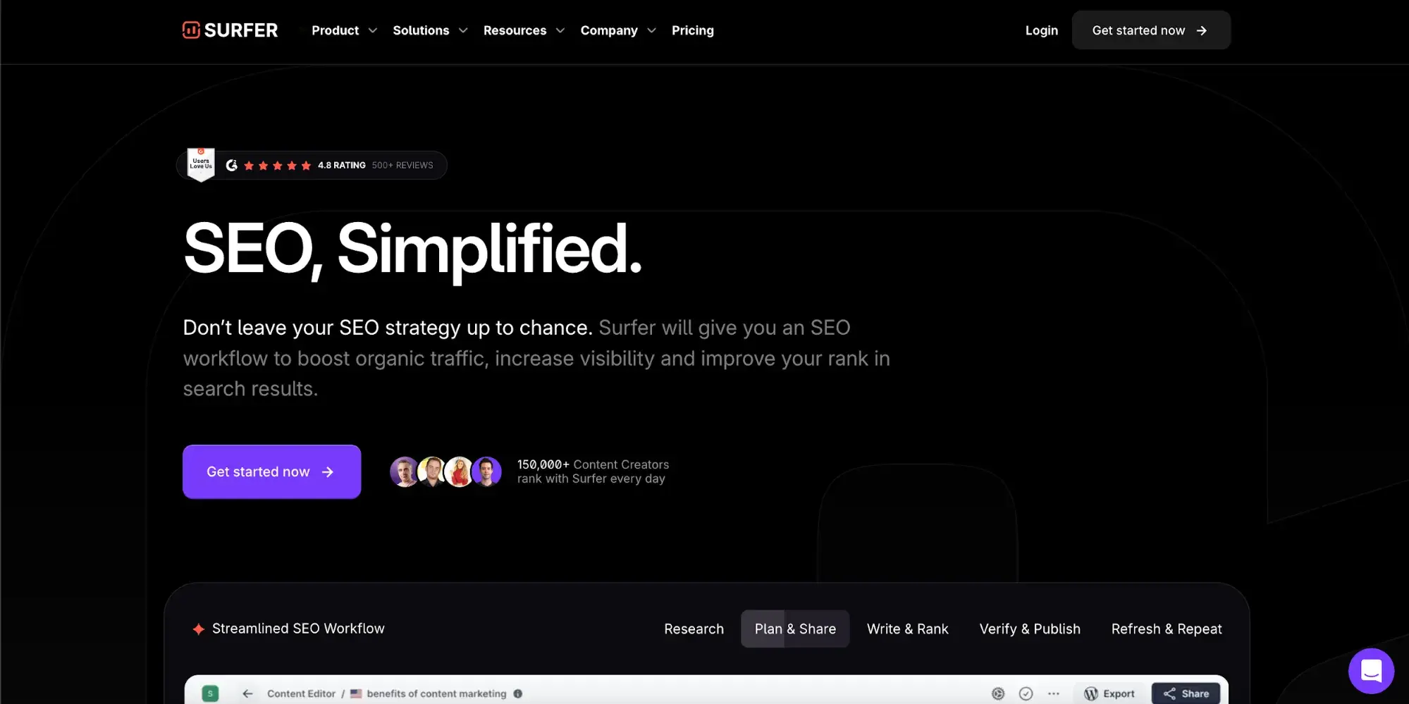
Surfer is an SEO software that helps you write content that will show up in Google's search results. The homepage has a strong catchphrase of “SEO, Simplified” and immediately reassures viewers with social proof.
As I scroll, I get to see the product, but Surfer doesn't use static images. Web designers used subtle animation to show their product in action. This makes the website dynamic while also showing potential customers the interface.
If I move my cursor to close the tab, a pop-up appears, trying to get viewers to engage before they leave the page. This is a normal marketing technique, but Surfer did so brilliantly by going off the cuff and posting a meme.
Most companies stick to strict branding and glossy custom graphics, but Surfer's design shows personality. I actually stopped and read the entire pop-up (despite already being a Surfer customer).
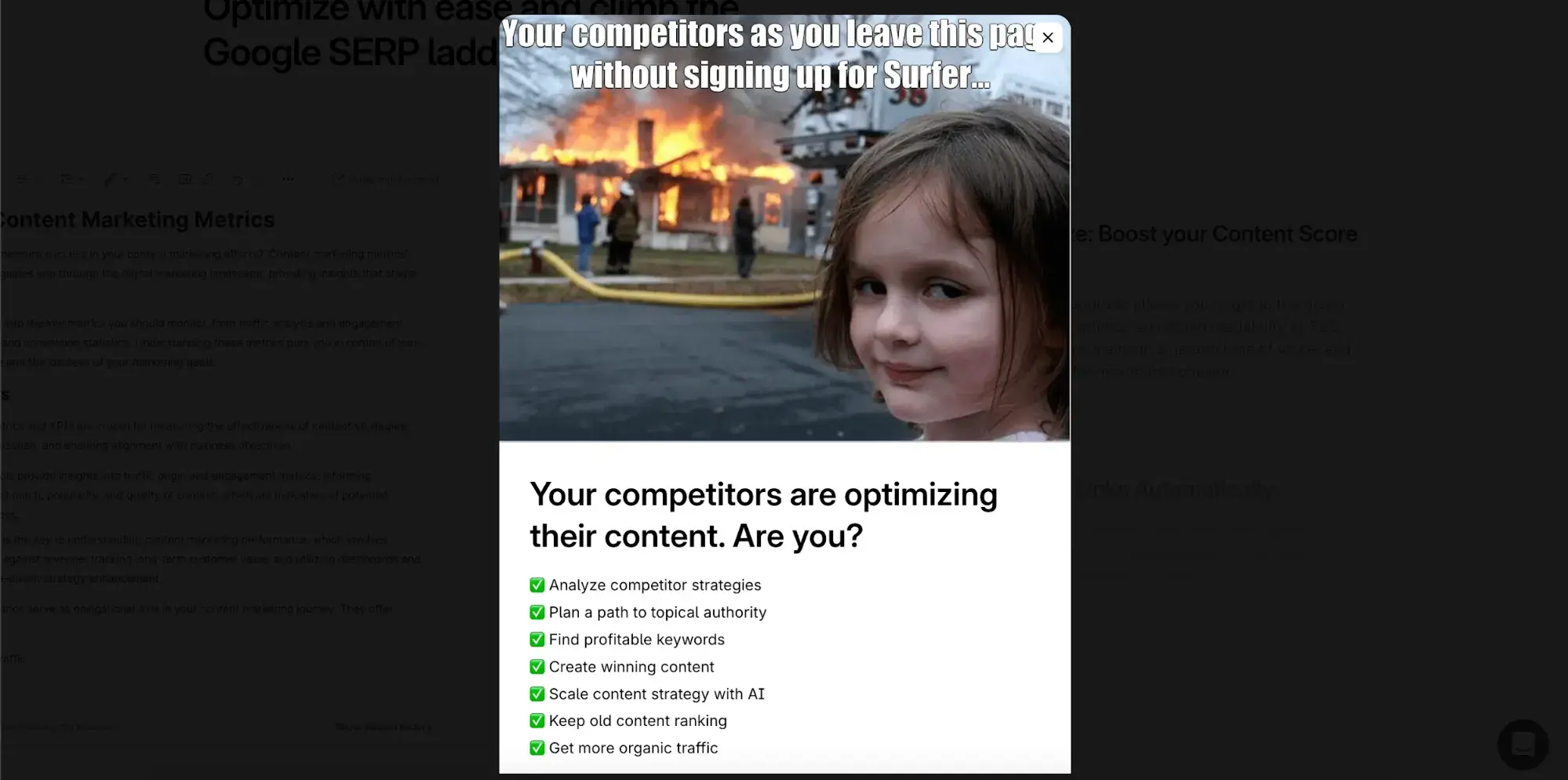
What I like: Surfer's website is sleek and engaging, with a sprinkle of personality that makes it feel authentic.
13. ChatGPT
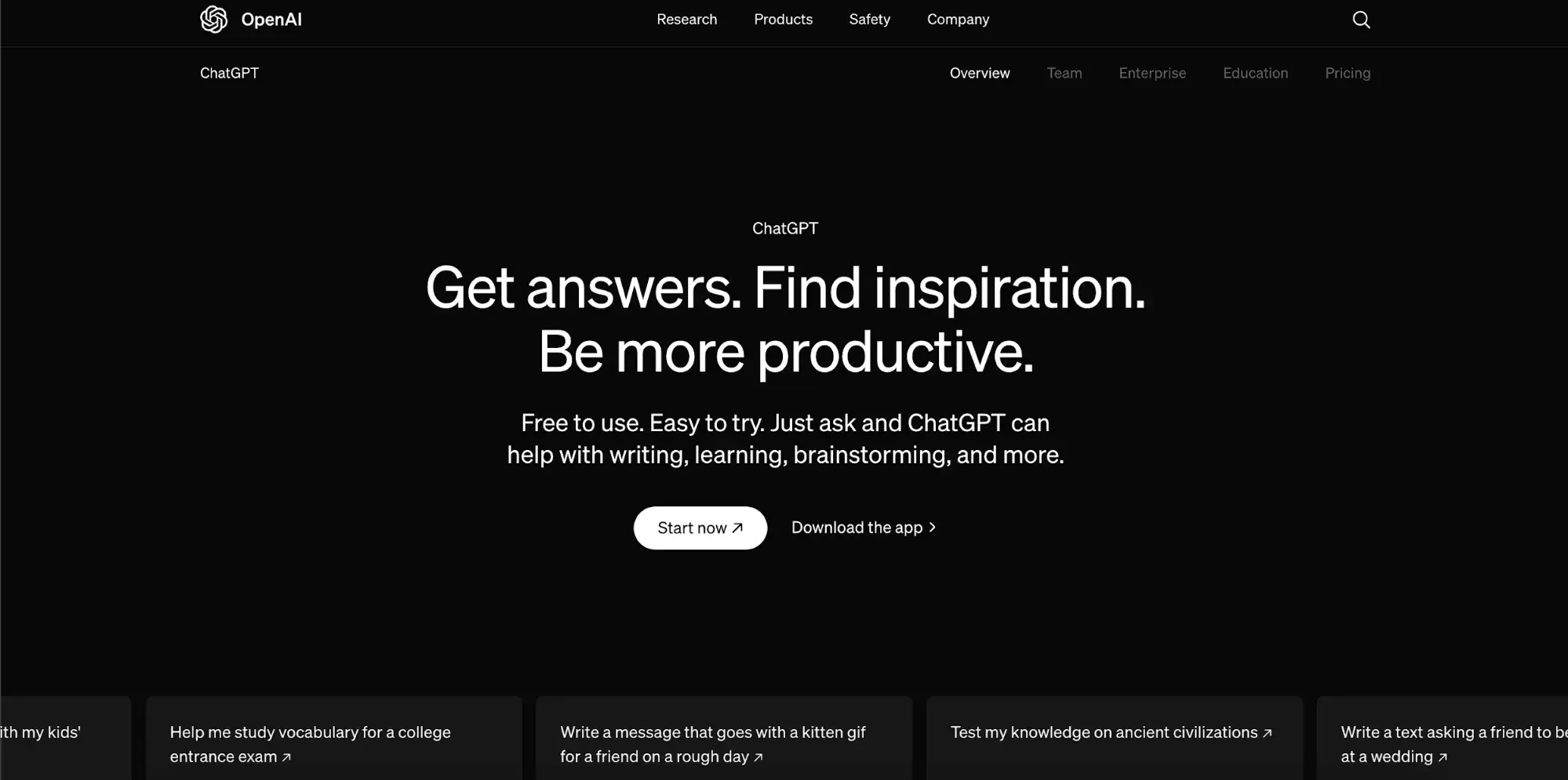
Love it or hate it, no list of technology companies is complete without a mention of ChatGPT. ChatGPT is the AI tool that changed the world with its launch in 2022. Like Apple and Google, it‘s big enough that it doesn’t have to incentivize users to try the product or subscribe to an email list.
OpenAI (owner of ChatGPT) is a company that can afford every bell and whistle, but they don't bog down their website with distracting animations or video content. The simple navigation, subtle animations, and minimal menu items help this website have direction and also maintain accessibility for all users.
I think this specific shade of black makes this site feel modern and edgy. In the world of graphic design, there's a huge difference between the different tones of black (this comes from the undertone) and OpenAI nailed it with this design choice.
What I like: The dark interface is minimalistic and offers a lot of white space (or rather black space), putting the spotlight on the text and features. This is an example of technology web design that's 100% product-focused.
14. Blue Origin
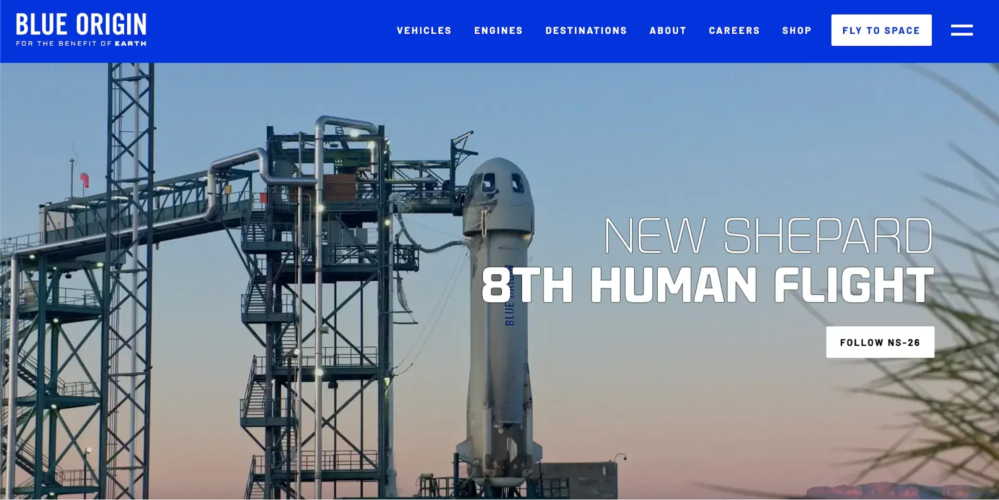
All tech companies hope that their websites convey trust and reliability, but it‘s more vital for Blue Origin than most. Blue Origin is a private space exploration company, with cutting-edge technology and high-ticket offers (so high that the price of their space flight isn’t even listed on the website). Their homepage builds this trust well, showcasing imagery of successful space flights and their work with NASA.
This website is simple but leverages high quality photography well. The design elements aren't very complex but the strong use of color combined with vivid images creates an enjoyable user experience.
What I like: This website doesn't bother showing viewers product images or technical specs — instead, it puts the dream and vision of the company front and center.
15. Carrd
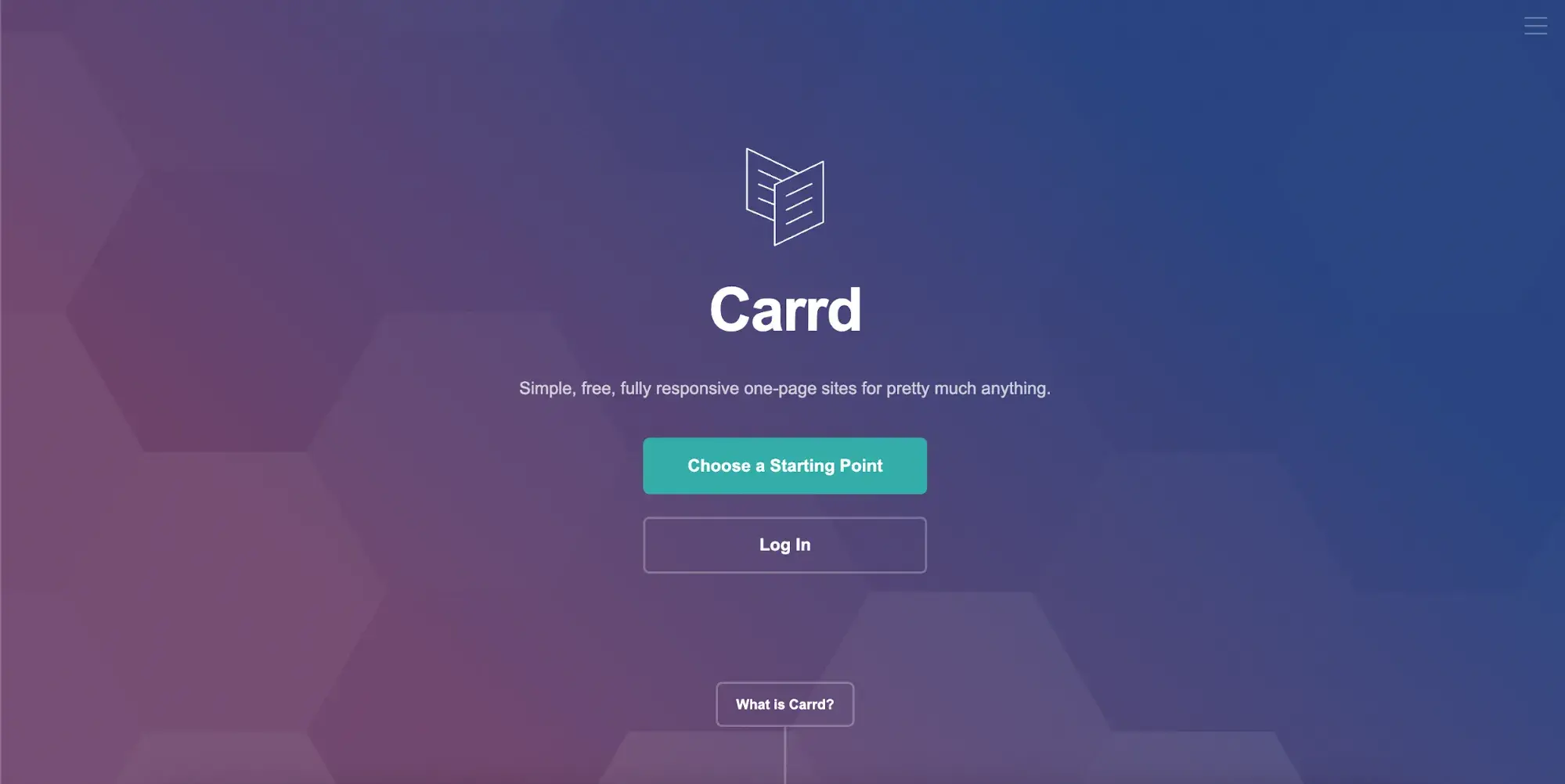
Carrd is a web design software that specializes in single-page websites (AKA landing pages).
Landing page design is even more specialized than normal website design — landing pages have a single focus and don‘t invite viewers to click around the way a normal website does. It’s a highly focused conversion funnel, with every design element focused on converting viewers into customers.
[Video: https://www.youtube.com/watch?v=ciNN1IpeVyA]
Carrd doesn't overwhelm readers. Instead, they have a minimalistic design and streamlined navigation. I find the simplicity to be refreshing.
What I like: I like that the paid features are mentioned, but they aren't the focus of this landing page. Carrd prioritizes getting viewers to try the product, knowing that many will convert to paying customers once they see how it works.
16. Pinterest
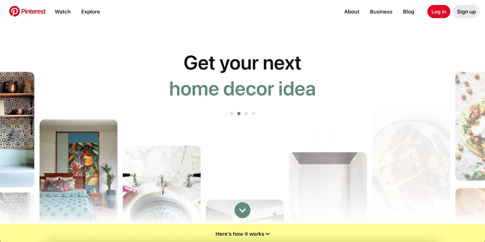
Pinterest is a visual search engine that users turn to for inspiration and ideas. It‘s a feel-good platform; I would argue it’s the nicest corner of the Internet, and you can feel this coming through in the design.
This design uses bold colors to create emphasis and to transition between sections, and it also effortlessly teaches you how to use the product. The best tech websites show you what the company is about and how the product works, and the Pinterest homepage strikes that perfect balance.
What I like: A lot of information is presented on the Pinterest homepage, but it never overwhelms or crowds the website design.
17. Elementor
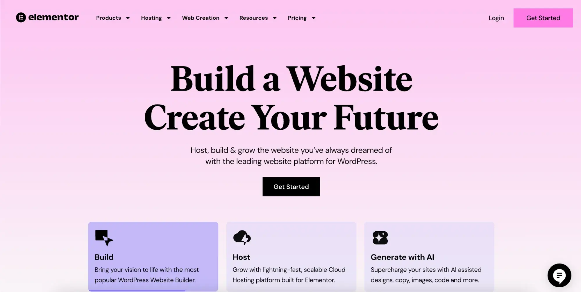
Elementor is a drag-and-drop website builder that allows average joes to design custom websites. Their homepage uses color creatively, opting for a dreamy gradient instead of sticking to specific brand HEX codes.
Instead of offering client testimonials, Elementor wows viewers with the sheer numbers of their impact. You get to see the software interface as you scroll, and then you're dazzled by animated graphics. This site has some cool features, which are an integral part of its value proposition.
What I like: This design is heavier in flair than many other tech websites, but given the product that they're selling (the design software itself), it shows that they know what their audience wants to see.
Getting Started Designing a Technology Website
After reviewing multiple websites in a row, it‘s often easy to spot the formula they’re all using, but tech websites are built differently. Something I appreciate about technology websites is how hard they work to make their website reflect their company. Don't forget to include that personal flare in your site, too.
With this inspiration and insight, you're ready to design a website for your business needs. Remember to emphasize your CTA, draw attention to important details using whitespace, and make sure that every part of your homepage serves a purpose.
Editor's note: This post was originally published in May 2023 and has been updated for comprehensiveness.
Free Website Design Inspiration Guide
77 Brilliant Examples of Homepages, Blogs & Landing Pages to Inspire You
- Agency Pages
- Ecommerce Pages
- Tech Company Pages
- And More!
Download Free
All fields are required.
Form not available


![15 black and white website designs to inspire your own [+ pro tips]](https://53.fs1.hubspotusercontent-na1.net/hubfs/53/black-and-white-website-design-1-20250520-1336267.webp)

![Gradient Website Design Examples That Prove This Trend Is Far From Over [+Tutorials]](https://lh7-us.googleusercontent.com/htOWIbyCIoCMxSjC4gJunkGnhCzXpccjTrL8NwoGdRdCsSiEmEAxe_qBFkMrzy2Y8d3cwEr_DMzSGHq9Xi-hQFnMJCo8HDQJ1yQGigcSfFxI2QKXo0s7xXSB2sY-eALG1iUqnHXgomcDsnp7AHRSH1s)
![15 Brochure Website Examples to Inspire You [+ How to Make One]](https://53.fs1.hubspotusercontent-na1.net/hubfs/53/brochure-website-examples-1-20250319-362228.webp)
![28 Types of Websites to Inspire You [+ Real-Life Examples]](https://53.fs1.hubspotusercontent-na1.net/hubfs/53/types-of-websites.png)