What is an accordion in web design?
In web design, an accordion is a type of menu that displays a list of headers stacked on top of one another. When clicked on (or triggered by a keyboard interaction or screen reader), these headers will either reveal or hide associated content.
This design pattern is ideal for breaking down longform or complex content into digestible chunks. It’s also ideal for mobile sites since it reduces how much a user has to scroll.
Here’s an example of an accordion menu used on a FAQ page of a website:

This gives people control over what to read, and when, which can enhance their user experience. In the example above, readers may only click on the first header to learn the dimensions and weight of the Yogaline Mat and skip the rest. Or they may scroll past the menu altogether. Either way, they get to decide what their reading experience is.
.png)
Free UX Research Kit + Templates
3 templates for conducting user tests, summarizing your UX research, and presenting your findings.
- User Testing Template
- UX Research Testing Report Template
- UX Research Presentation Template
Download Free
All fields are required.
Form not available
When to Use an Accordion
An accordion can improve the user experience — if used for the right reason and the right content. Let’s look at some use cases in which you should use an accordion.
- When readers only need a few key pieces of information: If readers only need some information on a page, then an accordion can help them more easily and efficiently find the information they’re looking for. FAQ pages often use an accordion because many readers are coming to find an answer to one or two questions only.
- When readers will be viewing your site from smaller screens: If you’re challenged with fitting a lot of content on a small screen like a mobile device, then an accordion can help give readers an overview of what the page is about and reduce how much they need to scroll.
When Not to Use an Accordion
Despite its many benefits, an accordion is not always the best choice for your website design. Let’s look at some reasons why you wouldn’t want to use an accordion.
- When readers will need to click on the majority of accordion items: If users need to open the majority of accordion items, then it’s better to reveal all the content instead of hiding some. That way you won’t be forcing users to decide which headings to click on and to click on them one at a time, which can be cumbersome.
- When you don’t have the resources to make it accessible: Accordions must be accessible, which is an additional development effort. If you don’t have the in-house support or budget required to meet accessibility standards, then it’s better to use plain text.
For an in-depth look at what an accordion is, when to use it, and the advantages and disadvantages it has, check out this video by Niki Tisza:
Accordion UI
While the design of an accordion varies by site and purpose, its user interface is made up of three elements. Let’s take a look at each below.
Headers
Accordion headers contain section titles. These are meant to be brief but descriptive enough to indicate what the reader can expect to learn more about by clicking. Here’s an example:

Icons
Icons, which typically appear to the left or right of the section titles, indicate there’s more content available if clicked. These icons might be an arrow pointing down or to the right, a caret, a plus sign, or a chevron pointing down, among others.
Often, there are two sets of icons used to indicate whether an item has been expanded or collapsed. In the example below, the plus icon of the expanded section is rotated so it looks like an “X”. When clicked again, the section will collapse and the icon will return to its original position.

Panels
Panels are sections of content associated with each header. By default, panels are typically hidden and revealed when a user clicks on a header or icon in the menu. Panels can be composed of bullet points or multiple paragraphs, but they should be brief and descriptive like accordion headers.

An accordion UI may also make use of colors, symbols, and subtitles, as we’ll see in the examples below.
To get a better understanding of an accordion UI, check out this video by DesignCoach that walks through how to build out an accordion component using Figma:
Accordion Menu Examples
Despite being such a common design element, accordion menus look very different from site to site. That’s because the context or purpose of the accordion will affect how it looks and how users interact with it. An accordion for navigation, for example, won’t look or behave the same way that an accordion for an FAQ section of a website does.
With this in mind, let’s look at a variety of accordion menu examples below.
1. &Tea

What we like: &Tea’s homepage uses an accordion to present its menu categories one at a time. That way, readers can easily browse each flavor and know which category it belongs to, or skip right to their favorite category.
2. Material

What we like: The FAQ page is split up into sections, each with its own accordion. The jump links on the left make it easy for users to jump to the section and respective accordion they’re interested in.
3. Urban Jungle

What we like: Like Material, Urban Jungle divides its FAQ page into sections, each with its own accordion and jump link for easier navigation. What’s unique about this page is the horizontal layout in which the section names are placed to the left of the accordion, instead of on top of it. This is a clever way to make the page shorter and quicker to scroll.
4. Nourish Change

What we like: Nourish Change’s FAQ page has a similar horizontal layout as Urban Jungle — but its color scheme and icons are totally unique. The alternating colors and generous use of white space helps make each accordion item distinct. The icons with help text also clearly convey the accordion’s functionality.
Using an Accordion in Your Website Designs
Accordions can help improve the user experience, especially on mobile devices. Since they provide the most important information first, and leave it up to users to decide what to learn more about, they’re ideal for FAQ pages, menu sections on homepages, and more.
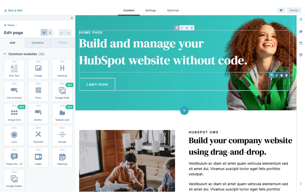
HubSpot's Free Website Builder
Create and customize your own business website with an easy drag-and-drop website builder.
- Build a website without any coding skills.
- Pre-built themes and templates.
- Built-in marketing tools and features.
- And more!
User Experience

![How to become a UX designer, a step-by-step guide [expert tips]](https://53.fs1.hubspotusercontent-na1.net/hubfs/53/become-a-ux-designer-1-20240731-321437.webp)


![How to Add a Parallax Scrolling Effect to Your Website [Examples]](https://53.fs1.hubspotusercontent-na1.net/hubfs/53/scroll-Aug-11-2023-05-24-08-8793-PM.png)

![20 UX Design Examples Hand-Picked by Experts [With Analysis]](https://53.fs1.hubspotusercontent-na1.net/hubfs/53/ux-design-examples-1-20250404-8425368.webp)