What are web design patterns?
A web design pattern, also known as a user interface design pattern, is a set of guidelines for designing a user interface aspect or component. Web design patterns are developed for specific user experience challenges and can be adopted and implemented by any website.
A web design pattern is not a standardized template or a precisely specified design. Rather, it is a collection of best practices that solve a user-centered problem. Let’s look at a simple example of a web design pattern: dropdown menus.
When designing for the user experience, space is always limited. You can only fit so many page elements inside the viewport (i.e. the visible area of the web page) before visual clutter sets in. This presents a challenge for larger websites with many pages. How do designers fit links to many different site sections on a single page?
One solution is the vertical dropdown menu. This design pattern specifies a list of options that appear after some trigger, typically a mouseover event or mouse click. Users can choose any option from this new menu. The menu closes when the user hovers off it.
As you can imagine, there’s an endless number of ways one could implement a dropdown on a website. Here’s just one example from the HubSpot.com homepage:
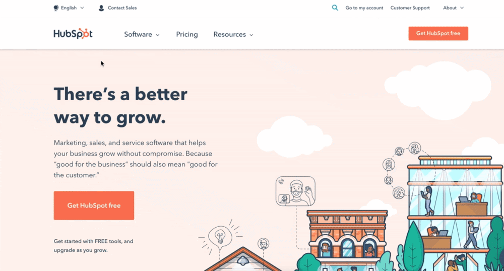
You have control over specific options, functionality, aesthetics, and even the language it’s programmed in. But, the design pattern for dropdown menus provides usability guidelines for their implementation.
So, why do web designers follow these patterns? Ultimately, there are two key reasons:
First, design patterns ensure good UX. A web design pattern instructs a designer how to place and arrange page elements to best serve visitors’ needs and establish critical trust.
Imagine landing on a website with poorly designed dropdowns. You’d probably form an immediate negative opinion of the site, and perhaps the business it represents, all because they can’t perfect fundamental navigation. This can largely be avoided by adhering to the design pattern.
Second, design patterns streamline the design process. Patterns address common UX issues seen across websites, so designers don’t need to invent a solution to the same problem over and over again.
It would be wildly inefficient for every website with dropdown menus to test and develop their own best practices. We know from years of testing what users tend to expect from dropdowns, and we know that their preferences stay more or less consistent from site to site. So we instead share the best practices which are based on these insights.
Of course, we’re all internet users ourselves. Some web design patterns probably reflect our own common sense, which is shaped by our own experiences on the web. However, designers are not the same as the people they design for, so the logical solution for us might not be the same for the majority of users. We need guidelines to ensure the interface is optimized for as many users as possible.
Examples of Web Design Patterns
It can be challenging to grasp the concept of web design patterns in the abstract, so let’s review some more examples below.
Navigational Web Design Patterns
Successful web design needs to nail the navigation. It’s one of the first things users see on your website, and probably the last if it doesn’t do its job. Here are just a few of the many navigational patterns that work well for getting visitors where they want to go.
Grid Layout
The grid layout is a foundational design component of many modern websites. This design pattern divides the page into a set number of columns of equal width and spacing between them. Page elements are placed based on these column boundaries, so they are aligned vertically, and often horizontally as well.

Grids solve the issue of presenting many pieces of content of equal importance in a way that users can easily follow. Designers have full control over the sizing of and spacing between page elements, though it’s recommended to provide at least some whitespace to aid visibility.
Some websites break the grid for an alternate take on the grid system that engages visitors, but this should still be done with usability principles in mind.
Breadcrumbs
Breadcrumb navigation helps users understand their location on a website, and is usually implemented as a navigation bar of horizontal text links. Each text link represents a page in the site’s hierarchy, and users can quickly jump to another page by clicking one.
In the example below, the breadcrumbs are visible in orange just above the H1 "Non-Degree Students":

The design pattern of breadcrumb navigation also recommends sizing breadcrumbs down to a secondary navigation feature, placing an arrow-like symbol — like > or » — between links, and ordering links left-to-right, from largest scope to smallest.
Wizard
A wizard helps users complete a relatively complex series of steps in order to accomplish some greater goal. Wizards break down the process and present each step one at a time, requiring users to complete the current step before advancing. Common applications of this method include creating and/or configuring a user account, completing a checkout, or following a tutorial.
The wizard design pattern dictates that each window in the wizard should contain just one step, accompanied by clear language, a button to navigate backward and undo steps, a progress indicator showing steps taken and steps left to complete, and an option to cancel the wizard at any point.
Infinite Scroll
In an infinitely scrolling feed, in which new content continually loads when the user scrolls to the bottom of the window. This gives the illusion of an “endless flow” of content, keeping engagement high and interaction cost low.
Infinite scroll is the opposite of pagination, which separates content into multiple pages of a website.
Infinite scroll works best on websites where users tend to explore without a specific piece of content in mind, and should only be implemented in these cases. Infinite scrolling mechanisms also might include an animated icon to indicate that more content is being loaded.
Also, some iterations of infinite scroll display a lightbox element if a piece of content is clicked, rather than direct users to a new page. This prevents the user from losing their place in the scroll.
Responsive Web Design Patterns
The rise of smartphones and other consumer touchscreen devices has changed the usability game. Not only are the screens smaller, but how people interact with touchscreens differ significantly from desktops — website designers need to keep this in mind.
Here are some examples of web design patterns that foster a better mobile UX:
Hamburger Button
Another solution to limited space, the hamburger button condenses a website’s primary navigation into an icon of three horizontally stacked lines. When pressed, a menu of navigation links appears:

Hamburger buttons have become commonplace thanks to mobile devices, though you’ll see them on some desktops layouts too. When designing for mobile, though, ensure the icon is large enough to be visible and pressable, place menu items spaced far enough so users don’t inadvertently press the wrong link. Also, allow users to close the menu without selecting a menu option.
Pull-to-Refresh
The concept of pull-to-refresh is...well, it’s in the name. To load new content on a mobile feed or refresh a page, pull downward with your finger, then release.
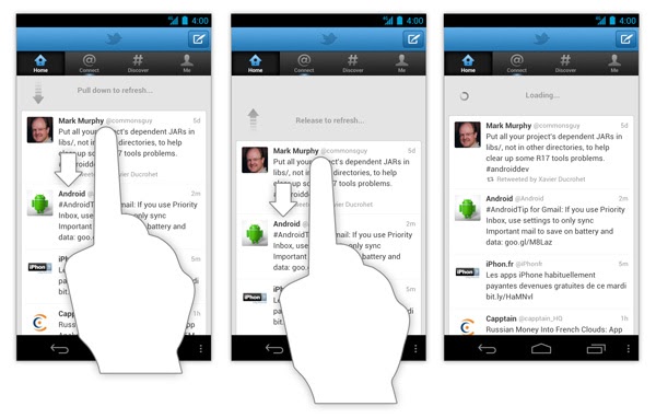
Because pull-to-refresh is so convenient and gives users more control over their feed, this method is widely implemented across mobile websites and applications.
Effective use of this method requires a “refresh indicator” to be displayed in the form of text, icon, or animation. Also, the user must pull the contents downward past a set threshold to trigger the refresh — otherwise, the content should snap back in place with no refresh.
One-Finger Mobile Layout
Rather than guiding the design of a specific feature, this mobile web design pattern applies to mobile website layouts in general. It encourages designers to take into account the user gripping their mobile device with one hand.
Essentially, the higher on the screen an element is on the screen, the harder it is to reach with one’s thumb. For convenience and accessibility reasons, be mindful when placing interactive elements at the very top of mobile web pages. Prevent it if possible.
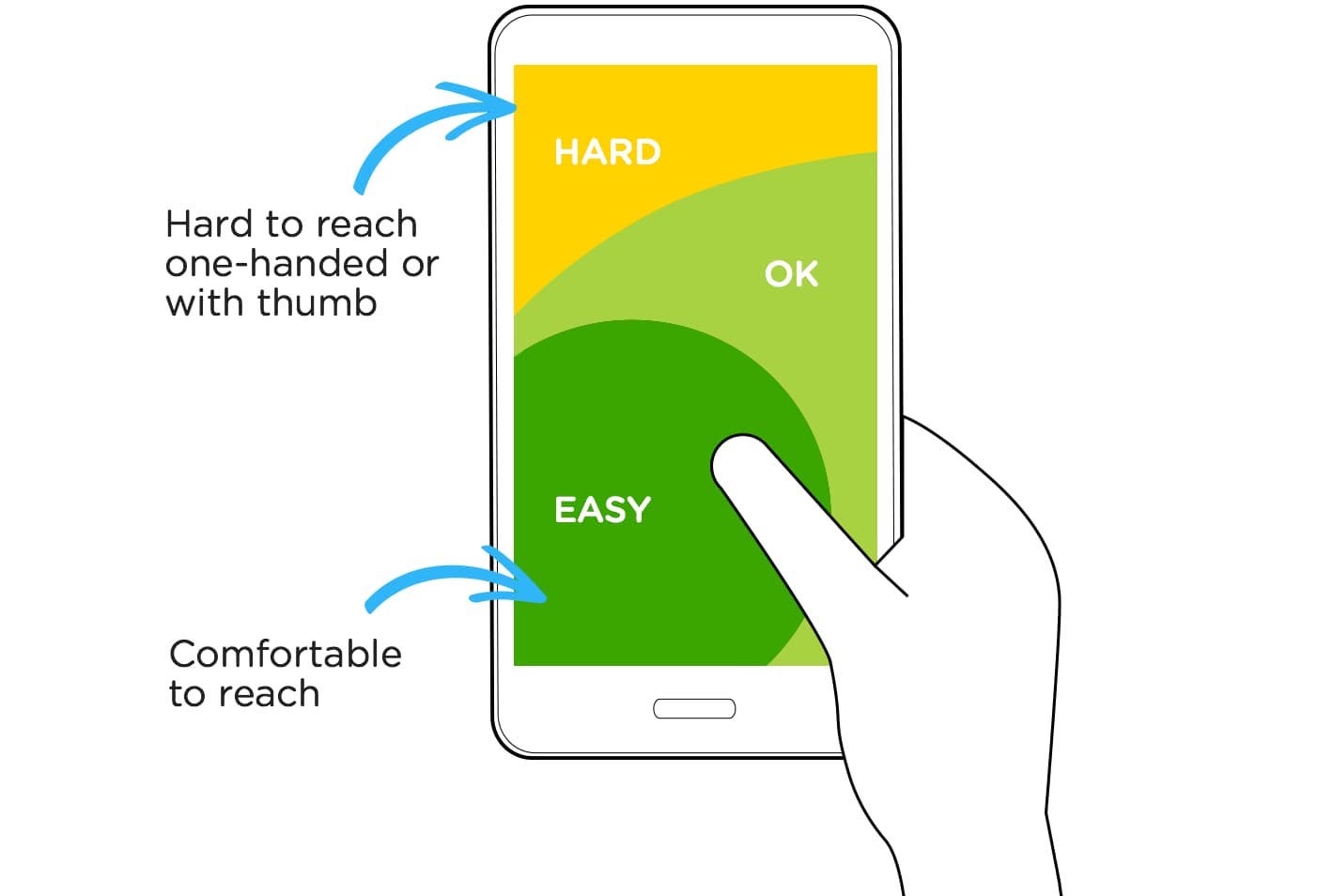
And yes, I know thumbs aren’t technically fingers, but you get the idea.
Other Common Web Design Patterns
We see iterations of design patterns on every webpage we visit, applied to practically any user goal. Here are a few more you’ve likely experienced:
Shopping Cart
Shopping carts are a staple of ecommerce. If your online store allows customers to purchase multiple products at a time and save their selected items to be purchased later, this is a design pattern to follow.
To add an item to the cart, users simply press an “Add to cart” button on the product page. The cart itself is accessible from any page via a cart link (often a shopping cart icon) at the top of the page. Shopping cart design should also enable users to alter items inside their cart (like changing quantity or removing from cart), and each item in the cart should include a link back to the original product page.
Dragging-and-Drop Uploads
Whenever a website requires me to upload a file from my computer, I always appreciate it when they offer a drag-and-drop option. This saves me multiple clicks for the task of file uploading.
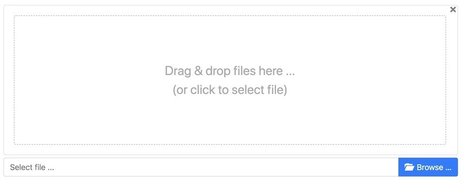
The drag-and-drop interface should designate a large page region for easily “dropping” files with visual feedback of a successful upload. Importantly, remember to also provide a file search and upload method for users who can’t complete the drag-and-drop action, as seen in the example above.
Modal Window
Sometimes you want to direct the user’s entire focus to a single element on the page — this is what modal windows, also called modals, are for. A modal window appears displays in front of and deactivates all other page content, like so:

A modal changes the way users interact with — or the “mode” of — the web page. To return to the main page, you must either complete an action within the modal window or dismiss it by closing the window manually.
Modals are intended to steal attention, if only temporarily. So, they should be used carefully and sparingly. To learn about modal window design best practices, see our guide to modals.
Using Web Design Patterns on Your Website
These are just a handful of the numerous patterns at your disposal. Whether you’re adding a new feature to your website or building one from the ground up, chances are there’s a design pattern out there that will help guide your design process.
UI-Patterns.com is an excellent reference for learning more about different UI patterns and when to use them. It lists solutions for usability challenges around navigation, user input, and more. Also, look to the design choices of other websites as well — successful sites tend to follow these conventions.
Finally, remember that web design patterns are ultimately guidelines, not law. Even after adhering to patterns, your designs still may not serve your users perfectly, and that’s to be expected. Conduct user testing when introducing changes to your interface usability, then tweak your UI elements accordingly to increase ease-of-use. Users might not notice the benefits, but your website’s growth will show it.

Website Design