In reality, creating a great website means understanding what makes a terrible one. When designers and business owners recognize why users abandon sites with cluttered layouts or buried information, they can build experiences that feel intuitive and seamless instead.
In this post, learn what makes a website “bad,” look at real examples of common mistakes, and discover practical tips to create a site that works for businesses and keeps visitors engaged.
Table of Contents
- What makes for bad website design?
- How do bad websites affect your business?
- How do you quickly identify bad UX/UI?
- Bad Website Design Examples
- Frequently Asked Questions About Bad Website Design
- Learning From Design Failures and Taking Action
What makes for bad website design?
There are six things bad websites have in common. A cluttered layout, hidden navigation menu, lack of color contrast, non-responsive design, and inconsistent typefaces are a few hallmarks of bad website design. Still, the main issue with sites with poor design is a lack of user-centricity.
Bad website design costs businesses more than aesthetic appeal. It directly impacts conversion rates, credibility, and revenue. Research shows users form opinions about websites in just 0.05 seconds, and improved user interface design can increase conversion rates by up to 200%. In fact, of consumers, 71% have ended relationships with companies due to poor customer experience.
.png)
Free Website Optimization Checklist
This website optimization checklist will help you perfect your website's:
- Performance
- SEO
- Security
- Mobile Performance
Download Free
All fields are required.
Form not available
The Six Cardinal Sins of Web Design
Poor website design typically stems from one or more critical flaws that drive visitors away and damage business outcomes.
1. Cluttered and Overwhelming Layouts
Cluttered layouts increase cognitive load and force users to work harder to find information. When every element competes for attention, nothing stands out. This creates frustration and triggers immediate exits.
2. Hidden or Confusing Navigation
Poor navigation structures force visitors into endless hunting expeditions for basic information. If users can’t locate what they need within three clicks, abandonment rates spike. Navigation systems that hide critical pages or use unclear labels destroy user experience and tank conversion rates.
3. Lack of Visual Hierarchy and Contrast
Without clear visual priorities, visitors don’t know where to focus first. Poor color contrast makes content unreadable, particularly for users with visual impairments. Inconsistent styling creates confusion about which elements are clickable versus static.
4. Non-Responsive Mobile Design
Non-responsive design is always problematic. With over 60% of web traffic coming from mobile devices, sites that don’t adapt to different screen sizes lose more than half their potential audience immediately.
5. Missing or Weak Calls-to-Action
Invisible, unclear, or hidden CTAs waste every visitor who lands on a page. When site visitors can’t immediately identify the desired action (like subscribing, purchasing, or contacting the company), conversion opportunities evaporate.
6. Slow Loading Times
Page speed directly impacts conversion rates. A one-second delay in page load time reduces conversions by 7%. Sites taking more than three seconds to load lose 53% of mobile visitors before content even appears.
HubSpot’s Website Grader evaluates websites based on mobile responsiveness, design quality, performance metrics, SEO optimization, and security vulnerabilities. The tool provides tailored suggestions for improvement across all these critical factors.
How do bad websites affect your business?
Bad website design creates measurable damage across multiple business metrics. The consequences extend far beyond aesthetics into revenue, reputation, and competitive positioning. Ultimately, bad website design causes lower conversion rates and lost revenue.
Conversion rates die.
Poorly designed websites kill conversion rates through friction at every step of the user journey. When visitors encounter confusing navigation, hidden CTAs, or overwhelming layouts, they abandon purchase processes, contact forms, and subscription flows.
SEO rankings plummet.
Search engines prioritize user experience signals when determining rankings. Google’s Core Web Vitals specifically measure loading performance, interactivity, and visual stability.
Websites with slow load times, poor mobile optimization, and high bounce rates get penalized in search results. This creates a vicious cycle: Bad design leads to poor user metrics, which leads to lower rankings, which leads to less traffic.
Brand credibility evaporates.
A website serves as the digital face of a brand, and poor design signals unprofessionalism and incompetence to potential customers. Outdated aesthetics, broken links, and inconsistent branding make businesses appear untrustworthy. In competitive markets, this perception drives potential customers directly to competitors with more polished digital presences.
Customer acquisition costs skyrocket.
When website design fails to convert traffic effectively, businesses must spend more on advertising and marketing to achieve the same results. If a website converts at 1% instead of 3% due to design problems, three times the traffic is required to generate equivalent leads or sales.
This multiplies customer acquisition costs across all channels. Paid search, social media advertising, and content marketing all become exponentially more expensive when the final destination fails users.
Support and service burden increase.
When users can’t find information or complete basic tasks, they reach out for help or simply leave. Companies end up spending resources answering questions that a clear design would have prevented. This operational inefficiency diverts staff from higher-value activities while simultaneously creating negative customer experiences.
Tools like HubSpot’s CMS streamline website management with drag-and-drop functionality that helps business owners avoid common design pitfalls. The platform’s built-in optimization features guide users toward best practices for conversion, mobile responsiveness, and page speed.
How do you quickly identify bad UX/UI?
Understanding what constitutes poor design becomes clearer through concrete examples. Let’s examine how to identify bad UX/UI quickly, then analyze specific websites to understand exactly what went wrong and how to fix it.
Cluttered Interface
Cluttered layouts make 92% of people switch to competitors, according to Hotjar’s research. When banner ads, flashing promotional signs, and pop-ups obscure actual content, the interface requires immediate attention. Web designers agree: 84.6% identify cluttered design as the biggest mistake businesses make with their websites.
News websites like the Daily News rely heavily on advertising revenue, which creates pressure to maximize ad placement. However, cramming more advertisements onto pages prioritizes short-term income over user experience. Readers struggle to navigate content and locate desired information when ads dominate the visual hierarchy.

Hotjar by Contentsquare offers website heatmaps and behavior analytics tools so businesses can understand how users behave on the site and identify any layout difficulties.
Navigation Nightmare
No one likes a website with a confusing user flow. Clicking a button leads visitors somewhere unexpected, and it’s unclear how to get back to where they started. The lack of intuitive flow makes it hard for users to find what they came for.
For example, take the Awwwards site.
It’s got a really slick design, no doubt about it, but navigating through it is a real mess. Menus are all over the place, making it hard to find what users need. Visitors end up spending way too much time just trying to sift through all the options.
It’s frustrating enough to make me lose my nerve whenever I visit it.

Pro tip: GA4’s path exploration helps web developers understand the user path on the site and discover any hiccups on the way that could be caused by poor navigation.
No Visible CTAs
An impressive 38.5% of global designers flagged the lack of CTA buttons on landing pages as a common slip-up. Visitors come to a site with a purpose, but if they can’t find clear buttons or directions, be ready to lose them. Without clear CTAs, visitors will likely leave and find a competitor with an easier path to follow.
That’s why CTAs need to be placed prominently and clearly visible on the website. Curious what CTAs a strong website should include? Check out these 10 essential CTAs.
Overly Complicated Flow
The more steps there are, the longer it takes users to finish a task. That can be a big turn-off in today’s world, where everyone wants things done quickly and easily. The fewer the steps, the better.
In Hotjar’s case study on Every.org, they increased donations by nearly 30% just by making the donation flow easier.
The issue: Users clicked “Donate” without adding a card beforehand and got stuck because they couldn’t add the card at that moment.
So, Dave Sharp, the senior product designer, suggested a simpler flow. Users add a card directly during checkout, then donate in the next step.

This simple change made a big difference. With the clearer process and added clarity, users were happier and more willing to donate. This improvement was brilliant. Every.org helped raise over $16 million for nonprofits in its first two years!
Pro tip: Review these key website engagement metrics to see how a site stacks up.
Inconsistency Chaos
A website that uses different fonts and color schemes on every page is chaotic. Such inconsistency disrupts the user’s flow and makes the experience feel disjointed.
For example, Blinkee.com has too many different fonts and colors that don’t make sense or match. Basically, nothing goes together here:

HubSpot Academy offers a basic course in graphic design to help businesses avoid rookie mistakes on their websites.
Waiting … Forever
If a website takes forever to load a user’s account or process orders, it’s a bad sign. The website needs to load fast, ideally within two seconds (or less), according to WebFX. More than half of users will leave if it takes longer than three seconds.
Slowness frustrates users and makes them question the platform’s reliability. Slow load times also increase bounce rates. Neil Patel throws down a surprising stat: A one-second delay in loading times can decrease conversion rates by 7%!
Test the website page speed with Google Page Speed Insights, then improve the time with these tips from HubSpot.
Pro tip: HubSpot’s CMS platform and hosting provide a built-in CDN that guarantees fast load times for websites.
Cryptic Error Messages
A form submission on a website fails, but the error message simply says “Error.” Sounds familiar?
Such messages provide no clues on how to fix the issue and what causes it, leaving the user confused and frustrated. Instead, explain the problem in simple terms (avoid technical jargon) and create informative and helpful error messages.
It’s also a good idea to tie the error message to the specific action the user was trying to perform. For instance: “We can’t add this item to your cart because it’s currently out of stock. Would you like to pick something similar instead?”

Pro tip: Review error messages to make sure they provide a clear explanation of what went wrong and suggest the action the user can take to solve it on their own.
Mobile and Responsive Design Failures
Websites that function beautifully on desktop computers but become unusable on mobile fail a critical test. Buttons become too small to click accurately, text shrinks to unreadable sizes, and layouts break completely. With 63% of people using phones for online searches, mobile responsiveness has shifted from an optional feature to a mandatory requirement.
HubSpot’s website optimization checklist helps businesses prioritize improvements across SEO, performance metrics, mobile optimization, and security. The framework guides teams through systematic evaluation of design quality and user experience factors.
Free Website Optimization Checklist
This website optimization checklist will help you perfect your website's:
- Performance
- SEO
- Security
- Mobile Performance
Download Free
All fields are required.
Form not available
Content Problems
Information Architecture Chaos
Poor information architecture buries critical content under multiple layers of navigation or scatters related information across disconnected pages. Users expect logical grouping and clear hierarchies that match their mental models. When website structure defies intuitive organization, visitors waste time searching for basic information or give up entirely.
Content Readability Issues
Text that’s too small, lacks sufficient contrast, uses difficult fonts, or appears in walls of unbroken paragraphs creates reading fatigue.
Effective content design employs adequate font sizes (minimum 16px for body text), clear heading hierarchies, sufficient line spacing, and strategic whitespace. Content accessibility affects not just users with visual impairments but everyone trying to consume information quickly.
HubSpot’s AI content writer makes sure marketers avoid these mistakes, as it helps marketers create compelling copy for their website.
Missing Trust Signals
Absence of trust signals — security badges, professional certifications, clear contact information, and privacy policies — raises red flags about legitimacy. Modern users have learned to spot these elements as markers of credible businesses. Sites lacking these signals face higher abandonment rates.
Pro tip: Implementing these seven things can make websites more trustworthy for users.
Visual Design and Hierarchy Failures
Lack of Visual Hierarchy
Without clear visual priorities established through size, color, contrast, and positioning, users don’t know where to focus attention first. Every element appearing equally important means nothing stands out. This forces visitors to scan entire pages systematically instead of being guided toward key information and actions.
Color Contrast Violations
Insufficient color contrast between text and backgrounds makes content difficult or impossible to read, particularly for users with visual impairments. WCAG (Web Content Accessibility Guidelines) specifies minimum contrast ratios of 4.5:1 for normal text and 3:1 for large text. Sites violating these standards exclude significant portions of potential audiences.
HubSpot Content Hub offers SEO suggestions and content recommendations that help teams optimize readability, structure, and accessibility. The AI-powered system identifies opportunities to improve content presentation and user engagement.
Bad Website Design Examples
- Zara
- Wayfair
- Arngren
- Life Action Revival
- Paper Source
- The Room - Official Movie Site
- Fandango
- Gwinnett Daily Post
- CNN
- The Daily Mail
- Yale School of Art
- NYU
- Colburn School
- Craigslist
- Hacker News
- New Century Chamber Orchestra
- ODC/Dance
Bad Website Design: Retail and Ecommerce
Retail and ecommerce websites are designed to showcase products, communicate value, and guide customers toward making a purchase. However, when these sites suffer from design, users can become frustrated and abandon their shopping experience altogether.
Here are a few retail and ecommerce bad website design examples that could benefit from thoughtful design improvements.
1. Zara
What it got wrong: Hidden navigation

Problem
Zara’s website prioritizes editorial aesthetics over shopping functionality. The homepage features small text and conceals the main navigation menu behind a hamburger button, leaving shoppers uncertain about next steps. No prominent CTAs guide visitors toward browsing or purchasing actions.
The mobile experience amplifies these navigation issues. Clicking the hamburger button reveals an unconventional structure without a “Clothing” category. Instead, unorganized lists force visitors to hunt through numerous options. The site provides no breadcrumbs or filtering tools to streamline browsing.
Impact
Hidden navigation creates friction at every step of the shopping journey. Visitors arrive ready to browse and buy but encounter unclear pathways that transform simple shopping into scavenger hunts. Ecommerce sites that obscure basic shopping functions sacrifice conversion rates for aesthetic choices.
When users can’t quickly locate product categories or understand how to browse inventory, they abandon purchase journeys before even viewing merchandise. Frustrated shoppers bounce to competitor sites with more traditional, intuitive navigation rather than guessing where to click next.

Solution
Straightforward navigation should replace the current hidden menu system. Visual icons added to menu categories would provide clearer browsing direction and reduce cognitive load. Breadcrumb navigation would help shoppers understand their location within the site hierarchy and easily backtrack when needed.
Standard product filtering and sorting options would enable efficient browsing without forcing visitors to scroll through irrelevant items. Zara can maintain its aesthetic identity while prioritizing the user experience that drives conversions.
2. Wayfair
What it got wrong: Lack of visual hierarchy

Problem
Wayfair’s homepage overwhelms visitors with abundance. Almost every element uses the same size, color, copy style, and icons. The site simultaneously promotes beds, mattresses, vanities, area rugs, outdoor seating, and bedding sets with equal visual weight.
Visual hierarchy arranges website elements so visitors naturally gravitate toward critical items. Without it, determining where to focus attention becomes difficult.
Impact
Lack of visual hierarchy creates decision paralysis. When websites present too many options with equal prominence, visitors struggle to choose and often abandon the site instead. Shoppers can’t determine priorities or next steps when everything competes equally for attention.
Solution
Visual hierarchy principles using size, color, and contrast would guide user attention effectively. Wayfair should determine which products or categories deserve prominence, then design accordingly. Leading visitors to one featured subcategory instead of promoting everything simultaneously would reduce overwhelm and improve conversions.
3. Arngren
What it got wrong: Chaotic layout

Problem
This Norwegian ecommerce site violates modern web design principles. Random colors appear in product titles, with only prices shown in red. No navigation structure organizes products into categories. Tiny text is difficult to read. Products scatter randomly across the page with no hierarchy.
The layout resembles 1990s classified ads with zero white space, creating visual chaos.
Impact
Chaotic layouts make shopping impossible. Visitors can’t efficiently browse categories, compare products, or locate specific items. The cluttered design signals unprofessionalism and raises concerns about transaction security. Shoppers abandon the site for competitors with functional interfaces.
Solution
The best approach here is to add clearer product categories instead of squeezing them on the right side. Bigger font, single-color usage, and the addition of white space would also smooth things out.
4. Life Action Revival
What it got wrong: Broken layout

Problem
The website displays broken code at the top instead of proper content. Visual elements overlap chaotically. Images, text blocks, and navigation items pile on top of each other. Random advertisements scattered throughout compete with actual content for attention.
The color scheme also lacks consistency. Blue links, black text, gray backgrounds, and colorful ads clash without any unifying design system. Navigation items appear as plain text links with no visual hierarchy.
Impact
Broken layouts destroy credibility immediately. Visitors question the organization’s professionalism and technical competence when basic website functionality fails. Overlapping elements make consuming content impossible. Users leave for functional alternatives rather than struggle through the chaos.
Solution
Fixing the broken code displayed at the top is the first priority. A grid-based layout system would prevent elements from overlapping and create visual order. Consistent spacing between sections would help visitors distinguish different content areas.
A defined color palette applied consistently would also create visual cohesion. Proper navigation structure with clear visual hierarchy would help visitors understand available options. Strategic ad placement rather than scattered positioning would improve readability.
5. Paper Source
What it got wrong: Outdated design

Problem
Paper Source’s website looks stuck in the early 2000s. The layout crams multiple promotional boxes, images, and CTAs onto the homepage with no clear focal point. Six different CTAs compete for attention, confusing visitors about where to click first.
The color scheme appears muted and uninspiring for a brand selling creative stationery. Generic stock photos dominate the page instead of showcasing unique product designs.
Impact
Outdated design makes products and the brand appear old-fashioned, pushing customers toward newer, trendier competitors. Excessive CTAs create decision paralysis. The busy layout signals a brand that hasn’t evolved with modern expectations.
Solution
Simplifying the homepage would reduce decision paralysis. Limiting CTAs to one or two primary actions would guide visitors more effectively. Modern, vibrant product photography would better represent the brand’s creative offerings.
A cleaner layout with strategic white space would make the site feel contemporary. Highlighting seasonal collections or trending products with a clear visual hierarchy would help visitors navigate choices without overwhelming them.
Free Website Optimization Checklist
This website optimization checklist will help you perfect your website's:
- Performance
- SEO
- Security
- Mobile Performance
Download Free
All fields are required.
Form not available
Bad Website Design: Movies
Movie websites inform visitors about a film and possibly persuade them to purchase tickets or film rights. However, if a movie website appears outdated, unprofessional, or difficult to navigate, visitors may exit before they get the information they desire. Here are a few bad website design examples for movies that could use some tweaks.
6. The Room - Official Movie Site
What it got wrong: No credibility

Problem
The Room’s website lacks a functional navigation menu. It’s just one endless scrollable homepage. Items below the featured image appear clickable but open new tabs when selected. Some links are broken and display blank pages.
Images, GIFs, and hard-to-read text scatter throughout with minimal connection to the film itself. The chaotic media distracts from the site’s primary goal: selling film rights to consumers.
Impact
Broken links and missing navigation destroy credibility instantly. Visitors seeking licensing information or film details must scroll endlessly or exit entirely. There’s no middle ground. The early 2000s aesthetic, combined with broken functionality suggests abandonment and unprofessionalism. Potential buyers question whether the organization can handle licensing transactions if basic website maintenance fails.
Solution
Functional navigation would give visitors control over their browsing experience. Fixing broken links is non-negotiable for credibility. Organizing content into logical sections — About, Licensing, Media, Contact — would help buyers find relevant information quickly.
Cleaning up text presentation and updating the visual design would signal active management. Clear CTAs directing visitors toward licensing inquiries would capture commercial opportunities currently lost to poor implementation.
7. Fandango
What it got wrong: No clear CTAs
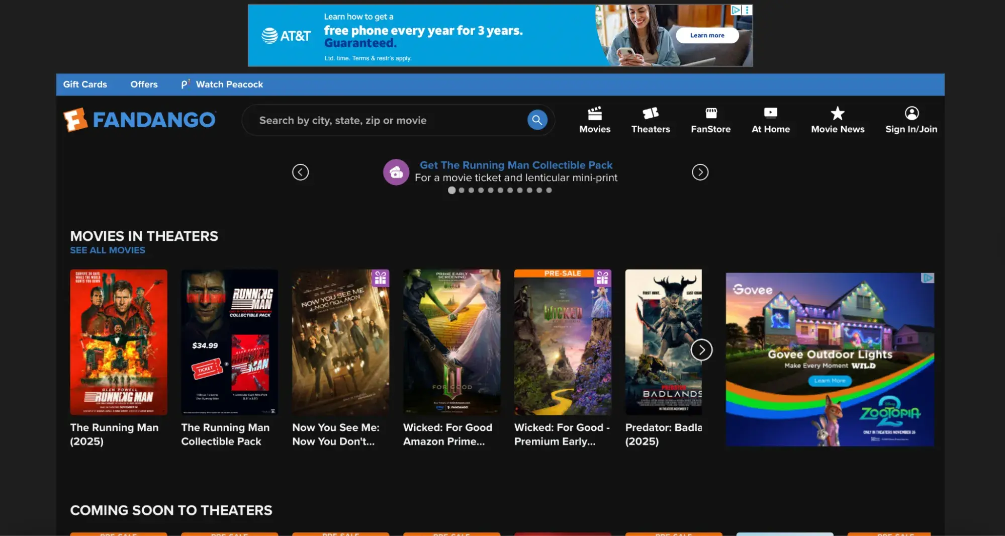
Problem
Fandango features prominent CTAs instructing visitors to buy movie tickets, but these buttons lack live links to checkout pages. Clicking the primary action leads nowhere. The muted color scheme provides minimal visual interest despite the entertainment focus.
Impact
CTAs without functional links waste every visitor who clicks, expecting to complete a purchase. When conversion pathways are broken, frustrated moviegoers abandon the site for competitors with straightforward purchasing processes — Atom Tickets, AMC, or directly through theater websites. Fandango’s broken user journey hands transactions to competitors.
Solution
Making primary CTAs feature functional links to checkout would enable immediate purchases. Increasing visual contrast and color vibrancy would better align with entertainment industry expectations. Clear, compelling CTAs with obvious next steps would capture conversion opportunities currently lost to poor implementation.
Bad Website Design: News
The primary goal of a news website is to get people to consume as much of the business’s content as possible. The trick is to promote a variety of the company’s content without overwhelming or confusing the user. Here are a few bad website design examples that miss the mark.
8. Gwinnett Daily Post
What it got wrong: Dark, cramped design

Problem
The Gwinnett Daily Post uses a dark black background with white text throughout the entire site. The navigation bar crams multiple categories into a single row with minimal spacing.
The dark theme makes extended reading difficult and creates a heavy, oppressive feeling unsuitable for a news site where users consume large amounts of text content.
Impact
Dark backgrounds with white text cause eye strain during extended reading sessions. News sites require sustained content consumption, and dark themes work against this goal by making reading physically uncomfortable. The cramped navigation makes finding specific sections difficult, forcing users to scan through numerous options without clear visual breaks.
Solution
Switching to a light background with dark text would improve readability for news content. Reorganizing navigation with better spacing or dropdown menus would reduce visual clutter. A cleaner, lighter design would make the site more inviting for the extended reading sessions.
9. CNN
What it got wrong: Slow load time

Problem
CNN’s page is heavy and slow to load, so slow that Speedmonitor.io lists it among the top slowest sites on the Internet. The design attempts to showcase a wide variety of content, but the volume creates significant performance issues.
Impact
Slow load times function as website kryptonite. Google’s Core Web Vitals specifically measure and prioritize loading performance, meaning CNN likely loses search engine rankings due to speed issues. Pages taking more than three seconds to load see bounce rates increase by 32%.
For news content where timeliness matters crucially, loading delays are particularly damaging. Readers click away to faster competitor sites to access breaking information. CNN loses both immediate traffic and long-term SEO visibility.
Solution
Reducing the quantity of text, images, and video loading on initial page views would accelerate load times. Implementing lazy loading for below-the-fold content, optimizing image file sizes, and utilizing content delivery networks would improve performance metrics.
Balancing content richness with loading speed represents a critical optimization challenge for major news sites. Strategic technical improvements can maintain comprehensive coverage while dramatically improving user experience.
10. The Daily Mail
What it got wrong: Too many ads

Problem
Advertisements clutter The Daily Mail’s main content area and both sidebars, pushing actual news content down the page and making reading difficult. The sheer volume of ads significantly slows website load time.
While ads generate necessary revenue for free content models, The Daily Mail’s implementation prioritizes ad quantity over user experience at every turn.
Impact
Excessive advertising creates unpleasant experiences that override content quality. Readers simply want to consume news. The ad overload eliminates both immediate engagement and long-term loyalty, ultimately reducing the ad impressions the site seeks to maximize.
Slow load times from ad-heavy pages compound the problem, causing visitors to abandon before content even appears.
Solution
Reducing ad quantity and adjusting placement to minimize invasiveness would improve the user experience while maintaining revenue streams. Strategic ad placement between content sections rather than overlaying reading areas would preserve readability.
Finding the balance between monetization and usability determines long-term success for advertising-dependent news sites. Fewer, better-placed ads often generate more revenue than overwhelming quantities that drive audiences away entirely.
Bad Website Design: Education
An educational website informs visitors and provides them with the necessary resources about the institution. Therefore, a website that uses animations, colors, or other design elements in an unconventional way risks distracting attention from the content. Here are some bad website design examples that fall short of this goal.
11. Yale School of Art
What it got wrong: Visual chaos

Problem
Yale School of Art’s website attempts bold artistic expression but sacrifices usability. Vivid animated backgrounds distract from content rather than enhancing it. Inconsistent use of colors, fade effects, borders, and font styles — uppercase, lowercase, italicized, bold, underlined, regular — creates visual chaos. Typography choices seem random rather than intentional.
The design breaks web conventions without a clear purpose or benefit to users seeking program information.
Impact
Distracting design elements pull attention away from essential information about programs, faculty, admissions, and events. While art schools naturally want to demonstrate creative vision through their digital presence, unusable websites fail prospective students who can’t locate application requirements or understand program offerings.
Inconsistent styling suggests a lack of design discipline, ironic messaging from an institution teaching design principles. When artistic expression overrides basic usability, the website becomes a barrier rather than a gateway to the school.
Solution
Removing distractions that negatively affect readability should take priority. Creating consistent design systems with intentional typography, color palettes, and visual hierarchies would demonstrate design competence while improving usability.
Artistic expression can coexist with functional design. The two aren’t mutually exclusive when approached thoughtfully. A bold, distinctive aesthetic built on solid usability foundations would better serve both creative vision and user needs.
12. NYU
What it got wrong: Poor contrast

Problem
NYU’s homepage features three major components — navbar, body section with grid layout, and footer — all rendered in purple. Slightly different purple shades create insufficient contrast between sections, making visual separation difficult.
The grid layout consists mainly of solid background color blocks with minimal imagery, creating the impression of incomplete page loading.
Impact
Lack of contrast between major page sections creates navigation confusion. When users can’t clearly distinguish headers from body content from footers, understanding site organization becomes challenging. The grid-heavy design without sufficient imagery makes the page feel claustrophobic and unfinished, potentially raising concerns about website maintenance and institutional attention to digital presence.
The monochromatic purple effect overwhelms visitors rather than reinforcing brand identity.
Solution
Improving contrast between website sections would clarify page structure and improve navigation. While grid layouts can work effectively, NYU’s implementation needs more imagery to provide visual interest and context. Applying visual hierarchy principles instead of treating all grid items equally would guide users toward priority content.
More restrained color usage would prevent the overwhelming monochromatic effect while still maintaining brand recognition.
13. Colburn School
What it got wrong: Weak hero image

Problem
The hero image shows a brass ensemble with a giant Santa hat superimposed awkwardly over the “CANADIAN BRASS” text. The composition feels disjointed. The musicians appear disconnected from the oversized holiday prop. Abstract geometric lines cut across the bottom without a clear purpose.
Despite being a music conservatory, the homepage prioritizes a seasonal promotional image over showcasing the school’s core identity. Navigation is functional, but the visual presentation lacks the sophistication expected from a prestigious performing arts institution.
Impact
Weak hero images fail to capture attention or communicate organizational quality. The awkward holiday overlay distracts from the performers themselves. Visitors seeking information about auditions, programs, or faculty encounter seasonal marketing instead of institution-defining content.
For educational institutions, first impressions signal academic standards and artistic excellence. When the primary visual feels amateurish or overly promotional, prospective students and their families question whether the organization matches the caliber they’re seeking.
Solution
Hero images should showcase student performances, faculty expertise, or facilities that communicate institutional quality. Professional photography of actual Colburn performances would better represent the conservatory’s standards. Seasonal promotions could appear as secondary banners rather than dominating the primary visual real estate.
Clean, sophisticated design with strong photography would better align with the institution’s reputation. Visual hierarchy should prioritize evergreen institutional content over temporary seasonal campaigns.
Bad Website Design: Community
A community website is where people turn to get their news, find popular content and products, and hang out. Ideally, this website should make it easy for readers to browse casually and find exactly what they’re looking for on any device. Here are a few bad website design examples of community sites that fail to meet these requirements.
14. Craigslist
What it got wrong: Non-responsive design

Problem
Craigslist’s site isn’t responsive across devices. Resizing browser windows on desktop hides significant content portions. While the mobile site functions adequately, the desktop version fails to adapt to different screen sizes.
Impact
Non-responsive design limits audience reach and creates frustration for users who switch devices throughout their browsing journey. Someone might browse listings on the desktop during work breaks, then try to follow up on mobile while commuting. If the experience doesn’t translate, conversions fail. Google penalizes non-responsive sites in mobile search rankings, reducing organic traffic and visibility.
Solution
Implementing truly responsive design would improve traffic and reduce bounce rates. Users would be more likely to visit and remain on the site across various contexts and devices. While Craigslist’s minimalist aesthetic has defenders who appreciate its functionality, responsiveness represents a basic expectation rather than an enhancement.
15. Hacker News
What it got wrong: Readability issues

Problem
Hacker News is the go-to source for tech coverage and breaking news related to cybersecurity. Although it's a widely-read publication, it has some readability issues." h
Each list item offers multiple actions: upvote, sort by website, view submitter profile, sort by posting time, comment, or read the full story. Small muted fonts without whitespace, icons, or hover effects make identifying these separate actions difficult.
Moreover, the minimalist design lacks visual cues distinguishing interactive elements from static text.
Impact
Poor readability reduces engagement with available functionality. Users who can’t easily identify interactive elements use only a fraction of available features, diminishing the community aspects that distinguish Hacker News from basic news aggregators. Time spent deciphering the interface reduces time spent engaging with content and community discussions.
Solution
Typography improvements, color differentiation, strategic whitespace, and hover effects would vastly improve readability and scannability. Adding subtle icons to actions would provide visual cues about functionality. These changes would help users engage more fully with community features while maintaining the minimalist aesthetic that appeals to the technical audience.
Bad Website Design: Arts
An arts organization’s website aims to offer a space where patrons and supporters find information regarding upcoming events, buy tickets, and make donations. The most effective ones provide all the details visitors might need about performances, staff, volunteering, and more. Here are a few bad design website examples that could benefit from improving their design.
16. New Century Chamber Orchestra
What it got wrong: Inconsistent branding

Problem
The orchestra’s logo features three specific colors: pink, blue, and yellow. These colors appear throughout the site, but in varying shades that don’t match the logo. Headings, email opt-in forms, and footers display different blue shades. CTA buttons alternate between neon pink, yellow, and blue without clear logic.
Impact
Inconsistent branding dilutes organizational identity and creates amateur impressions. Color variations suggest a lack of attention to detail. When design choices appear unintentional rather than deliberate, visitors question overall organizational competence and professionalism.
Solution
Establishing one cohesive color palette matching the logo would strengthen brand identity. Creating a design system specifying exact color values, typography choices, and spacing rules would ensure consistency across all pages. Brand coherence builds recognition and trust.
17. ODC/Dance
What it got wrong: Uninspiring layout

Problem
The website fails to inspire despite representing an arts organization. Colored circles appear as random blobs. The layout lacks structure. An outdated logo sits against a boring background.
The site doesn’t fill full screens, leaving distracting white space on both sides. “RIVERSIDE ART CENTER” text repeats unnecessarily.
Impact
Uninspiring design for an arts center contradicts the organization’s creative mission. When arts organizations present poor digital design, they undermine credibility with donors, patrons, and art enthusiasts. The outdated aesthetic suggests disconnection from contemporary culture.
Solution
A modern redesign should showcase actual artwork from performances or exhibitions. A disciplined layout with aligned typography would create a professional presentation. Full-screen design would eliminate awkward white space. Removing redundant text would clean up the structure.
Free Website Optimization Checklist
This website optimization checklist will help you perfect your website's:
- Performance
- SEO
- Security
- Mobile Performance
Download Free
All fields are required.
Form not available
Frequently Asked Questions About Bad Website Design
How do I know if my website has a bad design?
Check these key indicators to see if your website has a bad design: bounce rates above 50-60%, page load times exceeding three seconds, high exit rates on conversion pages, and poor mobile responsiveness. HubSpot’s Website Grader evaluates performance, mobile optimization, SEO, and security in one free report with prioritized fixes.
What’s the biggest mistake in website design?
The biggest mistake in website design is prioritizing aesthetics over user needs. Beautiful designs that bury navigation, hide CTAs, or slow down performance frustrate users and kill conversions. Purely functional but ugly sites also fail by appearing outdated and untrustworthy.
How much does bad website design cost businesses?
Bad design creates direct revenue loss through lower conversion rates. If poor design drops conversions from 3% to 1%, businesses need three times the traffic to generate equivalent sales.
Additional costs include SEO penalties from slow loading, increased support tickets from confused users, higher cart abandonment rates, and long-term brand damage affecting customer lifetime value.
Can I fix bad design myself, or do I need professional help?
Fixing bad website design requires identifying issues, prioritizing fixes, and testing improvements. Business owners can handle minor improvements. HubSpot CMS Hub provides drag-and-drop functionality, enabling non-designers to create professional websites. HubSpot’s AI content writer provides support when crafting compelling web copy.
Complex problems require professional help. If poor design costs $50,000 annually in lost conversions, investing $10,000 in professional redesign delivers 500% first-year ROI.
How long does it take to fix a poorly designed website?
Timelines to fix a poorly designed website vary by problem severity.
- Quick fixes (1-7 days): Optimizing images, fixing broken links, updating content, adjusting CTA visibility, and implementing basic mobile responsiveness.
- Moderate updates (2-6 weeks): Restructuring navigation, improving visual hierarchy, implementing consistent branding, optimizing conversion paths.
- Comprehensive redesigns (2-6 months): New information architecture, updated visual design, custom functionality, content strategy, performance optimization, thorough testing.
Phased approaches balance urgency with resources. Fix critical problems immediately while planning comprehensive improvements. The “80/20 rule” applies here. Fixing the 20% of problems causing 80% of user friction delivers disproportionate value quickly.
What tools can help me evaluate my website design?
The most effective evaluation combines multiple tools assessing different aspects: performance, mobile responsiveness, accessibility, SEO, and user experience.- Performance: Google PageSpeed Insights, GTmetrix, WebPageTest
- Mobile: Google Mobile-Friendly Test, BrowserStack
- Accessibility: WAVE, Lighthouse, color contrast checkers
- User Behavior: Hotjar, Crazy Egg (heatmaps and session recordings)
- SEO & Technical: HubSpot’s Website Grader, Screaming Frog
- Usability Testing: UserTesting, UsabilityHub
- Analytics: HubSpot’s analytics and dashboards or Google Analytics for bounce rates, session duration, exit pages, conversion paths
How do I convince my boss or team that we need a website redesign?
Convince your boss or team to redesign the company website by building a data-driven business case connecting design problems to financial impact.
- Quantify current problems: Note bounce rates above benchmarks, mobile traffic versus mobile conversions, page load times exceeding three seconds, conversion rates below industry standards, and support ticket volume from website confusion.
- Calculate financial impact: Consider data points like lost conversions, wasted customer acquisition costs, support costs from preventable questions, and SEO ranking decline.
- Present competitive intelligence: A side-by-side comparison with screenshots of competitors, performance testing comparisons, mobile experience gaps, and missing features will demonstrate room for improvement.
- Show quick win potential: Fixing pages with the highest traffic but highest bounce rates, checkout abandonment issues, and mobile experience problems affecting 60%+ of traffic are quick and easy ways to improve the company website and increase revenue.
- Propose clear next steps: Complete a formal audit using HubSpot’s Website Grader and user testing with 5 to 10 target customers. With this data plus the competitive analysis, present a phased improvement roadmap with timeline, budget, and success metrics for measuring impact.
The most compelling arguments combine quantitative financial impact with qualitative user experience evidence, competitive pressure, and low-risk implementation strategies.
Learning From Design Failures and Taking Action
The websites examined throughout this post demonstrate how design failures drive measurable business damage across every industry. Poor navigation loses customers to competitors. Slow loading kills conversions. Cluttered layouts overwhelm visitors into paralysis. Non-responsive mobile experiences eliminate 60%+ of potential audiences.
These patterns reveal universal lessons: Simplicity outperforms complexity, speed matters more than features, mobile optimization is mandatory, and visual hierarchy guides user action. Sites attempting to showcase everything simultaneously end up showcasing nothing effectively.
Evaluate Your Website: Quick Action Checklist
Performance & Speed
- Page loads in under 3 seconds on mobile
- Images optimized without quality loss
- No render-blocking resources slowing initial display
Mobile Experience
- Responsive design adapts to all screen sizes
- Touch-friendly buttons (minimum 44×44 pixels)
- Readable fonts (minimum 16px for body text)
Navigation & Structure
- Primary navigation visible without excessive clicks
- Critical information accessible within three clicks
- Clear hierarchy showing user location
Visual Design
- Clear focal point on each page
- Consistent branding across all pages
- Adequate color contrast for readability
Calls-to-Action
- Primary CTA clearly visible on each page
- Action-oriented copy explaining user benefit
- Contrasting colors making CTAs stand out
Content & Trust
- Scannable formatting with headings and short paragraphs
- Professional imagery and error-free copy
- Visible security badges, contact info, and privacy policies
Transform your website today.
Website design directly impacts conversion rates, search rankings, customer acquisition costs, and brand perception. Poor design costs businesses revenue daily through lost conversions, wasted marketing spend, and damaged credibility.
Get a comprehensive website evaluation. HubSpot’s Website Grader helps users evaluate website design quality by analyzing performance, mobile optimization, SEO, and security in minutes. The free tool identifies specific problems and prioritizes improvements for maximum impact.
Ready to build an optimized site? HubSpot CMS offers drag-and-drop functionality, responsive templates, and built-in SEO guidance that helps businesses create professional websites without extensive technical expertise. Build sites optimized for conversions, mobile users, and search engines from the ground up.
Stop losing revenue to design problems. Evaluate your website, prioritize critical improvements, and transform your digital presence from liability to competitive advantage.
Editor's note: This post was originally published in December 2018 and has been updated for comprehensiveness.
Free Website Optimization Checklist
This website optimization checklist will help you perfect your website's:
- Performance
- SEO
- Security
- Mobile Performance
Download Free
All fields are required.
Form not available


![15 black and white website designs to inspire your own [+ pro tips]](https://53.fs1.hubspotusercontent-na1.net/hubfs/53/black-and-white-website-design-1-20250520-1336267.webp)

![Gradient Website Design Examples That Prove This Trend Is Far From Over [+Tutorials]](https://lh7-us.googleusercontent.com/htOWIbyCIoCMxSjC4gJunkGnhCzXpccjTrL8NwoGdRdCsSiEmEAxe_qBFkMrzy2Y8d3cwEr_DMzSGHq9Xi-hQFnMJCo8HDQJ1yQGigcSfFxI2QKXo0s7xXSB2sY-eALG1iUqnHXgomcDsnp7AHRSH1s)
![15 Brochure Website Examples to Inspire You [+ How to Make One]](https://53.fs1.hubspotusercontent-na1.net/hubfs/53/brochure-website-examples-1-20250319-362228.webp)
![28 Types of Websites to Inspire You [+ Real-Life Examples]](https://53.fs1.hubspotusercontent-na1.net/hubfs/53/types-of-websites.png)