In this post, I’ll explain what a brochure website is, share examples of a brochure that can inspire you, and show you how to create one for your business.
Table of Contents
- What is a brochure website?
- How to Create a Brochure Website
- How to Adapt a Brochure Website to a Printed Brochure
- Brochure Website Examples
- Brochure Examples
- Creating Your Brochure Website
What is a brochure website?
A brochure website is an informational website that is designed to look and feel like a printed brochure. It typically has one to five pages and contains compelling text and images advertising a company’s products or services.
Because a brochure website is usually quicker and easier to build and maintain than a fully functional business or ecommerce site, it is ideal for small businesses with limited budgets.
Businesses like real estate agencies, spas, restaurants, and dental clinics can benefit from this type of website.
Watch this video to learn more about brochure websites and their benefits:
Let's explore some brochure websites and printed brochure examples to see how they work.
Brochure Website Examples
1. Unless Agency
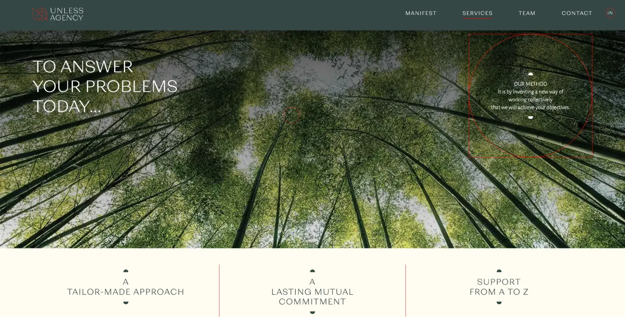
Unless Agency is a simple brochure website that explains the company’s mission and history, services, team, and contact information. Many pages use a two- or three-column layout with divider lines resembling the folds of a printed brochure.
What I like: This agency brochure website is light on text, so potential clients can quickly glance through it and understand what the company does.
2. Vmoto UK
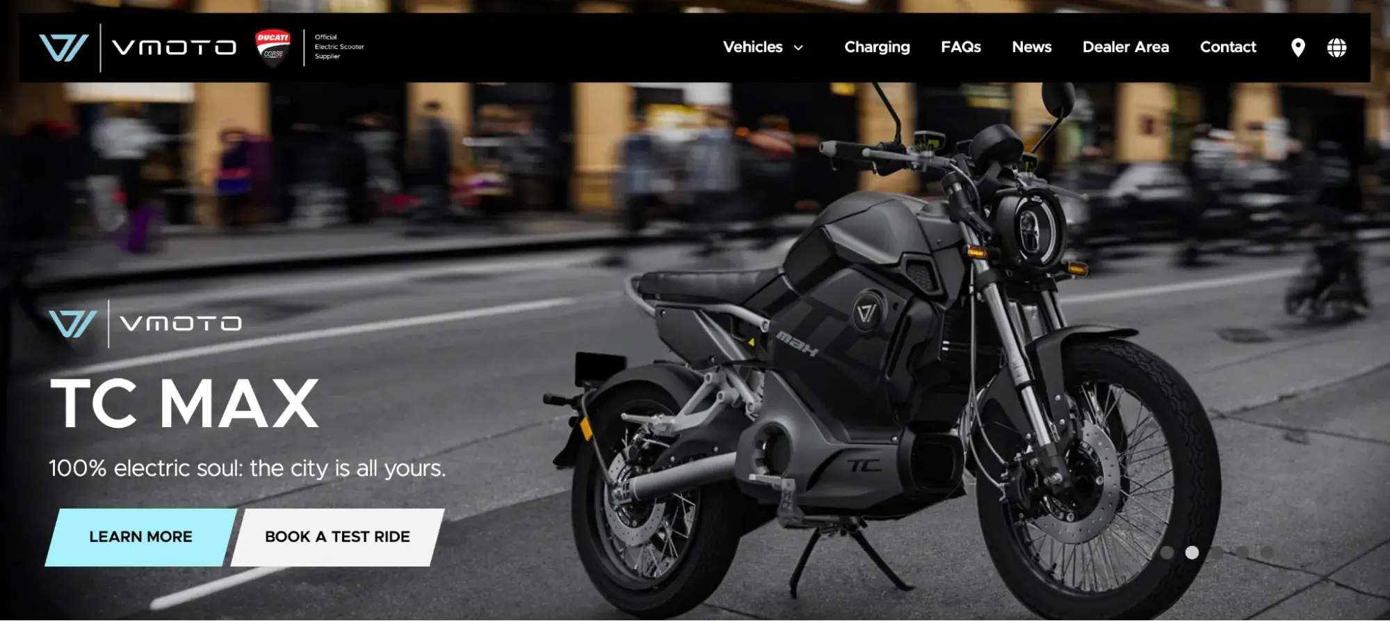
Vmoto is a clean, modern brochure website that showcases the UK's leading provider of electric motorcycles through multiple image sliders, animations, and minimal text.
What I like: I like how the site uses sliders. While sliders might not translate well in print, they work excellently on websites since using the same real estate, you can display as many products as you want.
3. Hagedorn
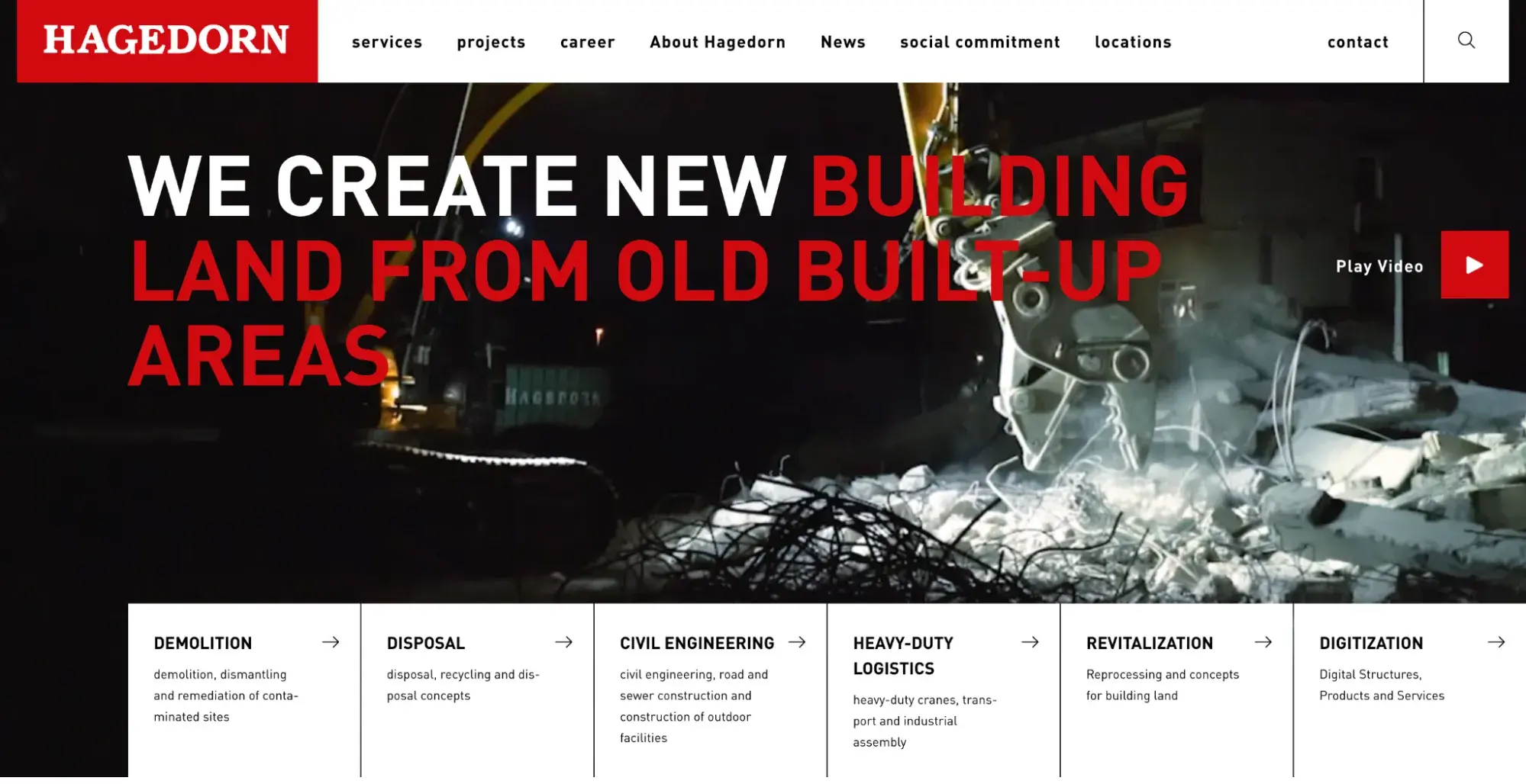
The Hagedorn Group is a full-service provider in the construction industry. The company performs all services in the process chain, from demolition, site remediation, disposal, and recycling to civil engineering and revitalization.
What I like: This brochure website reflects the company’s vision and unique services. It also provides information about its process chain, academy, innovation, and contact information.
4. Yomira
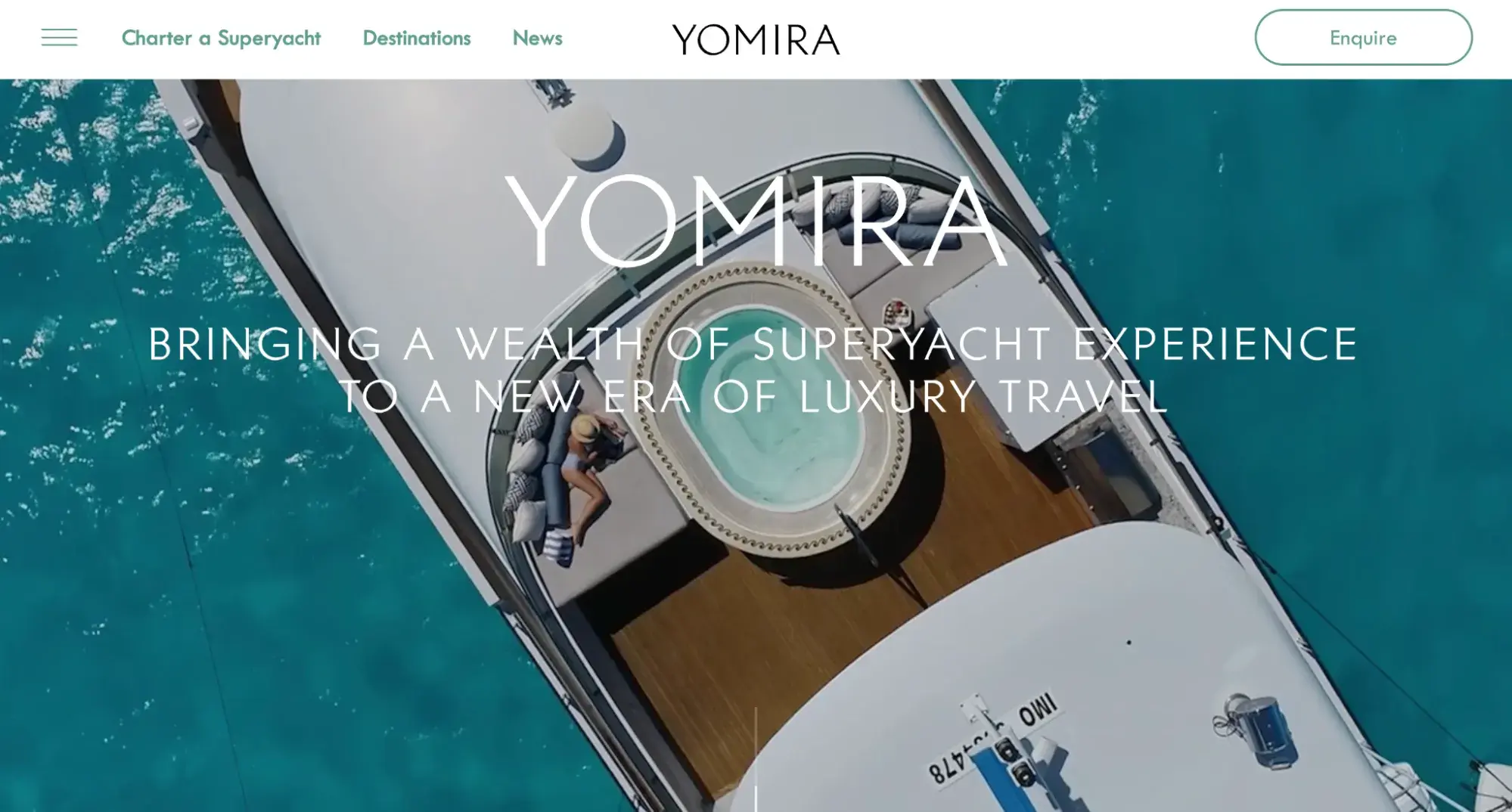
Yomira is an elegant brochure website for the luxury yacht charter business.
What I like: It uses high-quality images, clear messaging, and simple user journeys to enable visitors to learn more about the company and get in touch.
5. Moorlands School
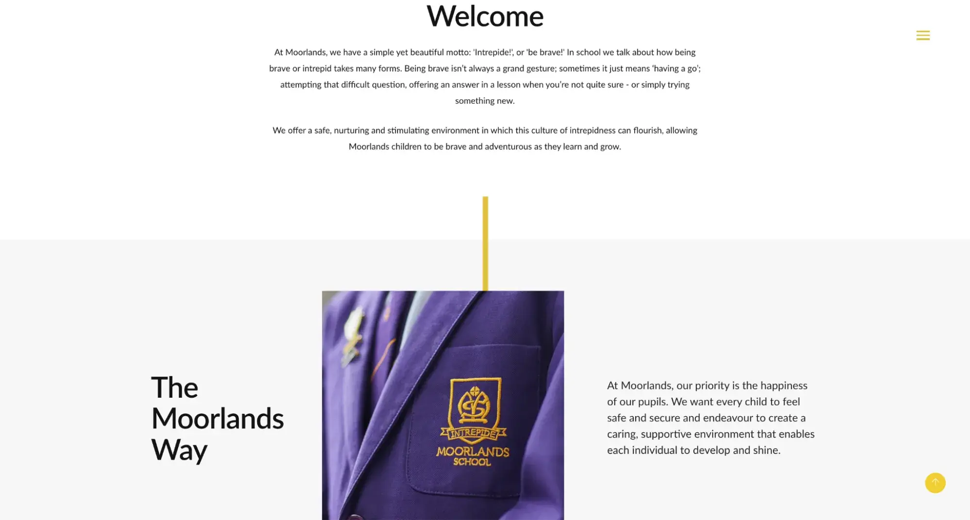
Moorlands School is a brochure site for an independent school in the United Kingdom. Each page has a brochure-like structure with many images, white space, and little text. It uses scrolling animations to make the experience more engaging than flipping a page.
What I like: I like how each image has an accompanying text that adds context or explains what readers are looking at.
6. Deakin Dental
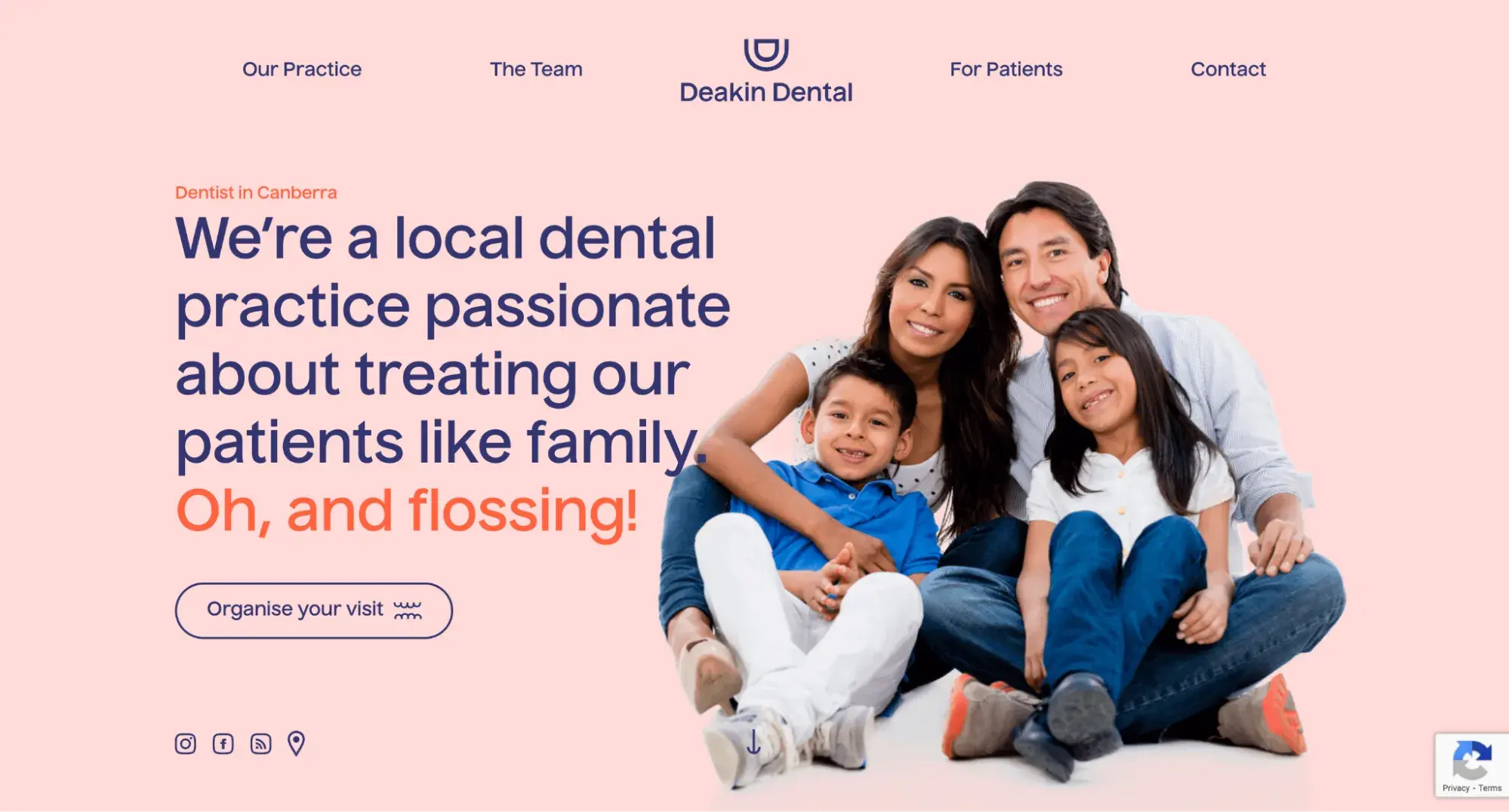
Deakin Dental is an Australian dental clinic that uses the latest technology and techniques to provide high-quality dentistry. The brochure website's homepage features a hero image and a unique two-column layout with scrolling animations.
What I like: The homepage section, which resembles a bi-fold brochure, tells prospective patients more about the team caring for them and invites users to submit their contact information to book a visit.
7. Royal Dog Boarding
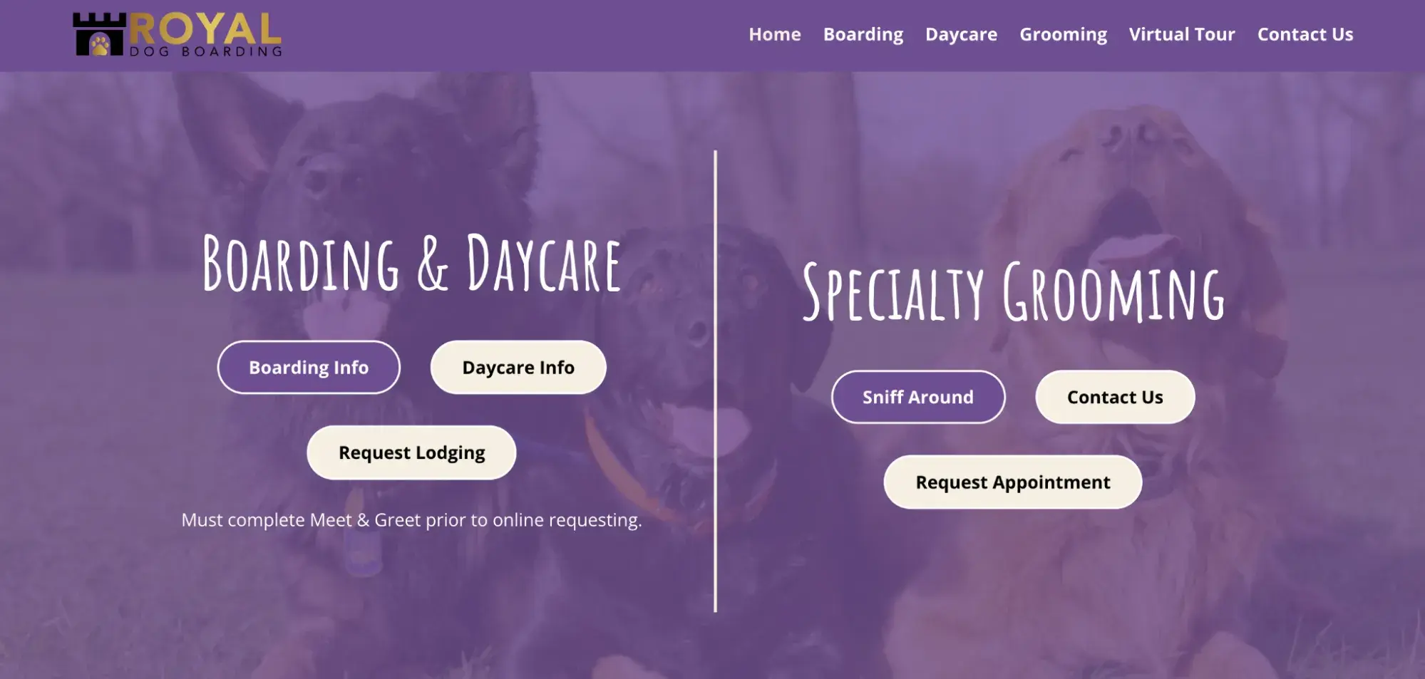
Royal Dog Boarding provides boarding, daycare, and grooming services to dog owners.
What I like: The site uses a two-fold vertical scrolling experience similar to looking up and down a printed brochure. It also uses clear imagery and copy to explain the company's offerings.
8. Clarity Benefit Solutions
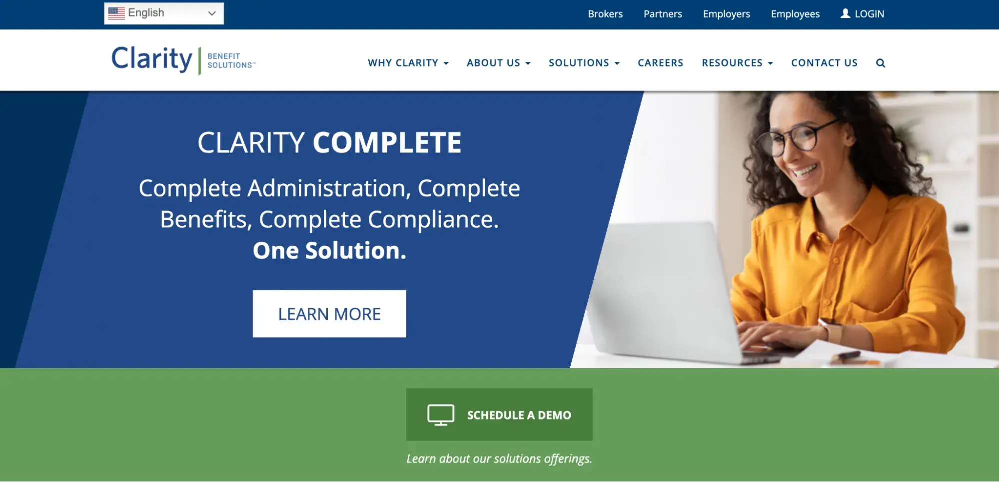
Clarity Benefit Solutions is a brochure website for a national benefits solutions provider. This site details its full suite of programs, industry-leading technology, and dedicated customer service.
What I like: I like the positions of the CTAs and forms, which makes it easy for visitors to log in, schedule a demo, sign up for their newsletter, and stay connected in other ways.
9. The Neat Space
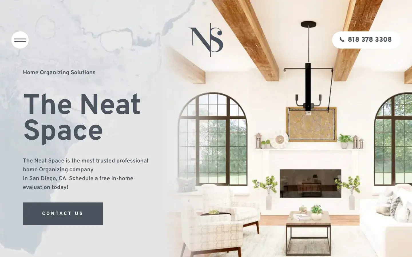
The Neat Space is a professional organizing service for clients with cluttered homes in San Diego, California.
What I like: Its brochure website clearly explains its services and invites visitors to schedule a demo or contact them. Visitors can view case studies, read customer reviews, and follow The Neat Space on Instagram to learn more before getting in touch.
10. Spazio Equilibrio 7
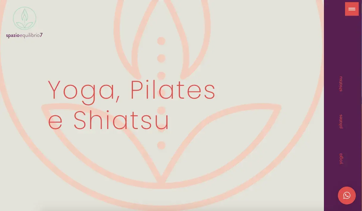
Spazio Equilibrio 7 is a fitness studio in Italy that offers classes and treatments in yoga, shiatsu, pilates, and more.
What I like: By visiting the brochure website, you can get a broad overview of each type of class and treatment. You can submit a form on almost every page for more information.
I also like the consistent branding and color scheme used throughout the website.
Brochure Examples
11. BMW
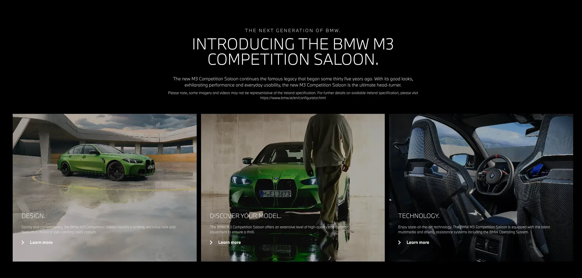
This BMW brochure showcases the luxury and sophistication you can expect from the brand. Each page focuses on different aspects of the car and helps viewers create clear mental pictures of its appearance.
What I like: The brochure's elegant design matches the advertised luxury product. I also like that it contains photographs of the car from different angles.
12. Ritz-Carlton Spa
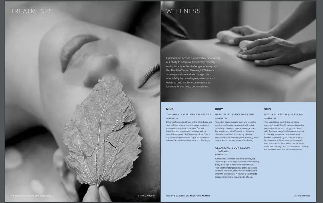
The Ritz-Carlton Spa’s brochure evokes the luxury of the hotel brand is known for.
What I like: This brochure is gorgeous and balances full-page black and white photographs with copy that advertises their products and services.
13. Ritz-Carlton Residence
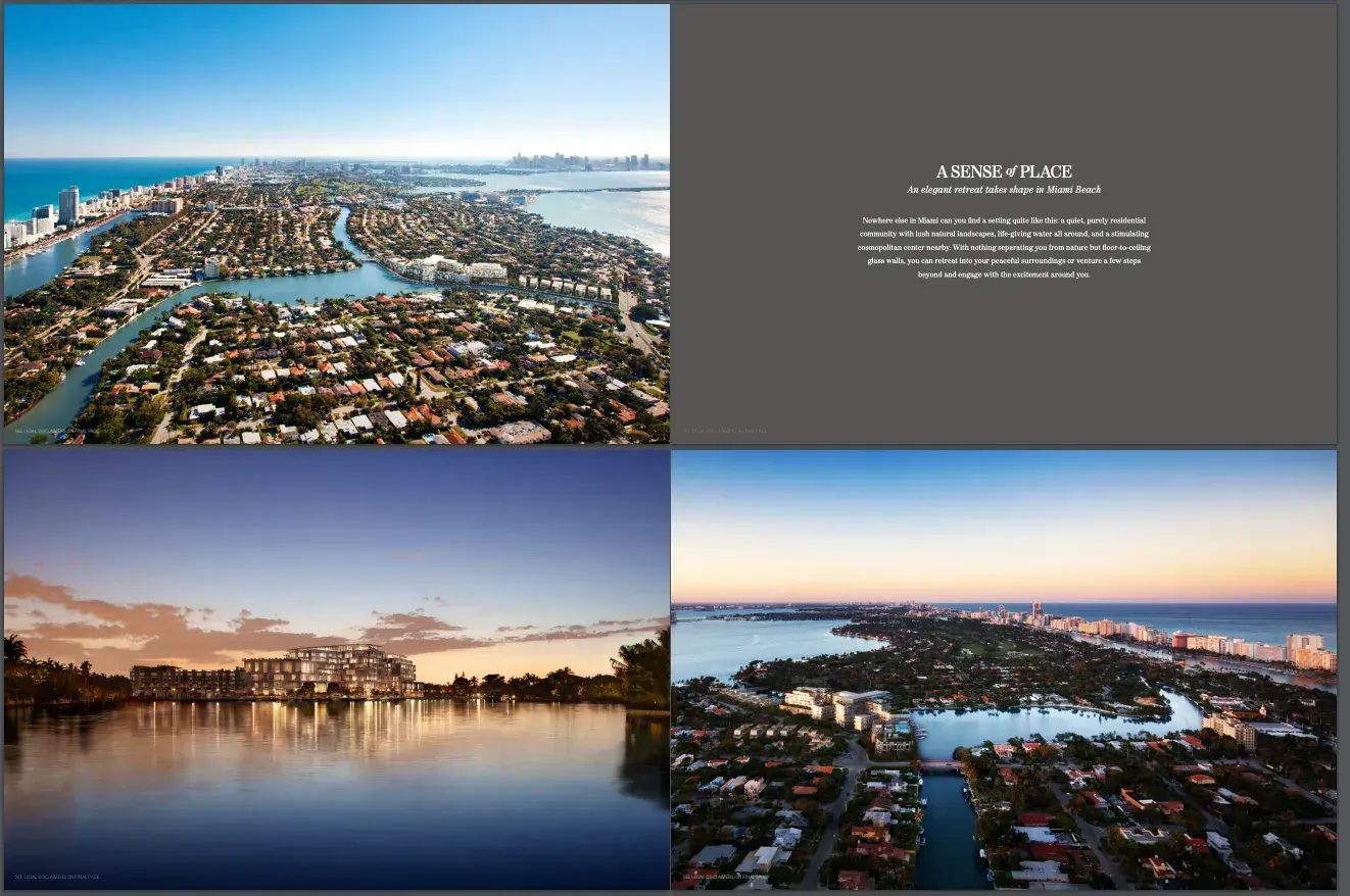
Ritz-Carlton is a luxury hotel chain operating in over 30 countries. The brand’s brochure uses stunning imagery of landscapes and architecture to reel readers in.
What I like: This brochure focuses well on what its core audience wants to see — stunning views, landscapes, and the like. I can already imagine myself at these locations.
14. Burst Oral Care
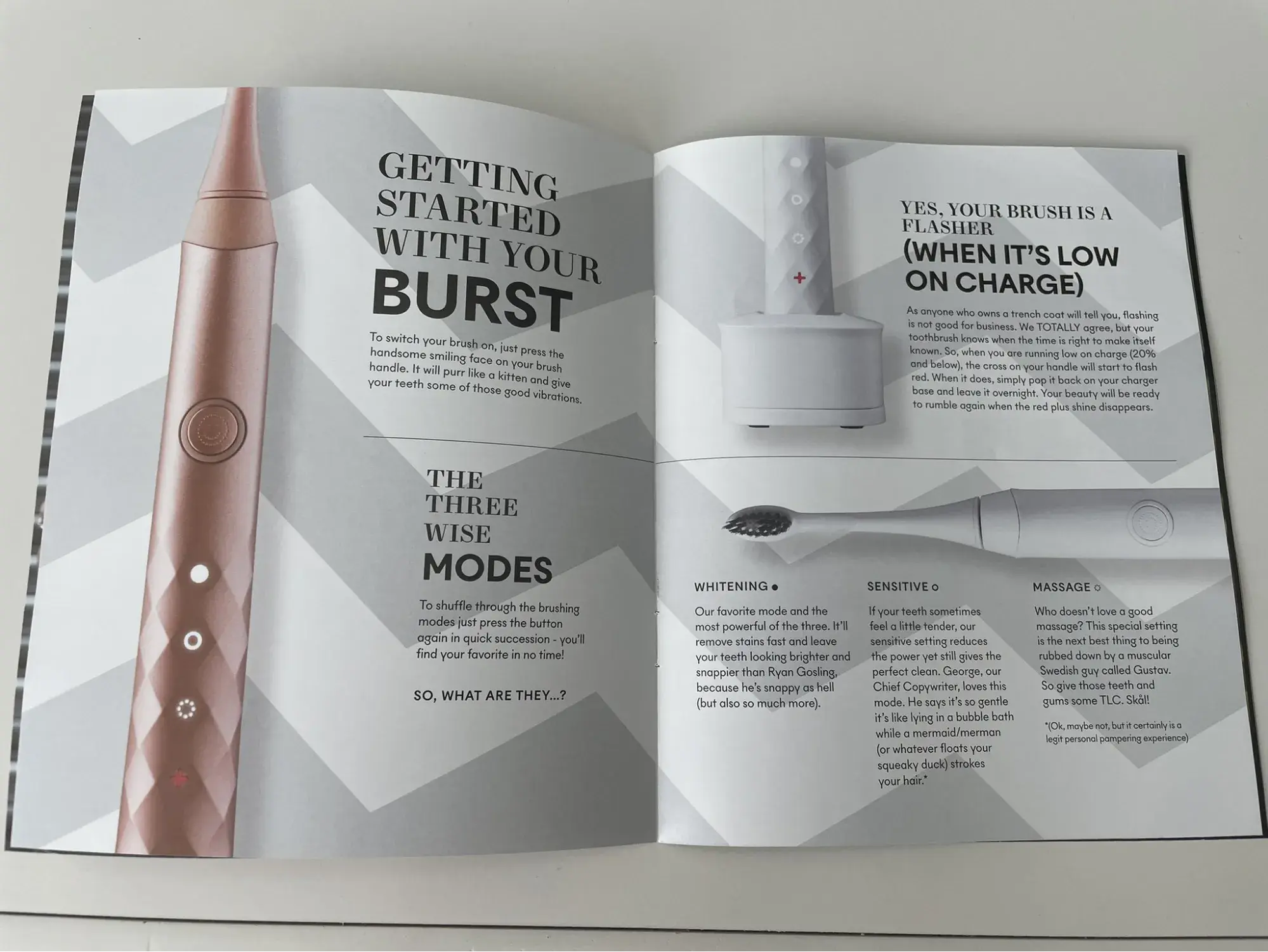
Burst Oral Care produces oral hygiene care products like electric toothbrushes, teeth whitening strips, and dental floss.
What I like: I like how organized the brochure’s content is. The images aren’t overwhelming. Instead, they focus on specific parts of their product that the copy explains to readers.
15. Virgin Atlantic
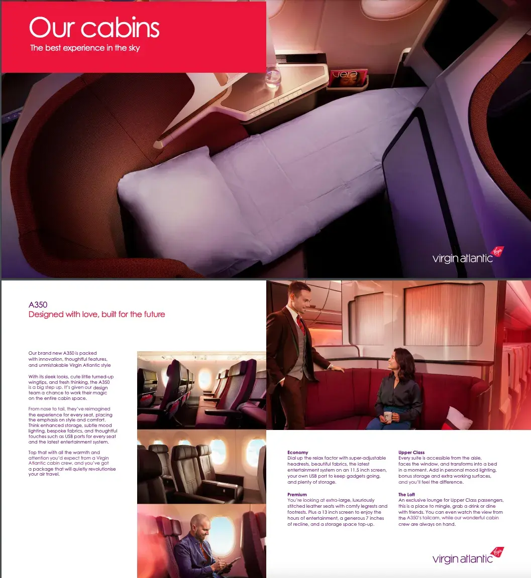
This digital brochure brilliantly showcases Virgin Atlantic's premium cabin experience through innovative design and storytelling. The piece opens with a sleek, dark cover featuring their iconic red accent, setting the tone for luxury travel.
What I like: I like how the fold-out panels mirror Virgin Atlantic’s cabin configuration. This panel layout lets readers “discover” the spaces as they open the brochure.
How to Create a Brochure Website
- Identify your target audience.
- Select an appropriate theme.
- Decide what information to include.
- Lay out the content.
Because a brochure website is designed to be simple and concise, creating one is typically faster and more cost-effective than building other types of websites, like an ecommerce site.
Let me walk you through the steps involved in creating one.
Identify your target audience.
Every website creation process begins the same way — by defining your target audience.
So ask yourself, Who is this website for?
Your target audience is a specific group of consumers who will want your product or services. You can categorize your audience based on factors such as age, gender, income, location, and interests.
Once determined, your target audience should inform every design and content decision.
Select an appropriate theme.
Nowadays, you don’t have to be a designer or developer to build a website. For example, I built my website without writing a single line of code.
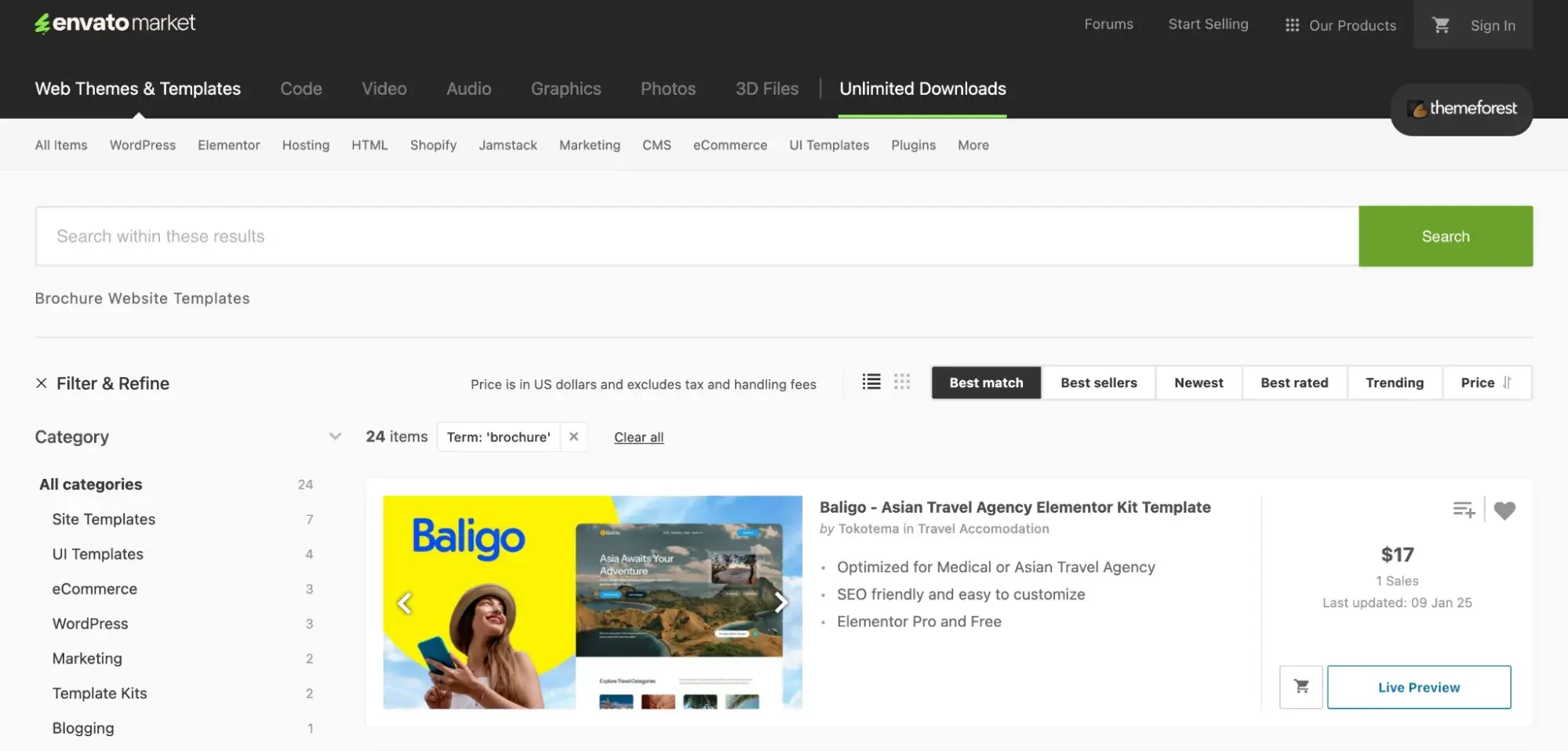
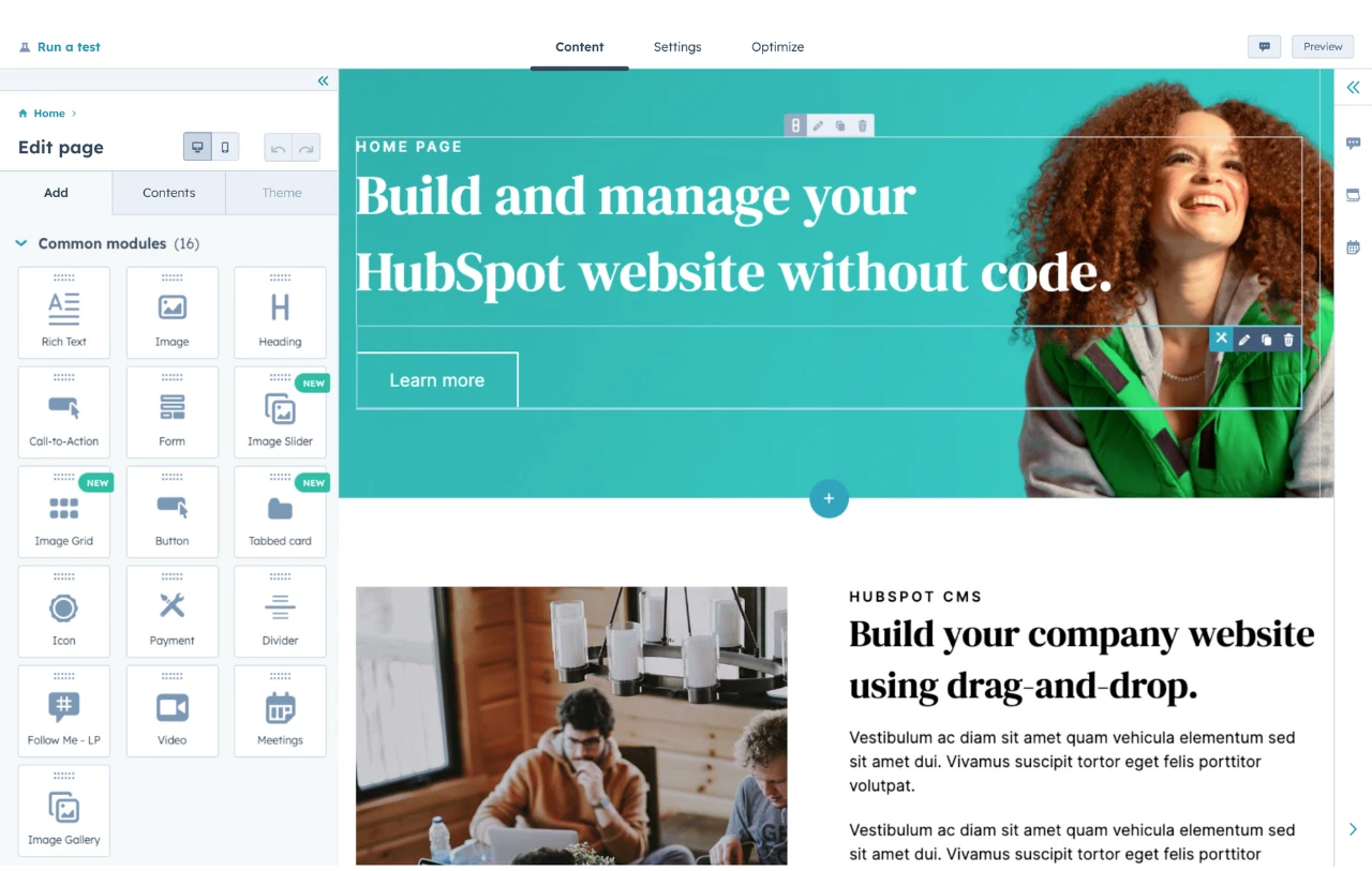
Most website builders offer pre-built templates that you can easily customize. I like to go to HubSpot's Website Template Marketplace when looking for professionally designed web themes and templates. You can sort the themes based on your business type, page types, features, etc.
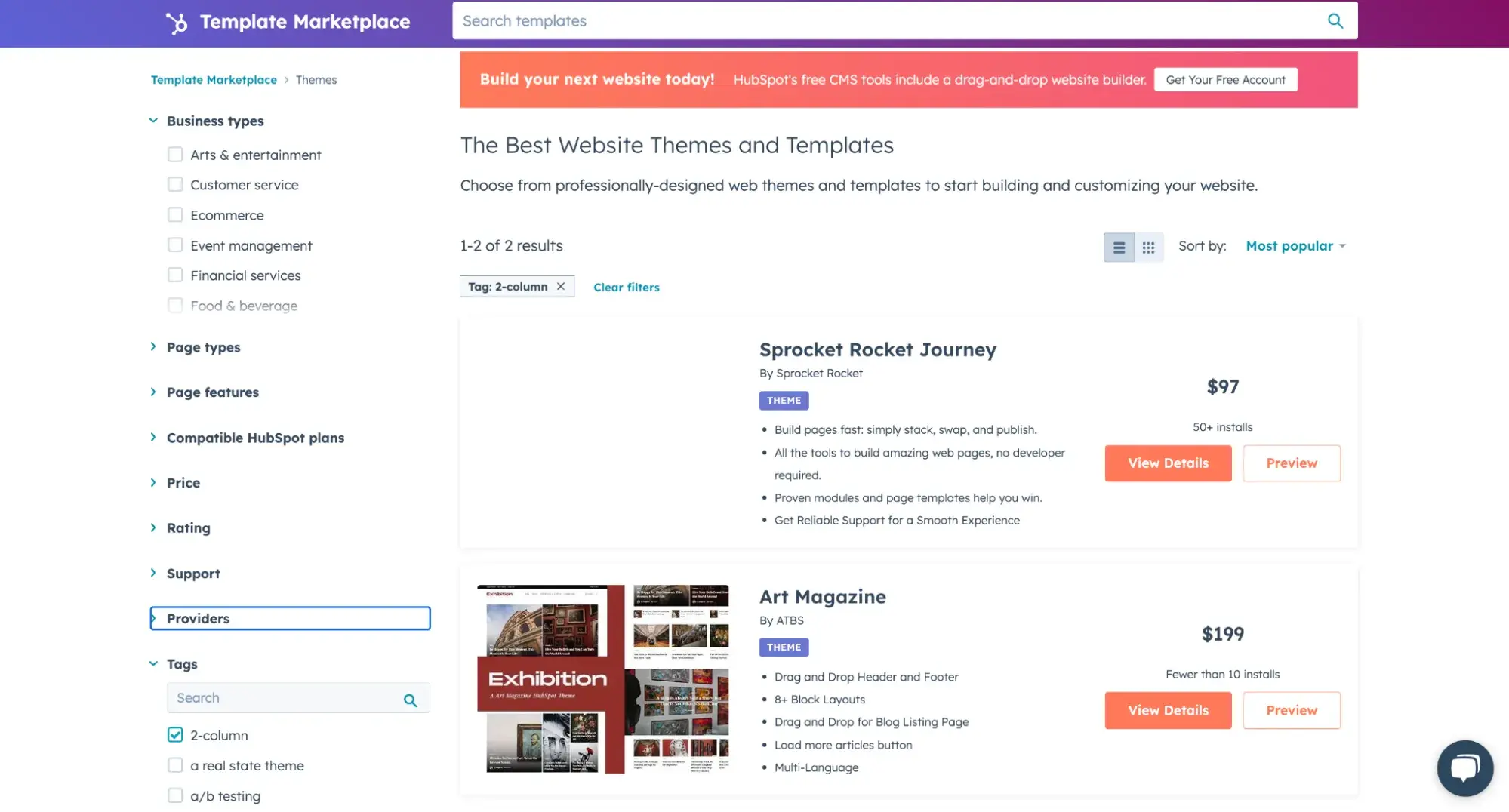
While you won’t find many options explicitly designed for brochure websites, look for landing page templates or themes. These will have layouts with many images, CTAs, and contact forms ideal for brochure websites.
Decide what information to include.
The exact information to include in a brochure website depends on your business type and target audience.
However, most websites include:
- Company logo
- Mission statement
- Detailed description of services or products
- High-quality images
- Contact information
- Contact forms
When deciding what information to include on your brochure website, remember that the goal of the site is to provide visitors with a broad overview of your business and a clear path for what to do next if they want to learn more (i.e., schedule a demo, call, submit a contact form, and so on).
Lay out the content.
Once you’ve decided what information to include, you’ll need to decide how to organize it.
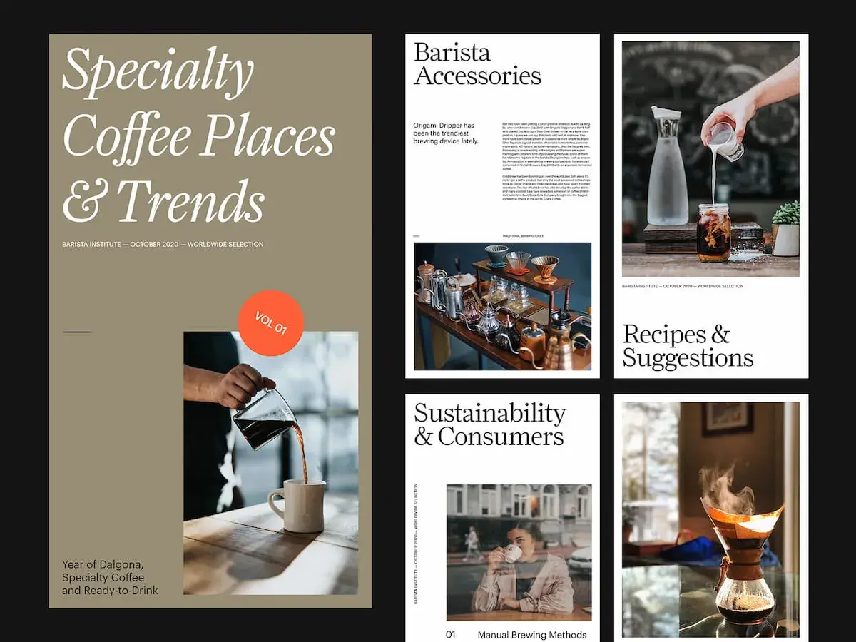
To get a clean and uncluttered look, use bold headings, images, and white space to break up text.
Here’s a great example:
Now, you’re ready to launch your website. Remember to incorporate SEO best practices (so potential customers can find you) and regularly update/maintain the site (so visitors can find up-to-date information).
How to Adapt a Brochure Website to a Printed Brochure
- Understand that print and website brochures are different.
- Determine the purpose of creating a print brochure.
- Choose the proper print format.
- Adjust website content.
- Check colors and other visual elements.
- Proofread the new print brochure.
- Choose a printing partner.
Taken a look at your audience and found that a significant amount prefer traditional marketing methods or have limited access to the internet?
You could also be preparing for a local event, such as a trade fair or conference, where you want your attendees to leave with something tangible.
In such cases, you could adapt your brochure website into a printed one. After all, the point of a brochure — whether digital or printed — is to reach as many people as possible.
Here’s a step-by-step guide on how to do so.
Understand that print and website brochures are different.
While they both serve similar goals, a print brochure vastly differs from a website one. Understanding those differences is the first step to help you successfully adapt your website brochure into print.
Here are some key differences to note:
- Printed brochures have limited space or real estate compared to website brochures. I could write a million words on a website, and you wouldn’t find the words falling off the device you’re reading on. Such scale doesn’t translate well on print.
- Printed brochures require higher-quality images. Since readers will be holding your brochures in their hands, you cannot get away with low-resolution images common with websites. You’ll also need a higher resolution for the colors, fonts, and other visual elements.
- Website brochures are more dynamic than printed brochures. While the papers in Hogwarts have moving pictures, that, unfortunately, doesn’t happen in real life. Instead, print brochures rely entirely on copy and static pictures and graphics.
Determine the purpose of creating a print brochure.
There are several reasons why you might choose to create a printed brochure. I mentioned a couple earlier — your audience likes traditional media or you’re preparing for a physical event.
Other reasons could be to improve your brand perception by producing high-quality printed materials, support your existing online marketing efforts, or target a localized market.
Any reason for creating a print brochure should be apparent from the onset. This clear purpose will determine the brochure’s shape, content, design, and more.
Choose the proper print format.
Physical brochures come in different shapes and sizes. The format you choose depends on what you want to achieve and your budget.
Common brochure formats include:
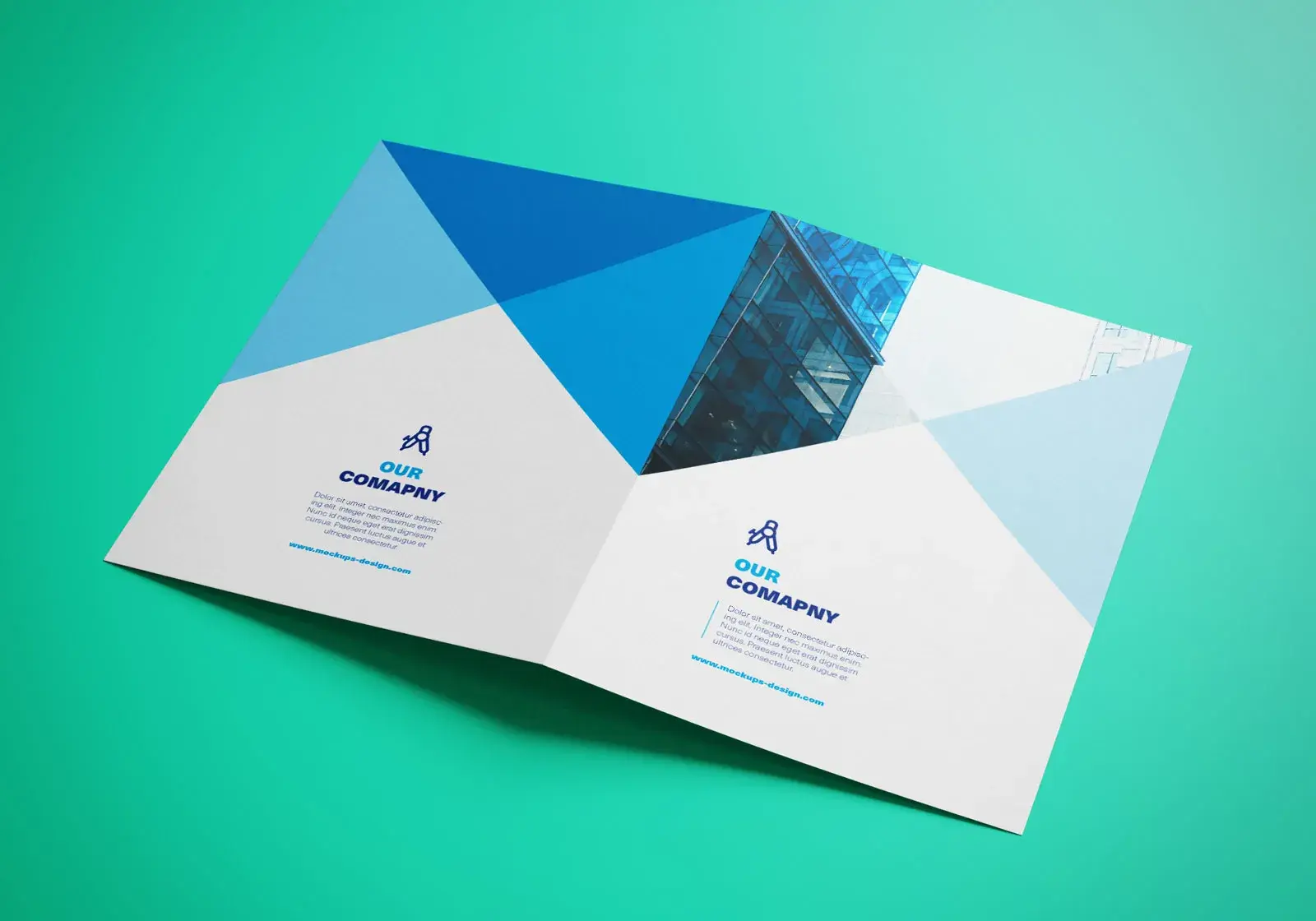
- Bi-fold (or half-fold) brochures. This includes a single sheet that’s divided into two equal parts. The bi-fold format features four panels where you can place images and texts.
Because it has only four panels and limited space, this format is best for frontloading crucial information, product features, or services your audience needs to know.
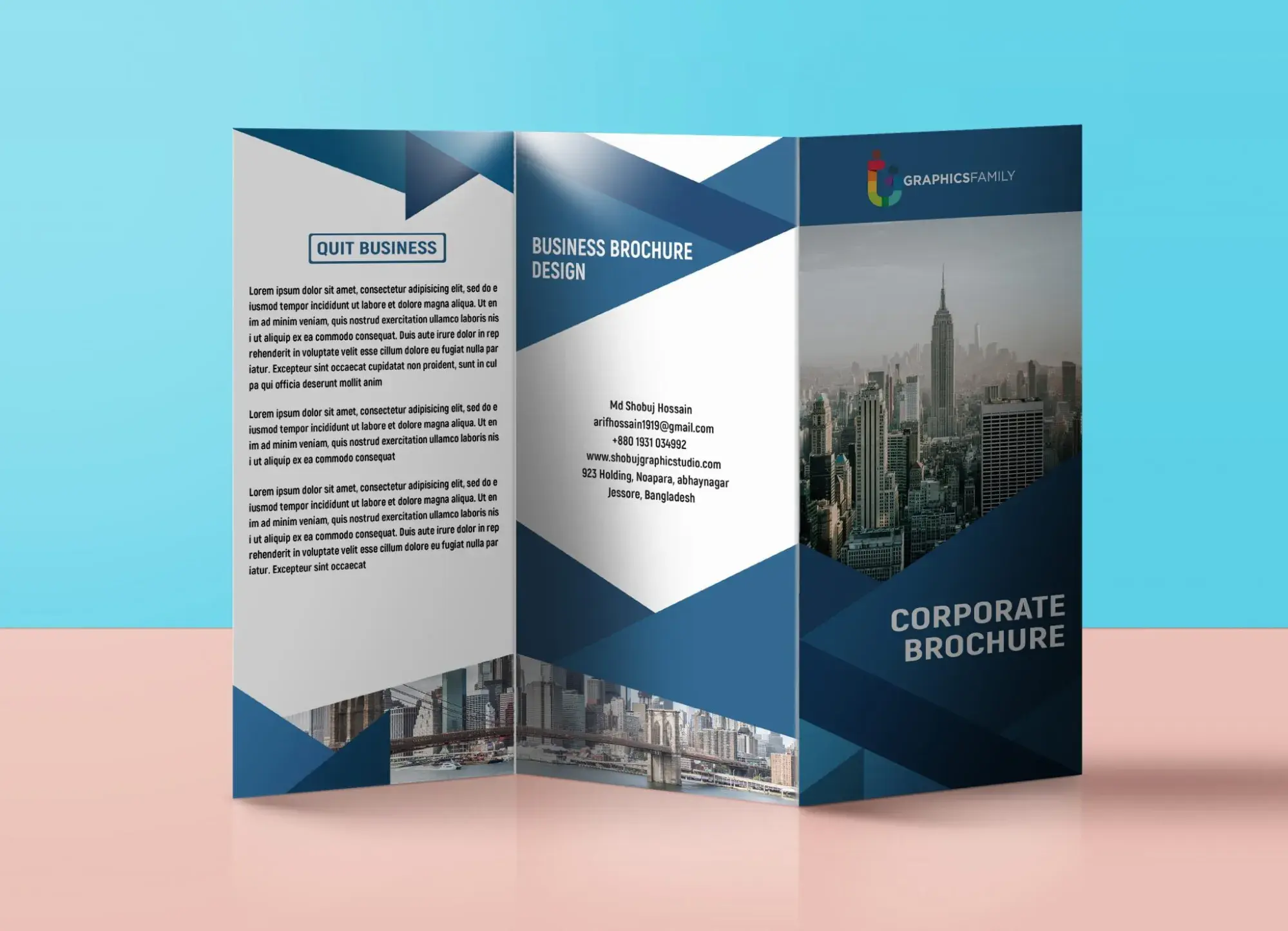
- Tri-fold brochures. This is a single sheet of paper folded into three equal parts, creating six panels or pages.
The front cover usually has eye-catching graphics that prompt readers to turn the pages. Tri-fold brochures contain more information than the bi-fold format but serve a similar purpose.
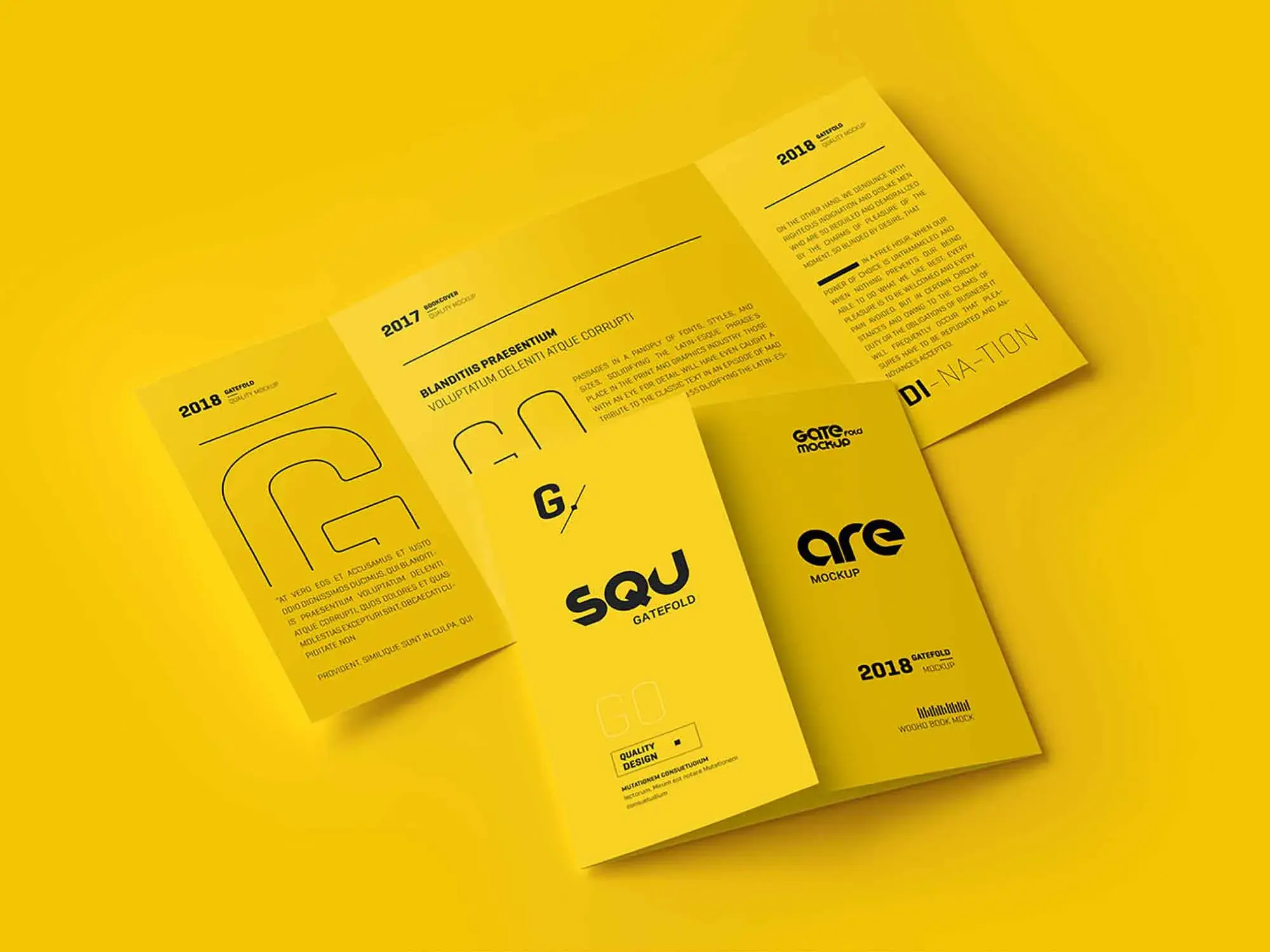
- Gate-fold brochures. Gate-fold brochures are similar to the tri-fold format as they’re divided thrice and have six panels. However, each panel's folding pattern and size make the gatefold format different.
The outer panels on the gate-fold brochure open like a “gate” to reveal a larger middle part. This format is excellent for engaging your audience and presenting information in an organized manner.
Adjust website content.
Remember, not all the content on your website can be printed. That is why you must choose the most relevant and adapt it to fit your printed brochure format.
Lengthy text should be cut short (while maintaining meaning) to maximize space. Say what you want to say once to avoid redundancies or repetition.
Use calls to action, quick response (QR) codes, and direct contact details instead of hyperlinks.
Check colors and other visual elements.
Ensure all images have a resolution of at least 300 DPI (dots per inch).
You should also check other visual elements, such as the colors. For example, most digital content uses the RGB (Red, Green, Blue) color format, while print uses CMYK (Cyan, Magenta, Yellow, and Key/Black).
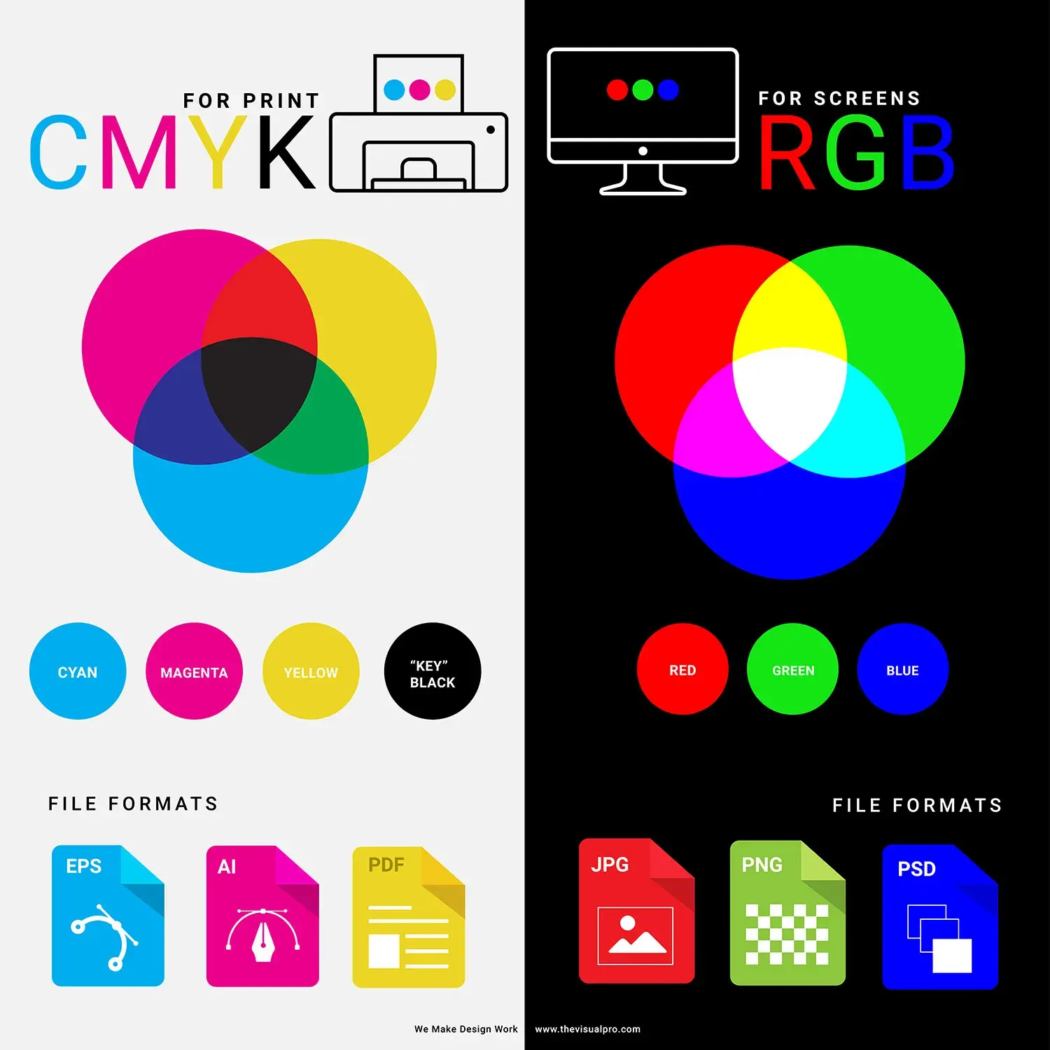
Make sure to convert your graphics to CMYK mode.
If you don’t have any good photos, consider hiring a professional photographer. Let the photographer know the scale of the images you want to avoid stretching the images to fit on print.
Another factor to consider at this stage is visual hierarchy and balance. Your print brochure should use the same colors and logos as your online presence. However, you should use different font sizes to denote the importance of your brochure’s content, just as you use H1s, H2s, and so on on web content.
Proofread the new print brochure.
Double-check your brochure for grammar errors and typos. Unlike digital content, you can’t easily edit mistakes when you’ve printed a physical copy. So check for errors, and then check again.
Also, review the brochure’s layout, design, and spacing.
Print a test copy when you’re sure you have what you want. With this test copy, you can assess the brochure’s overall quality in colors, images, texture, and copy before making the final print.
Choose a printing partner.
Now that everything is ready, it's time to print your final brochure. Ask around to compare prices, customer service, and quality.
Choose a vendor who meets your needs and get your brochures printed.
Creating Your Brochure Website
Creating a brochure website for your business can be a great way to promote your products and services, attract new customers, and engage existing customers.
I consider brochures as an excellent medium to present key information in a visually appealing and engaging format.
By leveraging the strengths of both digital and traditional marketing, businesses can create a seamless and impactful experience that resonates with diverse audiences, ensuring their message reaches as many people as possible.
Editor's note: This post was originally published in May 2022 and has been updated for comprehensiveness.
Website Design Examples




![15 black and white website designs to inspire your own [+ pro tips]](https://53.fs1.hubspotusercontent-na1.net/hubfs/53/black-and-white-website-design-1-20250520-1336267.webp)

![28 Types of Websites to Inspire You [+ Real-Life Examples]](https://53.fs1.hubspotusercontent-na1.net/hubfs/53/types-of-websites.png)


![10 of my favorite interactive websites [+ how I make my own]](https://53.fs1.hubspotusercontent-na1.net/hubfs/53/%5BUse%20(1)-Sep-27-2025-03-02-58-8817-PM.webp)