This post will explain what brutalist web design is and walk through 11 examples of websites that embrace the aesthetic. Let’s get started.
What is brutalist web design?
Brutalism is a style of architecture that emphasizes bare, minimal designs and structural materials over more traditionally “pleasing” aesthetics. In buildings, it is characterized by straight lines, block-like structures, and raw concrete.
A prime example of brutalist architecture can be found in my hometown of Boston, Massachusetts. Boston City Hall is considered a hallmark of the style.
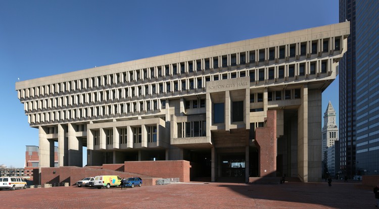
(For the record, a lot of people think this building is ugly. But I, for one, quite like it.)
The brutalist style can apply to web design too. It’s gained popularity in recent years as a reaction to the increasing “sameness” of modern websites. Brutalist websites incorporate bold imagery, stark color contrast, and unconventional visual methods to create a unique experience.
Pursuing a brutalist design can be a risk. But, with the right inspiration, it can be pulled off. In the next section, we’ll explore some of our favorite examples.
1. Studio Brot
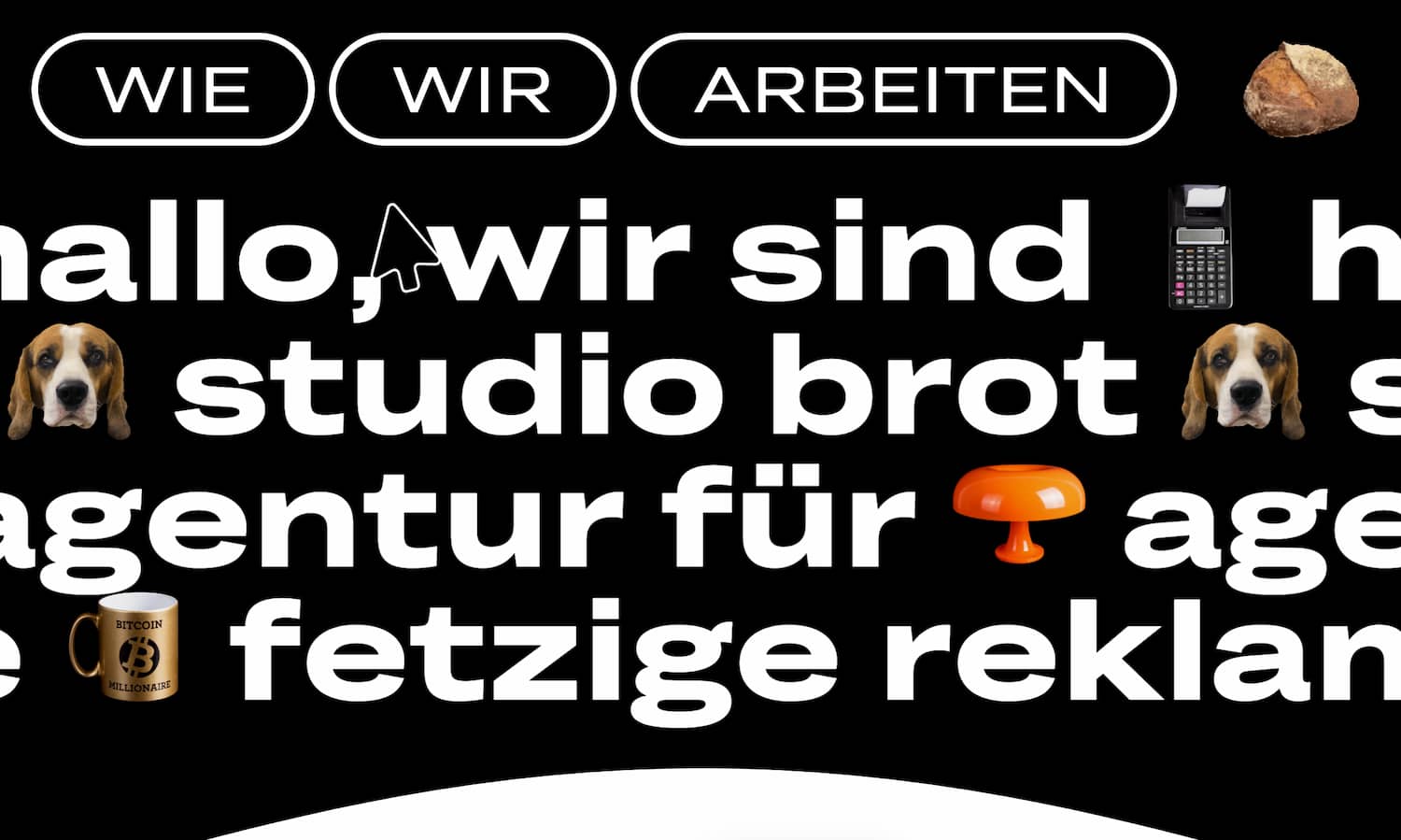
What we like: German creative agency Studio Brot’s brutalist website is a solid introduction to this genre of website design, combining minimalist and bare-bones construction with hints of fun and quirkiness that convey tons of personality. Check out the multiple captivating cursor effects and uses of motion that the designers have cleverly incorporated into the rough-around-the-edges feel. As the studio itself says, “It’s not perfect, it’s us.”
2. Freak Mag
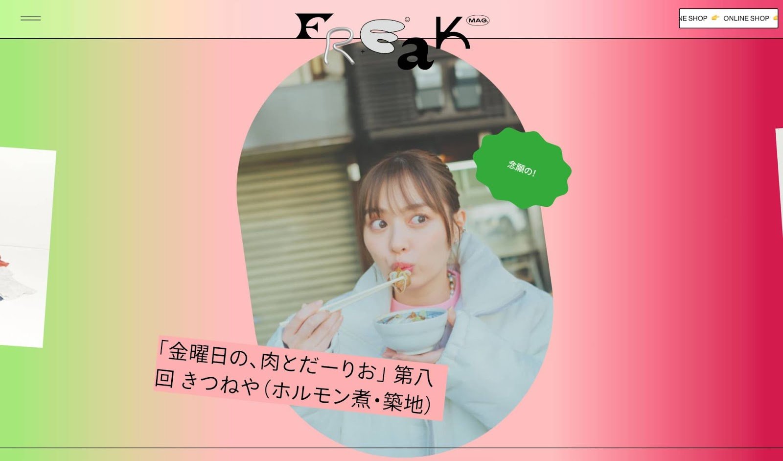
What we like: At first glance, Freak Mag appears to break almost every design rule in the book. But somehow, it works. Though somewhat chaotic, this website sticks to a consistent style when presenting its content so that, despite the brutalist appearance, its pages are still navigable and enjoyable.
3. Hot buro

What we like: Hot buro’s website features some awesome typography. It’s difficult to combine different typefaces in the same element and keep everything looking cohesive, but this website pulls it off by only using alternative fonts to emphasize important words and phrases. We also enjoy the 3D animations and buttons on its pages.
4. Ezekiel Aquino

What we like: We love this brilliant reinterpretation of a classic artistic medium, musical notation, into something totally fresh. This fascinating website features programmatically generated piano pieces. Watch and listen as the music plays in a loop — some of it is quite beautiful, in my opinion. Plus, the website features only what it needs to and nothing more, a key aspect of brutalist design.
5. Secession

What we like: Serving as the digital face of Vienna’s oldest contemporary art gallery, this website lives up to its purpose with a sleek and contemporary use of brutalist techniques. The site is text-centric with both static and scrolling text. When images are displayed, it’s done on simple cards. A lot of people look at contemporary art and think, “I could do that.” But a website like this is one you could actually try to replicate.
6. MrBeast

What we like: For those of you older than 25, I’ll explain: MrBeast is one of the biggest content creators on the web, known for his numerous viral videos that usually involve cash giveaways. However, I honestly didn’t expect him to boast such an impressive online store, which harkens back to retro aesthetics and old-school gaming. There’s even a game you can play right on the website.
7. Chrissie Abbott
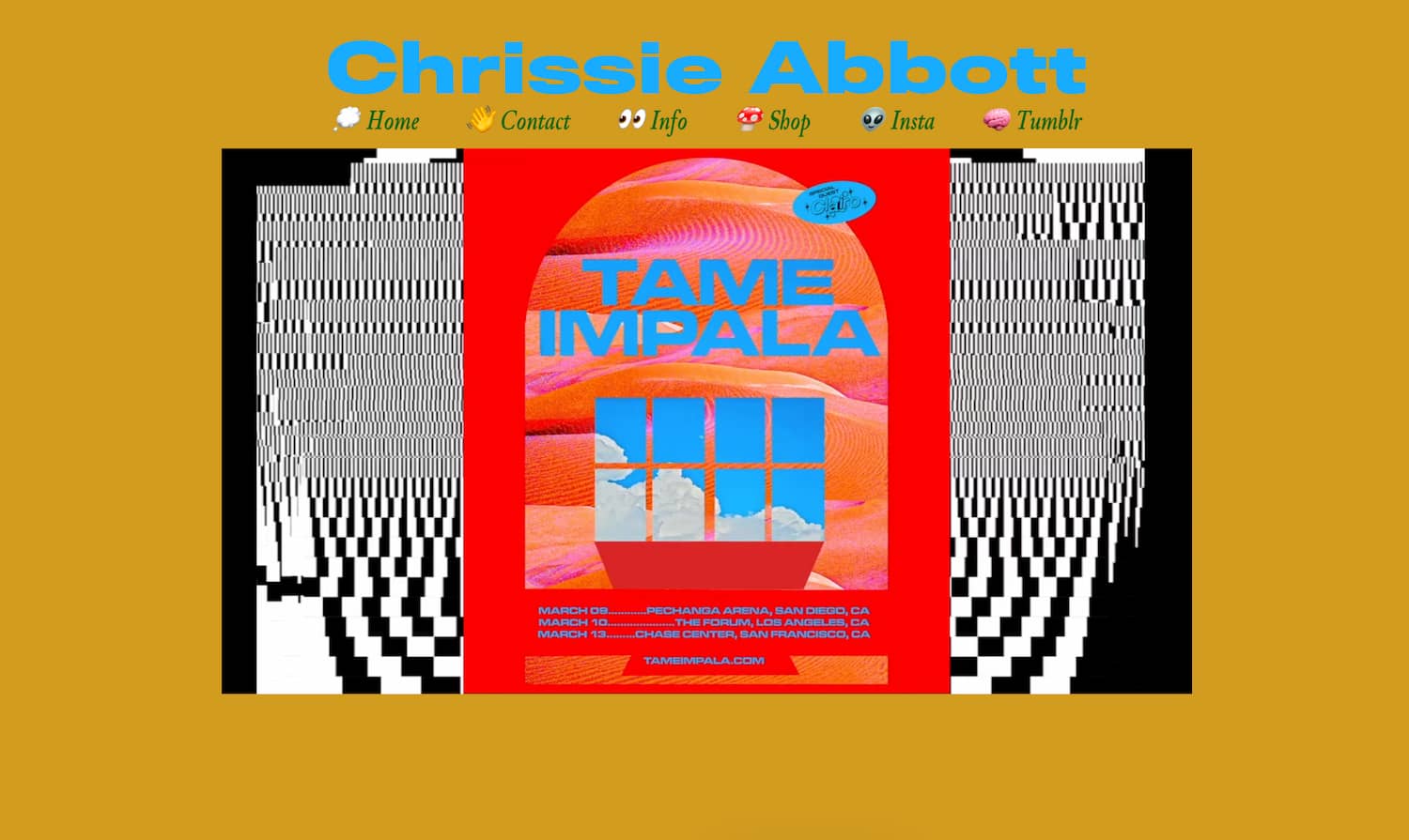
What we like: Chrissie Abbott is a designer who has created brutalist art for large brands and artists. Her website captures the very essence of her brutalist style, a barrage of loud, high-contrast visuals presented in a broken grid format. This website is also great for sourcing even more examples of brutalist design, as there are dozens of works to view.
8. CHRLS.DSGN
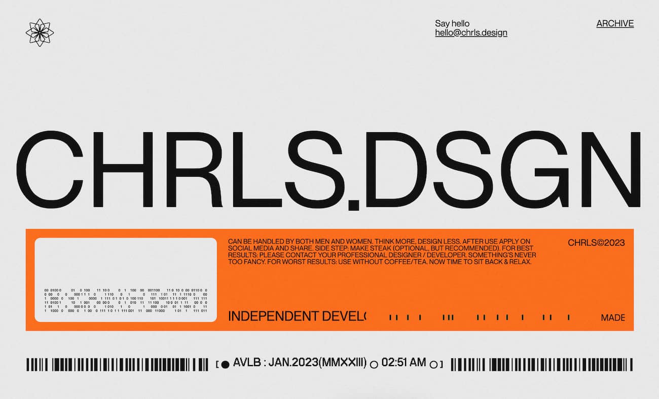
What we like: Here’s another personal website with a futuristic take on brutalist design. While the website introduces large, bold visuals as you scroll, what really makes this site great is its use of subtle animation effects that you may not consciously notice, but definitely contribute to the feel.
9. Studio Job

What we like: Featuring so many designers and design studios on this list almost feels like cheating, but it’s hard to resist when you have websites like this one. There are so many details packed into this website that it would be impossible to cover them all. Even still, it undeniably takes influence from brutalism. Just keep scrolling — the inspiration keeps on coming.
10. Sergio Diaz Schiaffino

What we like: This personal website revives the aesthetic of classic computer interfaces. Instead of pages, each section of the website opens in a new window. The attention to detail is impressive — the whole thing feels like you’re on a Macintosh from the nineties.
11. ChainZoku

What we like: Finally, Chainzoku combines brutalist aesthetics with manga and 3D renderings of NFT characters. Some pages also add background ambient noise which really adds to the immersive experience of the website.
Embracing Brutalism in Web Design
While it’s certainly not for everyone, brutalist designs can leave a lasting impression on visitors and help your website stand out from the competition. Maybe that’s why, like the buildings that adopt it, the style has stuck around for so long — love it or hate it, you’ll remember it.
Website Design Examples
.png?width=112&height=112&name=Image%20Hackathon%20%E2%80%93%20Vertical%20(50).png)



![15 black and white website designs to inspire your own [+ pro tips]](https://53.fs1.hubspotusercontent-na1.net/hubfs/53/black-and-white-website-design-1-20250520-1336267.webp)

![15 Brochure Website Examples to Inspire You [+ How to Make One]](https://53.fs1.hubspotusercontent-na1.net/hubfs/53/brochure-website-examples-1-20250319-362228.webp)
![28 Types of Websites to Inspire You [+ Real-Life Examples]](https://53.fs1.hubspotusercontent-na1.net/hubfs/53/types-of-websites.png)

