
Let's dive in.
Table of Contents
- The History of Media Queries
- What is a media query in CSS?
- How to Use Media Queries in CSS
- CSS Media Queries in Action
The History of Media Queries
CSS media queries were introduced in 1998 but gained popularity in the early 2010s with the rise of mobile devices. Ethan Marcotte's 2010 article, “Responsive Web Design,” was a game-changer. It proposed the use of media queries to build flexible, adaptive layouts that can adjust to different screen sizes and devices.
CSS3's 2011 release brought significant improvements to media queries. This update introduced new features such as min-width, max-width, device-width, aspect-ratio, and pointer.
Today, media queries are essential to web design. They provide providing designers with unparalleled control over their website's appearance and usability.
Sites can now have dynamic layouts that can adjust to the ever-changing digital landscape. By targeting specific devices, media queries have made websites more accessible.
What is a media query in CSS?
With media queries, you can take your CSS styling to the next level by applying it based on a device's characteristics, such as screen resolution or browser viewport width. By harnessing this technology, you can create responsive websites that look amazing across all devices.
Media queries offer an array of exciting possibilities for web developers, including the ability to conditionally apply styles. You can target specific media for HTML elements using the media attribute.
With the help of Window.matchMedia() and EventTarget.addEventListener() methods, you can test and track media states. This gives you unparalleled control over the appearance and functionality of your website.
When to Use CSS Media Queries
In today's digital world, users expect websites to adapt to all their devices. That's where Responsive Web Design (RWD) comes in. This design approach responds to the user's behavior and environment based on screen size, platform, and orientation.
By using flexible grids, layouts, images, and CSS media queries, RWD creates a dynamic, adaptable design that adjusts automatically to fit any device.
Imagine browsing a website on your laptop, only to switch to your iPad and see it flawlessly adapt to your device. With RWD, your website can do just that!
Plus, RWD can even consider the user's device settings, like their VPN for iOS on their iPad. In short, this approach provides a seamless user experience.
Using RWD eliminates the need for a separate design and development phase for each new gadget on the market.
CSS Media Queries in Action
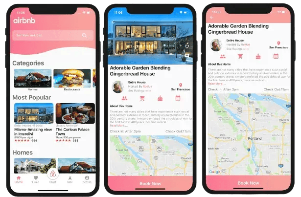
Popular travel website Airbnb showcases the benefits of media queries. So let's delve deeper into how Airbnb leverages CSS media queries to deliver a visually stunning and responsive website.
Desktop Media Query
The desktop version of the Airbnb website showcases beautiful images and effortless navigation in a sophisticated multi-column layout. The prominently positioned navigation menu and easy-to-use search bar let users quickly filter their preferences.
As the screen size decreases, the website adapts to a single-column layout. Images get smaller but remain high quality. The navigation menu becomes more concise, remaining user-friendly.

Tablet Media Query
The Airbnb website optimizes its layout for touch interaction on tablet devices. The navigation menu takes up less screen space while still maintaining easy accessibility. The search bar also moves to the top of the page.
The listing images are scaled down to fit the smaller screen size, while still maintaining their quality, providing users with a visually stunning experience.

Mobile Media Query
Airbnb's mobile website design prioritizes user experience and accessibility. The navigation menu is simplified to a hamburger icon. The search bar is front and center for quick filtering of results.
High-quality images are scaled down but easily browsable through swipeable galleries. The vertical scrolling layout provides seamless exploration with just one hand. The result is a user-friendly, enjoyable browsing experience on the go.
How to Use Media Queries in CSS
CSS media queries allow you to apply specific styles to different screen sizes or devices.
Below, we’ll cover the following aspects of using media queries:
- Syntax.
- Breakpoints.
- Screen sizes.
- Media types.
- Media features.
- Test and refine.
Syntax
In this example, we have two sets of CSS rules, one for desktop screens and another for mobile screens. The desktop screen rules are defined outside of any media query and apply to all screen sizes.
The mobile screen rules are defined inside a media query that targets screens with a maximum width of 768px. The syntax of the media query is as follows:

The @media rule indicates that this is a media query. The “only” keyword specifies that this query should only apply to screens that match the specified conditions. In this case, we're targeting screens that match the screen media type and have a maximum width of 768px.
Inside the curly braces, we define the CSS rules that should apply to screens that match the specified conditions. In this example, we're changing the background color, font size, and text color of the body element for mobile screens.

Breakpoints
In this example, we've defined three different sets of styles for three different screen sizes or device types:
- Mobile devices.
- Tablets.
- Desktops/laptops.
We've used media queries to target specific screen sizes and apply the appropriate styles.

The first set of styles, outside of any media query, applies to all screen sizes. We've set the font size to 16px and the line height to 1.5.
The second set of styles, inside a media query with a maximum width of 575px, targets mobile devices. We've reduced the font size to 14px and the line height to 1.4 to make the text more readable on smaller screens.
The third set of styles, inside a media query with a minimum width of 576px and a maximum width of 991px, targets tablets. We've returned the font size and line height to their default values of 16px and 1.5, respectively.
The fourth set of styles, inside a media query with a minimum width of 992px, targets desktops and laptops. We've increased the font size to 18px and the line height to 1.6 to take advantage of the larger screen size.

Screen Sizes
In the example below, we have defined styles for a .some-class selector for three different screen sizes:
- Desktop.
- Tablet.
- Mobile.
The styles for desktop screens are defined first, and then media queries are used to adjust the font size and color for smaller screen sizes. The @media rule is used to specify the maximum width of the screen for each breakpoint.

Media Types
CSS media types are used to define different styles for different types of devices or media. The most common media types are screen, print, and speech.

Screen media type is used for computer screens, smartphones, tablets, and other similar devices. You can use it to define styles for different screen sizes or resolutions.
Print media type is used when a web page is printed. You can use it to define styles specifically for print, such as hiding certain elements or adjusting the layout.
Speech media type is used for screen readers and other devices that read out the content of a web page. You can use it to define styles for users who rely on screen readers or similar technology.
To apply styles for a specific media type, you can use the @media rule followed by the media type in parentheses. See the examples below.
Media Features
In this code, each @media rule targets specific CSS media features. The first two @media rules target screen width, with the first targeting screens with a width of 600px or less and the second targeting screens with a width of 601px or greater. The third @media rule targets screens with a width between 601px and 900px.
The fourth @media rule is targeting screen orientation, specifically screens in portrait mode. Finally, the fifth @media rule targets screens with a high resolution, with support for both -webkit-min-device-pixel-ratio and min-resolution media features.

Test and Refine
Once you have written your media queries, it's important to test them on a variety of devices and screen sizes.
Start by using your browser's built-in developer tools, which allow you to simulate different screen sizes and devices. You can also test your media queries on physical devices to ensure that they function as intended.
When testing your media queries, look for any layout or display issues, such as elements that are cut off or overlapping. You may need to refine your styles or adjust your breakpoints based on your testing.
Consider the user experience when testing and refining your media queries. Make sure your content is readable and accessible on all devices and that any interactive elements are easy to use and navigate.
Getting Started with CSS Media Queries
Media queries are an essential component of web design. Designers can create dynamic, adaptive layouts that can cater to a wide variety of devices. Now, it’s your turn to create a frictionless, accessible user experience.
CSS


![How to Create Scrolling Text With CSS [+ Code Examples]](https://53.fs1.hubspotusercontent-na1.net/hubfs/53/Google%20Drive%20Integration/scrolling%20text%20css.jpeg)


