1. Seattle Sound Dental

With big beautiful hero graphics, an easy-to-find appointment scheduler, and clear buckets for service lines, the Seattle Sound Dental website easily makes its case to visitors. We like this website’s use of CTAs — from the appointment scheduler being front-and-center to the locations and service lines layouts.
What We Like
- The easy color scheme on this dental website keeps the information streamlined
- Big hero pictures are inviting and provide a sense of calm for visitors
- Navigation is simple, with big buttons for appointments and bill payments
2. Best Dentistry
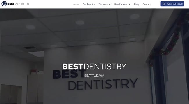
Best Dentistry takes its branding from the office, creating a streamlined experience for visitors in-person and online. With a great video header showing users what to expect at their visit to clear buckets of information to communicate services, this dental website lives up to its name.
What We Like
- A simple and easy-to-use navigation menu keeps links at hand
- The footer offers important links like new patient forms and business hours
- CTAs are useful and help visitors navigate top-of-mind tasks like scheduling appointments
3. Queen Anne Dental Group
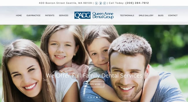
The Queen Anne Dental Group website is a classic, conservative design that offers a wide navigation menu with a logo front and center. The hero images feature clients and local scenery. Simple graphics accompany a streamlined content layout.
You can take design cues from this dental website and be well on your way to completing your own dental website project.
What We Like
- Patient reviews to build customer trust and brand awareness
- Staff pages focus on putting the dentists front and center
- The navigation is simple, and we like the unique “Smile Gallery”
4. Dentistry of Orlando
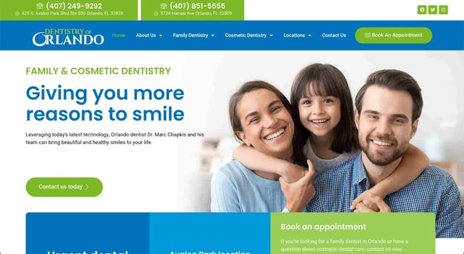
The graphics in the Dentistry of Orlando are big, bold, and frankly, bound to make you smile. The blue and green color scheme is bright and happy, easing customers' minds during stressful dental visits. Plus, large CTAs direct users where you want them to go.
The content layout is easy to follow, and animation helps keep users scrolling.
What We Like
- Blue and green graphics create a happy atmosphere
- A large footer offers everything a visitor needs to make an appointment
- Service lines are clearly articulated in drop-down navigation menus
5. Lincoln Park Dental Studio
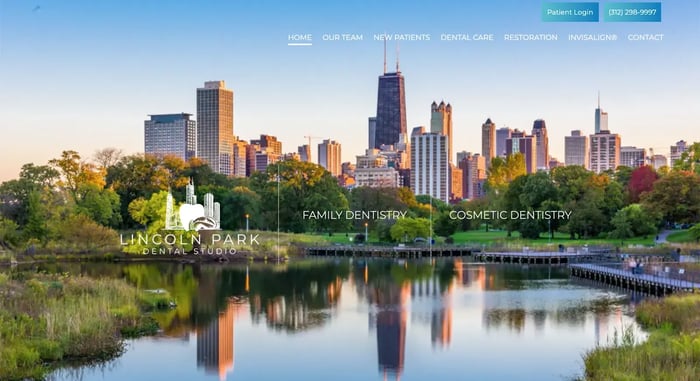
This modern dental website from Chicago builds customer trust with modern graphics, a video header, and straightforward CTAs. In addition to that, the panel with the dentist on record is inviting and professional.
We love the large video header showcasing the dental office’s Chicago location, plus service lines.
What We Like
- This family practice looks polished and ready for prime time
- Professional photos of staff, family, and testimonials lend credibility
6. South Florida Asleep Dentistry
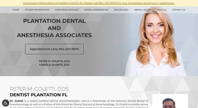
The clean and simple graphics on the South Florida Asleep Dentistry website live up to the business’s name: They are calming and, if we’re honest, a little hypnotic. The designs of the content panels are definitely doing the trick. A large menu helps round out whatever navigation is missing from a long-scrolling homepage.
What We Like
- The pattern in the content panels mirrors the brand’s message
- A clean and calming color palette drives home the message
- Patient information, appointment CTAs, and Covid-19 information are all easy to find
7. Tend
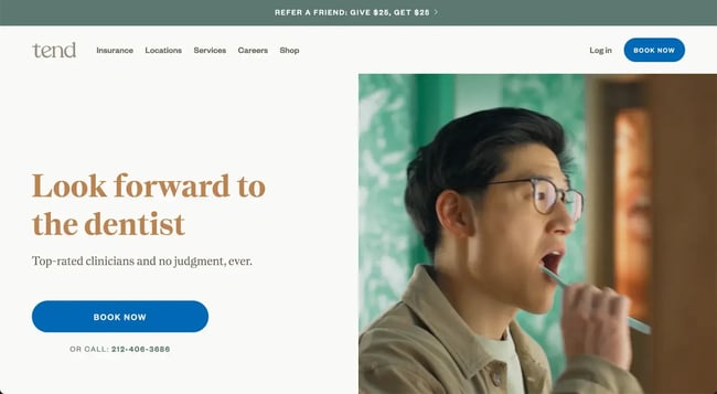
The Tend website — and, indeed, the brand itself — strikes a different tone than the other dentist websites on this list. That’s what sets it apart. If you’re working on your own dental practice website, consider what makes your company different, and drive the message home like Tend.
What We Like
- Tabs chock full of testimonials add value for customer drivers
- Large, round buttons are eye-catching and drive users to click
8. The Aspen Group
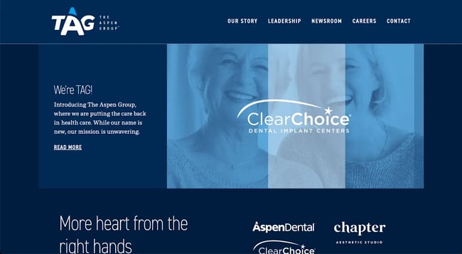
Another dental website that stands out from the usual pack, the Aspen Group's website is unique with its dark color scheme, animated header graphics, and round graphics for content buckets.
While this website is for dental insurance rather than a dental office, the use of customer groups, content layout, and unique graphics can still inspire your dental website design.
What We Like
- Cool, blue graphics throughout make this website stand out from the pack
- Circle elements keep the branding together across the site
- Professional photos elevate the brand as a competitor
9. Wellspring
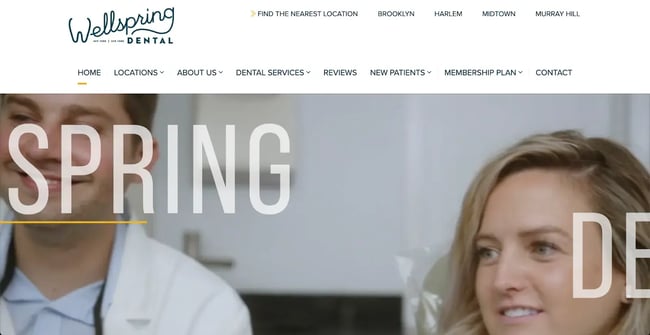
This NY-based dental practice’s website has strong branding, great design, and friendly smiles. Everything you would hope for in a great dental website design. The website showcases the brand’s office, which mimics the branding and carries the messaging to a real-life environment.
What We Like
- Large photos featuring smiling staff welcome visitors to the website
- Videos showcase the brand, the staff, and the practice services
- Location buckets clearly define where you can visit this practice
10. Shara Miller DDS

This sleek dental website offers big hero images featuring the practice’s location, easy-to-read content buckets, and sticky navigation with the patient CTAs right at hand, setting it apart from other websites. Cool service buckets take you to informative pages that are also great for SEO.
What We Like
- Individual service pages help boost this website’s SEO
- Sticky navigation keeps the menu top of mind for users as they scroll through pages
- Web copy helps communicate what this dental office offers and where
11. West Village Dental Studio

Clever buckets add unique value propositions compared to other websites in this list. We love the useful footer with location, contact, and a map.
What We Like
- The color scheme is carried throughout the site
- A hero graphic welcomes users and appeals to the CTA for appointments
- Professional photos elevate staff and service lines
12. Soul Dental
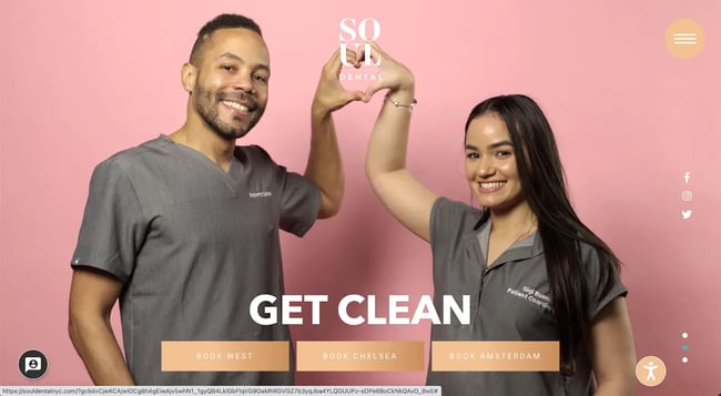
Empathy within the content copy is a trend for dental websites. This helps build customer trust, especially for those scared of dental work. The site's colorful backgrounds and professional photography lend a modern design sensibility. Take note of this website’s parallax layout, which sets it apart.
What We Like
- The use of staff images provides a friendly and welcoming feel
- Modern and unique colors put this brand squarely in the 21st century
13. Capitol Hill Dental Group
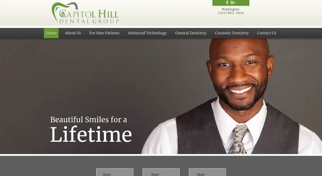
This modern dental website is more buttoned-down than the previous entry on this list, but it still gets the message across. From a consistent color scheme to a sticky menu that keeps information at hand for visitors, the Capitol Hill Dental Group website has plenty of inspiration for you.
Bonus: check out the navigation flyout menus and site architecture.
What We Like
- Beautiful hero images feature customers and big smiles
- The colors are understated and conservative, matching the brand's personality
- A content grid helps drive users to different areas of the site for information
14. City Smiles DC
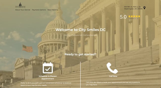
This Washington, D.C. dental website takes inspiration from the nation’s capital: A big, bold header featuring the capitol building serves as a welcome sign. We like this website’s use of iconography, colors, and information architecture.
What We Like
- The big hero is a breath of fresh air with its muted color scheme
- The navigation is understated and keeps only what patients need upfront
- Icons communicate content while presenting a friendly atmosphere
15. K Street Dental
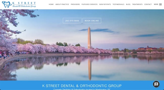
This dental website uses a traditional layout and modern, professional photography to communicate its brand to customers. Clean lines keep this website easy on the eyes, exactly what you want for nervous dental patients. A full-width hero allows visitors to book appointments or contact the office without hunting.
What We Like
- Springy hero graphics keep this website’s tone upbeat and friendly
- Nice typography throughout the site lends professionalism
- There's clear navigation, and the content layout is easy to follow for visitors
16. Midtown Dentist
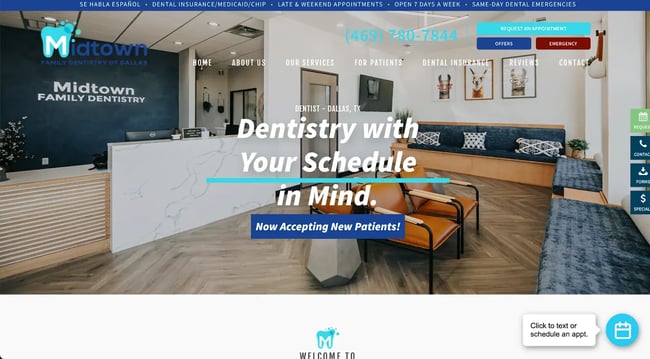
The most exciting aspect of the Midtown Dentist website is that you can tell the brand cares about carrying the user experience from the office to the digital platform. The overall experience, from when a patient books an appointment online to showing up at the place of business, is thoughtfully executed.
What We Like
- Cool animation in the hero communicates services clearly
- Graphics from the website mimic branding in the office in person
- CTAs are more than just payment forms — emergency booking and offers are also given
17. North Dallas Family Dental
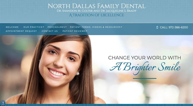
Big hero headers featuring all smiles from models and dentists are the center of this dental website from the Dallas area. A large menu helps visitors find the services they need and make appointments easily. This website can help you with your own dental website inspiration with its clean color scheme, easy contact forms, and well-organized information.
What We Like
- Dropdown menus to help visitors navigate to where they should go
- Information is easy to read and follow
18. Northeast Dallas Dentistry
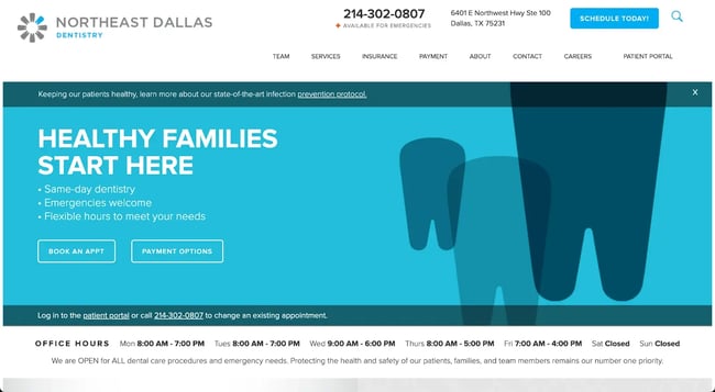
Clean graphics and an easygoing blue color palette make this dental office website pleasant to look like. We like this one for its use of color and the clear content buckets for information. It offers streamlined typography and color choices throughout the site, showing it cares about the visitor’s experience.
What We Like
- The quality of the graphics and photos is professional and clean
- Neat CTA buckets look like ads but without being overbearing
19. Dallas Dental Specialists
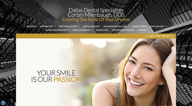
The Dallas Dental Specialists website will surely inspire you with its black and gold color schemes. The sky’s the limit with an interesting background photo, white text on a black background, and a testimonials slideshow.
What we like:
- An interesting choice of color scheme lends a formal air to this website
- The testimonial slideshow is a nice change of pace from usual CTAs
- Slideshows use both professional photos and excellent web copy
20. Swish
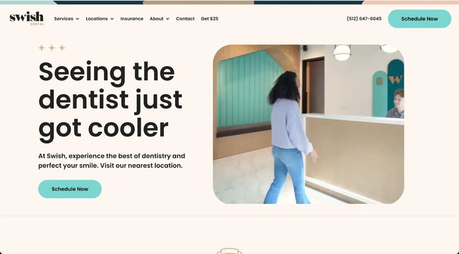
A more modern dental website than some, Swish offers loads of inspiration: with flat, mid-century-modern style graphics, video ads throughout the pages, and a consistent mirroring of the in-store experience. This dental website has a lot to love.
What We Like
- Good use of video throughout interior content pages to guide visitor experience
- Cute animated graphics add to the fun, casual feel of the branding
- Icons and branding are mimicked in the in-store design as well, adding to customer trust
21. ATX Family Dentistry
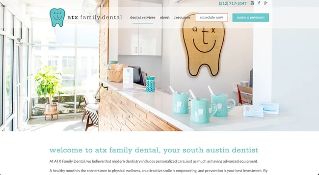
This cute and colorful dental website speaks to the family-friendly nature of its business. From light and airy graphics to branding that mirrors the in-person space, ATX Family Dentistry offers a cohesive experience online.
What We Like
- Colorful graphics make it clear that all ages are welcome at this practice
- The casual look and feel of the website could help put visitors' minds at ease
- Branding is cohesive between the in-person experience and digital experience
22. Austin Family DDS

The Austin Family DDS dental website shows off its lone star pride in its branding elements across the website. Content grids are a unique layout choice. They easily present information to visitors, and icons help to add value to content areas.
What We Like
- Consistent branding across the site adds to customer trust and brand equity
- The use of the nautical star alludes to its home base in the Texas state capitol
- Testimonials add credibility and patient confidence without being overbearing
23. Bowles Dental Center
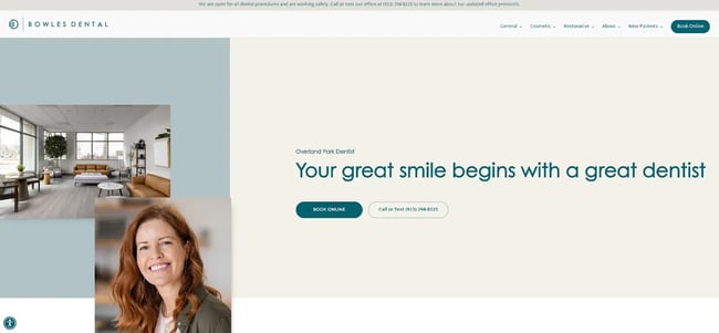
This dental website has so much to like about it; it’s hard to contain in just a single paragraph. But we’ll try our best. Bowles Dental Center might take the cake from the logo to the modern graphics. The icons throughout are simple but professional, with animation to keep the viewer engaged. Smiling patient photos cap everything off nicely. No pun intended.
What We Like
- The logo gives this dentist office an edge and creates brand trust
- The favicon is more than just the dentist’s initials — it’s the full mark
- Testimonials are given room to breathe and the space to shine
24. Grand Street Dental

Another Pinterest-worthy dental website, Grand Street Dental went outside the usual dental website playbook to do something unexpected. This dental practice website looks like an Instagram background. This colorful office and brand put Grand Street Dental on another level.
What We Like
- Modern branding that would look great on a Pinterest board or Instagram feed
- The world-class facility is given the life it deserves online as well as in person
- The website and branding live up to the press and hype
25. Zen Dental
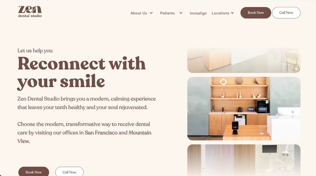
What would happen if BlockShop designed a dental office and a coordinating website to match? Well — Zen Dental, that’s what. This cosmetic dental office promises transformation, and considering how it transformed the very nature of dental websites, we believe them.
What We Like
- Logo and branding are spot on for the message that this studio communicates
- The color scheme is unique and modern
- Large CTA buttons direct visitors to do exactly what the designer would want
26. Derby Dental
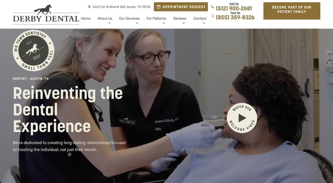
The professional video in the header of this graphic offers the visitor a great idea of what they can expect when they visit Derby Dental. And that’s the point of any website, isn’t it?
Communicate what a visitor might expect in a real-world encounter. Kudos to the website designer for this dental website for thinking about the end user.
What We Like
- Color scheme and branding mirror the in-person experience
- A video is showcased in the hero that drives home the value add of the brand
- A unique FAQ layout helps users determine whether this dentist is right for them
27. Sunrise Pediatric Dentistry

This bright-colored and fun pediatric dental website could be an artistic direction for your own dental website project. Take inspiration from the rainbow colors, the bright cerulean links, and the cohesion between the in-person offices and the digital experience.
What We Like
- Bright colors make dentistry fun in this kid’s dentist office website design
- The branding of the digital experience matches what to expect in person
- Information is easy to find in the top navigation menu
28. Overjoyed Dentistry
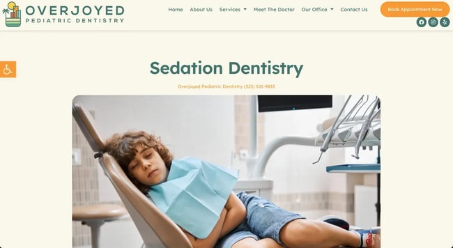
Ah, who would have thought a trip to the dentist could be so relaxing? This anesthetic-focused dentist website also happens to be aesthetically pleasing.
With a muted color palette suggesting a zen-like experience, a modern sticky navigation menu, and a logo indicative of their Los Angeles location, this website for Overjoyed Dentistry can be a good source of inspiration for your project.
What We Like
- The different colored menu backgrounds make the information pop out
- This brand’s logo is fun and evokes the Los Angeles sunsets — a good image for a sleep dentistry practice
- A unique color palette compared to some dental websites, this one is calm and reassuring
29. Pacific Heights Dental

Whatever happened to predictability? This dental website is anything but, and we mean that in the best way possible.
Featuring those row houses from that television show set in San Francisco, this dental website plays on familiar scenery, as well as professional graphics and layout design.
What We Like
- Pricing buckets make services clear before you even hit the schedule button
- The content is SEO-focused so that you can easily find the location near you
- Large buttons help users navigate appointments, payment forms, and more
How to Design a Dental Website
1. Highlight the dental services that you offer.
Make it clear what services you offer and what patients should expect from a visit to your office. For example, if you specialize in orthodontics or cosmetic dentistry, you should make it clear on the home page for prospective visitors.
It can also be helpful to have a section or a page to walk through the common services you offer, from X-rays to procedures.
2. Feature before and after photos.
Every customer loves a success story — and strong visuals can be used to your advantage. If you can show happy, smiling (literally) patients, it can put other prospective patients at ease. Visualizing certain procedures' impacts is helpful, so people know what they can expect.
3. Create a section to feature your team.
You have an experienced roster of staff, dental hygienists, dentists, and more at your practice. What better way to welcome patients and show off your clinic’s expertise than to prominently display your team?
You can help put prospective patients at ease by including more details about your employees.
4. Include a FAQ section for patients.
Many patients probably have some of the same questions. To save your email inbox and phone calls from inquiries, you can gather your most frequently asked questions and display them on your website. You can answer topics in-depth, like financing, the office's atmosphere, insurance, and more.
5. Make information for booking clear and easy to use.
Your goal is to make it as easy as possible for a prospective customer to find you and book a service. An online booking service is one way to make it easy for patients to book an appointment online without going through the friction of trying to book over the phone.
The easier this process is, the more likely a patient will follow through with the booking.
All other practical details about your practice, like location, times of business, and contact information, should also be displayed prominently on your website.
Get started with your dentistry website.
A trip to the dental office doesn’t have to be scary — and a website that offers empathy, easy scheduling, and well-organized information can help potential clients feel at ease. We hope you enjoyed this roundup of the best dental websites for 2023.
Consider using HubSpot for your hosting platform, and get all the tools you need to help market your dental practice. From a content management system that will make building your website a breeze to monitoring tools and beyond, we’ve got you covered.
Website Design Examples
.png?width=112&height=112&name=Image%20Hackathon%20%E2%80%93%20Vertical%20(50).png)


![15 black and white website designs to inspire your own [+ pro tips]](https://53.fs1.hubspotusercontent-na1.net/hubfs/53/black-and-white-website-design-1-20250520-1336267.webp)

![15 Brochure Website Examples to Inspire You [+ How to Make One]](https://53.fs1.hubspotusercontent-na1.net/hubfs/53/brochure-website-examples-1-20250319-362228.webp)
![28 Types of Websites to Inspire You [+ Real-Life Examples]](https://53.fs1.hubspotusercontent-na1.net/hubfs/53/types-of-websites.png)

