.png?width=112&height=112&name=Image%20Hackathon%20%E2%80%93%20Vertical%20(50).png)

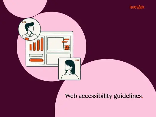
What is graceful degradation?
Graceful degradation means that your site or application can still be accessed by computers, even if a number of advanced features cannot run on the machine. You may have a website bursting with features. Even if one function breaks or an older machine can’t make the process work, the site itself can still be accessed functionally.
As web developers, we want graceful degradation for our web projects, ensuring that our web solutions are functional even when certain features aren't supported. You don’t know what machine people are using to access your site. What if they’re on an ancient machine but still need to access your content?
Graceful degradation creates beautiful websites that people across devices can use without sacrificing quality. Your goal is to create something that works well, even if your added bells and whistles won’t run on certain devices.
Graceful degradation is also a part of web accessibility. Let’s say a screen reader can’t access certain features of your site. Are all of the essentials still functional on those devices? Can these users still get the information you have to offer?
Accessibility should always be at the forefront of your design and development efforts. Graceful degradation can help you get it right.
Why use graceful degradation?
As technology advances and improves, it does not always do so proportionately. That is to say that not all software will improve with other technologies. Some operating systems may support some features, while others won’t.
Most programming languages are capable of far more than most browsers can handle. Further, not all browsers are capable of the same features. You need graceful degradation to make sure designers and developers ensure accessibility.
Reflecting on my web development journey, I once revamped a major ecommerce site, only to realize post-launch that older browsers struggled with accessing the shop. To make sure everyone — regardless of their browser — could make purchases, I needed to build for graceful degradation.
Every user deserves a seamless site experience regardless of their browser's version. I now focus on designs that leverage modern browser features and then devise effective fallbacks for older versions. This process helped me create the right balance between innovation and accessibility.
How to Implement Graceful Degradation
Graceful degradation is all about crafting an excellent foundational design. Even if the shiny edges break, I trust that my foundation is solid.
If you design with only older browsers, you will miss out on many features that could improve the user experience. Alternatively, suppose you only plan for newer browsers. In that case, you will miss out on a lot of visitors who cannot utilize your site to its fullest.
-1.webp?width=650&height=366&name=emailmarketing_3%20(1)-1.webp)
So, to fix this issue, developers aim to design for as many browsers as possible, understanding that targeting all browsers is an unreasonable task. They note features that may not work in older browsers and consider the most popular browsers visitors may use.
Let’s say you want to design a site for Chrome browsers that still works on Opera. Many Chrome browser features are not available in Opera. Designers will plan fallback features that will replace incompatible ones. Moreover, they aim to create a fallback that minimizes the decrease in accessibility.
In my life, I've found that flash is a big part of my graceful degradation efforts. This system is no longer essential (or completely unsupported) for most modern browsers.
However, when dealing with older browsers, I‘ve discovered that they might still need flash to play certain video content. Rather than pushing users to install flash, I’ve learned to work around this limitation. I supply images and transcripts for those flash-powered browsers instead.
This strategy has allowed me to deliver the content within the video seamlessly, without worrying concerned about the capabilities of a visitor's browser.
There are lots of other ways to handle cross-browser compatibility, but the industry standard is to use graceful degradation or progressive enhancement.
Progressive enhancement is quite literally the exact opposite of graceful degradation. Instead of designing for the most modern browsers and working backward, you plan for older browsers and add features according to how modern and up-to-date the browser is.
Getting Started With Graceful Degradation
Whenever I begin a design, be it with graceful degradation or through progressive enhancement, I aim for maximum accessibility.
I‘ve discovered that diving into either method is straightforward, even with sites I’ve already crafted. If I ever decide to eliminate a feature, and it diminishes the value or accessibility, I know there’s a fallback.
Below are some tips to ensure the best approach for your design.
- Write valid, standards-compliant HTML.
- Use external style sheets for your designs and layout.
- Use externally linked scripts for interactivity.
- Ensure the content is accessible even to low-level browsers without CSS or JavaScript.
Like anything in the technology field, it all starts with understanding the concepts learned here and then using them. The more research and practice you do, the better you will understand how to handle these modifications and design planning.
Editor's note: This post was originally published in September 2022 and has been updated for comprehensiveness.

Website Design