
With no design or development background, I wasn’t sure how to figure out the best image size for websites. So, I put on my research hat and dug deep. In this guide, I’ll be sharing everything I’ve learned so you don’t have to stumble through trial and error like I did.
Table of Contents
- Why does image size matter?
- How big should your images be?
- Image Dimensions for Every Part of Your Website
- Image Dimensions for Mobile Websites
- Tips for Optimizing Images
Why does image size matter?
Image size for your website matters because it’s directly linked to how your site performs and the impression it leaves on the user surfing it. Getting it right for both desktop and mobile devices is important for these reasons.
Affects User Experience
Statistically, it takes a mere 50 milliseconds (one-twentieth of a second) for a visitor to decide whether they want to stay on your website. This short span is all you’ve got to make the right impression, and images play a role.
If website images are too large, visitors might have to scroll to see the entire image. Conversely, when they’re too small or pixelated, they can make visitors question your content or product quality. You don’t want this, right?
Impacts Site Speed
When website images are too large, they slow down a site by taking longer to load from the server, frustrating your users. According to research, 53% of visitors expect a website to load within three seconds or less. Half of them are likely to abandon their shopping cart if a store's web page takes more than three seconds to load. Bottom line: Taking care of image size for speed is vital if you want visitors to stay or convert.
.png)
Free Website Optimization Checklist
This website optimization checklist will help you perfect your website's:
- Performance
- SEO
- Security
- Mobile Performance
Download Free
All fields are required.
Form not available
Influences Search Rankings
I’ve also found that search engines favor websites that load quickly and thereby deliver excellent user experiences. Unoptimized image sizes affect the user experience and also hurt SEO, a fact that becomes clear from Google’s SEO best practices.
In short, let me stress that you shouldn’t treat image size for a website like a minor detail. But what does that perfect image size look like? Let’s explore below.
How big should your images be?
I’ll start with my staple answer: it depends. I’ve figured out there’s no best image size for a website. Ideal sizes rely purely on their purpose and placement.
If you’re building theme-based sites, their ideal size specifications are mentioned. When you’re building from scratch and have a blank canvas, there are more decisions to make.
However (and thankfully so), a few general rules apply regarding file size, display potential, and visual quality, and I swear by them.
I’ve listed those general guidelines below.
File Size
I aim for under 200 KB for most images, as I’ve learned that increasing the file size impacts website speed. If I have to stretch, I try staying with 500 KB. Research has told me that the maximum size we should aim for is 20 MB.
Resolution
Resolution is super important. It indicates how much detail an image holds. Higher resolutions mean sharper images, regardless of size. Does this mean the more, the merrier? Not exactly.
I’ve found that 72 DPI is the best image resolution, as it works fine in most cases. Higher resolutions are usually unnecessary, and adding them only increases file sizes and loading time and hurts UX and SEO.
File Format
While many file formats exist, I stick to a few that work best.
I’ve figured it’s best to use:
- JPEG for product photos, blogs, and background images, as they are lightweight.
- GIF for animations and product photos.
- PNG for graphics requiring background transparency, like icons and logos. (These are heavier in size than JPEGs.)
- WebP for products, banners, and featured images. I’ve been using WebP a lot lately since I’ve found it offers smaller file sizes of images than JPEG at excellent quality.
While these are generic guidelines, I’ve also curated specific dimensions that work best for the key website elements. Let me take you through those next.
Image Dimensions for Every Part of Your Website
Every section of a website has unique design and functional requirements. From the best image size perspective, I’ve noted that the ideal image dimensions will vary accordingly.
In the table below, I’ve compiled the ideal dimensions, aspect ratio (ratio between the width and height of the screen), and file size that you can follow to design images for different parts of your site.
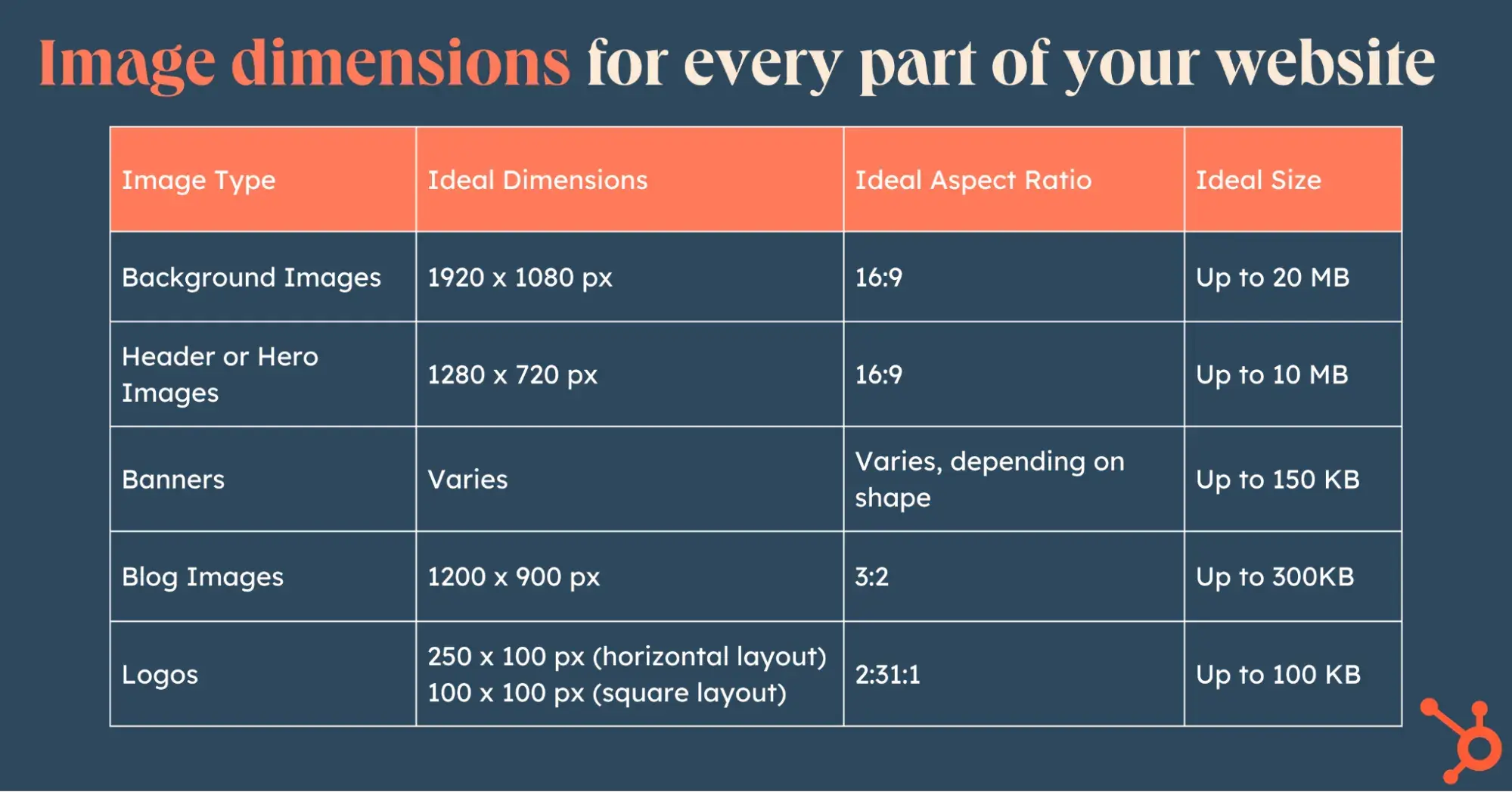
Now, let’s go into detail for each of these.
Background Images
Background images are among the largest on any website and tend to fill up the entire screen on any device. Ensuring they’re eye-catching, high-quality — and yet lightweight — is essential.
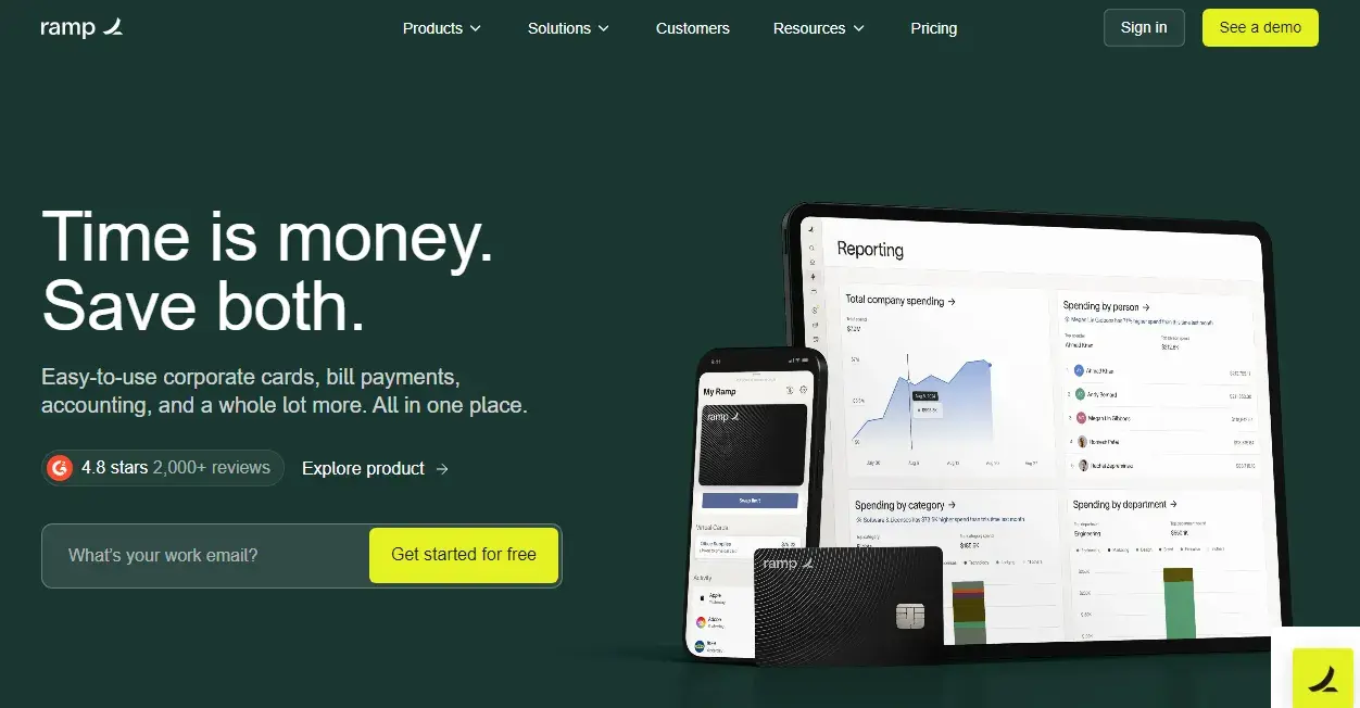
I particularly love the background image on Ramp’s website. It’s super attractive and high-resolution, with their brand colors nicely tied in. They’ve kept the copy on the image minimal, explanatory, yet catchy. At the same time, I love how they’ve also shown their products visually by the side so that the viewer gets a real feel about what they’re talking about.
Pro tip: I’ve found that dimensions of 1920 x 1080px with a size of up to 20 MB work great for full-screen backgrounds. On the upper side, you could go up to 2400px by 1600px. Just make sure it follows a 16:9 aspect ratio for proper scaling.
Header or Hero Images
Header or hero images are similar to background images. They are often the first thing visitors see and fill up anywhere between half the height and the entire page height. Using a hero image is a good option for featuring more text without making users scroll to see it.

As you can see in HubsSpot’s hero image above, they’ve used a nice balance of text in their hero image packed in a clean background, ensuring it gives away enough information without overwhelming the viewer. They’ve also added a great snapshot of their technology along with two catchy CTAs to get users to take their desired actions.
Pro tip: I’ve found that the dimensions of a hero image should ideally be 1280 x 720px at an aspect ratio of 16:9. The file size is recommended at 10 MB — the smaller, the better.
Banners
Banners are design elements useful for promotions, seasonal campaigns, or announcements. They ought to get attention yet not overwhelm other content.
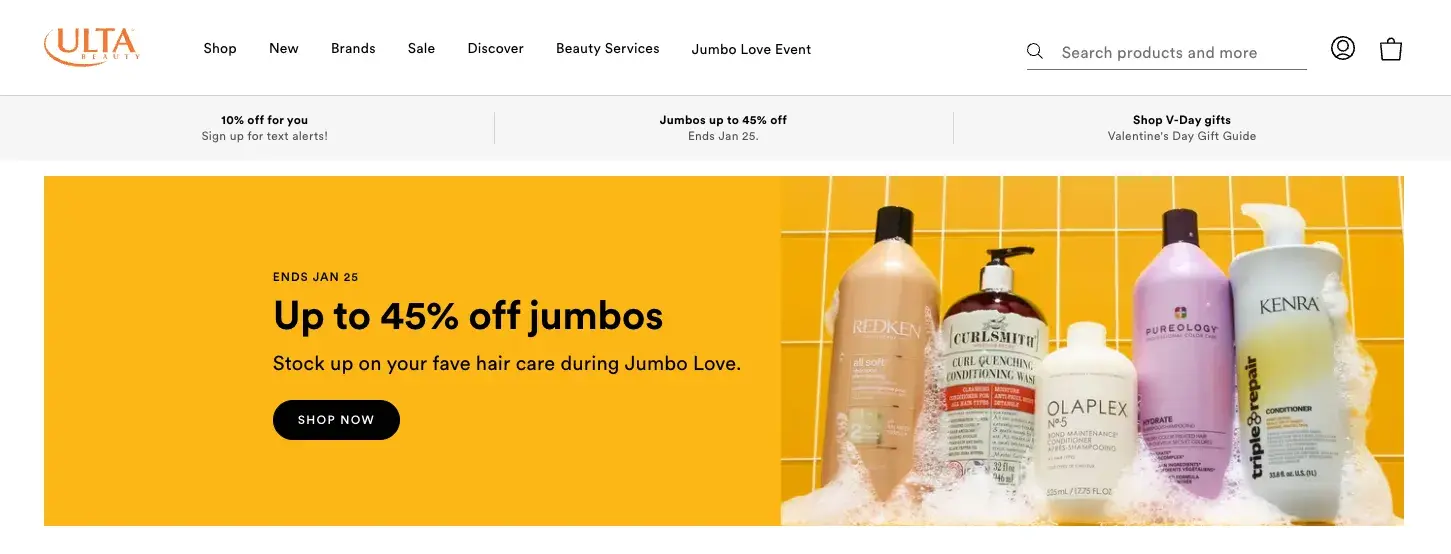
In the banner ad from Ulta above, you can see how it’s the current focus of the homepage. Its purpose is to raise awareness (and clicks!) for their current promotion.
Pro tip: You can play around with banners, shapes, sizes, and shapes, depending on where they are added and their purpose. However, the most common dimension I’ve noticed is 250 x 250 px for square banners and 160 x 600 px for vertically rectangular banners.
Whatever you choose, design them with responsive scaling so they shrink neatly on mobile devices. Ideally, the file size for banners shouldn’t exceed 150 KB.
Free Website Optimization Checklist
This website optimization checklist will help you perfect your website's:
- Performance
- SEO
- Security
- Mobile Performance
Download Free
All fields are required.
Form not available
Blog Images
Blog images make your blogs more attractive (on your website and social media) and impact readership, so their size matters too.
While the dimensions depend on your blog template, I’ve seen that 1200 x 900 usually works well for featured blog images.

“Here on the HubSpot Blog,” said Marja Vitti, an editor on the team, “we use 598 x 398 for our standard featured image sizing.”
Pro tip: Whatever blog image size you choose, ensure you’re consistent with the size across all your blog posts. I’ve seen the most professional-looking websites follow this approach. As for the file size, I’d say try to keep it within 3MB.
Logos
Last but not least, let’s talk about the logo. It’s among the tiniest website elements, yet it speaks volumes about your brand.

Nested typically on top left or center, it is vital to ensure it looks polished yet doesn’t take up excessive space. Notice how on the Hubspot Blog homepage, the logo sits in the top left corner of the navigation bar.
Pro tip: I’ve found that logos can be square or rectangular. Square formats work best with a 1:1 aspect ratio and a size of 100x100 px. Rectangle formats should have a 2:3 aspect ratio, and the 250x100 px size is quite popular.
Bonus tip: I’ll also add that saving these in PNG format with a transparent background is a good idea so they blend seamlessly with any design. I’ll advise you to target a maximum size of 100 KB for these.
Image Dimensions for Mobile Websites
Optimized desktop and mobile websites differ slightly due to the varying real estate available. This requires following different sizes for images in desktop and mobile.
Thankfully, if you’ve built (or are building) a responsive website, most images will automatically get resized. Adding responsive images will also save your mobile users bandwidth while ensuring high-resolution displays on larger screens.
But here’s the thing: Even with responsive design, you need to ensure your website images fit both well. If your desktop images are big, automatically scaling them down for mobile could distort them.
I’ve found that images with a 1:1 aspect ratio display well on mobile automatically. For images with aspect ratios of 16:9 or 3:2, automatic resizing may sometimes lead to cropping on mobile. Therefore, when you’re designing your responsible images, I’d say the best bet is to ensure the focus area of the subject lies in the middle of the image.
Now, let’s review some tips for optimizing image sizes for your website.
Tips for Optimizing Images
While getting the dimensions and sizes right for mobile and desktop is one aspect, there are a few more things that you can do to optimize images on your site. Here is my list of tips.
1. Compress without compromising quality.
It’s possible to further reduce the size of your website images without losing visual quality. For instance, your images may include metadata like camera settings or location information.
These would increase the file size and won’t precisely add value. So, you could check in and make such files leaner by compressing while preserving the essential details needed for display.
Some handy compression tools I like to use include TinyPNG, ImageOptim, or Squoosh.
Another option is automating the compression process by adding CMS plugins like Smush or ShortPixel. If you’ve got larger batches, you can use Adobe Photoshop’s “Save for Web” feature or free alternatives like GIMP. I find these work pretty well.
2. Leverage lazy loading.
Implementing lazy loading for your images ensures they only load as users scroll. This reduces the strain on your server and ensures faster page rendering on your website.
To implement lazy loading, add the loading = “lazy” attribute to your <img> tags. These days, popular CMS platforms also offer plugins to enable lazy loading.
3. Optimize alt text for SEO.
This is one step I never miss now, and I’ve seen firsthand that search engines reward me for it: I always add alt text to any images I upload.
This enhances the image’s accessibility and helps search engines understand my site’s visual content. I’ve found that alt text is also super helpful for visually impaired users.
While you add alt text, keep the text descriptive and concise. I make sure to incorporate keywords naturally — but of course, don’t stuff them.
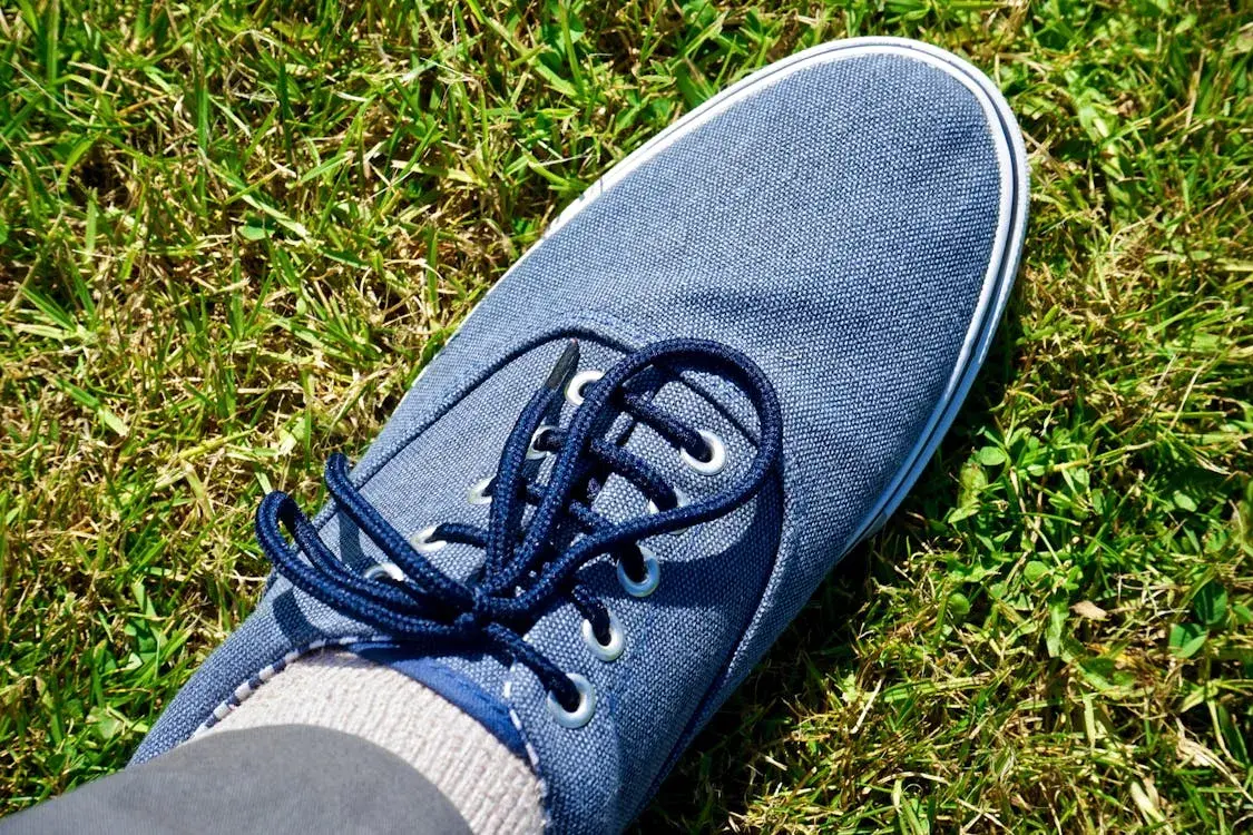
For example, I’d add alt text for the image as “Blue sneakers on grass.”
How To Write Great Image Alt Text And Get More SEO Traffic
4. Use a content delivery network (CDN).

Using a CDN is another excellent way to optimize your website images. CDNs improve image delivery by serving files from servers close to visitors as opposed to from a central location. This reduces latency and speeds up loading times. I think this approach works great, especially if you’re catering to global audiences.
You can use platforms like Cloudflare or AWS CloudFront. They are easy to integrate and ensure your images reach users quickly.
Combining a CDN with lazy loading creates a highly optimized experience.
5. Test and monitor image performance.
Last but not least, I’ll remind you: Don’t forget to test!
Image optimization isn’t a one-time task — it’s an ongoing process to maintain speed and quality. So, regularly audit your website to ensure your optimized images always perform as intended.
Pro tip: You can use tools like Google PageSpeed Insights to identify oversized images and proactively pinpoint performance bottlenecks. Based on your findings, you can remove outdated or unused images, keeping everything clean and efficient.
Master Image Sizes to Build Websites That Deliver
Looking back on my first attempt at building a site, I’ve come a long way. From dealing with unoptimized images, blurry images, and painfully slow load times, I’ve learned the secret to building a fast site that boosts my rankings with images that entice my viewers.
And it’s not rocket science. There are just a few things to get right — the format, file size, dimensions, and a bunch of simple optimization tricks.
My two cents? The next time you hit “upload,” think about what’s at stake and spend those few extra minutes fine-tuning your images. You’ll reap the benefits.
Free Website Optimization Checklist
This website optimization checklist will help you perfect your website's:
- Performance
- SEO
- Security
- Mobile Performance
Download Free
All fields are required.
Form not available
Website Performance


![7 Site Performance Challenges That Will Hold Businesses Back [Data + Expert Predictions]](https://53.fs1.hubspotusercontent-na1.net/hubfs/53/how-to-improve-lcp-1-20250121-126295.webp)