.png?width=112&height=112&name=Image%20Hackathon%20%E2%80%93%20Vertical%20(50).png)

Good design is especially important for increasing sales. More than 60% of people find that good design is important to their content viewing experience, and 38% of people will actually leave if your site is unattractive. Your design should interest people — an unattractive website will look spammy, causing potential customers (and dollars) to run the other way.
But if you aren’t a designer by trade, how can you make a website that looks great and brings in sales? Luckily, there are several simple tips and tricks to make a beautiful website.
Good Design Elements That Will Drive Sales
With any website, there are some clear dos and don’ts. Here are some basic design elements to include on your website to encourage visitors to stick around and even make a purchase.
Cohesive Colors and Fonts
Nothing says outdated like a hodgepodge of fonts and colors. For a clean website, you’ll want to choose 2-3 fonts that complement one another to use throughout the entire site. You can certainly opt to have more, but be sure that you have a few main colors and then choose slight variations of those core colors to use throughout the website. If you need help, reference a color guide that will help you determine the best colors for your website. Feel free to have some fun with a font generator, but try not to impede usability or distract users with illustrative text.
Some psychologists suggest that color makes up 60% of a user’s acceptance or rejection of a website. In tests, Performable saw a 21% increase in conversions by changing its call-to-action button color from green to red. Similarly, Ript Apparel experienced a 6.3% increase in sales after changing the call-to-action button color from green to yellow.
The website Departika uses a simple color scheme of grays and red, which contrast without being jarring. The font choices are also simple and complementary, so users’ eyes aren’t distracted — they go straight to the images of the company’s work.

Simple Navigation
One of the easiest ways to increase sales on your website is by making it quick and easy for customers to find your products. With a clear, concise navigation bar and a search bar at the top of the page, you can either guide site visitors to the products you want to sell, or they can find exactly what they are looking for to quickly make a purchase. In fact, one study found that 86% of visitors are immediately looking for information about your products; meanwhile, over 60% of users want to find your contact information. Keep this in mind while designing your website, or users are bound to leave if they cannot find what they need.
Tempo, a recruiting company, has a very clear, simple navigation. On its homepage, the button to find candidates is easy to spot for employers, and job-seekers can quickly find the button to look for a new job. New users have a place to sign-up while returning users can easily log in from the main navigation.
Certifications and Testimonials
While you might not think that adding certification logos or testimonials on your website is part of website design, it most certainly is. Adding logos that show your credentials, such as security badges or third-party reviews of your business, show new customers that you are a legitimate business. It also demonstrates to prospects that you’ve put in the effort to ensure all transactions are secure and clients are satisfied with their purchases. Many consumers won’t share their financial information from websites that lack some level of security.
Testimonials are a great tool for driving sales. About 85% of users trust testimonials and product reviews as much as personal recommendations, and gaining 5-star ratings can increase your click-through rate, ultimately driving conversion and generating sales, by 28%.
ChowNow, an online ordering system for restaurants, has a dedicated testimonials page. Each testimonial offers a quote from the customer accompanied by a video of that customer speaking highly of the service. The videos bring more authority to the testimonials, meaning potential customers are more likely to trust what other customers are saying about the brand.

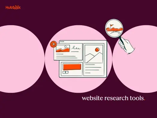
Infographics
If you’re sharing a lot of content, particularly statistic-driven information, you should try adding infographics to better display this data. Compared to a web page full of writing, an infographic is 30 times more likely to be read in its entirety, simply because people are 80% more likely to respond and engage with visual content.
Take, for instance, the infographic from Happify. Sure, this science-backed gaming app could share a long blog post full of statistics on stress, anxiety, and health, but it might not be that interesting for many people to read. Instead, the information is presented in an easy-to-read, intriguing infographic that also indirectly encourages users to try out Happify to relieve their own stress and anxiety.

Poor Design Elements That Will Turn Customers Away
Unfortunately, there are many design tactics that can make a website seem untrustworthy. A prospect is not going to input their credit card information to make a purchase if something seems off. Be wary of adding the following design elements, which can come off dated and unprofessional.
Too Many Elements
If your website is inundated with GIFs, text, videos, and pop-up advertisements, a potential consumer will quickly exit the page. An overabundance of elements can be distracting. Conversion rates on web pages with more elements drop significantly. There are many seamless ways to integrate advertisements and embed eye-catching media, but these elements will drive away potential business. Remember, less is more.
Jarring Color Schemes
Choosing the color palette for your website and business can be daunting. It becomes an essential part of your brand. But if you choose too many bold, clashing colors (i.e., neon green, red and black), the site will quickly become an eyesore. No one wants to stick around on a website that gives them a headache, and they certainly won’t stay on the homepage long enough to figure out what you are selling or how to make a purchase. Some psychologists even suggest that poor color choices can harm a customer’s trust in your brand as much as confusing navigation or slow load times.
Cluttered Navigation
Similarly, users aren’t going to stay on a website where they cannot find what they need. If prospects come to your website and the navigation is confusing and cluttered, they will quickly go back to a search engine to find a similar product or service on a website that makes those goods easy to find. Plus, the longer a user is lost in a string of pointless webpages, the less time they are spending money on your products.
Loud Multimedia Set To Autoplay
Many sites today embed multimedia, particularly videos, on their webpages. This can sometimes intrigue visitors to stop and see what a business is all about, but more often than not, a loud burst of audio from an embedded video will alarm a user and cause them to close the website quickly. Just like that, you’ve lost a sale.
Build Trust and Increase Conversion Through Good Design
If you want users to trust your brand and purchase your products or services, you need to have a clean, modern website. With cohesive colors and fonts, glowing testimonials, and a simple layout and navigation, users can find what they need.Ultimately, good design will have users coming back to your website again and again, which for you means more traffic and a higher chance of conversions.

Website Design