1. VOID
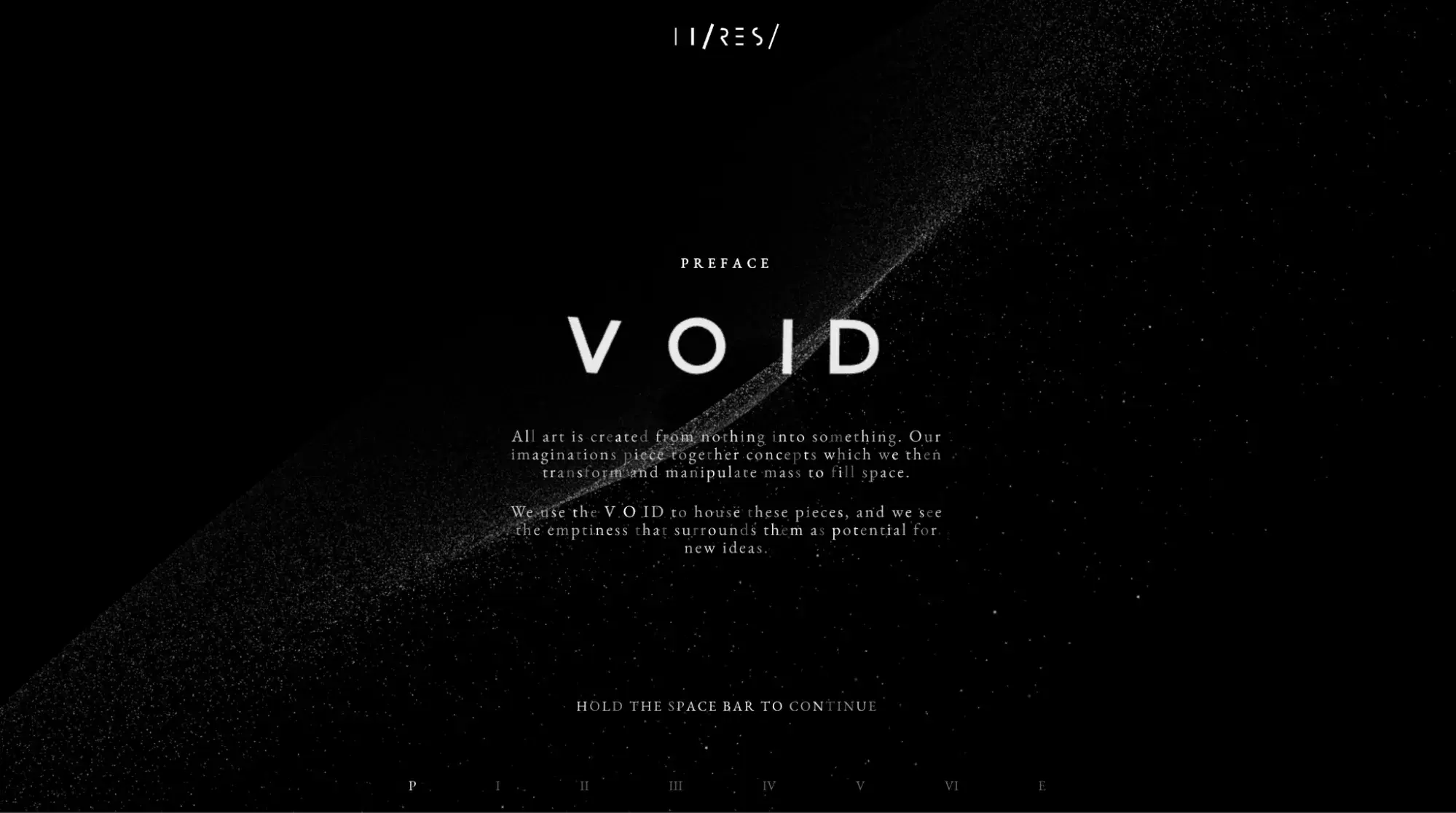
Designed by the creative minds at Hi-ReS!, VOID is a space-themed adventure that pulls you into a digital cosmos. The site uses a sleek black color palette, creating a mysterious, space-like feel.
For me, VOID's use of animations makes it stand out — everything moves and scales in sync, creating a 3D experience that feels immersive and alive. The website is a testament to Hi-ReS!’s knack for seamlessly blending form and function, creating an unforgettable online encounter that’s truly out of this world.
What I like: I felt part of the whole experience. Using my space bar, I unlocked new pieces of the narrative, which made the navigation even more interactive and engaging.
2. Collection Paris
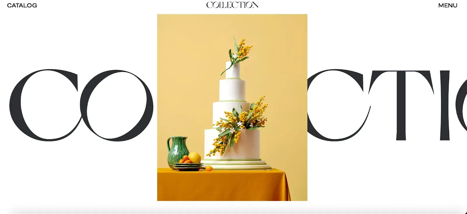
Collection Paris keeps things simple yet visually stunning. The site is a scrollable dream, with bold, easy-to-read text that makes navigating a breeze. Its color palette — a classy mix of black, white, and natural tones — feels effortlessly elegant, perfect for inspiring brides-to-be as they plan their wedding day.
I also found the chic layout to make the website inviting. The stie feels like an excellent place for brides to explore ideas and services for their big day.
What I like: The hamburger menu. When you hover over the items, it shows preview images that give a quick, visual snapshot of each section.
3. Fitsole
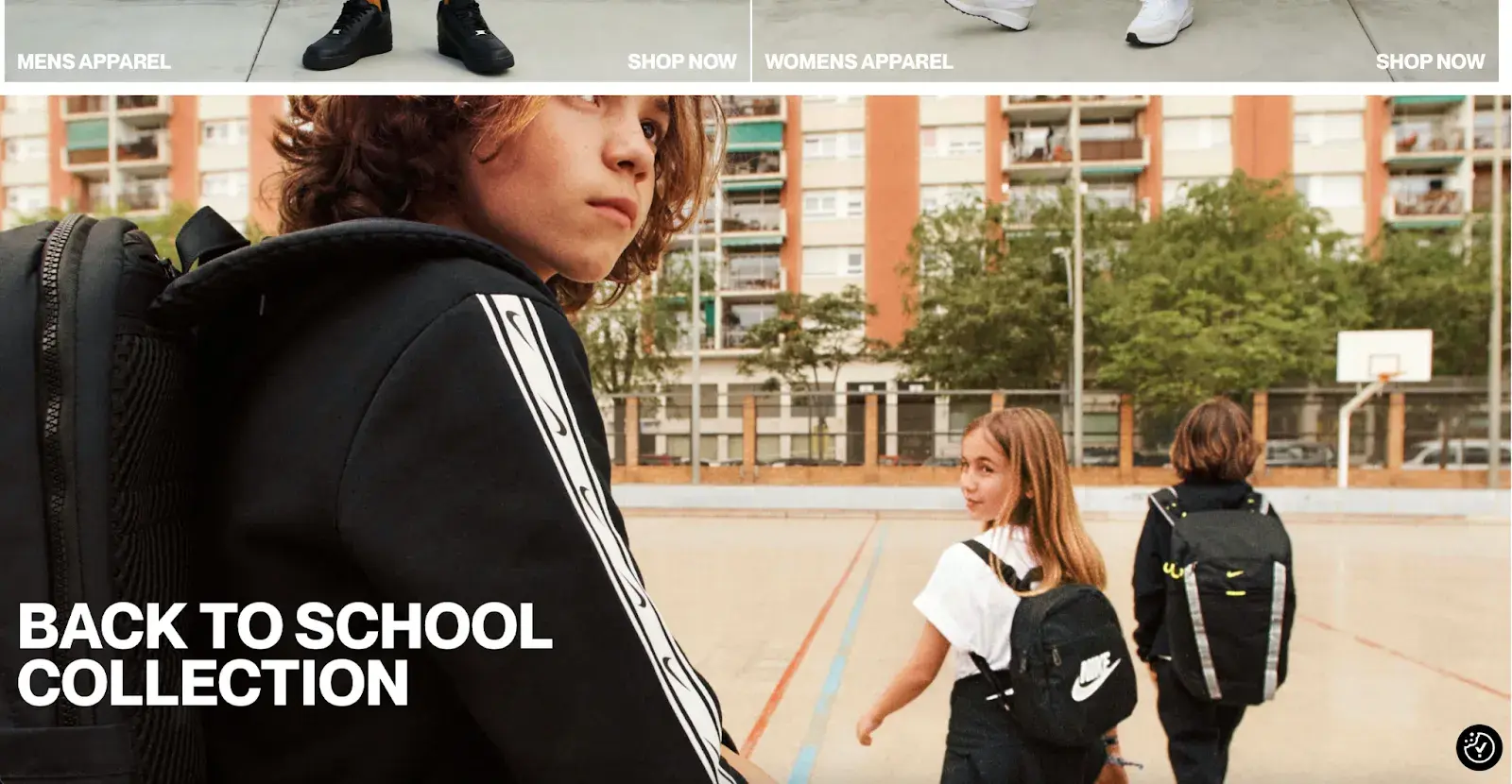
FitSole nails the balance between aesthetics and usability. The site’s sleek design and smooth navigation pull you in, especially if you’re into the latest sneaker drops. With a vibrant color scheme that energizes the shopping experience, the bold typography pops, helping me find my way around the site.
Moreover, the website’s intuitive navigation, featuring a clean and easily accessible menu, ensures visitors can effortlessly find the information they need.
What I like: The blend of trendy gear with a clean, intuitive interface really makes this site work — it’s got substance and style all in one.
4. Sonsoles Print Studio
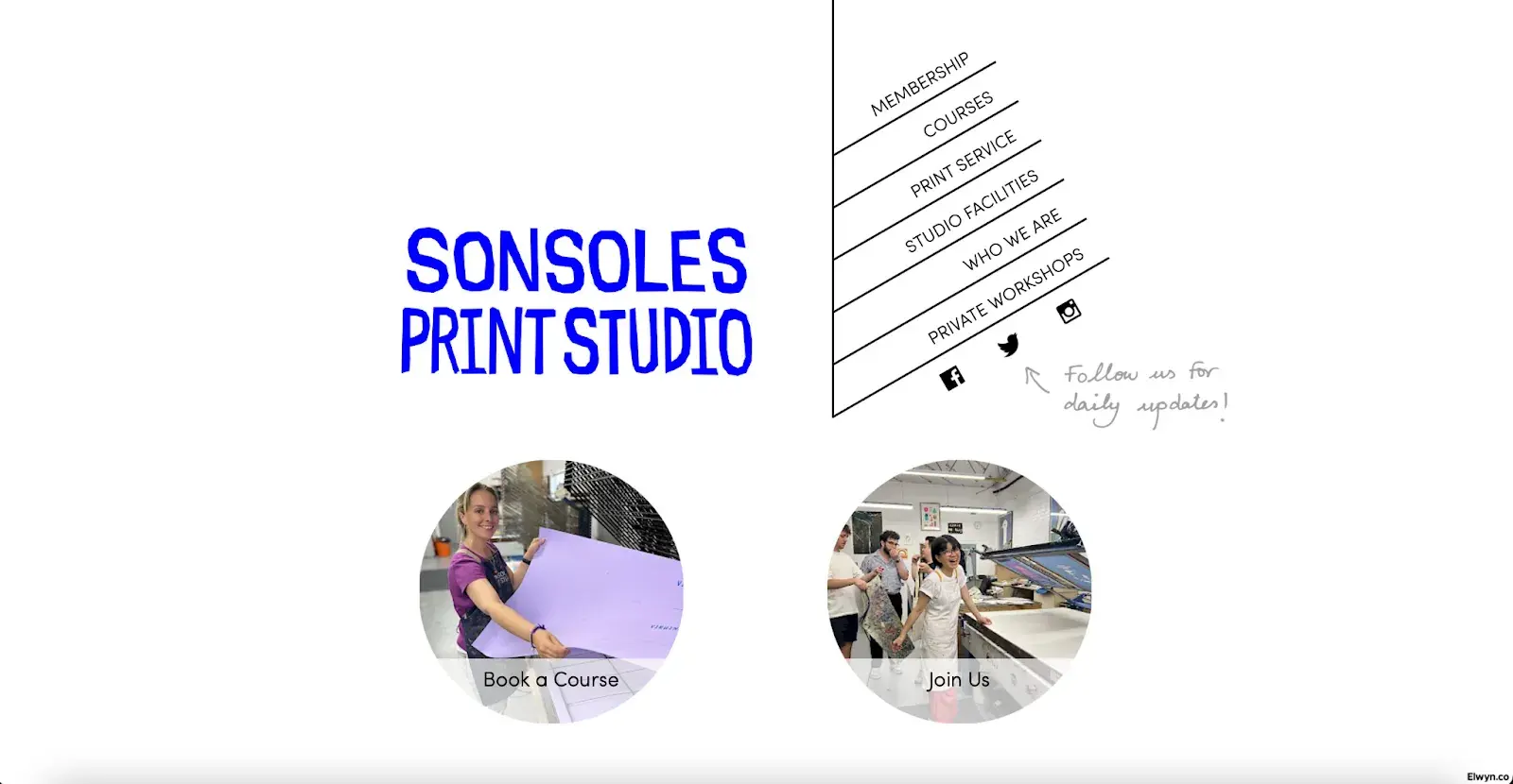
I found Simplicity is key at Sonsoles Print Studio; there’s no unnecessary clutter. Its innovative menu design catches the eye and efficiently organizes its information pages. This made navigation a breeze without overwhelming me with too much info.
The site's strategic use of large, impactful images paired with CTA buttons also proves how minimalism can be powerful.
What I like: Sonsoles gets it right by sticking to the basics — clear, concise, and focused on what really matters.
5. Joshua Kissi
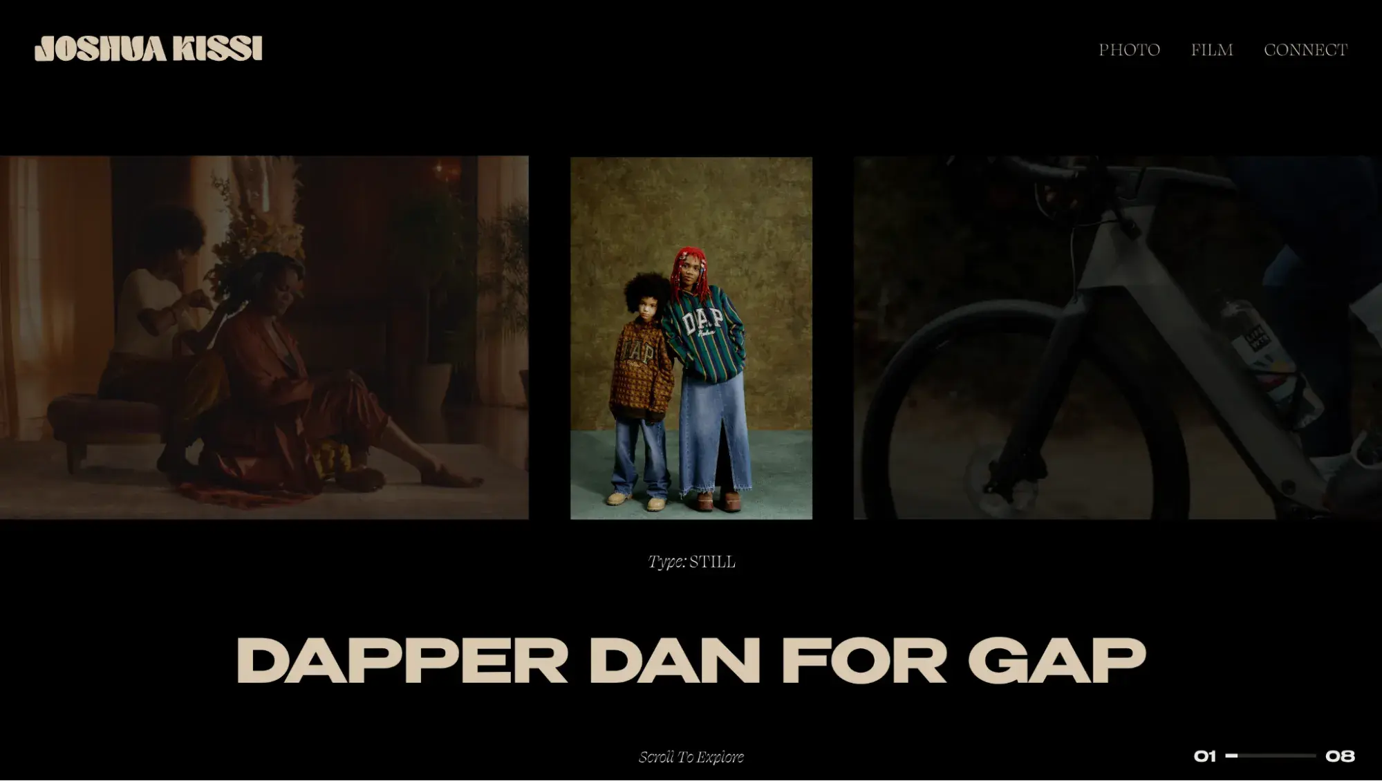
Ghanaian-American photographer Joshua Kissi uses a sleek, magazine-like website to showcase his impressive work.
I thought the site’s dark color palette really made his photos pop. There’s minimal text, which works beautifully, given photos do all the storytelling. And trust me, they speak loud and clear, pulling you in with their depth and creativity.
What I like: A smart sorting feature means I could easily explore his work by editorial or commercial categories. It’s a thoughtful design, and I appreciate how much easier it makes navigating his work.
6. Emonomy
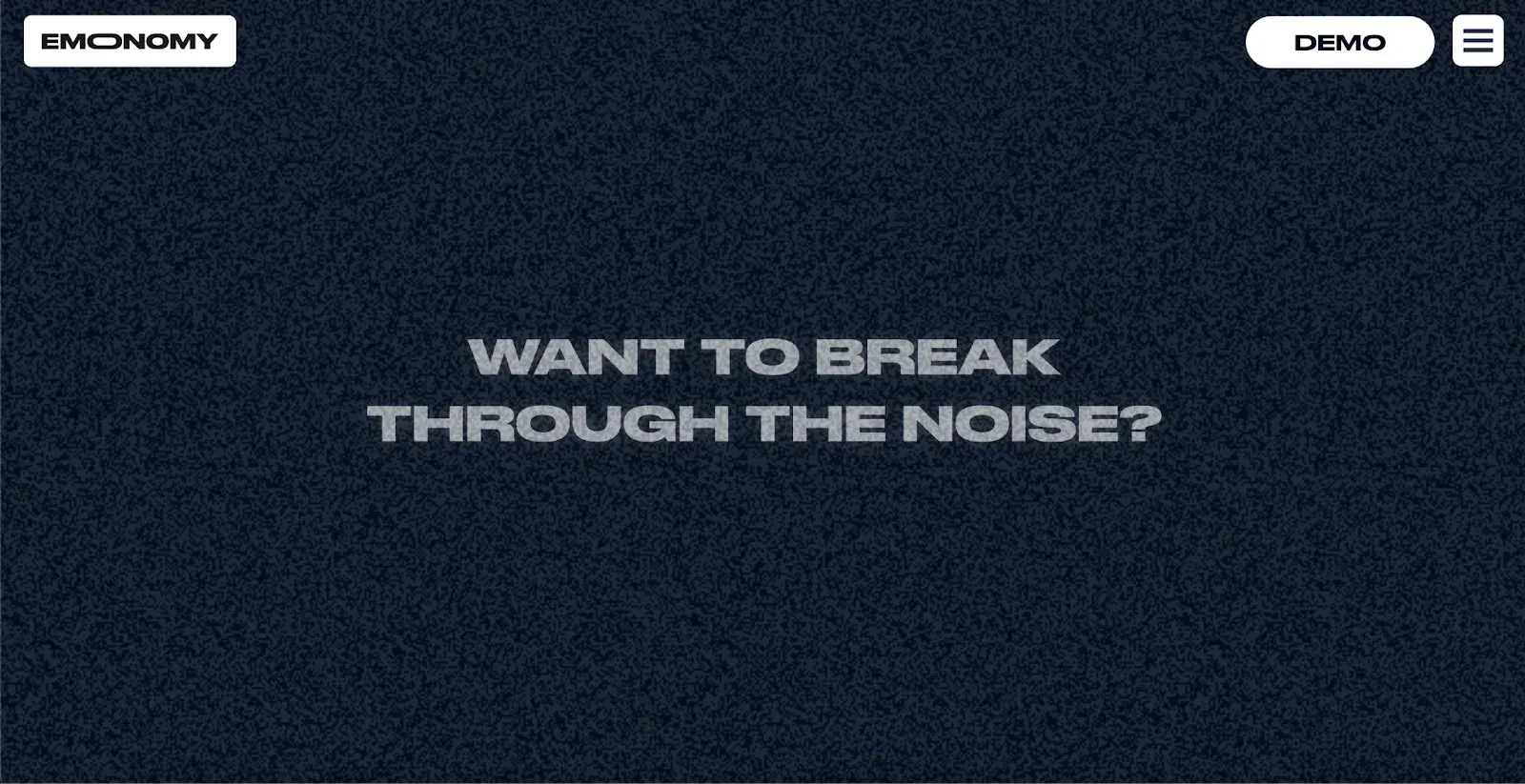
Emonomy is all about blending AI with brand marketing, and its website nails that message. With smooth scrolling effects, it effortlessly transitions between content, drawing me deeper into the world of AI-powered advertising.
Special mention to the color scheme — it starts bright, then gets more dynamic as you scroll. Kind of like how AI evolves in its learning. Plus, the site’s packed with info on how Emonomy can amplify my brand’s presence.
What I like: Emonomy emphasizes its global reach using continents as part of the design. Plus, seeing a roster of past clients right there gives me immediate confidence in their expertise.
7. CorePlus
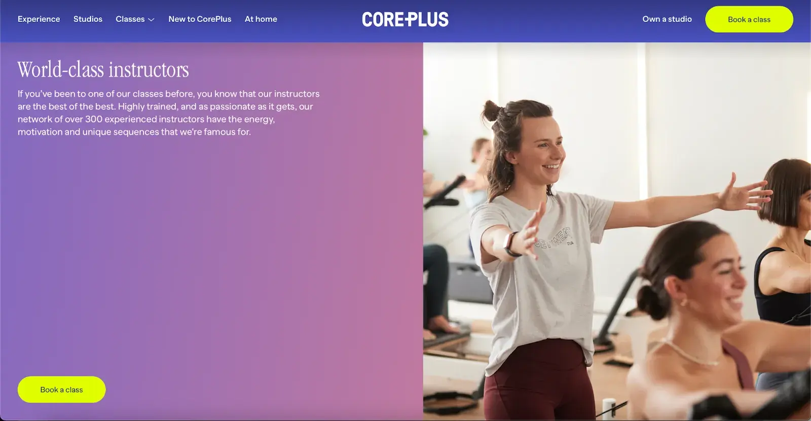
CorePlus Fitness is a masterclass in translating the vibe of a yoga and pilates studio into a digital space. Its focus on well-being shines through the calming purples and mindful design.
The site’s calming color palette is all about creating a tranquil, serene experience, like stepping into one of their yoga classes. And those neon yellow CTAs? They pop perfectly against the soothing background, guiding me effortlessly through the site.
What I like: The sticky text effect is genius. The text stays put while images glide by, echoing the smooth, flowing movements of a yoga pose. It’s simple, yes. But it adds such a cool touch of fluidity.
8. Ever Live Here
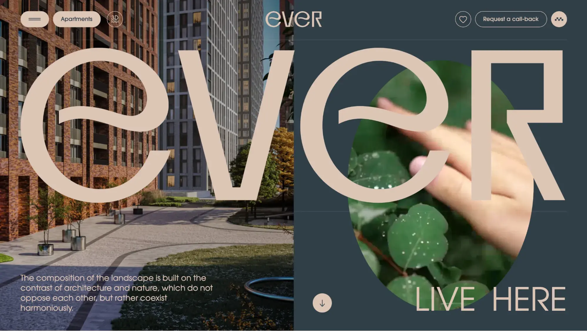
What I really love about Ever Live Here is how the warm wood tones immediately make the site feel cozy and inviting, almost like stepping into a home. The simple, clear icons make it super easy for me to know exactly where to click.
But for me, the highlight is the animations. They don’t just add flair — they tell a story. As I scrolled through, I felt like I was being taken on a virtual tour of the apartments, which made me want to live there even more.
What I like: The large “Ever” text that overlaps the dynamic content instantly caught my attention when I opened the website. I‘m also very impressed with the unique navigation; it’s fun and engaging.
9. Data USA
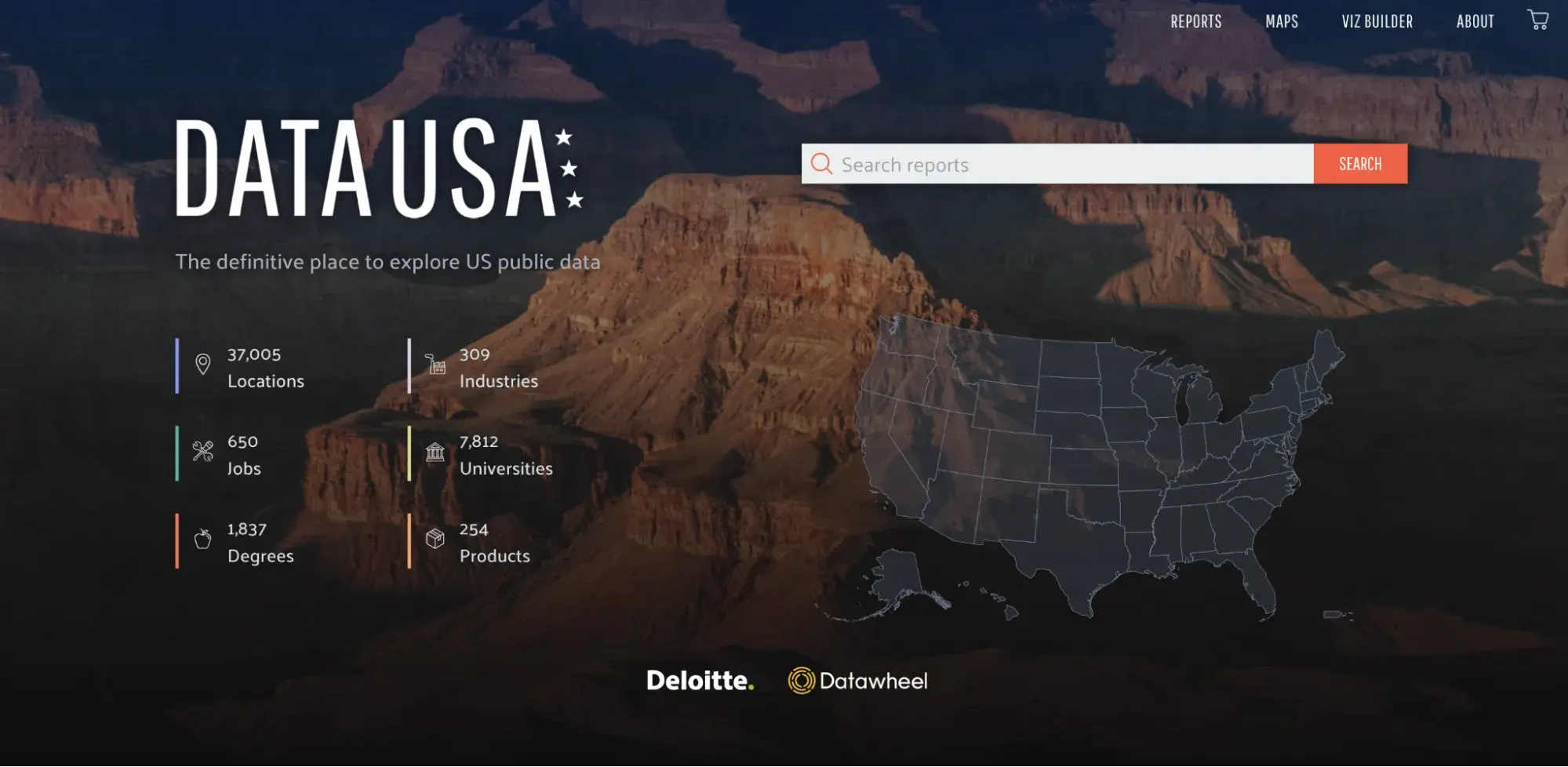
I find Data USA to be an incredibly useful open-source platform that brings together, visualizes, and shares data about the U.S. It covers a wide range of topics, from demographics to education and economics, and makes exploring large datasets feel approachable. I appreciate how it simplifies complex information with clean charts, maps, and infographics. As I navigate through the site — whether by location, industry, or specific topic — it feels intuitive and effortless.
What I like: The interactive charts and simple visuals make it easy to digest even the most massive datasets. I love how it caters to all levels of data-savviness.
10. The Emma Rose Agency
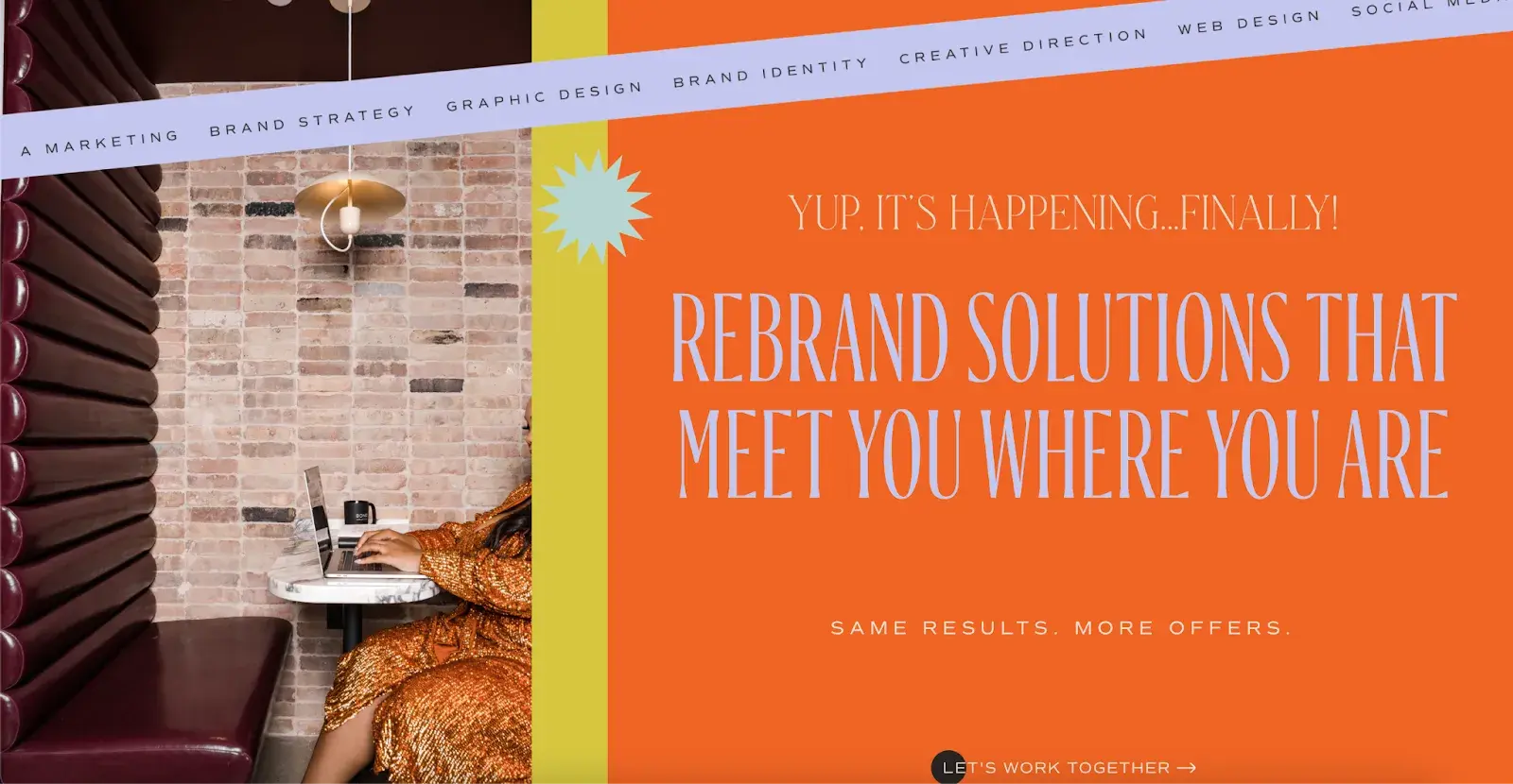
The Emma Rose Agency specializes in transforming brand identities, and its website reflects that creative energy. Everything is so well-organized that I had no trouble navigating through their services and success stories. The vibrant design reminds me of blooming spring flowers — fresh, energetic, and exactly what you’d expect from a company that breathes new life into brands.
What I like: The bright, bold colors really bring the website to life. It feels like walking into a brand-new identity, perfect for a branding agency.
11. On Purpose Events
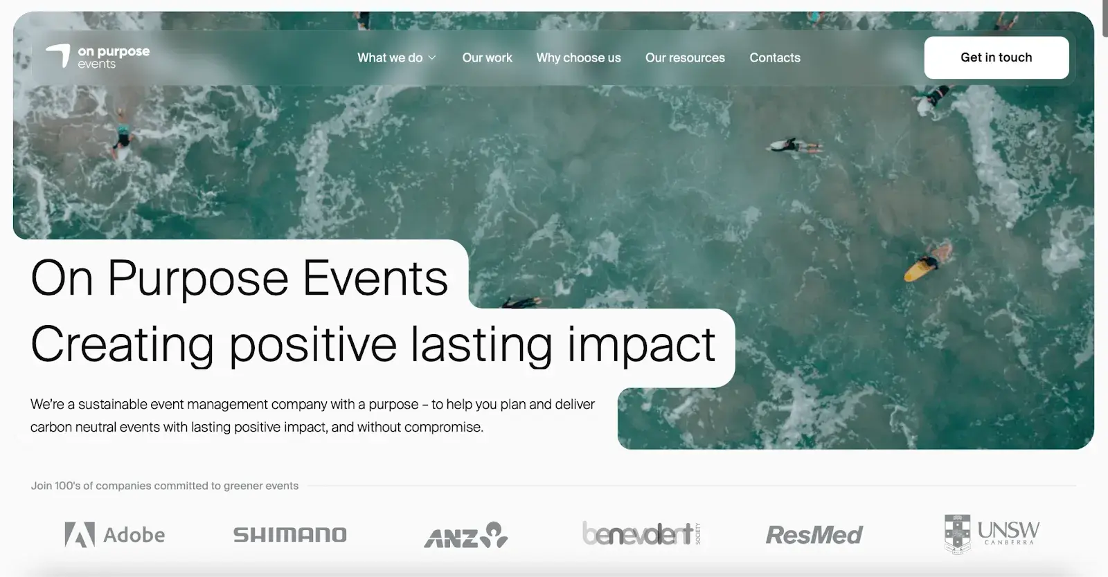
On Purpose Events is an event company that prioritizes sustainability while helping craft memorable events. A splashing ocean greets me as I open the site, which also symbolizes the brand's dedication to respecting the earth. An earthy color scheme ties the whole page together, while the simple header menu makes everything easy to navigate.
What I like: I love how the sustainability theme is woven into the visuals. It’s a subtle but powerful way to tell visitors exactly what On Purpose Events stands for.
12. Smithsonian Magazine
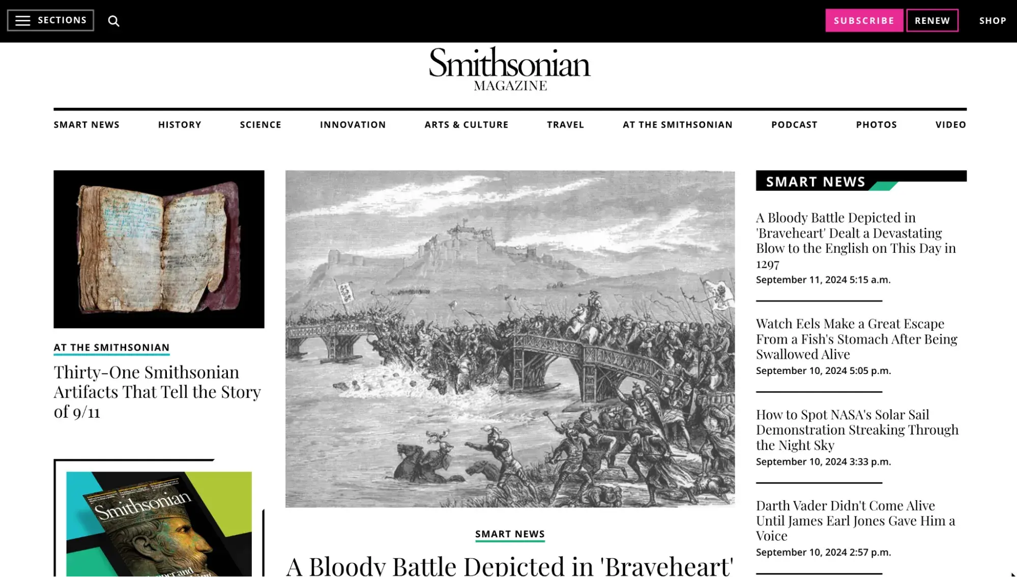
Smithsonian Magazine’s website really draws me in with its clean, elegant design that showcases its incredible content on history, science, arts, and culture.
The layout is minimalist, letting the stunning photography and in-depth articles shine. I found the navigation smooth, and it’s great how their responsive design makes it just as enjoyable to browse on my phone as on my desktop. The interactive features, like 3D artifact models and immersive galleries, really take the educational experience to another level.
What I like: The interactive galleries and detailed graphics kept me hooked while making learning feel like a hands-on experience.
13. Tach Clothing
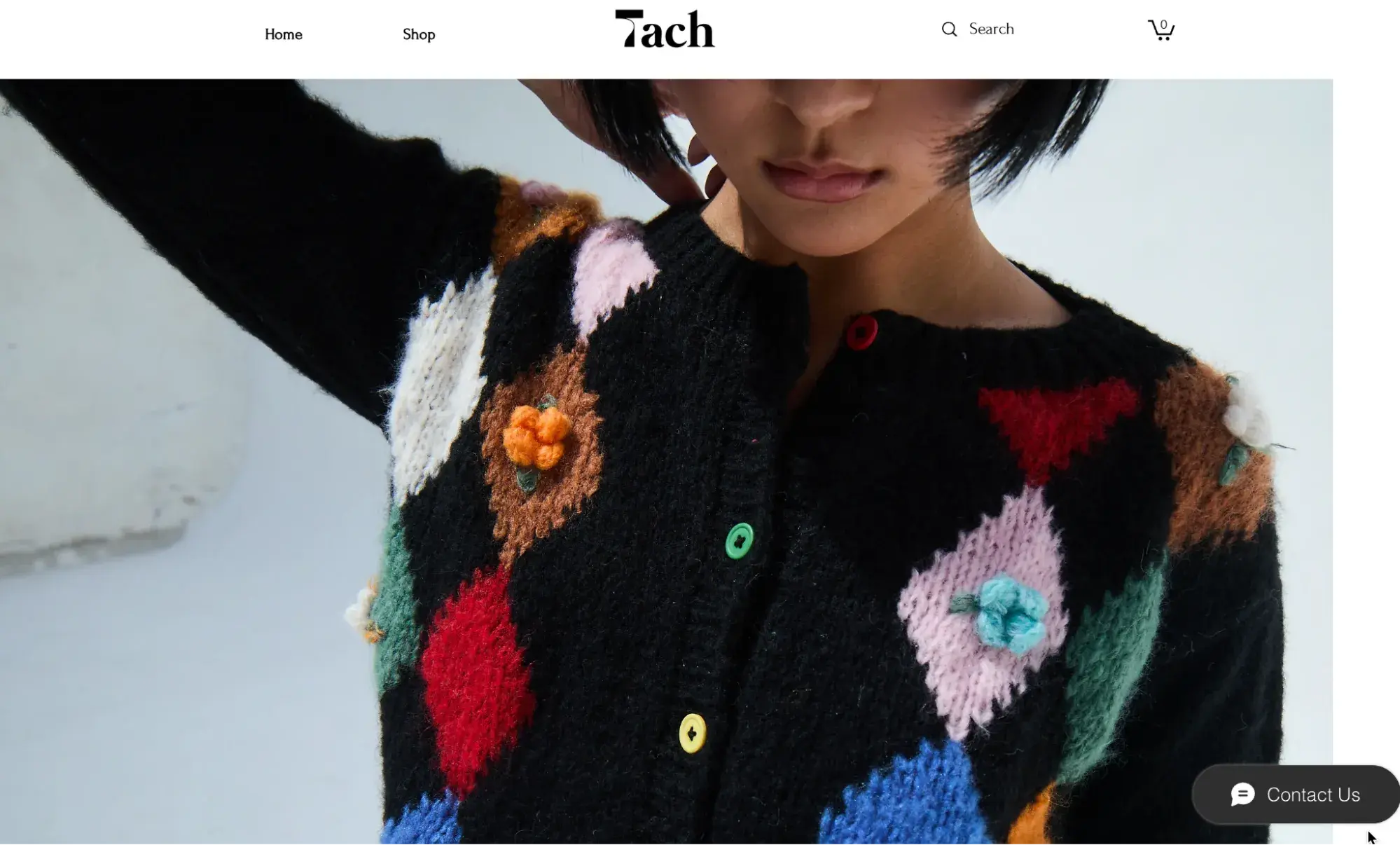
When I visit Tach Clothing’s website, I’m struck by how minimalist it is in all the right ways. It feels like a reflection of its dedication to craftsmanship and sustainable fashion. The soft, neutral colors immediately create a calm, distraction-free browsing experience. Navigating the site is effortless: everything is well-organized, with detailed descriptions that give me all the info I need, from materials to sizing, along with style inspiration that draws me in.
The “About” section really speaks to me, sharing the brand’s journey and its ethical stance on fashion, which builds trust. Plus, the high-quality images and videos offer a close-up view of their products, making it all feel authentic and engaging.
What I like: The storytelling is what wins me over here. It’s like having a conversation with the brand while also browsing beautiful, minimalist designs that spotlight the quality without any clutter.
14. FPP
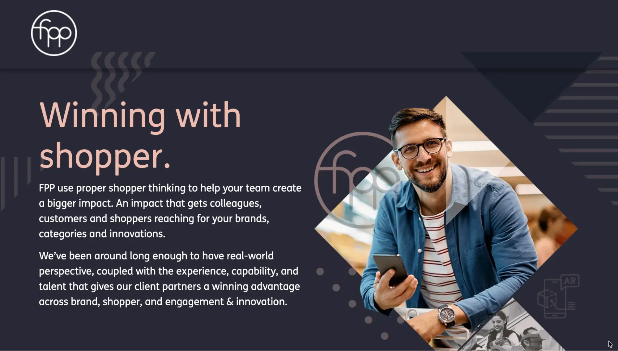
Shopper marketing agency FPP has this retro charm that fits perfectly with the whole vibe of film photography. As soon as I start browsing, I notice how simple yet effective the design is, seamlessly guiding me through sections like “Shop,” “Podcast,” and “Blog.”
There’s so much content here — articles, tutorials, and podcasts that cover everything from beginner tips to more advanced film photography techniques. I love how the layout makes it easy to explore without feeling overwhelmed.
What I like: The mix of educational content and a strong sense of community makes me feel like I’m part of something bigger, where I can learn and share my love for film photography.
15. Okalpha
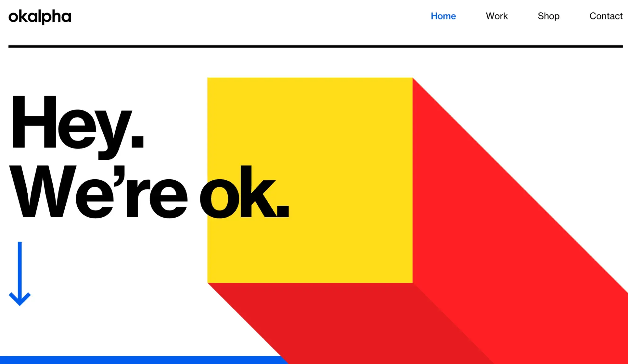
Okalpha’s website makes an instant impact with its vibrant energy. As an animation studio, the brand really knows how to turn static images into captivating, moving stories. Every animation I come across feels like it’s part of a bigger narrative, showing me just how powerful visuals can be. The whole browsing experience is lively, and it’s clear that storytelling is at the heart of everything they do.
What I like: The bold use of orange, yellow, and blue adds to Okalpha’s playful tone. Then there are the moving animations, which bring the whole experience to life.
16. Cure Nails
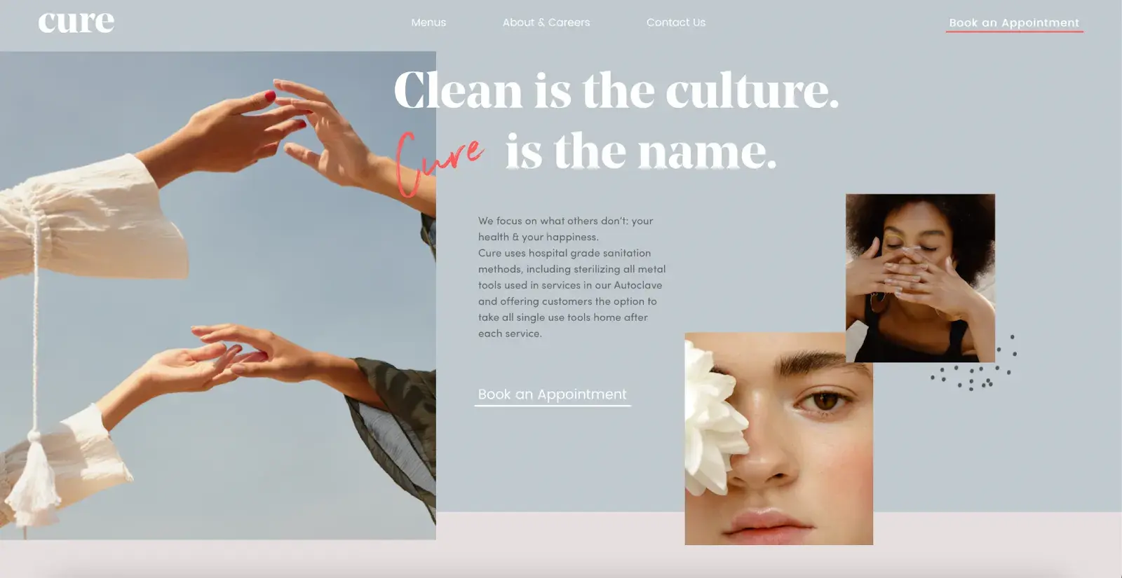
Based in El Paso, Texas, Cure Nails offers a range of beauty services, from facials to nails and waxing, along with organic products.
What really stands out to me is how polished the presentation is, with vibrant imagery giving me a sneak peek into the pampering services available. It feels like I’m getting a preview of the relaxing treatments they offer, wrapped in a visually stunning package.
What I like: The smooth color transitions throughout the site are a standout for me. They add a layer of elegance that elevates the whole experience.
17. Life in Vogue
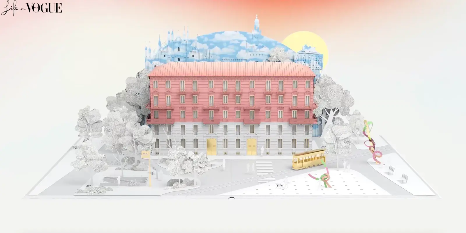
Life in Vogue nails the art of creative navigation with an interface mimicking an elevator call list.
As I explore the site, it feels like I’m wandering through a real building. The elegant animations are like a visual guide, seamlessly transitioning me from one section to another. The soft pink and gold colors give off a luxurious, regal vibe, making every corner feel as grand as the castle it portrays.
What I like: Life in Vogue transports me into a world of sophistication, combining aesthetics and functionality to create an unforgettable online experience for me.
18. We Are Breakfast
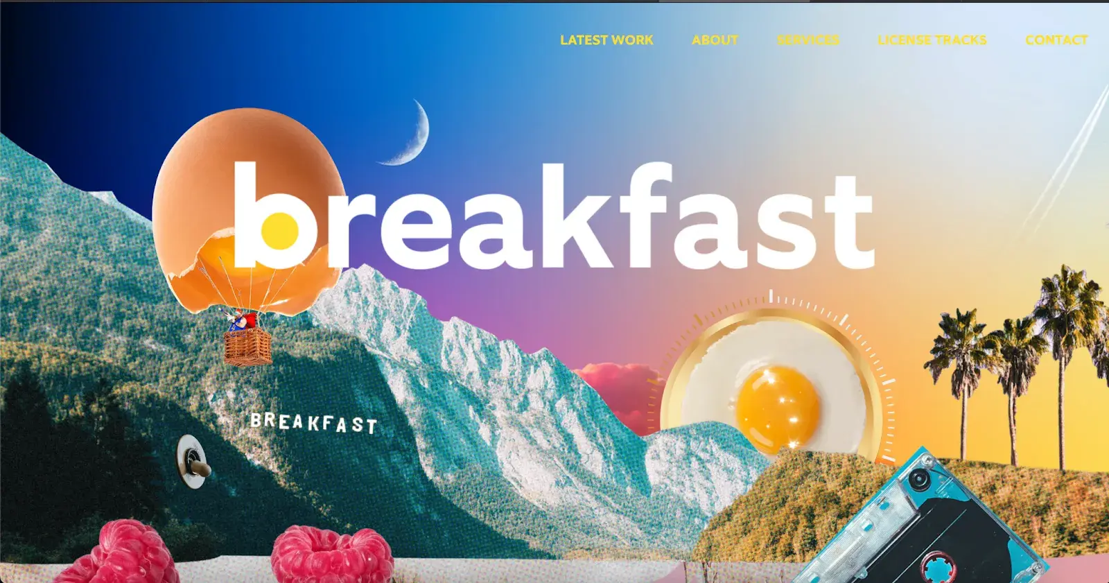
We Are Breakfast, a music production studio, does an amazing job using imagery to connect with visitors. I love how breakfast foods are used to tell the story, infusing the entire website with a sense of culinary creativity. It’s like a visual feast, with vibrant colors adding to the charm and transitions that remind me of a rising sun, welcoming me to explore further.
What I like: How they pair breakfast items with distinctive sounds, like the crack of an egg, immersing me fully in the music. It’s a brilliant way to use design to communicate the essence of their product.
19. The New York Times
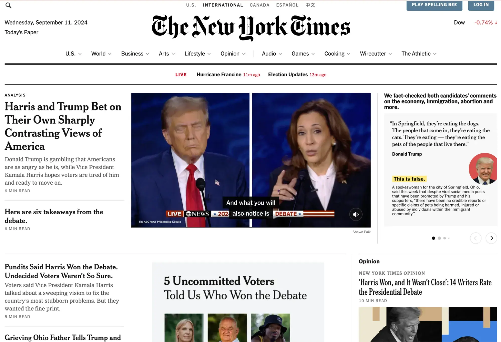
The New York Times’ structured layout makes it so easy to find what I’m looking for, even with the vast amount of content available. Whether it’s breaking news or in-depth features, everything feels organized without being overwhelming. I really appreciate how they balance modern design with functionality, using text, images, and multimedia to enhance each story.
What I like: I’m a fan of their interactive features — infographics, maps, and videos really help break down complex topics into something I can easily digest.
20. 3rd Wave Coffee Collection
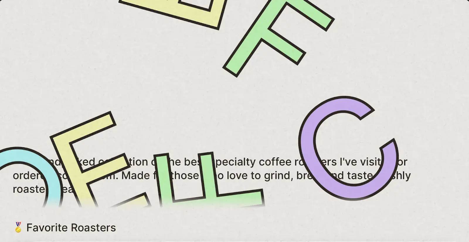
When I land on 3rd Wave Coffee Collection’s site, the first thing that grabs my attention is the oversized, unstructured letters I can drag around with my mouse. It’s such a playful and edgy feature, made even more fun by the custom cursor that follows me. But beyond the cool design, I love how easy it is to find the perfect brew with their straightforward navigation.
What I like: I found the site's favorite coffee list simple and thoughtful. No need to scroll through endless options when I just want to make a quick selection.
21. The Outline
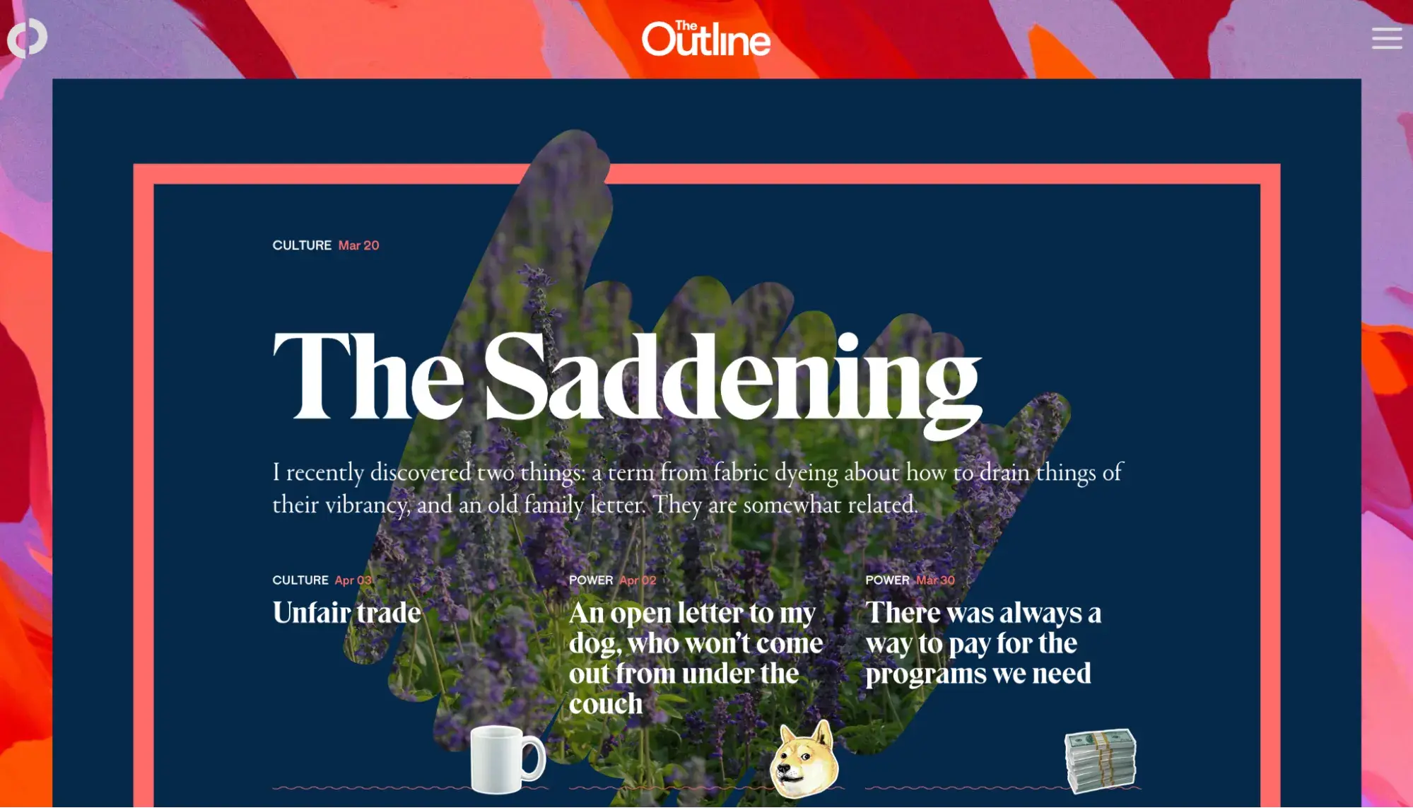
For me, The Outline stands out with its bold, daring design. Every article feels like a new experience for me, thanks to the dynamic use of bold colors, playful typography, and seamless layout transitions.
As I scroll through the site, the animations guide me effortlessly through the content. The site’s minimalist use of whitespace keeps the focus on the information, while videos and infographics enhance the storytelling without feeling overwhelming.
What I like: Each piece on The Outline feels tailored, engaging me with both compelling text and a quirky, immersive design. It’s the kind of site where I want to stay and explore, not just for the content, but for the experience itself.
22. FWA
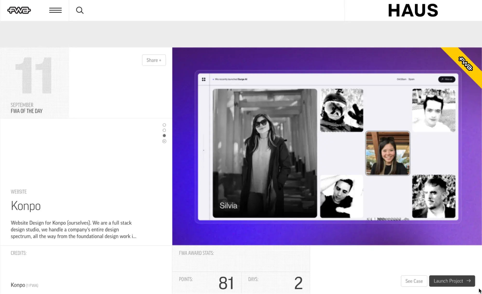
With a clean, grid-based layout, the FWA site is easy to navigate, showcasing award-winning digital projects through bold, eye-catching visuals.
I enjoyed how the hover effects and animations add a layer of interactivity without being distracting, keeping the focus on the featured work. The streamlined menu makes finding categories, past winners, and submission guidelines a breeze, so exploring the site feels effortless.
What I like: The visuals and functionality work perfectly together. The large images highlight the creativity of the projects, while the simple navigation lets me stay focused on discovering fresh designs.
23. NOWNESS
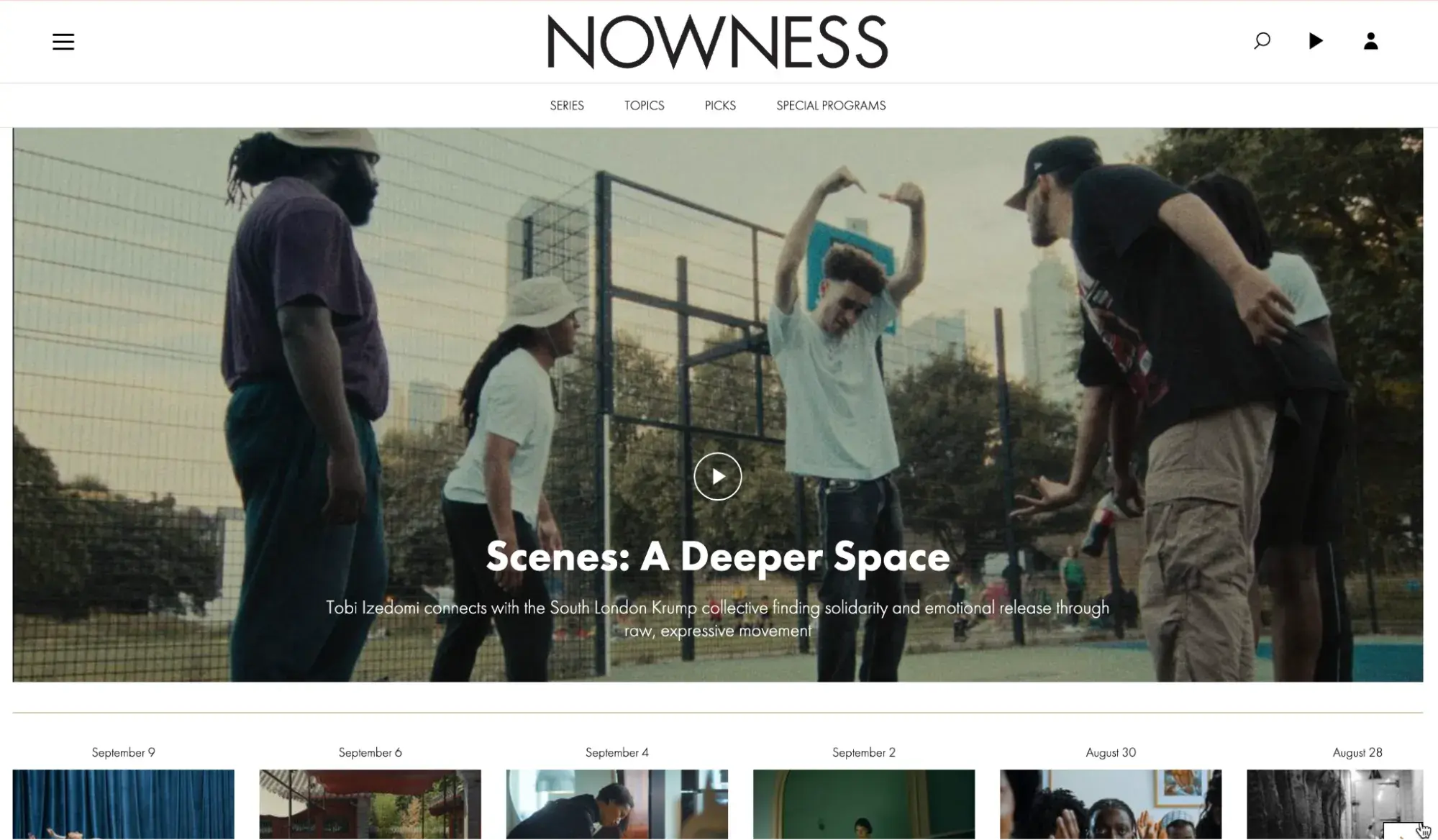
NOWNESS is all about storytelling through stunning video content. Its minimalist design really draws me in, with full-screen videos taking center stage and allowing each piece of content to shine.
There are also brief, poetic descriptions that accompany each video. A seamless UI invites me to explore different themes, like ‘Art & Design,’ ‘Fashion & Beauty,’ or ‘Culture & Lifestyles,’ through an elegant side navigation bar.
What I like: The site is incredibly immersive, offering an artful mix of motion and storytelling. I appreciate how easy it is to dive into these visually striking, cinematic films without feeling overwhelmed by the design.
24. Google Arts & Culture
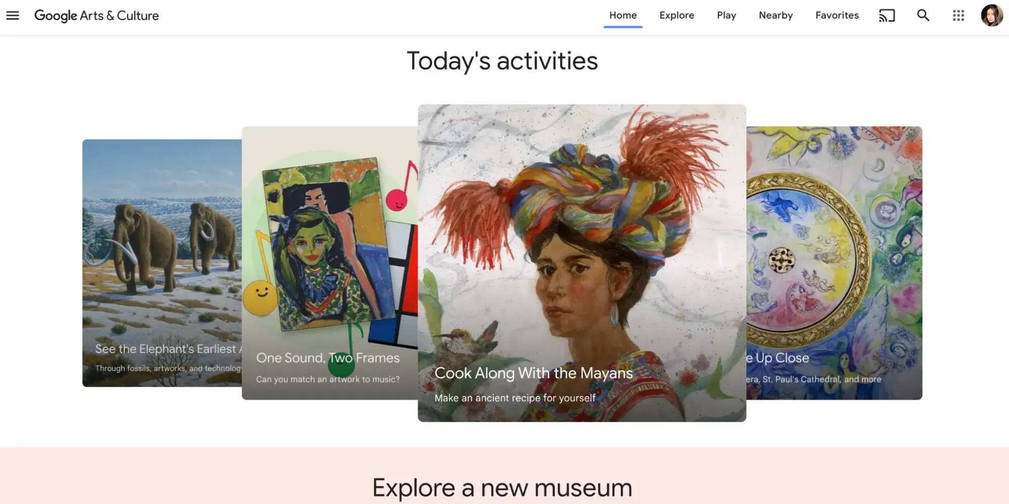
I find Google Arts & Culture to be an absolute treasure for anyone interested in art, history, or culture. The interactive layout lets me explore museums and exhibits from around the world through virtual tours, and the ability to zoom in on high-resolution images is amazing.
Additionally, navigating the site is a breeze, thanks to clear categories based on artist, location, or theme. The creative tools and educational resources keep things engaging, and the responsive design ensures I can enjoy the experience on any device.
What I like: The virtual museum tours are a game changer. I can get lost in these immersive experiences. Also, the quizzes and interactive tools add a fun, educational spin that’s hard to resist.
25. World Wildlife Fund (WWF)
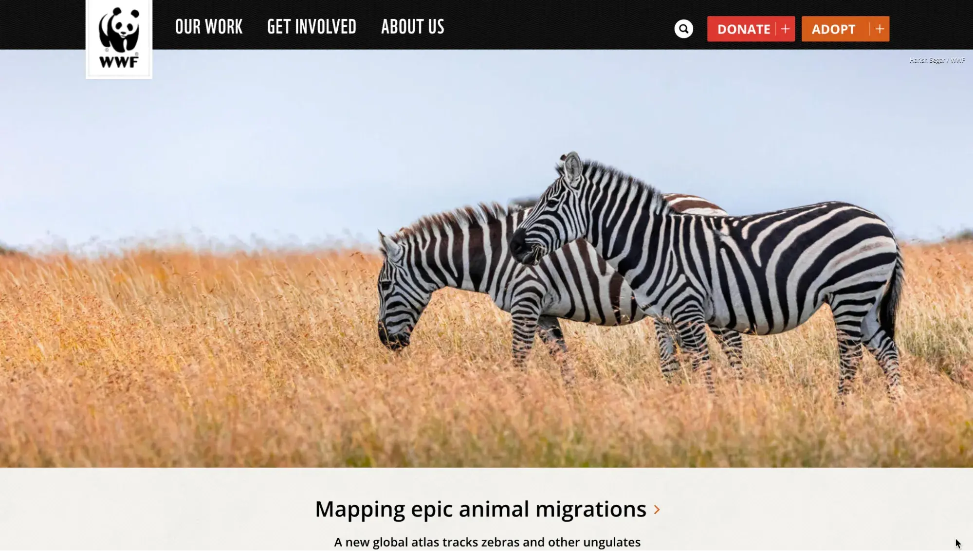
WWF’s website balances stunning visuals with well-structured, clear content. The detailed insights on wildlife conservation are complemented by high-quality images and infographics that keep me engaged.
Calls to action, like donating or learning more, are integrated naturally throughout the site, making it easy for users to get involved. The “Explore” section, with its interactive maps, videos, and stories, adds a dynamic layer to the overall experience.
What I like: I love how the website blends information with action. I‘m not just learning about wildlife conservation. I’m also encouraged to get involved.
Tips for Creating an Informational Website
When designing an informational website, I like to keep these tips in mind:
- Design with purpose. Keep things clean and focused. Your site should reflect your brand’s purpose, without clutter or distracting features. Less is more — stick to what helps users get the info they need quickly.
- Create a seamless UX. Make sure everything flows logically. Organize content with clear headings and subheadings, plus use a navigation bar that’s easy to follow. I highly recommend using breadcrumbs or a sticky menu to simplify navigation further.
- Add high-quality visuals. Invest in quality imagery, videos, and multimedia elements that support the text. Verify the visuals load quickly to prevent slowing down the site.
- Ensure responsiveness across devices. Your site should be mobile-friendly and adapt seamlessly to any screen size. This is essential, as more users access the web via mobile devices.
- Speed matters. No one likes waiting, and neither does Google. That‘s why I make sure to optimize a client’s site’s speed. My go-to tactics? Compressing images, using a content delivery network (CDN), and cutting unnecessary scripts.
- Engage users with interactive content. Add interactive elements such as quizzes, data visualizations, calculators, or clickable maps to offer added value and engage users. Tools like embedded videos, comment sections, or downloadable resources are also useful in boosting interaction.
- Ongoing updates and maintenance. Keep content fresh by regularly updating the site with new information, blogs, or relevant news. Fix broken links and remove outdated content.
Create Your Informational Website Today
I've discussed 25 of my favorite informational websites, each showcasing creativity with purpose. They challenge the usual, pushing boundaries to create memorable online experiences.
Now, it’s your turn. Take that inspiration and craft something that blends clarity with captivating design, creating connections that truly resonate with your audience.
Editor's note: This post was originally published in November 2023 and has been updated for comprehensiveness.
Website Design Examples
.png?width=112&height=112&name=Image%20Hackathon%20%E2%80%93%20Vertical%20(50).png)
.png)
![15 black and white website designs to inspire your own [+ pro tips]](https://53.fs1.hubspotusercontent-na1.net/hubfs/53/black-and-white-website-design-1-20250520-1336267.webp)

![15 Brochure Website Examples to Inspire You [+ How to Make One]](https://53.fs1.hubspotusercontent-na1.net/hubfs/53/brochure-website-examples-1-20250319-362228.webp)
![28 Types of Websites to Inspire You [+ Real-Life Examples]](https://53.fs1.hubspotusercontent-na1.net/hubfs/53/types-of-websites.png)

