The best websites are designed with users in mind. Interactive websites are particularly successful at user-centered design. They are not only personalized and playful — they also give users control over their experience and help guide them toward information they want.

Visitors on interactive websites are invited to scroll, click on navigation items, view portfolio items, and participate in other ways. The result is a more engaged and memorable user experience.
In this post, we’ll take a look at more than a dozen interactive websites that can inspire your own web design. Then, we’ll walk through some actionable steps you can take to make your site interactive.

Interactive Websites
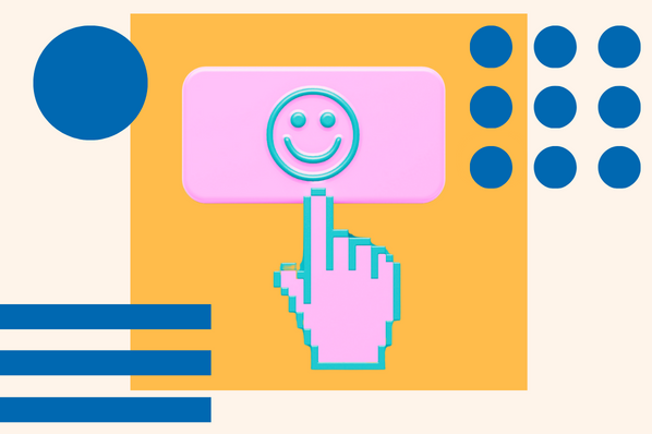
Interactive websites either respond to a user’s interaction or guide the user journey with captivating animations, videos, and other interactive elements (like on this homepage). This type of website does more than delight users — it helps keep them engaged on the site for longer. Here are some of the best examples of interactive design.
1. Fern

Fern is an Atlanta-based animation and design studio that specializes in animation, illustration, and storytelling. Their website offers multiple ways for visitors to interact, including horizontal scrolling, animated text, GIFs, and video backgrounds.
You’ll find one of the most unique interactive elements when you scroll down to their Archives. It seems like a simple table with the name of the brand the agency worked with and a short description of the project. But when you hover over one of these names or descriptions, the cursor reveals a short animated clip that’s basically a trailer of the project. It’s the perfect combination of interactive and informative.
2. Earth Month With A Redwood

Earth Month With A Redwood is a microsite for Redwood Empire Whiskey. Designed and developed by Affinity Creative, its purpose was to educate and incentivize customers to enter the Redwood Glamping Experience Sweepstakes.
Earth Month With A Redwoof not only invites users to interact with the site — it requires it. When you land on the homepage, you are invited to “plant your seed.” You have to slide the rotating element into the glass to essentially unlock the rest of the site. Once you do, the background will be replaced by a hand drawn map. At the bottom, you’ll see a scrolling banner that invites you to enter the sweepstakes or share it on Facebook or Instagram to increase your own chances. Once you hover over the banner, it stops scrolling. As you scroll, you’ll notice plenty of additional interactive elements.
3. Eamonn Day Lavelle

Eamonn Day Lavelle provides an excellent example of a simple interactive portfolio website. If you click “View Projects,” you are automatically scrolled down to a list of his projects. If you click on any individual project, then you are redirected to a more comprehensive landing page. Thanks to a fade-in transition effect, the page fades in and changes background color to visually depict the loading process.
The best part about this site is that it’s optimized for performance. Coded with HTML5 and CSS3 and weighing less than 8MB, the site loads incredibly fast. This proves that interactive design and website performance don’t have to be tradeoffs.
4. Whiteboard

Whiteboard is a creative agency that drives strategy, designs brands, develops websites, builds apps, and launches campaigns, among other responsibilities. Its website is a treasure trove of interaction. You’ll find parallax scrolling, fly-in animations, hover animations, and much more.
For example, if you scroll down the page, you’ll find a unique portfolio section that looks like a collage board with images. If you hover over any of the individual images, then the image becomes a white text box with the brand’s name and an invitation to view the project, and the background becomes a full-width image from the case study.
5. Foot Locker's Home Game
 Foot Locker’s Home Game is a microsite designed and developed by CTHDRL. Its purpose was to inform and incentivize visitors to participate in a virtual basketball and sneaker contest on Twitter. Fans had to follow along on social and then enter gated challenges to win exclusive sneakers, merch, and experiences.
The site excelled in capturing visitor’s attention and sustaining it. The first thing visitors see is a colorful background that looks a bit like a basketball court. Elements that look like paper cutouts of basketball hoops, sneakers, and Foot Locker gift cards continuously rain down the screen. There are CTA buttons encouraging users to “Follow Along” throughout the page. These buttons turn a different color and rotate when users hover over them. When scrolling through the section called “The Drops,” cards appear as the reader scrolls showing which prizes were available.
6. (UN)TRAFFICKED
TRAFFICKED%20invites%20users%20to%20follow%20a%2013-year-old%20girl%20throughout%20a%20life-changing%20week.jpg?width=650&name=Interactive%20website%20(UN)TRAFFICKED%20invites%20users%20to%20follow%20a%2013-year-old%20girl%20throughout%20a%20life-changing%20week.jpg) (UN)TRAFFICKED is an interactive digital story created to draw attention to the child trafficking crisis in India. Based on the choose-your-own-adventure format, this interactive site has users follow a 13 year old girl through a life-changing week and make decisions throughout that will impact the outcome of the story. (For example, you start by giving the girl a name.) A soundtrack, in which you can literally hear the girl’s heart breaking, and up-to-date statistics on the state of child labour and sexual abuse in India are featured throughout. After “playing” the game, users are encouraged to continue taking action by signing the pledge and sharing on social media.
(UN)TRAFFICKED is an interactive digital story created to draw attention to the child trafficking crisis in India. Based on the choose-your-own-adventure format, this interactive site has users follow a 13 year old girl through a life-changing week and make decisions throughout that will impact the outcome of the story. (For example, you start by giving the girl a name.) A soundtrack, in which you can literally hear the girl’s heart breaking, and up-to-date statistics on the state of child labour and sexual abuse in India are featured throughout. After “playing” the game, users are encouraged to continue taking action by signing the pledge and sharing on social media.
As the digital centerpiece of a large-scale campaign by the Kailash Satyarthi Children's Foundation and the Children’s Investment Fund Foundation to end child exploitation in India, (UN)TRAFFICKED shows how powerful interactive web design can be.
7. Cyclemon
 Cyclemon is an interactive illustrated website created by two French designers. This website allows users to cycle through (get it?) different bike models paired with different identities: traveller, weirdo, hipster, and swagger are just a few. They can stop scrolling whenever they see a description or model that suits them. Parallax scrolling gives the illusion of travelling through the different places in the background, which include a hotel, amusement park, and ferry, among others.
The catch: the bikes aren’t actually for sale. But the designs are.
8. Bragg
 Bragg — short for Bragg Live Foods — is a health food company that’s dedicated to helping each individual eat better, feel better, and enjoy a more healthful and vibrant life. Bragg takes this personalized approach to its website as well.
As users hover over different elements, they change colors or move on the page. For example, there’s an interactive timeline that invites users to learn about the major landmarks in the company’s history, starting with its founding date. Then there’s a product slider. If a user hovers over one of the products, then more information appears thanks to the slide-in animation, including the product name, star rating, size availability and price. The user can click on another available size and the price will automatically change.
9. Violet

Violet is a company dedicated to making culturally competent health care accessible for all communities. Its website is characterized by bold colors and typography, animations, and illustrations.
Scrolling down the page, you’ll notice elements rotate as you scroll past them or the background color changes. Once you get close to the Library section, vertical scrolling changes to horizontal scrolling. The illustrated icons of each resource will also grow if you hover over them. The overall effect of the design is a personalized user experience, much like the company hopes all communities can receive from the health care system.
10. Decatur Dan

Dan Hall, better known as Decatur Dan, is a famous music video director who now creates visual stories for brands like Nike and Beats by Dre. His portfolio site — also developed by CTHDRL — exemplifies his visual storytelling skills. Inviting users to share his commitment to what’s bigger, greater, and better, his website allows users to drag and resize all elements on the page. As a result, users can remix his work into their own layout.
11. Delve Architects

Delve Architects is a London-based company that aims to bring a light-hearted and personable approach to architectural design. These two values are reflected in its website’s design.
The color palette is mostly made up of light pastels. The homepage is interactive so the user can choose how they navigate the site. Clicking on one of the color blocks will reveal an image and category, so users can view their projects, learn more about their practice, read their blog, or contact them with enquiries.
12. Cycles Gladiator
 Cycles Gladiator is a California-based wine company dedicated to inspiring and empowering women. This interactive one page website invites users to locate a nearby retailer or restaurant that sells their wines, learn more about their partnership with the non-profit group Do More Art, and join their mailing list. Each of these calls-to-action has a button with a subtle hover animation. At the bottom of the page, there is a slider so users can view their wine collection one bottle (or can) at a time.
13. Daniel See
 Daniel See is the Principal National Creative Director for Deloitte Digital Australia. Since he’s been working in the digital industry for over two decades, he has a lot of projects to showcase. To make the viewing experience simpler and more interactive, infinite scroll and fly-in animations are used to reveal projects one at a time as the user scrolls.
14. Portfolio Night
 Portfolio Night is a microsite created by AKQA Amsterdam to invite aspiring creatives to attend their event. The site is designed with the goals of the event in mind: one, for aspiring creatives to cross paths with the AKQA Amsterdam team and two, to get practical and actionable feedback on their portfolios. That’s why there’s a “worm” on the homepage that’s made up of projects from portfolios. As the user scrolls, the worm rotates and spans across the screen so it continuously crosses the user’s path. It also moves when the user hovers over it.
This provides a truly unique example of an interactive portfolio section.
15. Prometheus Fuels

Prometheus Fuels invites readers to dive into an interactive story to learn how their company is creating fuel from the air. It’s basically part website, part video game. When users hover over the background, the car moves as if by game controller. If they hold the spacebar, they’ll see and hear the car accelerate. As the user scrolls and the car accelerates, bits of the story will be revealed.
How to Make Interactive Websites
- Create a loading animation.
- Make scrolling fun.
- Leverage hover animations.
- Incorporate video.
- Add carousels.
1. Create a loading animation.
Loading animations are a great way to capture and keep the user’s attention immediately. Not only do they reassure users that the page is loading, they can also show off your brand personality and delight users. Many loading animations will indicate how long it will take for the page to load, which makes the waiting time seem shorter and makes users less likely to bounce.
Below is a simple and effective example.

2. Make scrolling fun.
You want to make it as fun as possible for users to browse your site and discover your content. Scrolling patterns can help. Let’s briefly go over the most popular options below:
- Horizontal scrolling: This scrolling pattern allows the user to scroll left and right to reveal content from the sides of the window or container — instead of up and down, which is a more traditional orientation.
- Infinite scroll: With this type of long scrolling, content continually loads once a user reaches the bottom of the page. Pinterest is one of — if not the — most well-known sites for using this scrolling pattern.
- Parallax scrolling: This scrolling pattern creates an illusion of depth. Basically, some elements are either fixed in place or set to scroll slower while other elements on the page scroll normally. This makes it look like some elements are moving in front of others, which simulates 3D movement.
Here’s an example of dynamic scrolling on a portfolio site:

3. Leverage hover animations.
Another type of animation that can delight your visitors is hover animations. When a user hovers over an animated element like a button for example, it can change color, grow, shrink, rotate, and more, depending on how you coded it. Like loading animations, hover animations are enjoyable for the visitor and assure them that your site is working.
Here’s a great example of a hover animation that makes the primary CTA more clickable.

4. Incorporate video.
Since many users are more likely to play, share, and otherwise interact with videos than text, incorporating videos is an easy and effective way to make your website interactive. It can also help boost conversions. In fact, 83% of video marketers say video has helped them generate leads.
Taking interactive web design to a whole new level, Nikolaj Juhlsen used video to literally show visitors how it feels to take a ride.

5. Add carousels.
A carousel — or carousel slider — is a slideshow for presenting a series of content. When done right, a carousel slider is a great way to organize serial content or multiple, separate pieces of content, like images. It can also boost user engagement and provide a better experience by allowing visitors to quickly and easily navigate this content, especially on mobile.
Here’s an example of a product carousel that encourages user interaction:

How will your website interact with visitors?
Interactive websites can provide a more playful, personalized, and engaging experience to online consumers. The good news is that there are actionable steps you can take to add more interactivity to your site right away. You might add a video, re-organize a product display into a carousel, or create a loading animation, depending on your skillset and target audience.


![19 Examples of Bad Website Design in 2024 [+ What They Got Wrong]](https://www.hubspot.com/hubfs/badui.webp)


![20 Best Filmmaker Website Examples We Love [+ How To Make Your Own]](https://lh7-us.googleusercontent.com/3pG46rohpxjh8Gc6rCZo_xt0Mp7sSSMdM4_TQO4PTGfSJ3IP2uiCNlHXTD-9GRN2tF4KO22m1mQ9jhcTLQHuP1FHXBLEVVHskrmCfezXym-FWG_Zx6V3gFrHzCMi8oWalZgI3QC9CA3yf2HjV0OAI4w)


![31 Makeup Artist Website Design Examples We Love [+ How To Make Your Own]](https://www.hubspot.com/hubfs/makeup-artist-websites.png)