In this post, I'm going to help you make sure your loading page fits in that “done well” category by going over some important basics and then sharing 11 real-world loading page design examples to give you some inspiration.
Table of Contents
Loading Page Design: The Basics
Before I get to the real loading page examples, I think it's helpful to first go over the basics of loading page design, including what a loading page is and the general anatomy of a loading page.
What is a loading page?
A loading page is a temporary design that appears while a website or app is loading the “real” content that users want to see. You might also see these pages called loading screens or preloaders.
Many loading pages include some type of animation to communicate loading progress. Most loading pages also use a fairly simple design, though there's a lot of variation in what they look like.
While not every single website or app needs a loading screen, some websites and apps require more time in order to retrieve content for the user. In these cases, a loading screen can reassure users that the page is still working, which wouldn't be possible with just a blank screen.
Anatomy of a Loading Page
Most loading pages are simple by nature, in large part because it doesn‘t really make sense to load a complex page while you’re already trying to load the actual content that the user requested.
However, in my experience, there are still some common elements that most loading pages include.
You won‘t see every single element on every single loading page, but here’s a general rundown of the anatomy of a loading page:
- Clear progress indicator — You want to show users that the page is actually working by letting them see the progress increase over time, typically with some type of loading animation. Avoid generic “spinners,” as these don't provide any context about progress and might make users think the page is “hanging.”
- Skeleton content — A lot of loading screens display a “skeleton” of the content that will be loaded, which is a sort of wireframe look at the real design of the page. You can also use the skeleton content to communicate loading progress, which is something you'll see in some of the examples below.
- Short snippets of information — You can get the most from a visitor's attention by using your loading page to communicate short bits of information (usually a single sentence). For example, a travel booking site might share information about its price match guarantee, while a language learning app might present a new vocabulary word.
- Branding elements — You can use your loading page to reinforce your branding. For example, if a business has a playful brand, you'll often see them include funny quotes or illustrations on the loading page.
Again, I don‘t think that every loading page needs every single element. When I share some real examples below, you’ll see that most of them don't include all of these elements.
However, every single loading page should at least include some sort of progress indicator, as this is non-negotiable when it comes to creating a good user experience.
Why Loading Pages Are Important in UX
If your website has some pages that take longer to load, properly implementing a loading page can be a great way to improve your site's user experience and reduce the negative impact of those slower-loading pages.
You should never add a loading page just because. That is, your first priority should always be to eliminate the need for a loading page by making your site load quickly.
In situations where slower load times aren't avoidable, though, here are some of the biggest UX benefits of properly implementing a loading page.
A loading page makes your website seem like it's loading faster.
People generally don't like using websites that “feel” slow.
For example, Google found that the probability of a mobile visitor bouncing increased by 32% when load times went from one second to three seconds. Similarly, Portent found that conversion rates were significantly lower on websites that loaded in five or more seconds across both B2B and B2C websites. This indicates that the poor user experience of a slow website actually turns users off from converting.
At the same time, having slightly slower load times might be unavoidable for some parts of your site because of the technical requirements needed to load that page.
Using a loading page can help you avoid the negative UX impacts of slow load times by making your website “feel” like it's loading faster. This is because users will still see content right away, rather than having to stare at a blank screen.
A loading page reassures visitors that the content is coming.
If visitors have to look at a blank white screen while they‘re waiting for a site’s content to load, they‘re going to start asking negative questions that you don’t want them to ask. For example:
- Did the page hang? Do I need to close my browser tab and try to load it again?
- How much longer is it going to take before I can start interacting with the site?
When they see the loading page, they already know that the page is still working rather than hanging.
What's more, if you implement your loading page design well, they should have a good idea of where they are in the loading process and how much longer they might need to wait. This is why I said that having a clear progress indicator is non-negotiable when it comes to creating a good loading page.
A loading page lets users prepare to get to work.
This won‘t apply to every single situation and loading page. But, as you’ll see in the examples below, one really common loading page design approach is to use something called a skeleton screen.
A skeleton screen displays a basic wireframe-like layout that matches what visitors will actually see once the page loads.
Here‘s an example of a skeleton screen from Asana, which I’ll cover in more detail below.
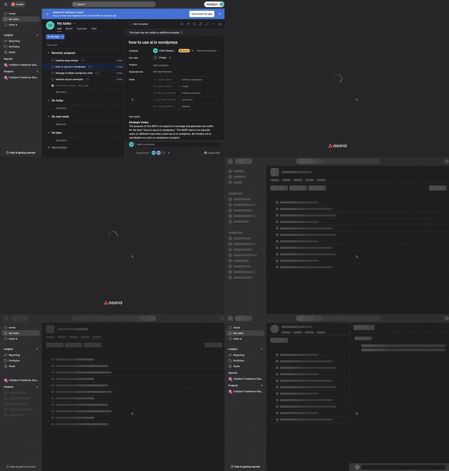
The advantage of using this approach is that visitors will already be prepared for the layout of the page. While it's a small time savings, it makes your website easier to use and reduces the cognitive processing needed for people to navigate your site.
A loading page lets you play with the “perception of time.”
Another interesting UX aspect of loading pages is that they let you “play with users’ perception of time and turn it into an advantage,” in the words of Fanny and Ceara at Pencil & Paper.
In a lot of situations, you want to use your loading page to make people feel like they're not waiting very long. But in some cases, you can actually create a better experience by doing the opposite.
For example, let‘s say you offer a service to automatically create a custom diet plan based on a user’s goals, which is one of the real examples that I‘ll show you below. Even though the plan is automatically generated, users want to feel like they’re getting access to a completely custom plan.
In this case, you might want to use your loading screen to make the plan generation process feel a little longer. By stretching the perceived time of this task, users will feel like your service is really doing a lot of work to create a unique plan just for them.
If you want to learn more about how your visitors are experiencing your site, you can use some of the UX research templates for HubSpot Content Hub.
Loading Page Design Examples
Now that you know the basics of loading page design and why they‘re important, let’s get into some real-world examples of loading pages to inspire you when building your own.
Personally, I always think real-world website design examples are the best way to learn.
As you'll discover, there is a wide range of loading page design styles, from practical, information-focused designs to more whimsical and fun designs.
To help inspire you in different ways, I tried to find examples that span the full spectrum. Some come from large commercial brands, while others come from smaller brands with a more playful approach.
1. Agoda
Agoda is a travel booking service that people can use for hotels and/or flights. It's part of Booking Holdings, which is the same company behind similar services such as Booking.com, Priceline, Kayak, and many others.
When a user searches for a hotel, Agoda displays a loading screen while it looks for hotels that match the user's search criteria.
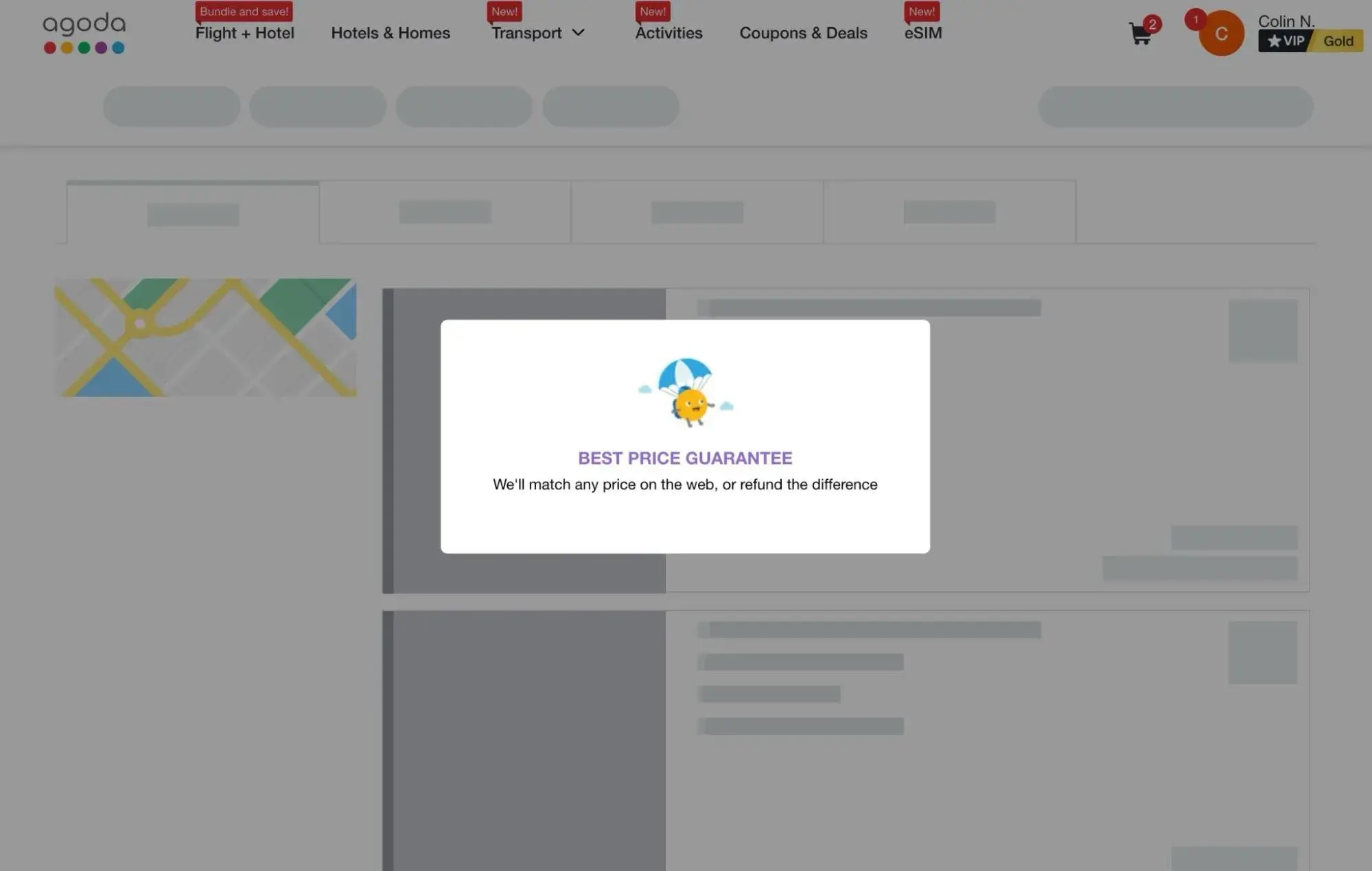
What I like: My favorite thing about this example is how Agoda uses its loading screen to display information about its price match policy. This lets users book with confidence because they know Agoda will match any price that they see in the hotel results.
I also like how Agoda uses the skeleton content in the background to communicate progress and show users what the content will look like once it loads.
2. Carb Manager
Carb Manager is a low carb and Keto diet tracker app that people can use to build a plan, track their eating, and work towards goals.
When you register for the app, Carb Manager collects some information from you about your goals. Then, it generates a plan for you based on the information that you provided. While it generates that plan, it shows a fun loading screen with an avocado juggling some vegetables.
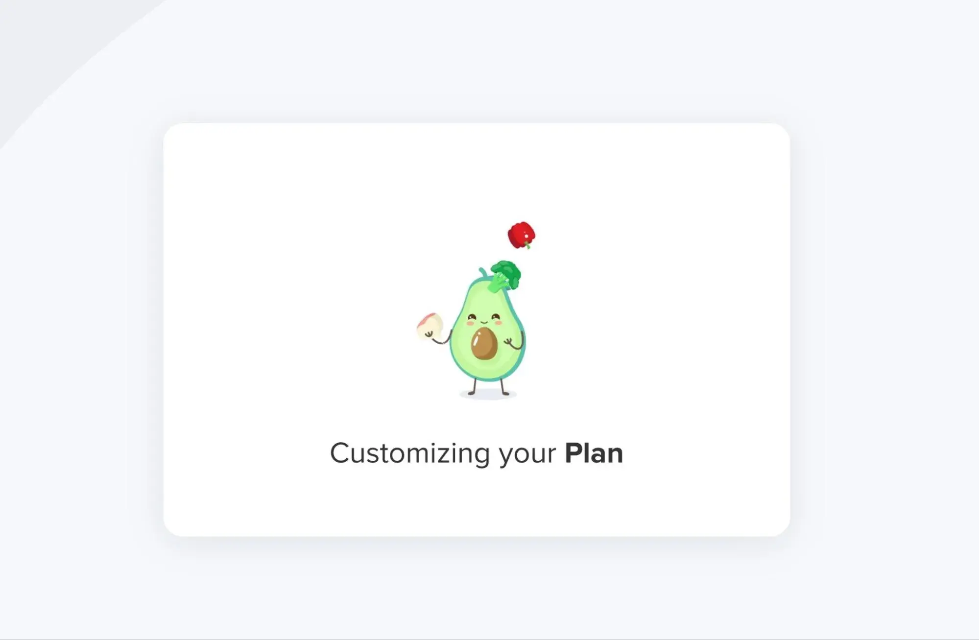
If you want to see the full animated version of this loader, you can find it on the designer's Dribbble page.
What I like: I like this loading page design because it's a great example of how you can be a little more playful with your loading page design if it fits your brand. While it might not be as practical as the Agoda example above, it reinforces the playful and healthy lifestyle branding that Carb Manager is going for.
It also ties in with the idea of adjusting the “perception of time.” As I mentioned above, having the loading screen actually reinforces the idea that Carb Manager is building a custom plan for the user.
3. Duolingo
Duolingo is a popular language learning app that people can use to improve their language skills. When a user clicks into a new lesson, Duolingo displays a loading screen while it prepares the lesson content.

What I like: Like the Agoda example above, I like that Duolingo uses its loading screen to communicate helpful information to visitors. In this case, Duolingo shares language tips related to the actual language that the visitor is learning (which is Vietnamese, in my case).
Beyond that, the playful owl and animation really fits with the rest of the Duolingo brand and experience. It adds some fun to what would otherwise be a boring page.
4. WeTransfer
WeTransfer is a free file sharing service that also offers premium plans with more functionality. Anyone can upload a file for free and share the link with other people for easy file transfers.
While users are waiting for their files to upload, WeTransfer shows some really well-designed loading screens, such as the example below.
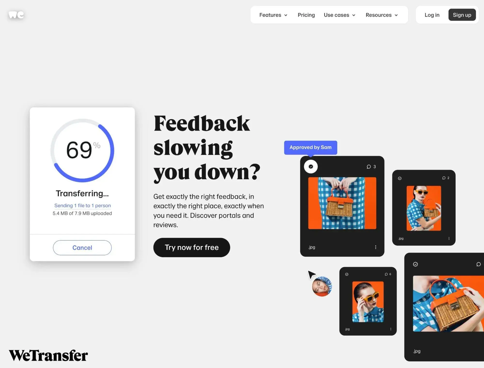
What I like: I like the WeTransfer loading page because it‘s able to pack a lot of information into one page. It’s able to achieve this busier design because the loading page is initiated by the user uploading a file, rather than the user trying to retrieve information.
On the left, it shows a standard progress meter so that users can clearly track the progress of their uploads. Then, on the right, it utilizes that space to promote its premium functionality that lets people collaborate on the files that they're sharing.
5. Asana
Asana is a project management tool that helps teams stay on track and work collaboratively. It's also the task management tool where the HubSpot team and I collaborate to create these blog posts (which is where the example below came from).
To create a better experience when opening the Asana app, Asana uses a well-designed loading screen.

What I like: This example is a great reminder that you don‘t need to actually use a progress bar to show people the loading process. Instead, Asana progressively loads a wireframe of the actual page content that the user is trying to load (again, this is called a skeleton screen). I like that it clearly shows the progress while also preparing users for what they’re about to see.
6. Etsy
Etsy is a popular ecommerce marketplace that helps people sell handmade products. It's sort of like Amazon but for handmade goods.
When someone uses the Etsy product search functionality, Etsy displays a skeleton screen loading page while it loads the results for that search term.
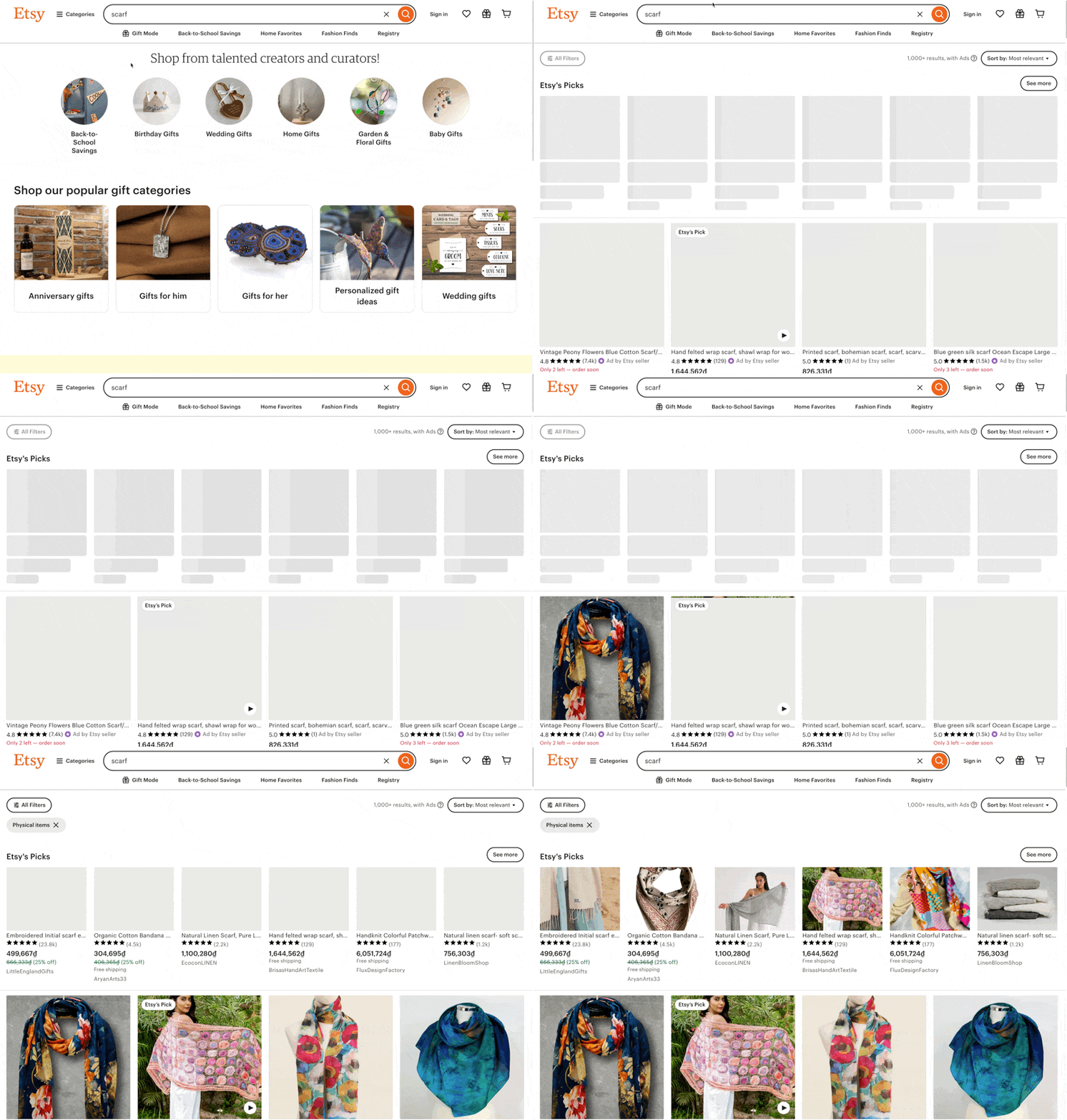
What I like: I think this is a great example of how you can do a loading screen for an ecommerce store. The skeleton screen clearly shows visitors that product results are coming, and being able to see the skeleton layout lets them jump right into analyzing the results.
7. ITG.Digital
ITG.Digital is a tool that helps people create custom illustrations using an online builder. People can create unique combinations from more than 1,500 different vector illustrations.
While it's loading the homepage, ITG.Digital displays a loading screen with an illustrated dachshund that becomes longer and longer as the loading process continues.

What I like: At first glance, the ITG.Digital loading page seems like just another fun, whimsical design without much purpose. However, when you remember that ITG.Digital's business is actually in creating these types of vector illustrations, it becomes a lot more purposeful.
That's why I like this one — it blends whimsicality and practicality in a really fun way, all while still providing information about the page-loading process.
8. Slack
Slack is a team-based communication platform that's used primarily by businesses.
When someone opens a Slack channel in their web browser, Slack displays a loading page while it loads the chat history and interface.
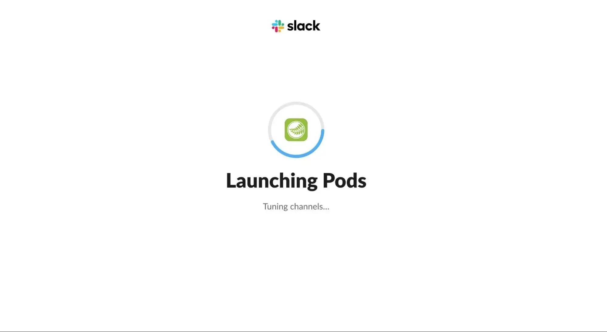
What I like: Slack uses a pretty classic progress indicator to actually show the loading process. However, I think what makes Slack's loading page unique is how they also bring in some humor and creativity with the text messages that are displayed below the loading bar (which change during the loading process). I like this because it adds some playfulness to the experience.
9. Momondo
Momondo is another travel booking service similar to Agoda above. Honestly, I could probably pull dozens of unique examples just from travel booking sites because so many of them have great loading screens — it‘s pretty much a necessity because there’s no way to avoid a delay while looking up flight or hotel availability.
Momondo opts for a slightly different approach than Agoda, though, relying exclusively on a skeleton screen instead of showing any type of overlay.
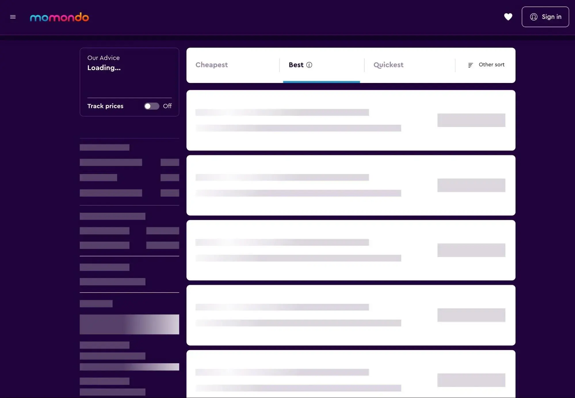
What I like: Like the Asana example above, Momondo is another great example of how you can use a skeleton screen to communicate progress without needing to actually show a progress bar. The animated effects show Momondo's progress toward pulling up flight data, and the skeleton screen helps users jump in right away once the data loads.
10. Webflow
Webflow is a popular website builder tool that gives users more control over the underlying code of their websites.
When users launch the Webflow editor, it takes the Webflow website some time to load all of the required assets. While Webflow works on doing that, the interface shows a pretty standard progress bar loading page, along with the Webflow logo.

What I like: Webflow is a good reminder that you don‘t always need to reinvent the wheel. Sometimes, all you need is something simple, which the progress bar indicator achieves. Do I think it’s fancy or creative? No. But is it effective at its purpose? Yes.
11. Mural
Mural is a visual work platform that's built for collaboration. It offers a free-form interface that lets people generate new ideas and connect them together. While loading the Mural editor, Mural displays the loading screen from the animation below.

What I like: Mural is another good example of how you can effectively use a classic design on your loading page. While I'm not generally a fan of spinners, the spinner only appears for a very brief time on the loading screen. It then uses a more traditional progress bar, along with other loading indicators.
The “warming up” text also adds a bit of fun and playfulness to the experience.
Make Your Own Awesome Loading Page
If having a loading page fits your website or app, there are a lot of different ways in which you can implement it, which I hope the examples above demonstrate. Personally, I like loading page designs that are a bit playful, such as the examples from Carb Manager, Duolingo, and ITG.Digital.
If that type of design fits your brand, don't be afraid to play around and get creative. As long as you follow the general best practices, you can turn an otherwise dull page into something fun that will create a great user experience for your visitors.
Website Design
.png?width=112&height=112&name=Image%20Hackathon%20%E2%80%93%20Vertical%20(50).png)

.png)


