In this guide, we’ll share ten practices to make any login screens you create shine. Then, we’ll share a login screen example for each to help you get a better understanding of what it looks like in practice. The result of following these guidelines will be a friction-free experience for your site visitors.
Login Screen Best Practices
- Aim for simplicity.
- Use website branding.
- Skip the username and ask for email.
- Make passwords safe and easy.
- Provide help if they forget their passwords.
- Allow sign-in from an external account.
- Separate login and sign-up.
- Make it accessible.
- Allow visitors to create an account right there.
- Let users save their login information.
1. Keep it simple.
Of course, your login screen isn’t why users come to your site — you want them to move through it as quickly as possible. The best way to ensure this is to make simplicity your focus. However, remember that simple doesn’t mean axing important parts of your login screen, such as a button to reset a password, for the sake of keeping the interface sleek.
Upon landing on the page, it should be immediately clear to users what information they need to provide to log in and where to put this information. In most cases, one or two form fields and a “log in” button are enough. You could also split your email and password fields onto separate screens — it’s up to you.
In addition, you’ll probably want to add a link to an account creation page for new users and a password reset link (more on those later). For example, here’s the login page for Defy performance products:

What we like about this example: Defy has only the essentials in its login screen, with bold contrasting colors leaving no ambiguity about what actions the user needs to take.
Keep your login screen to one page — requiring users to progress through multiple page loads is never a good thing, especially when it’s unnecessary. You could even present your login area as a modal of the current page instead of its own dedicated page, as you can see on Canva’s website:

What we like about this example: By presenting the login screen as a modal on top of its homepage design, Canva trims off valuable time from the login experience. Plus, after logging on, users are already where they need to be: On the homepage, where they can begin creating their designs.
2. Use website branding.
Your login page isn’t just a means to sign into your website — it’s also an opportunity to invite users back. If you don’t make use of your website’s unique branding on its login screens, you’re missing out.
Think of the users who are returning to your website after a long time away or users who have remained signed in for months and are finally seeing this screen again. You want them to feel welcome and, most importantly, confirm that they’re in the right place. The easiest way to achieve this? By incorporating your website branding onto the login page. That way, visitors will have no questions about whether or not they’ve landed on the right website.
To successfully carry your website’s branding onto the login page, you don’t need to do much. Remember: Less is more! Avoid a generic look by including your signature colors, and consider adding some friendly microcopy in your brand voice. You could even include a product update or marketing materials on Calendly’s login screen:

What we like about this example: Calendly’s page is clean and straightforward while retaining enough familiar brand characteristics to keep an inviting feel in line with the product’s tone.
3. Skip the username and ask for email.
Remember when you used to have a username for every website? Juggling all of those usernames (and passwords) was no small feat. Luckily, those days are over — and web apps and services now typically allow visitors to log in with their email. We recommend you skip the username and ask for an email address on your website login screens.
The primary reason for this is convenience — emails are much easier for users to remember. Visitors already need to remember a password to sign into your site, so avoid making them remember an extra username if you can. This can be seen on the Asana login page below. Alternatively, you may decide to l them sign up — and, therefore, log in — with a phone number.

What we like about this example: This login page is fairly generic but makes the user’s options clear. The email address field is plainly visible, with the password field hidden on the next screen.
Of course, if the nature of your website requires usernames (e.g., a forum site or websites that allow multiple accounts per user), you need to allow them at sign-in. However, these are exceptions to the rule. Another option is to allow visitors to log in to your website with a username or email.
4. Make passwords safe and easy.
Password entry can appear simple on the surface, but there are several things to consider for good UX.
The main question you should ask yourself is if you should show or mask the password when the user types it in. On one hand, letting them see it will prevent typos, failed logins, and frustration, ultimately reducing friction and getting your visitors where they need to be quicker. On the other, users may not want their passwords on display if they’re using a computer in public.
Luckily, you can find a happy medium: Mask the password field by default, but allow users to show the inputted text if they want to. The HubSpot login page does this well:

What we like about this example: By default, the user’s password is protected from onlookers, but they have the option to show their password if, for instance, they think they made a typo.
Besides password masking, here are some other functions of your password input to keep in mind:
-
Can users paste a password into this input? We recommend allowing this in case visitors store their passwords digitally.
-
Can the input be auto-filled by a password manager? Again, this is recommended.
-
Will you allow two-factor authentication? 2FA is becoming increasingly common for web applications, especially those storing sensitive information. Providing visitors with the option to enable this is advisable.
-
What happens when a user submits the wrong credentials? How many tries will you give them? Your password field should indicate when a password is wrong and have protection against brute force attacks (entering many passwords in an attempt to guess the right one).
Finally, consider offering alternatives to passwords that allow for easier logins. On mobile, you can replace a password with a fingerprint ID or facial recognition. Ikea’s website has another option: Instead of a password, the website emails you a login code. However, you can still opt to sign in with a password if that’s easier.

What we like about this example: Providing a login code instead of a password means one less password for users to store or remember. The tradeoff here is requiring users to open their email and retrieve the code.
5. Provide help if they forget their passwords.
Some users are going to forget their passwords, so a quick and convenient password recovery feature is a must on your login screen.
The password recovery button doesn’t have to be prominent. A small but clear text link will work, which can send a password reset link to their email or phone. Or, clicking this button could provide password reset instructions. Whatever the steps are, make the process a small speed bump rather than a full roadblock. It shouldn’t take more than a few minutes for visitors to regain access to their accounts.
The copy on your button is important too. Humans aren’t perfect (and far from perfect when it comes to passwords), so avoid being condescending here. Patagonia does this nicely:

What we like about this example: Asking a user if they need help with their password can be perceived as friendlier than something like “I forgot my password.” Ultimately, refer to your brand’s voice and tone guidelines for what to write. In this login screen example, the brand comes across as friendly and helpful.
6. Allow sign-in from an external account.
Single sign-on (SSO) technology allows users to authenticate themselves on one website using credentials from another website. SSO is a game-changer, and you should consider allowing users to make use of it on your website. Again, this is all about reducing friction. It’s faster and doesn’t require an additional password to recall. Overall, it’s a win-win.
Which external accounts you allow is a tougher call. Given its popularity, a “sign in with Google” option is usually a good call. You can also include one or more social sign-ons from sites like Facebook, LinkedIn, or Twitter.
While including multiple SSO options is convenient, providing too many options can have the opposite effect on users. Pick one to four external sign-on options based on what websites you know are popular with your audience.
Importantly, SSO isn’t a replacement for email sign-in. Users may avoid signing on with an external account — they may not have these accounts or would rather just keep their accounts separate. Always allow users to sign in with email if they prefer. Note this login screen example to see how Airbnb handles external sign-on:

What we like about this example: This login modal lets users sign in with email, Facebook, Google, or Apple — four options that are likely popular with the typical Airbnb user. It maintains branding with the font and color, too.
7. Separate login and sign-up.
Logging in and signing up are two different user flows: A user signs up only once and logs in every time afterward. Your login screen should be for return visitors only. By keeping this separate, you can ensure your visitors have a more enjoyable experience.
Login and sign-up user flows are often different and are therefore placed on different pages. Alternatively, you could combine your login and sign-up screens into one, as is the case with the Airbnb example above. Or, you could separate them with tabs, like how the Partake Foods website does it:

What we like about this example: Partake Foods puts its links to “sign in” and “sign up” next to each other. This way, it’s clear which one the user is doing, and easy to switch to the page they need.
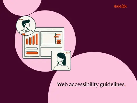
8. Make it accessible.
Finally, your login page is the gateway to your site, so make it one that all users can pass through. If it isn’t web accessible, you’re limiting access to a large portion of your users that rely on assistive technology and well-structured web pages. Not to mention making sure your login screen is accessible for all users is the right thing to do.
As is true with all your pages, ensure that users can tab through elements on your login page, that HTML is coded semantically, that form fields and buttons are labeled properly, that color contrast is sufficient, and that the page works with JavaScript turned off.
The simpler your page, the easier it will be to achieve web accessibility compliance. Take the New York Times login: a simple login screen that retains style and accessibility.

What we like about this example: This login page keeps high color contrast, a simple layout, and well-coded HTML.
9. Allow visitors to create an account right there.
We’ll be the first to admit this seems obvious, but it’s worth a reminder. Be sure that you also offer users the opportunity to create an account if they don’t already have one. Yes, as we mentioned earlier, it’s important to separate login and sign-up. But it’s equally important to ensure visitors don’t have to search around for the sign-up page. If you’re building a mobile app, your users should be able to make a new account right then and there — without visiting your website on desktop. Alternately, desktop users shouldn’t be prompted to head over to the app to create an account.
What we like about this example: The Rent the Runway login pop-up allows you to log in with your email, social media, or to create a new account. We like the placement and how the bold color and font pop against the background.
10. Let users save their login information.
Last but not least, give users the option to bypass the login process next time they land on your website. Let’s face it: Remembering multiple passwords can be tricky. Therefore, your visitors can rest assured knowing the next time that they land on your website, they won’t have to try to remember it. Instead, it will already be stored and waiting.
This login screen example from Spotify demonstrates just how effective it can be.
What we like about this example: Users can quickly toggle to turn on the ‘Remember me’ feature on Spotify’s website. We love how visual this addition is.
Must-Haves for Login Screens
When considering the overall user experience of a website or application, every detail matters and your login screen is no exception. Whether a user is logging into your site for the first time in a while or the first time ever, the process should be seamless.
Since we see login screens all the time, it’s easy to take their careful designs for granted. However, poor login experiences will stand out to visitors, so putting in the extra effort to get it right will be worth it for your users and for your bottom line.
Editor's note: This post was originally published in February 2022 and has been updated for comprehensiveness.

Website Design