Well, think about a window with a discount that blurs the information you were just reading. These boxes that appear when you’re visiting a site are modals. They require you to take action (fill out a form) or click away (hit the X symbol) to return to your browsing.
Love them or hate them; you will notice modals! In this post, I'll share my experience with modals. That includes what a modal is in programming and tips on how to use them to get the best results for your site. Let’s dive in!
Table of Contents
- What is a modal in programming?
- Benefits of Modals
- Cons of Modals
- When are modals used in web design?
- Modal Window Best Practices
- How to Implement Modals in CSS
What is a modal in programming?
Modals are elements that overlay the main window. Modals work simply: the page fades out, and a small window appears on the screen with a message or prompting an action, like signing up for an email list or downloading a content offer.
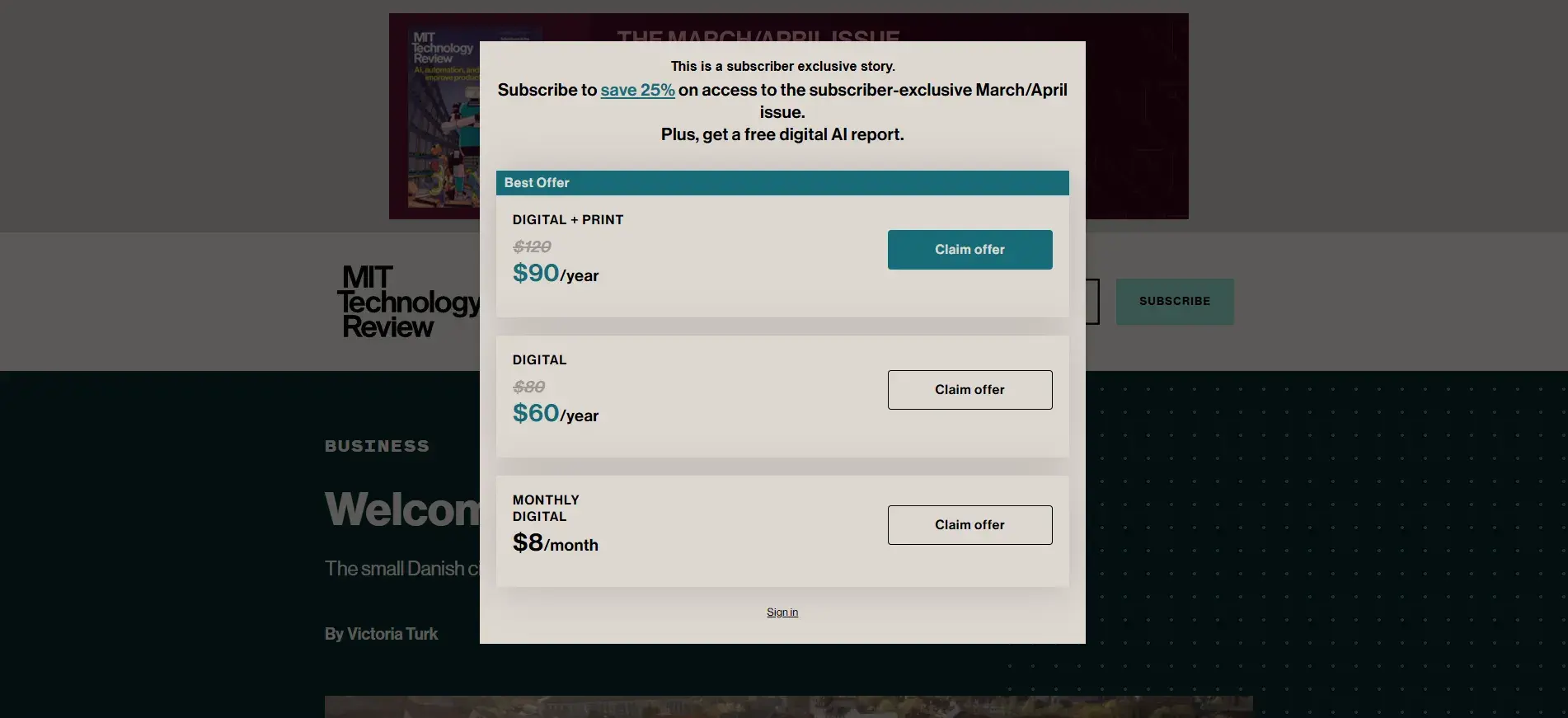
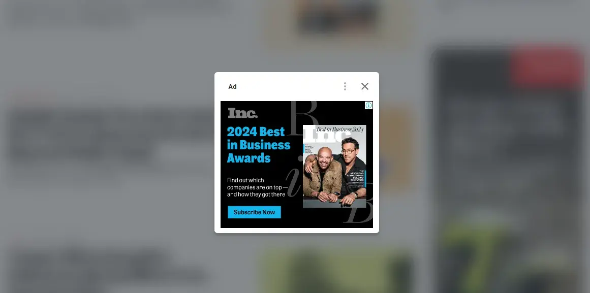
Here’s a simple example from the MIT Technology Review. The publication uses modal prompts to invite readers to subscribe to their exclusive stories.
Modal vs. Modeless
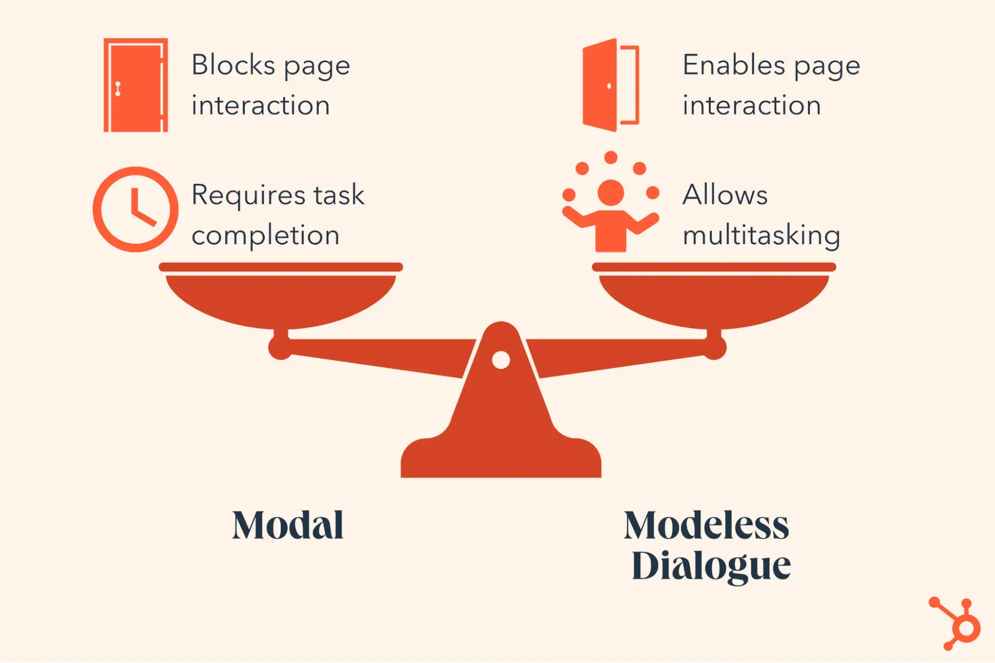
We usually call the popup elements “modal” because they temporarily take control of user interaction, requiring you to focus on a specific task before continuing. A modal window blocks interaction with the rest of the page. You need to complete or dismiss an action before proceeding.
The opposite of a modal element is a “modeless” element, which allows you to continue interacting with the main page while the dialog remains open. You can always interact with parent content while a modeless element is open.
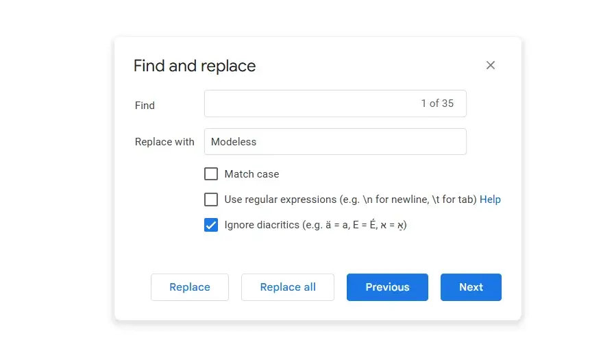
For example, I wrote this article in a Google Doc. When I use the Find and Replace function, a modeless box appears. I can move this box out of the way and keep typing in my document. My ability to work on the document is not impaired.
So far, floating chat windows, persistent search bars, page side panels, and formatting toolbars are excellent examples of modeless elements. These elements provide a flexible user experience and are ideal for multitasking.
HubSpot's Free Website Builder
Create and customize your own business website with an easy drag-and-drop website builder.
- Build a website without any coding skills.
- Pre-built themes and templates.
- Built-in marketing tools and features.
- And more!
Modal vs. Pop-Up
There is only one basic difference between modals and regular pop-ups: they look practically equal. Once you get the modal on your screen, you can't interact with other elements on the page. You either take immediate action or dismiss it using the button if available. There is no in-between.
In contrast, pop-ups are modeless designs. A pop-up gives you enough freedom if you choose not to interact. You can continue interacting with the page content while the pop-up remains on the screen until you engage.
Benefits of Modals
Whenever I encounter a modal on a site, I have to stop and interact. That helps me refocus on and make decisions about newsletters, discounts, and other offers. Sometimes, they convey important information — like warnings, confirmations, or login prompts.
Aside from demanding attention, modals present additional benefits, including the following.
Modals offer simplicity.
Modals keep things simple. Everything stays within one tab, helping visitors stay connected with what they were doing before the modal appeared. Big tasks — like checking out, filling out forms, or setting up an account — are broken down into smaller steps using modals.
Modals save space and effort.
Modals let you set extra content like a form, video, or quick message in a lightbox rather than opening a whole new page. Once created, a modal component can be reused throughout your application. You define the structure, styling, and behavior once, then launch it wherever needed, saving you time.
Modals guarantee visibility.
If prompts appear in a new window, the user may miss or instinctively close out before they even read the information. However, modals appear within the user’s active tab, so you can be sure information reaches the visitor.
Beyond that, modals often dim or blur the background content while bringing the modal content to the foreground. This visual hierarchy improves visibility.
Cons of Modals
Modals are as good as you make them, and they have drawbacks that you should consider before placing them all over your site. Remember, implementing these features thoughtfully will improve your results.
Modals interrupt visitor workflows.
I hate it when a modal appears while I'm reading or typing. It disrupts my focus and attention and requires me to remove it before I can return to work. I get frustrated when I’m interrupted, just like everyone else.
Avoid placing modals over areas of your site that already have high levels of interaction (like the pages where people need to type and work). If you have to use a pop-up or modal, use them sparingly on these pages.
Modals look worse on mobile.
Modals can be a great way to grab attention on desktop, but on mobile they can overpower every other site element. Modals can cover almost everything on the display. The “X” button often renders too small or on the edge of the display, making it hard to tap.
Modals can also be frustrating. You might reload the page to get rid of the box, and it just appears again!
Modals can’t be bookmarked.
Sometimes, I find useful content within a modal and want to save it for later. However, I can’t bookmark or share the link because modals don't have web addresses. If I close the modal, I have to reload the page to get it back.
Modals may create accessibility challenges.
If you use screen readers or the keyboard to navigate, you may struggle with modals. When modals open, keyboard focus often doesn‘t automatically move to the modal. After closing, the focus rarely returns to the place you were before the box appeared. This creates disorientation for screen reader users who can’t see where the focus has moved.
When are modals used in web design?
Over the years of working with content, I have learned that modal windows are inevitable. They are effective anytime you need users to see or do something specific. They typically appear after a trigger event, such as a button click, scroll, or exit intent. However, using modal dialogs effectively is only one part of creating great content experiences.
You need a proper content strategy to deploy modal windows and marketing content through different forms and channels. You can use tools like HubSpot’s Content Hub to add morals to your site. This CMS and others can help you create, manage, and optimize content across multiple channels.
HubSpot's Free Website Builder
Create and customize your own business website with an easy drag-and-drop website builder.
- Build a website without any coding skills.
- Pre-built themes and templates.
- Built-in marketing tools and features.
- And more!
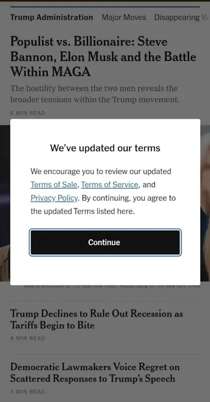
Warnings, Alerts, and Confirmations
If there‘s one thing I’ve learned, modal windows work best when you truly need to interrupt the user. They are excellent at directing attention. A modal window can contain an alert about a significant event or error, a warning about the consequences of some action, or confirmation of a completed process.

I have used modals only for critical messages. For example, errors that actively prevent a desired action from being completed (e.g., "We could not complete your request due to a server error. Please refresh the page and try again.”)
Modals can also remind visitors about actions they can't revert (e.g., “Are you sure you want to continue?”). That’s an important stopping point your user should be aware of. A “cookie policy” alert, not so much — save this for a modeless notification window or bar.
Pro tip: Make sure that the modal contains enough critical information. Interrupting a user can lead to a negative user experience. Ensure the message justifies the disruption.
Forms
I’ve found that forms inside modals work best for quick user inputs. If a process on your website requires user-submitted information, you can place a form inside a modal window. You’ll see this often as an alternative to a dedicated login/signup page. Modals with forms also promote email newsletters, content offers, or discount codes.
Many premium websites, such as the Boston Globe, restrict their content to members only. Modals remind users that they need to subscribe to access the content.
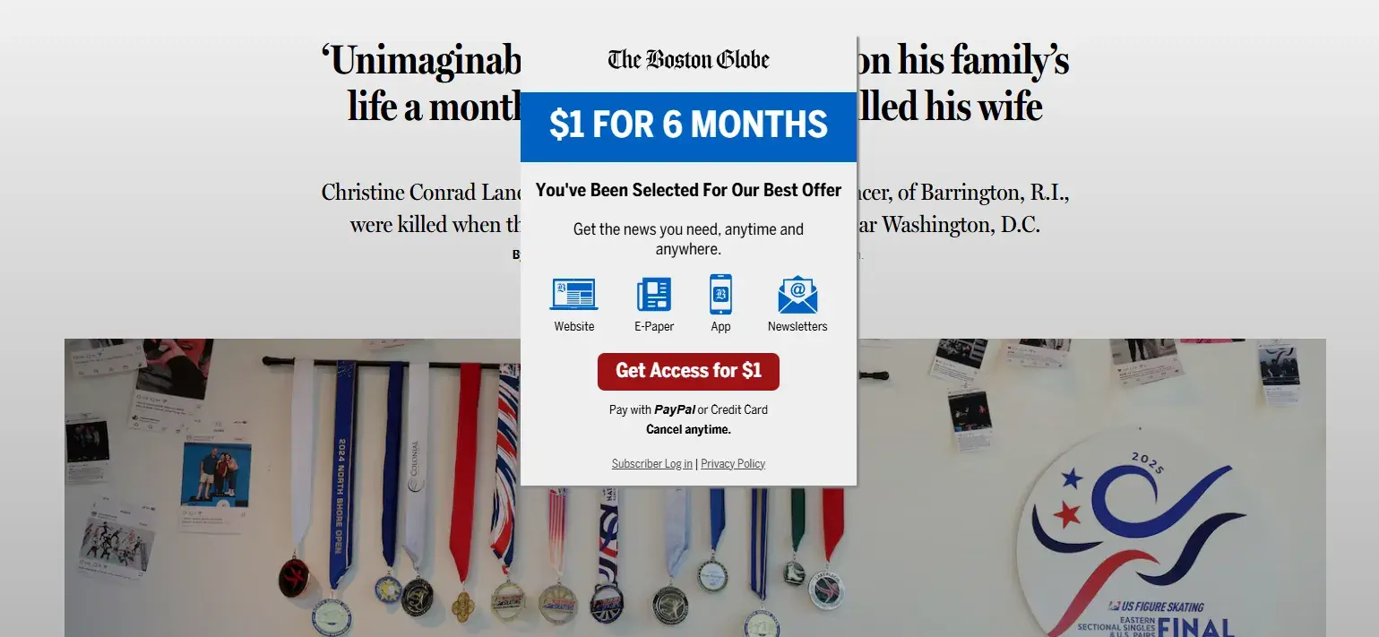
Usually, the trigger for this type of modal window is a CTA click or other button click, but it’s also common for sites to throw a modal after a scroll event. It’s up to you whether you feel this trigger is too distracting, but know that some visitors will be bothered if they consider it irrelevant.
Media Displays
One of the most effective ways to increase media engagement is to display images and videos in modals. I’ve personally noticed this approach works exceptionally well in portfolio websites, ecommerce product previews, and news media galleries.
Media often supports the main content of a webpage and sets the tone for the browsing experience. If an image gallery or video is a focal point on your website, a modal window allows visitors to view it without navigating to another page.
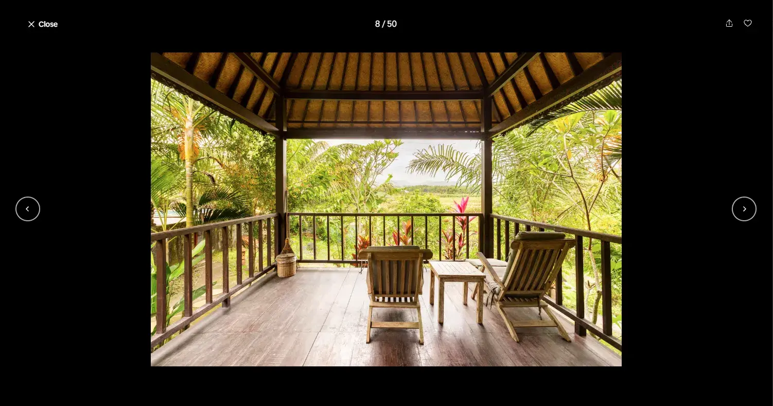
For example, you may click a thumbnail on the parent page, which opens a modal for a gallery of related images that is easily navigable with arrow buttons on both sides of the window. Airbnb does it perfectly to showcase property images.
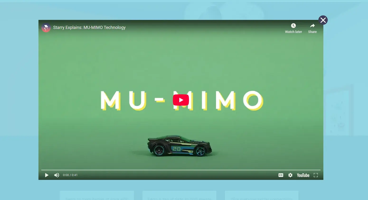
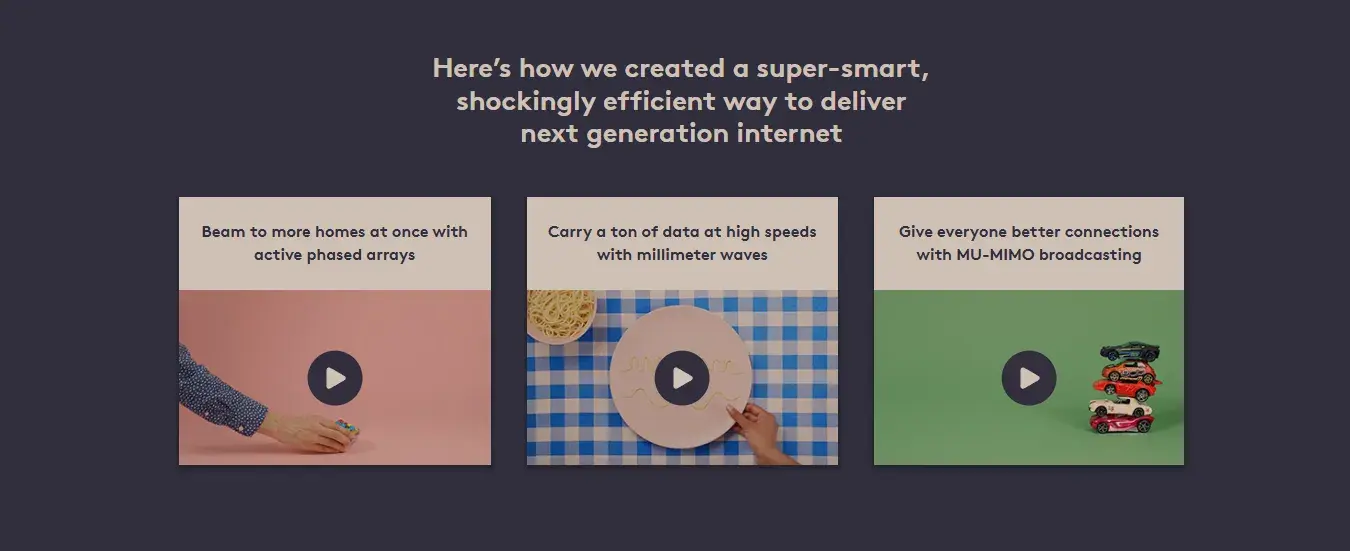
A thumbnail can also open a video modal, which displays the video like its own little theater and then closes once the video completes. Internet service provider Starry’s website information page lists a few videos that present this way:
Pro tip: Use media modals to keep your page clean — display images and videos through thumbnails, opening them in a modal to save space and enhance user experience.
Multi-Step Processes
For longer, more energy-intensive actions on your website — creating a user profile, signing up for a service, or completing a tool setup — consider separating each step into its own modal window so the experience feels more manageable.
This technique is common in software applications as a “wizard” or “installer guide.” You can show the progress within the window as a bar, a sequence of small dots, numbers, or other indicators.
Multi-step processes are primarily effective for:
- User onboarding.
- Checkout processes.
- Software installation wizards.
- Form-heavy interactions.
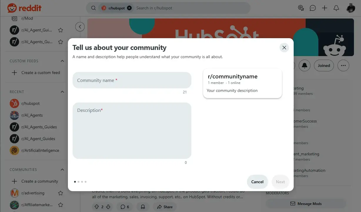
Reddit does this well with its new community creation process. Notice the progress indicator at the bottom.
Modal Window Best Practices
Over the years, I’ve worked on countless web projects, and one thing I’ve learned is that modals can make or break the user experience. When designed well, they guide users smoothly through key actions. But when used poorly, they disrupt, annoy, and even drive visitors away.
Users today are so familiar with modals that they instantly recognize when one is useful and when one is just an unnecessary distraction. If you want to make sure your modals enhance — rather than frustrate — stick to these best practices.
1. Use modals intentionally and infrequently.
Modals are disruptive by design. If you've noticed, they pull you out of the flow and push for immediate interaction. Popping them up for every little action is a high cost for the user. So, try to use modals sparingly.
From what I've learned, a modal makes the most sense in these situations:
- Warnings and alerts. Only crucial errors and permanent actions should prompt a modal display.
- Forms. Stick to essential forms only, like login prompts, short feedback requests, or payment confirmation steps. All steps in a multi-step modal process should be highly relevant to the users' end goal.
- Other interactive elements. Use a modeless display instead for any interactive elements or steps that don't qualify.
HubSpot's Free Website Builder
Create and customize your own business website with an easy drag-and-drop website builder.
- Build a website without any coding skills.
- Pre-built themes and templates.
- Built-in marketing tools and features.
- And more!
2. Deactivate all background elements.
One mistake I frequently see is modals that still allow users to interact with the background page. To effectively draw all attention to the modal, you should visually and functionally phase out all background elements behind the child window.
To keep things clear, always make sure:
- Darken background. Blur or darken the background to indicate that the modal is the main focus. Dropping some shadow around the modal can also create this effect.
- Deactivating functionality. No page element outside the modal window is clickable. Any extra functionality from the parent page will confuse the modal's purpose.
- Turn off scrolling. Scrolling should be disabled while the modal is open.
Pro tip: Users should never have to refer to the parent page to complete a modal action. If a user needs extra info from the main page, then a modal isn't the right solution.
3. Write clear instructions and button text.
Vague or confusing wording has no place in modals. All modals should have title text stating their purpose or action to make it useful for the user. Every word in a modal should impact the user. Write your button text and other action prompts to be concise and intuitive.
4. Give users an out.
Nothing irritates me more than a modal I can’t easily close. I often had to close the page to get out because the modal had no escape. You can see what Reddit Pros think about needing a close button, ESC key support, and proper keyboard focus for accessibility.
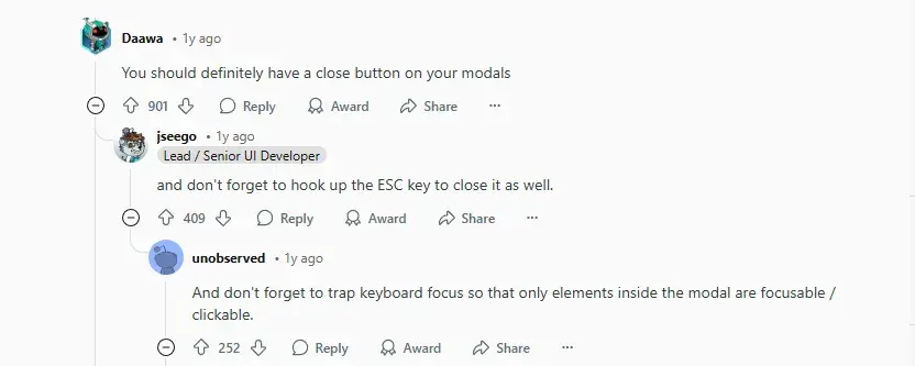
Well, the internet has spoken; if your modal traps users, it’s bad design!
An effective modal should always allow users to close it in at least one of these ways:
- Pressing the Escape key.
- Clicking an “X” in the top corner.
- Clicking outside the modal.
- A “Cancel” or “Close” button inside the modal.
Pro tip: Giving users breathing space and control is key to maintaining a smooth user experience.
5. Size your modal window appropriately.
One of the most frequent mistakes I have seen is using modal sizes that are too big or too small. A modal that fills the entire screen may lead you to believe you‘ve opened a new page. And if it’s too small, you might confuse it with an ad and glide right past.
But there's a sweet spot to stand:
- Limit modal to at most 50% of browser width and height.
- Ensure it is large enough to show all the content without scrolling.
6. Introduce and close the modal with a fade.
Modal transitions make a big difference in how users perceive them. If a modal just pops up suddenly, it feels jarring. It becomes distracting if the transition is too eventful (e.g., a slide-in) or flashy.
Include a transition effect to ease the switch between the parent and child windows. A brief fade-out of the background content and fade-in of the modal window will work well in nearly any scenario.
Back to our Starry example, note how the video modal quickly but smoothly fades into view while background contents are dimmed.
7. Limit modals on mobile.
All the design features I’ve shared work great for desktop screens, but mobile devices are a different story. The reduced screen size makes it harder to achieve the window-within-a-window look without appearing too large or too small.
Where you might place a modal on your normal site, consider adding a modeless element or placing your modal content entirely on a new page. If you still prefer modals on your mobile site, test to make sure they’re responsive, legible, and easy to use.
8. Design your modals for accessibility.
Here are some common practices to design modals with web accessibility in mind:
- Every clickable action in the modal should also be possible with the keyboard. The “Esc” key should close the window, and the “Tab” and “Enter” keys can select options.
- The keyboard should not access any other elements from the parent page if the modal is visible.
- The modal window should visually contrast with the background page.
- Transitions into and out of the modal should be smooth and non-flashy.
- Any images, video, or other media items should include descriptive alternative text.
- All text and media can be interpreted by screen readers and other assistive technologies.
How to Implement Modals in CSS
CSS and HTML alone are enough to add a basic and useful modal window to your site. With a bit of CSS know-how, you can tweak most of the modal design factors.
No matter how you implement your modal, use it only when necessary. It's okay to demand attention from your user, as long as it ultimately serves their end goal and provides enough value to justify a brief disruption.
Make sure each modal has a purpose in the visitor's journey and stick to these best practices for design and function to ensure a smooth user experience.
Editor's note: This post was originally published in September 2020 and has been updated for comprehensiveness.
HubSpot's Free Website Builder
Create and customize your own business website with an easy drag-and-drop website builder.
- Build a website without any coding skills.
- Pre-built themes and templates.
- Built-in marketing tools and features.
- And more!
Website Design