Curious about website button design? Not sure how (or where) to get started? Don't worry, I got you covered.
Table of Contents
- Button UI Design Guidelines
- Button Design Examples
- How to Create a Website Button
- Button Design CSS
- Website Button Makers
- The Button Bottom Line
Button UI Design Guidelines
There’s no absolute right or wrong way to design a website button. Experienced developers know that just about every rule can be broken to achieve a goal successfully. However, I follow some best practices when designing buttons without much trial and error.
Below, I’ve outlined some design practices to give you a crash course on creating attractive buttons like us pros.
Predictable Placement
Because buttons add interactivity to all websites, users have preconceived expectations about where buttons should be on a webpage. For instance, can you imagine an e-commerce website that doesn't use a button to signal a user to submit a payment? That would be pretty confusing and possibly result in a loss of sales. This is why designing your buttons based on user expectations is crucial for a more intuitive layout.
The bottom line: Buttons should be easy for users to locate and use. The key is to know where your user button assumptions are. Here is a list of the most common button placements on a website:
- Navigation. Menus often include buttons to help users navigate to different pages.
- Forms. Buttons are typically used on forms for submitting, resetting, or canceling forms.
- E-commerce pages. Buttons are crucial for product pages. They are typically used near the product description and allow users to add items to their shopping cart. They can also be found on the checkout screen, signaling users to submit payment.
- Content pages. Articles, blog posts, or social media sites often have Buttons for sharing, commenting, or subscribing placed at the bottom of the content.
- Modals and Pop-ups. Buttons for closing, confirming, or canceling actions are usually found inside the modal or pop-up window.
- Footer. Almost every major website has a footer that contains buttons for contact information, legal information, and social media links.
Here’s a button example from HubSpot’s landing page — prompting new users to book a demo or try a free trial.

Action Verbs
A CTA (call to action) is a piece of text that calls a user to take action. If labeled properly, buttons can be a great example of a CTA. I recommend labeling your buttons with action verbs describing what will happen when users click them. I always aim to create smooth interactions for my users, and using clear, descriptive text for buttons is a perfect way.
Here is a list of some common verbs used to label buttons:
- Sign Up
- Submit
- Download
- Learn More
- Start Free Trial
- Subscribe
- Contact Us
- Search
- Pay Now
- Shop Now
- Find out more
- Continue
- Add to cart
- Login
Avoid Unnecessary and Misplaced Buttons
As a developer, I advocate for clean, intuitive web designs. Although buttons may seem small, they significantly impact our layouts. Too many or misplaced buttons can confuse and overwhelm users.
If your buttons aren’t placed in an area that sets the reader up to learn more or make a purchase, a lone button in the middle of a paragraph won’t help and could make matters worse. Keep things simple by avoiding unnecessary buttons and adding them only where you need the visitor to take action.
Unnecessary Button Use Example
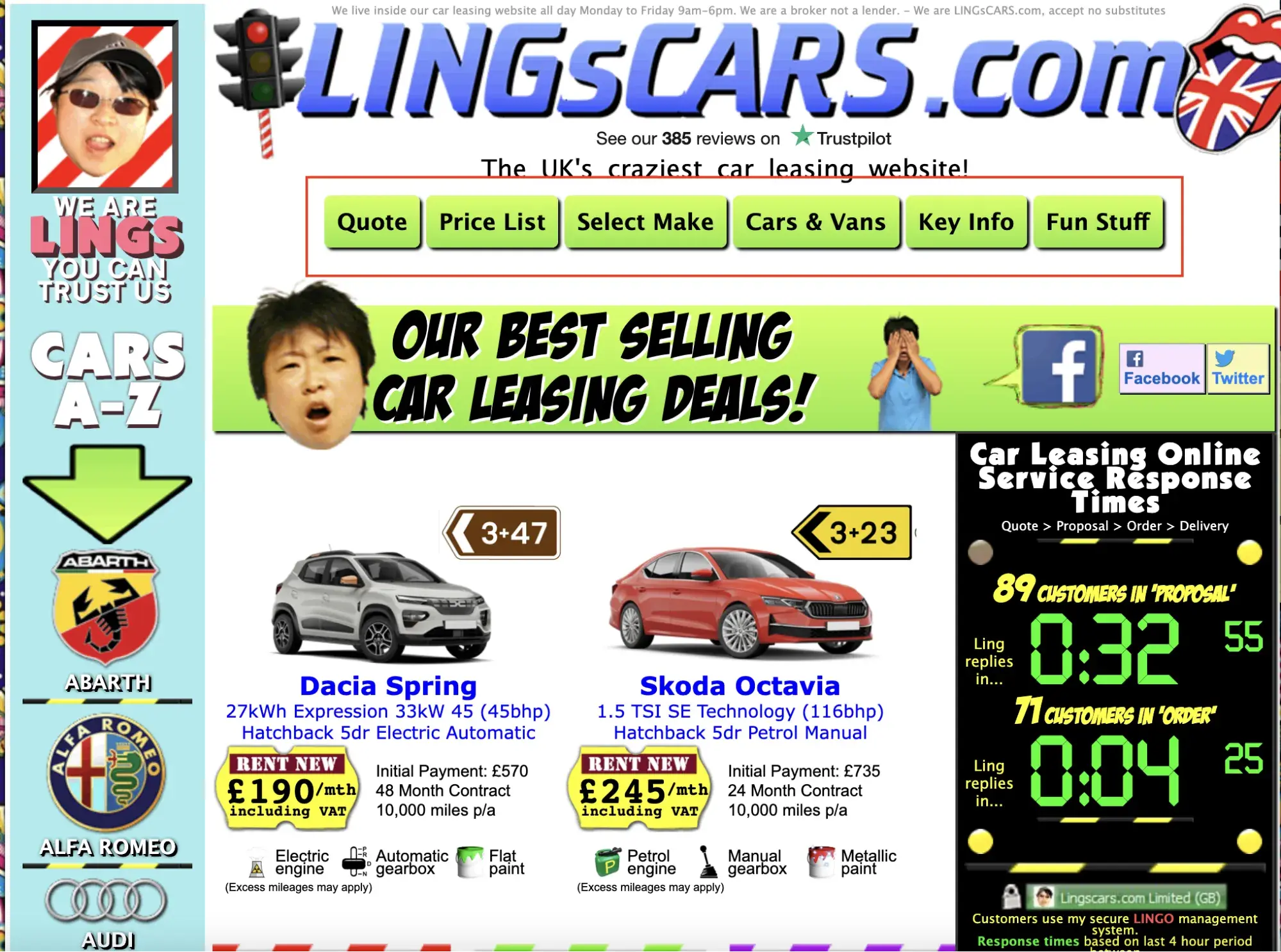
The landing page for Lings Cars is an excellent example of using unnecessary buttons and misplacing them. The options inside the red box need to be correctly classified as buttons. Remember that buttons perform an action while links take you to another page.
Necessary Button Use Example
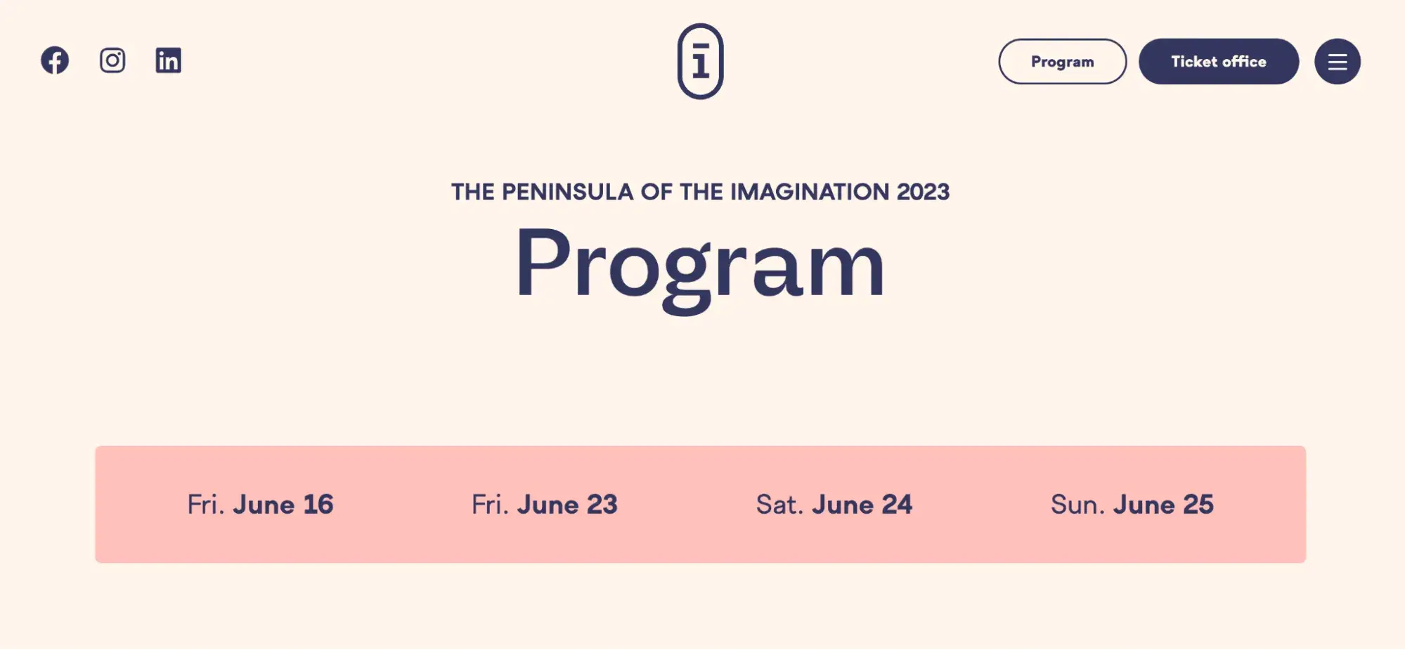
The buttons for the Festival-presqu'ile site are great examples of clean website button design. In the header, they have their social platform icons to the left and three buttons to allow users to quickly take action — to the right.
Users can quickly explore information about the program, purchase tickets, or use the menu button to find other pages to navigate. My favorite button is located in the middle of the header. Users can easily navigate back to the home page with one click.
Proper Styling
When styling buttons, I adhere to a few best practices. Let’s go over them.
- Size: I aim to make all buttons the same size across my layout. My buttons must also be proportional to the elements around them on the screen.
- Shape: It’s pretty popular to use rectangles to shape your buttons. However, this is completely optional and depends on the style and vibe you want to display in your website design. I recommend you try to minimize the number of shapes you use throughout your webpage.
- Colors and contrast: I use contrasting colors between the text and the button background to make my buttons visually appealing. Try to achieve a contrast ratio of at least 3:1.
- Typography: I recommend keeping your text clear, concise, and contextual. This means trying to aim for two words or fewer on your buttons. In terms of context, ask yourself — Where does the button lead? What does it do? This will help you make sure the button’s text describes its action. Don’t forget the text placement. Use the padding or margin properties to properly align the text inside of your button for design purposes.
Feedback
Imagine you are on a website trying to buy a new pair of shoes. You enter your credit card information and hit “pay now,” but you don’t receive any communications telling you whether it was successful. You retry the transaction, and you are charged twice. You will likely not be a happy customer if you experience unnecessary mistakes. I avoid mishaps by giving users feedback when clicking buttons via messages or micro-interactions.
Micro-interactions are small visual cues that let users know the status of an action. For example, if you are developing an e-commerce store, you can show the number of items a user has added to their cart near the cart icon. As the user hovers over certain buttons, you can change the color.
You can also show messages to communicate a successful action to your user. I usually dynamically set the message to show whether the action was successful or not using a message on the page or a quick pop-up.
Giving feedback can be done in many ways, but here are two simple examples:

The image above is an excellent example of a micro-interaction. It shows the user how many items they currently have in their cart. This is a great way to help users avoid checking out items by mistake, which can reduce returns.
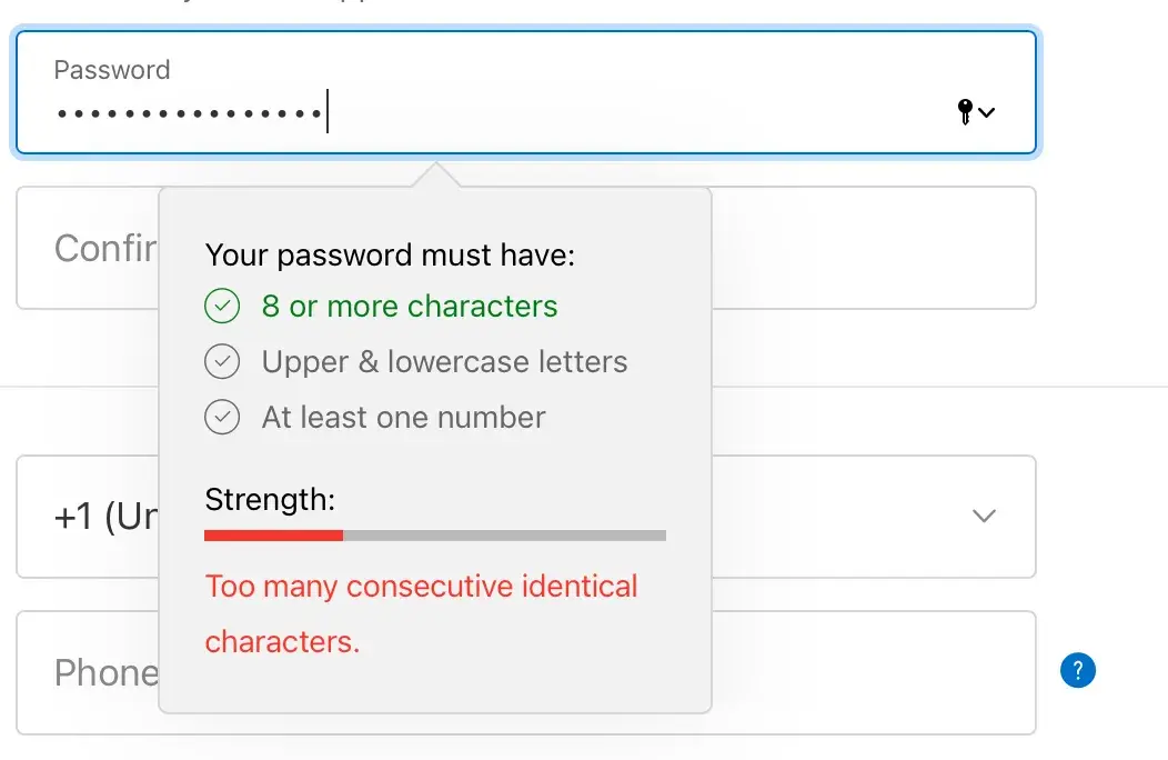
The above image is an excellent example of feedback shown in a pop-up. The message informs the user that their password has not yet met the requirements.
Button State
A button’s state refers to its visual appearance when it is currently shown or interacted with by a user.
Here are the different button states and what they mean:
- Default — The initial appearance of the button before any interaction.
- Hover — How the button appears visually when the user hovers over it with a mouse pointer.
- Active — How the button appears visually when the user clicks or taps on it.
- Focus — How the button appears visually when it's focused on via the keyboard.
- Disabled — How the button appears visually when it is not operable.
Developers can create a visually appealing and intuitive user experience by carefully designing these states.
Accessibility
As I aim to create websites that are accessible to everyone, I follow accessibility guidelines when designing website buttons. Ensuring significant color contrast between the button’s text and background is essential.
Pro Tip: Be sure to check out WCAG for color contrast ratios about accessibility. It’s important that the buttons are the right size and easily clickable.
I also ensure proper spacing surrounding my buttons and other elements to avoid unnecessary frustration caused by accidental clicks.
Remember when we talked about button states? That comes in handy with accessibility, too. It’s important to give visual cues to let users who use the keyboard to navigate websites when a button is selected. Remember to use clear and concise labels to define a button’s function.
Last but not least, Aria attributes are used to let the assistive technologies know that the element is, in fact, a button. Users may use assistive technologies to help them navigate my websites, so I must design my buttons with this in mind.
Testing
After following the guidelines above, I test my buttons to ensure they function correctly. While you can test your buttons in many different ways, such as automated testing using a framework like Cypress or user testing, which consists of observing a user using your website and gathering feedback, I always opt for manual accessibility testing.
I click every button during manual testing to ensure it functions appropriately and leads to the correct action. For example, if I have a button labeled “buy now,” it should lead to a page where users can input their card details rather than another page describing the product they want to buy. If I have buttons designed to change upon hover, I verify that the appearance changes as expected. I also verify that my button's appearance changes based on its state as created.
For accessibility testing, I use a screen reader like NVDA to ensure my buttons are announced properly. I use the keyboard only to navigate the entire website and ensure the button's focus state is updated when selected by the keyboard. To test button contrast, I use the free feature on Aditus to check if my color contrast ratios are accessible.
Button Design Examples
1. Nike
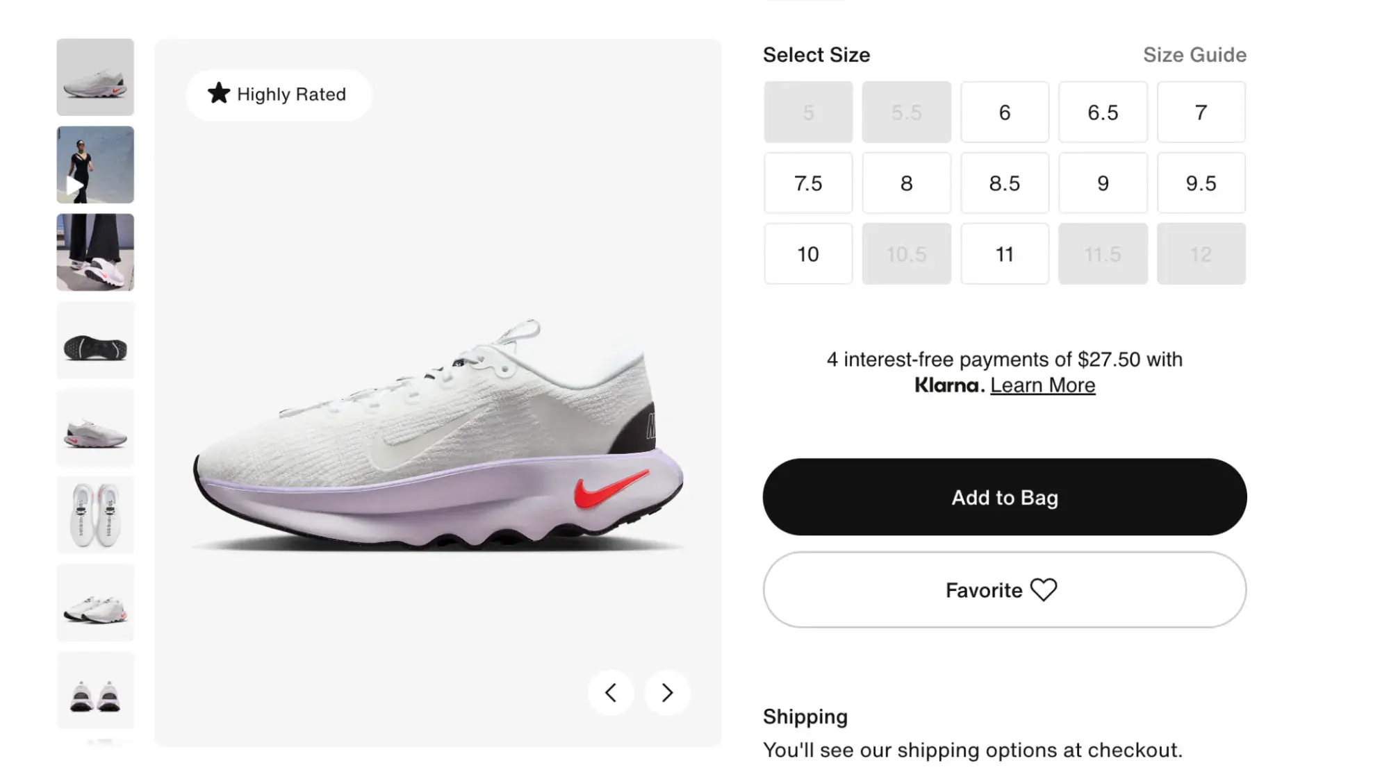
Nike’s shoe product page is the perfect example of excellent website button designs. Nike is a global athletic shoe and apparel retailer. I attribute its overall design success to its sleek gray, black, and white color scheme and perfectly placed elements, specifically its buttons.
The goal of this product page is for users to see available selections, select what they want, and add the shoe of their choice to their shopping cart. This can be easily accomplished thanks to the developer following the standard button design guidelines.
The button gallery of sizes catches your eye as soon as the page renders. I can easily see if my size is available thanks to sizes that aren’t available, such as those with a light gray background that looks distinct from the white default buttons.
Using larger buttons for the “Add to Bag” and “Favorite” is a great opportunity to guide the user flow on the page and allow them to easily find the next button after selecting a shoe size.
What I like: The buttons on the page follow a “minimal and necessary” approach that doesn’t overwhelm the user or make the page appear congested.
2. Medika Health Clinic
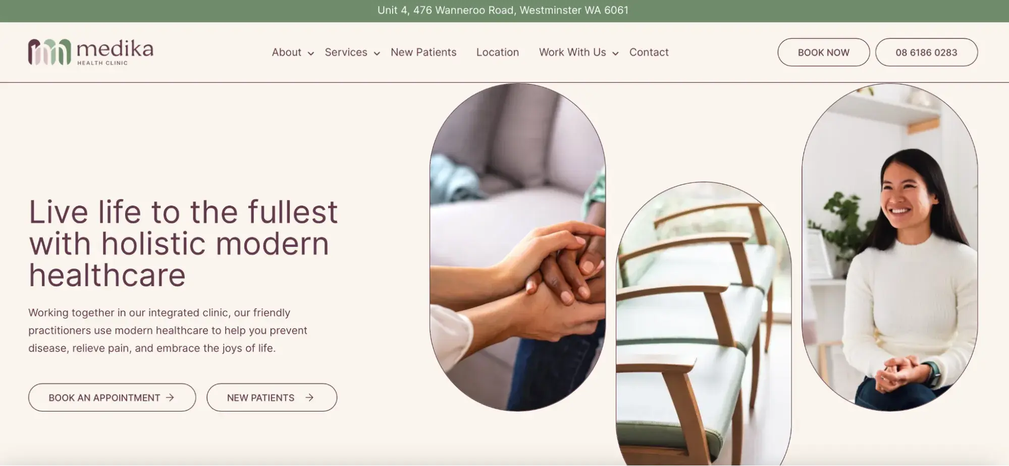
I’m a huge fan of keeping designs consistent and clean, so I had to choose the Medika Health Clinic for this list. The clinic offers general health services to those looking to treat illnesses or satisfy preventative maintenance.
As you scroll the page, you can see that all buttons are consistently designed to have the same text and background color with the exception of one button. This is great for users because they can easily identify all buttons on the website.
Pro Tip: Use tools like Aditus to verify that your button text and background follow a 3:1 contrast ratio at minimum.
I tested the contrast rule on the Medika Health Clinics website using Aditus, and it passed with flying colors.
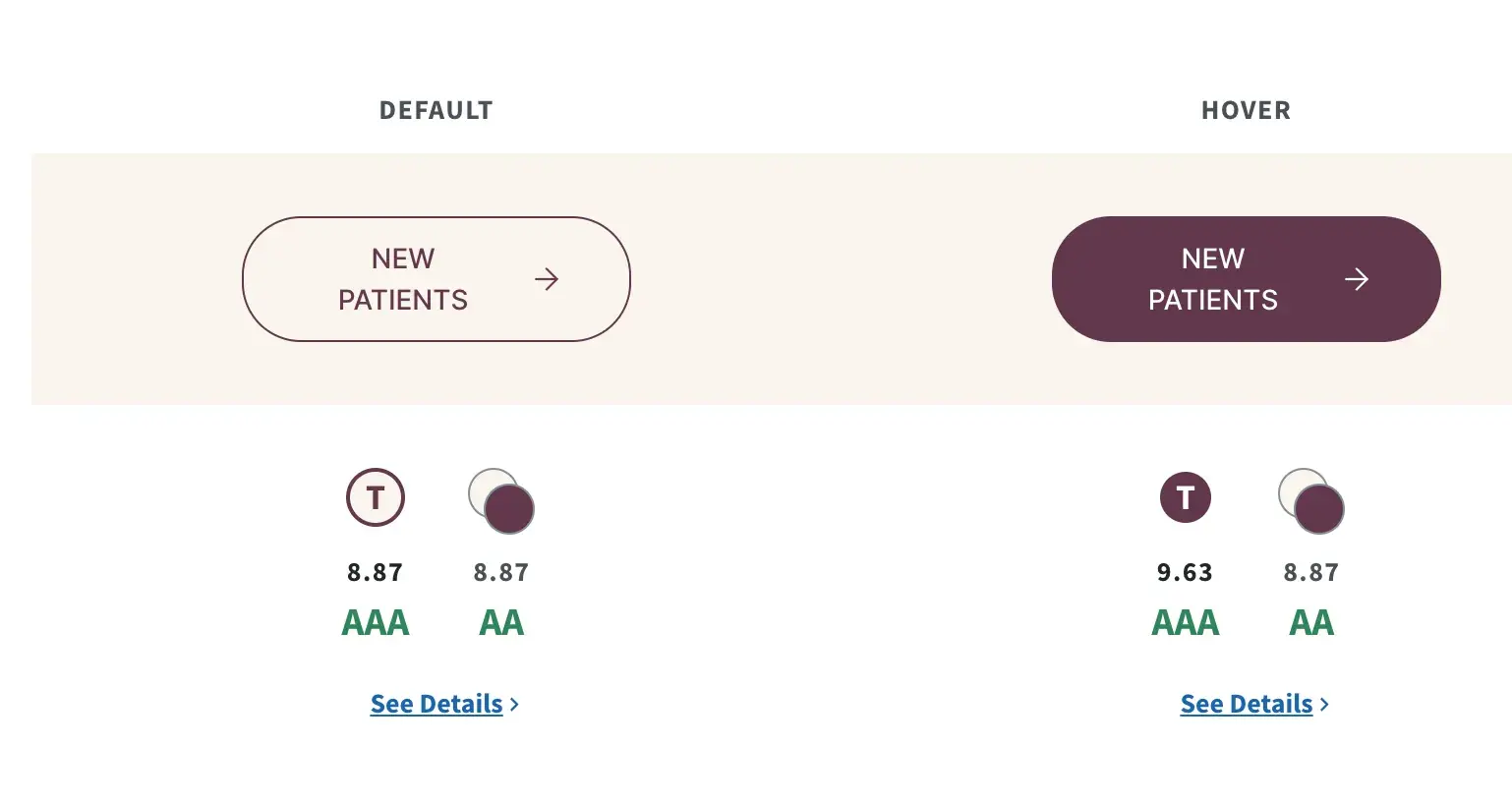
Aditus graded the contrast for the default state and its focus state AAA, which means its contrast ratio meets the minimum 3:1 recommended.
3. Pittori Di Cinema
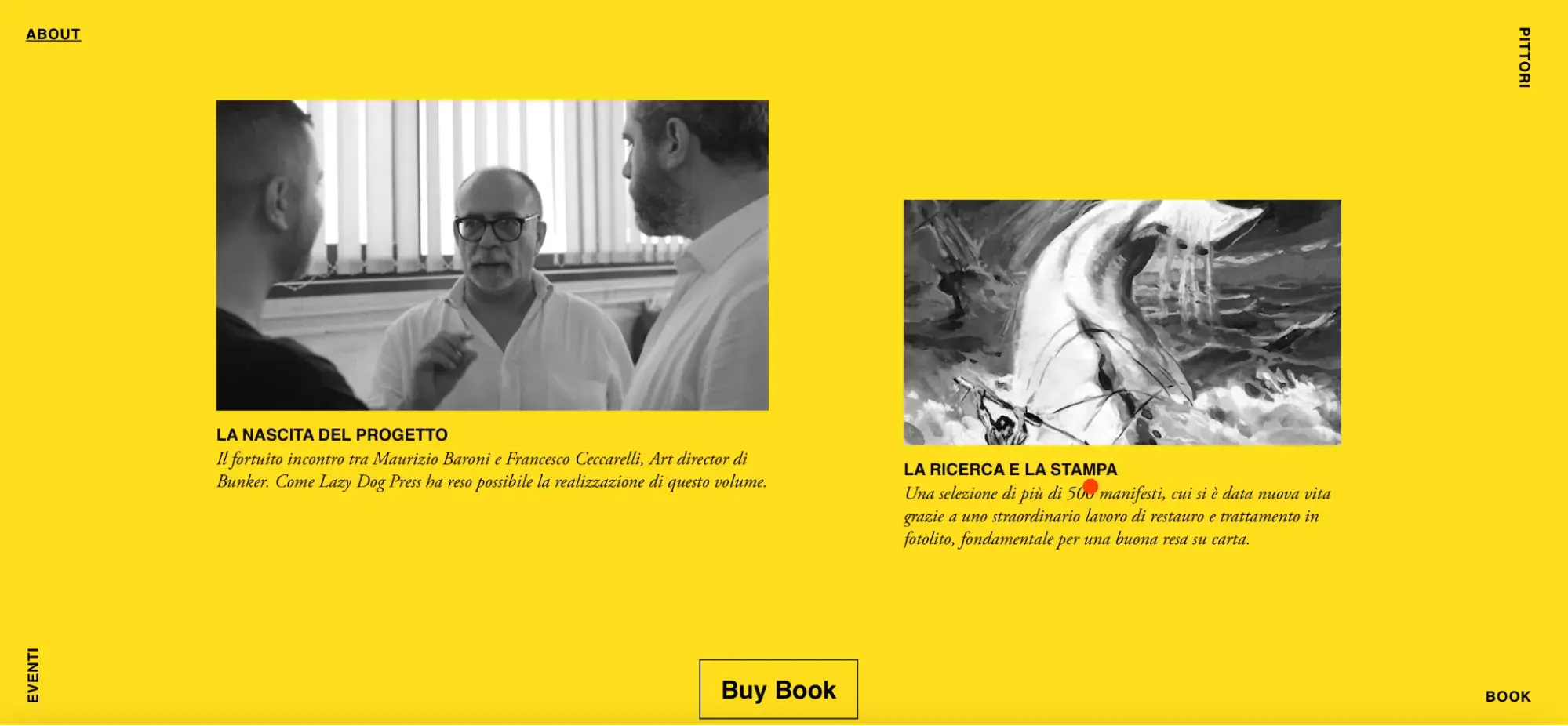
I always enjoy scrolling through websites with unique effects and layouts. The Pittori Di Cinema website is one of a kind. It’s a webpage that allows you to learn about Italian art and purchase a book full of rich paintings.
As I scrolled the page, I felt like I was browsing art in various media forms in an art gallery. What impressed me was how the “Buy Book” button followed me as I scrolled up and down the page.
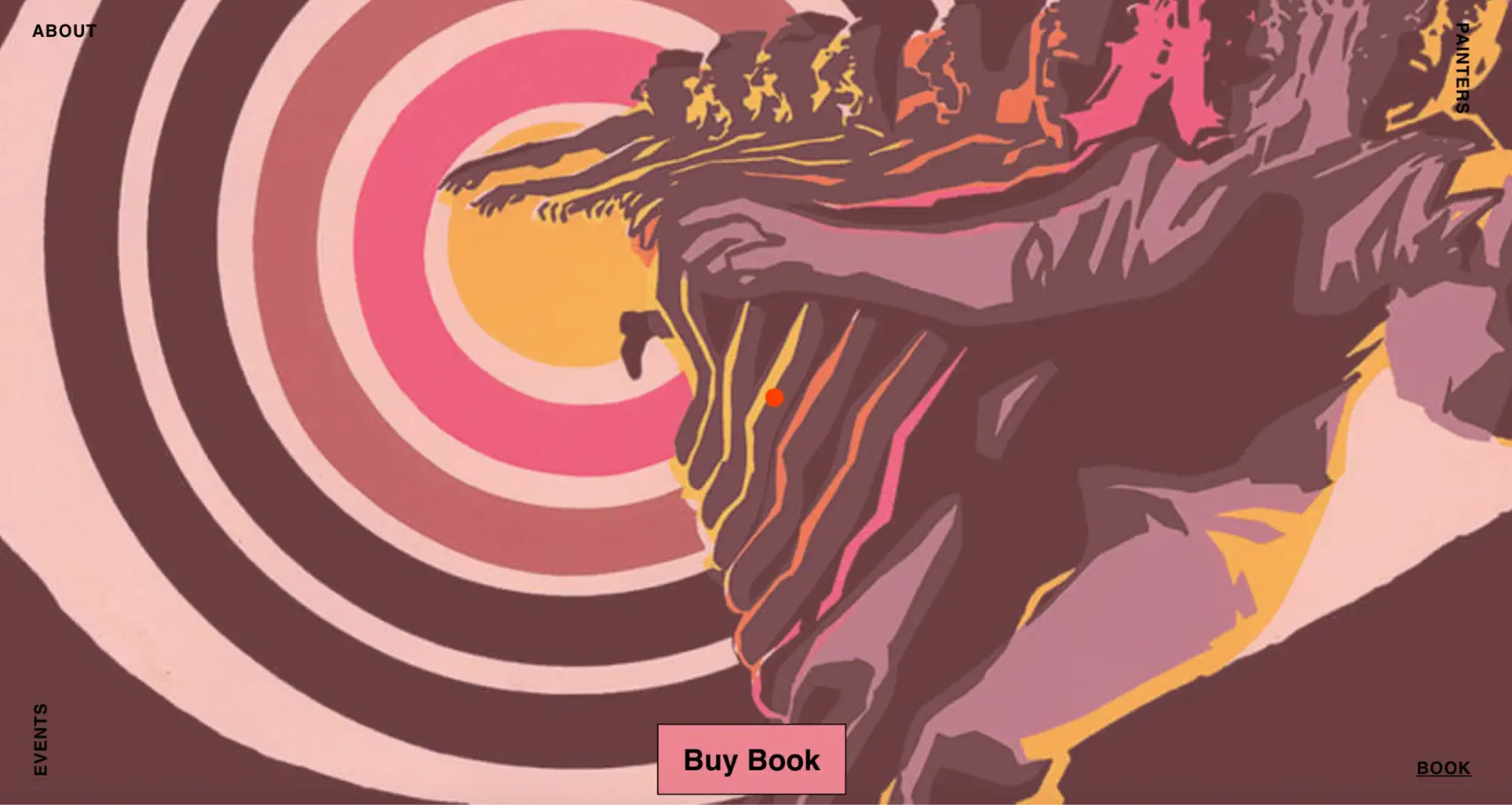
The text remained black throughout my visit, but the button’s background color changed based on the site’s color. The button also always remained at the forefront of the elements, always making it the center of attention.
This button is a great example of making your users notice your button and using the perfect words to describe what will happen if they click on it. The entire website design made me eager to know what was behind such an important element as small as a button.
4. Reddit
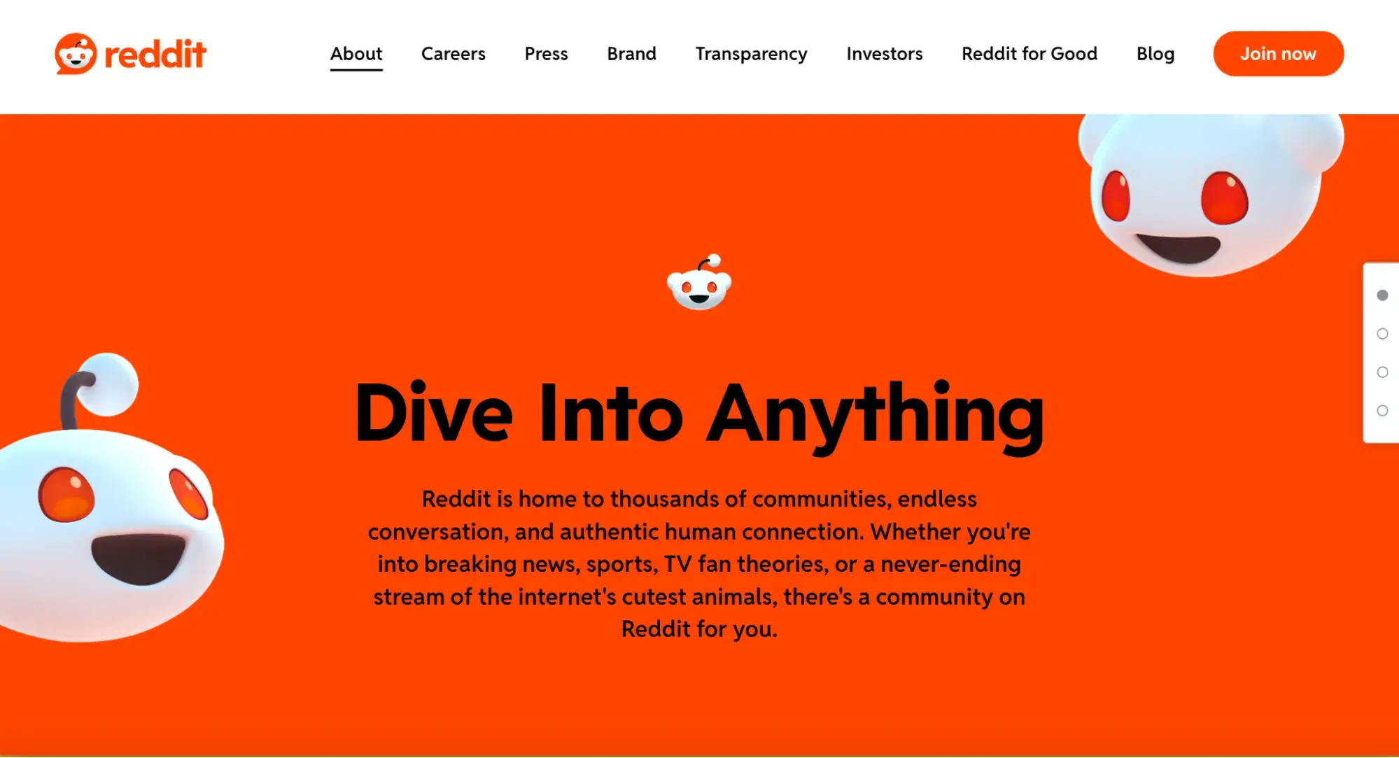
If you’re a frequent internet user, chances are you’ve stumbled upon Reddit — the online social community where users share and engage with different types of content. Reddit is a busy digital hub with over 1.2 billion monthly active users. Despite being drowned with content, the platform’s developers have skillfully incorporated subtle button design elements to enhance user engagement and provide clear instructions for interaction.
One prime example can be found in the comments section of a post.

The buttons are reasonably spaced 12 pixels apart, making each button easily distinguishable. The hover effect — changing the color to a darker gray background — provides visual feedback when your cursor hovers over a button. Additionally, the up and down vote buttons change color to red upon clicking, a micro-interaction that instantly confirms your action. With so many website button designs shown here, it was a no-brainer to include Reddit on my list.
What I Like: I love having all the buttons to interact with a post in one spot.
How to Create a Website Button
What if you want to design your own button? Although basic buttons serve their purpose, you can also choose to dig deeper and add exciting effects — everything from buttons that change color when you hover over them to buttons with shadows, disabled buttons, or groups of buttons.
Your best bet for building? Button design in CSS (cascading style sheets). CSS is a tool that defines and describes how elements are displayed in HTML. Using a CSS editor, you can customize every aspect of your webpage, from headers and footers to sidebars and buttons. If you want to know more about how to style HTML with CSS, check out this helpful guide full of HTML and CSS hacks.
You can add CSS conditions to any website, but differing tools require differing levels of expertise. If you’re just getting started, WordPress is a safe bet — the platform makes it easy to access, add, and adjust CSS settings and build new buttons. Here’s how.
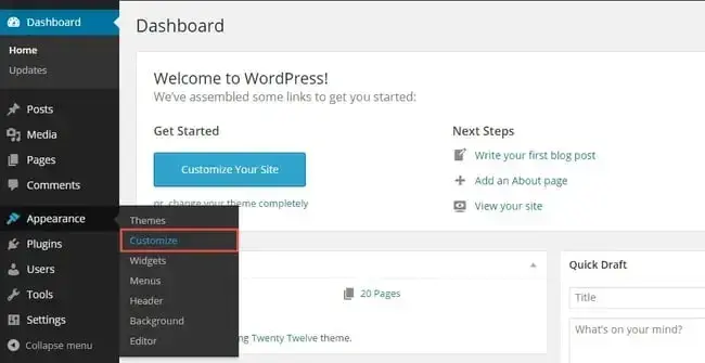
Step 1: Head to your WordPress dashboard and click Appearance > Customize.
Step 2: Next, head to the bottom of the left sidebar and click Additional CSS.
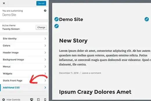
This will bring up a CSS editor page where you can enter any custom CSS code.
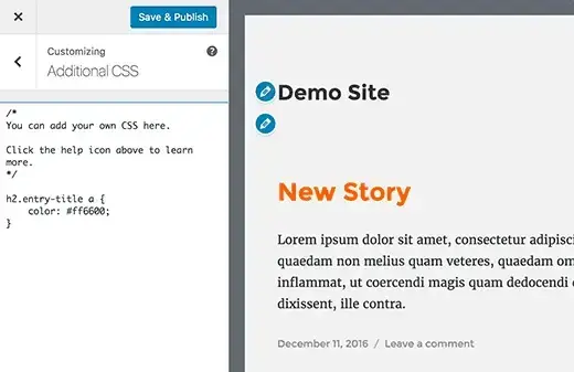
Now that you’re here, what should you add to build great buttons? It depends on what you’re looking for. Let’s walk through how to alter your button properties.
Button Design CSS
This code creates a basic blue button that users can click. You’ll notice there’s a line of HTML that makes this code work. Throughout this section, I’ll discuss how I use CSS and HTML to edit and customize buttons based on my website button design preferences.
See the Pen Website CSS Button by HubSpot (@hubspot) on CodePen.
Colored Buttons
I Use the background-color property to change the background color of my button.
See the Pen Colored Buttons by HubSpot (@hubspot) on CodePen.
Rounded Corners
Square corners aren’t always ideal. I use the border-radius property to change the border radius to round the corners of my buttons — the higher the pixel count (or percentage), the more rounded the corners.
See the Pen Rounded Corners by HubSpot (@hubspot) on CodePen.
Colored Borders
I use the border property to give my buttons colored borders with white backgrounds.
See the Pen Colored Borders by HubSpot (@hubspot) on CodePen.
Hoverable Buttons
I use the :hover selector to change the style of my button when users move their mouse over it. I can use the transition-duration property to change how the hover effect works.
See the Pen Hoverable Buttons by HubSpot (@hubspot) on CodePen.
Shadow Buttons
I use the box-shadow property to add shadowing to my button. Notice the HTML changed slightly to render the shadow behind the button.
See the Pen Shadow Buttons by HubSpot (@hubspot) on CodePen.
Disabled Buttons
In some cases, I may need to disable buttons. I use the opacity property to add transparency to the button, which creates a “disabled” look. I can also add the cursor property with a value of not-allowed to display a “no parking sign” when you mouse over the button. Notice the HTML changed slightly to render the disabled features of this button.
See the Pen Disabled Buttons by HubSpot (@hubspot) on CodePen.
Website Button Makers
Sometimes, getting help is easier than building a button from scratch. Given the sheer number of buttons on your website — and the need for style and form consistency — it’s worth considering scalable tools that let you streamline button creation and iterate your site as it grows.
Some of the best customizable features to look for in a button generator — whether it’s free or paid — are color, size, border, background, and text. These features will give you the control to create the perfect website buttons.
1. Hubspot CMS
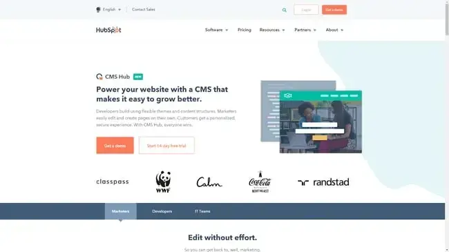
HubSpot CMS is your one-stop-shop for everything you need to build great websites. Start first by checking out the drag and drop website builder.
Purchasing a monthly subscription grants you access to designing sites that suit your needs and capture visitor interest. You can expand all your hard work further by connecting your site to marketing solutions like HubSpot’s Marketing Hub to make sure your design is delivering over time. Choose from a host of prebuilt button templates and styles to get the perfect look for your site.
2. Wix
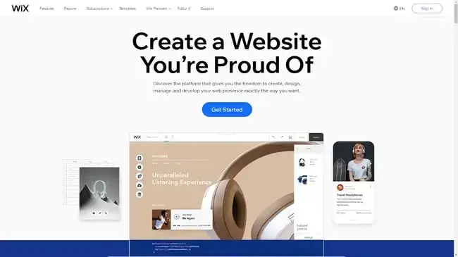
Wix is a paid CMS platform that makes web design easy with beautiful and intuitive site features and functions. While you don’t get complete button customization with Wix, it’s a solid starting point if you need clear, contextual options that work right out of the box.
3. WordPress
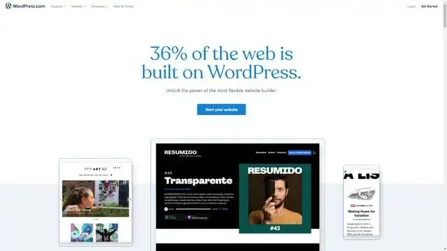
Coding CSS in WordPress is easy, and the website platform also comes with a host of site templates and plugins. While custom-built buttons in WordPress require more work, it’s worth considering if you’re comfortable with basic coding. Because WordPress is open source, you can use it for free, or you can purchase a WordPress plan for more specific functionality.
4. Best CSS Button Generator
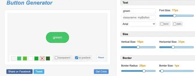
Best CSS Button Generator is a free tool that lets you customize the look of your website buttons. Choose everything from the exact shade of green in your brand color palette to the shadow behind the text within your button. When you’re done designing, simply click the “Get Code” button to copy and paste your CSS code into your website's “customize additional CSS” field.
5. CSS Button Generator
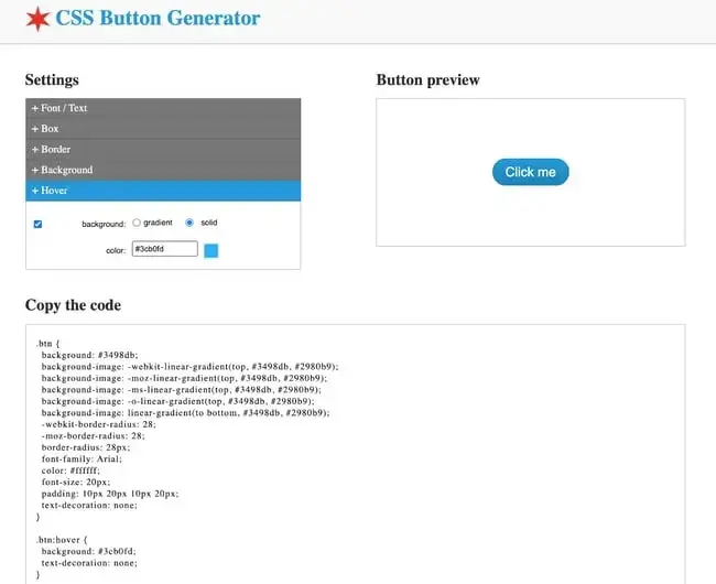
Another similarly named platform, CSS Button Generator is a free, straightforward tool for creating beautiful CTA buttons. It has all the basic features a button creator should have, but what makes this one unique is its “hover” customization feature.
That means when you use CSS Button Generator, your buttons will have the dynamic functionality of professionally-made sites.
The Button Bottom Line
First impressions matter. Users almost instantly form a general opinion on your site when they arrive — so it’s worth making sure that every aspect of your website works together.
Buttons are a critical background element; customized, clear, concise, and contextual button design choices can help dress — and impress — your site for success.
Editor's note: This post was originally published in May 2020 and has been updated for comprehensiveness.
Css Animation

![Creative and unique CSS animation examples that bring websites to life [+ code]](https://53.fs1.hubspotusercontent-na1.net/hubfs/53/how-to%20(1).png)
