A parallax effect on a website occurs when the background and foreground of a web page move at different speeds (and sometimes different directions) as the user scrolls. In this blog post, we’ll explain how parallax scrolling works and show you 20 remarkable parallax designs to help you implement this effect on your website.
Table of Contents
- Summary: Parallax Scrolling
- What is parallax scrolling, and how does it work?
- 20 Best Parallax Website Examples
- How to Implement Parallax Scrolling on Your Website
- Ready to make a parallax effect website?
- Frequently Asked Questions: Parallax Websites
Summary: Parallax Scrolling
Parallax scrolling is a website visual effect where text or images in the background and foreground move at different speeds and sometimes different directions as the user scrolls, creating a captivating sense of depth and motion. The key benefits of this effect include creating visual intrigue, boosting engagement, and enhancing storytelling. To add parallax scrolling to a site, you can choose a website template that has it built in, add a plugin or module to an existing site, use CSS and HTML, or use a JavaScript library. To get started with parallax scrolling, use a website builder like HubSpot Content Hub, which comes with premade templates and modules that add parallax scrolling to a site.
What is parallax scrolling, and how does it work?
How does parallax scrolling work? As a user scrolls a webpage, parallax scrolling creates depth and animation by having the background stand still or move more slowly than the foreground, which sometimes scrolls in a different direction. One study found that parallax scrolling improves engagement in storytelling websites, and for ecommerce sites, it helps users locate objects of interest faster.
While you can add parallax scrolling to any kind of site, the effect works particularly well for websites promoting games, videos, comics, designs, or any site that could benefit from motion and depth. You can make a parallax effect on a website with CSS and HTML, by using plugins, or by using parallax libraries if you know how to code.
Pro tip: By far, the easiest way to incorporate parallax design into your site if you haven’t built it yet is to choose a premade website template that already has the effect. You can find these in the HubSpot Template Marketplace.
20 Best Parallax Website Examples
If you need inspiration, I’ve rounded up the best parallax websites and grouped them into the following categories:
- Parallax Scrolling for Storytelling Websites
- Portfolio Parallax Designs
- Product Showcase Parallax Scrolling Examples
- Ecommerce Parallax Examples
These parallax effect examples offer a glimpse into the diverse applications of parallax in web design, from storytelling to branding and beyond. Each one harnesses the power of parallax to create an engaging and memorable online experience.
Parallax Scrolling for Storytelling Websites
1. The Believer

Literary magazine The Believer makes the most of parallax scrolling in its comics section. As the reader scrolls down the page, new panels appear. Images in the foreground shake and move as speech bubbles fade in.
In the comic “Yellow Faces,” JS Wu describes the challenges she faces when drawing herself as a person of color. As her thoughts appear with scrolling, the reader gets to share her epiphanies in a measured, spaced-out way.
What we like: Parallax scrolling keeps the readers engaged as they read comics on The Believer. I love reading printed comics, but this experience cannot be replicated in print form.
2. The Boat

The Boat is featured because it showcases the potential of parallax scrolling in creating immersive and engaging online stories. The site offers a web-based adaptation of a story about refugees traveling on a boat. As users scroll, panels of the story rock side to side. However, images of boats and a seascape persist.
The Boat invites users to embark on a unique digital adventure, making it a standout example of parallax-driven storytelling.
What we like: The interactive storytelling is immersive because of the different ways the screen scrolls. Images appear at different angles. The sound design adds to the immersive experience. The story is already compelling, and these extra elements keep me hooked.
3. The Goonies

When I think of the Goonies, I think of adventures with friends, iconic characters, and a forested coast. This parallax effect website pays homage to the film perfectly. As you scroll, you zoom into the beach where the story takes place. You see all of your favorite characters and the phrase “Goonies never say die” over a pile of treasure.
What we like: I love how the site logically presents information about the film. You don’t have to scour the site for information. Everything you’d want to know appears on scroll.
4. NASA Prospect

NASA Prospect brings the wonders of space closer to users, fostering a sense of wonder and curiosity. When you land on the site, you are instructed to turn up the volume and scroll. An astronaut appears against a starry background.
You’re then taken on a science fiction adventure where the space explorer journeys through space with a robot. These two figures change position all with the power of parallax scrolling.
What we like: The cosmic journey that NASA Prospect takes us on, where parallax scrolling makes me feel like I’m exploring outer space.
5. Every Last Drop
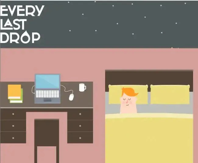
Every Last Drop engages users in the importance of water conservation through a visually captivating narrative. Its parallax scrolling allows visitors to move through the story effortlessly. We follow the character through his day and learn about how much water we consume daily. The scrolling ends with more buttons to continue learning about water conservation.
What we like: The parallax scrolling on this site makes the simple sketches more engaging. I like how the items slide on and off the page, like the changing of a set.
6. Web Design & Art History

Parallax scrolling is a great way to show evolution. You can create a timeline that shows how a concept has evolved over time. This site, which is about web design and art history, demonstrates this capability. The site shows how art has changed from ancient cave paintings to the present.
When people think of art, they often think of static paintings hanging in a museum. Parallax scrolling allows images to move and transition seamlessly on the visitor’s screen.
What we like: Informative text and animated images are balanced throughout the site. You have both plenty to look at and plenty to learn.
7. Firewatch
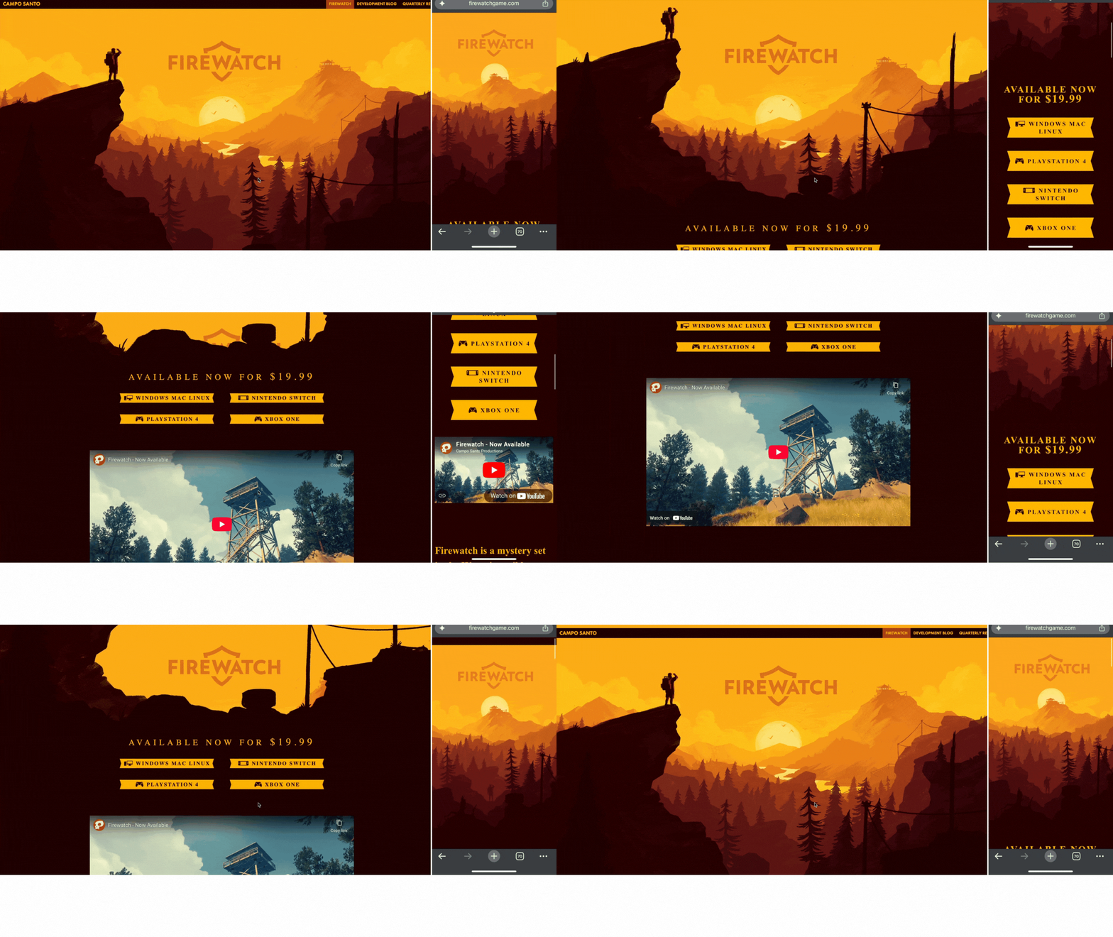
Firewatch’s website transports users to the game’s forest setting, generating anticipation and interest. Once the page loads, you can scroll past the sunset. Rocks pop up in the foreground, and text appears to start the journey. You can then learn more about the game’s storyline.
Firewatch is a good example of how parallax effects look different on desktop versus mobile, as you can see in the GIF above. The makers of the site chose to use a different, static image for the mobile version, instead of using parallax scrolling.
What we like: This video game’s desktop website uses parallax scrolling to immerse me in the game’s world.
8. NBC News
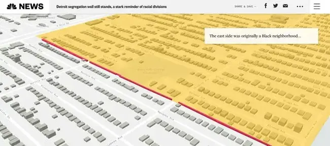
I know reading the news is important. However, getting through a lengthy article can feel like a push. NBC News has special stories that include parallax scrolling, engaging readers as they learn more about a topic.
Let’s explore “Built to keep Black from white,” a story about a wall in Detroit that separates communities. As I scroll, I can see a map of the wall in the context of greater Detroit. This structure gets closer as I zoom in, and I can see a 3D model of the area.
What we like: Parallax scrolling helps storytellers focus on different elements of the narrative. Creators can also integrate maps, charts, and visuals that reinforce the message.
9. The Other Side of Truth

When it comes to understanding complex geopolitical issues, it’s tough to know where to start. Informational websites often use parallax scrolling to create an intuitive starting point for people just learning about complicated topics.
Let’s take a look at The Other Side of Truth, a site about the war in Ukraine. A clear timeline appears, showing images of the area before and during the conflict. You have access to news articles, links, and images all on scroll.
What we like: Parallax scrolling is a tool that can help you order information. This site makes the most of this offering.
10. Ben the Bodyguard

Ben the Bodyguard is a mobile security app designed to protect your passwords. However, instead of a boring lock symbol, users have Ben — the personification of a digital bodyguard. The app’s site uses parallax scrolling and a video-game style that leans into this branding.
As users scroll, Ben appears. Fully clad in a James Bond-esque suit, he walks down a dimly lit screen as you move down the site. Speech bubbles appear, and Ben talks about how dangerous the cyber world can be.
What we like: I enjoy how this parallax site effectively communicates the benefits of a mobile security app through interactive storytelling.
Portfolio Parallax Designs
11. Louie Sellers
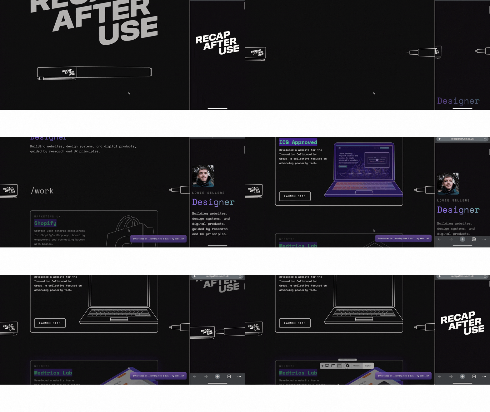
If your career is in the design world, having an engaging, user-friendly website is essential. Louie Sellers gets it right in his UX designer portfolio, which you can see above in both desktop and mobile versions.
The first thing you see is the phrase “recap after use” in bold. As you scroll, an open pen appears, which closes as you move farther down.
What we like: The first part of the site I encountered was visually stunning. I was grabbed from the very beginning.
12. Qode Interactive Catalog
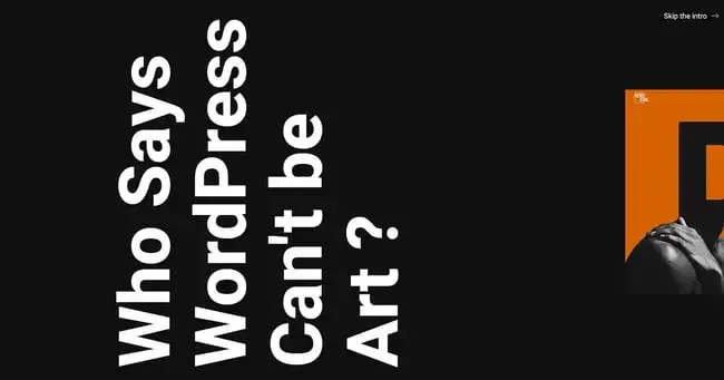
The Qode Interactive Catalog starts strong with parallax scrolling in the intro. Once you scroll past, you’ll find a menu that reveals images with different WordPress themes from the developer. Within the catalog, you can see a scrolling portfolio of examples that use the theme.
What we like: When I think of catalogs, I think of boring magazines that appear in my mailbox. This goes far beyond that.
13. 93Grados
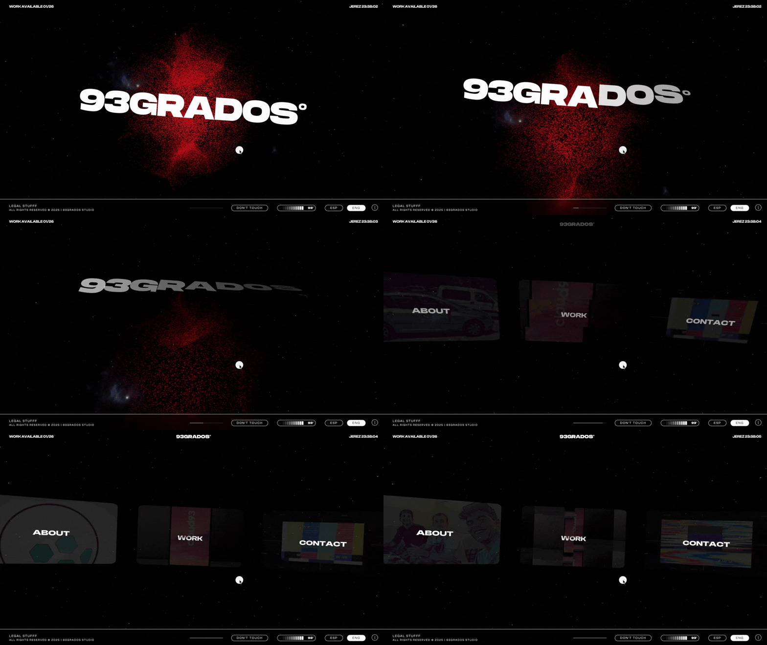
Spain-based creative studio 93Grados turns up the heat in its animation-filled website that’s full of different types of parallax scrolling. The homepage immerses you in a galaxy where, as you scroll, the starry background moves at a speed different from the text, which eventually fades away.
Then, the “Work” page features horizontal scrolling, where the images scroll at a different rate than the text overlay; meanwhile, the floating animations in the background change color.
What we like: There is a lot going on with this parallax effect website, and it’s not something that would work for every business. But for a design studio billing itself as unique and progressive, it’s perfect.
14. Soleil Noir
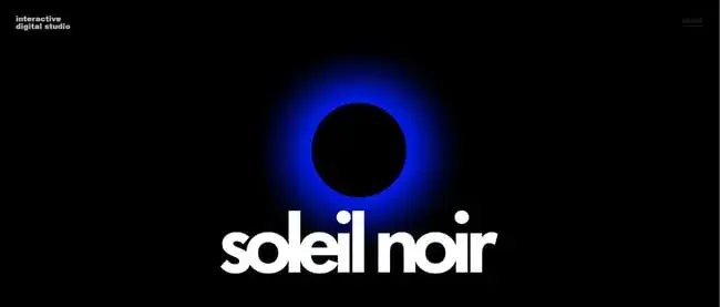
Soleil Noir opens with sideways scrolling that reads, “We craft immersive and interactive experiences for global brands.” This use of parallax scrolling puts the message right in front of site visitors. There is no way to escape the brand’s mission statement.
Soleil Noir highlights how parallax scrolling can add creativity to a portfolio. This immersive first touch is a telling example of the service it offers.
What we like: The stunning portfolio presentation by this creative agency uses parallax to showcase its work in a visually engaging way.
15. Ivy Chen

Parallax scrolling isn’t just for major brands. This technique can help your digital portfolio stand out from the pile. Turn to fashion designer Ivy Chen for inspiration. Though she’s changed it now, a previous version of her site showed an image of a flower and a sketch of a jacket. As you scrolled, those images transformed into a model wearing a real-life design.
What we like: Fashion designers turn ideas into products that people can wear. Chen’s site used parallax scrolling to bring this concept to life.
16. Cyclemon

Cyclemon is an art project showcasing bicycle-related digital designs, revealing bikes one by one with parallax scrolling. As you scroll, different versions of the bike appear in front of different backgrounds. For example, a bike with lights appears over a nighttime city street.
What we like: The playful and imaginative world of cycling is presented through parallax scrolling, adding even more intrigue.
Product Showcase Parallax Scrolling Examples
17. Porsche Evolution

Porsche Evolution takes users through a visual timeline of iconic cars, emphasizing the brand’s legacy of excellence. You can scroll past cars, seeing them from different angles. The seamless scroll feels like walking past the cars themselves at a museum. This website exemplifies how parallax scrolling can be used to showcase a product’s history and innovation.
What we like: Parallax scrolling is used in a slideshow-like fashion to showcase Porsche’s evolution and design excellence.
18. Delassus Group
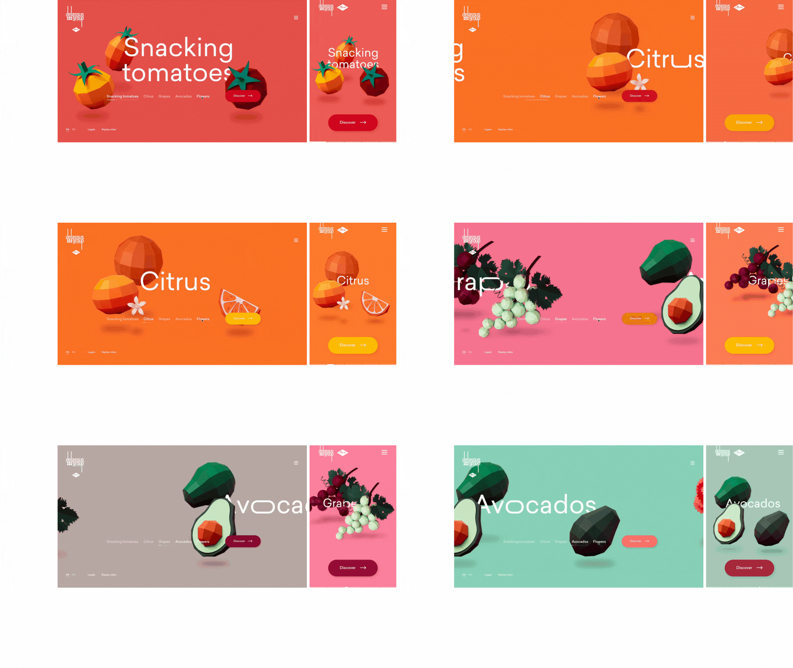
Most sites include a carousel of images that show off what they sell. However, Moroccan agricultural company Delassus Group takes this experience to the next level, creating one of my favorite parallax design examples. Once the home page loads, visitors can horizontally scroll past the snacking tomatoes, citrus, grapes, avocados, and flowers that it sells.
What we like: Today, we are bombarded by advertisements. Product presentation needs to be unique to stand out. I like the artistic representations of Delassus’ product. I’m eager to see what appears next as I scroll.
Ecommerce Parallax Examples
19. DopeGood
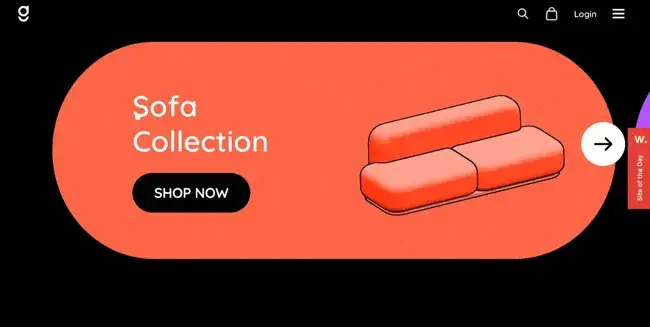
If you’re showing off products, parallax scrolling can help you make the process an experience. As you scroll, you can see sofas, chairs, and lamps that appear as you scroll. Images slide in from the left and the right, adding extra movement to the site.
What we like: This parallax effect website showcases product features and benefits in an engaging way. This is a clever way to help customers make purchasing decisions.
20. Wildwonder
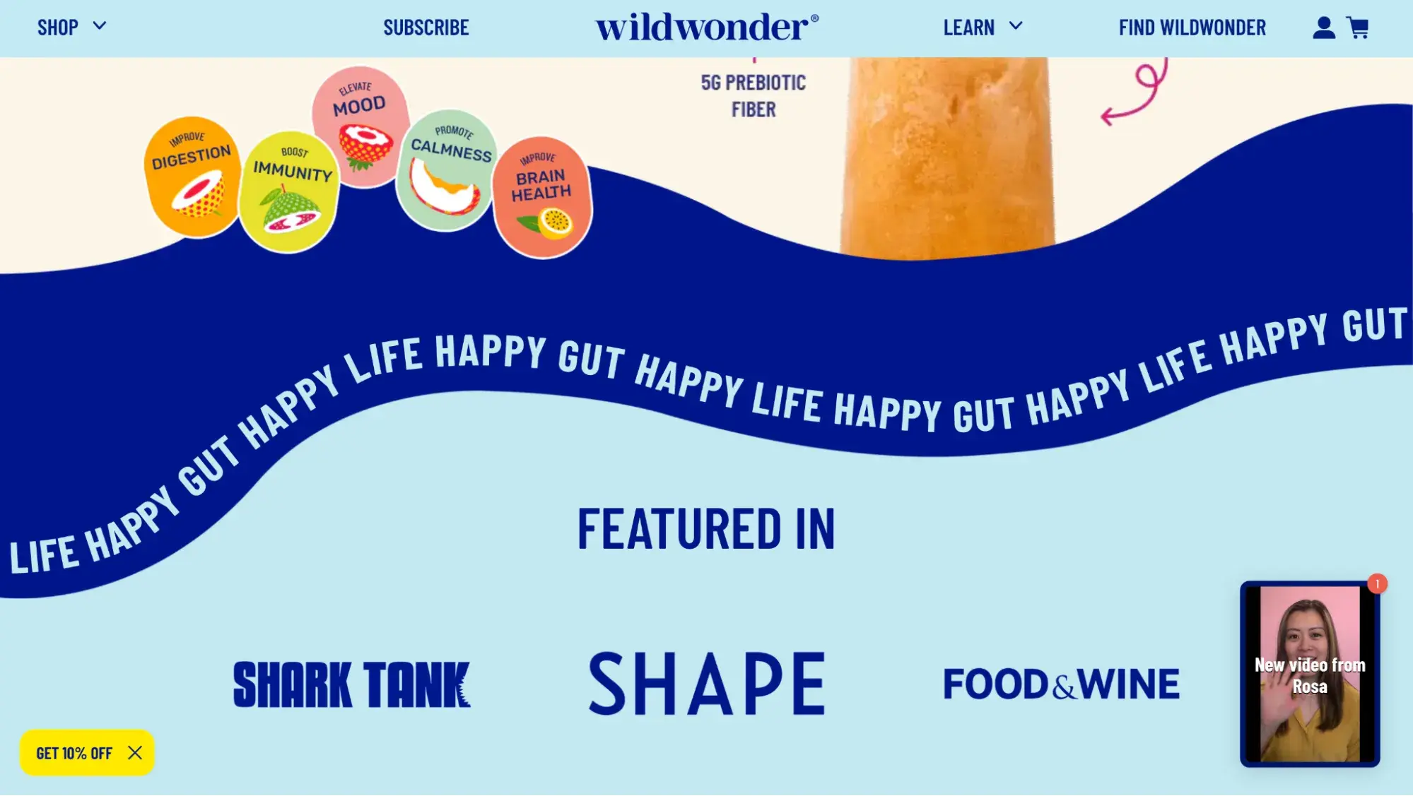
Besides serving up tasty gut-healthy sparkling drinks, Wildwonder serves up a visually appealing website experience. As you scroll down the homepage, “Happy Gut Happy Life” scrolls horizontally across the page, reversing order when you start scrolling back up.
What we like: The wavy scrolling text adds even more visual appeal to an already fun website.
How to Implement Parallax Scrolling on Your Website
If you want to implement parallax scrolling on your website, here are four common options:
- Use a plugin or module for no-code implementation.
- Get a theme that already has parallax scrolling.
- Use HTML and CSS.
- Borrow from parallax libraries.
|
Tool |
Best For |
Requires Coding? |
Difficulty Level |
|
Plugins/Modules |
Existing sites on a CMS, such as HubSpot or WordPress |
No |
Low |
|
Website Templates |
Websites not yet launched that will use a CMS, such as HubSpot |
No |
Low |
|
CSS and HTML |
Adding basic parallax scrolling to specific parts of an existing website |
Yes |
Medium |
|
JavaScript Libraries |
Developers wanting to add more advanced parallax effects |
Yes |
High |
Popular Parallax Libraries and Tools
Plugins and modules can extend the functionality of your CMS-built website to include parallax scrolling — without you needing to code.
- Dew Parallax Banner HubSpot module
- Scroll-linked Animation HubSpot module
- Parallax Section Block WordPress plugin
Website theme marketplaces feature premade design templates with parallax scrolling already built by professionals. If you haven’t yet built your site, or you’re willing to change themes, consider using one of these.
If you know HTML and CSS, you can create a basic parallax scrolling effect using the background-attachment: fixed element as explained in our parallax scrolling implementation article. Below, you can check out the CodePen to get started.
See the Pen Hubspot Blog: Parallax scrolling Method 1 by Clinton Joy (@Cejay101) on CodePen.
JavaScript libraries feature ready-to-use code you can borrow so you don’t have to start from scratch. However, note that this requires you to understand JavaScript. Some popular parallax libraries include:
Best Practices for Parallax Design
- Use it sparingly and purposefully. This is one of the top parallax design best practices. Remember that parallax scrolling should enhance an important image or message, or make your storytelling more engaging. If you overdo it, it loses its power. Additionally, the parallax effect can be nauseating for people with motion sensitivity.
- Don’t let parallax scrolling negatively affect page speed. Adding parallax scrolling can cause your website to load more slowly. If it negatively affects your website performance, it’s better to remove it.
- Compress those images. Speaking of website performance, be sure to compress the images you use in your parallax scrolling to help them load faster.
- Conduct user testing on your site. When done well, parallax scrolling should feel engaging and intuitive. But if it’s done poorly or used too much, it can be a very confusing experience. Test the parallax effects on your site by having real users navigate it.
Common Mistakes to Avoid
- Failing to test it on mobile devices. Some parallax scrolling effects that are perfect on desktop do not work on mobile. It might not work at all, or it might look wonky. Be sure to preview the effects on mobile and desktop before pushing to production.
- Confusing website visitors with too much motion. For example, if you choose to make your text parallax scroll horizontally or diagonally, consider that it might be hard for users to actually read what the text says.
- Increasing your bounce rate because the parallax scrolling takes so long to load. Some parallax effects take a long time to load. In that case, visitors might not wait long enough and might just abandon your site, increasing your bounce rate.
Ready to make a parallax effect website?
Parallax scrolling has transcended the realm of mere aesthetics. It’s a tool for storytelling, user engagement, and inclusivity. As we conclude this journey, it’s clear that parallax scrolling websites are a dynamic force that continues to redefine web design, pushing the boundaries of what’s possible.
Have these parallax scrolling examples inspired you to add this effect to your website? Try HubSpot Content Hub for free. It has many premade templates with built-in parallax scrolling. And if you choose a template that doesn’t already have it, HubSpot offers parallax scrolling modules that let you implement the effect without needing to code.
Frequently Asked Questions: Parallax Websites
What is parallax scrolling?
Parallax scrolling is a website effect that creates a feeling of motion and depth by having the background of a webpage move at a speed (and sometimes direction) different from the foreground.
How does parallax scrolling work on a website?
As the website visitor scrolls through the webpage, the text and/or images in the background move at different speeds and/or directions compared to the foreground elements. This is accomplished by using CSS, HTML, and sometimes JavaScript.
How do I add parallax effects to my website?
You can add parallax effects to your website by:
- Adding a plugin or module to your CMS that allows for no-code implementation.
- Adding CSS and HTML to your website.
- Choosing a website template that has built-in parallax scrolling.
- Using a parallax library.
What are the best tools or libraries for creating parallax effects?
To create parallax effects, try these tools or libraries:
For parallax-enabled website templates:
For plugins and modules
- Dew Parallax Banner HubSpot module
- Scroll-linked Animation HubSpot module
- Parallax Section Block WordPress plugin
For JavaScript parallax libraries:
Does parallax scrolling work on mobile devices?
Yes, parallax scrolling can work on mobile devices, but it’s more complicated and less likely to work than on a desktop. For example, it’s common for background-attachment: fixed to break on mobile devices. Also, due to smartphones and tablets having smaller screens and different ratios, the effect can end up looking quite different on mobile. Be sure to test your site by previewing your parallax effects on both mobile and desktop.
Can parallax effects slow down my website?
Yes, if you don’t implement it wisely, parallax effects can slow down your website, especially if the parallax scrolling involves large images. That’s why image compression is crucial.
Is parallax scrolling good for SEO and accessibility?
Is parallax good for SEO? Well, parallax scrolling doesn’t necessarily help SEO or accessibility. But it can hurt SEO and accessibility if it causes your site to load slowly or if it makes it difficult for people with motion sensitivity or visual challenges to navigate your site.
Editor's note: This post was originally published in November 2023 and has been updated for comprehensiveness.
Website Design Examples
.png?width=112&height=112&name=Image%20Hackathon%20%E2%80%93%20Vertical%20(50).png)

.png)


![15 black and white website designs to inspire your own [+ pro tips]](https://53.fs1.hubspotusercontent-na1.net/hubfs/53/black-and-white-website-design-1-20250520-1336267.webp)

![15 Brochure Website Examples to Inspire You [+ How to Make One]](https://53.fs1.hubspotusercontent-na1.net/hubfs/53/brochure-website-examples-1-20250319-362228.webp)
![28 Types of Websites to Inspire You [+ Real-Life Examples]](https://53.fs1.hubspotusercontent-na1.net/hubfs/53/types-of-websites.png)

