

4
- Andrew Heeley Weddings
- Grace Chuang
- Studio Kleiner
- Ian Loring Shiver
As a website design expert, I‘ve found that some factors weigh heavily for a good website that also ranks highly. That’s why I'm using the following criteria for these websites.
- Navigability: How easy it is to navigate the website and find what I'm looking for.
- Visuals: How visually pleasing is the website, do the visuals increase the website's accessibility, is the CTA strategically placed, etc?
- Trust: Does the website inspire trust in the owner through social proof, examples, and effective copy?
1. Andrew Heeley Weddings
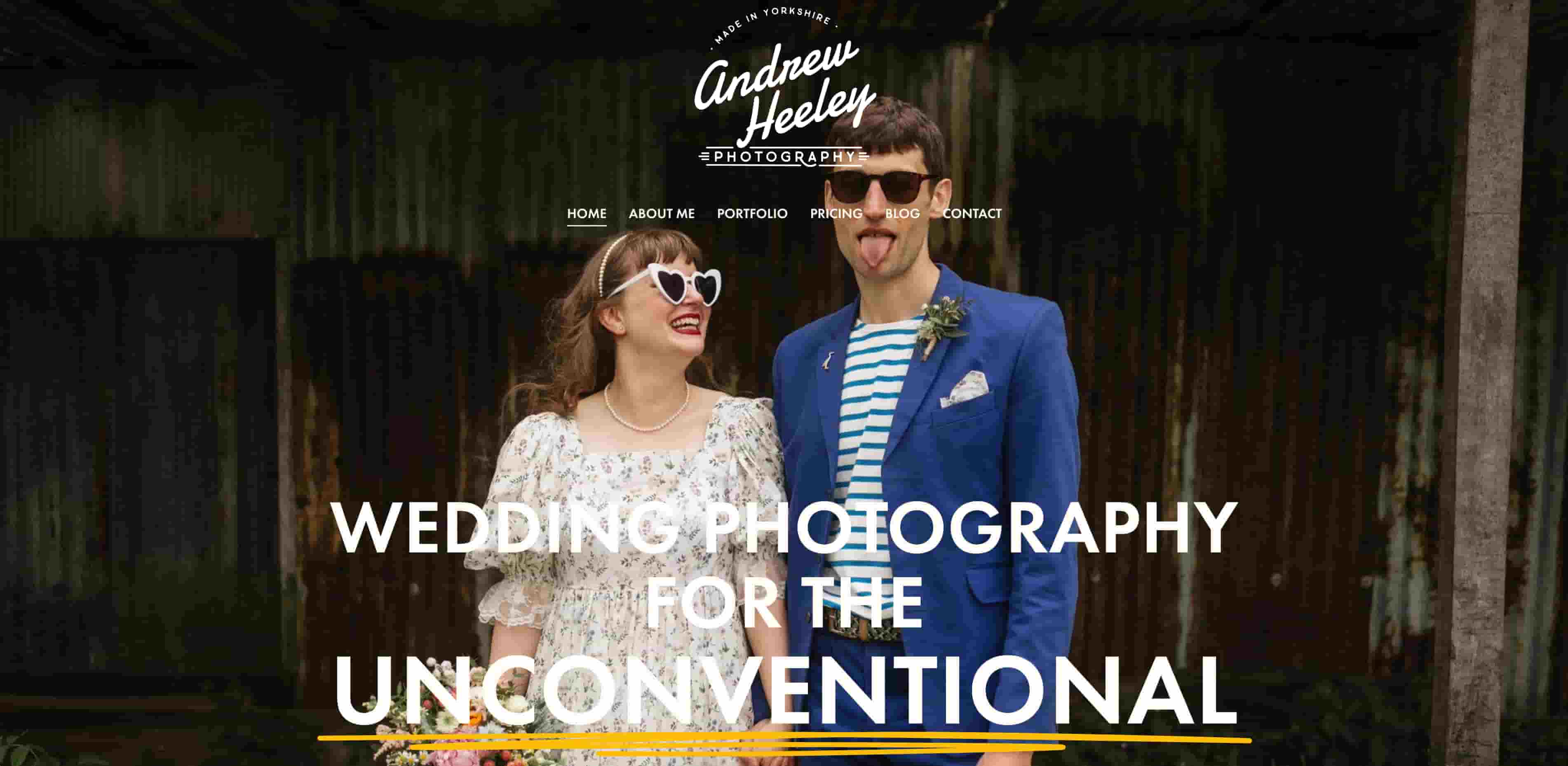
My first example is Andrew Heeley Wedding photography. Being a wedding photographer is a common side hustle, so this is good inspiration for anyone looking to capture some beautiful moments for a couple's special day. I was instantly drawn by the aptly named unconventional picture displayed on the homepage.
Navigability: 9/10
The website navigation is really intuitive. I really like that the website gives you a lot of content by just scrolling down. The nav bar at the top also includes a lot of information. The one place I‘d suggest room for improvement would be a more strategically placed CTA. The ’contact' button is tucked away and will reduce the number of potential lead conversions.
Visuals: 10/10
The color palette of this website is vividly beautiful, and has great color contrast to improve accessibility. The copywriting font is bold and instantly captured my attention on every page I saw. This website claims to be the unconventional alternative to wedding photos. Judging by the website visuals, it delivers.
Each block of text is paired with a picture to improve the website's readability.
Trust: 10/10
Hiring a wedding photographer is a greatly personal endeavor, so it‘s important that Andrew finds a way to display his personality. His ’about me' page includes the story of how he got into wedding photography in the first place.
He also makes use of a blog, which is one of the proven most effective ways to drive traffic to your website and foster trust. Andrew‘s blog answers common questions about his particular brand of photography, which proves that he’s an expert that you can trust to capture the moments of your big day.
Total: 29/30
We‘re starting off with a strong website as our first pick. Andrew Heeley’s website is the perfect inspiration for anyone looking to build trust with visitors through a user-friendly web design.
2. Grace Chuang

I picked Grace Chuang's website for its effective use of whitespace, and mobile-friendly design. This website also has a lot of room for improvement, which could be helpful for those looking to build out their own website.
Navigability: 7/10
Grace‘s website is easy to get to the different pages, but to me, it lacks the scrolling-based content that Andrew’s website delivered effectively. Because this website is based on navigation through individual pages, I would've liked the use of breadcrumbs to make this website more navigable.
There‘s also no clear CTA on the page for users to contact Grace. The social media icons on the side are the closest thing to a CTA, but they’re tucked away and hard to find if you're not specifically looking for them.
Visuals: 7/10
The actual images on Grace‘s website are amazing, and the website is beautifully designed for mobile. I docked 3 points because it’s clear that this website was not designed with desktop users in mind. Almost half of the page on a desktop is blank, which could turn off potential visitors.
Trust: 7/10
Grace‘s website effectively tells her story through body copy, but unlike other examples on our list, it lacks the effectiveness of telling her story through visual imagery. There are pictures which aren’t paired with any blocks of text, making them feel empty and lacking.
Total: 21/30
Grace's website has a lot of room for improvement but also has some good points to take-away. This is a great example for a mobile website design. If Grace makes the website easier to navigate, easier to find the CTA, and uses her visuals more effectively, this website could easily gain back some points.
3. Studio Kleiner

Studio Kleiner‘s website takes a unique approach to website design with multiple tags at the top of the website. I actually really like this design in theory because it’s fresh and innovative with some cool tricks that I'll go into detail in the grading. I picked this website as a good example of ideas that need to be improved from a practical standpoint to help the user experience.
Navigability: 6/10
I love the categories on this website pointing to different creative projects. But it's a little bit too much. There are 36 icons on the header page, but only 23 are actually visible unless you zoom out. This to me is a great idea that could be improved upon in execution.
That small arrow you see in the middle of the page? That‘s the CTA, and there’s no way of knowing that unless you actually click on it. Going through the website, the lack of breadcrumbs on an already abstract design makes it very easy to get lost when scrolling this website. And not in a good way.
Visuals: 6/10
I docked three points on visuals because the lack of color contrast in some instances, harms accessibility. When you scroll down the page, the header changes color, but sometimes it blends into the background. Other pages like the ‘about’ page, uses red font on a salmon background, which is a nightmare for anyone, let alone those with red-green color blindness.
Trust: 5/10
I see a lot of pictures on this website, but no body copy that tells me the story of the studio. Without knowing its background or any personal touch, I don't really have an incentive to work with this studio beyond just the nice pictures.
Total: 17/30
Experimentation on websites is great, but always make sure that user experience is at the top of your mind when implementing unique strategies. Studio Kleiner could shoot for a perfect score by adding body copy, making the website more navigable and accessible to users.
4. Ian Loring Shiver
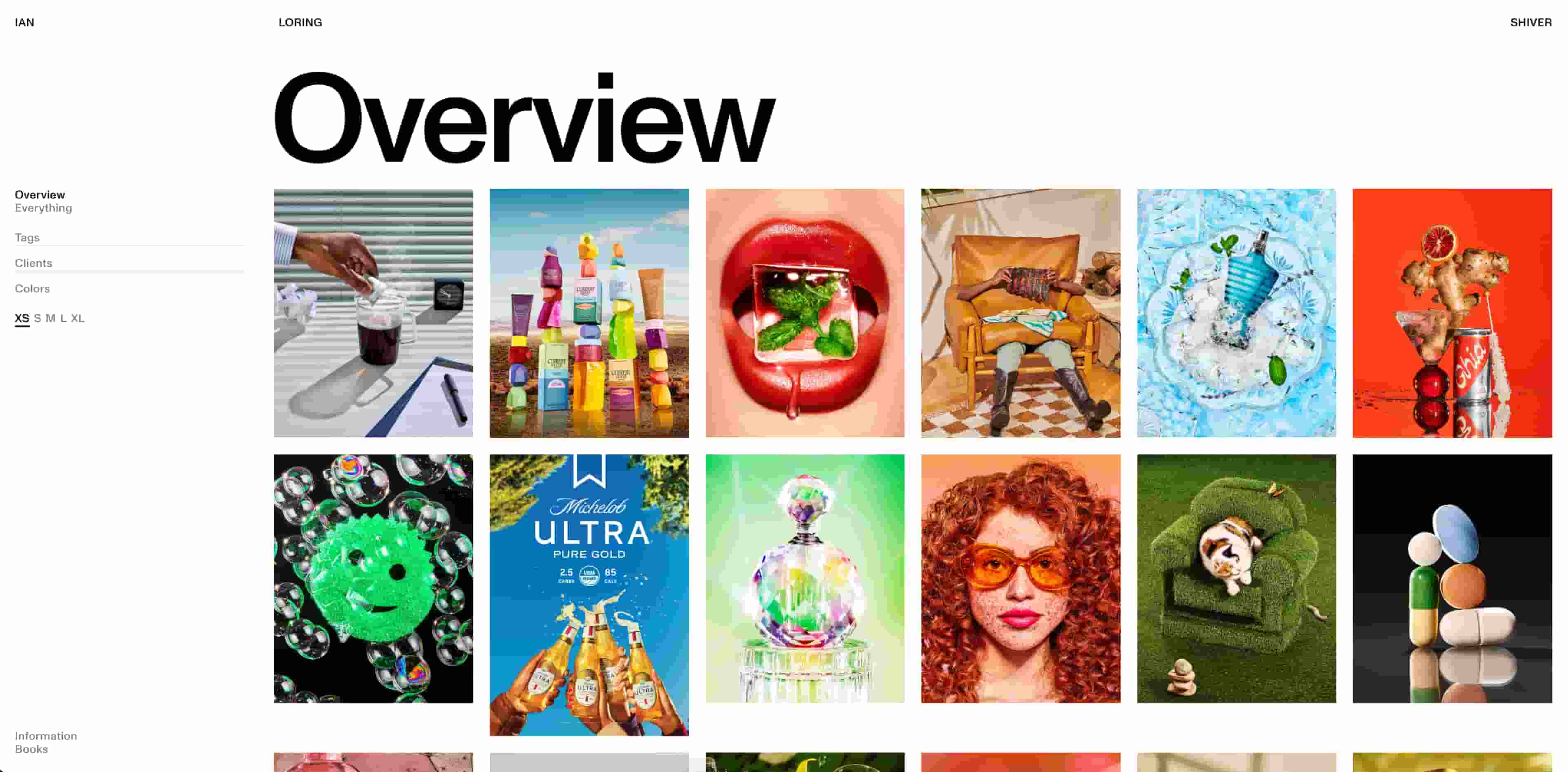
I picked Ian Loring Shiver as a classic example of a photo gallery website. The effective use of white space, colorful imagery, and easy navigation makes this a good example website.
Navigability: 7/10
There isn't a lot to navigate on this website, which could be a good thing. The main focus is on the art, and displaying the clients who have worked with Ian in the past. This site would have a higher score if not for the fact that there is no CTA to work with the artist on the homepage. You have to go to information for details of the booking agency.
Visuals: 10/10
This website layout is simple but effective. Having a simple gallery layout is an effective way of showcasing your artwork to prospective clients. It's the standard for a reason.
Trust: 10/10
The social proof on this website is off the charts. Prominently displaying projects with big clients like Playboy, Postmates, Michelob, Bloomberg, and more is a great way of creating demand for people to want to work with you in the future.
Total: 27/30
With some marginal improvements to the navigation, Ian Loring Shiver's website is one of the highest-graded on my list.
Building Your Own Photography Website
With the diverse group of options presented here, you should now have enough inspiration to build your own website. Remember that you don't need to have a design as fancy as any of these. An effective CTA placement (in the middle of the page where attention is drawn first), a good story, and good pictures will help you stand out from the crowd.

Website Design Examples


![15 black and white website designs to inspire your own [+ pro tips]](https://53.fs1.hubspotusercontent-na1.net/hubfs/53/black-and-white-website-design-1-20250520-1336267.webp)

![Gradient Website Design Examples That Prove This Trend Is Far From Over [+Tutorials]](https://lh7-us.googleusercontent.com/htOWIbyCIoCMxSjC4gJunkGnhCzXpccjTrL8NwoGdRdCsSiEmEAxe_qBFkMrzy2Y8d3cwEr_DMzSGHq9Xi-hQFnMJCo8HDQJ1yQGigcSfFxI2QKXo0s7xXSB2sY-eALG1iUqnHXgomcDsnp7AHRSH1s)
![15 Brochure Website Examples to Inspire You [+ How to Make One]](https://53.fs1.hubspotusercontent-na1.net/hubfs/53/brochure-website-examples-1-20250319-362228.webp)
![28 Types of Websites to Inspire You [+ Real-Life Examples]](https://53.fs1.hubspotusercontent-na1.net/hubfs/53/types-of-websites.png)

