My mentor advised me to go with React, which I did, and only after using multiple JavaScript frameworks did I appreciate his advice. React makes building complex UIs feel manageable. Problems that would normally take me days to solve now take me a few hours thanks to React.
If you’re reading this blog, you probably want to level up your web development game by trying out React, or you are in search of design inspiration for your next big React project. Whatever the case may be, I got you. In this blog, I will be sharing 25 React websites I love and giving you tips on how you can build your own React application if you are just getting started.
Table of Contents
What is React.js?
React.js is an open-source JavaScript framework that was created by Jordan Walke, a software engineer at Facebook, in 2013. It was created for building fast and interactive user interfaces, mainly for single-page applications. With React, instead of doing DOM manipulation using JavaScript, you can perform these same actions of describing what your UI should look like using state. React updates the UI efficiently when the state changes.
I’ve used React in everything from small marketing sites to large-scale platforms. It’s especially popular for:
- Single-page applications (SPAs).
- Dashboards and admin panels.
- SaaS products.
- Content management systems (CMS).
- High-performance marketing websites.
With React, you can also use a powerful framework like Next.js, which adds server-side rendering, routing, etc., on top of React. This just makes it the best for production apps.
Also, despite the emergence of other new frameworks, React has still maintained its relevance due to its ecosystem and open-source community. Even 13 years after its first release, it is still the most used JavaScript framework.
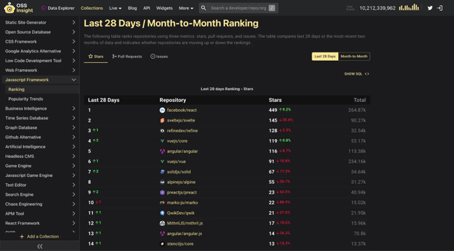
Now that we know a bit about React, let’s continue by seeing some React website examples.
25 React Website Examples
- Cavai
- Mr. Pops
- EverGreener
- Bryant Smith
- Soren Rose Studio
- Le Salon Peugeot
- Custom Truck One Source
- Daedalos
- Art Gallery of Ballarat
- Far Co
- They Call Me Giulio
- PUMA Velocity 2 Experience
- Surgent Studios
- DFFRNT-ERA
- Malala Fund Annual Report
- NXTIDE
- Cal.com
- Guide to Heavy Metal
- Electrode Web
- Hydrogen
- Repeat
- Seacat
- Setpoint
- Bundlee
- Haven Servicing
1. Cavai
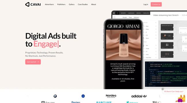
From the bold gradient backgrounds to the striking typography and subtle motion, Cavai blends energy with structure in a way that’s rare. It pairs striking graphics with clear, readable content, and that mix of dynamic visuals and calm elements gives the site real balance.
What I like: I appreciate seamless transitions that give scrolling purpose. The headlines stand out without being hard to read because the typefaces were chosen carefully.
Cavai’s design stands out because it suits the company’s strategy of creating personality-filled interactive commercials. While telling you what they do, the site makes you feel like it. Many React websites lack that modest design gain.
2. Mr. Pops
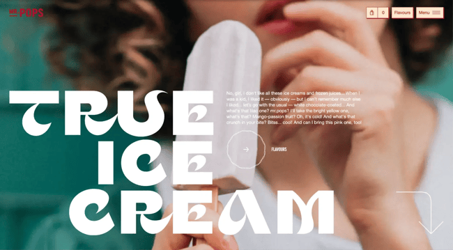
Opening Mr. Pops’ website feels like entering a lively summer atmosphere rather than just perusing an online store. The site showcases their popsicles in such a beautiful way that it makes you want to eat them. I noticed how purposeful every design element is, from the smooth animated transitions, which are a perfect example of React’s component architecture at work, to the popsicle imagery and minimalist navigation.
What I like: The high-quality visuals sell both mood and goods. Visuals like this make you look twice. Mr. Pops’ website also has playful transitions and a memorable color scheme.
Despite the site’s fancy looks and animations, navigation is easy. All feels intentional and approachable.
3. EverGreener
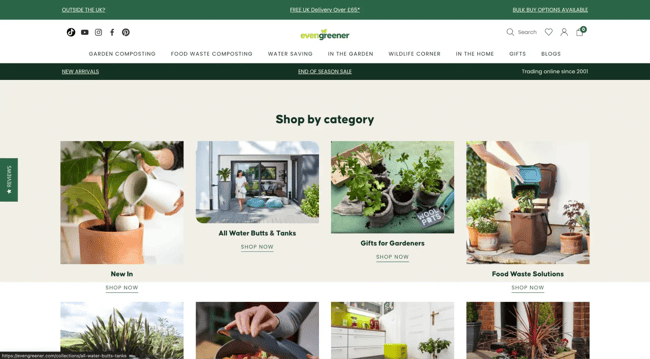
The Evergreener website is detail-rich, image-rich, and designed to stimulate exploration without overloading the user. This type of experience suggests a well-designed component structure with well-defined and reusable sections and categories in React.
I noticed how the site discreetly adapts to user intents. If you want to learn about sustainability, browse products, or grasp the brand’s objective, the layout naturally guides you. React handles flexibility well when components and state are created intentionally.
What I like: Evergreen has a clear content segmentation. Each area provides a purposeful experience, helping various users find what they need. The layout is also flexible and scalable, which is ideal for a React-driven website.
4. Bryant Smith
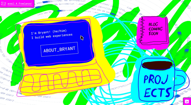
Bryant Smith’s portfolio website is one of the most creative portfolio websites I have seen. It consists of a blend of React with 3D animations, hand-drawn, crayon-style images, and unexpected interactions that reward curiosity. The experience emphasizes creative experimentation.
The design resembles interactive art rather than a website. Every movement, hover effect, and transition feels purposeful, urging you to play rather than observe.
What I like: I like how the site introduces itself with an animated sequence before the main material. That moment makes a good first impression and conveys Bryant’s technical expertise.
This site shows how far React can go using custom components, animation libraries, and state-driven interactions. The fun UI and interactive pointer show how React can coordinate complex graphics without sacrificing control.
5. Soren Rose Studio
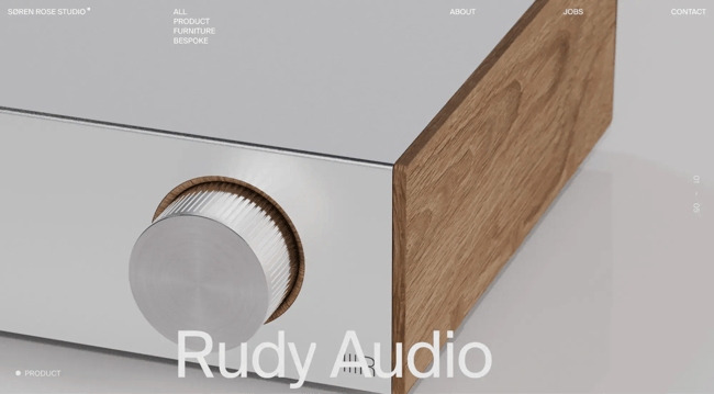
Soren Rose Studio is unique — and you immediately see that when you first pull up its React website. The minimalist, clean black-and-white color palette design and visually striking product images can capture anyone’s attention.
Soren Rose Studio product images are prominent, almost like a gallery. Each image is spacious, and the crisp arrangement keeps your focus moving from section to section. For React, this kind of experience comes from a well-structured layout system that reuses components carefully and handles transitions smoothly rather than forcefully.
What I like: I like the menus and page structure. It makes the Soren Rose Studio website minimalist, refined, and purposeful.
6. Le Salon Peugeot
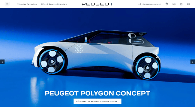
Le Salon Peugeot’s website feels like a car show when I enter the site. Cinematic transitions, layered images, and flowing animations take you through the website.
The navigation is purposely odd, but it works. Movement and spatial storytelling guide users through the site instead of page layouts. This design clearly suggests a React-driven architecture where state, animation timelines, and user interactions are tightly linked across components. The UI feels lively and responsive.
What I like: The site feels like an experience, not just pages. The use of high-impact animations directs attention and excites viewers. I also liked the strong brand storytelling, as the Internet experience resembles a car show.
7. Custom Truck One Source
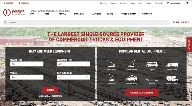
Custom Truck One Source’s website is one of those websites that has a big and sophisticated catalog, yet the design is visually disciplined. The deliberate, professional white, black, and red color scheme builds trust and emphasizes content. This kind of experience requires well-organized components and structured data rendering in React, especially when handling several goods and categories.
What I like: Even with a vast inventory, straightforward navigation makes finding what you need easy. Custom Truck One Source’s website maintains a visual consistency; the interface’s limited color palette is professional and readable.
Custom Truck One Source shows how React can serve enterprise-scale, content-heavy websites. Structure and usability first make React a great tool for organizing complexity without sacrificing user experience.
8. Daedalos
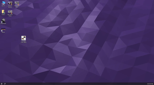
Daedalos is Dustin Brett’s portfolio. He’s an experienced web designer specializing in React-based website design, so I love that his portfolio showcases that in a strikingly original way. This site combines a stunning desktop environment, creating an interactive user experience.
His attention to detail with his clean lines, subtle typography, and calming color palettes gives the site a unique visual appeal.
What I like: Dustin’s web design looks great on all devices while providing seamless and responsive performance. Plus, I think the added effect of feeling like the web visitor ended up on his laptop elevated the experience.
9. Art Gallery of Ballarat
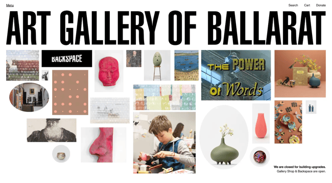
Art Gallery of Ballarat is laid out like a museum. There’s lots of white space and tons of incredible images. Think of interactive experiences with fluid page transitions, 3D images, animations, and videos.
In my opinion, this helps to create an immersive user experience that can make a website stand out from its competition.
What I like: My favorite part was how the art concept permeated every contact. Animations feel like part of the display, not decorative. Each transition underscores that you’re in a curated place, not merely browsing pages.
The Ballarat Art Gallery shows how React can allow deep, content-rich storytelling. It shows that when simplicity and innovation are balanced, a website may be elegant and thrilling.
10. Farco
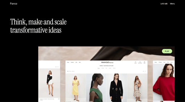
Farco is a web design firm that provides clients with cutting-edge, modern solutions using React. So, of course, they didn’t hold back with their own design. Their site makes use of white space, video, pops of color, modern imagery, and much more.
What I like: I don’t think anyone can deny Farco’s ability to bring all web design elements together in one place with this website. It’s flexible, capable, and impactful — all rolled into one stunning design with exceptional user experience. In my opinion, how they transition from a dark to a light theme helps break apart the site’s monotony.
11. They Call Me Giulio
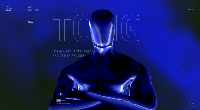
Giulio Collesei is a creative technologist based in Italy who has created one of the most stunning React website designs. It sticks to a very bold color palette of black and blue with pops of white for definition. And the text is laid out in a neat and unexpected way.
What I like: I appreciate that Giulio has dedicated time to showcase not only his technical ability but also himself as an individual. The portfolio website’s robust yet straightforward navigational design stands out from the crowd. Moreover, I find that the moving visual that acts according to the text further amplifies the site’s creativity.
12. PUMA Velocity 2 Experience
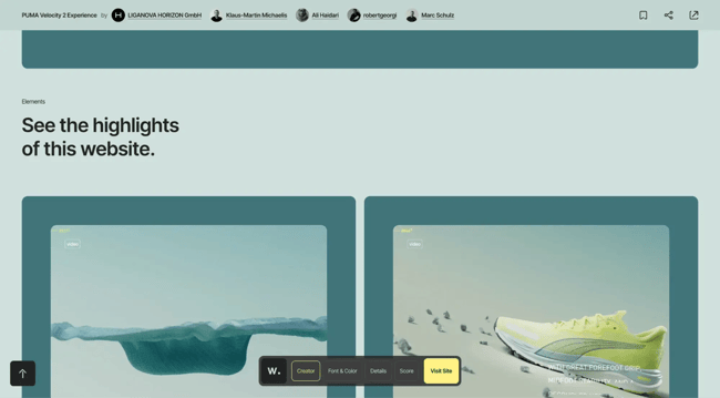
In the PUMA Velocity Nitro 2 Experience website, motion and speed dominate the design from the first scroll. The lightweight, quick, forward-moving shoe inspires the entire experience. The interface increased as I navigated, creating the sensation of free-falling — a totally immersive experience.
The product reveal itself is notable. Site visitors can rotate and view it from numerous angles with minimum scrolling, making the interaction feel physical and intriguing. These experiences are usually powered by state-controlled animations and component-based 3D rendering in React, where user interaction directly affects screen content.
What I like: I like the interactive product exploration; visitors can view the sneaker from different perspectives. Its animations are also smooth, and the design and product narrative match.
13. Surgent Studios
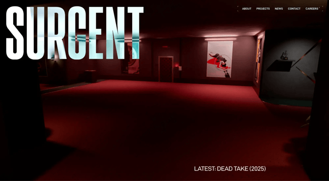
Surgent Studios’ website is modern, minimalist, and deliberate. The site uses a basic look to allow the content to shine instead of a showy UI. Soft yet powerful motions give an immersive experience without being distracting. Everything feels planned, from section layout to visual and text pacing. This design draws you in quietly and keeps you occupied longer than expected.
This shows how component-driven layouts and controlled animations can make a React app look excellent without being complicated. Each section feels modular, like it could be reused or expanded as the studio expands.
What I like: I liked how easy the navigation was. You can easily switch between projects, learn about the studio, or visit their social channels without searching for connections. Surgent Studios nails that, unlike many creative studios.
The homepage video was great, too. It sets the mood and conveys the studio’s mission better than text. It reminds us that film, animation, and layout can instantaneously evoke emotion.
14. DFFRNT-ERA
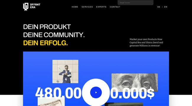
DFFRNT-ERA’s website has a dark, moody style that draws you in. It sets a bold, assertive, and purposely unusual tone. It looks striking without being chaotic — a difficult balance.
The animation flows fluidly as you scroll, producing a sense of depth and motion. Visual momentum, not heavy copy, drives site exploration. With every scroll, the site is gently guiding you.
This experience shows how state-driven animations and component-based sections may provide an immersive, performant, and controllable React experience.
What I like: I like this web page because it’s memorable. I saw the animation react to scrolling, which encourages engagement instead of racing through the content.
I also like how visuals never dominate utility. Despite the drastic design decisions, the experience is smooth and easy. The site feels polished and planned because everything loads and transitions smoothly.
15. Malala Fund Annual Report
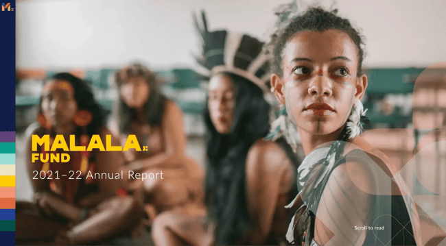
The Malala Fund Annual Report website is clean, focused, and purposeful. This site isn’t showy for no reason. Instead, every design decision promotes the organization’s mission, effect, and people.
Clean and easy to read, the layout has smart spacing and smooth page transitions to navigate vast volumes of information. For an annual report containing visuals, data, and long-form storytelling, the site loads rapidly and travels smoothly. It shows how a React-powered UI can manage complicated material while being lightweight and responsive.
What I like: The way this site leverages design to promote its mission is my favorite part. The page opens with striking images of young women and girls from throughout the world. Without much elaboration, it defines the Malala Fund.
16. NXTIDE
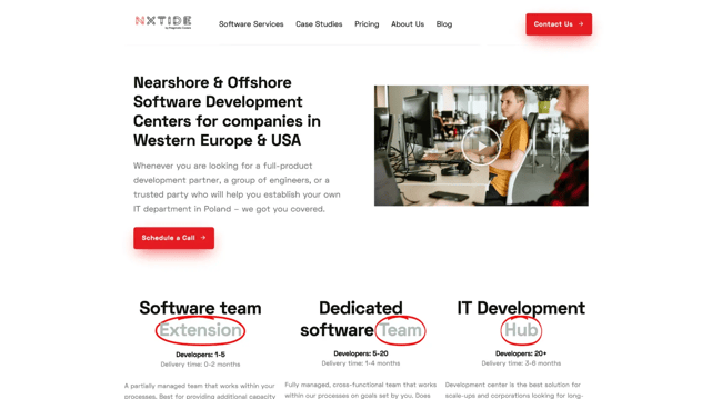
NXTIDE has a very traditional, clean-cut website at first glance. However, as you navigate the site, it becomes clear that it is a shining example of how minimalist design can still be engaging. With fast and seamless transitions, the user experience is a pleasure.
What I like: Its mission clarity is my favorite thing about NXTIDE. The site clearly states that this is an IT company without using jargon or clutter. Navigating and locating service information is easy.
The site’s subtle animations and visuals are very nice. Though subtle, they give enough visual interest to keep the experience interesting. NXTIDE shows how a basic React-based design can be professional and engaging.
17. Cal.com
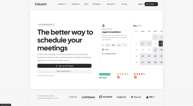
In the Cal.com website, everything feels well-thought-out, which promotes trust, especially for a scheduling and reliability solution.
The arrangement is ideal: clean and predictable. The site prioritized usability as I browsed. Interactions are discreet but responsive, and the interface naturally explains the product’s functions and operations. This is a textbook illustration of how component-driven UI and state management can produce a smooth, intuitive experience without visual noise in React.
What I like: Cal.com’s simplicity is my favorite feature. Easy UI, intuitive navigation, and plain copy that doesn’t presuppose technical understanding. As expected of a SaaS website, the solution enables you to arrange meetings promptly.
18. Guide to Heavy Metal
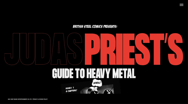
I knew Guide to Heavy Metal would be different from other websites when I arrived. The background music and vivid images immediately immerse you in heavy metal. It feels more like an interactive story for genre enthusiasts than reading a site.
Comic-style graphics, animated transitions, and dramatic imagery bring heavy metal history to life. Instead of big blocks of text, the narrative unfolds piece by piece using motion and images to keep you engaged. Each chapter feels like an interactive module, demonstrating how React-style component architecture can allow rich storytelling.
What I like: I particularly like how the site immerses visitors in hard metal visually and auditorily. The genre is more impactful when you live it rather than read about it. I think this site highlights how the web can enlighten and engage with culture and art.
19. Electrode Web
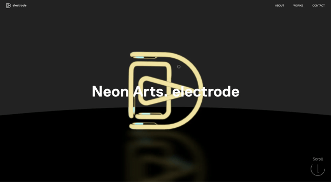
Electrode Web feels like an extension of the art it displays. The site is a curated digital gallery for Taisho Ichikawa’s neon glass work, as I discovered as I browsed. The site’s rhythmic transitions and controlled movements make scrolling feel intentional. A React-style component structure can create a gallery-like online experience, as each portion feels like an exhibit.
What I like: The immersiveness is my favorite thing about this site. High-quality photography captures the neon glass’s detail and shine, and section transitions are smooth.
The rotating neon light animation while scrolling drew my eye. Though delicate, it supports the artist’s “light as a medium” idea in a natural and expressive way. Every visual element fits the topic.
20. Hydrogen
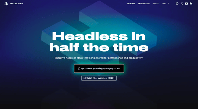
Hydrogen’s website states that this product is for the future of trade. The headless commerce stack from Shopify seems modern, speedy, and technically confident. Everything in the design supports performance and adaptability, which are crucial for dynamic commerce applications.
What I like: The site’s fluidity struck me most. The animated features and transitions make the experience bright and interesting without overpowering the content. It quietly suggests Hydrogen is designed for rapid, dynamic stores.
The site’s consistent color scheme is also nice. The uniform palette unites the product and makes it look polished and intentional. Nothing seems amiss.
21. Repeat
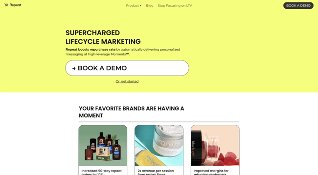
Repeat has ensured you’ve never seen or experienced a website like theirs before. With incredible animations, user-friendly navigation, and smooth transitions, their website immediately catches the eye and makes you want to explore more.
What I like: The large, expressive typography and direct, explicit messaging are my favorites. It simplifies the value offer without making visitors search for information. It feels intentional and unambiguous.
22. Seacat
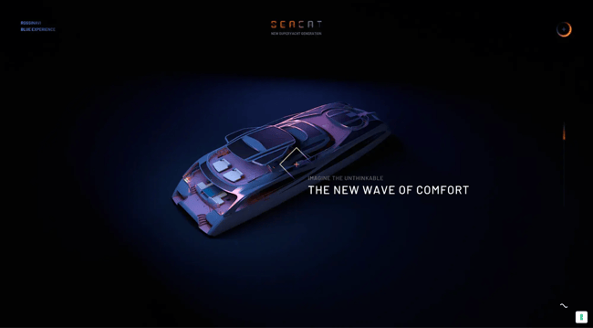
Seacat is another dark, moody addition to this list — but expect the unexpected here. As a superyacht created by Rossinavi, one of the world‘s top builders of luxury vessels, Seacat’s website perfectly captures the brand’s commitment to excellence.
From the moment you enter the site, you’re transported into a world of sophistication and elegance, where the latest technology and timeless craftsmanship come together to create something extraordinary.
What I like: Beautiful animations of the yacht’s sleek design and details attracted me. They feel natural and deliberate, making you enjoy the design rather than being overwhelmed with motion.
The audio experience added another depth of immersion and made the site feel more like an experience than a web page. The homepage, in particular, sets expectations quickly and begs you to enter rather than skim past.
23. Setpoint
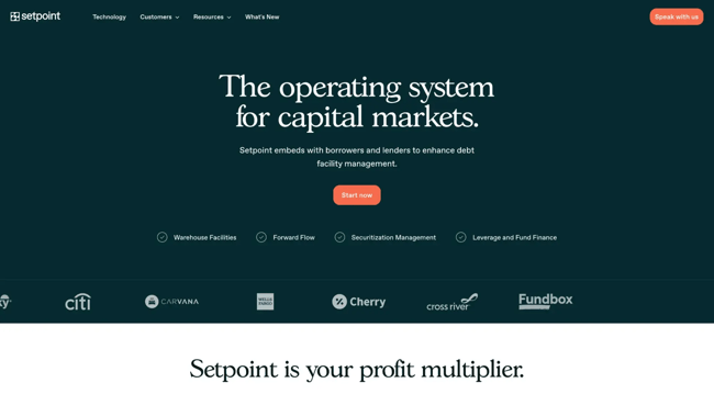
I think Setpoint’s website looks a bit like the HubSpot website. It shows how constraints may work in online design. I first noticed how clean and uncluttered everything was. Visual noise and distractions are absent. The site makes it clear what Setpoint performs and how its solution fits into a process.
Clarity comes from intelligent design and strong frontend implementation. This is a classic React example of leveraging minimal components to create a distraction-free experience.
What I like: My favorite part is how perfectly the design matches Setpoint’s brand. The minimalist design reflects their inventive, tech-driven approach and builds trust immediately.
Setpoint shows that impact doesn’t require excessive animation or striking images. Well-structured React-based designs with intent can be just as engaging, or even more so.
24. Bundlee
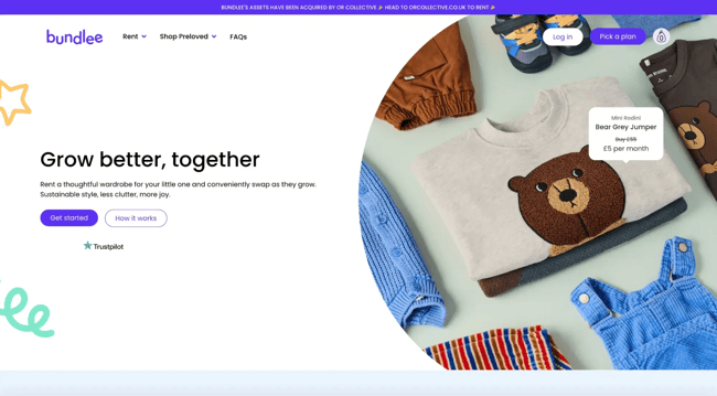
Bundlee’s website is happy by default. The site’s bright colors, amusing images, and friendly writing immediately identify its target audience. The design of the U.K. baby clothes rental business shows its warm, family-friendly ethos while being purposeful and well-structured.
With its colorful design, the site guides users well. Clear layout, simple messaging, and a smooth experience from start to end.
What I like: The fast and smooth transitions between pages make browsing a breeze, and the content provides users with everything they need to know about the service they’re offering. I also noticed that the site includes the smallest details (illustrations or images) to keep users engaged.
Bundlee showcases how a colorful, React-powered design can be entertaining and approachable while being polished and user-friendly.
25. Haven Servicing
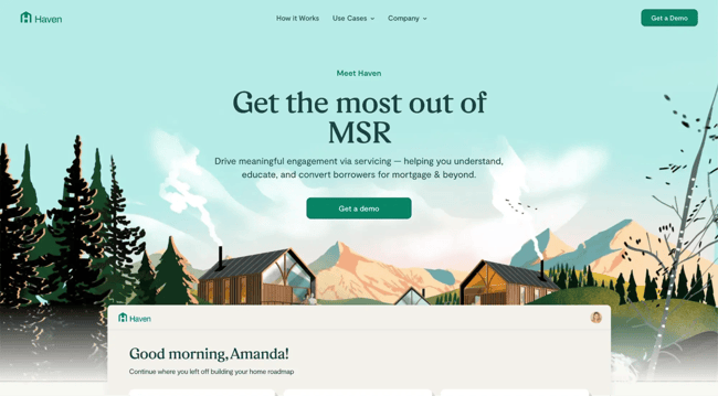
A historically “serious” industry like home financing may yet feel modern, approachable, and user-friendly, like Haven Servicing’s website. One of the first things I noticed about the site was the cartoon-style images and vibrant colors. The intimidation factor of the mortgage and loan systems is immediately reduced.
This platform serves homeowners, servicers, subservicers, and lenders, and its clear and well-structured style makes it easy to understand. The site simplifies financial concepts with images and action.
What I like: My favorite part is how the design simplifies a complicated product. Images assist users in understanding the platform’s value, especially recapturing and cross-selling functionalities.
How to Design a React Website
Designing a React website is not so difficult to learn for developers who have already gone through the process of learning HTML, CSS, and JavaScript. In this section, you will see all the steps I take from start to finish when designing a React website.
1. Plan the website first (before writing code).
I always start away from the code editor. Before touching React, I define:
- The purpose of the website.
- The target audience.
- The core pages and user flows.
- The key features that matter most.
This step saves me from overengineering later. A React website with a clear goal is far easier to design than one built on vague ideas.
2. Choose a modern React development setup.
These days, I rarely use older tooling. My current go-to setups are Next.js for SEO-friendly, production-ready websites. Use Vite and React for fast local development and prototypes. Visual Studio Code is still the most practical editor for React work.
I avoid outdated tools and setups because they slow teams down. A modern environment makes a noticeable difference in both performance and developer experience.
3. Pick a design framework (or system).
React doesn’t care how your site looks; that’s on you. To speed things up, I usually choose a design framework or system early.
The most popular and still relevant design frameworks now are:
The key is consistency. Whatever you choose, stick to it.
4. Create the layout and visual style.
Once the framework is set, I define:
- Color palette
- Typography scale
- Spacing rules
- Layout structure (grid, sections, containers)
I design mobile-first whenever possible. React makes it easy to reuse layouts, but responsiveness has to be intentional from the start.
5. Break the UI into React components.
Now this is where React truly shines. I never build full pages in one file. Instead, I break everything down into small, reusable components:
- Header
- Footer
- Navigation
- Cards
- Forms
- Sections
If I reuse something more than once, it becomes a component. That rule keeps my codebase clean and scalable.
6. Add interactivity and functionality.
With the structure in place, I layer in behavior:
- User interactions
- Dynamic content
- UI states
- Animations
Through the use of React Hooks (useState, useEffect), you can handle both interactivity and functionality very well. For animations, I often reach for Framer Motion’s simple, powerful, and production-ready tools.
7. Test the website the modern way.
Testing is one area where best practices have changed. Instead of older tools, I now use tools like Jest and React Testing Library.
This combo encourages testing how users actually interact with the UI, not internal implementation details. It’s far more reliable for long-term maintenance.
8. Optimize for performance and SEO.
SEO plays a huge role in how well your website will do; a good website that isn’t seen isn’t worth much. So whenever I design a React website, I always:
- Optimize images.
- Reduce unnecessary re-renders.
- Add proper metadata.
- Ensure fast load times.
9. Deploy the React Website.
When it’s time to go live, I stick with platforms that are React-friendly. My go-to choices are Vercel and Netlify.
Deployment today is mostly about configuration and environment variables, not server headaches.
Getting Started
If there’s one thing I hope this blog makes clear, it’s that React isn’t just a JavaScript framework; it’s a creative tool. Over the years, I’ve seen React power everything from clean SaaS landing pages to immersive brand experiences, interactive annual reports, portfolios, and experimental storytelling sites. The examples in this post prove just how wide that spectrum really is.
React provides the tools; your creativity is the magic.
Editor's note: This post was originally published in May 2023 and has been updated for comprehensiveness.
Website Design Examples
.png?width=112&height=112&name=Image%20Hackathon%20%E2%80%93%20Vertical%20(50).png)
.png)

![15 black and white website designs to inspire your own [+ pro tips]](https://53.fs1.hubspotusercontent-na1.net/hubfs/53/black-and-white-website-design-1-20250520-1336267.webp)
![15 Brochure Website Examples to Inspire You [+ How to Make One]](https://53.fs1.hubspotusercontent-na1.net/hubfs/53/brochure-website-examples-1-20250319-362228.webp)
![28 Types of Websites to Inspire You [+ Real-Life Examples]](https://53.fs1.hubspotusercontent-na1.net/hubfs/53/types-of-websites.png)

