.png?width=112&height=112&name=Image%20Hackathon%20%E2%80%93%20Vertical%20(50).png)

There are numerous times I’ve been handed an existing website that can barely load on mobile and, if it does load, is almost totally unusable. Not only does this have visitors bouncing straight off the site to find a competitor, but it can damage first impressions of a company or brand.
So, when I’m working with developers on rebuilding a client site, I take a mobile-first approach and make sure that responsiveness is built into the design right from the start. Below, I’ve collected a list of responsive design tools I tested this year, along with a couple of familiar favorites that I regularly turn to.
Table of Contents
- What are responsive design tools?
- Evaluating Responsive Design Tools
- The Software Management Tools I Tested
- So, are responsive design tools worth it?
What are responsive design tools?
Responsive design tools are apps or software for web developers and designers to help ensure the sites they are building will work seamlessly on multiple screen sizes and devices. Responsive design has become a pivotal part of web design as users are accessing sites on an increasingly diverse range of viewports.
There are different types of responsive design tools, and, depending on their structure, they offer different ways to build or test design responsiveness. Most base their functionality on easily building responsive grid systems, managing media queries, and other flexible layout elements.
Whether users are accessing your site on a smartphone, desktop monitor, laptop, or tablet, responsive web design tools help ensure a seamless user experience across all devices.
There are a lot of reasons to incorporate responsive design tools into your dev stack.
First, search engines like Google take mobile-friendliness into account when ranking websites in organic search results as part of their “mobile first” policy. So, responsive design contributes to driving traffic to the website.
Aside from that, responsive design affects a whole host of user engagement and retention metrics that, once you get users to your site, influence whether they stay, how long or how much they engage, and whether you can convert them.
In May 2023, data from Similarweb showed that 65.47% of all internet traffic was generated from mobile devices. Conversion rates are typically lower on mobile devices, but it’s entirely possible that’s a symptom of poor user experience rather than lower intent, because mobile draws the highest numbers of both new (65%) and returning (745) visitors to websites.
Evaluating Responsive Design Tools
I mainly work with small businesses to redesign their websites. It started with a family member’s side gig and a website that needed a facelift. The results were far better than I expected, so I started investing time in upgrading some of the websites for my own side projects.
Fast forward a couple of years, and I now work with a couple of clients at a time on a referral basis to upgrade their online presence. The most common complaint I hear? “The website is terrible on mobile.”
I’ve tried a lot of different web design tools over the years, especially early on when I was getting to grips with the basics, and mostly worked on a trial-and-error basis. But tools for quickly and easily ensuring websites are optimized for mobile quickly became a regular and important part of my process.
If you’re shopping around for responsive design technology, there are a few things I would keep an eye out for.
Firstly, find one that’s easy to use. When it comes to straightforward websites, in particular, some tools have a lot of bells and whistles that you simply won’t need. So focus on the functionality you actually need and search for tools from there.
Another critical aspect for me is the ability to easily work with others in the tool. Most of the time, I work alongside a developer for more complex aspects of a site build, and I need to collaborate with them in one spot and hand off designs easily. Similarly, your client might want to look at the designs as you make progress, so a tool that makes it easy to preview designs for others is always a plus.
I always want to be able to test that what we’re building is as responsive as I’m promising it will be. So, the ability to test the site on a wide range of screen sizes and viewports is also important.
Finally, I like to work with pre-built components a lot. So tools that have large libraries of responsive components (forms, nav, icons, etc.) make my job a lot easier.
.png)
Free Website Design Inspiration Guide
77 Brilliant Examples of Homepages, Blogs & Landing Pages to Inspire You
- Agency Pages
- Ecommerce Pages
- Tech Company Pages
- And More!
Download Free
All fields are required.
Form not available
The Software Management Tools I Tested
I’m working on two websites at the moment that provide interesting use cases to test out responsive tools.
The first is a spa website that needs to be able to drive phone call clicks and website appointment bookings, showcase the treatment rooms, and highlight customer reviews. The second is an e-commerce site selling holiday decorations around the world.
Both sites have some issues with responsiveness and require pretty significant facelifts. So, I tried out some of the tools below on new designs for the sites to see what worked best.
1. Bootstrap

Bootstrap is free to use as an open-source framework for front-end development. Its primary purpose is to help quickly build responsive websites by providing pre-designed components that are built for responsiveness. Provided in CSS, HTML, and Javascript, Bootstrap provides a ton of components, including nav bars, buttons, forms, modals, and more.
I’ve used Bootstrap a couple of times before, and I’ve always found it very straightforward and simple to use. Since the components are pre-styled, it’s a huge time-saver. The only downside is that when you know what you’re looking for, you can end up with a very “Bootstrap-looking” website unless you’re willing to put in some serious customization.
Best for: Bootstrap is well suited for developers who need to work fast on a reliable framework to prototype and iterate on responsive websites quickly. If you like a standardized approach and are under time pressure, Bootstrap is well worth a look.
How Bootstrap Worked in Testing
I tested Bootstrap on the spa site since I wanted a very simple nav bar that would work well on mobile and to see how I could use the responsive utility classes to hide certain elements on mobile. The grid system made it super easy to structure a responsive layout with column classes, so the content adapted well from mobile to desktop.
2. Elementor

If you like specifically working quickly and efficiently on WordPress sites, you can’t really go wrong with Elementor. It’s a page builder with responsiveness built into the drag-and-drop editor with lots of room for customization. Neither of the websites I’m working on at the moment are on WordPress, but I’ve used Elementor a lot in the past, and it’s one of my favorites.
There is an extensive library of widgets that are easy to customize, and you have out-of-the-box responsive editing modes for both mobile and tablet viewports. You can also leverage dynamic content with all the usual WordPress plugins.
When using Elementor, I can easily switch into preview mode as I go and verify the responsiveness of the site as I work, which is always handy. Elementor allows you complete freedom when it comes to breakpoints, so you can build for any device size.
Best for: If you prefer code-free editing without sacrificing customization control, Elementor is a great option. It’s also good for developers who work on a wide range of websites, from simple blogs to more complex sites, since it’s so flexible. There might be a learning curve to tackle if you’re a beginner, but it’s worth the investment.
How Elementor Worked in Testing
I’m going to draw on my previous experience here rather than my two tester websites. Having worked on Elementor before, I will say that its primary purpose isn’t solely about responsiveness.
Rather, that’s a feature built into a much wider web design tool with easy development and tons of customization options. If you’re a one-stop-shop type of person and want to streamline your dev stack, I’d check out Elementor for your next WordPress project since you can draw on the widget library and all your usual WordPress plugins for functionality.
3. Figma

If prototyping and collaboration are the name of the game, then Figma is for you.
Used by web developers and product designers alike, Figma’s vector networks and layout function provide real-time collaboration and easy sharing of designs for feedback and quick iterations. When it comes to responsiveness, you can use Figma to implement constraints and control how elements resize across different devices.
Figma is a tool I’ve used in the past when a site’s design needs to be handed off to a more experienced web developer. In those instances, I’ve used the auto-layout feature to build flexible components that can adapt to multiple different screen sizes.
Best for: Figma is typically used by teams of designers and developers who need a highly collaborative platform for designing interfaces. If you’re a lone web designer, you probably won’t need its suite of features. But it also makes it easy to share with clients for feedback and iterate fast.
How Figma Worked in Testing
With Figma, I wanted to see how I could lay out product category pages for the ecommerce website to make them responsive on mobile sites.
It’s pretty simple to create elements that keep their integrity across different viewports. The auto-layout keeps things in check as you design, and you get pre-loaded frames to check out responsiveness as you go. I started by laying out the category pages, which required a grid system, in desktop view. Although some tweaking was needed in the pre-loaded frames for mobile and tablet sizes, the constraints’ functionality made it a pretty light lift.
4. Sketch

Similar to Figma, Sketch is a vector-based tool for designing websites and mobile apps. I hadn’t used Sketch before, so it was interesting to try it out and compare it with Figma.
With Sketch, you get a very simple interface and a pretty extensive set of plugins, so you can customize it to your design workflows. The Artboards section is really where responsiveness comes into play, as this is where you build your design.
Best for: If you’re an experienced designer who prefers to work from a dedicated UI/UX tool, Sketch might be worth a try. There’s a big plugin library that is good for customization, but a lot of the functionality relies on these plugins, so it’s almost a requirement if you want in-depth use of the tool. It’s also worth noting that the Sketch app is only available for macOS.
How Sketch Worked in Testing
I wanted to like Sketch, but I think after trying it out, my loyalty still lies with Figma.
I didn’t find Sketch to be intuitive to use, and it doesn’t really provide responsive design at your fingertips. I had to go searching for a workaround to create responsive designs with the out-of-the-box features first and set up responsive resizing rules, which took a while.
Then, I added a plugin for the Anima app, which made it a lot easier, but it’s still functionality that I would prefer if I’m looking for a tool specifically made for responsive design.
5. Responsive Design Checker

Sometimes, designers can get stuck in their ways a little. You build how you build, and you don’t necessarily want to start designing from a brand-new tool. If that’s the case, you might like Responsive Design Checker. It enables you to test the responsiveness of websites, so if you find an issue, you can go back to your tried and tested design tool and fix the problem from there.
Best for: Responsive Design Checker does exactly what it says. You won’t find any design or development features — it’s purely for checking live pages for their responsiveness.
If you like your existing stack but just want a quick responsiveness test to build into your workflows, it’s a great free tool for simple websites. If you want to do extensive checking, you’ll only be able to check five web pages within a five-minute window.
How Responsive Design Checker Worked in Testing
Since it only works for live pages, I picked a random live website to test using the tool. A panel on the left contains tons of pre-set sizes across different device types for you to test quickly and easily. And you can use the space next to the search bar to test specific custom dimensions if needed, too.
I found this tool very easy to use, but I did have challenges with some websites not connecting correctly when I tried a few out, so it may not be 100% reliable.
6. Foundation

Similar to Bootstrap, which was first on our list, Foundation is a front-end design framework. Foundation specifically prioritizes a mobile-first approach, so it’s got responsiveness built into its entire grid system and UI components library.
With such a strong proclamation about designing responsively, I was excited to try it. Similar to Bootstrap, you get a whole library of components like forms, modals, buttons, nav menus, and more.
Best for: Foundation definitely isn’t for beginners. However, if you’re an experienced developer who wants a design framework that prioritizes mobile experience — but still provides total customization flexibility — then the built-in responsiveness makes this tool worth a try.
Free Website Design Inspiration Guide
77 Brilliant Examples of Homepages, Blogs & Landing Pages to Inspire You
- Agency Pages
- Ecommerce Pages
- Tech Company Pages
- And More!
Download Free
All fields are required.
Form not available
How Foundation Worked in Testing:
Even with some familiarity with a similar framework, I found Foundation to have a bit of a learning curve. The grid system is super flexible, which is great if you want that level of customization, but makes it a little more work to use if you want very precise layout control across different devices.
However, Foundation has an impressive resource library and an active community with plenty of threads to leverage when questions come up.
7. Wirefy

Wirefy is another framework that prioritizes responsive design. It’s a 12-column grid system with a completely semantic grid that doesn’t add extra markup to your code, and widths live within your CSS instead.
The grid is highly responsive and flexible and pretty straightforward to adjust across different viewport sizes. Additionally, you get UI elements like navigation menus, slideshow, breadcrumbs, and tabs alongside forms, lists, and tables.
Best for: Wirefy is about designing responsive wireframes that can then be easily implemented into additional frameworks or your CMS. The good thing about Wirefy is that it’s relatively beginner-friendly, and you don’t need much more than a foundational grasp of HTML and CSS to get going.
How Wirefy Worked in Testing
Building wireframes in Wirefy was a dream when it came to responsiveness. The grid is very flexible, and it was easy to build early-stage designs focused on overall layout to make sure they were moving gracefully from one screen size to another.
That being said, you will definitely need to implement the wireframes into a further framework or page builder for full design capabilities. But it doesn’t claim to be anything more than a wireframe builder, so if that’s what you want to ensure responsiveness is taken into account right from the start of the design process, then it’s worth giving it a go.
8. Marvel

Marvel is a full platform for designing web applications and is specifically lauded for designing mobile apps quickly and efficiently.
The platform focuses on collaborative design and actually owns the design tool Sketch we listed above. Marvel pretty much does it all when it comes to designing apps, but the standout feature from a responsiveness point of view is the wireframing functionality.
Rather than building from scratch, Marvel provides a large library of pre-built wireframes that you can use with intuitive drag-and-drop functionality.
Best for: Marvel is an excellent choice for teams who want a central place to manage the entire design process from start to finish in a collaborative environment. If you only need it for responsiveness, some of the other features of the tool outside wireframing and design might be a little excessive, although it’s pretty reasonably priced either way.
How Marvel Worked in Testing
The first thing Marvel asks during the onboarding process is what screen size you want to focus on, so the option to focus on mobile design is there right from the start.
Then, you can instantly start dragging and dropping designs into the tool. If you use Sketch, you can quickly connect with the plugin and bring your designs in that way too.
Overall, the UX within Marvel was very straightforward and easy to use. It was simple to build prototypes that automatically adapted to different screen sizes. I started out by building a wireframe from scratch, and a handy drop-down to view in different resolutions made it easy to ensure my design was staying responsive as I went.
That being said, if you’re into highly customized designs, you’ll likely want to export your wireframes to a different tool, as this was one aspect of Marvel that was a little limiting.
9. Mockplus

When I looked at the features and functionality available with Mockplus, an end-to-end design tool available on MacOS, I was in no doubt of its robustness.
But the real question here is whether it’s useful as a responsive web design tool. Mockplus certainly delivers in that area, with a drag-and-drop interface for prototyping that makes it easy to keep responsiveness top of mind right from the start and customize as you move into wireframing and design.
Best for: Mockplus is really for anyone, as it has high customization or low-code options available, depending on your abilities and preferences.
You can get access to a lot of functionality for free, and the paid plans are very reasonable. Whether you’re an individual interested in specific functionality or part of a team looking for an end-to-end collaborative solution, Mockplus is a great choice.
How Mockplus Worked in Testing
Mockplus was really easy to get up and running. There was a huge range of templates to get started with for my wireframe, so I used a template to build a quick wireframe for the spa website’s homepage layout.
It was already responsive in that mode and very simple to move onto the design phase, where micro-interactions and animations were easy to start building into the product through drag-and-drop functionality. With the “Responsive layout” option toggled, the design moved seamlessly into different screen sizes the whole way through the project.
10. Froont

Sometimes, you don’t need lots of bells and whistles. If you’re focused on building responsive landing pages or publications specifically, Froont is a tool that was created with this specific use case in mind.
You can use templates or import your own designs and work with a visual editor to tweak and test for responsiveness. You can also start with a basic design and then pull from a library of pre-built responsive components like forms, buttons, and content blocks.
Best for: While you probably wouldn’t use Froont for a full site or app design, it’s really handy for quickly building responsive landing pages. If you’re a designer or dev team working on an existing site and need to rinse and repeat from a couple of base landing page designs, it’s a great time saver.
How Froont worked in testing
I decided to try out one of the template page designs in Froont and apply some of the visuals from the spa website. The auto-layout makes the pages very responsive, but you can also reset the breakpoint on all elements for super precise customization if needed.
The interface was pretty user-friendly, but functionality was slightly limited. That being said, there is an Expert Mode for more detailed access to dimensions and positioning, too.
11. Divi 5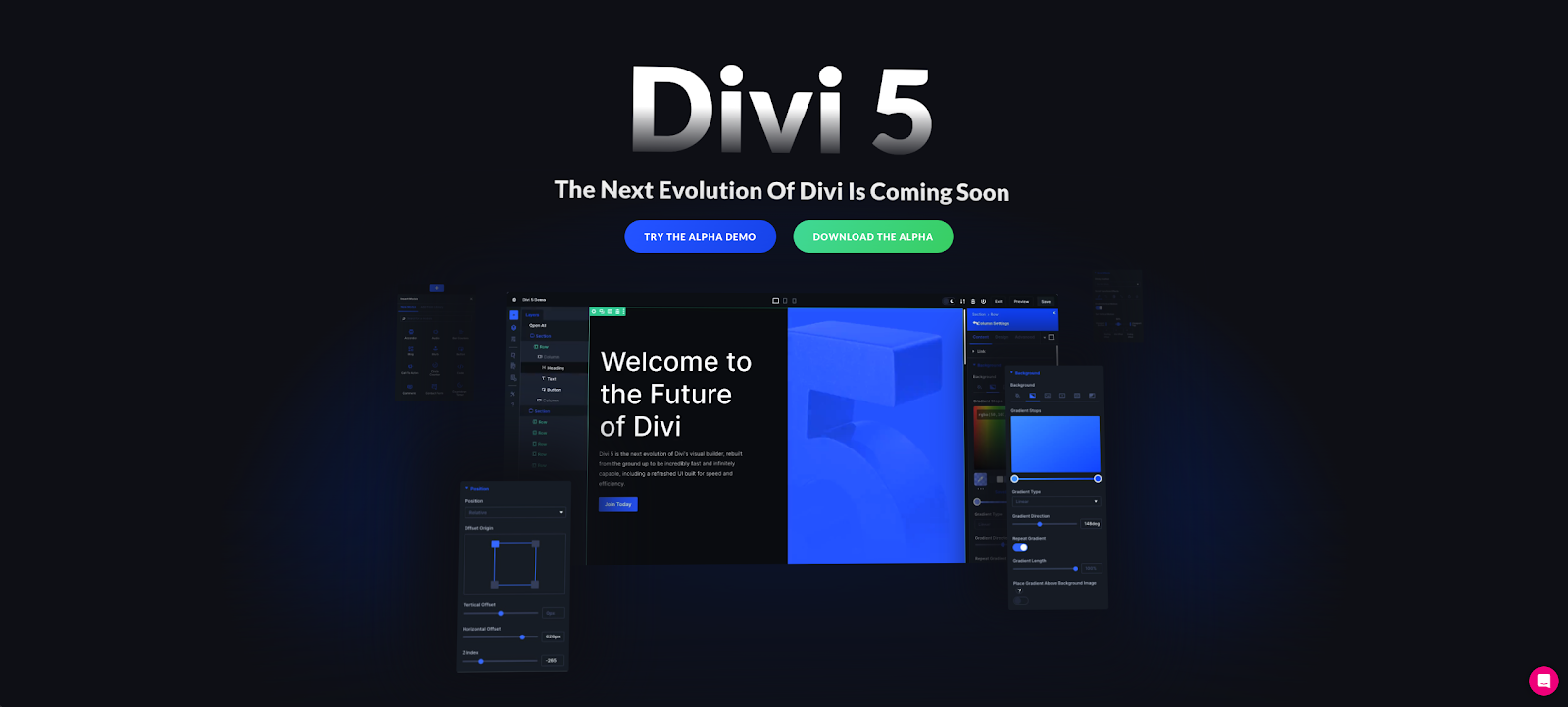
Divi 5 is a powerful WordPress builder with exceptional responsive capabilities, offering a significant performance boost over Divi 4. Its modular framework ensures faster load times and intuitive editing. The standout feature is its responsive design system with seven customizable breakpoints for precise control across devices.
The Visual Builder simplifies responsive design with seamless breakpoint switching and real-time layout editing. Divi 5’s Advanced Units feature allows the use of CSS functions like calc and clamp for fluid typography and responsive layouts, ensuring text scales well across all device sizes.
Best for: Designers and developers who want comprehensive control over responsive design without sacrificing ease of use. Divi 5 is ideal for WordPress sites of any complexity, from simple business pages to sophisticated eCommerce platforms. While there's a learning curve to master all these new features, the intuitive interface makes it accessible for most users.
How Divi 5 worked in testing
Divi 5 excels at creating highly customized responsive layouts. The ability to define and adjust custom breakpoints allows for incredibly precise control over your site's responsive behavior. The Visual Builder provides a true WYSIWYG experience, showing exactly how your designs will appear across all device sizes as you build.
So, are responsive design tools worth it?
The short answer is “yes.”
No matter the type of website you’re designing these days, responsiveness is an absolute must. But the ability to design responsive sites is typically something that’s built into another tool or framework, outside of single-purpose tools like Responsive Design Checker.
The decision really comes down to what you like and want to keep about your existing tech stack and what you can add in or swap that will make your site design process more intuitively responsive.
Since I typically work with frameworks, Bootstrap is a firm favorite, but I also liked the simplicity of tools like Froont for landing page creation with responsiveness built in. Larger teams might like to explore more end-to-end tools like Mockplus or Marvel, where responsiveness becomes a core part of the process at multiple stages of handoff.
The good news is that almost every tool on this list has either a free option or an extensive free trial period, so you can jump in and check them out firsthand.
Responsive Design

![Responsive Text: Making Your Font Look Great on Every Device [+CSS & HTML Tips]](https://53.fs1.hubspotusercontent-na1.net/hubfs/53/responsie-text-1-20250206-8138788.webp)
.png)