
Table of Contents
- What are responsive website templates?
- Benefits of a Responsive Website Template
- Best Responsive Website Templates Available
What are responsive website templates?
A responsive website looks good, regardless of the device on which it's viewed. These websites use modern web principles to create the best experience for all visitors. Images, text, and layout shift, so they are optimized for different screen sizes. Sometimes, developers remove bells and whistles for smaller, mobile devices.
Before 2023, responsive web templates were generated with HTML5, CSS, and jQuery. Today, some also support Google’s accelerated mobile page. This helps your site load faster on mobile devices, reducing bounce rates and visitors wandering away.
Benefits of a Responsive Website Template
You may have a site that looks beautiful on desktop, but a large number of your visitors will explore your offering on other devices.
According to Exploding Topics, people spend more time on their phones than ever. Mobile device traffic has accounted for over half of global website traffic since 2017. In the final quarter of 2022, this percentage rose to 59% of web traffic.
If you think that a mobile app will help you get around building a responsive site, think again. In 2019, Google found that 63% of smartphone users are more likely to use a brand’s mobile site when shopping because they don’t want to download an app.
You’ll want to make sure the growing majority of your visitors can navigate your site with ease. Having a responsive website goes a long way to building customer trust and reducing bounce rates.
The Best Responsive Website Templates
Looking to build a compelling omni-platform experience? We’ve collected thirty of the best responsive website templates to help.
These templates are platform-agnostic, which means you can use them on your hosting platform without the trappings of a CMS. You’ll have to update them client-side or port them so they can talk to your CMS of choice.
W3School Templates
Band

This responsive web template from W3Schools, the people who teach you how to code, simply rocks. Get a local band up and running for little more than elbow grease with this template.
With this template, you can include photos from your gigs, your group’s tour dates, and your contact information. This is great if you’re looking for a no-frills solution to build buzz for your group.
What We Like
- This is a free template packed with developer tutorials
- There’s a large slideshow on the homepage
- You get an easy-to-read menu with drop-down options
Limitations
- The design is a little clunky, with large typefaces
- You’ll need to build additional pages outside of the home page
Food Blog Template

Dress your table with this food blog template, and get your mouth-watering recipes out into the world! You’ll be up and running in no time with your recipe blog, and mobile users can view your site without any issues. This site is ideal if you’re looking for a simple grid layout to display your food adventures.
What We Like
- The front-page gallery offers big, portrait images
- The typography is easy on the eyes
- The collapsible burger menu is already a mobile standard
Limitations
- You only get the front page
- This layout will be too simple for some users
Wedding Invitation Template
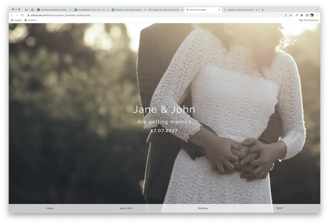
If you and your partner are ready for the next step in your lives, you’ll need a way to share the details about the big day. While you can get a hosted wedding website elsewhere, you’d have to pay for the service. Use this responsive template and host it yourself.
This template is great if you’re looking for a responsive one-page layout. You’ll have one central hub to share information and pictures.
What We Like
- There are sections for everything your guests need to know about the wedding
- Popup form for guests to RSVP
Limitations
- You’ll need to integrate Eventbrite, MailChimp, or another email service yourself
- You can click away from the popup until you fill out the form
Parallax Theme

Although the parallax one-page website design has waned in popularity, it’s an easy way to create a portfolio with all your information. This template from W3Schools offers a sleek design. You can share how many projects you’ve created and samples of the work itself.
What We Like
- This versatile template can be used for all kinds of portfolios
- The site has a trendy theme that’s great for creatives
- You can build a one-page layout with sections for about, portfolio, and contact
Limitations
- Any additional pages will need to be built by you by hand
- You will need to use a form maker to set up the contact form — try Formspree!
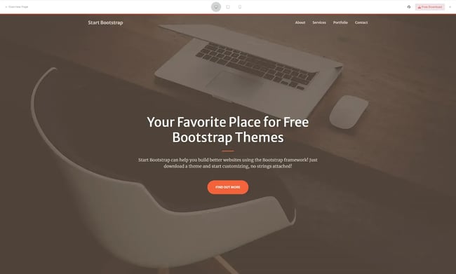
Start Bootstrap Templates
Freelancer

The next few themes are built using Bootstrap, a CSS framework that makes building responsive websites a breeze. Graciously, Start Bootstrap created a series of free themes that you can use for many different projects.
This theme is designed with freelancer designers in mind. Here, freelance professionals can build a single-page portfolio. You can host images of your work that expand when clicked. Plus, you can share a brief bio and your contact information.
What We Like
- The template uses the bootstrap framework, which offers stable and lightweight code
- There’s a working contact form that uses SBForms
- You get mobile-friendly navigation that scrolls with your user
Limitations
- You may need intermediate CSS knowledge to customize the theme
Agency

Agency offers a responsive-ready, one-page theme. Plus, this template is designed with businesses in mind. You showcase a company timeline and profiles for each team member, giving the site a personal flair. You can also show off nice, big graphics to break up text on your page.
This is a great theme for startups, freelance consultants, or consulting agencies.
What We Like
- A shiny, responsive top nav sticks to the top of the browser as you scroll
- This template integrates with Font Awesome icons
- You get classic agency-site sections including about, team, and timeline
Limitations
- Any additional pages will need to be built by hand
Creative
Another one-page bootstrap theme, this HTML template works well with any mobile device. Plus, you can adapt the theme for small businesses, one-person agencies, restaurants, and more. Get those creative juices flowing with this free template.
This is a great template for users looking to show off the best work in their portfolio. You can create an image gallery with samples of past projects. However, if you’re looking for a more extensive site to display the vast array of your work, opt for a template with more than one page.
What We Like
- This template is free to download and use for any Web design project
- Modern, flat graphics are easy on the eyes (big and small screens alike)
- A working form powered by SBForms is already included
Limitations
- Support can be slow for users
- Additional features are behind a paid theme option
Grayscale

If you want to create a dark and dusky aesthetic, Grayscale may be the template for you. This theme offers big, beautiful images that look good on any device your visitors may be using. You’ll stand out from the crowd with this free, responsive HTML template.
This theme is great for photographers that specialize in black-and-white imagery. You can show off your work and find clients, no matter what device they use.
What We Like
- Scrollspy highlights sections as you scroll the page
- A sticky menu makes the parallax feature easy to navigate
- There’s nice typography that is enhanced by the contrast
Limitations
- Some of the column features of Bootstrap’s native framework don’t behave well
- Porting the themes from Start Bootstrap to WordPress may take advanced coding knowledge
Stylish Portfolio

Like most of the Start Bootstrap themes, Stylish Portfolio is exactly what it says on the tin. What makes it stand out from the pack? JQuery makes the one-page scrolling smooth as silk. This template also includes stylish call-to-action sections for ads and banners that look great on all devices.
What We Like
- JQuery keeps visitors scrolling through sections
- Image grid layout is available for portfolio pieces and client work
Limitations
- Implementing additional bootstrap features requires advanced coding knowledge
Free CSS Templates
SEO Master

An agency-friendly responsive website template, SEO Master is a great starting point for your next web design project. The flat-style graphics and unique animation make this a modern and stylish template that will look good on any device.
What We Like
- Sleek animation elevates the theme from basic to shiny
- The navigation is easy to read and highlights alert visitors where they are
Limitations
- Adding bootstrap features may require additional coding knowledge
Global

Global is a free responsive website template available at Free CSS. With global, you can quickly customize a portfolio that shares your work with the world.
This template features a standout, innovative navigation structure. You can click on different sections on the home page via a slider on the left-hand side to navigate between sections. And, when you click the hamburger menu, large text slides into view.
These simple animations make this portfolio site feel modern and sleek.
What We Like
- An interesting timeline-style layout guides visitors through projects
- The big type is nice and legible for people with accessibility needs
- Fancy animation toggles between pages and eschews a one-page scroll
Limitation
- This template requires some coding knowledge to get it to display like the demo
Carta

A great, lightweight landing page theme, this minimal, one-page layout would make any marketing manager happy.
Easy-to-read typography, simple colors, and smooth scrolling give Carta an edge over other landing page templates. This is especially true if your company uses icons or graphics on its landing pages.
What We Like
- You can easily link to the Apple App Store and Google Play
- The flat-style icons are modern without being too cartoonish
- The sign-up form is a dark color scheme, providing an intuitive CTA for visitors
Limitations
- There’s no navigation on the page
- This template can’t work as a full-scale website without additional design work
Plot Listing

Plot Listing was made with local business directories in mind. This responsive website template provides you with the right infrastructure to create a digital repository of local recommendations. Users can search for stores and services in their area regardless of their device.
As with any directory, you’ll need to port a database or content management system with recommendations to power your site.
What We Like
- This template offers a beautiful user experience graphics make browsing this template easy
- There are clearly defined sections that guide the users through a journey
- There are slideshows, a sticky menu, a full footer, and other desirable features
Limitations
- You’ll need some extensive coding language to get this onto a CMS
- Additional pages require your keen design eye
Consult

If you’re building a website for a consulting agency, get started with this free theme. You’ll have a design that looks great on any device and offers all the classic sections to help visitors learn about your business.
This website uses two-column layouts, a three-column grid, and a full-width image carousel to keep the page visually interesting for desktop. The number of columns decreases as devices get smaller. Animation is also embedded throughout, adding motion and life to the side.
What We Like
- There’s a second, mini-navigation menu for login info, contact, and more
- The theme offers lots of page options already designed
- There are bold, beautiful colors and typography throughout the layout
Limitations
- You’ll need some additional coding skills to port this to a CMS
HTML5 UP! Templates
Paradigm Shift

ParadigmShift is a multipurpose theme that’s easy on the eyes. You could imagine this responsive template as the starting point for any website category.
Paradigm Shift has stylish graphics and large images that look good no matter the device.
What We Like
- Its cool, two-column template is different than the usual one-pager
- There are bright colors that you can customize to your liking
- HTML UP lets you test the site on different devices in the browser
Limitations
- No interior pages, so you’ll have to develop those yourself
- You’ll need to set up your own form integration
Massively

There’s not a bad theme at HTML5 UP! Massively is an interesting take on a blog front page that works well across devices. This theme includes an elements guide to make styling your site easy styling reference.
With Massively, you don’t just get the home page. One interior page is included so you can demo the neat tab navigation.
What We Like
- There’s strong typography abound in this theme, which is good for accessibility
- You get nice animation on buttons and other elements throughout the theme
Limitations
- The mobile style removes the tab navigation of the pages
Story

Story is a theme for those who like wide templates. Plus, you can choose your column width. You can split both columns 50/50 or opt for a 75/25 distribution. This theme is great for portfolios, personal sites, and creatives looking to gain clients by showcasing their work.
What We Like
- The typography is big, bold, and easy on the eyes with lots of element styles
- Photography layouts offer split columns as well as grids
- You get a wide range of features, including icon columns, tables, and code blocks
Limitations
- We wish there were a lightbox for images that float within paragraphs
- No interior pages are offered, meaning you’d need to build any yourself
Editorial
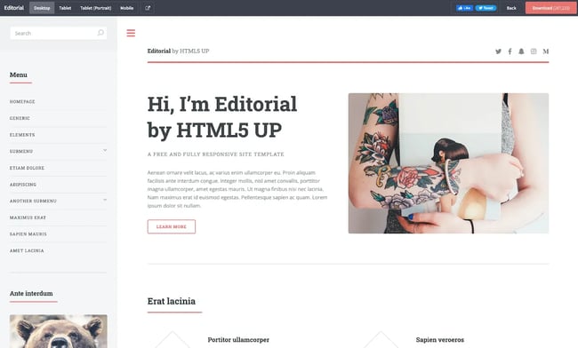
This free responsive website template is geared toward those who want to create a sweeping blog with many categories and topics. You get a cool, sticky sidebar that stays put as you scroll the main interior content of the site.
The sidebar disappears on the mobile view to create an optimal mobile experience. You can make sure everything looks great, even on smaller devices.
What We Like
- Editorial’s cool sticky sidebar is modern and great for accessibility
- There are zoomable images with smooth rounded corners
- Icons make the theme feel finished and detailed
Limitations
- Coding is required to get the site ported onto a CMS
Phantom

Phantom is a free, completely responsive template with unique features. Category buckets zoom into colored photos. Interior pages are also included, making it simple to build a full site. You could use this for a variety of projects, from a portfolio to an agency website.
What we like:
- Neat animation effects entice visitors to click on project categories
- An interior page template is offered so you can build additional pages easily
- Rounded corners on photos and icons give the template a modern feel
Limitations
- The home page’s grid layout may feel limiting to some users
Solid State

Solid State offers a very sleek one-page responsive template with flat-style graphics and modern styling. Right out of the box, you get access to a photo gallery, contact form, and other easily customizable sections.
What We Like
- This template has a dark color scheme for those who want a moody design
- Flat-style graphics provide a modern backdrop for your content
- You get a parallax navigation menu and an added burger-style menu
Limitations
- Interior pages are hard to find
Striped

Striped is a free, responsive website template for stylish blogs. This theme gives you a cool sidebar for categories, post dates, and ad space. Your site will also play well with mobile devices, making reading easy for those on the go.
What We Like
- This is a great blog template that looks good across all devices
- There are nice, wide images to make storytelling a breeze
- You get a cool sidebar with traditional blog elements, like categories and a calendar
Limitations
- You’ll need to design any interior pages yourself, which requires coding
Colorlib Templates
Raptor

Raptor is a contemporary website template designed with app developers in mind. Rawr onto the scene with this sleek and modern layout for your app. Just download the code and customize it with your branding and content.
What We Like
- The hero slideshow has many value-add areas for your product or service
- The template comes with classic features built in, including a pricing table, search box, stats panel, and staff buckets
Limitations
- Raptor is a paid template, and many free templates do the job just as well
Theme Forest Templates
Nosei
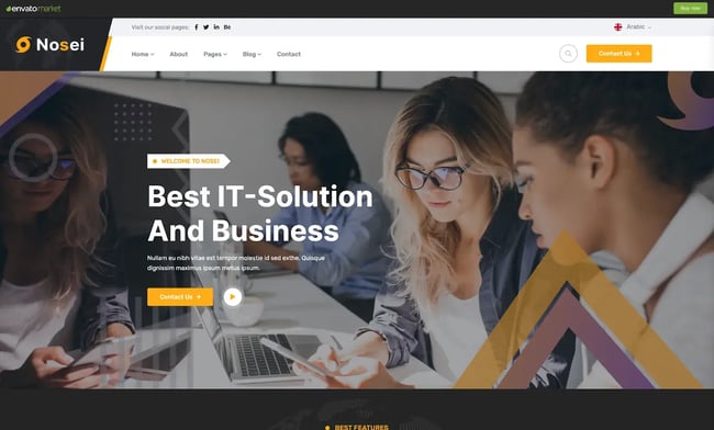
A beautiful and bold theme ready for your business venture, Nosei offers big images, bold fonts, and quite a few bells and whistles. Built with Bootstrap, Nosei loads fast and is a lightweight theme to have on your server.
What We Like
- The price is a steal – just $9
- Lots of interior pages are ready to go; all you need is branding and content
- The mobile design retains many of the design and branding elements beautifully
Limitations
- This site is designed for business ventures and is difficult to adapt for other types of sites
Canun

Cancun is a great choice if you’re looking for a responsive template for WordPress. Though this theme is billed for lawyers and consultants, a little imagination could make this theme multifunctional.
Branding and design elements carry over to mobile devices seamlessly, so you can make sure your business is accessible on all devices.
What We Like
- You can choose whether you need the WordPress-friendly version of the theme
- Lots of templates readily available for interior pages and features
Limitations
- The WordPress theme uses Elementor, which you would need to purchase
Feelings

Aptly named, Feelings is a responsive Website template designed for wedding planners and those getting married. Use this template as an elegant starting point for your special day.
Feelings also allows you to easily create a blog. With mobile responsiveness, all of your posts will look great on any device.
What We Like
- This beautiful blog layout could be used to communicate updates to guests
- Extensive features for a wedding Website, including RSVP and gallery
- Ports nicely over to mobile devices, with nothing lost in translation
Limitations
- Built with Bootstrap, customizing may require additional coding knowledge
- The WordPress version uses Elementor, which has an additional cost
Dora

The Dora template offers a bright and beautiful responsive website for your portfolio. This theme is packed with interesting features, including service buckets, experience sliders, and animated mouseovers.
What We Like
- Dora offers a different take on the one-page layout with bright colors and bold typography
- The sticky menu includes a call-to-action button for your services
- Dora looks great on all devices and doesn’t lose an ounce of its personality
Limitations
- The one-page architecture forces blogs to pop up instead of navigating to a new page
BeeBerry

The most specific theme on this entire list, BeeBerry is a responsive template for your online honey store. Although a savvy developer could alter the layout with graphics for any kind of business, the bee business certainly looks like it’s booming on this template.
What We Like
- There are stunning graphics for any honeycomb-related business, from candles to skincare
- Ecommerce pages include well-designed features for shopping
- BeeBerry looks great across all devices, and the shopping buttons carry over well
Limitations
- You would need to port this over to an ecommerce platform yourself
Mellis
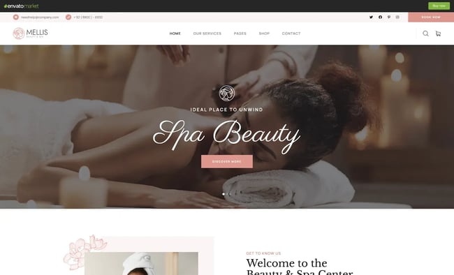
With a skincare or beauty brand in mind, Mellis is a beautiful and elegant responsive template you can use to start your web design project. This theme features wide hero graphics, a zen color palette, and fully-designed interior pages.
What We Like
- Serene graphics paint the perfect backdrop for your spa or skincare brand
- Fully-designed interior pages mean less coding for you or your developer
- Styling and graphics carry over nicely to the small screen
Limitations
- You would need to port over this theme to a content management system of your choice
Poket

Poket is a responsive Website template that, you guessed it, looks good on whatever device you have in your pocket. This budget-friendly theme comes packed with demos to help you get started on your latest web design project quickly.
What We Like
- The breadth of demos to choose from means you may never need another theme
- Demos have a landing page, multipurpose page, and video page premade
- The demos look great across all manner of mobile devices
Limitations
- The WordPress version uses Elementor, which adds an extra cost
- You may need extra help to plan and design your Website with all these options available
Template Monster Themes
Multipurpose Intense

Multipurpose Intense has some impressive stats: 120+ HTML files, 100+ reusable components, 15+ header and footer styles, 20+ blog templates, and the list goes on and on and on. Use the Novi page builder to customize the site quickly and easily to get up and running.
What We Like
- There are an extensive amount of templates, interior pages, and reusable code snippets
- There are templates included for just about every use case imaginable
- The template is built with Bootstrap for easy responsive tables and columns
Building Your Responsive Site
While some users still surprisingly manage to hit that “Request Desktop Site” button on their mobile device, more and more are tuning into their favorite websites on the small screen.
It’s more important than ever from a user experience perspective to go where your visitors are –– in their pocket. Use a responsive template like the ones we’ve curated above, and you’ll be well on your way to meeting their mobile browsing needs.
Responsive Design

![Responsive Text: Making Your Font Look Great on Every Device [+CSS & HTML Tips]](https://53.fs1.hubspotusercontent-na1.net/hubfs/53/responsie-text-1-20250206-8138788.webp)
.png)