.png?width=112&height=112&name=Image%20Hackathon%20%E2%80%93%20Square%20(10).png)

When crafting a digital product like a website, app, or wearable, the key is to ensure it's user-friendly and efficient. This hinges on the principles of User Interface Design (UI), which centers on creating intuitive and visually pleasing interfaces for seamless user interactions.
For this article, I spoke with talented HubSpot UI designers and sourced insights from external experts. I’ll share what I learned, plus my favorite UI design techniques and tools.
Table of Contents
- What is UI design?
- UI Design Principles
- 4 Common Types of User Interfaces (With Examples)
- 7 Essential Elements of UI Design
- How to Design UI for a Website
- UI Design Tools
- Best UI Design Examples
- The Importance of UI Design
What is UI design?
UI design is about crafting the visual and interactive elements of a digital product, such as colors, text, buttons, and animations. UI design is essential for a positive user experience but distinct from UX design, which addresses broader product development aspects in both digital and physical realms. UI design involves strategic choices in layout, like logo placement and button behavior, to ensure visual coherence and an engaging interface.
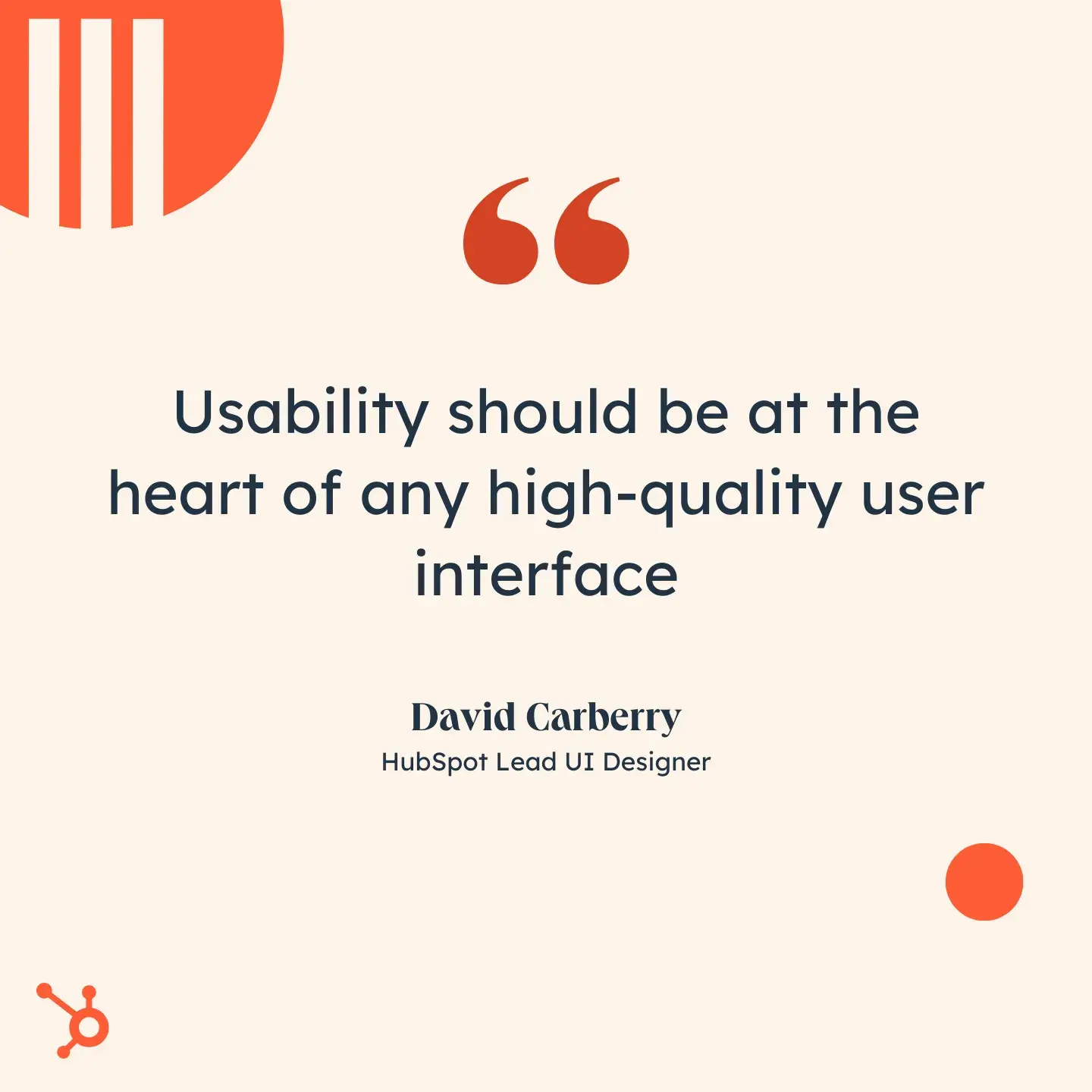
As my colleague and HubSpot Lead UI Designer David Carberry explains, “Most people assume that good UI design is about aesthetics and making everything look nice. UI design is about balancing aesthetics with functionality to enhance the user experience. Usability should be at the heart of any high-quality user interface.”
UI Design Principles
While every application will require a unique interface, there are a few fundamental principles that should guide every project. You’ll find dozens online and in textbooks, but a handful are the most well-known and regarded.
These include the 10 Usability Heuristics for UI Design by Jakob Nielsen, The Eight Golden Rules of Interface Design by Ben Shneiderman, and Principles of Interaction Design by Bruce Tognazzini.
Most of these principles overlap, so I’ll condense and summarize them below.
.png)
Free UX Research Kit + Templates
3 templates for conducting user tests, summarizing your UX research, and presenting your findings.
- User Testing Template
- UX Research Testing Report Template
- UX Research Presentation Template
Download Free
All fields are required.
Form not available
1. Be consistent.
Consistency in colors, typography, animations, and language usage is vital for a cohesive interface, impacting both the user experience and brand identity.
For instance, using different labels like “Submit” and “Send” on forms can confuse users. To ensure internal consistency, standardize button copy, using either “Submit” or “Send.”
Jeff Byer, CEO of web design business Byer Company, emphasizes the importance of maintaining sufficient spacing throughout your interface.
“Your interface elements need consistency, and that is usually handled by a global stylesheet,” says Byer. “Once you have your global styles set, resist the urge to override them.”
External consistency, on the other hand, involves following established conventions from other products to avoid burdening users with new patterns.
For instance, most websites use “Home” for their homepage navigation. Imagine if it said “Front Page” instead. Consistently adhering to established conventions, such as “Home,” reduces cognitive load and enhances the user experience.
2. Make users feel in control.
Creating an interface that empowers users to feel in command encourages them to explore and learn the application further. This involves allowing room for mistakes and the ability to reverse actions.
Consequently, here are some essential features to add:
- Clear close buttons on popups
- Straightforward options for revisiting or editing cart information on checkout pages
- Undo and redo functionalities in text editors
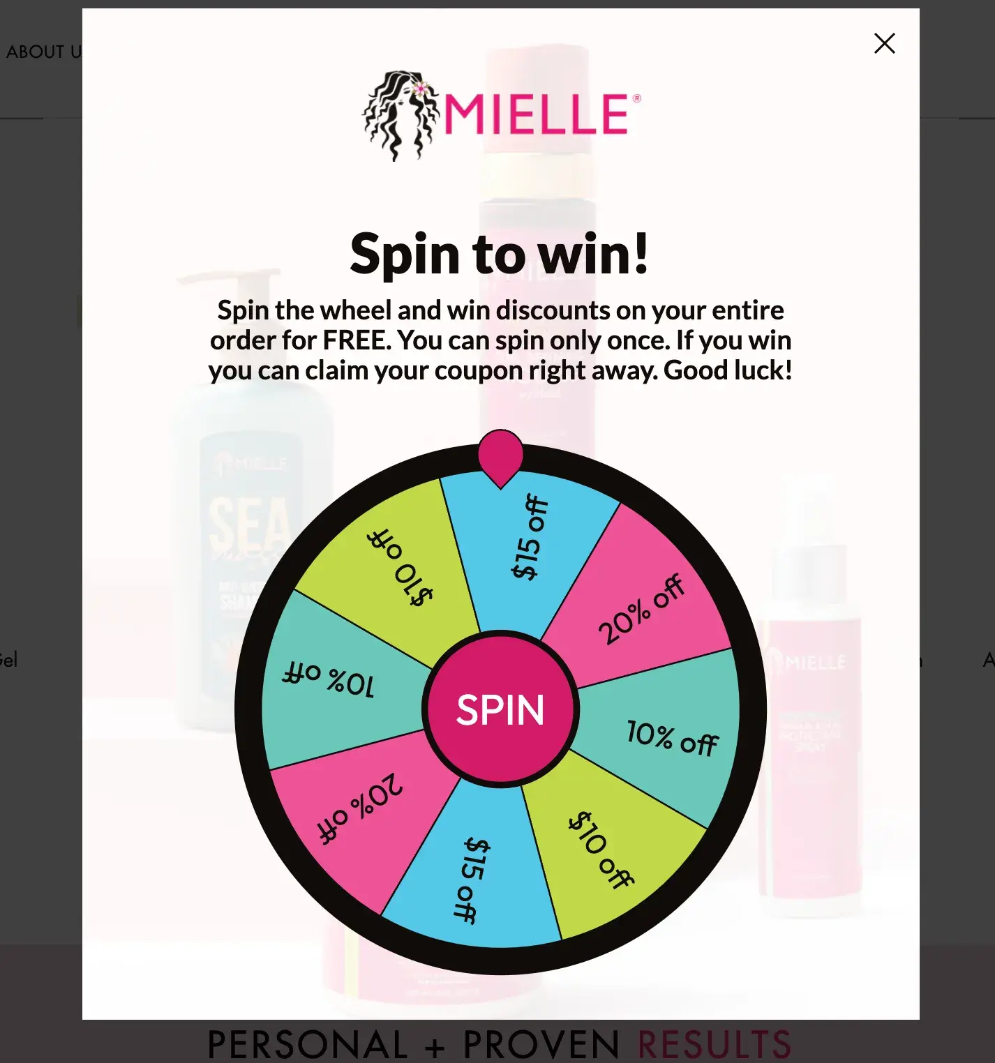
Consider this example from Mielle Organics, where a lightbox popup presents users with the clear choices of spinning to win or clicking the close button. This approach prioritizes user control and enhances their overall experience.
3. Provide feedback.
You can boost user confidence by providing feedback as they interact with the interface. Feedback lets a user know that their action worked or is working.
This can begin with a loading animation, indicating successful page access. I found this helpful when I visited the Dala website, which takes a bit longer to load due to its complexity.
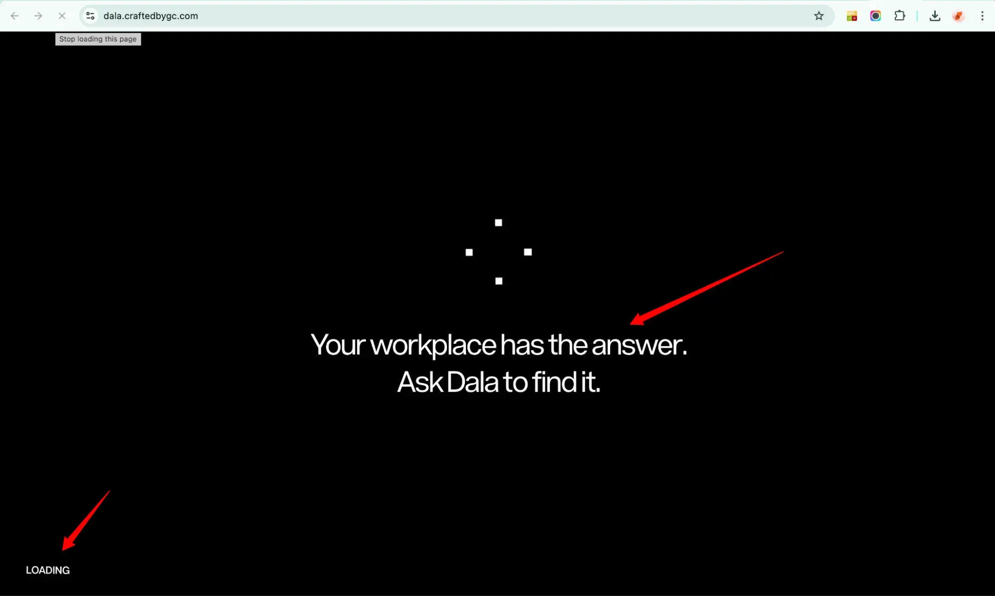
Without that loading animation, I might’ve thought the page wasn’t loading and clicked away.
Also, consider an order confirmation message on an ecommerce site, which confirms an action was successful and reassures users. Without such feedback, uncertainty may lead to duplicate orders or early exits.
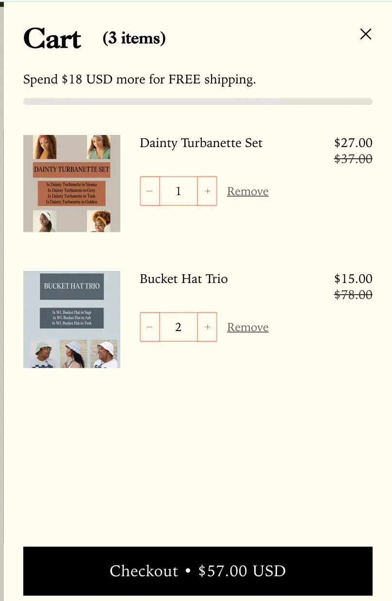
Similarly, informing users about their progress towards free shipping before checkout, as done by The Wrap Life, manages expectations and encourages additional spending.
4. Enable users to resolve errors.
A user interface should allow errors and enable users to correct them. This is where error messages come into play.
An error message with clear language and visuals identifies the issue and suggests a solution, aiding users in understanding, resolving, and avoiding the same mistake.
Take the “incorrect password” message on a login page, for example. It typically offers two solutions: re-entering the password or resetting it.
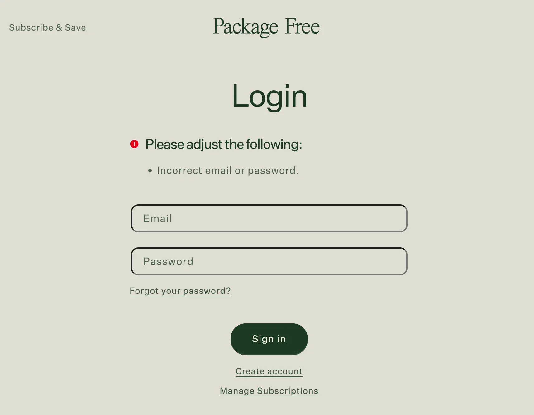
On Package Free Shop, an error message notifies users of an incorrect email address or password. It provides options to keep trying different combinations or initiate a password reset by clicking “Forgot your password?”.
5. Prevent errors.
Of course, empowering users to correct errors is great, but it’s even better if you can prevent those errors in the first place. You can do this by:
- Offering undo options
- Requiring steps to verify personal or payment information
- Issuing warnings
- Applying constraints to prevent error-prone actions
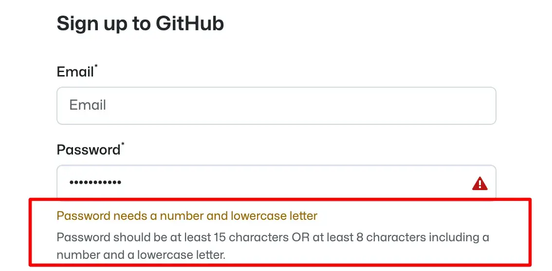
For instance, when setting a password, certain requirements like length, character combinations, special characters, and uniqueness must be met before a password can be created. This prevents duplicate passwords and ensures compatibility with processing requirements, enhancing security.
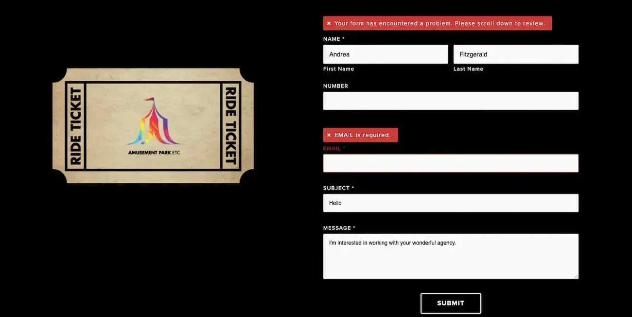
Another example of error prevention is in form completion. If a required field is left blank, users cannot submit the form; instead, they receive an error message, prompting them to review and correct the omission.
6. Don’t rely on users to remember information.
Regardless of where users are within the interface, whether at the bottom of the homepage or ready to check out, it‘s crucial to provide all necessary information for their next steps.
Users shouldn’t have to recall details from other parts of your site or perform cumbersome actions like scrolling up or using the back button.
For example, imagine offering a discount prominently displayed on your homepage but nowhere else. Users on product pages may be uncertain about the discount, and those on the checkout page might need to return to the homepage, potentially leading to cart abandonment or site exit.
To prevent this, ensure information is consistently visible and accessible across the entire user interface. For instance, place a discount banner on every page, allowing users to easily find it.
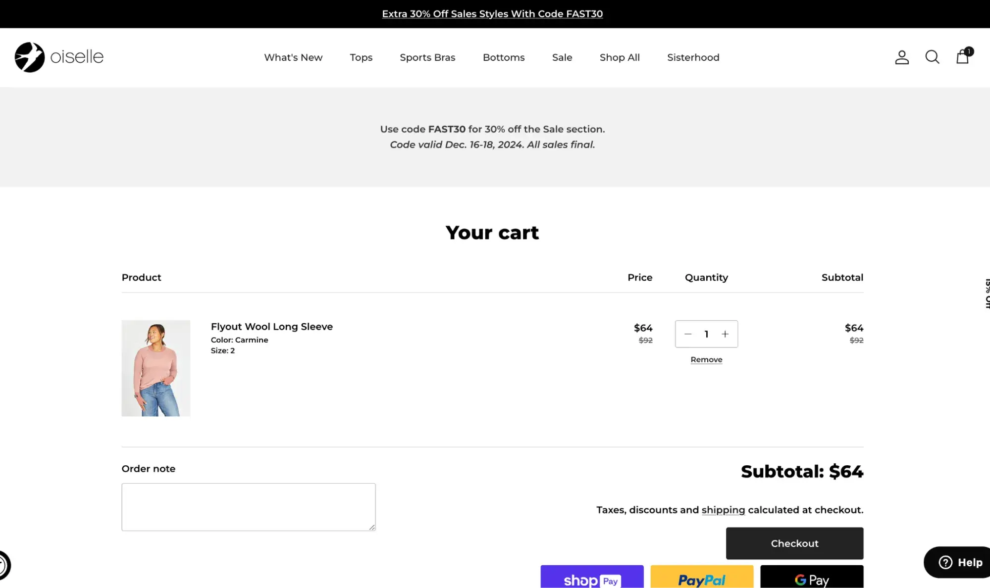
Oiselle, a women’s running apparel brand, achieves this by showcasing the discount on a hero image on the homepage, using a sitewide banner with the discount code on every page, and displaying the discount on the shopping cart page.
This design approach eliminates the need for users to remember or calculate discount details, enhancing their experience.
7. Keep it simple.
Keeping the user interface simple doesn’t mean making it flat and avoiding shadows, effects, or other decorative elements. It just means using a minimalist approach when designing the interface.
Think: What elements must I include to enable users to complete their goals? Anything else will compete for the user’s attention and is likely better left out.
I like the advice my colleague Steve Le, a HubSpot user interface designer, gave me: “When I design something, I always want to stay away from visual noise. So, if everything is just condensed, then I feel like it adds a lot of visual noise.”
Le’s fix? Using white space, negative space, and padding.
Carberry agrees. “You need to let the content breathe,” he says. “ Include extra padding in your UI elements and containers.
“It’s a subtle change, but it adds much more clarity and flow to your designs, ensuring a clear distinction between each content section. The power of white space cannot be overstated.”
Free UX Research Kit + Templates
3 templates for conducting user tests, summarizing your UX research, and presenting your findings.
- User Testing Template
- UX Research Testing Report Template
- UX Research Presentation Template
Download Free
All fields are required.
Form not available
8. Design for different types of users.
Let’s say you’re designing an interface for a content management system. Some users might have a lot of experience with other CMS platforms, while others might have never used one before. That’s why it’s important to design with both experts and beginners in mind.
You can achieve this by offering demonstrations or tooltip recommendations for newcomers, as well as shortcuts and other speed-enhancing features for experienced users.
Importantly, all of these functionalities should include options for users to skip or exit at their discretion. This way, users who require guidance can utilize the demos and suggestions, while those with greater expertise can seamlessly navigate the platform and leverage shortcuts.
Design tool Figma masters this with its onboarding user flow, which asks pertinent questions to better segment each user based on interests and experience.
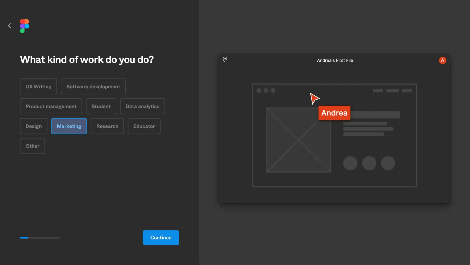
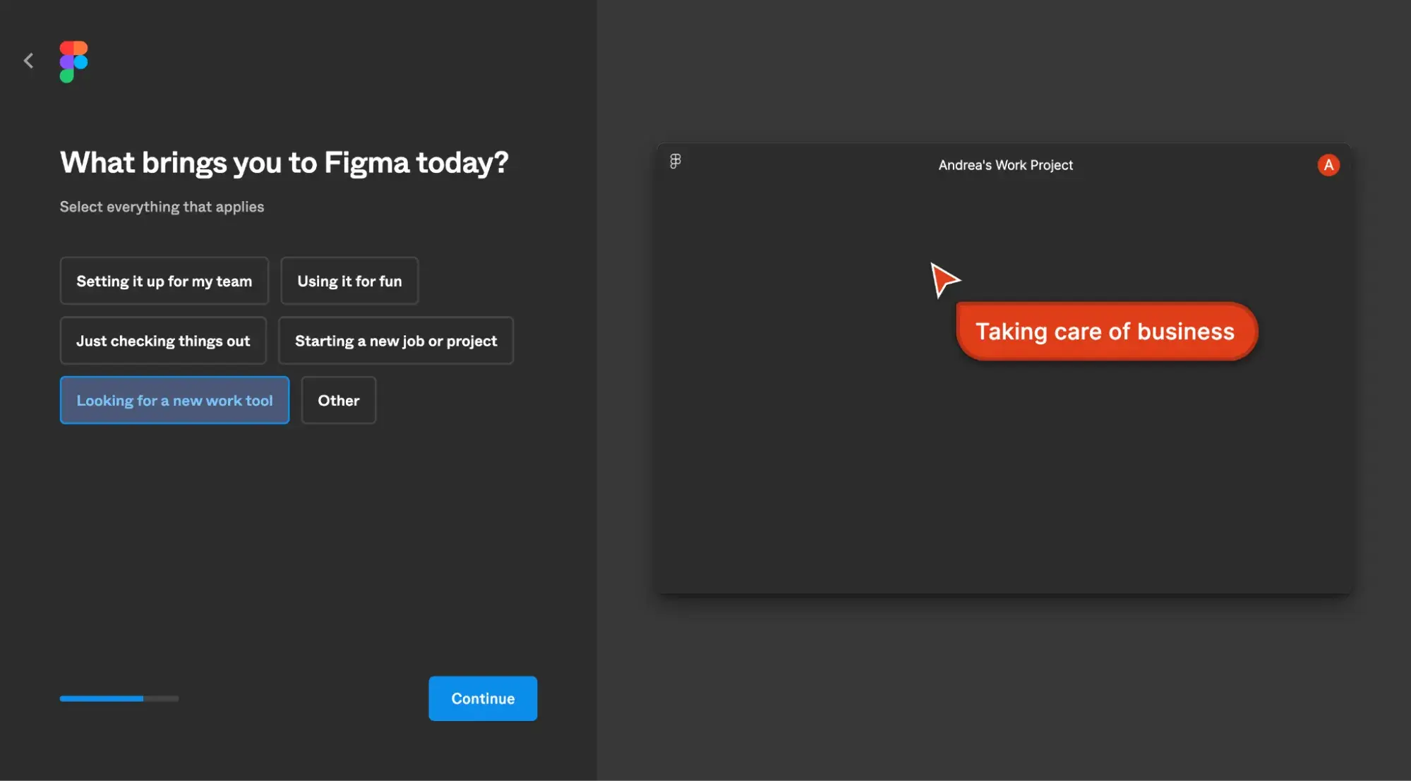
It asked me if I’ve used Figma products before, what my role is at my company, why I’m using the tool, and other questions.
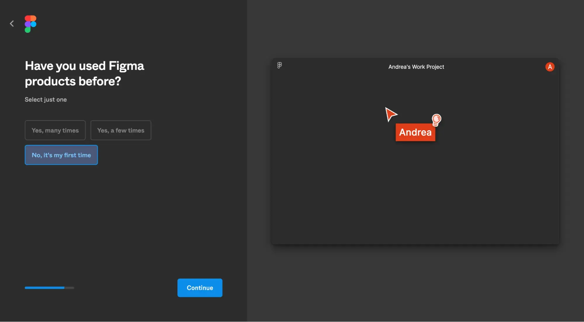
When Figma realized I was a beginner, it set up my dashboard with basic tutorials.
4 Common Types of User Interfaces (With Examples)
According to Make:Iterate design school, there are 15 types of user interfaces. Let’s go over some common ones along with examples.
1. Command Line Interface (CLI)
Unlike the graphical interfaces of laptops and smartphones that you and I use regularly, the Command Line Interface (CLI) is purely text-based. They’re most commonly used by software engineers.
2. Graphical User Interface (GUI)
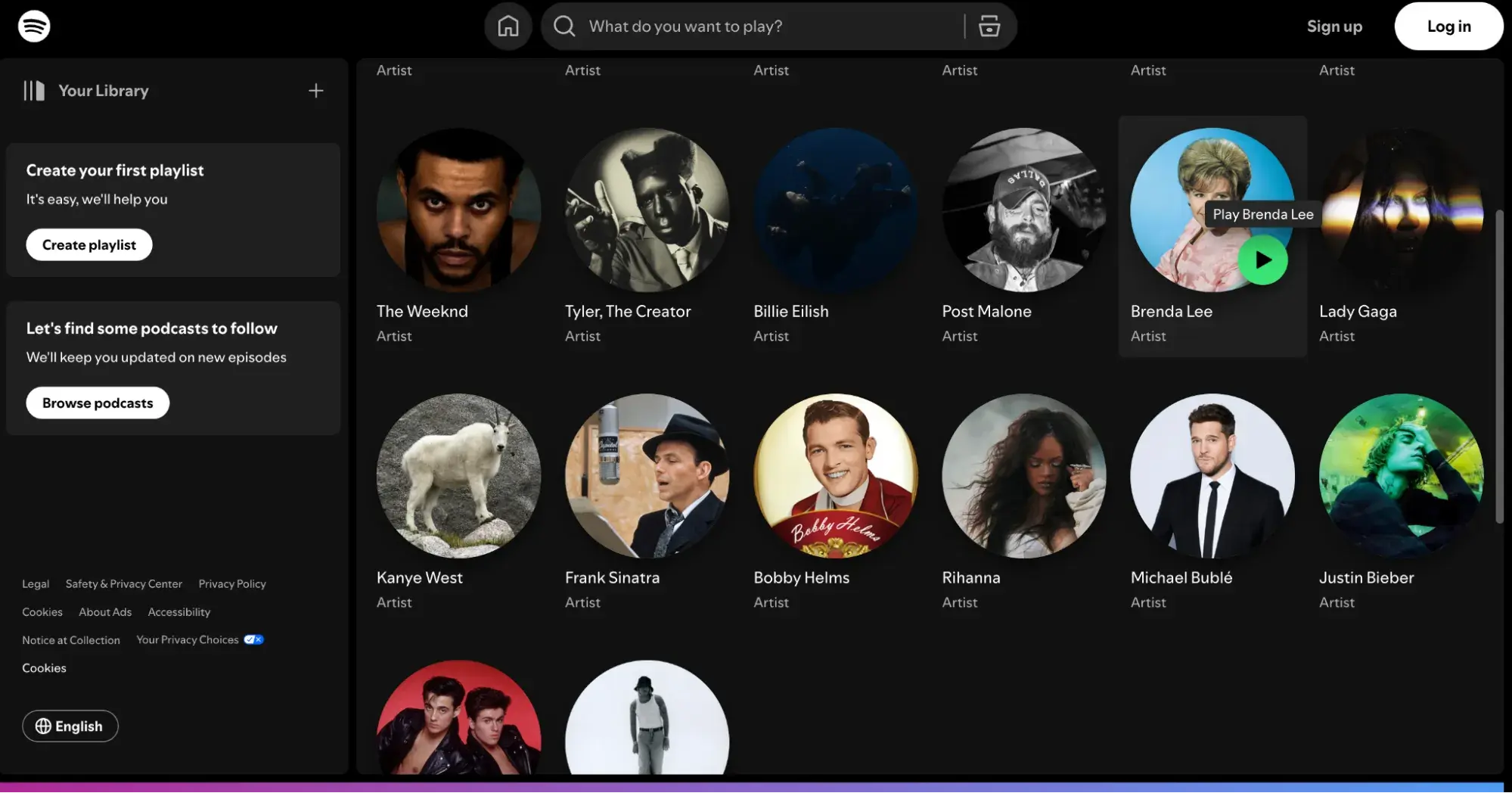
Graphical User Interfaces (GUIs) are so ubiquitous that you might not even realize you’re using them all the time. The computer or smartphone that you’re reading this blog post on is a GUI. GUIs use visual elements to represent actions, such as a right-facing arrow meaning you can click it to play audio or video.
In the Spotify GUI example below, you can click the green arrow button to play music, instead of typing in a text command like in a CLI.
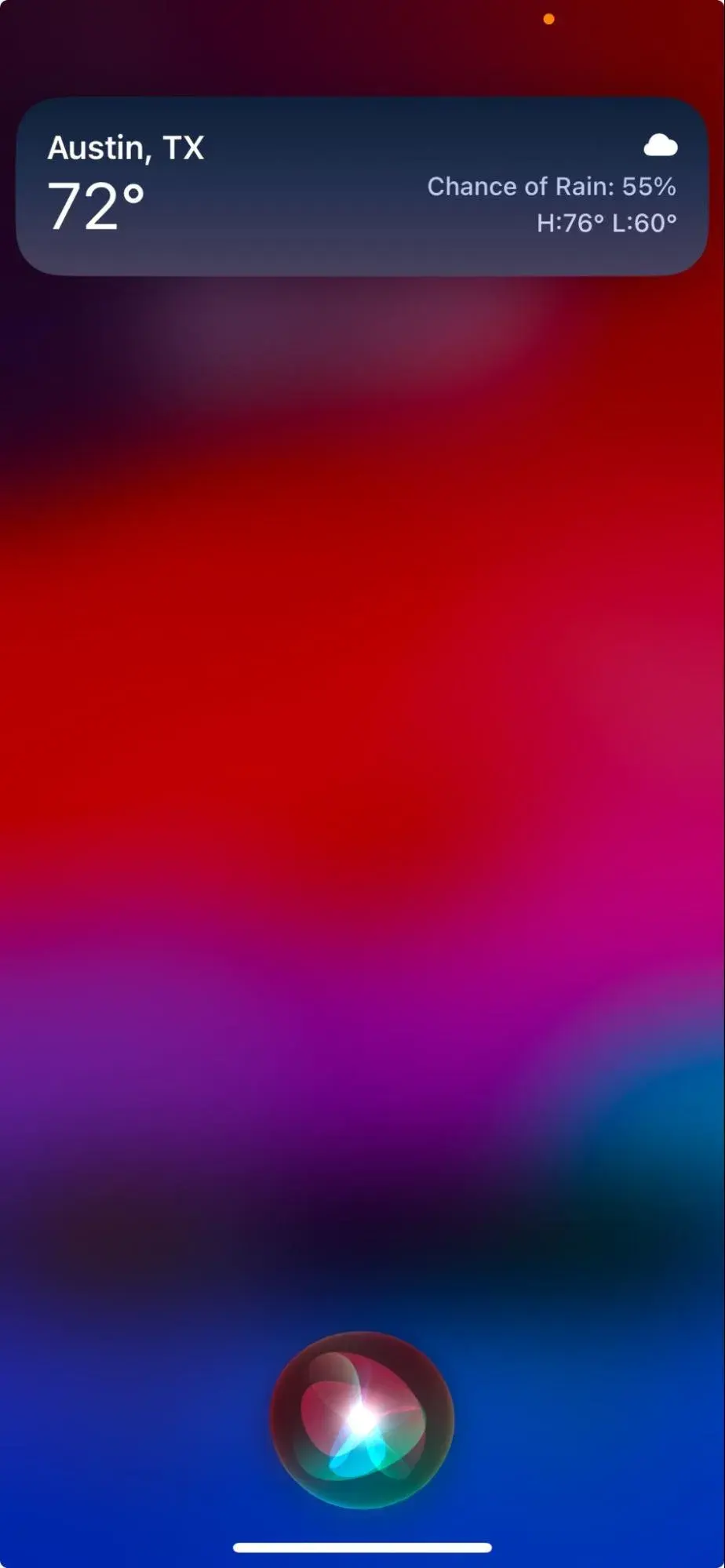
3. Voice User Interface (VUI)
If you’ve ever asked Siri or Alexa to tell you the weather forecast, you’ve interacted with a Voice User Interface (VUI). These interfaces are controlled by the user’s voice commands.
4. Touch User Interface (TUI)
Made extremely popular thanks to smartphones like Apple’s iPhone, the touch user interface allows users to interact with screens using their fingers.
7 Essential Elements of UI Design
Whether you realize it or not, you see the elements of UI design everywhere — they make up the interfaces of every digital product you use.
Let’s go over seven common elements of UI design, according to Kickass UX. Be sure to watch the full video to learn about all 27 UI elements!
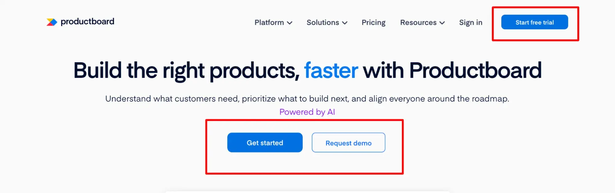
1. Buttons
Buttons are clickable elements that prompt a user to take some sort of action. As you can see on the Productboard website example below, there are three buttons that have three different calls to action: “Get started,” “Request demo,” and “Start free trial.”
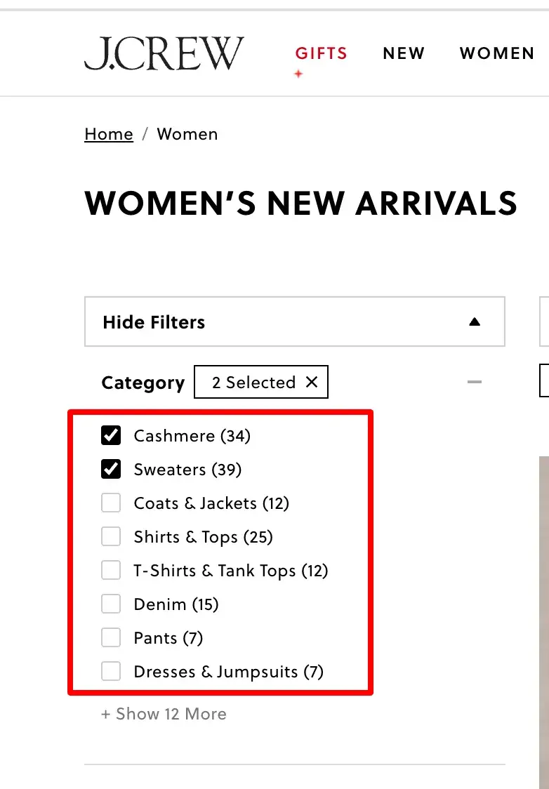
2. Checkboxes
Users expect that when they click an empty checkbox, a checkmark will appear. If they click it again, the checkmark should disappear. Checkboxes are useful for filtering results, like in the J.Crew example below.
3. Icons
Icons are simple images that convey a message without words. For example, the house icon in the LinkedIn example below is a universal icon for going back to the website’s homepage.

linkedin.com
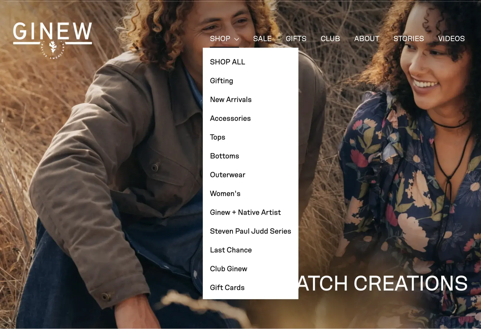
4. Menus
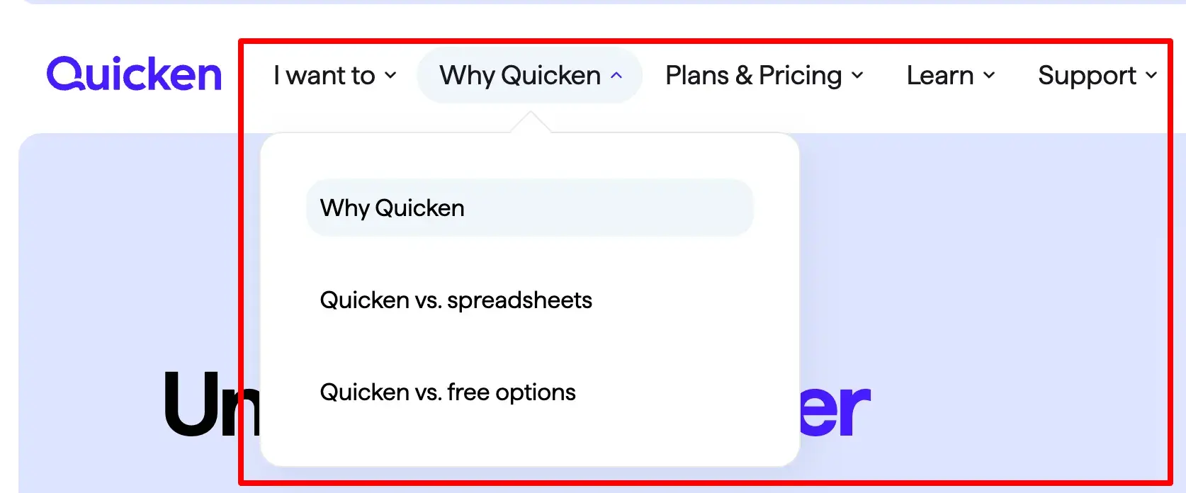
Menus signify options and help a user navigate. Each option in a menu should indicate the link's destination. For dropdown menus, users typically expect an arrow to signal that they must hover or click to see the full menu, like in the Quicken example below.
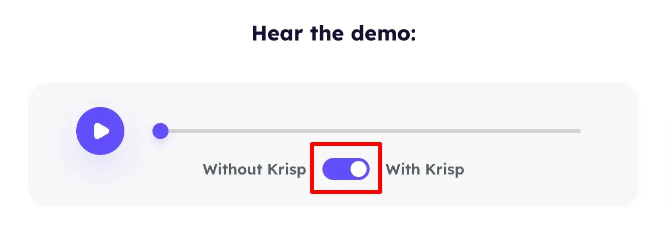
5. Toggles
Toggles allow users to go back and forth between two options, usually between an “on” and “off” state.
This is particularly useful when you want the user to be able to compare two states, such as the Krisp noise cancellation app does in the example below. Users can hear the audio without Krisp and then switch the toggle on to hear the audio with Krisp.
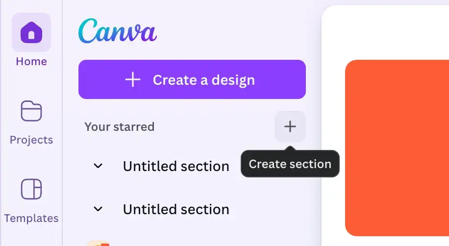
6. Tooltips
Tooltips are the words that pop up when a user hovers over something. They provide extra context to help the user gain clarity and orientation.
For example, in Canva, if I hover over the “+” icon, a tooltip appears that tells me that clicking the icon will create a section.
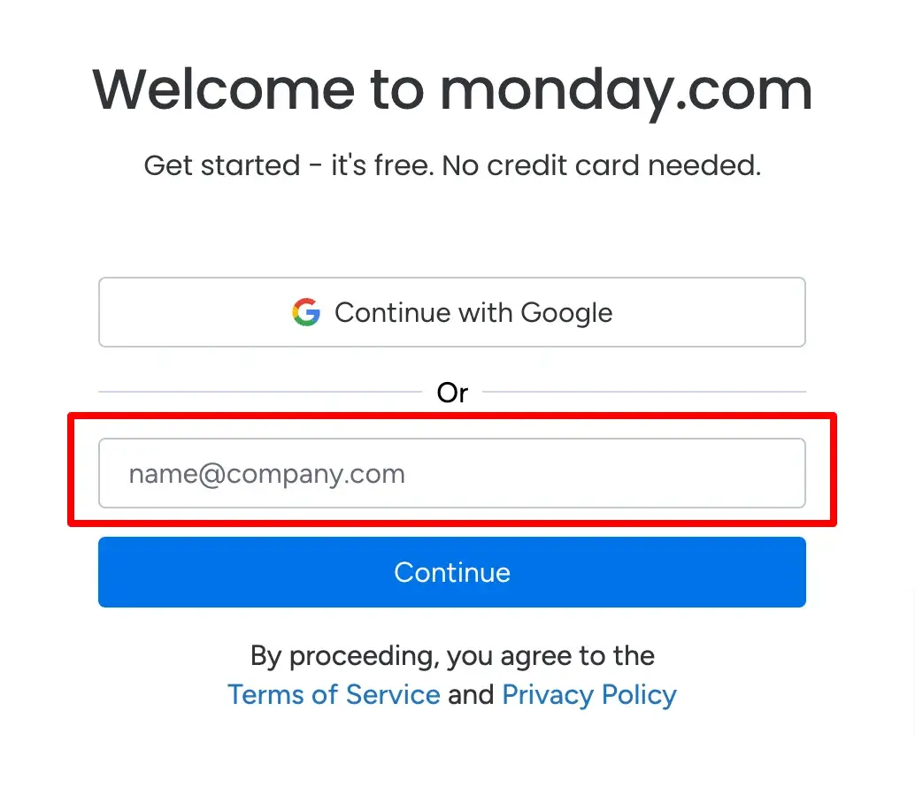
7. Text Fields
Text fields are an extremely common UI element that signal that users can enter text in a form. They also provide context.
For instance, in the Monday.com example below, the email text field tells the user that they must enter their email address and provides example text of “name@company.com” so the user has more clarity.
How to Design UI for a Website
1. Understand your user’s pain points.
Understanding what bothers your users is a key first step in designing websites or apps. It goes beyond just knowing their age or where they live.
The main goal is to really get what your users truly want, even things they might not realize themselves. You need to know their expectations and the problems they face when using your website or app.
Empathy, rather than relying solely on data and analytics, is key. You can gain empathy through techniques such as:
- Interviews
- Online surveys
- User testing sessions
Free UX Research Kit + Templates
3 templates for conducting user tests, summarizing your UX research, and presenting your findings.
- User Testing Template
- UX Research Testing Report Template
- UX Research Presentation Template
Download Free
All fields are required.
Form not available
2. Write user stories.
After you’ve performed your interviews, surveys, and user testing, you’ll have lots of rich information about your users. One way to use and organize this information is to create user stories.
According to UI/UX architect Tom Brinton in an article on UXBooth, user stories describe a basic goal that the user wants to accomplish using the application.
They’re usually only one sentence and follow this format: “As a user, I want to … [some goal].”
Think of some goals a user of a meal delivery service kit might want to accomplish. Here are some examples using the user story format:
- “As a user, I want to create a new account.”
- “As a user, I want to log in.”
- “As a user, I want to add my payment information.”
- “As a user, I want to change my address.”
- “As a user, I want to change how often I receive a delivery.”
- “As a user, I want to change the day I get my deliveries.”
You’d need to brainstorm a lot more user stories to identify all the goals of users for the meal delivery service kit.
Identifying user stories first will ensure that the user’s needs and behaviors dictate the design and functionality of the application — not the other way around.
3. Make an interface inventory.
Now that you have a clear idea of what the user wants and needs, you can create an inventory of the UI elements and features required for the user to accomplish their goals.
Web designer Brad Frost refers to this as “the interface inventory.” You’ll need typography, images, media, tables, forms, buttons, a navigation system, and any other odds and ends that make up an interface.
If you and your team have already designed some of these components or used them in other marketing collateral, Frost recommends taking screenshots of them and compiling and categorizing them in a PowerPoint.
You’ll be able to identify any inconsistencies at this stage — maybe you designed a button with rounded edges, and another team member designed it with square edges — and begin identifying patterns. This will be great for streamlining the UI design process.
4. Identify design patterns.
As you finalize your interface inventory, you can identify common design patterns.
Design patterns are general solutions to recurring problems in software design. They’re not code, but rather a template or description for solving a problem that can be applied to different situations.
For example, say the problem is that a website has many sections, but limited space for a navigation menu. In that case, a vertical dropdown menu could be a solution.
Identifying these patterns will help maintain consistency and efficiency in the UI design process.
5. Create a prototype.
A prototype is a partially operational layout that provides a detailed preview of the appearance and functionality of the actual application's interface.
While most prototypes may not encompass the full functionality of the app, they effectively mimic its operations, enabling clients and other stakeholders to get an idea of what the finished product will look like.
Through prototypes, UI designers and stakeholders can showcase and deliberate on how various elements will function, test their concepts, and introduce modifications. Typically, at this stage, UI designers hand over their designs to developers for implementation.
Now that we‘ve covered the phases of the UI design process and highlighted the significance of prototyping, let’s explore some tools that can assist you in crafting responsive and interactive prototypes.
Free UX Research Kit + Templates
3 templates for conducting user tests, summarizing your UX research, and presenting your findings.
- User Testing Template
- UX Research Testing Report Template
- UX Research Presentation Template
Download Free
All fields are required.
Form not available
UI Design Tools
1. Justinmind
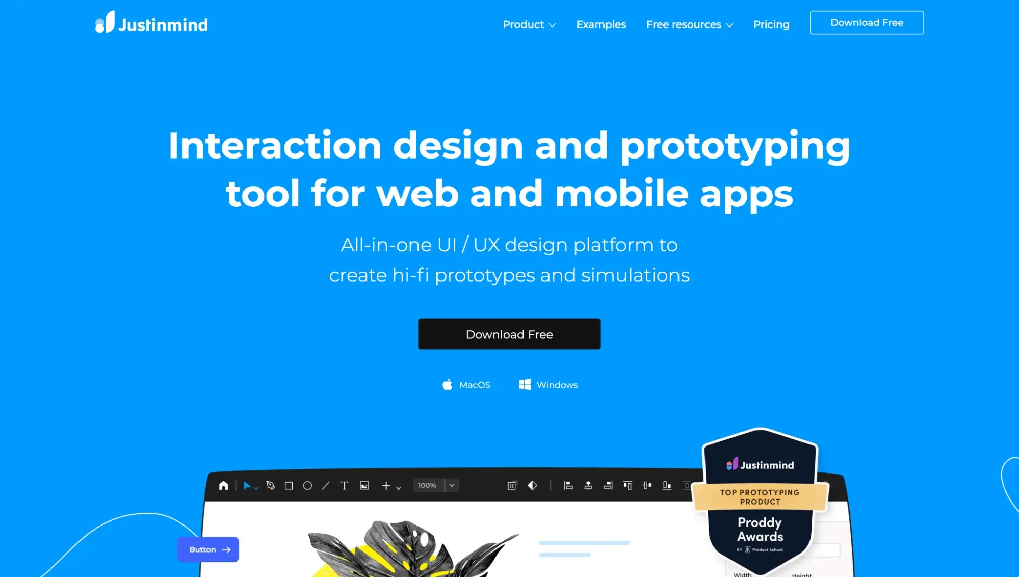
Justinmind is a free tool for designing responsive and fully interactive prototypes. You can design the style, size, and layout of UI elements to fit the look and feel of different screens, and use a full range of interactions, animations, and transitions to design the interactivity of your interface.
Justinmind has a free plan, and paid plans start at $9 per editor per month.
2. Sketch
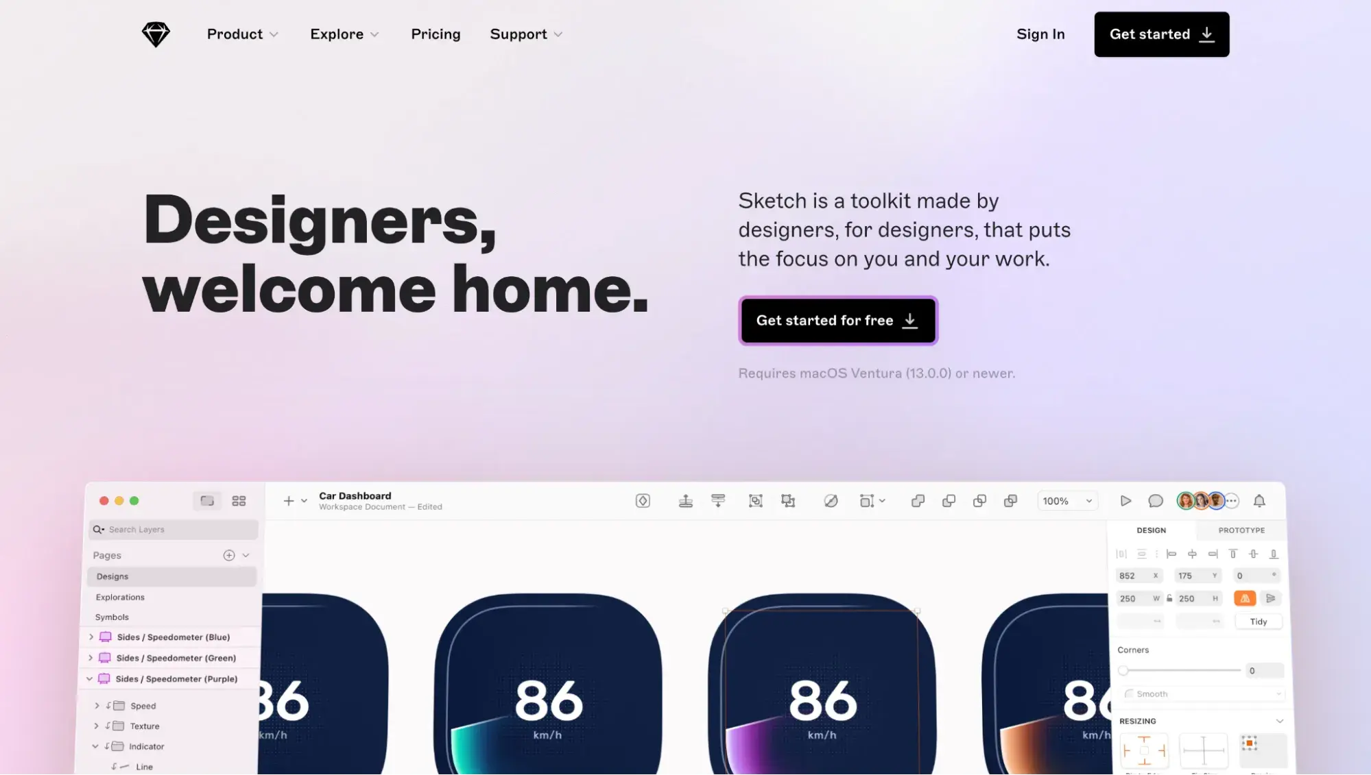
Sketch is a design platform that lets users create prototypes while collaborating with a team to bring their ideas to life.
As a vector-based tool, Sketch allows you to easily resize a drawing, prototype, or wireframe without losing quality. Sketch offers a 30-day free trial, with paid plans starting at $10 per editor per month.
3. Marvel
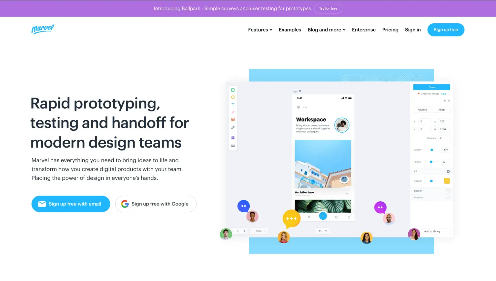
Marvel is a flexible tool for creating wireframes, mockups, and prototypes for any device. You can build mockups within the tool, upload your images, or sync designs from Sketch.
With Marvel, you’ll get millions of assets, stock photos, and icons to add to your designs. At any point, you can provide your team or other stakeholders with visibility into your project and leave comments or annotations on others’ designs. There’s a free plan as well as paid plans starting at $12 per month.
4. Wondershare Mockitt
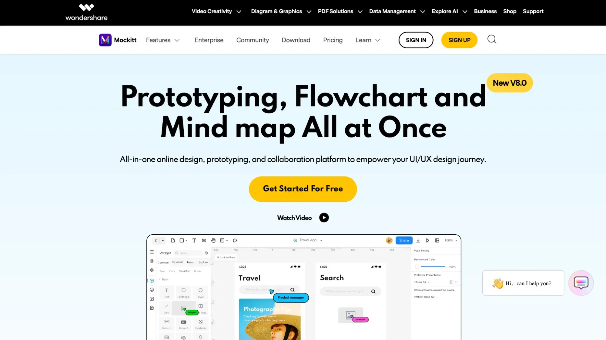
Wondershare Mockitt is a rapid prototyping tool with a library of built-in UI assets and templates. You can drag and drop UI components onto the page, create and reuse your own libraries, and work on the same page as teammates to collaborate in real time.
Wondershare Mockitt has a free plan and paid plans starting at $8 per editor per month.
5. Figma
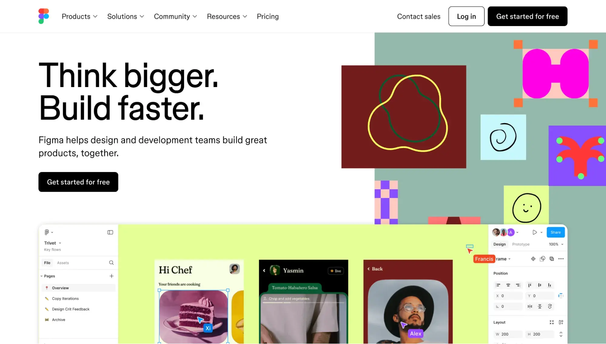
Let’s face it: Figma is king of UI design. Every designer I’ve spoken to uses it, and even as a non-designer, I’ve used it.
Figma offers powerful design features. You can create animated prototypes in less time, adapt them to different screen sizes using the constraints feature, and reuse elements across your projects using the components feature. You can also co-edit the same project to ensure you can offer and respond to feedback as you design.
Figma offers a free plan, plus paid plans starting at $15 per full seat per month.
Best UI Design Examples
You know the process and tools you need to design a user interface. Now, let’s check out some examples from real websites and apps that might inspire you to create your next project.
1. Octopus
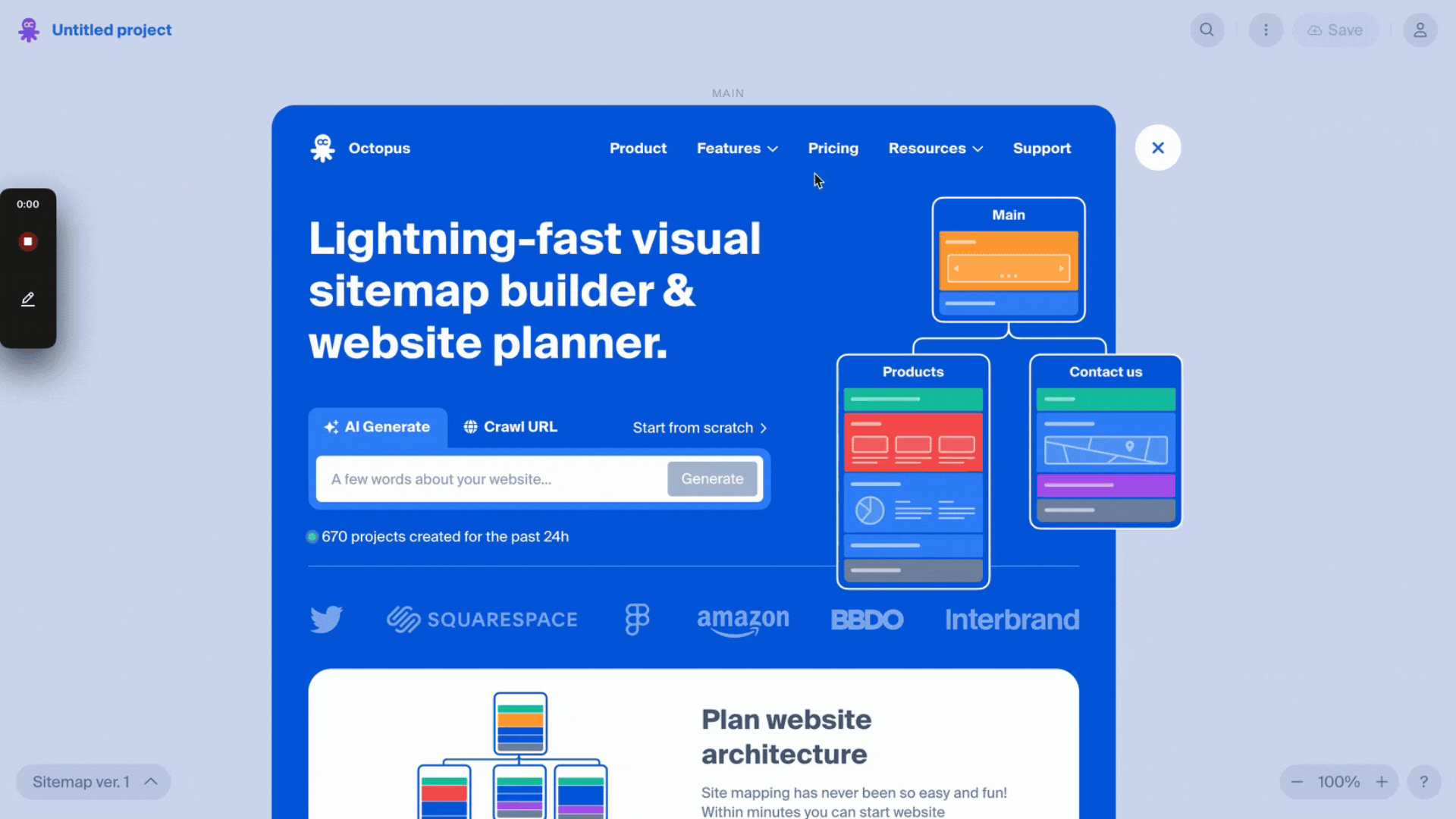
Octopus, a visual sitemap tool, has one of the most creative and intuitive websites I’ve seen. The homepage contains a layer that can be exited out of, and the user can immediately use the web app.
Despite never having used the tool before, I was able to easily figure it out thanks to its minimal and intuitive UI. Plus, the popup message in the lower right corner made it clear that this was an unsaved project.
To save the project, I was prompted to create an account. What a creative way to onboard new users!
2. Delassus Group
Delassus Group, a Moroccan producer specializing in snacking tomatoes, citrus, grapes, avocados, and flowers, features a 60-second video for first-time website visitors. This video on their website offers an informative overview of the company's history, product range, and commitment to social responsibility.
For users unfamiliar with the company or visiting for the first time, the option to view the full video, with or without sound, is available. In contrast, returning users or those already acquainted with the company can easily skip the video and swiftly access the homepage.
This user-friendly interface not only empowers users to customize their experience but also caters to a diverse audience.
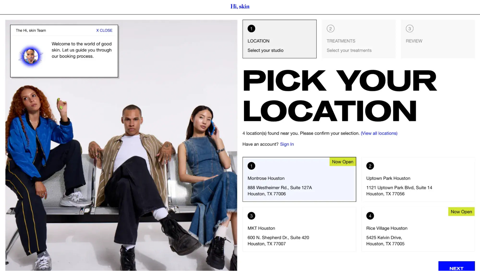
3. Hi, skin
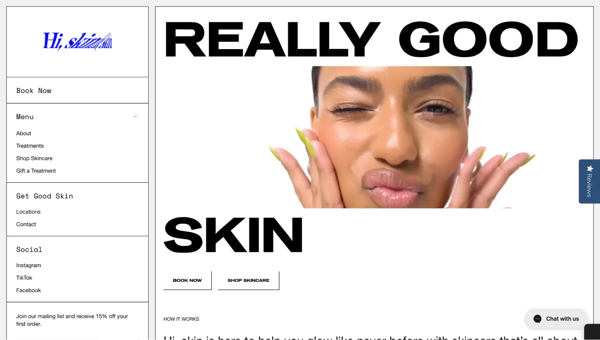
Hi, skin specializes in personalized skincare, tailoring facials and face workouts to each individual's unique complexion. Its website showcases models in skincare routines, emphasizing customer satisfaction and skin health.
You’ll find user-friendly pathways to explore the team, services, and locations. With a balanced blend of media, white space, and concise text, the design guides users toward the primary goal of booking an appointment.
4. Spain Collection

Spain Collection, a premium travel experience website for Spain and Portugal, encourages user autonomy.
On the homepage, users can watch videos related to the company, its CEO, and team members or scroll past them. You can also choose from collections in a slider or from the navigation header.
5. Tasty Burger App
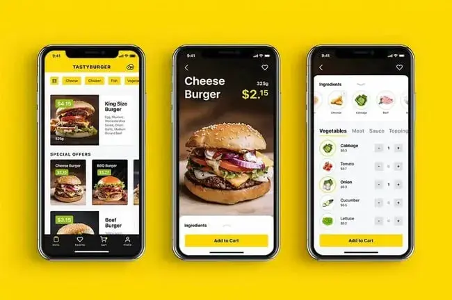
The image above isn’t the app you’ll download from the app store; it's a UI design crafted by the Tubik team. This UI caters to two types of users: those who wish to explore and those who have a specific order in mind.
Exploratory users can use filter options and view photos along with key details, including pricing, for each menu item. Clicking on a specific product provides access to the “Ingredients” tab for customization.
Users who know precisely what they want benefit from color accents highlighting prices and quick-action buttons like “Add to Cart” for efficient scanning and swift checkout.
6. Dribbble
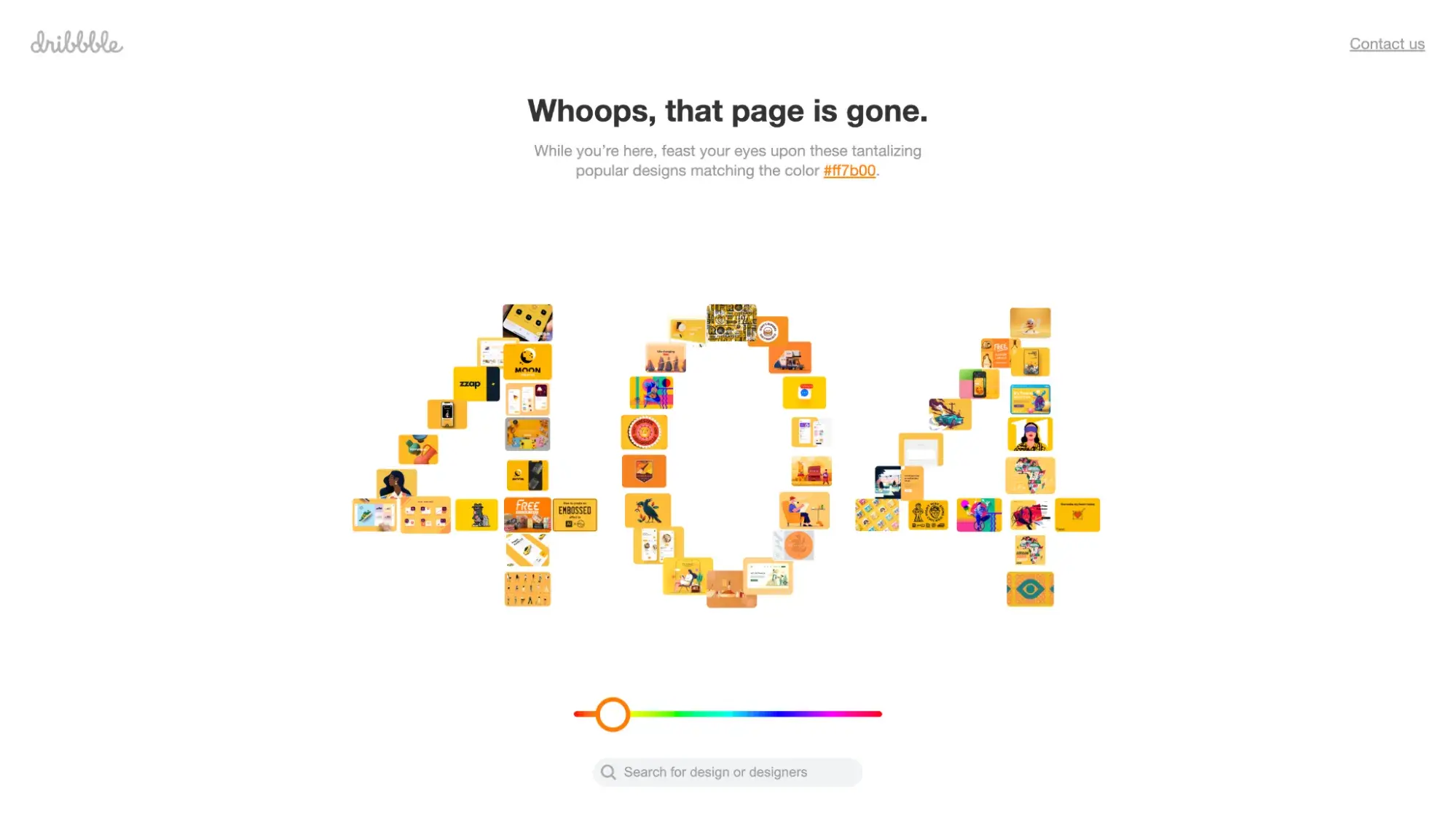
Dribbble, a platform designed for creative professionals to exhibit their work, ensures a consistent user experience, even on its former 404 error page.
Instead of encountering a dead end, lost visitors were redirected to a page displaying popular designs based on a specific color. If that didn’t pique their interest, they could use a slider to explore designs in different colors or employ the search bar to locate specific designs or designers.
Additionally, they had the option to click the logo in the top left to return to the homepage or select “Contact us” in the top right to access the help center.
This approach empowered users to maintain control over the interface, even when they encountered errors or broken links.
The Importance of UI Design
Every day, we interact with user interfaces — whether it’s using a microwave, logging into an app, or making a purchase on an ecommerce site.
Successful UI design can make the difference between an excellent user experience and a poor one. Understanding and applying UI design principles, as well as the guidelines of website design — simplicity, navigability, consistency, and user-centricity, among others — and using the right tools can help you create the best interface for your product.
Editor's note: This post was originally published in December 2020 and has been updated for comprehensiveness.
Free UX Research Kit + Templates
3 templates for conducting user tests, summarizing your UX research, and presenting your findings.
- User Testing Template
- UX Research Testing Report Template
- UX Research Presentation Template
Download Free
All fields are required.
Form not available
User Experience

![How to become a UX designer, a step-by-step guide [expert tips]](https://53.fs1.hubspotusercontent-na1.net/hubfs/53/become-a-ux-designer-1-20240731-321437.webp)


![How to Add a Parallax Scrolling Effect to Your Website [Examples]](https://53.fs1.hubspotusercontent-na1.net/hubfs/53/scroll-Aug-11-2023-05-24-08-8793-PM.png)

![20 UX Design Examples Hand-Picked by Experts [With Analysis]](https://53.fs1.hubspotusercontent-na1.net/hubfs/53/ux-design-examples-1-20250404-8425368.webp)