There are many different kinds of heuristics, but in this post, I’ll cover the popular 10 usability heuristics created by usability consultant Jakob Nielsen in the 90s. These time-honored, broad guidelines and principles can be applied to your website’s design to improve its usability and overall user experience. Let’s dive in.
Table of Contents
- What are usability heuristics?
- Why are usability heuristics important?
- 10 Usability Heuristics and How to Apply Them to Your Website
- Applying Usability Heuristics to Your Website
What are usability heuristics?
Usability heuristics are a set of guiding principles that evaluate the usability of a user interface (UI).
The heuristics we’ll discuss below were originally developed by Jakob Nielsen and Rolf Molich. In 1994, Nielsen released 10 revised heuristics; they have since become common criteria for evaluating user interfaces in what’s called a “heuristic evaluation.”
Usability heuristics are crucial in designing effective and efficient websites, apps, and products, as they can identify and address potential usability issues before they become larger problems.
Nielsen’s heuristic principles cover ten different topics, including visibility of system status, user control and freedom, and consistency and standards. Each heuristic provides a set of guidelines on how to design an interface that is user-friendly, easy to navigate, and intuitive.
Why are usability heuristics important?
Simply put, usability heuristics create clear benchmarks for optimizing how easy and efficient it is for a visitor to use your website or software.
“Heuristics are table stakes,” says UX researcher Kristine Angell, who runs human-centered design research consultancy Hopscotch Labs. “Because these heuristics are common baseline experiences for all software, they're often invisible. Yet, software users have no patience for experiences that do not consider them.”
Usability heuristics also provide a common language for designers, developers, and stakeholders to discuss UI design. Each heuristic represents a specific best practice in interface design, making it easier for everyone involved to understand what needs to be done to create a great user experience.
Another advantage of usability heuristics is that they can help save time and money. By evaluating your user interface against these guidelines, you can identify potential issues early in the design process, which can reduce the cost of fixing these issues later on.
Additionally, applying these heuristics can help streamline user testing, making it easier to gather valuable feedback and adjust your design accordingly.
Now that I’ve explained what heuristic principles are and why they’re important, let’s get to the main attraction: Nielsen’s 10 Usability Heuristics with examples of each and tips from UX experts.
10 Usability Heuristics and How to Apply Them to Your Website
1. Visibility of System Status
The first heuristic refers to the system's ability to keep users informed about what’s happening and provide feedback within a reasonable amount of time. Essentially, it means that the system should communicate its status to the user through appropriate feedback so the user understands that the system is processing their request.
“I talk about this with my students as being the ‘anti-anxiety heuristic,'” says University of Houston assistant professor Elizabeth Rodwell, Ph.D., “because when we don't have visible system status, we have uncertainty.”
Example of Usability Heuristic #1
Consider the e-commerce website of Spinnaker Chocolate below. When I click “Add to Cart” on the Uganda bar, my updated shopping cart slides out from the right, showing what I’ve placed in it and how much it totals. It even shows a progress bar indicating that I’m $10 away from free shipping.

Pro Tip: Love them or hate them, recognizable visual cues are crucial.
Visual cues, such as progress bars, animations, or loading icons, indicate that the system is processing the user's request. These cues should be consistent throughout the system and instantly recognizable.
“None of us want to see the swirling beach ball or the hourglass,” says Rodwell. “But at the same time, they're really important communication tools because it’s so much worse having that delay and not knowing that it's delayed or not knowing what’s happening.”
Tips for Visibility of System Status
- If your website takes too long to process the user's request or there is no feedback, users may lose patience and become frustrated. Providing quick and meaningful feedback can enhance the user’s experience, build trust with the system, and encourage them to continue using the website.
- Make sure feedback messages are clear and concise. Avoid jargon or overly complicated language; provide the user with specific details about what is happening.
2. Match Between the System and the Real World
The second heuristic emphasizes the importance of designing interfaces that match the users' existing knowledge and mental models. By using terms, concepts, layouts, and images that are already familiar to the user, they’ll more easily understand and navigate your site.
Example of Usability Heuristic #2
For this example, consider the top navigation bar of the ecommerce website Madewell.

Without ever having used the site before, I know what the top four icons represent:
- Search
- Favorites
- My account
- Shopping bag
There is a match between the system and the real world, as the shopping bag is something I use in real life when shopping at physical stores (a concept known as skeuomorphic design). And the other icons are universally used to represent the same things on other websites I’ve visited.
Tips for Match Between System and the Real World:
- Consider using plain language and simple, recognizable terms that align with users' common knowledge and mental models.
- Ensure that the visual cues you choose represent the corresponding action, making the system intuitive and easy to use.
- Conduct user interviews, surveys, and user testing to gain valuable feedback on your product as it develops.
3. User Control and Freedom
The third heuristic gives users control over the system and enables them to recover from mistakes, providing a sense of freedom within the user experience. The goal is to ensure that users can interact with the system without fear of making mistakes or suffering consequences for their actions. By empowering users, designers can create a more positive user experience, leading to loyal customers.
Example of Usability Heuristic #3
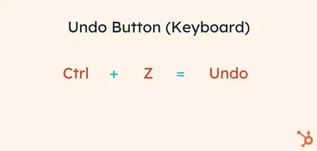
An “Undo” button is an excellent way to provide users with control over the system. It allows users to easily recover from any mistake they make by undoing previously executed actions. The “Ctrl + Z” command is probably the most common application of the “Undo” feature, giving users a sense of control and freedom within their experience.

Tips for User Control and Freedom:
- Clearly label and place your “Exit” or “Cancel” buttons in the user interface so the user quickly understands how to exit or return to a previous stage.
- Undo actions should have obvious methods of execution so the user quickly recovers from any mistakes before they turn detrimental.
- If possible, offer various navigation paths and assistance through the product experience. Doing so will give users more control over how they interact with the product.
4. Consistency and Standards
The next usability heuristic refers to the idea that design elements, such as fonts, colors, buttons, and formats, should be uniform throughout a website or application. In other words, users should not have to relearn how to navigate the site as they move between pages.
A consistent user experience makes the site more intuitive and easy to use, which increases user engagement and reduces user frustration.
Example of Usability Heuristic #4
Let's say a website has multiple pages requiring users to input personal information. If the format and layout of these pages are inconsistent – say they have different fields in different orders and varying labels – the user could become confused and frustrated.
However, if the pages are organized in the same way with the same field types and labeling, the user will have an easier time navigating the site and filling out information.
Pro tip: To ensure consistency, be careful not to create design siloes by trying to do it your own way.
As HubSpot Senior Product Designer Brittany Weigandt explains, “Something that designers can fall into the trap of with consistency is trying to design something better than how it exists.”
In other words, an individual designer may feel tempted to create their own design based on what they personally think is best for the user, breaking from how it works across the rest of the product.
“It actually makes the holistic experience worse,” she says.
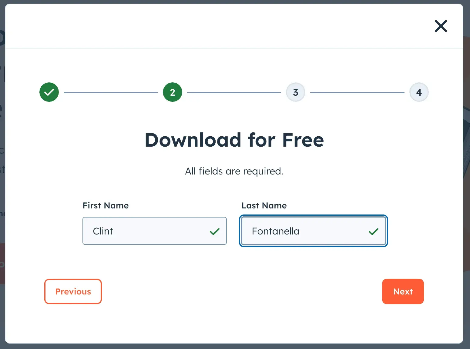
For example, if you’ve ever filled out a HubSpot form, you’ll notice consistent colors, icons, and flows. In the example below, you’ll see that a green checkmark appears when the user enters appropriate information into the field.
But, let’s say one designer decided to change it so that when the user fills out a field, the entire field turns green. That would deviate from the consistency and standards of the HubSpot form experience.

Instead, that designer should work with the team in charge of forms — since they’re the experts in that specific UI element.
“You have a limited amount of time,” says Weigandt. “Would you rather spend your time reinventing the wheel of something that already exists? Or would you rather free up your time to focus on higher priority or more unique problems?”
More Tips for Consistency and Standards:
- If you create a style guide, everyone on your design team will use the same design elements, making your final product cohesive and consistent.
- Watch how users interact with your site and ask for their feedback. Use this information to adjust your design to ensure greater consistency.
- Templates can ensure consistency throughout your website. Use a consistent template for each type of page, such as product pages or contact pages, to ensure that design elements are repeated across the site, creating a more intuitive and easy-to-use experience for users.
5. Error Prevention
Error prevention is a usability heuristic that emphasizes the prevention of errors and mistakes in user interaction.
This heuristic aims to help designers create intuitive and error-free interfaces, reducing the need for users to correct mistakes or backtrack through their actions. This improves the overall user experience and leads to greater satisfaction.
Example Usability Heuristic #5
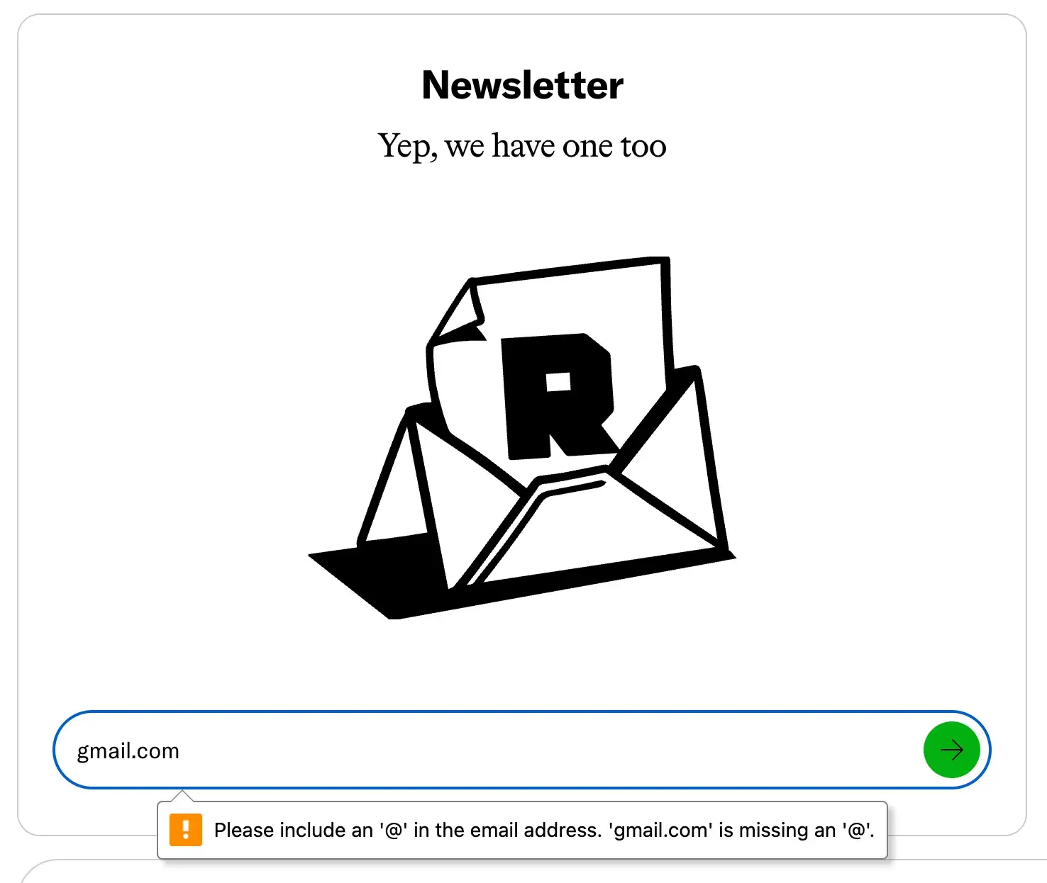
A simple example would be this form from The Ringer that automatically validates user input, alerting them immediately if they fail to fill in a required field. The interface below reduces user frustration and improves overall usability by identifying potential errors and offering countermeasures to prevent them.

Tips for Error Prevention:
- Before building your interface, anticipate the different types of user errors that could occur. This could include typos or incorrect data entry, selecting the wrong option, or accidentally deleting information.
- Provide clear and consistent instructions. This will help users understand what is expected of them and what actions they need to take.
- Offer a convenient way for users to report issues or suggest improvements, and use this feedback to improve your design over time.
6. Recognition Rather Than Recall
This heuristic emphasizes the importance of making information and actions visible and available in the interface rather than requiring the user to remember them. This heuristic aims to create an interface that is more intuitive and easy to use by reducing cognitive load and memory demands on the user.
Example of Usability Heuristic #6
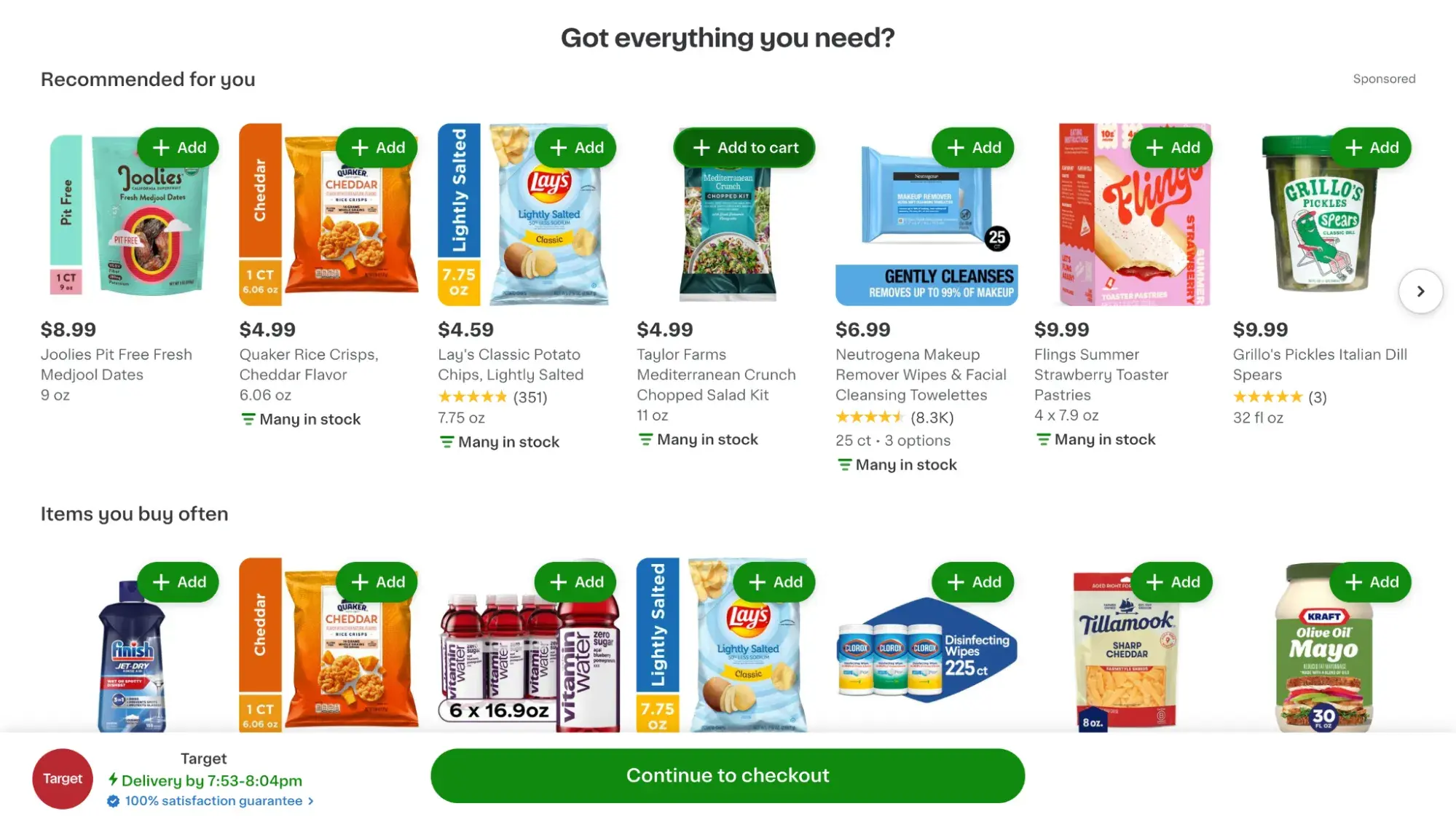
A great example of “recognition rather than recall” is Instacart’s checkout experience. Every time I’m nearly ready to place my order on the site, I worry that I may be forgetting something — but Instacart stays a step ahead.
When I click “Go to checkout,” the following page pops up, asking, “Got everything you need?” with images of items I typically buy. This relieves me of the burden of racking my brain or poring over my shopping list for items I need. I can click “+ Add” to add them to my cart without losing my place in the checkout process.

Ashten Smith, a senior product designer who works on HubSpot’s checkout experience, explains: “If I'm shopping online or I’m paying a bill online, and I go to complete a purchase, it's not just the buyer’s responsibility to remember all of the things that they want to buy.
“The system also has been able to log and note the type of thing that you want to buy, the quantity that you want to buy, the amount that you want to buy. As a result, it's really important to make sure that that is always surfaced to the user when it’s relevant to them because it's too much of a burden typically for the buyer or the end user to have to carry that.”
Pro tip: If you’re struggling with understanding what your users need in terms of recognition rather than recall, it might be time to conduct user research.
“It's not just on the user to have to know what they need,” explains Smith. “Through deeply understanding the types of users who are going to interact with our product and knowing our audience, we should be able to intuit that as well.”
Smith also recommends adding “clear visual cues that let them understand where they're at in the journey.”
This is particularly pertinent if you have a B2B SaaS website, which Smith says tends to have many information layers.
“When you're designing a task, be mindful of the visibility of the navigation layer, even if you're going from primary to secondary to a third information layer and a fourth information layer,” she explains.
“I see so many times workflows and task flows just drop the navigation altogether as the user is going through their journey. And a lot of times they'll stop, realize that they need to go back, and they don’t know where they need to go back to.”
More Tips for Recognition Rather Than Recall:
- Clear and consistent labeling for features and functions helps users recognize what they’re looking at rather than requiring them to recall what it is they need to do.
- Visual cues give users clues on what they need to do next without having to remember how to do it.
- Reducing the complexity of your interface will help users easily recognize the information and actions that they need.
7. Flexibility and Efficiency of Use
This heuristic emphasizes the importance of designing interfaces that accommodate a range of user abilities and preferences. The goal is to create an interface that can be used in varied ways, depending on the user's experience level, needs, and preferences, making it more flexible and efficient.
Example of Usability Heuristic #7
The Apple Messages app includes multiple ways to write a message, such as using the keyboard, sending an audio message, or using speech-to-text.

This app accommodates different user preferences and needs by providing multiple communication methods, making the interface more user-friendly.
Tips for Flexibility and Ease of Use:
- Allow users to customize the interface and features to suit their needs. This can include options to adjust the font size, color contrast, and layout.
- Offer users the ability to access features or commands through keyboard shortcuts.
- Provide only the necessary information and options upfront, gradually revealing more advanced settings or options. This helps prevent users from being overwhelmed by too much information at once.
8. Aesthetic and Minimalist Design
This heuristic recognizes the importance of designing a visually appealing and simple interface. The goal is to create an elegant and functional interface that is not cluttered with unnecessary design elements. These interfaces are easy to navigate and help users focus on the primary task at hand.
Example of Usability Heuristic #8
The Google search engine is a great example of an aesthetic and minimalist design. When users open Google's homepage, they are presented with a simple, uncluttered interface.
The white background and minimalistic design allow users to focus on the main task of entering their search query. Even more, Google's search bar is the largest element on the page and is positioned front and center — making it clear where the action should happen.

Tips for Aesthetic and Minimalist Design:
- White space can effectively help users focus on the most important parts of the interface. It can also help the design look clean and uncluttered.
- Limiting the number of colors and fonts on your web page or app will create an interface that looks unified and cohesive.
- If you use images in your interface, ensure they are high-quality and align with the overall design aesthetic. Poor-quality images can make the interface look cheap and can detract from the user's experience.
9. Recognize, Diagnose, and Recover from Errors
This heuristic helps you design an interface that is capable of handling user errors. The goals are to:
- Help users recognize when an error occurs.
- Diagnose what went wrong.
- Provide options for recovering from the error.
This can help improve the user's confidence in the system and reduce frustration.
“Often enough, errors are an afterthought,” says Dan Berlin, founder of UX research consultancy Watch City Research. “Errors live in a weird space between design and development, so they sometimes get lost in the mix.”
Pro tip: Conduct usability testing before you launch. “We often don't know what errors will arise until users get their hands on it,” says Berlin. “So there has to be that iteration in the cycle to learn from users, hopefully before release.”
However, Berlin cautions against a one-and-done approach. “It should be clear that folks shouldn’t be doing a single usability study just before launch,” he adds, “because that may result in a lot of rework. Instead, it’s best to conduct usability studies iteratively throughout the design process to uncover potential errors.”
Need some help getting started? Check out these free UX templates for user testing.
Example of Usability Heuristic #9
A great example of this heuristic is TurboTax, an online tax preparation software. When a user makes an error, TurboTax recognizes it and provides an error message explaining the problem.

The error message provides specific details on correcting the problem and allows the user to navigate back to the area where the error occurred. The software even offers a “Help me fix this” button that takes the user to a detailed help article explaining how to fix the error.
More Tips for Recognize, Diagnose, and Recover from Errors:
- Error messages should be easy to understand and provide specific information on how to fix the problem. “The wording of errors is really important,” says Berlin.
Just take a look at the now infamous error message below that some users got when installing Windows 10. As a user, would you be able to understand what went wrong — or that anything went wrong at all?

- Along with a specific error message, provide suggestions for recovering from the error. This could include providing options or links to help the user fix the problem or seek additional assistance.
- Giving users the ability to undo or redo actions can help them recover from errors faster. This is especially useful for complex tasks where errors are more likely to occur.
10. Help and Documentation
This heuristic design principle recognizes the importance of providing users with adequate help and documentation to assist them if/when they encounter issues while using your interface.
This includes instructional materials, FAQs, user guides, support chat, and other resources that provide additional information about the product or feature set.
Example of Usability Heuristic #10
Slack is a business communication platform that provides numerous resources to help users better understand and navigate the interface. It has a “Help Center” with documentation that covers frequently asked questions and a Slackbot that offers tips and tricks on how to use the product better.

Additionally, Slack users can submit support tickets and chat with agents to get answers to their problems.
Tips for Help and Documentation:
- Make sure help and documentation resources are easily accessible from within the interface. This could include providing links to help articles, live chat, or in-app help features.
- Consider using videos, images, diagrams, and other forms of multimedia to help users better understand how to use your interface.
- Use customer feedback to update your documentation and help you tailor it to your users' needs.
Applying Usability Heuristics to Your Website
Usability heuristics are essential for designing effective, efficient, and easy-to-navigate interfaces.
By implementing these guidelines on your website, you’ll be able to create interfaces that prioritize the user and enhance their experience with your company’s products and services.
This article was written by a human, but our team uses AI in our editorial process. Check out our full disclosure to learn more about how we use AI.
Editor's note: This post was originally published in May 2023 and has been updated for comprehensiveness.
User Experience
.png?width=112&height=112&name=Image%20Hackathon%20%E2%80%93%20Square%20(10).png)

.png)

![How to become a UX designer, a step-by-step guide [expert tips]](https://53.fs1.hubspotusercontent-na1.net/hubfs/53/become-a-ux-designer-1-20240731-321437.webp)


![How to Add a Parallax Scrolling Effect to Your Website [Examples]](https://53.fs1.hubspotusercontent-na1.net/hubfs/53/scroll-Aug-11-2023-05-24-08-8793-PM.png)

![20 UX Design Examples Hand-Picked by Experts [With Analysis]](https://53.fs1.hubspotusercontent-na1.net/hubfs/53/ux-design-examples-1-20250404-8425368.webp)
