.png?width=112&height=112&name=Image%20Hackathon%20%E2%80%93%20Square%20(10).png)

1. Instacart: Example of Match Between System and Real World
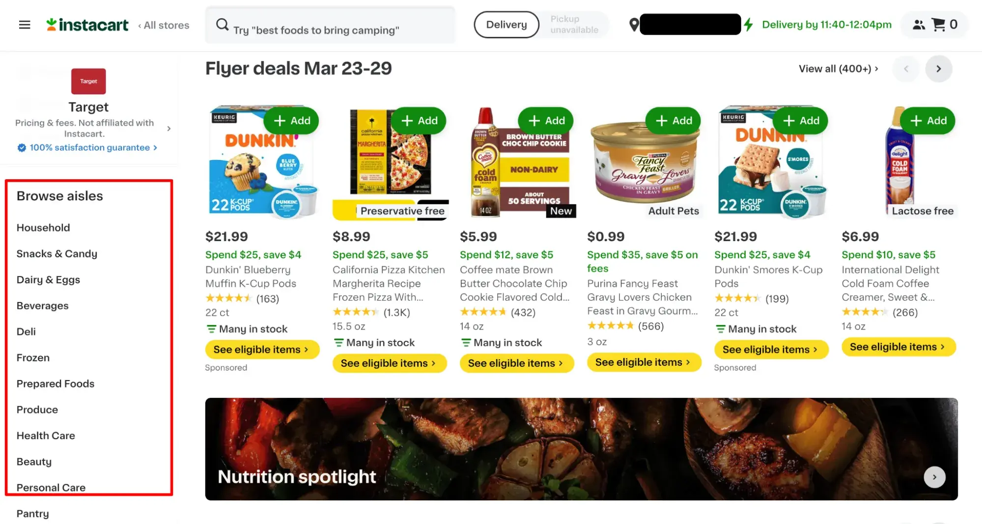
The website of on-demand grocery delivery service Instacart is a good example of creating a match between the system and the real world. Instacart is intuitive because its interface is based on what shoppers experience in brick-and-mortar stores.
“The overall layout of the content and design is similar to being in a physical grocery store,” explains Baymard-certified senior UX content strategist Samantha Saenz. “You can easily go to different ‘aisles’ or browse the store because it matches a user's existing mental model.
“Everything is also clearly labeled and categorically organized at the information architecture level. So finding what you need or browsing between different stores is easy, fast, and intuitive.”
Pro tip: As you design your website or app, think of the real-world structure your user is already familiar with, whether that’s a grocery store, restaurant, or beauty salon. Is there a way for you to replicate the real world in a digital environment? That could be in the icons you use, the way you structure your menu, or even the website layout.
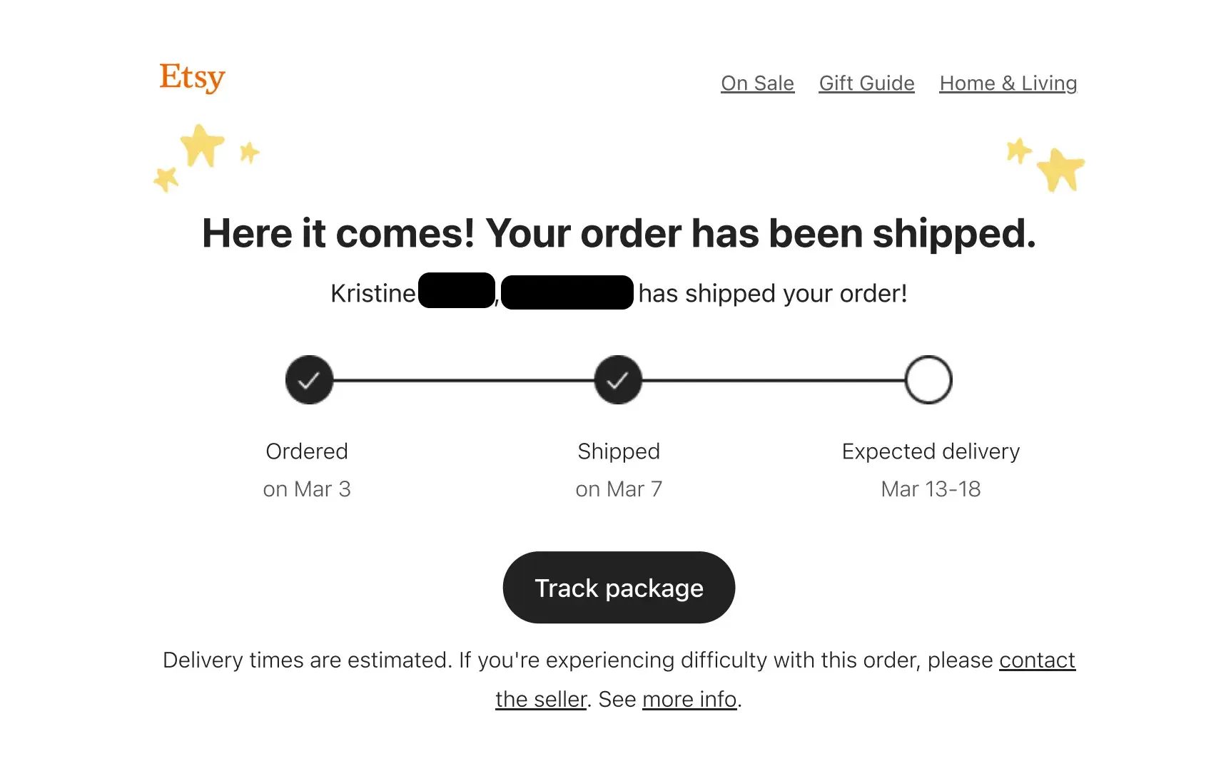
2. Etsy’s Order Tracking: Example of Visibility of System Status
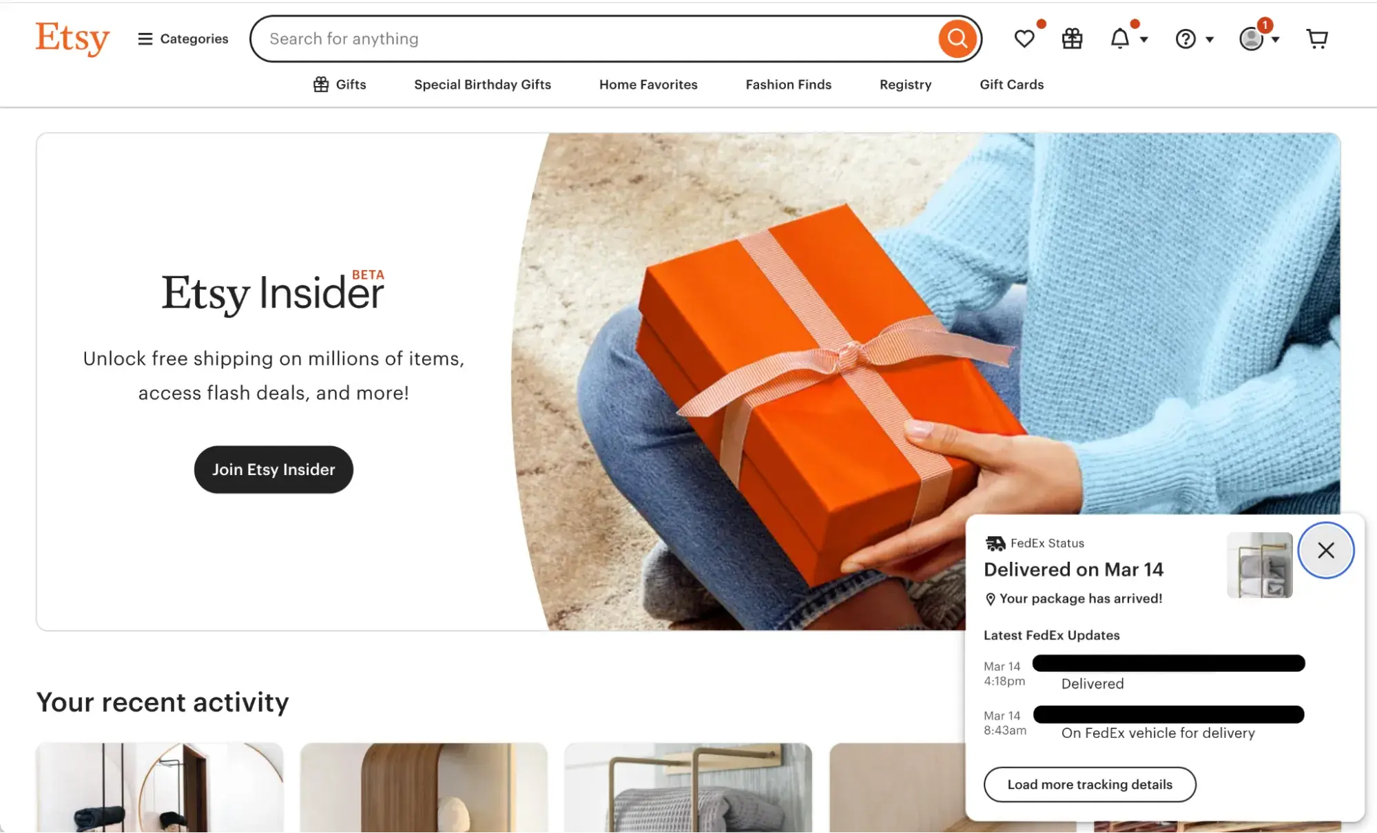
Source (Screenshot courtesy Kristine Angell)
When users do something on your site, they want reassurance that it worked — this is especially true when they’ve just spent money. This visibility of system status builds trust and eliminates confusion.
“Etsy is doing a fantastic job right now,” says Kristine Angell, owner of design research consultancy Hopscotch Labs.
When Angell purchased from the online marketplace known for its handmade goods, she was pleased with the way Etsy kept her updated on her order. Etsy sent a confirmation email with the relevant details: when it would be shipped, who to contact, who she purchased from, and when to expect it.
(Screenshot courtesy Kristine Angell)
“And then when you click on the links, it not only takes you back to the website, but it also puts it in an overlay,” Angell says. “So that creates a completely different experience than you‘re getting from anyone else who’s doing something similar.”
She adds, "The overlay of the FedEx status of when it‘s supposed to be delivered, where it’s at within the process — all of that looks amazing and it's extremely clear.”
.png)
Free UX Research Kit + Templates
3 templates for conducting user tests, summarizing your UX research, and presenting your findings.
- User Testing Template
- UX Research Testing Report Template
- UX Research Presentation Template
Download Free
All fields are required.
Form not available
Pro tip: Whenever a user takes an important action on your site, such as a payment transaction, think of the end-to-end experience. Notice how Etsy didn’t just send a confirmation email. It also allowed Angell to track the package all the way to delivery.
3. Toggl - Example of Smart Handling of Empty States
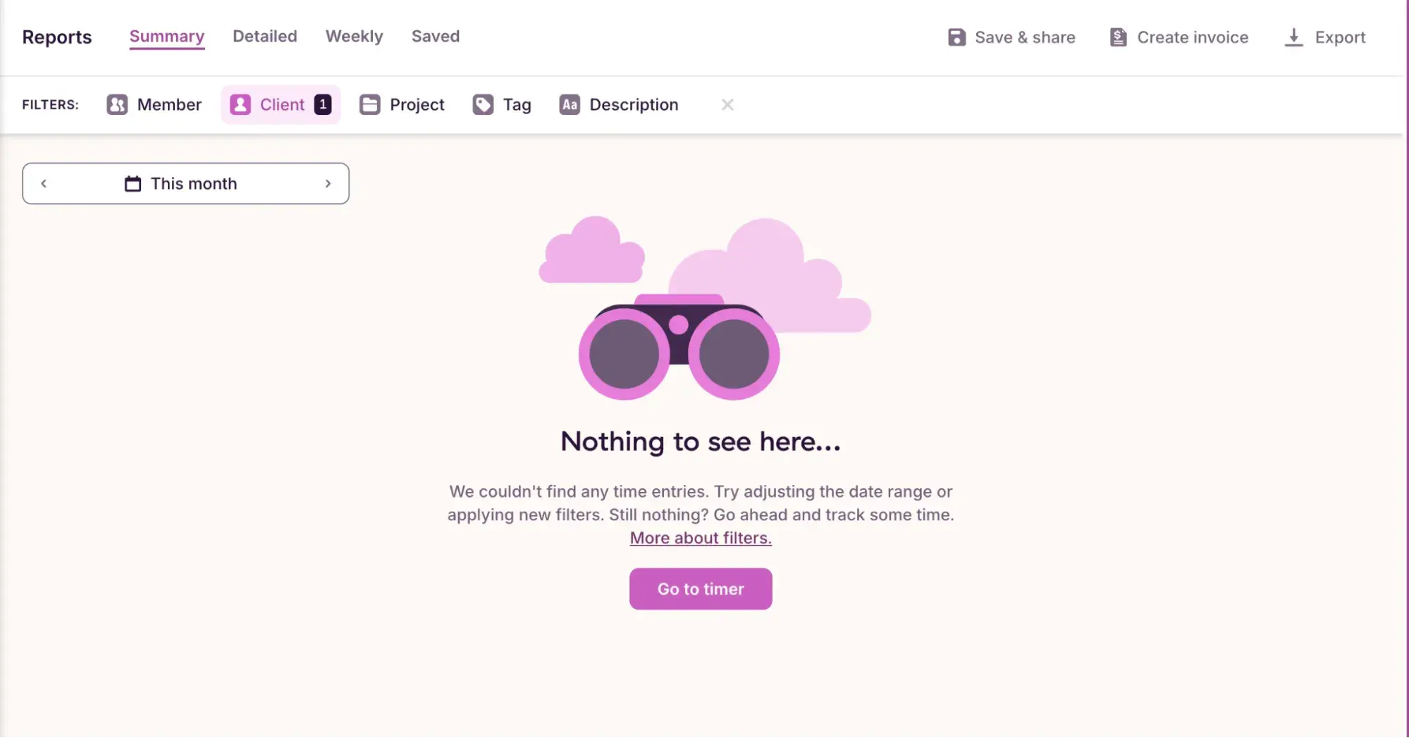
Here’s an excellent UX design example from my personal experience. For my freelance writing business, I sometimes generate reports using time-tracking software Toggl.
Recently, I finished a project and wanted to send an invoice to the client along with a report showing how many hours I’d spent on it.
When I went to the “Reports” tab and selected the client, however, I didn’t see what I expected to see: the many time entries I’d put in.
This almost made me panic, thinking I’d forgotten to log the time or the software was glitching. Thankfully, Toggl used impactful words to handle this empty state and prevent user panic.
Let’s break down why Toggl’s empty state UX writing is powerful:
- “Nothing to see here” reassures me that the software is not glitching; I shouldn’t be able to see any entries there.
- “Try adjusting the date range” uncovers the mistake I’d made: I was on the wrong month, so I did, in fact, need to adjust the date range.
- “Still nothing? Go ahead and track some time.” The call to action ensures that the user isn’t left hanging and isn’t tempted to leave. It encourages them to actually use the product.
4. Spotify Web Player - Example of Balancing Simplicity with Complexity
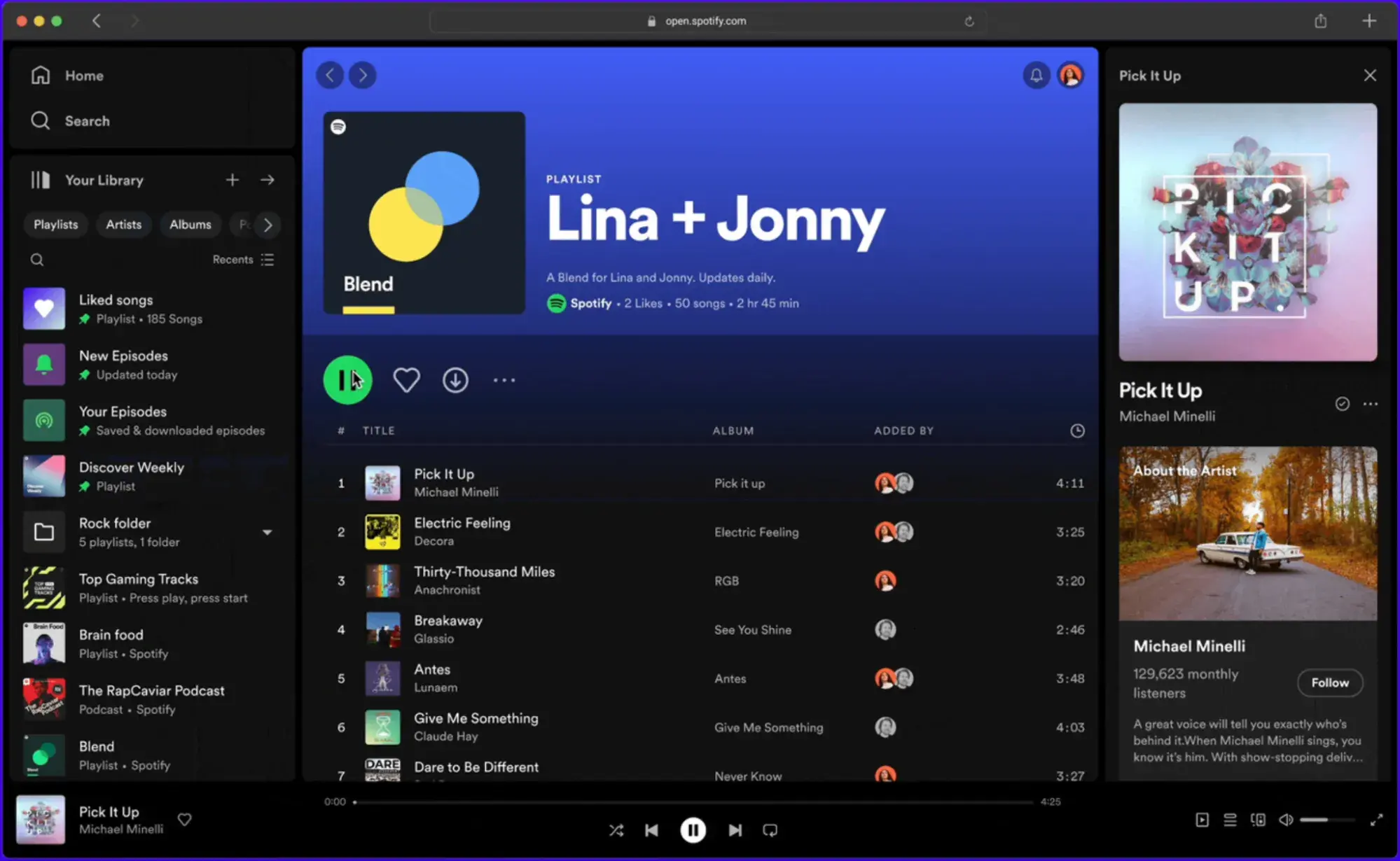
While I don’t use Spotify myself (admittedly, I am not that cool), I simply had to include it in this list. Why? Spotify’s Web Player was the 2024 Webby Winner for Best User Experience.
To get expert insight on what makes Spotify’s Web Player Webby-worthy, I asked my much cooler colleague, HubSpot design manager Mac Taylor.
“My immediate thoughts are that it’s as deep or as shallow as you need it to be at any moment,” says Taylor. “It’s an interface that allows you to play your favorites quickly and stay surface level or seamlessly go on a journey through music discovery.
“I have found some amazing music that I would have never dreamed of even listening to that have become my favorites. I have even learned a thing or two along the way.
“On top of all that, you can go even deeper and connect with artists, getting merch and tickets directly through Spotify; it’s an insanely robust and flexible interface that stays simple on the surface.”
Pro tip: Give your users a choose-your-own-adventure feel by giving them personalization options. From a “smart shuffle” feature that provides recommendations based on your playlist to the beloved “Spotify Wrapped” at the end of the year, Spotify's designers managed to create a web app that provides deep and meaningful personalization.
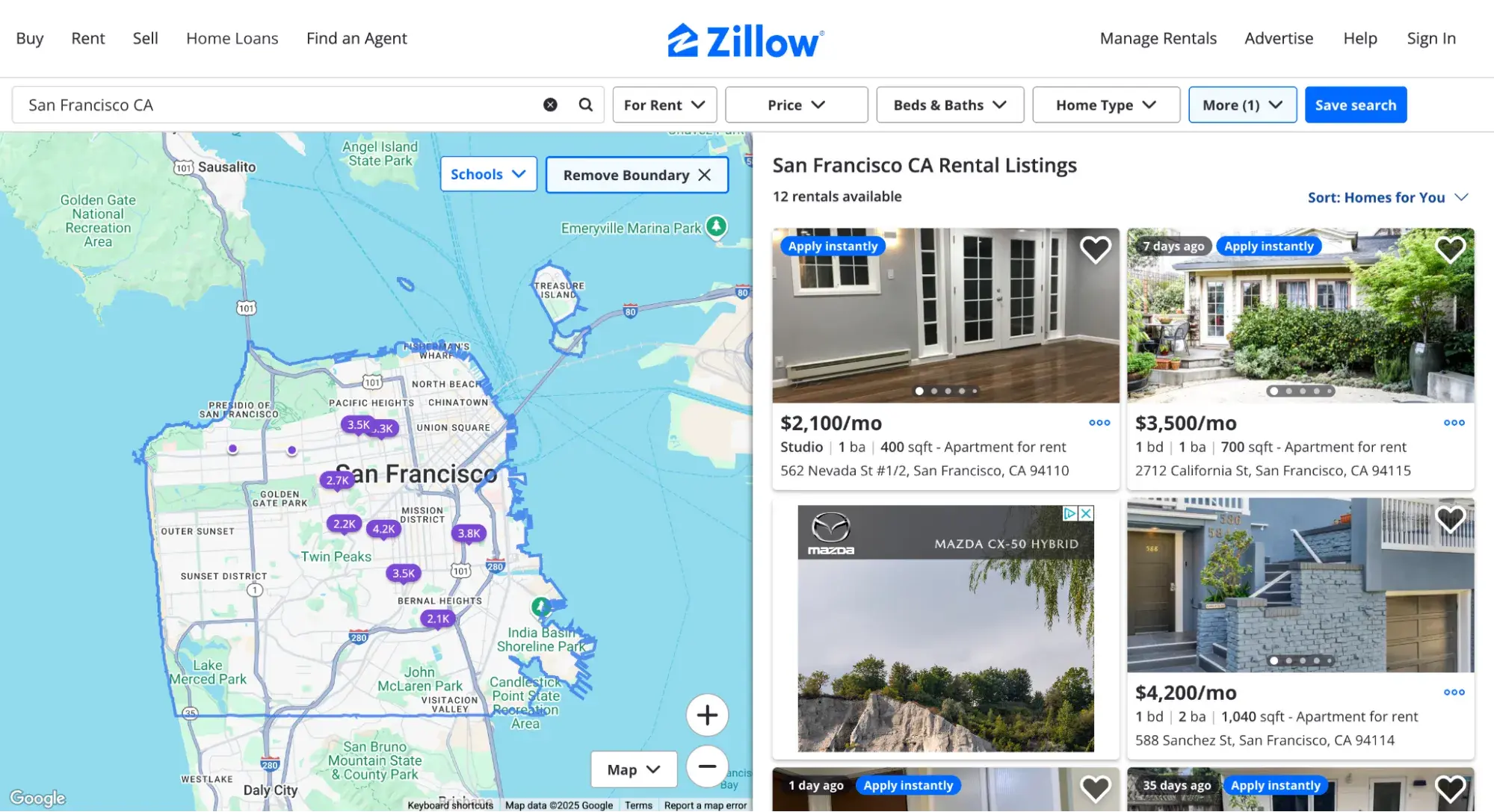
5. Craigslist: Example of the Difference Between UX and UI
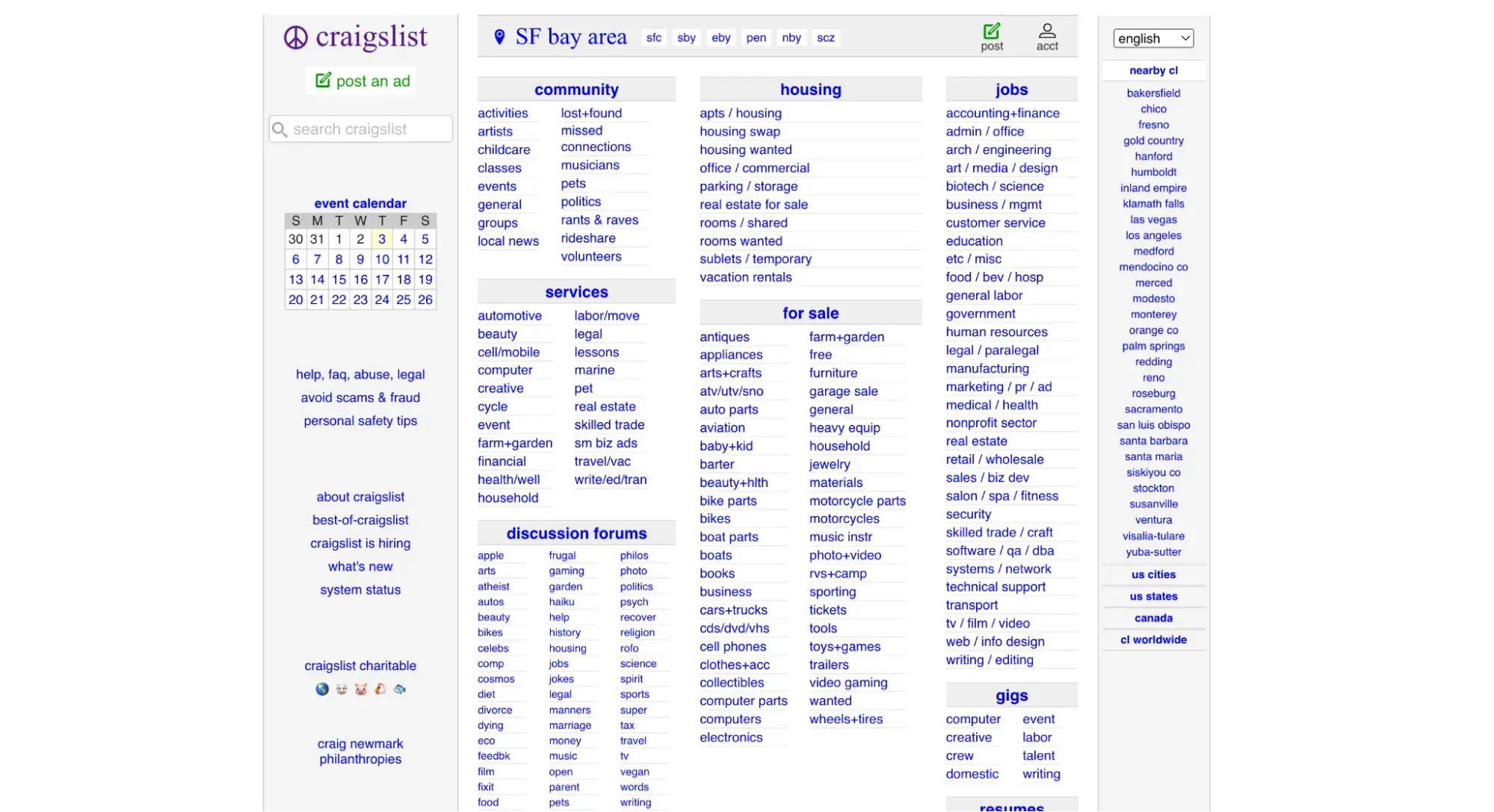
If you gasped and thought, “But Craigslist is an ugly site!” I don’t blame you. But that’s exactly why I included it: Criticism of its appearance is a UI issue — its UX is actually quite effective.
“I wouldn't say Craigslist is my ‘favorite’ website by any means,” says Marlyn Stevenson, a HubSpot product designer who suggested this UX design example. “But it's had the same design for 20+ years because it works.
“It looks pretty terrible from a UI standpoint, but it has nice spacing and information hierarchy/architecture that makes it easy to find what you need and functions exactly how you expect it to.”
And she’s right. I’ve used Craigslist for over a decade, and it’s never failed me. Its clear tagging system, simple search, and minimalist listings have helped me find everything from writing clients to apartments.
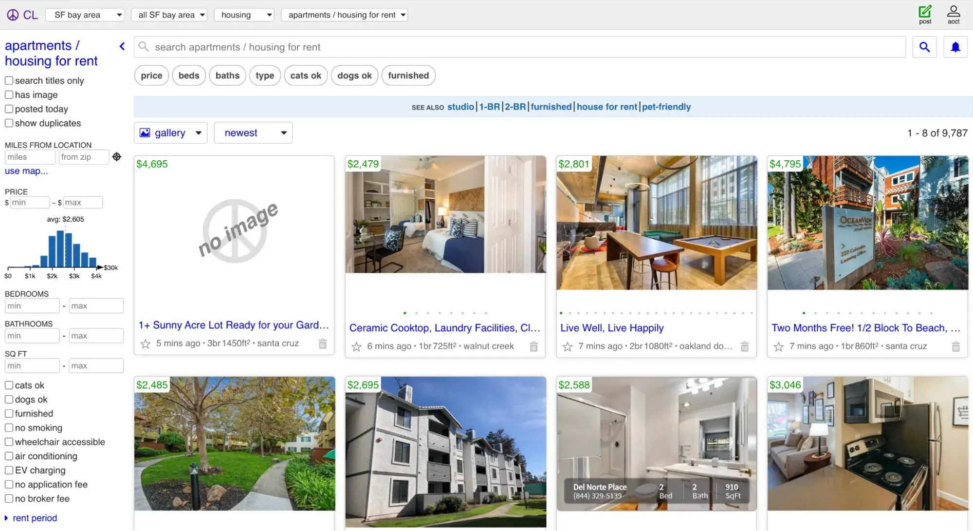
A similar site with a better user interface? Zillow. But with its fewer distractions (no display ads) and better search functionality, I prefer the user experience of Craiglist.
6. UPS Website Redesign - Example of User-Centered Design
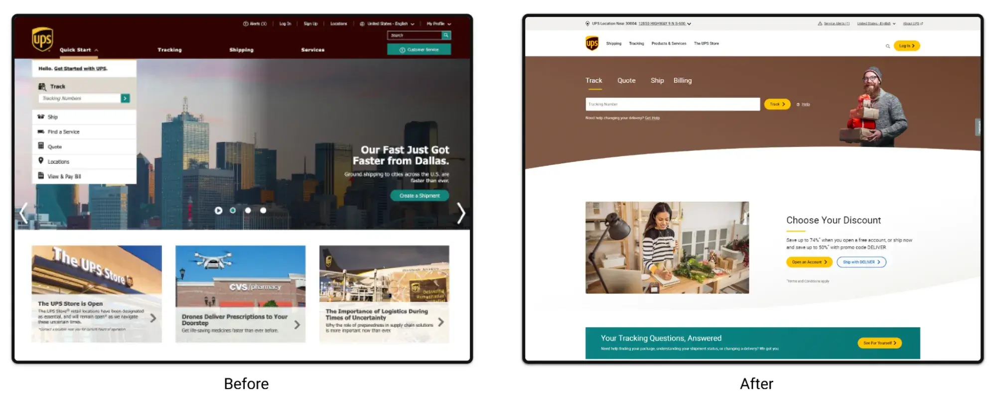
UPS was named a Webby Honoree for Best User Experience for the redesign of its website — whose results prove the power of good UX.
UPS conducted user research and found that 76% of customers couldn't find what they were looking for in their 300,000-page website. That’s a UX nightmare.
So, UPS redesigned its site to be user-centered, namely:
- It reduced the number of pages by 98%.
- It switched to creating content for customers instead of UPS employees.
These design changes resulted in a 16-point increase in Net Promoter Score over three years and decreased desktop homepage bounce rate by 41%. And on mobile, user experience for consumers went up by 20 points.
Pro tip: UPS’ astounding improvement post-redesign underscores the importance of UX research to inform your website design. To get started, download this free UX research kit with templates for user testing.
Free UX Research Kit + Templates
3 templates for conducting user tests, summarizing your UX research, and presenting your findings.
- User Testing Template
- UX Research Testing Report Template
- UX Research Presentation Template
Download Free
All fields are required.
Form not available
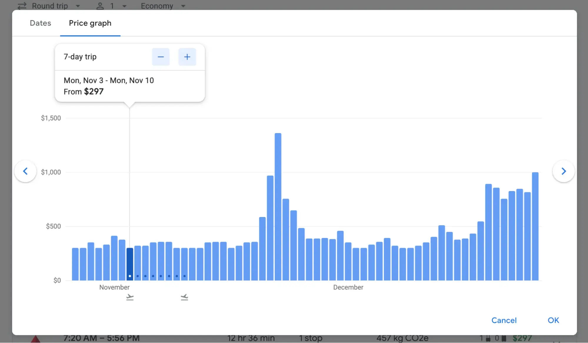
7. Google Flights - Example of Flexibility and Efficiency of Use
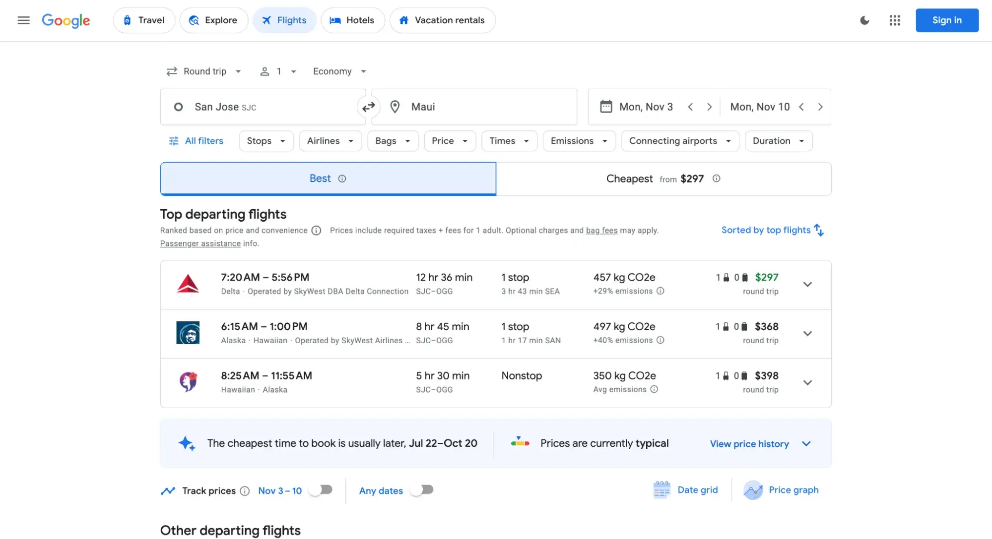
Google Flights is my go-to when booking a trip, so I was thrilled when my coworker Juan Manuel Devia Pinzon suggested it as a UX design example.
The many ways users can visualize the results show why Google Flights is a good example of flexibility and efficiency of use.
“When deciding on a trip, most users have a specific budget in mind,” explains Pinzon, a HubSpot senior UX designer.
“Google Flight's Date Grid provides a landscape view of prices for different days. It even highlights the best prices, given a specific departure and return date combination.”
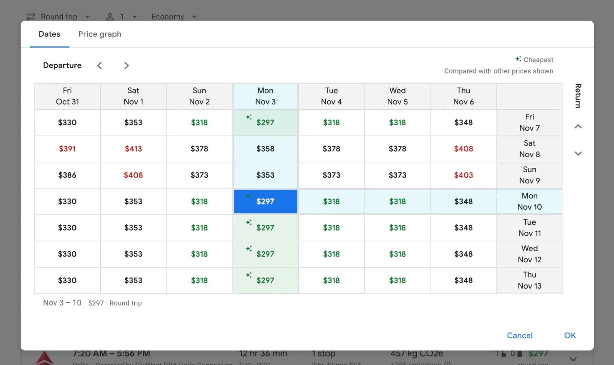
“Additionally, it lets you lock in a date and then apply the changes to your flight search,” he says. “In the past, this feature has helped me plan trips around the best dates to fly.”
Users can also toggle to a price graph grid to compare prices across different dates. These different views are a great example of flexibility and efficiency of use, providing users with multiple options based on their preferences as well as solutions to get them to their goals fast.
8. Gmail’s “Undo Send” - Example of Error Recovery
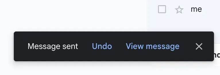
Anyone who’s ever experienced the flood of relief washing over them as they click “undo” on a hastily written email to the wrong recipient will appreciate this one.
I can’t think of a better example of error recovery than Gmail’s “undo send.” As a user, I gain confidence and reduce my anxiety whenever I use Gmail because I know that if I make a mistake, I can always reverse it.
The interesting thing about this feature is that it doesn’t actually undo the send, as in, the email was never sent in the first place.
As UX designer Michael Leggett wrote on the official Gmail blog back in 2009 when “Undo Send” was first unveiled: “This feature can't pull back an email that's already gone; it just holds your message for five seconds so you have a chance to hit the panic button.”
While you could argue that this may be unclear to the user, I’d argue it’s a better user experience than that of Apple Messages’ “undo” option.
With that one, that opposite is true: The text message is immediately sent, and you can, within two minutes, recall it.
However, in that situation, the recipient still receives the message temporarily — meaning that if they clicked it fast enough, they may still have read the message before it was deleted.
Additionally, there remains a message that says “[Name] unsent a message” on the recipient’s end. That builds my anxiety even more as a sender.
9. Pinch of Yum’s “Jump to Recipe” Button - Example of User-Centered Design
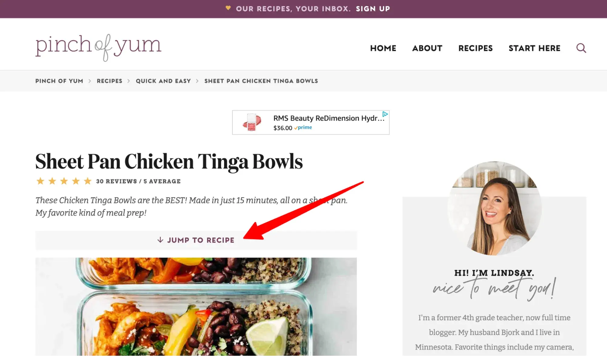
As a blogger, I’ve seen many, many conversations between frustrated blog readers and exasperated food bloggers who can’t agree on whether it’s appropriate to include a long preamble to the recipe.
For background, food bloggers often include a story before sharing their recipe for two reasons:
- They make money on display ads, so having viewers dwell on the page longer increases their ad revenue.
- They’re trying to infuse their content with E-E-A-T, particularly first-person experience, to satisfy Google.
On the flip side, readers don’t like this because their intent when they land on a recipe post is to read the recipe.
The “Jump to Recipe” link — one of my favorite ever UX examples — feels like a nice compromise and excellent user-centered feature. I particularly like the wide, prominent button as shown on Pinch of Yum.
Pro tip: When in doubt, test it out. In a case where a small design change (like a “Jump to Recipe” button) might negatively impact a business goal (like ad revenue), conduct split testing to see. Some CMSs like Content Hub have built-in A/B testing so you can easily gain insights.
10. Apple’s Accessibility Page - Example of Visual Hierarchy and Accessibility
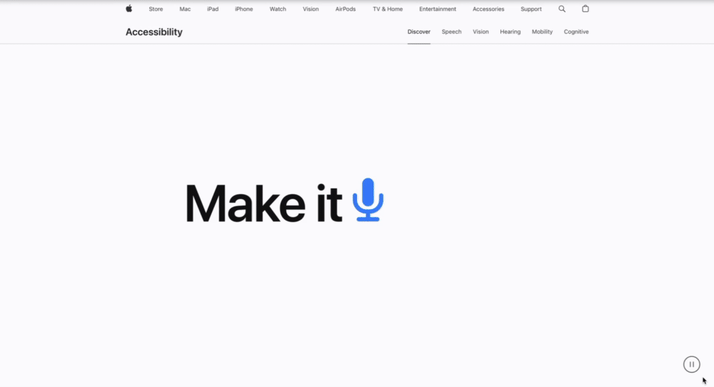
When it comes to user experience design examples, Apple gets a lot of mentions. But I really liked this submitted example because it’s a unique aspect of the tech giant: Apple’s accessibility features page.
“This is one of my favorites, and I think it marries accessibility and aesthetics really well,” says Maigen Thomas, founder of Level 11 Technology, which provides website accessibility and usability evaluations.
“Apple's really known for both being contributors to the human interface guidelines and helping people be more accessible. And I think this page is, in particular, very usable. It makes the most important information the biggest on the screen.”
She adds, “It just makes it really easy to process. It‘s not trying to overwhelm the user with too much information. There’s lots of places where you can find more details and click in further.”
Free UX Research Kit + Templates
3 templates for conducting user tests, summarizing your UX research, and presenting your findings.
- User Testing Template
- UX Research Testing Report Template
- UX Research Presentation Template
Download Free
All fields are required.
Form not available
11. Charles Schwab’s Two-Step Verification - Example of Flexibility and Efficiency of Use
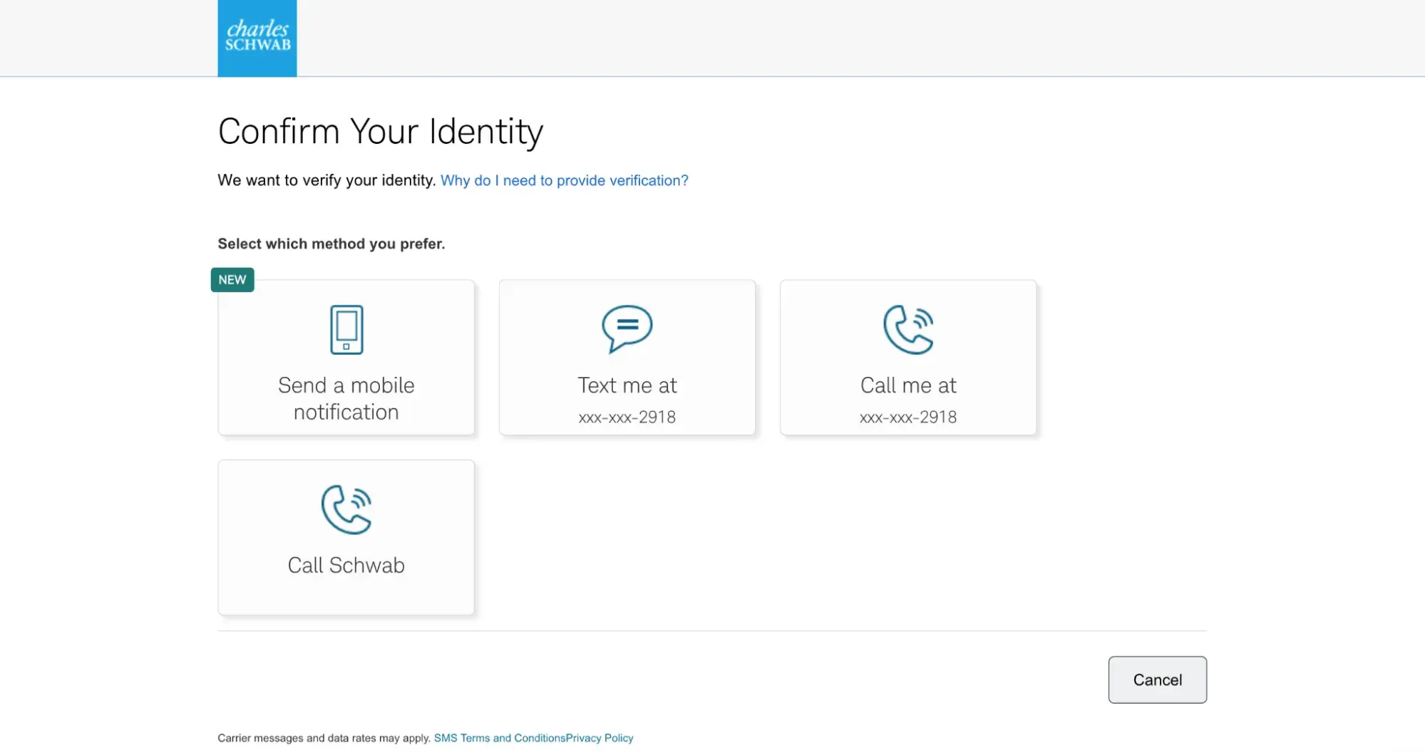
As an impatient user, I dislike two-step verification. But as someone who cares about not getting hacked, I appreciate it.
Charles Schwab’s banking system makes the best of it by implementing a fantastic example of flexibility and efficiency of use, which means it provides multiple options to accommodate different users’ different preferences.
While most sites would give me two options at best (receiving a code by email or text), Schwab gives me four:
- Send a mobile notification.
- Text me.
- Call me.
- Call Schwab.
12. Undetectable.ai’s One-Click Sign-In “Magic Links” - Example of Reducing Cognitive Load
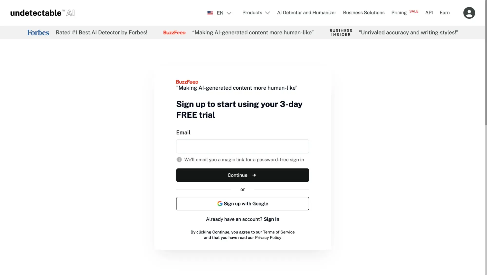
Sometimes, I like not having to think — especially when it comes to signing up or signing in. AI detector Undetectable.ai reduces the user’s cognitive load by sending a “magic link” to click instead of having to enter a password.
This is regardless of whether you’re creating an account for the first time or logging back in (so you don’t even have to remember if you’ve already created an account before).
All I had to do was enter my email address, and it sent me an email with a link. Once I clicked it, I was logged in — no password required.
13. Amazon’s Progress Bar - Example of Goal-Gradient Effect
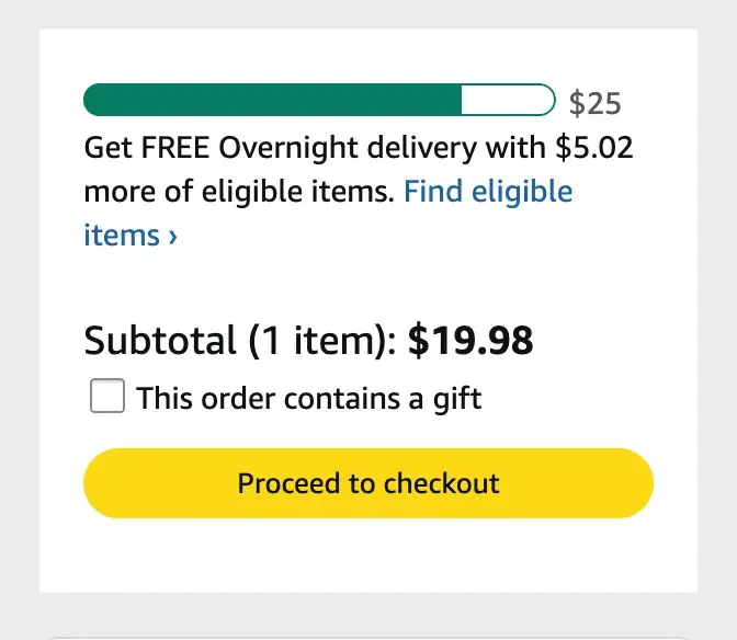
The goal-gradient effect states that the closer a user is to completing a goal, the faster they’ll move toward it.
“The real magic happens when we deliberately design for this effect,” writes UX/UI designer Jamie Esterman on LinkedIn. “Progress bars, achievement badges, and profile completion meters all tap into our natural drive to finish what we've started.”
And that’s why Amazon’s checkout progress bar is a good UX design example. It keeps me notified of the system status: I’m $5.02 away from qualifying for free overnight delivery.
It also increases my motivation to achieve free delivery. My wallet may not like it, but almost every time, I find something that I “needed” to add to my cart anyway so I can “save” on shipping costs.
14. You Need a Budget (YNAB) - Example of a Cancellation Flow That Builds User Trust
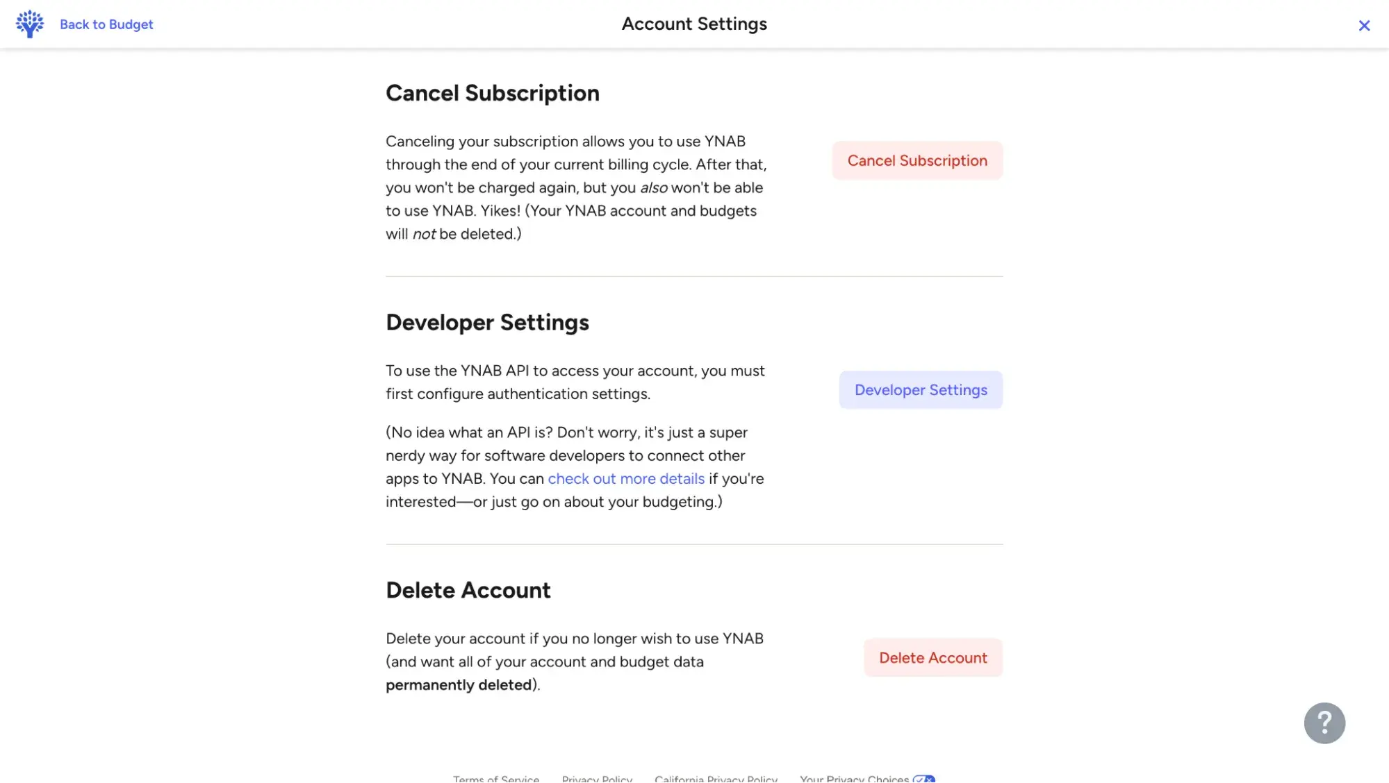
When you’re a subscription-based business, churn is the enemy. However, that doesn’t mean you should resort to dark UX in an effort to keep customers.
You Need a Budget (YNAB) provides an example of a good cancellation flow, one that builds trust because it doesn’t attempt to trick users.
I love YNAB. And I love that before it renews every year, it emails me a reminder.
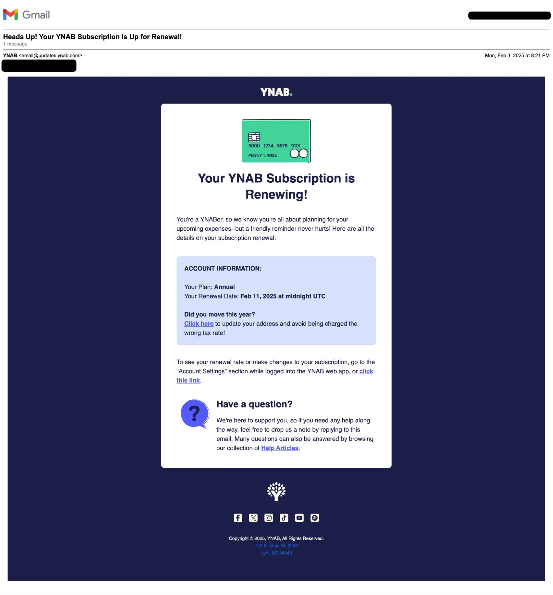
Within that email is a link to my dashboard in case I want to cancel. And when I click that link, YNAB doesn’t try to hide the cancellation button at the bottom of the page or in small letters.
Instead, it has a big red button that says “Cancel Subscription.”
Now, I have no plans to cancel my subscription with YNAB, but it makes me like the company even more knowing that they wouldn’t try to trap me if I did.
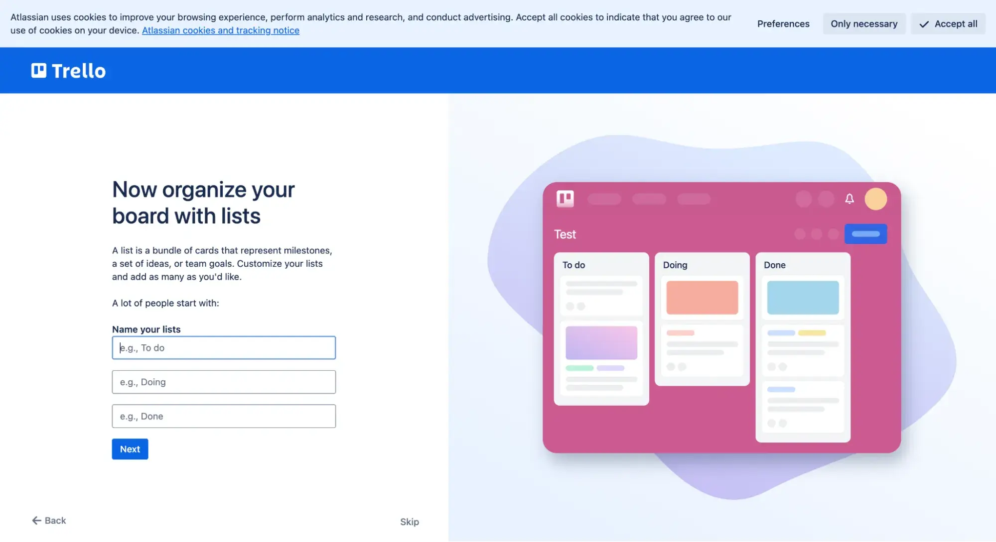
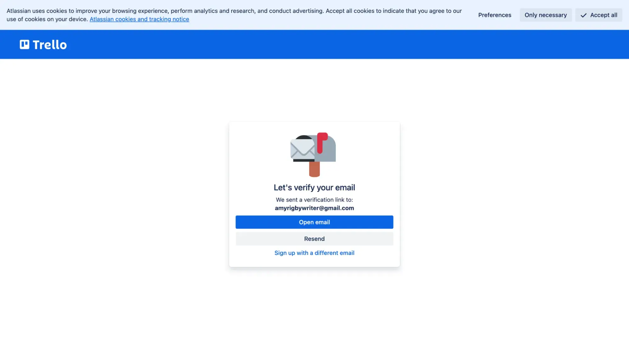
15. Trello - Example of Efficient Onboarding Flow
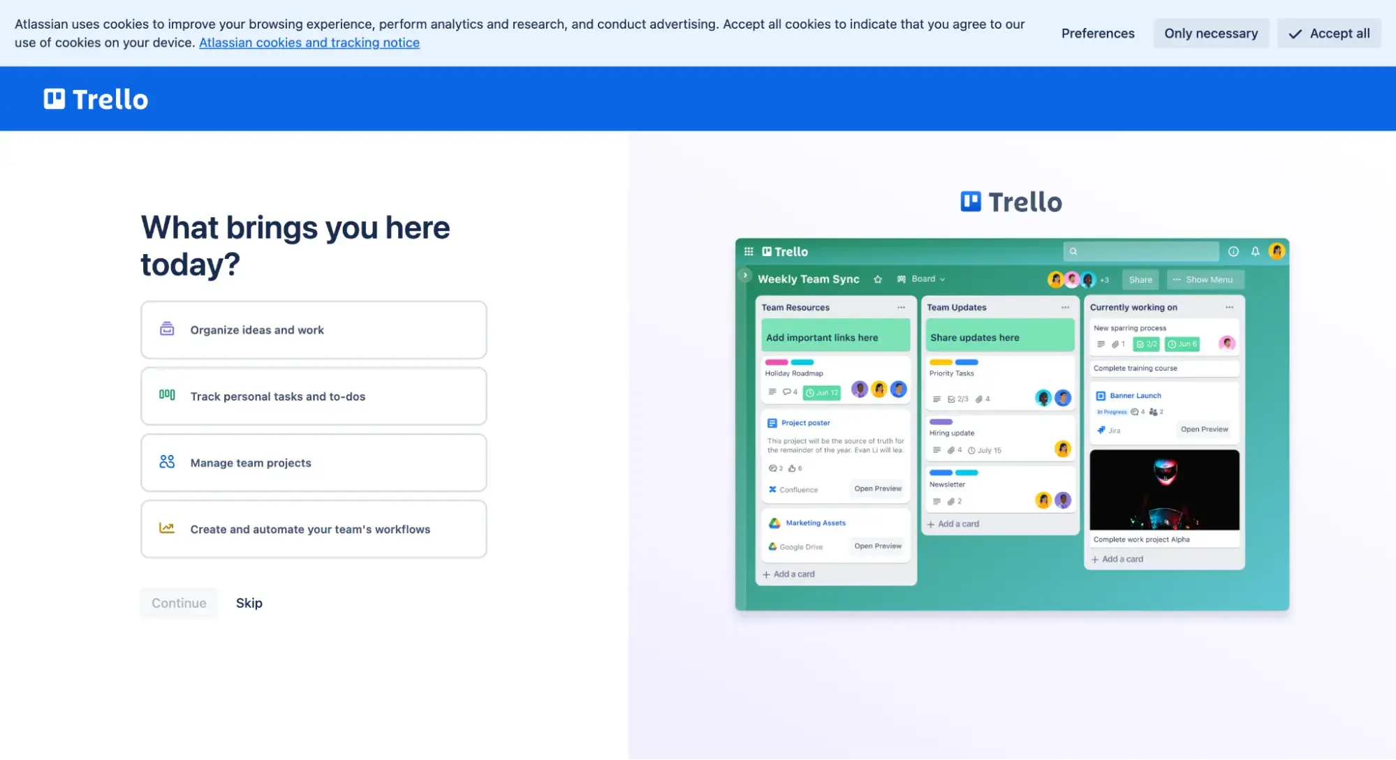
I think you’ve learned by now that I am impatient. This comes to a head anytime I sign up for a new account and am added to an onboarding flow. I hastily click through without reading, my frustration growing by the second.
The first thing I appreciated about Trello’s onboarding flow was that it allowed me to click “Skip” at any point during the onboarding process (which was only five steps).
The next thing I appreciated was that Trello provided an “Open email” link to make the process of finding the verification email just a tad easier (it’s an annoying but necessary step, I understand).
I know, I know. UX designers put so much thought and care into designing elaborate onboarding flows for that first-time user experience — but we users often want to skip right over them.
Pro tip: My advice when designing an onboarding flow?
- If you can avoid having an onboarding flow at all, avoid it! Don’t just take it from me.
As UX specialist Alita Joyce shares in this Nielsen Norman Group video, “Onboarding increases the interaction cost because these flows require user attention and effort. Even if users decide to skip your onboarding, they still have to interact with it to do so, and that increases the interaction cost of completing a task in your application.” - If you must have an onboarding flow, for the love of saving time and frustration, please:
- Allow users to skip it.
- Keep it as short as possible.
Free UX Research Kit + Templates
3 templates for conducting user tests, summarizing your UX research, and presenting your findings.
- User Testing Template
- UX Research Testing Report Template
- UX Research Presentation Template
Download Free
All fields are required.
Form not available
16. RunSignup’s “Keep Me Signed In” by Default: Example of Reducing Cognitive Load
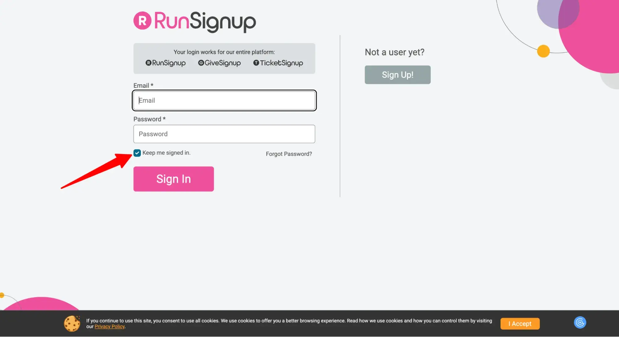
I can’t tell you how many times I’ve given up on logging into a website simply because I can’t be bothered to hunt down my username or password. RunSignup solves this with its “fast registration” feature.
Enabled by default, RunSignup keeps me logged in. So no matter which race I want to sign up for, all I do is click the registration link and it remembers all my information. This is a fantastic example of reducing the user’s cognitive load.
17. Dropout - Example of Minimalist UI and Effective Information Architecture
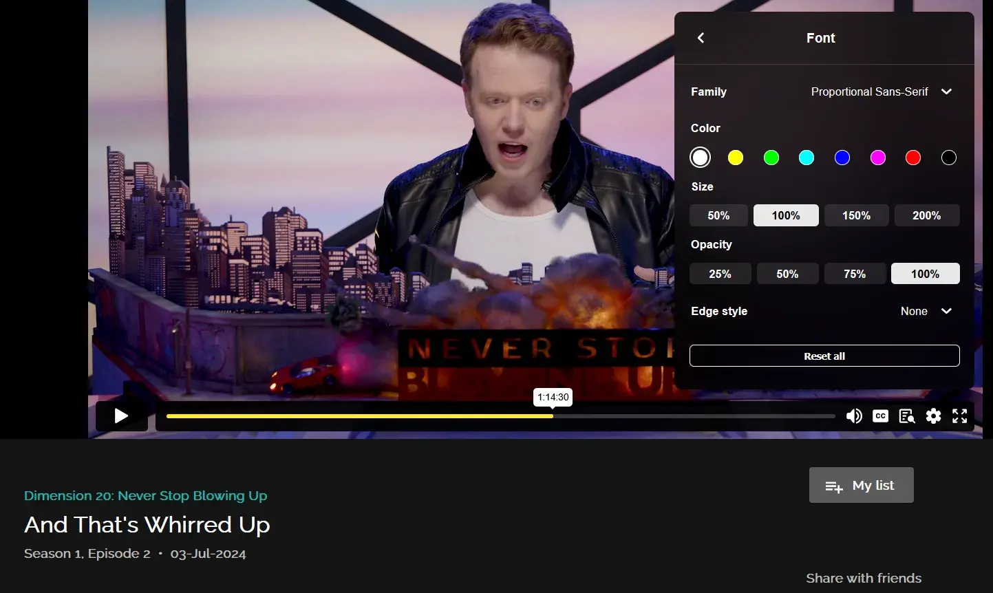
Source (Screenshot courtesy Joe Lollo)
“I think a web app with some fantastic UX, alongside its fantastic content, is the web app for Dropout TV,” my friend Joe Lollo told me when I asked for favorite UX design examples.
Lollo is a librarian who recently graduated with a Master’s in Library & Information Science — so it’s no wonder he appreciated the information architecture of the ad-free comedy streaming service.
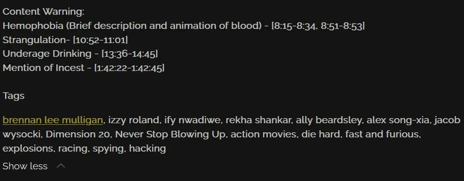
“It has a really robust tagging system within the service so that you can find shows, episodes, or sketches/shorts with actors, themes, or topics that you like based on what you are currently seeing,” he says.
Source (Screenshot courtesy Joe Lollo)
He also points out that viewers can check content warnings before watching and customize the font of subtitles for better readability.
Dropout‘s web app is also a great example of how a UI doesn’t need to be fancy to be powerful.
“Its UI is very simple compared to something like Netflix or Hulu,” Lollo adds, “but very effective when it comes to navigating and finding shows.”
18. BigScoots’ Omnichannel Support - Example of Help and Documentation
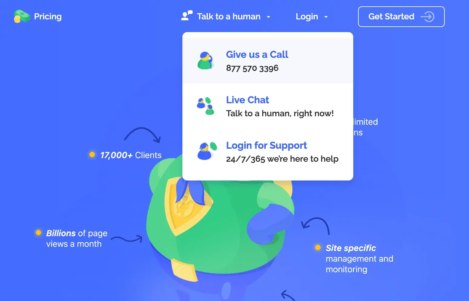
Even before logging in to BigScoots web hosting, a visitor can select from two different options to get their questions answered: phone call or live chat.
There’s also a “Talk to a human” button that stays with them on the lower right no matter what page they’re on. When a user clicks that button, they’re met with more options.
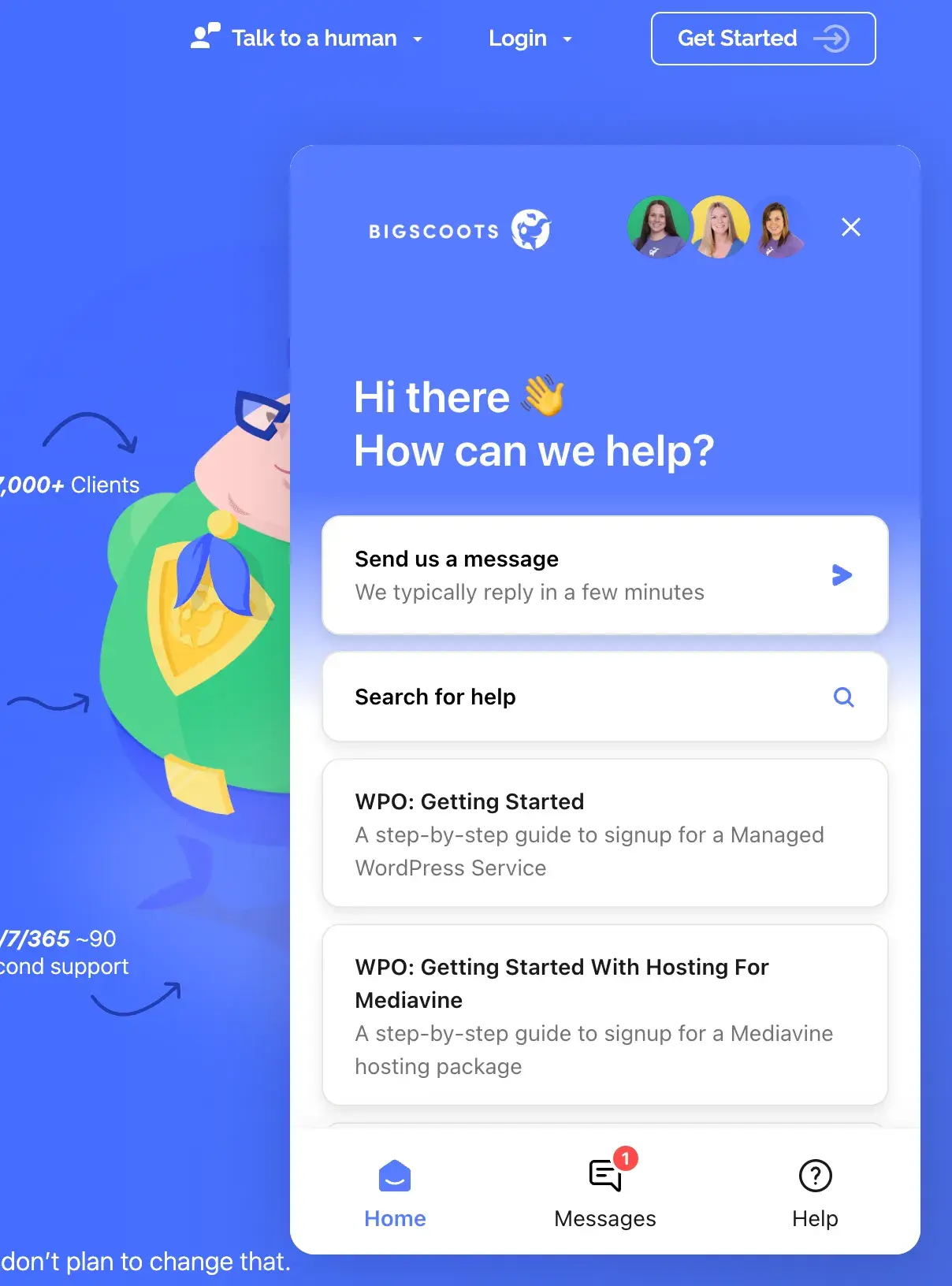
I love that this popup tells me how long I can expect to wait for a reply, and it gives me the option to search its help center in the meantime.
19. Notion’s Workspace Deletion Flow - Example of Error Prevention
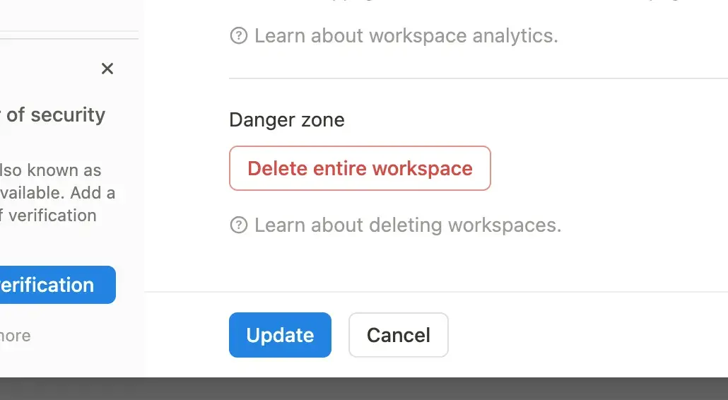
Notion demonstrates excellent error prevention in its workspace deletion flow. As a rule of thumb, the difficulty with which a user can delete something should increase as the stakes get higher.
So, to delete a Notion document (which the user can always recover in the Trash), it takes a mere two clicks.
But to delete an entire workspace — an action that cannot be undone — it takes about five clicks and the typing of very specific wording (in this case, “Amy’s Workspace”).
First, Notion warns me by labeling it “Danger Zone.” Then, when I click “Delete entire workspace,” it prompts a popup that asks me if I intend to delete the entire workspace. It also details the consequences.
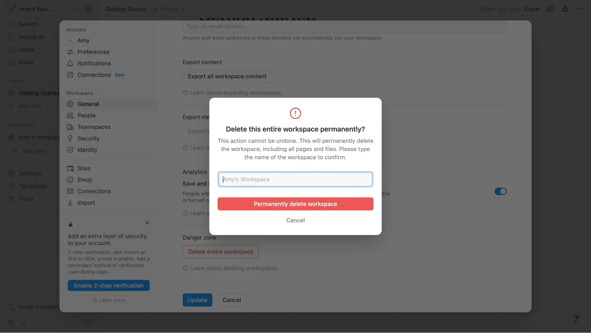
Then, if I truly intend to follow through on this action, I must type in the exact name and then click “Permanently delete workspace.”
With a high-stakes action such as this, Notion’s designers have done as much as they can to ensure I cannot accidentally do it.
20. Todoist’s Daily Goals & Karma Points - Example of Gamification in UX Design
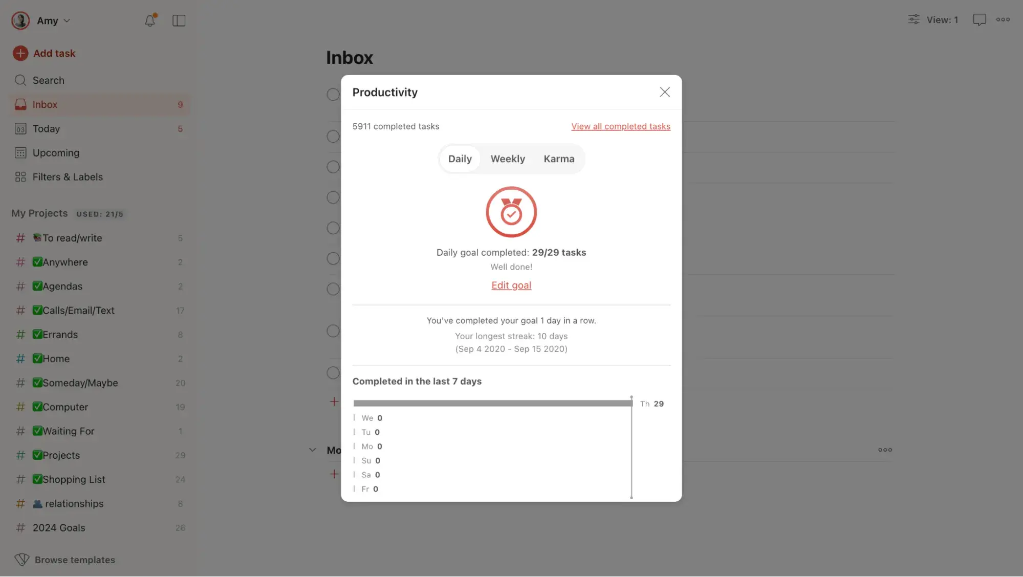
I love the to-do list app Todoist for many reasons — its minimalist UI, ease of use, and handy features, to name a few — but it is a particularly good example of using gamification in UX design.
By default, the app sets a daily goal of five completed tasks (which is editable). When a user checks off five tasks, a popup appears with a ribbon and data on how many tasks they’ve completed today versus yesterday. It’s a nice little dopamine boost.
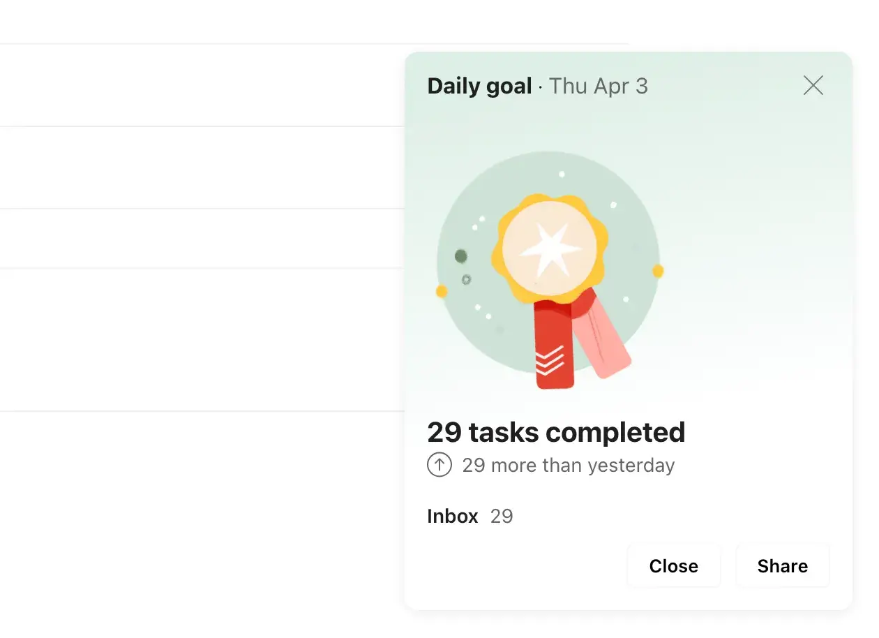
On top of that, Todoist has built-in “Karma points” that users can gain by completing tasks and maintaining streaks. Accumulate enough points, and you can unlock new levels — very gamified.
Use UX Design Examples to Inspire Your Work
During my research for this article, I was constantly delighted by the genius UX design examples out there, further highlighting the importance of this field.
Save these UX examples to use as inspiration the next time you’ve hit a plateau. Chances are, there are already designers out there doing a fantastic job that you can rework or build upon. Something from this list might just spark a new idea.
Free UX Research Kit + Templates
3 templates for conducting user tests, summarizing your UX research, and presenting your findings.
- User Testing Template
- UX Research Testing Report Template
- UX Research Presentation Template
Download Free
All fields are required.
Form not available
User Experience

![How to become a UX designer, a step-by-step guide [expert tips]](https://53.fs1.hubspotusercontent-na1.net/hubfs/53/become-a-ux-designer-1-20240731-321437.webp)


![How to Add a Parallax Scrolling Effect to Your Website [Examples]](https://53.fs1.hubspotusercontent-na1.net/hubfs/53/scroll-Aug-11-2023-05-24-08-8793-PM.png)