I once worked on a product where users kept dropping off during signup. The form looked clean, but we asked for credit card details before they even knew what they were signing up for. By simplifying the flow, moving non-essential steps later, and adding clear progress indicators, we saw conversions jump within days.
That realization pushed me to care as much about the design process as I do about the technical one. The framework that makes that possible is user-centered design.
Let me go into more detail about what user-centered design is and why it’s so important.
Table of Contents
- What is user-centered design?
- Why is the user-centered design process so important?
- User-Centered Design Example
- Benefits of Implementing User-Centered Design Principles
- What are the main user-centered design principles?
- What is the user-centered design process?
- Tips & Tools for Implementing User-Centered Design Principles
I get it — the concept of UCD might seem obvious. After all, users are the ones who are, well, using your product. Why wouldn’t you prioritize what’s meaningful to them?
The main issue is that if we don‘t incorporate users throughout the process, other forms of bias can creep in and steer us away from what users want. Personal opinions, standard industry practices, business goals, and general resistance to change can all impact what designers think a product should be. This causes them to forget who they’re designing for. The result can be a product that isn't effective for users.
Lindsay Derby, senior product designer on the sales enablement team at HubSpot, explains it best. "User-centered design is an iterative design approach that is fundamentally driven by making decisions based on the user needs,” she says.
Derby notes that this process involves a research phase in which designers need to fully understand the context of the use cases and specific user requirements. The designer will work to balance business objectives with these user needs to achieve the final design.
“User-centered design requires empathy for the users and balances the pragmatic approach needed for designing for a company or client. Design solutions are iteratively evaluated and improved, ideally by testing with actual or prospective end users,” Derby says.
Why is the user-centered design process so important?
User-centered design brings our focus back to the user by prioritizing them and framing entire projects around their feelings, needs, and goals.
UCD does this by employing various exploratory research and ideation methods to understand the user comprehensively. Once this robust comprehension of the user is created, designers can use what they know to build a product they'll love.
Let the numbers speak instead of me:
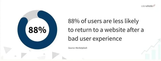
- 88% of users won’t return to a website after a bad experience.
- Mobile users are five times more likely to abandon a site if it’s not mobile-friendly.
- Two-thirds of visitors prefer a well-designed site over a simple one.
- Over 90% of users don’t trust poorly designed sites.
According to Derby, a major reason UCD is so successful is that it considers how users naturally do things — and incorporates that into the design.
“User-centered design takes into account the user's natural way of doing things based on their inherent behavior and established mental models,” says Derby.
According to Derby, teams shouldn’t try to impose the design on the user and force people to adjust.
“We have all encountered UIs that try to force us to use the system in an unfamiliar way. It is confusing and often frustrating. User-centered design attempts to deliver a much more integrated and pleasing experience that will leave the user with a positive impression and also be able to complete the desired business objective without having to needlessly adapt,” she says.
Importantly, user-centered design isn‘t about understanding just any user — it’s about your users, the ones you envision using your specific product. UCD considers the characteristics of a target audience and what makes them unique, as this informs what they‘ll want to do with your product and how they’ll use it.
User-Centered Design Example
Are you wondering what user-centered design looks like in practice? Let me share one from my own work.
I’m designing Bea’Viewed, a community-driven platform where beauty professionals can grow their business and consumers can book with confidence. Early on, I put out a survey to potential users who are women who regularly book hair, nail, and skincare services.
One insight stood out: while people loved the idea of discovering new pros, what they valued most was trust. They didn’t want endless scrolling; they wanted to quickly find someone credible, nearby, and aligned with their style.
So instead of starting with a generic search bar, we’re designing the experience around filters that matter to them: location, availability, service type, and reviews with photos. We’re also prioritizing visuals (before-and-after images, real client photos) because survey responses showed users make decisions faster when they can “see the work” upfront.
That’s user-centered design in action. The business goal is clear (viz., connect beauty seekers with professionals), but the way we build the flow is shaped by actual user needs, not just what’s easiest to code. And by listening to users early, I have confidence that Bea’Viewed’s search experience won’t just look good, but it will be useful for the people who matter most.
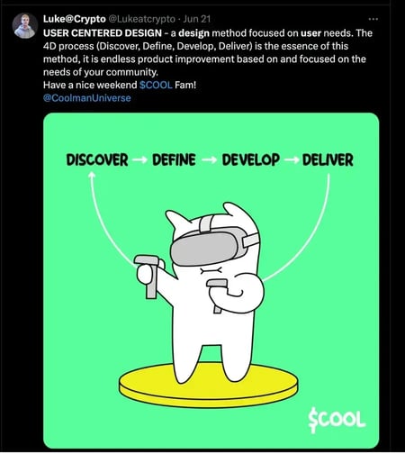
By the way, I saw a great post on X by a UX/UI designer Luke who explained UCD as a 4D process — Discover, Define, Develop, Deliver — showing ongoing product improvement based on your community’s needs.
This super cool infographic made the 4D process totally stuck in my head:
Benefits of Implementing User-Centered Design Principles
When I first started learning UCD, this seemed like a lot of extra work. But once I saw how much I was gaining in the long run, I stopped thinking of it as “extra” and started thinking of it as essential.
Here are a few reasons why.
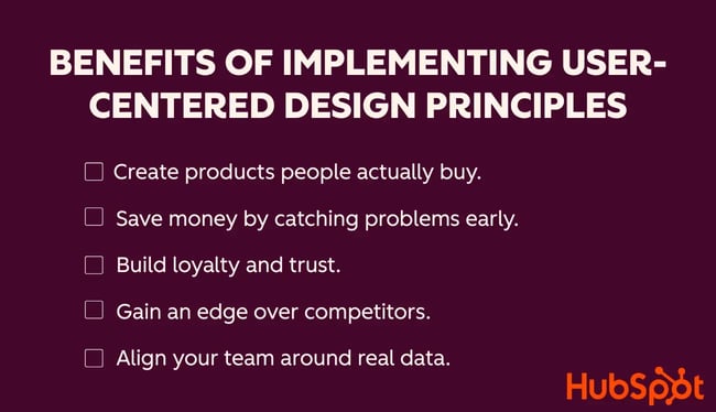
1. Create products people actually buy.
When your design matches what users need, sales follow. Think about a mobile app that makes checkout effortless with Apple Pay. People are more likely to complete the purchase, recommend it to friends, and come back again. I certainly am more likely to purchase when Apple Pay is an option.
2. Save money by catching problems early.
Involving users during design helps you identify pain points before launch. For example, if testers struggle to find the “Sign Up” button in a prototype, it’s far cheaper to fix that upfront than rebuild the flow after release.
3. Build loyalty and trust.
A smooth experience encourages customers to stick around for the long run. Chipotle’s app comes to mind when it comes to this. It remembers my frequent orders, which is often the reason I choose them for dinner over others. I keep using it because it saves time and feels reliable.
4. Gain an edge over competitors.
If two products offer the same service, the one that’s easier to use wins. That’s exactly how Calendly surged ahead of traditional scheduling tools. Instead of endless email threads, it lets people book a meeting in one click.
5. Align your team around real data.
UCD gives designers, developers, and stakeholders a shared direction. Instead of making assumptions, you can point to user research — like feedback showing 80% of users prefer swipe navigation over dropdown menus.
What are the main user-centered design principles?
User-centered design is all about stripping away assumptions and building something people actually want to use.
When you put your users’ needs front and center, every design decision has a clear purpose. In return, it becomes a lot harder to create a product that misses the user’s goals.
Here are the main principles.
Focus on the users and their goals.
UCD begins with understanding who your users are and what they’re trying to achieve. In design, we refer to these users as our target audience. Every design choice should help them accomplish their goals more quickly and with less friction. When the product aligns with real needs, users naturally feel more satisfied and engaged.
Pro tip: On large-scale projects I’ve worked on, I learned that it’s easy for stakeholders to push features that serve the business but not the end user. A simple way to stay aligned is to map every feature request to a specific user story. If you can’t connect it back to a real user goal, it’s probably not important.
Involve users throughout the process.
Don’t just design for users, design with them. Involving users early through surveys, interviews, or usability testing uncovers problems you’d never see from behind a screen. Their feedback provides a reality check that saves time and money down the road.
Pro tip: On one enterprise app I helped build for a major cruise line, we ran short user-testing sessions every sprint. Even if the feedback was minor, such as a confusing drop-down label, those tweaks resulted in a smoother experience that prevented costly fixes after our launch.
Iterate and improve continuously.
UCD isn’t a “set it and forget it” process. Products evolve, and so do user expectations. Prototyping, testing, and refining on repeat keeps the experience fresh and relevant.
Pro tip: I’ve seen projects stall because teams feared releasing before everything was perfect. In practice, launching a lightweight version and then iterating based on user data builds more trust than waiting months for a “big reveal.” Users appreciate it when they see improvements shaped by their feedback.
Balance user needs with business goals.
Great design doesn’t choose between business success and user happiness; it finds the overlap. The most impactful products achieve both by aligning what users want with what the company needs to accomplish.
Pro tip: In my development work, I’ve had to push back on “business-first” requests that added trouble. The best outcomes occurred when I collaborated with the product manager to reframe those goals in terms of user value. For example, reducing steps in a workflow to capture user information not only increased conversions but also decreased abandonment rates.
Prioritize accessibility and inclusivity.
If your design only works for some people, it doesn’t really work. Accessibility ensures everyone, regardless of ability, can use your product. Beyond compliance, inclusive design improves usability for all users.
Pro tip: Adding alt text to images and clear color contrast not only helps visually impaired users but also boosts SEO.
What is the user-centered design process?
While not every business follows the same exact process of UCD, I’ll take you through the general steps that I typically adhere to: plan, research, aligning requirements with the business, designing, testing, and refining and iteration.
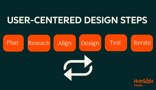
Plan
Whenever I start a project, I begin with assumptions about who my users are and how they behave. It’s part of the planning process where I form a few hypotheses and then test them before I commit to design decisions or marketing strategies.
For Bea’Viewed, I initially assumed that most people were using TikTok just as much as Instagram to discover beauty professionals. My first thought was that I’d need to split my marketing energy between the two.
But once I ran a survey, I learned TikTok was actually one of the least-used platforms for this purpose. That insight told me I didn’t need to pour resources into TikTok content. Instead, Instagram was where my audience was hanging out.
Another assumption I made early on was that everyone would be eager to download an app. In reality, a segment of potential users preferred not to clutter their phones with new apps at all. That meant I needed to think about a lightweight web experience to capture people who just wanted to browse reviews without committing to a download.
Starting with assumptions is natural, but validating them early keeps me from building features or campaigns that don’t matter to my users.
Research & Align
After I’ve outlined my assumptions, the next step is research. This is where I slow down and learn about the people I’m designing for (target audience). Skipping this step can lead to flashy features that look good in a demo but flop in real life. Research is what keeps me grounded in what users actually need.
Identify your target audience.
To design for users, I need to understand who they are, what obstacles they face, and how they’ll interact with the product in their daily lives. I use a mix of methods.
- Surveys: To gather quantitative data about behaviors and preferences.
- Interviews: For one-on-one conversations that reveal deeper insights.
- Focus groups: To spark discussion and surface shared frustrations.
- Ethnographic research (observation): To see how users behave in their real environment.
Say I’m designing a children’s learning app. A survey might tell me parents want apps that build reading skills, but an observation session at home could reveal that kids get distracted easily when instructions are too text-heavy. That’s a signal to design with visuals, audio cues, and shorter tasks.
Create user personas.
Once I have research in hand, I translate it into user personas — semi-fictional profiles that capture goals, frustrations, and context. Personas help me design with empathy, not just data points.
One persona for the learning app could be “Busy Parent Ashley.” She works full time, wants her child to build reading confidence, and values apps that are safe, simple, and engaging without requiring constant supervision. Her biggest frustration? Apps that feel like games but don’t actually teach skills.
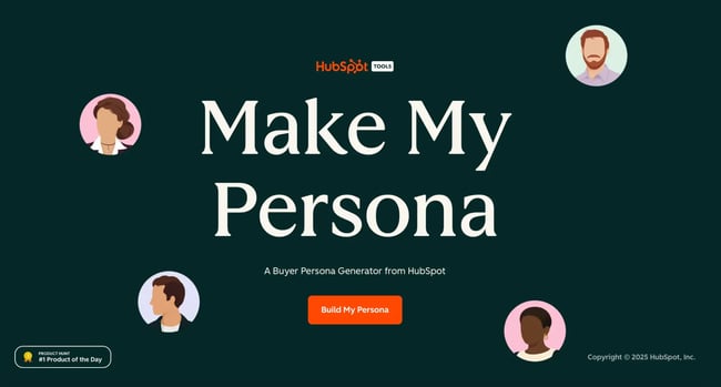
A persona like this helps a ton when I’m making design trade-offs. And if you need help structuring personas, HubSpot’s Make My Persona tool is a great resource. It gives you a ready-to-use template for mapping out your audience’s demographics, needs, and pain points. I used this tool to create the user personas for Bea’Viewed.
Find the context of use.
It’s not enough to know who your users are — you also need to know where, when, and how they’ll use the product. Context drives design choices.
For a children’s learning app, the context might be a child using a tablet on the couch after school, sometimes alone and sometimes with a parent nearby. That means the interface needs large tap targets, minimal typing, and built-in audio so instructions don’t rely on a parent being present.
Research takes effort, but it’s the foundation of user-centered design. The more I invest upfront in understanding users, the easier it is to build products that not only get used but also make a meaningful impact.
Set requirements that align users’ goals with business goals.
Once I’ve done my research, I don’t jump straight into wireframes. First, I pause and translate what I’ve learned into requirements. For me, this step is about connecting the dots between what users need and what the business needs to achieve. If those two aren’t aligned, the product won’t succeed.
Turn research into clear, testable requirements.
I like to take insights from surveys, interviews, or personas and write them as requirements. Not just “make onboarding easier,” but something I can measure, like: “Users should be able to create an account in under two minutes.”
Balance user needs with business priorities.
This is also where I align requirements with business goals. User needs should always come first, but they also have to drive growth for the company. Otherwise, you risk building something delightful that doesn’t keep the lights on.
Align with stakeholders before moving to design.
One thing I’ve learned the hard way is that it’s not enough for designers and developers to agree on requirements. Before moving into design, I sit down with stakeholders — whether that’s marketing, product owners, or leadership — and confirm that everyone is aligned.
On a past home improvement brand app project, we assumed a new feature was a priority until we shared requirements with stakeholders. It turned out the business needed regulatory compliance updates first. Catching that misalignment early saved weeks of design work that would have been scrapped.
Prioritize what matters most.
It’s rare that I can meet every user's needs in the first release. That’s why prioritization matters. I always ask: Which requirements give the most value to users and impact the business at the same time? Those go into the first iteration. The rest get parked for later.
For Bea’Viewed, some users asked for advanced social features like following friends’ favorites. I love the idea, but the data showed filtering and booking were the real pain points. So social features went into the “later” bucket, and I am focusing on nailing the essentials first.
Design
Once requirements are agreed on, I shift into design. This is where ideas start taking shape. This is where I translate those “must-haves” into flows, wireframes, and prototypes that bring the requirements to life. In past projects, I’ve learned that design isn’t just about aesthetics; it’s about clarity, efficiency, and making sure thousands of users can accomplish their tasks without frustration.
Start with user flows and wireframes.
I rarely open Figma and start designing screens right away. Instead, I map out the end-to-end flow first. Wireframes help me strip away the cute stuff and focus on structure — how a user gets from point A to point B.
Build prototypes for feedback.
After creating flows and wireframes, I move on to interactive prototypes. These prototypes are critical because they let stakeholders and users “click through” an experience before it’s coded. It closes the gap between abstract requirements and how the product will actually function.
I remember on a past digital transformation project for a major bank, I created a clickable prototype for a new booking system to meet with bankers. In early demos, users got stuck because navigation labels didn’t match their terminology. Catching that mismatch in a prototype, not after development, saved the developers from redesigning a core part of the app.
Leverage design systems and standards.
One of the biggest lessons I’ve learned in consulting is the value of design systems. Large organizations often have brand guidelines, but not always a system of reusable, accessible components. By aligning prototypes to a design system, I can move faster and ensure consistency across dozens of teams. If the organization is not open to building a custom system, then my go to is Material Design by Google.
Test
Testing is the stage where designs move out of theory and into reality. It’s not about whether the screens look polished — it’s about whether real people can move through the flow easily and achieve their goals without confusion.
Validate against requirements.
I always test designs against the requirements we set earlier. If the requirement was “users can book in under two minutes,” then that’s the benchmark. This keeps testing focused and avoids drifting into subjective opinions about style or preference.
Use high-fidelity prototypes for usability tests.
By the time I’m testing, I want my designs to feel as close to the real thing as possible. That’s why I rely on high-fidelity prototypes: clickable, realistic versions that let users interact naturally. It gives me more accurate feedback than static mockups.
Evaluate accessibility and inclusivity.
Good design works for everyone, not just some. Testing also means checking for accessibility - ensuring color contrast is strong enough, text is readable, and navigation works with assistive tools. Use screen reader demos or quick accessibility audits in tools like WAVE to catch issues early on.
Refine & repeat.
For me, design doesn’t end when the files are handed off. Once the product goes live, it’s about listening, learning, and feeding those insights back into the next cycle. User-centered design is iterative by nature - you refine based on real-world feedback, then repeat the process to keep improving.
Launch
Launch is the moment everything comes together — but it’s also where reality sets in. No matter how much research, design, and testing you’ve done, launch day always teaches you something new. As a designing developer, I see launch as less about “shipping and forgetting” and more about preparing to monitor, learn, and adapt.
Roll out thoughtfully.
I avoid big-bang launches whenever possible. Feature flags, phased rollouts, or pilot groups let me see how real users interact with the product without risking the entire audience.
Monitor performance and usage.
The work doesn’t stop once the code is live. I keep an eye on analytics, error logs, and user behavior to make sure the product is performing the way we intended.
Gather feedback and iterate.
Launch is also the best time to actively listen. Users are usually most vocal right after a release, and that feedback is gold. I log issues, track requests, and then loop back with the design team and stakeholders to prioritize fixes or enhancements.
Iterate
I’ve never finished a round of testing and thought, “This is perfect, we’re done.” That’s not how user-centered design works. Instead, I expect to go back, make adjustments, and test again, and sometimes more than once. Iteration isn’t a failure; it’s the process doing what it’s supposed to do.
When I test a prototype, I usually find that users like parts of it but stumble on certain steps. That tells me I need to return to design, tweak the flow, and test it again. Other times, testing reveals something bigger, like my original understanding of the user was off. In that case, I go all the way back to research.
Each round of iteration brings the product closer to something people actually enjoy using. I ask myself: Have I truly considered my persona? Does this design meet both the user’s needs and the business requirements? If the answer isn’t clear, it means another cycle is needed.
And when I finally reach a point where users can move through the experience smoothly and with confidence, I know the work has paid off. That’s when I take a breath, pat myself and the team on the back, and start preparing for the next round of improvements, because user-centered design never really ends.
Tips & Tools for Implementing User-Centered Design Principles
When I’m working on a new product, I rely on a handful of tools that make the user-centered design process smoother and more effective. From Figma for prototyping to Plausible for analytics, these are the platforms I lean on to turn user feedback into better experiences.
Research! Research! Research!
I’ve learned you don’t need a huge budget to learn from users. Even a few structured conversations or quick surveys can uncover valuable insights. Some of my go-to tools are Google Forms, Typeform, Hotjar for behavior insights, Lookback for interviews, and Zoom for virtual sessions.
Involve users as much as possible.
I try to bring users into the process as early as possible because it saves so much time down the road. Testing ideas before development gets too far means I can catch usability issues while they’re still easy to fix. I like using Figma prototypes with Maze or UserTesting for remote sessions.
Document user needs clearly.
One thing that helps me keep projects on track is translating research into clear requirements. If I can tie every feature back to a user's needs, I know we’re building the right things. I usually document in Notion or Confluence, map journeys in Miro, and manage user stories in Jira or Azure DevOps(ADO).
Ensure business and user goals are being met.
I’ve seen how powerful it is when business goals and user needs overlap. To stay balanced, I track both sides — what users want and what the business needs to achieve. For metrics, I use Google Analytics or Plausible, and I validate the user side with testing platforms like PlaybookUX or Useberry.
User-centric products require user-centric designers.
When I think about user-centered design, I see it as a cycle I come back to again and again by planning with assumptions, researching to ground myself in reality, setting requirements that balance user and business goals, designing flows and prototypes, testing them with real people, and then refining until it feels right.
I’ve learned through both consulting work and building my own startup that no design is perfect on the first try, but every round of iteration gets me closer to creating products people actually want to use.
For me, UCD isn’t just a process. It’s a mindset that keeps the user at the center of every decision I make.
Editor's note: This post was originally published in June 2022 and has been updated for comprehensiveness.
User Experience
.png?width=112&height=112&name=Image%20Hackathon%20%E2%80%93%20Square%20(10).png)
.png)
![How to become a UX designer, a step-by-step guide [expert tips]](https://53.fs1.hubspotusercontent-na1.net/hubfs/53/become-a-ux-designer-1-20240731-321437.webp)

![How to Add a Parallax Scrolling Effect to Your Website [Examples]](https://53.fs1.hubspotusercontent-na1.net/hubfs/53/scroll-Aug-11-2023-05-24-08-8793-PM.png)

![20 UX Design Examples Hand-Picked by Experts [With Analysis]](https://53.fs1.hubspotusercontent-na1.net/hubfs/53/ux-design-examples-1-20250404-8425368.webp)
