There’s a lot to figure out in the UX design process, and the overall objective is to improve conversion and retention rates (i.e., revenue). However, revenue-driving digital experiences start and end with the customer, and that’s where user experience (UX) research becomes a critical component of the playbook. UX research design takes the guesswork out of design decisions and puts customer-sourced data and information at the core of your processes.
Table of Contents
- What is UX research?
- The Benefits of UX Design Research Methods
- 11 UX Research Methods and When to Use Them
- UX Research Example
- Choosing the Right UX Research for Your Project
What is UX research?
UX research is the process of studying user behavior and preferences to inform design decisions for digital products like software, websites, apps, and systems. No matter which research method you use, the goal is to come away with actionable insights so that your design meets user needs and provides a positive experience all around.
Part of UX research can include identifying pain points or specific preferences or understanding user motivations and behavior. When it comes to choosing the right UX research method for your particular product, it’s important to know that available methods vary by their purpose and outcomes. Each method can be categorized across distinct dimensions across four main categories.
UX Survey and Data Collection Methods
Quantitative UX research: collects numbers and data for statistical analysis. It’s useful for making data-driven decisions, particularly between a set of distinct choices within your design (e.g., color usage). Surveys are a good example of quantitative research.
Qualitative UX research: less about standardized data and more about getting insights into individual experience. With qualitative information, you can get more depth and context for your design decisions. An interview with a user would qualify as qualitative research.
UX Research Response Focus
Attitudinal research emphasizes the way users express their wants and experiences. It’s how they believe they interact with interfaces and what they’d like to see. Interviews and focus groups are types of attitudinal research.
Behavioral research involves observing what users actually do when interacting with the product. It’s typically more of a data-based approach, and it can uncover nuggets about behavior that the users may not even be aware of themselves. Heat maps and eye tracking are both examples of behavioral research.
Depending on your chosen research method, you’ll end up with either quantitative or qualitative, and attitudinal or behavioral. Interviews are qualitative and attitudinal, whereas A/B testing is quantitative and behavioral, and so on.
Pro tip: I like to use a mixture of research methods wherever possible because it gives me a much fuller overall picture.
When dealing with quantitative data, for example, I might be more inclined to make assumptions about an outcome. However, a few well-chosen user interviews might provide me with context that I hadn’t considered, and therefore, I’m able to make more fully informed decisions.
Typically, it comes down to the complexity of the design decision, too. A simple decision on a button color? A/B testing tells me everything I need to know. But a more complicated exploration of an entire user journey? That definitely requires a deeper level of research and the use of multiple methodologies.
Check out this UX research kit with templates to help guide your research methods and planning.
The Benefits of UX Design Research Methods
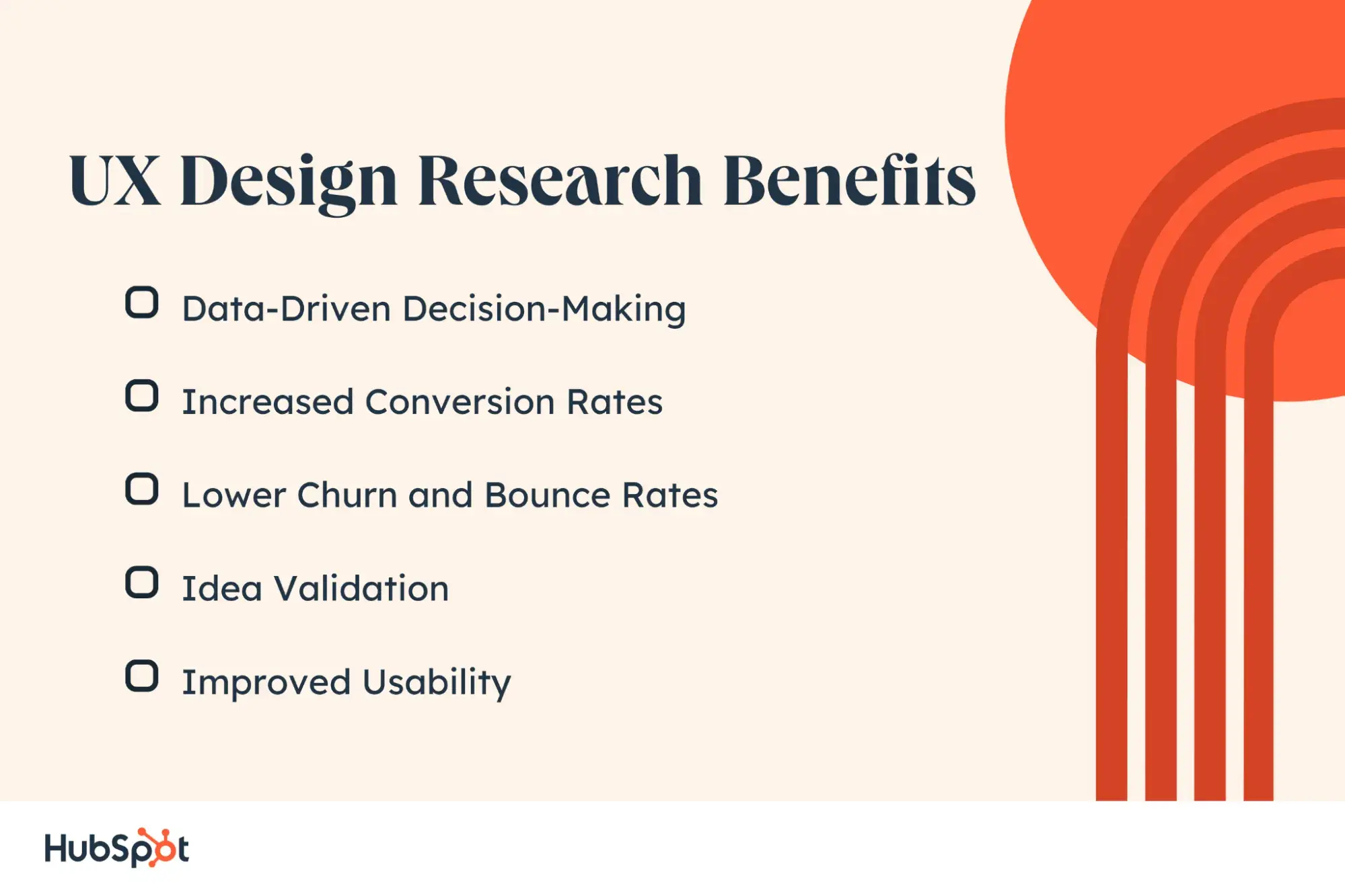
Data-Driven Decision-Making
Until people actually visit your website or use your product so you can get feedback, all design decisions come down to personal preferences, team consensus, and guesswork. Even if it’s an educated guess, you won’t really know if it works for your users and target audience until they take a look for themselves.
The beauty of UX research (especially the quantitative kind) is that you can make data-driven decisions. This means you’re as sure as possible that you’re selecting the right elements, colors, layouts, and more to maximize user satisfaction.
Increased Conversion Rates
Conversion rates are the website/product metrics that make your UX sing. I track them all the way through the customer journey, from organic search user on Google to website user to free trial period to fully onboarded paying customer.
The journey points might vary depending on your business model, but the conversion rates are always one of the best indicators that your UX needs some work (and exactly where that work is needed).
UX research helps you get ahead of the game and make sure your digital products are primed to convert at every stage. It also helps you figure out why people are not converting if you identify a sticking point in the journey.
One eCommerce website I worked on was attracting a huge amount of organic search traffic, but the conversion to online purchases was really low. A little UX research led to a complete overhaul of their categories and the layout of individual product pages — and a nice big bump in conversions from site visitors to paying customers.
Lower Churn and Bounce Rates
On the flip side of this is the ability to reduce the amount of customers you lose through the design of your site or app. People don’t just buy into a digital experience because it’s good; they’ll also leave one pretty promptly if it’s bad.
Research by Baymard Institute looked into reasons for cart abandonment on online stores and many of them related directly to UX.
For example, 24% abandoned because the site wanted them to create an account, 17% because the checkout process was too complicated, 16% because they couldn’t see a total cost before checking out, and 13% because the website had errors or crashed. That’s a lot of potential revenue left on the table due to suboptimal user experience.
Whether I’m working on a website or product marketing for a SaaS company, the “current state” of user experience is always my first priority because it’s much easier and more cost-effective to retain customers than it is to attract new ones.
Idea Validation
Sometimes, there can be too many cooks in the kitchen when it comes to UX design. Conducting some research helps to weed out good ideas from bad and provides a clear direction that is backed up by data.
Pro tip: When this happens, I like to get real-life potential users into the app or website and get their feedback. Other people involved in the decision-making are more likely to listen to this type of feedback, and it can challenge your own perception of what works, too.
In this way, you get validation from the people who are going to be using your site, and you can even include survey-style questions throughout the process to get more quantitative data as well.
Improved Usability
People expect digital experiences to be easy to use and navigate. In fact, 73% of users expect a simple and intuitive interface, and they’ll make judgments about a company’s credibility based on that.
But, usability is a tricky one sometimes, and it’s something I see particularly in B2B businesses. When you’re designing a product for someone else, you don’t always have enough context to know if the interface or journey you’re building really works.
Let’s say I’m designing a website layout for an electronics store. I have professional cameras to place somewhere, so I nest it under the Gadgets category. But, professional photographers wouldn’t go to this section to find cameras and they certainly wouldn’t consider their equipment to be gadgets.
It’s a simple example, but the point is that detailed UX research is about learning about the audience and their preferences, a core concept in design thinking.
11 UX Research Methods and When to Use Them
Choosing the best UX research design method is entirely dependent on the situation and what you hope to find out. Additionally, it’s often better to use a combination of methods to get a more complete picture.
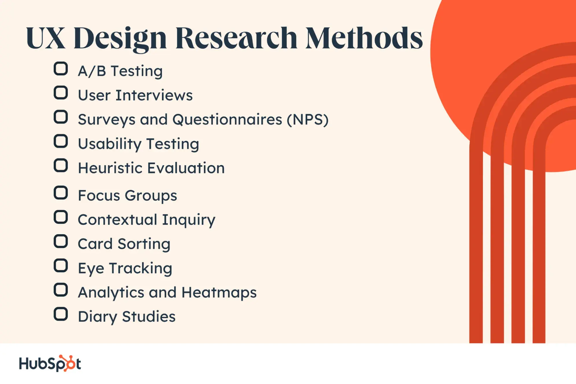
1. A/B Testing
A/B testing is the process of taking two versions of the same element and displaying them to users. The goal is to test which version provides a better experience and leads to better outcomes.
Also known as split testing, A/B tests need a clearly defined test (placement, color, copy, etc.) and a concrete success metric. Once you’ve run the test, you can select the winner and move on to testing another element.
Use Case
You can A/B test almost anything, but one of the more common tests is the color and copy of call-to-action buttons on websites or apps. Color plays a huge role in the click-through rate on buttons and so does copy. So you might A/B test some color combinations and then, once you have a winner based on the number of users who click the button, move on to testing different variations of the copy. Maybe “Buy Now” performs best or “Contact Us.” A/B testing gives you a clear answer either way.
2. User Interviews
Interviews are a category of UX design research methods with a looser structure, typically used for attitudinal research. You can leverage interviews at any time in the design process to gauge user opinions, preferences, and feedback on existing design elements. Interviews can be as structured or unstructured as needed, depending on what you need to know.
Use Case
If you’re trying to find out what’s most important to users, you may want to let their answers to initial questions guide the conversation a bit more. But if you’re collecting feedback on your existing design, a structured interview might be beneficial.
Let’s say you’re working on a B2B SaaS product. You might conduct less structured interviews with industry influencers to find out about general challenges and overall sentiment or behavior. However, your interviews with customers might be far more specific to your existing and planned features.
3. Surveys and Questionnaires (NPS)
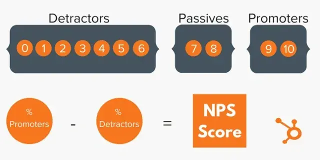
Surveys and questionnaires allow you to combine attitudinal research with a quantitative method so you can make more data-driven decisions. They’re useful for collecting information about preferences, opinions, and feedback from a larger sample size.
Use Case
The Net Promoter Score (NPS) is a great example of using surveys and questionnaires for UX research. It’s a specific type of survey that measures your customers’ loyalty and satisfaction rates and includes space for qualitative answers that can be fed back to the product team to improve UX.
4. Usability Testing
Usability testing involves observing behavior as users interact with your site or app. The goal is to identify any common difficulties people are having so the UX can be rectified and resolve the issue. This can be anything from finding information on the site to completing a user flow without issue. If you can watch a user in action, you can see where certain steps and decision points are unclear and create frustration or confusion.
Use Case
Let’s say I have a homepage where we’ve used lots of text highlights and design elements as part of the overall branding. It looks great, but the number of user flows completed, and calls-to-action conversions are low.
I can see from the website analytics that the bounce rate is high and time on page is low. So I go to a tool like Hotjar (or a free version like Microsoft Clarity) to look at heatmaps and screen recordings of user journeys on the site. Lo and behold, the text highlights and other design elements are confusing users and resulting in rage clicks.
Ultimately, I’ve discovered that users can't navigate the site due to these design elements, so they’re not converting and leaving instead.
5. Heuristic Evaluation
Heuristics refers to a set of established principles by which you can measure the usability of a product. You’ll need experts to conduct a heuristic evaluation, and it’s particularly useful for testing a website or app before design or in the prototype phase.
The goal is to weed out any UX issues before you release a product to real life users. It can often be a more cost-effective UX research method in the early stages of design.
Use Case
If a team of engineers is building a brand new app or digital product, they may engage a heuristics expert to evaluate mock-ups and test out prototypes. The team can then take recommendations from the heuristic evaluation and improve the initial version of their app before getting further information and feedback from end users.
6. Focus Groups
Focus groups involve gathering a group of your end users to test out ideas or gather feedback on new features. It can be used at any stage of the design, from early concepts to adding new features or making big changes to an established product. A focus group typically means providing a showcase followed by a guided discussion with the group to gather opinions and feedback.
Use Case
An established eCommerce website might use a focus group in combination with usability testing and other methods if they’re considering making a big change to the layout of their site. They may invite existing customers, prospective customers or both, and allow them to try out the new layout before gathering them together for a discussion about what they did or didn’t like. The outcome can range from tweaks to the planned changes to scrapping them altogether.
7. Contextual Inquiry
Formal surveys and interviews are one thing, but they’re not a totally natural environment for the user. This means a user might subconsciously modify their behavior or attitudes due to being observed or using the product in a different environment, which is where contextual inquiries come into play. These types of inquiries allow you to observe people using the product in the real world for a more true picture of usability and satisfaction.
Use Case
If I wanted to observe the way someone uses an eCommerce website, I might look at recorded sessions on a tool that screen records user journeys.
When I’ve done this in the past, I’ve observed some interesting behavior that indicates the site needs better categorization and navigation. This can include things like using the search bar to find a type of product rather than the menu. Another indication can be repeated searches trying to find the same item, which means the way products are tagged for search on the back end needs some work.
8. Card Sorting
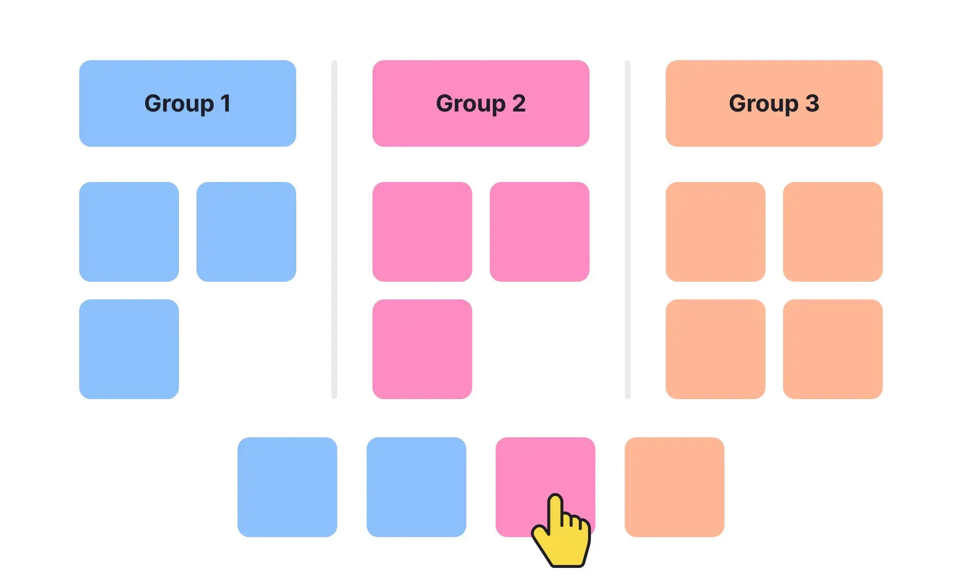
Designers can use card sorting as a type of market research method. With card sorting, you can instruct users to sort information and categories into cards and start to build a layout for your product that better meets their needs and expectations.
Use Case
Card sorting is particularly useful for complex products like software or apps, where trying to undo navigation and architecture after the fact would be time-consuming and costly. By conducting this kind of research, you can improve the usability of your product for the intended audience.
9. Eye Tracking
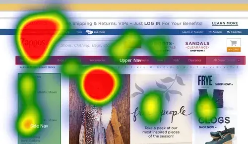
Eye tracking is a more technologically advanced form of UX research that allows you to track the movement of a user's eyes as they use a website or product. From this research, you can find out which design elements grab attention and where they focus on the screen at different points in the user journey.
Use Case
A news website might use eye tracking to find out how users interact with the content, how noticeable advertisements are and where they focus on the article rather than skimming.
10. Analytics and Heatmaps
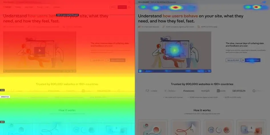
Many research methods for UX rely on interaction with the end users. But, remote and automated research methods are equally valuable. Analytics that gather data in the background, for example, can provide you with a much more complete picture than an individual user interview or observation. Heatmaps are a subset of analytics that show you where users hover their mouse or click the most on different pages of your site or app.
Use Case
If you’ve put a lot of time into your homepage, it can be disappointing to see low click rates and interactions. Analytics like heatmaps can show you on a color-coded scale why this might be the case. Perhaps most users aren’t scrolling much further than just below the fold, for example. In that case, you might want to try out different sections and layouts throughout the homepage to encourage further scrolling and interaction.
11. Diary Studies
When it comes to more complicated products, how a user behaves and interacts can change significantly over time. They may use simpler features first, for example, but then run into issues when their product knowledge grows, and they want to carry out more complex tasks.
Diary studies involve a user recording their experiences with a digital product over an extended period of time, giving you long-term (or “longitudinal”) insights into your UX.
Use Case
B2B software companies might engage early adopters into a form of diary study to collect feedback at regular intervals throughout their use of a product. Long term, loyal users are an important revenue source, so researching and correcting any trips and hazards in the UX for more mature users can greatly decrease churn rates.
UX Research Example
Let’s say I’m engaging in a project where we’re planning to completely redesign an existing website. It’s a huge change for any company to go through and it’s important to get it right. I might use several research methods to investigate the performance of the current UX, understand the preferences of the target audience, and test the decisions I do eventually make for the new site for quick iterations.
First, I’ll use tools like analytics and heatmaps to understand common issues with the existing website. Any data that the company has already gathered, such as smile sheet responses or email complaints about the site or app, can also be useful. If there are any repeat customers that are willing to engage in an interview process, I may do that too to gather some qualitative data.
Analyzing feedback on the existing site in this way helps to inform the decision you make for the new and improved version.
Pro tip: I would typically categorize the research findings by structure and navigation, visual design, usability, content, and accessibility. Categorizing the research and its findings makes it much easier to select the actionable design decisions you can implement.
If it's possible, I’ll use some methods during the design process to gather feedback as the site comes together so that we can iterate before publication. If there are any industry experts or thought leaders or customers we can engage to test and provide feedback prior to the site launch, there are several methods for doing so.
You can send a “this or that” survey for users to indicate which versions of a page or design they prefer. You can run a focus group using a staging version of the site. You can also send out a questionnaire to determine whether specific messaging is resonating or not.
Finally, there is the ongoing UX research that I’ll conduct post-launch. Quantitatively, I will continue to A/B test design elements on an ongoing basis to refine everything from navigation to color choices. When bigger redesign projects come up, I will again try to engage industry experts and customers for surveys and focus groups.
Regardless of the design stage or research type I use, it’s important to always keep the “why” at the forefront of your mind. What is it you’re hoping to find out and which decisions do you want to be guided by these findings? This keeps your research targeted and ensures you end up with actionable information as the outcome.
Choosing the Right UX Research for Your Project
No matter whether you’re designing something from scratch, fixing up an outdated website, or making smaller tweaks to a user journey, data-driven and contextualized information is essential. The stakes are high when it comes to user experience. So, the more confident you can be in your decisions (and how quickly you can iterate on them), the more successful your site or app will be.
My final recommendation on UX research is this: Something is always better than nothing. If more complex research like user interviews and heuristic analysis is not available to you, then work with what is. A deep dive into website analytics or user reviews is still a great place to start, so you’re not working in the dark. Ultimately, the more you can bridge the gap between your ideas and the target audience’s expectations and preferences, the better.
User Experience


.png)


![How to become a UX designer, a step-by-step guide [expert tips]](https://53.fs1.hubspotusercontent-na1.net/hubfs/53/become-a-ux-designer-1-20240731-321437.webp)


![How to Add a Parallax Scrolling Effect to Your Website [Examples]](https://53.fs1.hubspotusercontent-na1.net/hubfs/53/scroll-Aug-11-2023-05-24-08-8793-PM.png)

![20 UX Design Examples Hand-Picked by Experts [With Analysis]](https://53.fs1.hubspotusercontent-na1.net/hubfs/53/ux-design-examples-1-20250404-8425368.webp)
