Website accessibility is crucial for ensuring that all users, including those with disabilities, can access and navigate your site. However, novice designers often make common mistakes that can hinder accessibility.
Let's explore why website accessibility is important, some of the most common mistakes, how to avoid them, and best practices for making your site accessible and visually appealing.
Download Now: 25 HTML & CSS Hacks [Free Guide]
Use the following jump links to go to a particular section or keep scrolling:
- Importance of Website Accessibility
- Common Website Accessibility Mistakes
- Best Practices for Making Your Website Accessible
The Importance of Website Accessibility for Your Business
By making your site accessible to diverse audiences, including those with disabilities, you can expand your reach and engage with a wider range of potential customers. Catering to disabled users not only benefits your business but also aligns with the principles of inclusivity and equality.
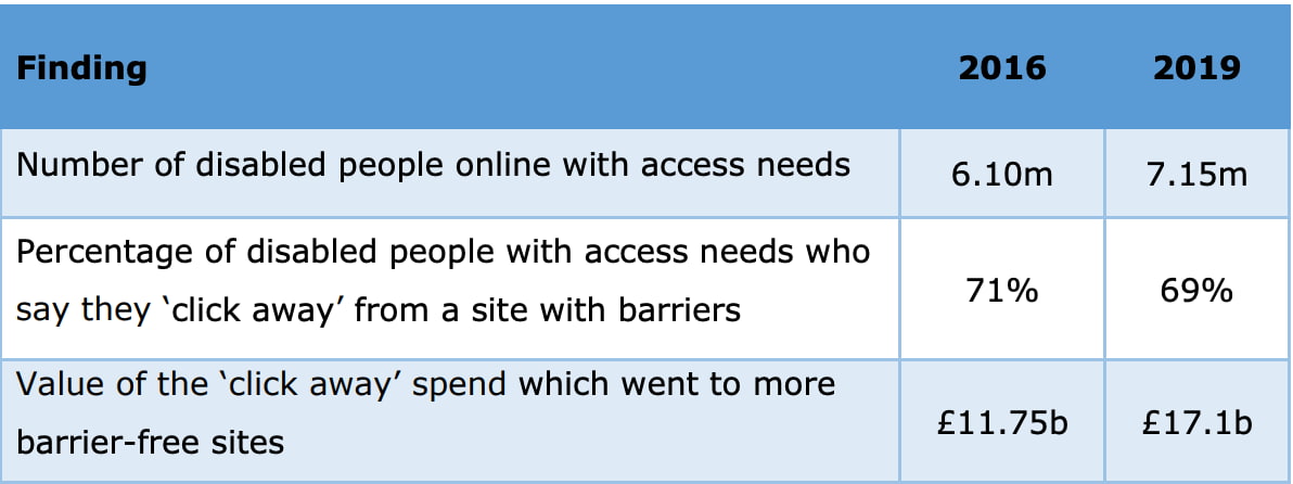
The number of disabled people with access needs online is a growing audience, so creating a widely accessible website is in the best interests of everyone.
By avoiding common website accessibility mistakes, such as insufficient color contrast and inadequate alt text for images, you can create a visually appealing and accessible website. Following best practices, like using descriptive headings and subheadings, helps users navigate and understand your content more easily.
.png)
Website Accessibility Checklist
This checklist will help you make the following more accessible on your website:
- Web Pages
- Navigation
- Video & Media
- And More!
Download Free
All fields are required.
.png)
Common Website Accessibility Mistakes Made by Novice Designers
Avoid These Design Errors to Improve Your Website Accessibility
Insufficient Color Contrast
One of the most common errors in ensuring website accessibility is insufficient color contrast. Many designers overlook the importance of contrast in creating an accessible website. Contrast refers to the difference in color between text and its background. Low contrast can make it difficult for users with visual impairments or color blindness to read and understand the content. To avoid this mistake, it is essential to choose color combinations that provide sufficient contrast.
Here are three tips for choosing the right color combinations for your site:
1. High Contrast: Opt for colors that have a significant difference in brightness and hue. For example, pairing black text with a white background ensures maximum contrast, making it easier for all users to read the content.
2. Color Contrast Tools: Utilize online color contrast tools to check the contrast ratio between text and background colors. These tools provide a clear indication of whether your color combination meets accessibility standards.

3. Consider Accessibility Guidelines: Familiarize yourself with accessibility guidelines, such as the Web Content Accessibility Guidelines (WCAG), which provide specific standards for color contrast. Following these guidelines will help you create an inclusive website that can be accessed by a wider audience.
Here are the WCAG accessibility guidelines on color contrast:
"The visual presentation of text and images of text has a contrast ratio of at least 4.5:1, except for the following:- Large Text
Large-scale text and images of large-scale text have a contrast ratio of at least 3:1;
- Incidental
Text or images of text that are part of an inactive user interface component, that are pure decoration, that are not visible to anyone, or that are part of a picture that contains significant other visual content have no contrast requirement.
- Logotypes
Text that is part of a logo or brand name has no contrast requirement."
By understanding the importance of contrast in accessibility and following these tips for choosing the right color combinations, you can make your website visually appealing while ensuring it is accessible to all users.
Inadequate Alt Text for Images
Another common mistake made by novice designers is inadequate alt text for images. Alt text, or alternative text, is a description of an image that is read aloud by screen readers for users who are visually impaired.
It provides important context and information about the image that may not be conveyed through visual means alone. Without proper alt text, users relying on screen readers may miss out on understanding the content and purpose of the image. To improve website accessibility, it is essential to write effective alt text for all images on your website.
So, what exactly is alt text, and why is it important for accessibility? Alt text serves as a textual alternative to images, allowing users with visual impairments to understand and engage with the content. It helps screen readers accurately describe the image, providing users with important information that they may not otherwise be able to perceive.
Additionally, alt text is also important for search engine optimization (SEO) as it enables search engines to understand and index the images on your website. Therefore, writing effective alt text is not only crucial for accessibility but also for improving the visibility and discoverability of your website.
This video explains ‘alt text’ in more detail:
Best Practices for Making Your Site Aesthetic Accessible
Best practices for making your site aesthetically accessible involve various aspects of design and content creation. Organizing the content on your website makes it easier for all users, including those with disabilities, to navigate and understand the information.
Use Descriptive Headings and Subheadings
Headings provide structure and organization to your content, making it easier for all users, including those with disabilities, to navigate and understand the information on your site. Clear and concise headings help users quickly and efficiently find the specific content they are looking for, improving the overall user experience.
Additionally, headings are important for screen readers, as they provide a way for visually impaired users to navigate through the different sections of a webpage. By using descriptive headings that accurately summarize the content beneath them, you can ensure that your website is accessible and user-friendly for all visitors.
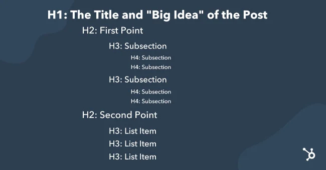
Here's a helpful graphic that shows how you can leverage headings to organize your post.

To ensure that your headings and subheadings are effective, consider the following tips:
1. Be descriptive: Use headings and subheadings that accurately summarize the content beneath them. This helps users quickly and efficiently find the specific information they are looking for. Avoid vague or generic headings that do not provide clear guidance.
2. Use a hierarchy: Organize your headings and subheadings in a logical hierarchy, with main headings representing major sections and subheadings representing subsections. This helps users understand the structure of your content and navigate through it more easily.
3. Keep it concise: Use concise and concise language in your headings and subheadings. Avoid lengthy or complex wording that may confuse or overwhelm users. Aim for clarity and simplicity to ensure that your headings and subheadings are easily understood.
Making Your Website Accessible
Website accessibility is crucial for ensuring that all users, including those with disabilities, can access and navigate your site. Prioritizing website accessibility expands your reach to diverse audiences and benefits your business. Embrace these best practices to make your site both aesthetically pleasing and accessible to all users.


