In this post, we will explore some of the biggest brands that are using WordPress to run their websites and how they use the CMS to their advantage.
WordPress Website Examples
62% of the top 100 fastest-growing companies in the United States use WordPress. Some of these sites are major brands, like The New York Times, BBC America, and Sony Music.
Let’s examine how these and other big brands are using WordPress to deliver the best digital experiences to their audience.
1. The New York Times

The New York Times was one of the first media outlets to fully leverage the power of the user-generated content feature provided by WordPress. Back in 2012, it introduced a plugin for the CMS that allowed multiple journalists to work on the same article — it allowed changes to a post to be tracked and then accepted or rejected.
As a result of their efforts, it was able to reach 260 million unique monthly visits in 2021.
In addition to using WordPress to publish and organize thousands of articles, NYT also features gated content on its site and has a billing system for subscriptions.
Furthermore, to accommodate its large international audience, NYT enables readers to switch from English to Spanish or Chinese with the click of a button. You can see these buttons at the top of the home page, right above its brand name.
Many bloggers admire the website’s clean layout, also known as the “NYT theme.” You can add one to your website by downloading and installing it on your website or blog.
What we like: Sticking with the newspaper theme is the right call and The New York Times pulls that off well with their “NewsPrint” style theme for their website. Displaying prominent information on the home page like the front page of a newspaper while providing ample navigation options.
Similar theme: The Fox
2. Reuters
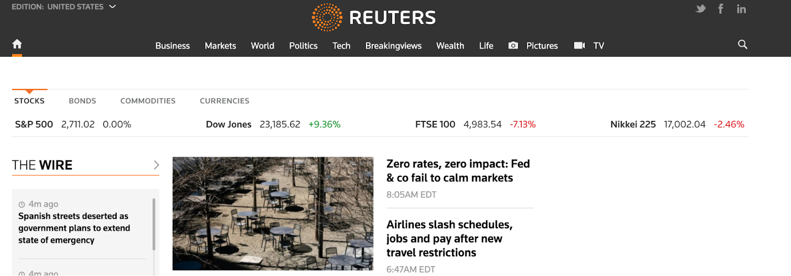
Reuters is a huge media company that delivers breaking world news every day. Powered by WordPress, the site is updated by the minute. On every post, Reuters includes the publish date and time so you know exactly when it was published.
And for those keeping an eye on the stock market, Reuters lists share prices at the top of the homepage by using widgets that update automatically. There are dozens of WordPress plugins that do this — for weather, real estate listings in your area, traffic, insurance quotes, retail sales, and more.
In the image below, you’ll see a navigation menu with categories like Markets, Business, and World, which are displayed in the navigation menu at the top of the screen. By clicking on any of these categories, you can find all the content Reuters has published on this topic.

Reuters’ upper menu invites you to switch between different countries' coverage through WordPress’s customizable menu options, as seen in its simple UI design.

What we like: Easy Navigation for all of your needs while giving an updated by-the-minute design is no easy feat, and Reuters pulls it off well with their web example. Streamline and efficiency.
Similar theme: Newspaper
3. BBC America
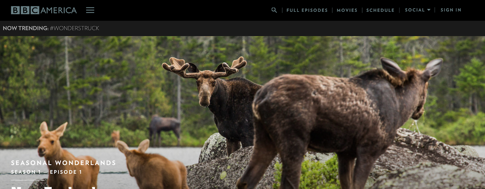
BBC America is an entertainment network and a child company of the British BBC giant. The company mainly targets adults 25-54 and receives around 1.5 million monthly visits.
Its website hosts a streaming service with tons of video content and a shopping section powered by WordPress’s native eCommerce plugin.
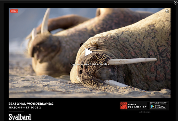
BBC America’s website helps its audience navigate and learn through the intuitive interface of dropdown menus. If you want to learn more, you can hover over the lower right corner of any video episode you are interested in.
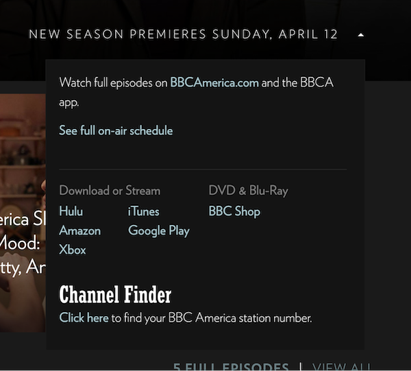
BBC America uses a responsive menu plugin, or an animated burger menu, from the WordPress.org catalog — no coding necessary.

What we like: Keeping all the action in the forefront is also a great tactic, and BBC America pulls no punches when it comes to an in-your-face interface. Video clip previews and enticing imagery draw you into even the most obscure programming listed.
Similar theme:Jannah
4. Vogue

We wouldn’t expect anything less than a sophisticated website from one of the world’s leading fashion and lifestyle magazines. And that’s exactly what you get visiting Vogue. Vogue’s website draws 3 million unique visits each month.
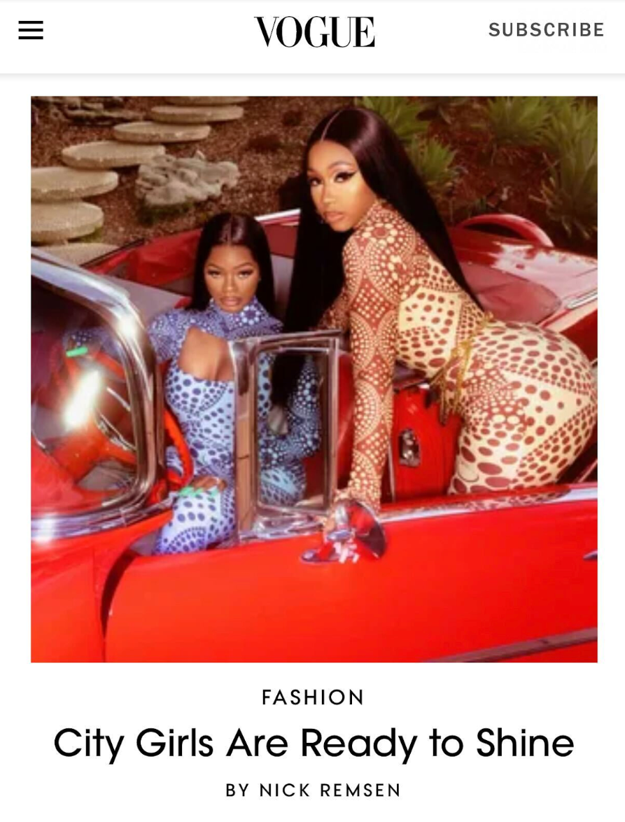
To delight these visitors and catch their eyes, Vogue features lots of high-quality images and videos on its homepage. This multimedia has overlayed text describing the post’s title, author, and category so the reader can make an informed decision about what they want to read.
Not only is this layout visually appealing, but it’s also responsive so that visitors on mobile and desktop can easily scroll through the site. Check out how the site is optimized for smaller screens below.
If you are searching for a CMS solution for a printed publication, Vogue is a great example of how to transfer paper publication style to online while simultaneously keeping the feel of flipping through a magazine.
What we like: We like style, and Vogue oozes this with expert-level intrigue. From the landing page to the sub-links, you can find a highly stylized look no matter where you navigate.
Similar theme: Qoxag
5. Sony Music
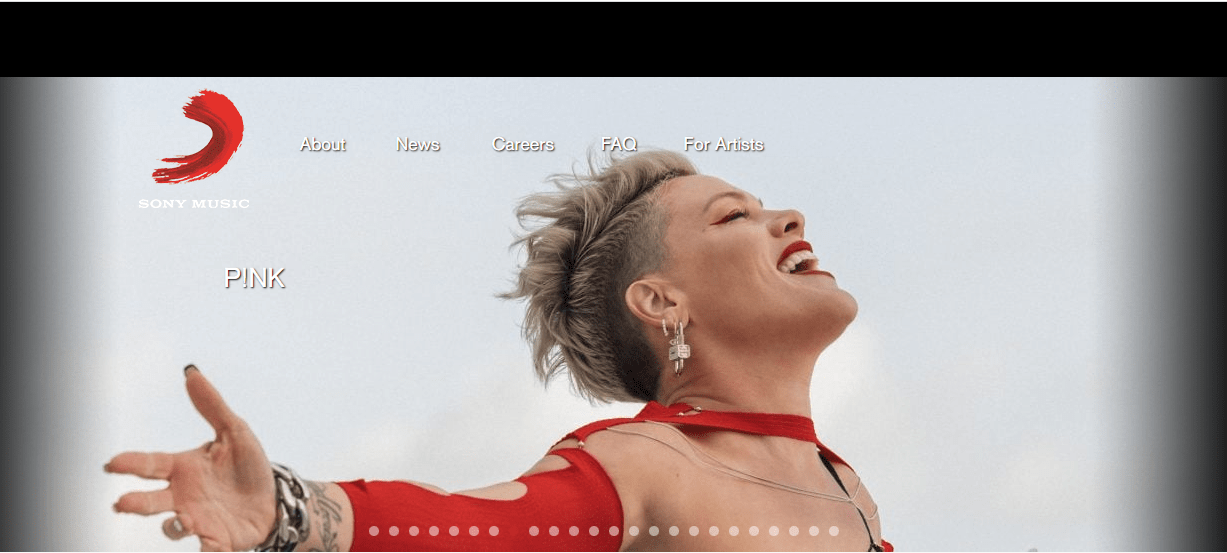
Sony Music’s website is as cool as you’d imagine it would be. As the company targets international audiences, the first sight you’re met with is a slide show of trending artists at the top of the landing page, and there is absolutely no hint of a news story until you scroll down.
Consistently, Sony Music has amassed over 140,000 site visits every month, largely seen after the company switched to WordPress as a host. This rise in traffic reflects Sony Music’s ongoing focus on building web destinations that offer clean and easy navigation, compelling user experiences that connect fans and artists, and innovative direct-to-consumer features.
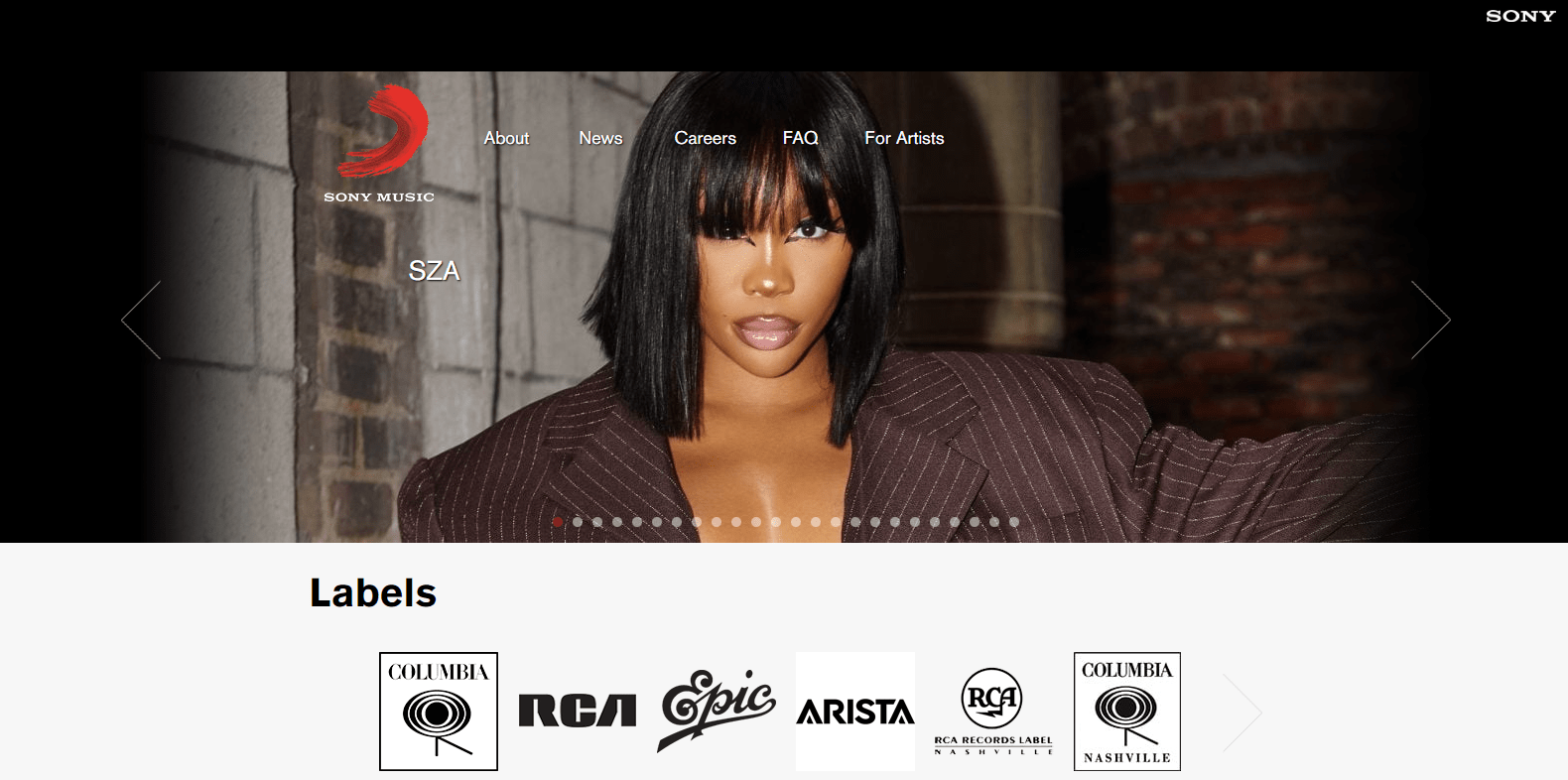
Some of these features include playlist recommendations, a rewards system for repeat visitors, and an integrated lyrics function so listeners can follow along with the lyrics as they listen.
What we like: Sony has always been a pioneer in getting their prized content into the forefront, and its webpage is no exception. Easy to navigate scrolling features and prominently showcasing your favorite artists and imagery.
Similar theme: Sony Music WordPress theme
6. The Walt Disney Company
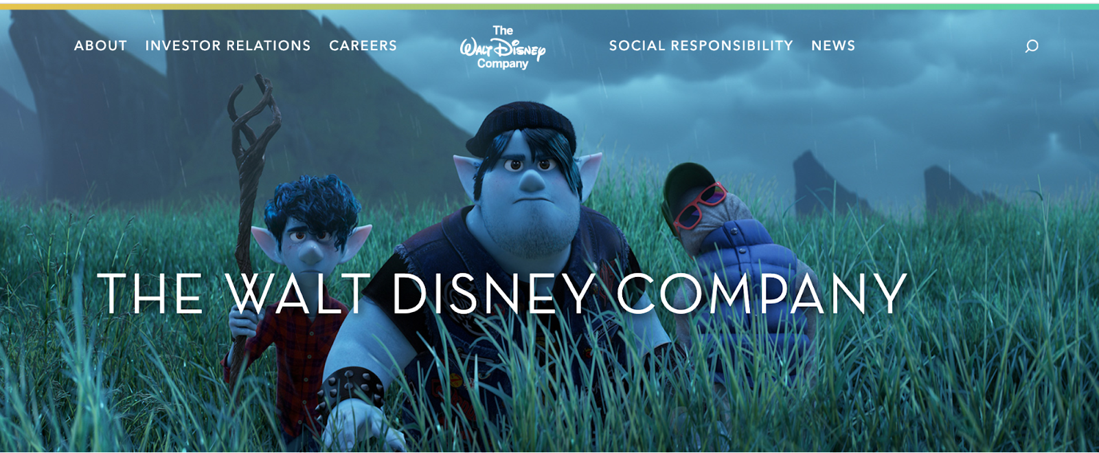
The Walt Disney Company’s website is focused on informing, entertaining, and inspiring its readership with stories about movies that the company produces. Moreover, it highlights the company’s policies, vacancies, investor relations information, and social responsibility projects.
The Walt Disney Company is very experimental with the upper menu: move the cursor to the upper part of the main page, and the responsive menu shows up while the background fades. These impressive animated effects are powered by WordPress.
Hint: Try searching for any responsive menu plugin to mimic the same effect on your site.
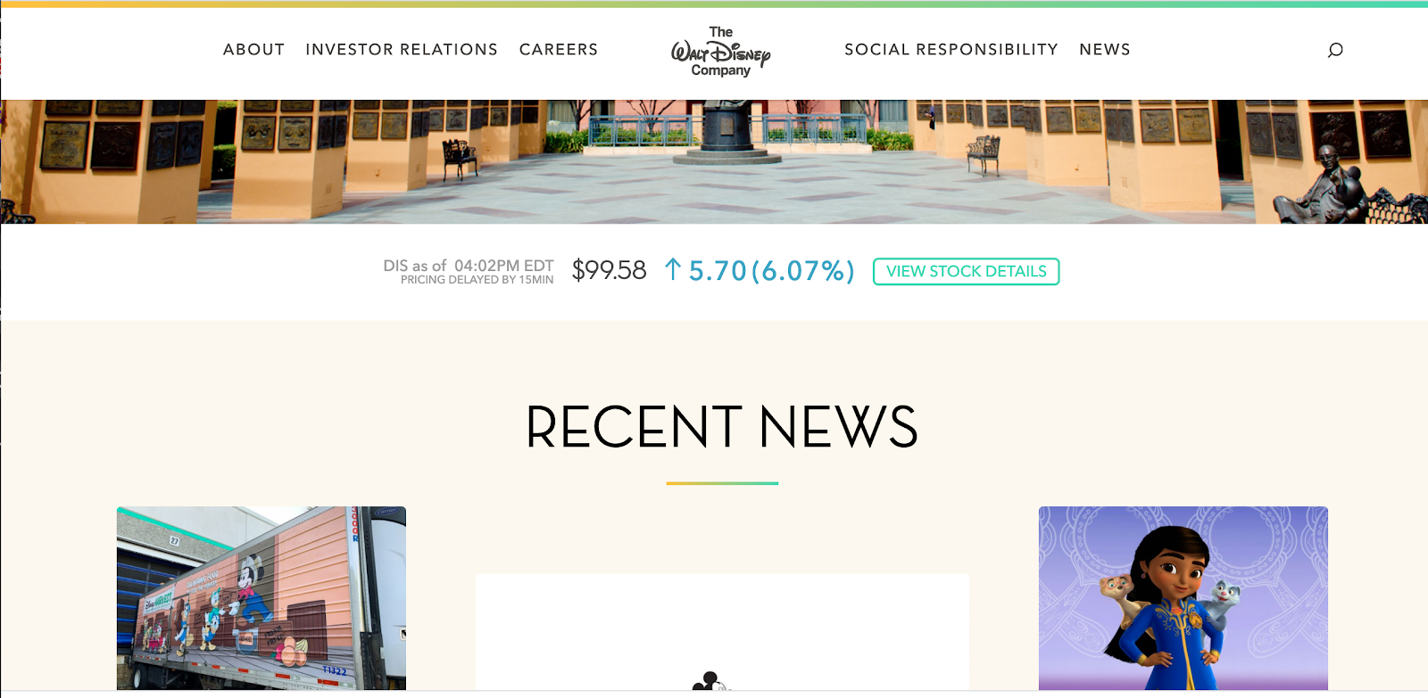
Disney uses auto-updated widgets as well — the website has a tracker for company stocks where you can adjust the time frame.
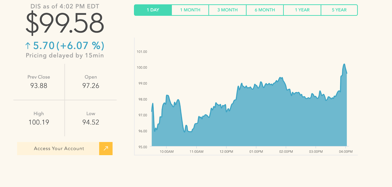
If you want your About page to stand out, try using pop-ups for company employees, like Disney. This effect is achieved with the Builder Plugin that you can find in the WordPress.org catalog.
And the last but not the least inspiring WordPress-powered feature — a slider with photos from the history of The Walt Disney Company starting from 1923.
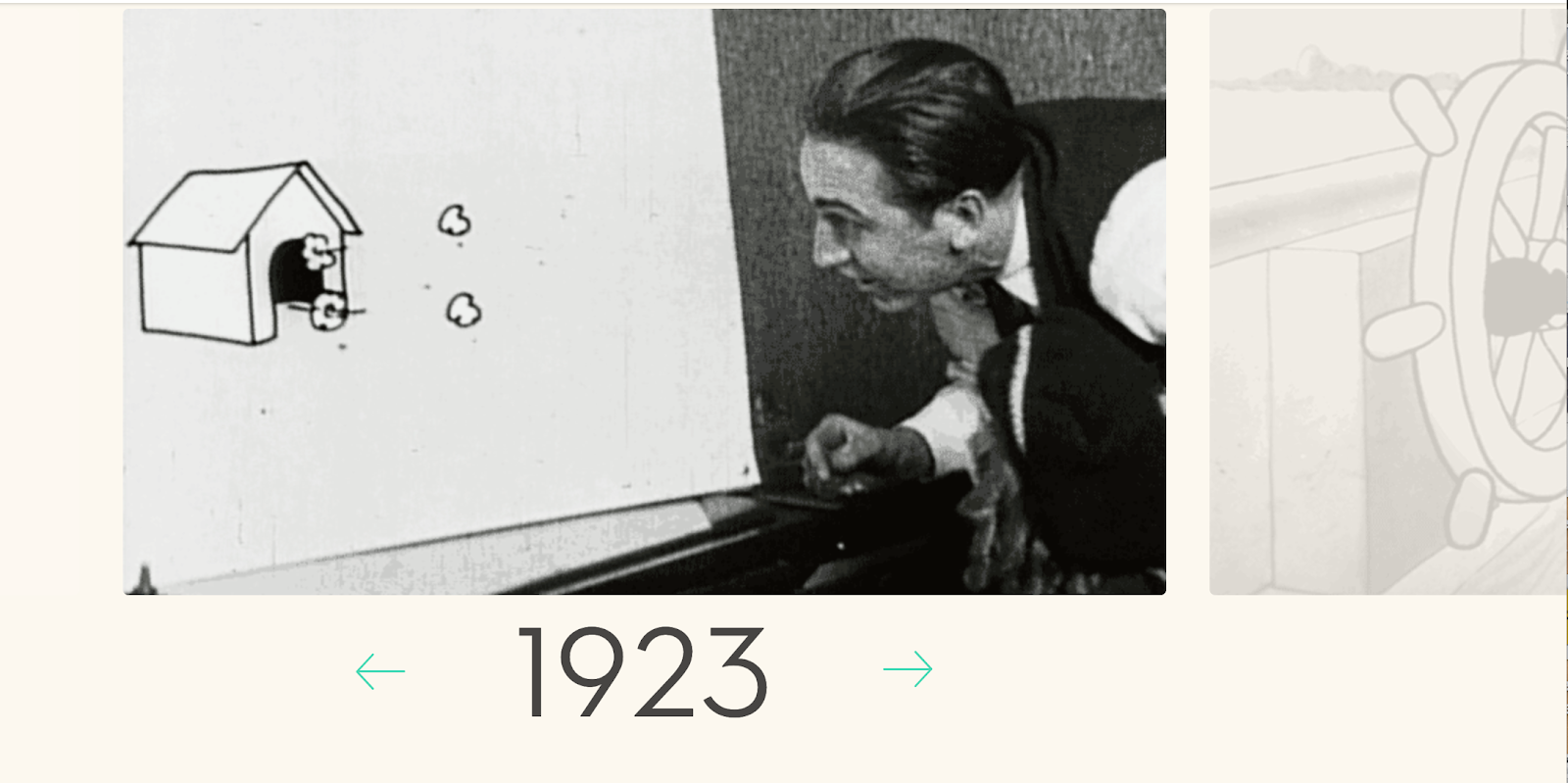
What we like: Celebrating 100 years of magic and entertainment is no easy feat, but movie and investing giant Walt Disney Company made it and is going strong. From the new and improved to the old and timeless, there's a place for everything on the Disney company website.
Similar theme: Divi
7. Angry Birds
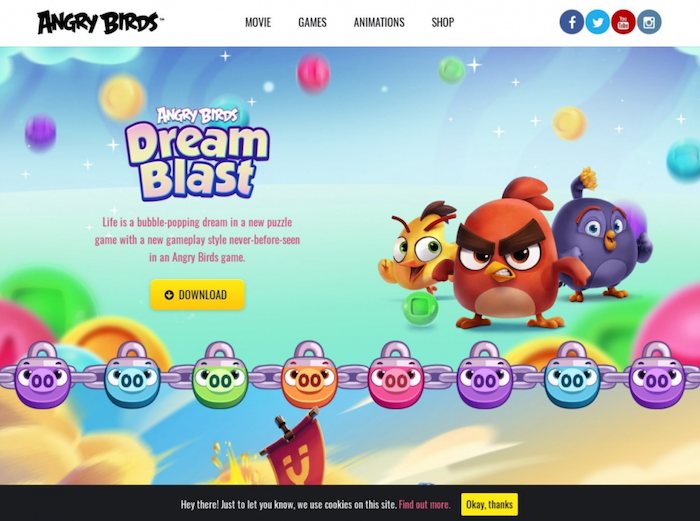
Angry Birds, initially a mobile game created by Rovio, took the world by storm in 2009. Over the years, Angry Birds has seen rapid growth and evolved into an entertainment brand that covers mobile games, books, animation, print products, merchandise, and a movie franchise.
The website has several key sections displayed at the top of the homepage, including Movies, Games, Animations, and Shop. Altogether, it provides its visitors with tons of video content, mobile and web games, and an online store with branded apparel and souvenirs.
If you scroll down, you’ll see that the gaming company has a separate block for all the games that are available for download now on the main page. Each game design block comes with a button that leads to a download. WordPress allows you to duplicate this approach, add the pre-designed images, and change the sequence if needed.
The Angry Birds website provides a unique experience with its historic line of products it's built since the first game was released using a photo slider widget for WordPress.
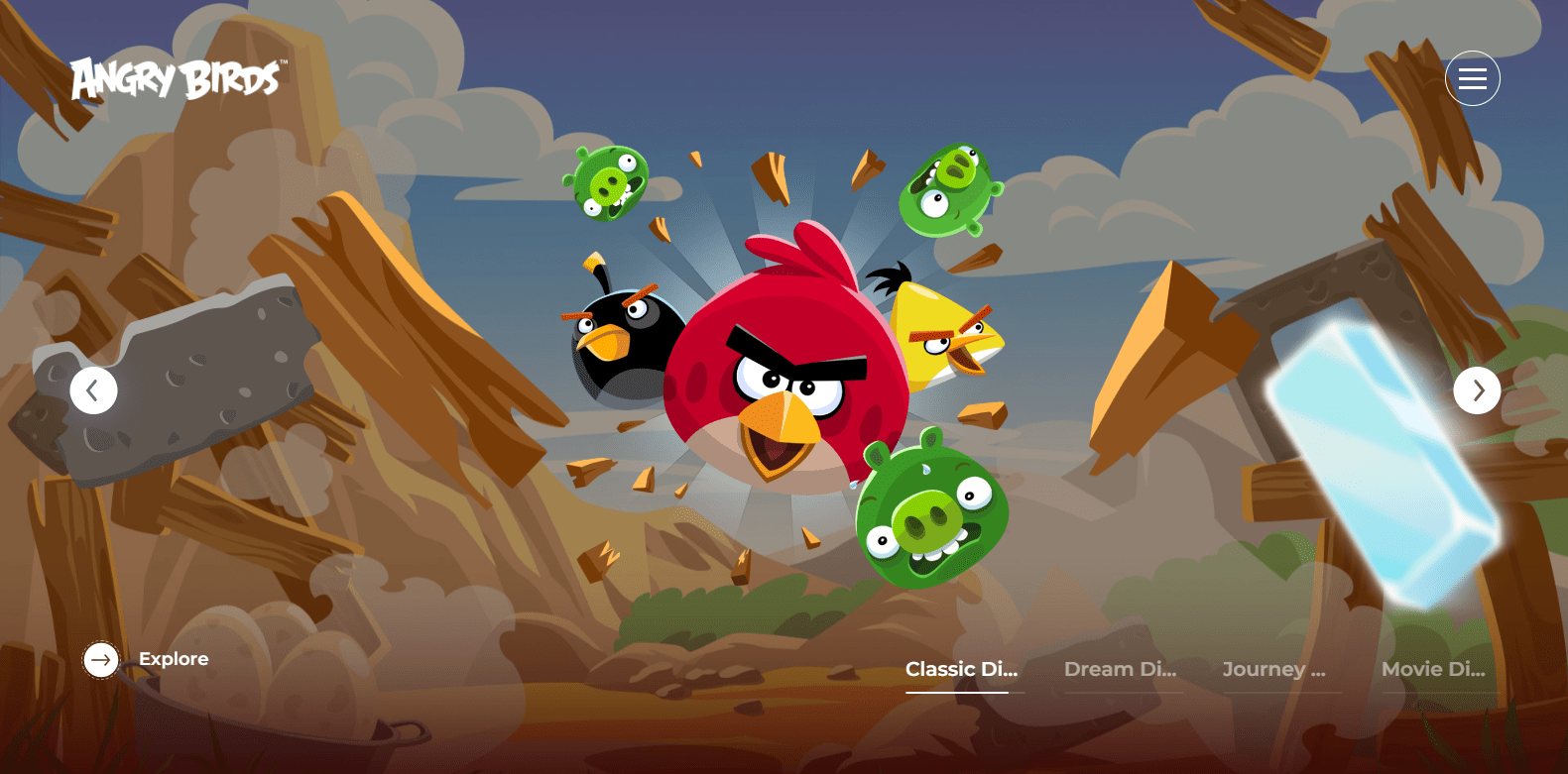
You can go even further with your experiments. Add an original artwork or symbol for each year. See Angry Bird’s creative and interactive art as you scroll through the timeline.
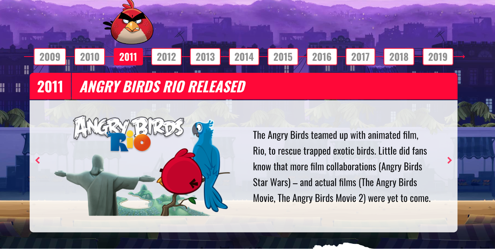
What we like: Colorful and fun would be the first words to come to our minds to describe this web example, and we love it! From the colorful front page showcasing their most prominent features to the interactive navigation process, the Angry Birds website is fun at its core.
Similar theme: Ocean WP
8. The Jane Goodall Institute
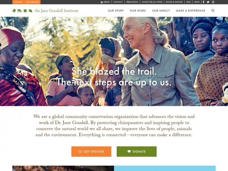
The Jane Goodall Institute (JGI) is a global nonprofit committed to community-centered conservation, whether it be protecting chimpanzees and great apes in Africa while improving the lives of communities around ape habitats or supporting youth-led efforts around the world to improve their communities.
Aimed at an international audience, the website has a modest reach of 50,000 monthly visitors. Featuring a built-in billing system, the JGI site offers its visitors the possibility to donate. Its online store with merchandise is powered by a WordPress eCommerce widget.
The Jane Goodall Institute uses a photo slider that embeds GIFs to engage its audience on the homepage.
The website is also using the built-in block animation feature on its About page. You can find a similar plugin with any desired effect from the WordPress.org catalog. If you scroll over any pic on the page, a description will pop up.

What we like: Not all web designs need to be flashy and ostentatious. They can also be heartfelt and story-driven. Such is the case with the Jane Goodall Institute. From landing on the front page, you are informed of Jane's accomplishments and progressive movement forward in the conservation of apes.
Similar theme: Go
9. The Obama Foundation
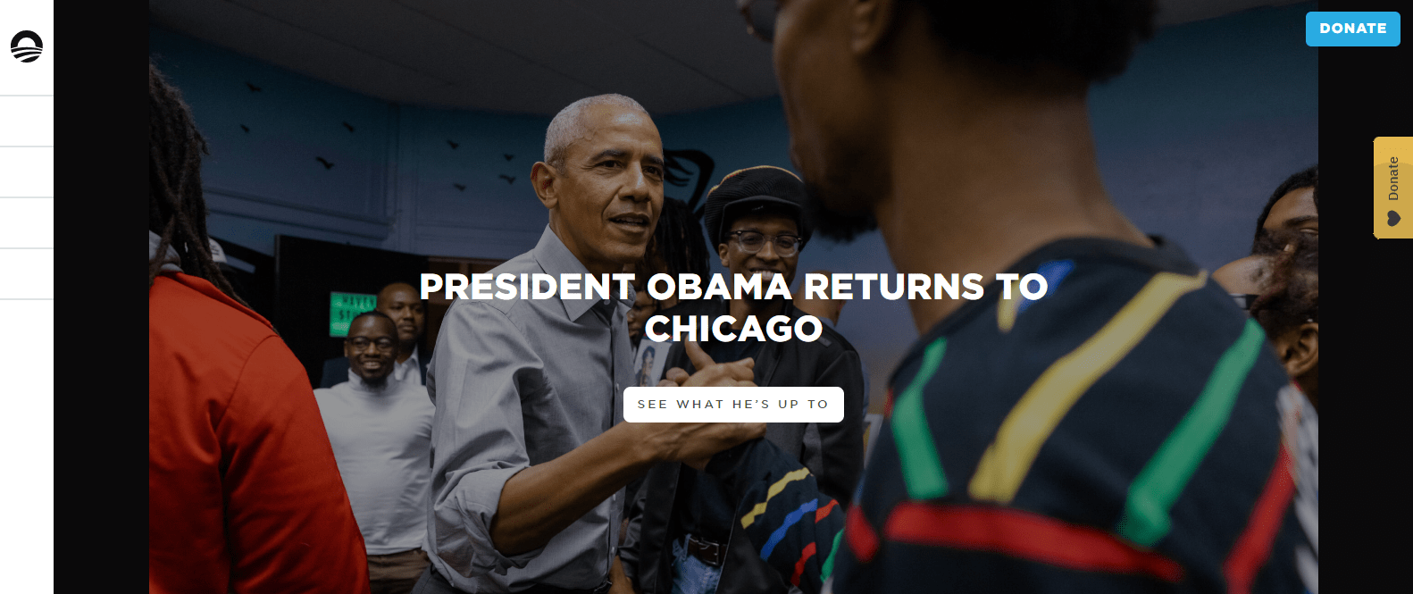
The Obama Foundation is a non-profit that was established in January 2014 to “carry on the great, unfinished project of renewal and global progress.” Its monthly reach is around 150,000 visitors per month.
With a simple structure, the website features articles, videos, and social media content reflecting the mission and vision of the Foundation’s humanitarian efforts.
The website has an animated drop-down menu visible when you scroll over the foundation logo.
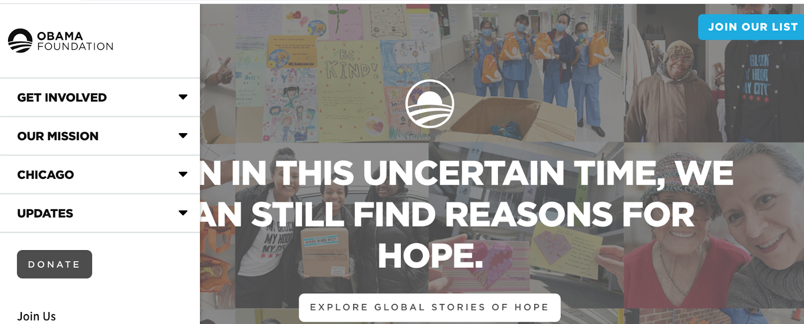
The Obama Foundation is using animated blocks as well. Clicking on any of these modules will lead you to another page on the website.
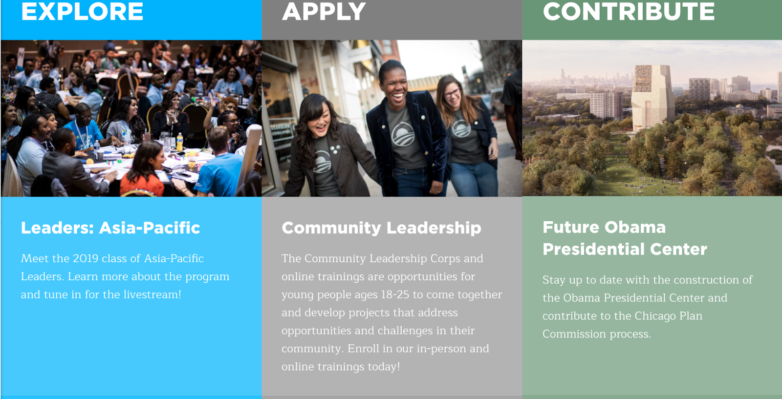
What we like: Ever in the pursuit of moving the people forward, The Obama Foundation webpage does a fantastic job of giving its supporters and the public working knowledge on the foundation's movements and contributions. From interactive menus to easily look into your chosen topic to pulling information on supporting the program, everything is easy to find.
Similar theme: Blueprint
10. Renault Group
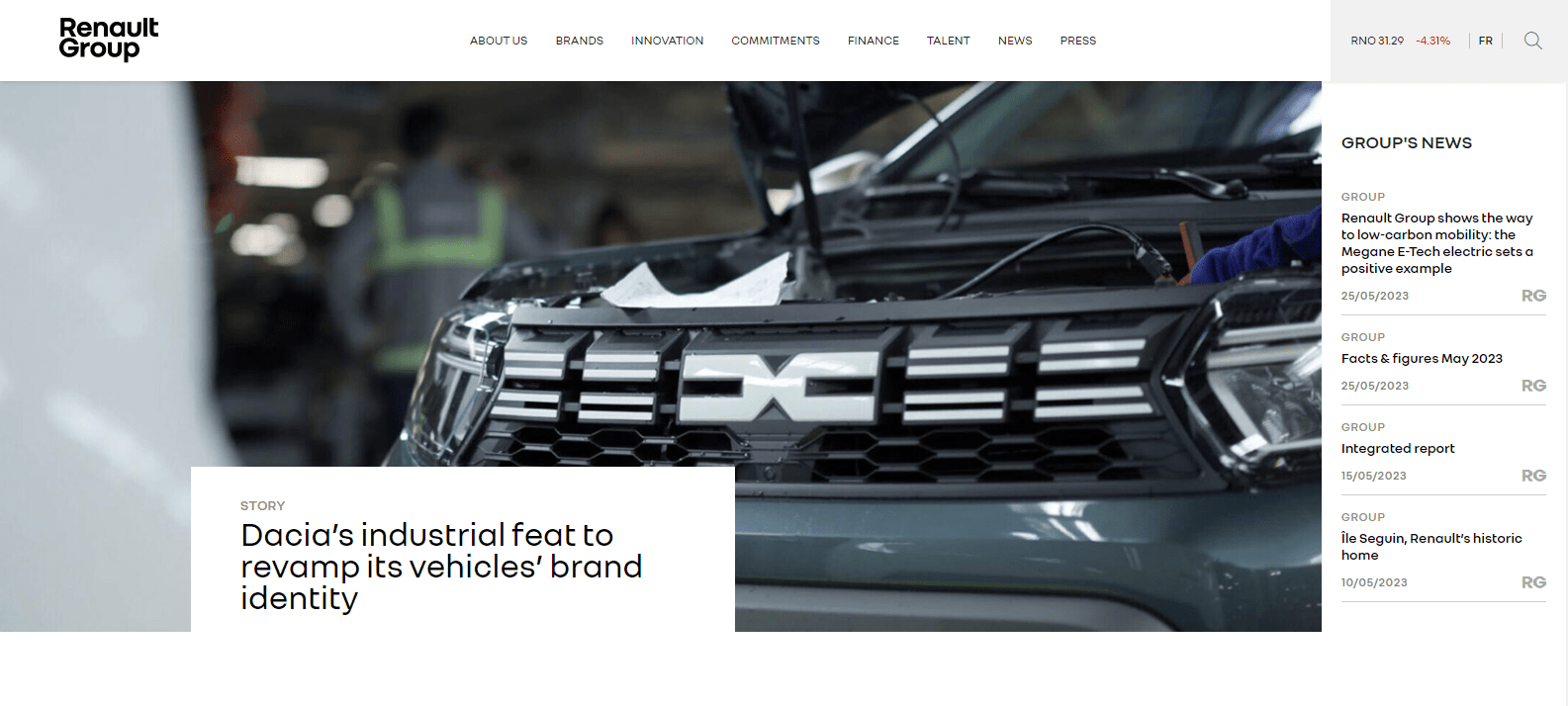
French automotive company Renault Group uses its website to highlight its latest news, showcase its vehicles (complete with stunning high-quality pictures), and raise awareness of its environmental efforts. Half a million of their monthly visitors benefit from the site’s eye-pleasing layout and fast loading speed.
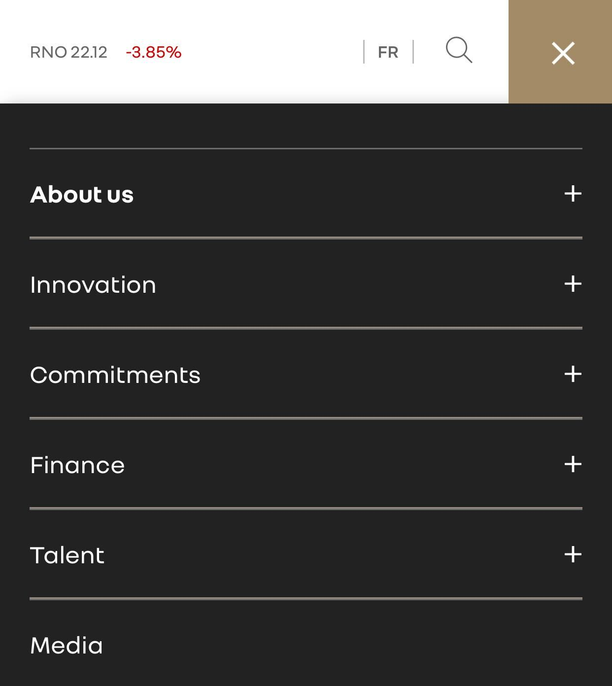
Renault has different designs for its menus for desktop and mobile to ensure customers can select car models even on smaller screens.
Additionally, WordPress photo sliders are repeatedly used throughout the website, provide a flexible way to create unique button designs, and are widely available in the WordPress directory.
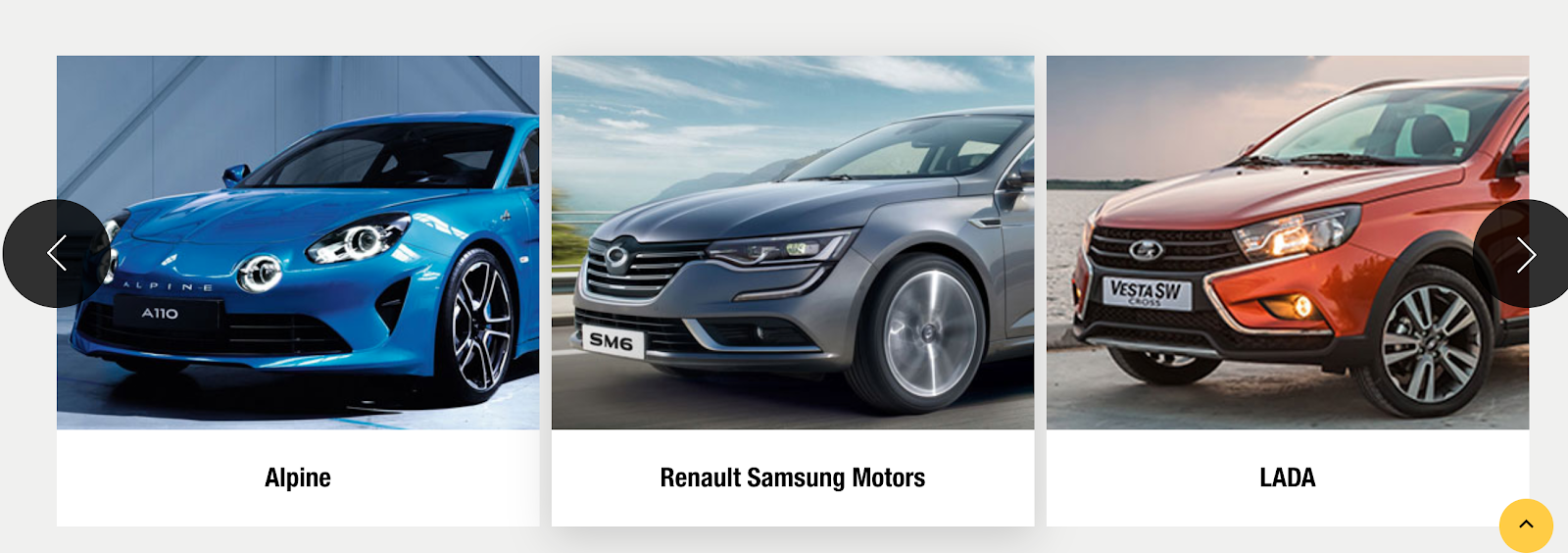
What we like: Sleek and to the point, this choice gives a stylized look mixed with informative news on the company. Another great example to use when looking into your WordPress website.
Similar theme: Sahifa
11. Network Rail
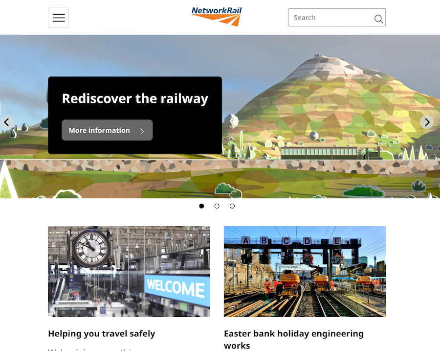
Network Rail is a company that owns and operates the entire railway infrastructure in the United Kingdom, managing 18 of the largest stations in England, Scotland, and Wales.
The company switched to WordPress from its previous CMS in 2017, aiming simply to upgrade the website to make it easier for users to find the service it's looking for. The new WordPress-powered theme greatly improved the UX of the site.
Additionally, the ability to assign various custom user roles makes it much easier for Network Rail personnel to manage the site internally. The new design layout is also far easier for users to navigate, and the site is now responsive across all mobile devices.
To help customers learn the latest company news, Network Rail decided to implement a slider on the main page.
Widgets can make up a significant portion of the main page. Here’s another well-made implementation of a career interactive widget that helps the audience find a job opportunity with the company.
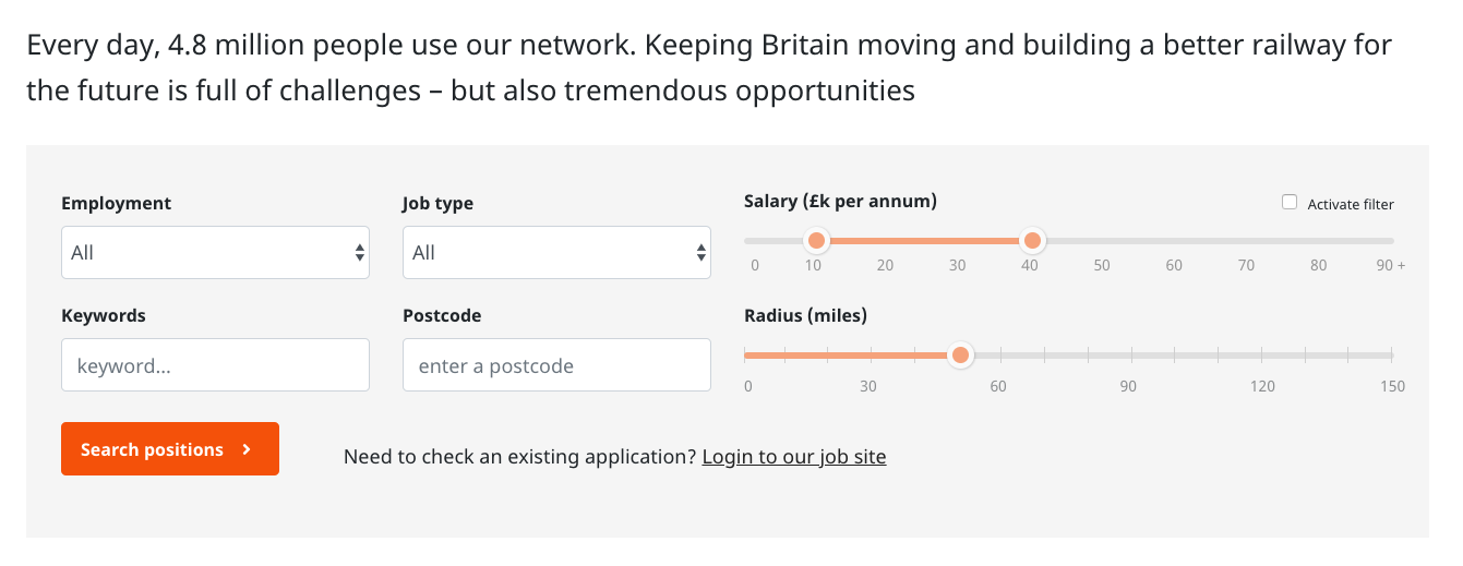
What we like: The more simplistic approach to the Network Rail website is fantastic. Not utilizing any flashy modifications and keeping to a more uniform approach works well here as we see a neatly laid out website with everything in its place.
Similar theme: Bravi
12. TechCrunch
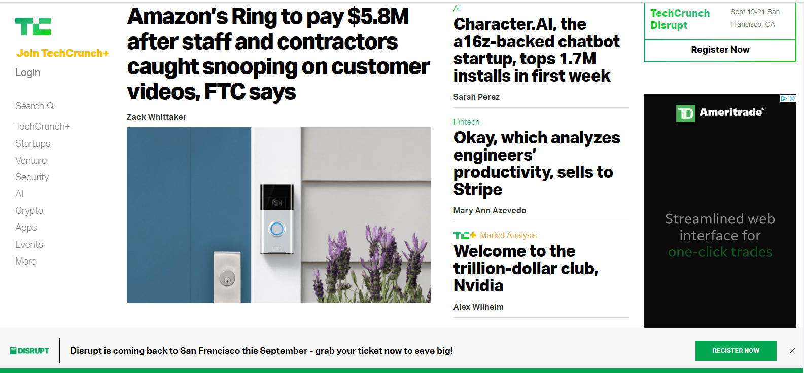
TechCrunch is an American online publisher focusing on the tech industry. It is the go-to website for the latest news in the tech sector, with hundreds of stories being published each day. All in all, the company is pretty much on the ball with keeping its 15 million monthly users in the loop.
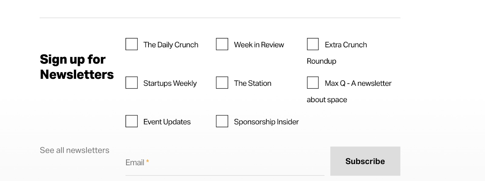
TechCrunch distributes gated newsletters, analytics, articles, and even tickets to worldwide tech events. As we have seen before, WordPress comes in very handy for this purpose. Each post on their site has an embedded widget where the reader can easily subscribe — making it simple to convert visitors to newsletter readers.
The media outlet has also incorporated one of the leading search plugins for fast-load websites called Swiftype.
What we like: Easily navigated and front-facing with the news pieces they publish, TechCrunch executes the “ease of use” tactic effortlessly. Open up the home page and scroll down to see multiple interesting stories highlighted. Or, mosey on over to the search bar and search for your chosen topic.
Similar theme: Caards
13. TED Blog
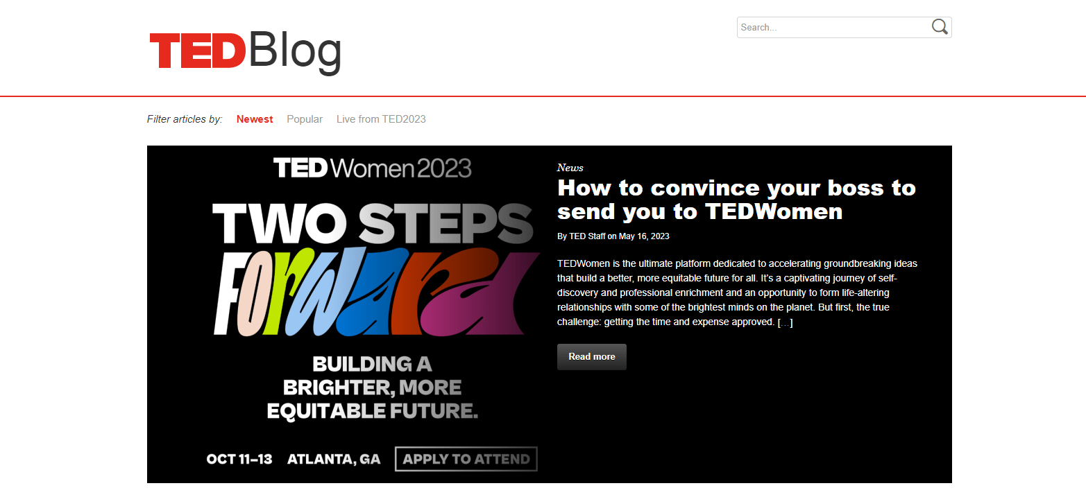
TED is a non-profit organization dedicated to “spreading ideas that matter.”The website is a collection of stories presented in the form of video presentations of various lengths. Maintaining such a high amount of video content would be a challenge for another site, but aided by the WordPress CMS, TED exceeds its visitors’ expectations.
The TED Blog has scooped close to 12.5 million unique visitors over the last six months, which is a strong testament to the value it offers.
The main page layout incorporates a featured image with a call to action button. If you scroll down, you’ll see featured posts and new posts sections. There is a great choice of similar themes for companies who run events and want to promote videos on their website.
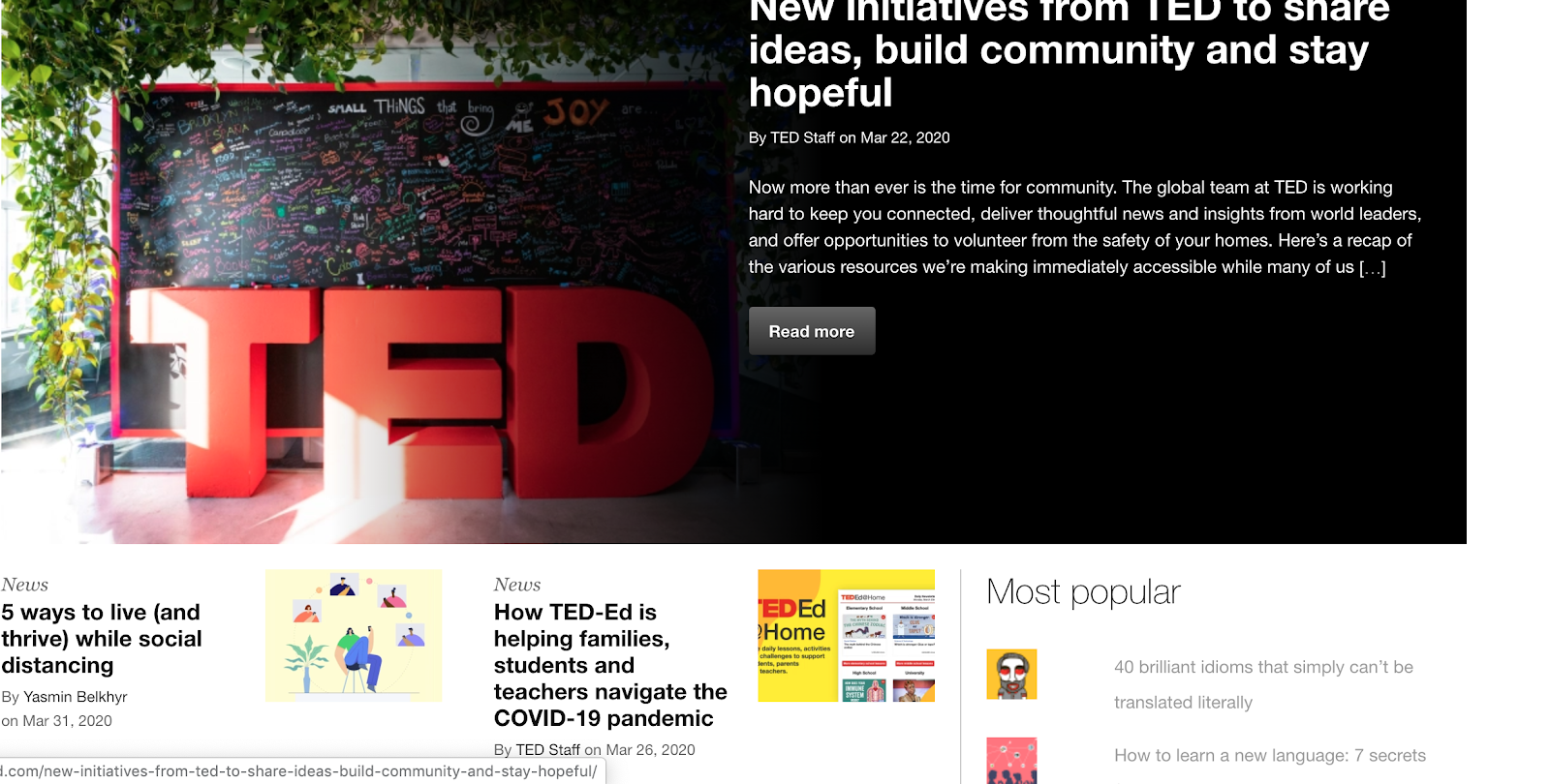
The TED Blog also leverages the powerful user-generated content feature of WordPress. Similar to the NYT Opinion, people can submit blog posts and become contributors to a public blog.
What we like: Utilizing the power of user-generated content and fusing that with an informative platform has worked in The Ted Blog's favor. Stories are presented in a digestible fashion, a wide variety of topics to read through, and everything is easily navigated.
Similar theme: Hunted
14. Katy Perry

Katheryn Elizabeth Hudson, known professionally as Katy Perry, is an American singer, songwriter, and television judge. In 2013, Perry was declared the Top Global Female Recording Artist by the International Federation of the Phonographic Industry and is currently the tenth top digital singles artist in the United States.
More than 60 thousand people visit her website monthly, arriving from one of the most popular search inquiries, “Katy Perry gallery.” It’s only logical that as a public figure that she places a huge emphasis on visual content, like photos from tours, professional photoshoots, and videos.
To delight her fans, the website (built on WordPress) incorporates animated galleries.
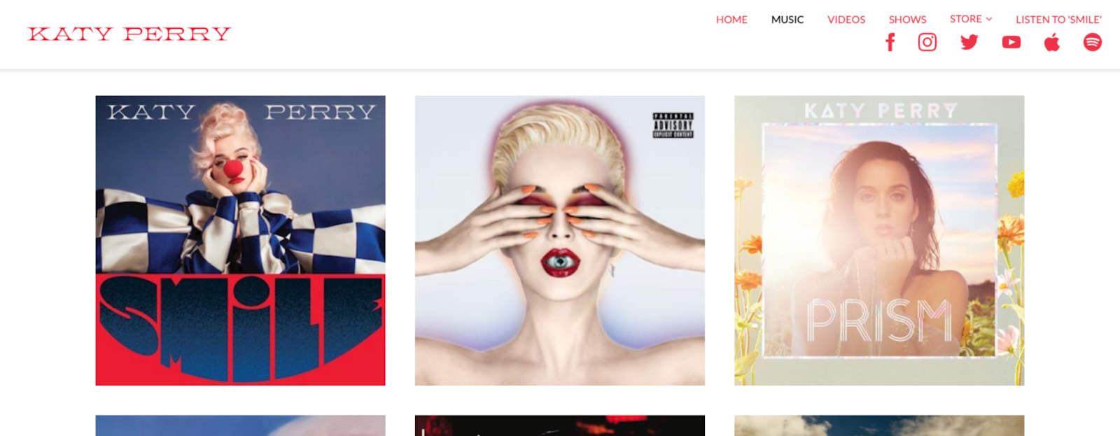
The video section is a set of animated thumbnails of her official videos on YouTube. The main menu leads to the star merchandise store, official social media, and links to any platform where you can buy her albums and singles.
What we like: Giving a more stylized look with Katy Perry front and center is the only way to go in this case. Opening the homepage gives details for her most recent Vegas tour and has easily navigated options to see exactly what our favorite “firework” has been up to.
Similar theme: Cascara
Find your inspiration.
Maintaining an online presence is a must for any business. With a solution as versatile in functionality as WordPress, any business can create a site that will meet their specific goals and delight their visitors. We hope you took some inspiration from these popular brand pages and made an amazing website of your own.
Editor’s note: This article was originally published May 2020 and has been updated for comprehensiveness.
Wordpress Website



![How to become a WordPress developer [+ tips from WCEU speaker Paul Bearne]](https://53.fs1.hubspotusercontent-na1.net/hubfs/53/59_How%20to%20Become%20a%20WordPress%20Developer.png)


