

First impressions are everything, especially when it comes to web design. A landing page is a great way to get visitors to interact with your site by engaging with your calls-to-action, making a purchase, contacting you, or sharing your content.
A landing page should be informative and direct, but also attention-grabbing and welcoming. It may seem like the content of your landing page is the focus, but the design is equally as important.
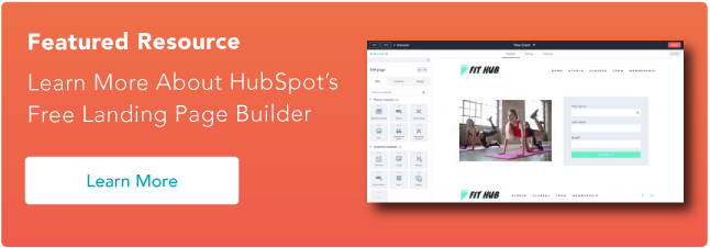
Learn More About HubSpot's Free Landing Page Builder
Landing pages are critical to converting your visitors into customers. They broker the exchange of information between you and your audience. Combining an eye-catching offer button with an effective landing page design can turn what was once just web traffic into a steady stream of leads for your sales team.
What makes a good landing page?
A strong website is essential for reaching your business goals. And the landing page provides important information for your audience along with a clear call to action. These seven elements will help your landing page be as effective as possible.
1. Structure & Design
Unfortunately, not every visitor will make it to the bottom of every page. So, keep the important features, such as lead intake forms and calls-to-action, above the fold to ensure that they’ll be seen. Additionally, remove the navigation from the page to avoid distractions in the form of other links.
2. Compelling Headline
The largest text on your landing page should be something that makes your visitor want to learn more. Saying “We are Georgia’s largest marketing agency” isn’t as captivating as “We helped businesses earn $10 million in profit this year.” Any additional copy on your landing page should maintain the momentum of interest initiated by the headline.
3. Call-to-Action (CTA)
What do you want visitors to do when they come to your site? Your design and copy should inspire them to take action. You have their attention, so strike while the iron is hot and put a Contact Us Now or Join the Family button right on the landing page.
4. Testimonials and Case Studies
A first-time visitor to your site may not have done any business with you before. They will be more encouraged to take action by seeing what you’ve been able to accomplish for a similar client and not just a general description of what you do.
5. Trust Symbols
A well-designed website isn’t enough to prove to visitors that you’re a credible organization, especially in today’s world. Social proof builds credibility, while elements like trust seals and a privacy policy create trust with your visitors.
6. Media
A headline can be a powerful motivator, but a photo or video can also communicate your desired message. Choose a media that promotes either what you do or what you want your audience to feel when they land on your page.
7. Quick Loading Pages
Be sure to optimize any images or videos on your landing page to avoid slowing down your page speed. If your page takes too long to load, visitors may abandon ship before even seeing the whole page.
7 Landing Page Best Practices
Follow these landing page best practices to ensure a high-converting, easy-to-navigate webpage.
1. Pass the blink test.
Visitors to your site will often make the decision of whether or not they’re going to fill out your form before the page even finishes loading. Make sure where you’re sending folks appears immediately professional and easy to fill out. In other words, make sure they can understand the offer and what you’re asking for in the time it takes them to blink.
2. Keep it simple.
Every visitor to your landing page clicked on something to get there, like a CTA button for a free trial, webinar, or other offer. So, theoretically, you already know something key about these folks. If they clicked to download a whitepaper on blue widgets, for instance, then you will know they are interested in blue widgets. Armed with that information, you should be able to plan your page layout accordingly. Use that knowledge to your advantage and keep everything about this page simple.
3. Keep it concise.
Pinpoint the most important things you want to communicate with your landing page. Avoid including a long company history or elaborate explanations that can go on a different page. A visitor should be able to take a quick look at your landing page and receive your desired message.
4. Graphics and endorsements matter.
Remember, you’ll be asking people to submit information they may consider sensitive. Before doing so, building credibility will be key. Make sure you have all of your trust-building material — like testimonials, social proof, and privacy promises — placed prominently on the page.
5. Go naked.
Your landing page visitors are a few keystrokes and a click away from becoming a bonafide lead. In other words, you’ve got them right where you want them! The last thing you would want to happen is for them to get distracted. “Going naked” refers to the practice of making your landing page deliberately sparse. Customize the page so that it has zero navigation, that is, no menu, no link back to the homepage, and no other places to click. This page needs to be devoid of any and all hyperlinked distractions. Let the form and “submit” button be their singular point of focus, and usher them through to completion.
6. Restate value.
The landing page will be hyperlinked to the CTA button on your website, but make sure the two are also logically linked. Use a simple, bulleted list near the top of the page to restate what you’re offering and why it’s valuable. Doing so will ensure your prospect knows exactly what they’re getting and will ensure a qualified lead for your sales team.
7. Eat your own dog food.
Before publishing the page, ask yourself a few questions, like: Would I fill out this form? Would I find this page confusing? Would I feel comfortable sharing my information with this site? Use these questions to ultimately perfect the look and feel of your landing page before going live. And of course, test, test, test!
The Landing Page is the Takeoff Point
The warm welcome that your landing page provides is the jumpstart to your visitor’s interactions with the rest of your site and your organization. Establish a few precise goals for your landing page, and then take action to publish the elements necessary to accomplish them. Ask yourself, what do you want a visitor to understand and feel in the first few seconds of landing on your page? The answer will lead you in the right direction for personalizing your page for the optimal user experience.
Editor's note: This post was originally published in May 2010 and has been updated for comprehensiveness.
Landing Pages


![Why You Need to Create More Landing Pages [Data + Tips]](https://53.fs1.hubspotusercontent-na1.net/hubfs/53/create%20more%20landing%20pages.png)
.png)


.jpg)