
As a consumer, I often feel overwhelmed by the sheer number of brands trying to get me to try their service or purchase a product. However, as a marketer, I can recognize that the best call-to-action examples are the ones that give me a reason to take that step — either by offering me something for free, a special perk or access, or a unique opportunity that I can’t get elsewhere.
Unless I discovered it via word-of-mouth marketing, nearly every app or service I use was influenced by clever or engaging calls-to-action (CTA). Whether it was the actual language used, the design, or the ease of the sign-up process, the CTA is what convinced me to learn more and pull the trigger on some of my favorite services, such as Spotify, Goodreads, and SoulCycle.

In this post, I’ll explain how strategic CTAs can guide potential consumers through the buying journey and highlight my favorite (and least favorite) examples.
Table of Contents
What is a call-to-action (CTA)?
CTA stands for call-to-action, and it's the part of a webpage, advertisement, or piece of content that encourages the audience to take a certain step. CTAs help a business convert a visitor or reader into a lead for the sales team. They can drive various actions depending on the company’s goal.
What is a CTA in marketing?
In marketing, CTAs are necessary because they encourage an audience to act on a marketing campaign. It’s why we put dollars behind marketing — to encourage consumers to take this specific action.
Ultimately, the goal of any marketing campaign is to guide the audience in the buyer's journey so they eventually make a purchase. So, it’s imperative to create calls-to-action that resonate with the audience.
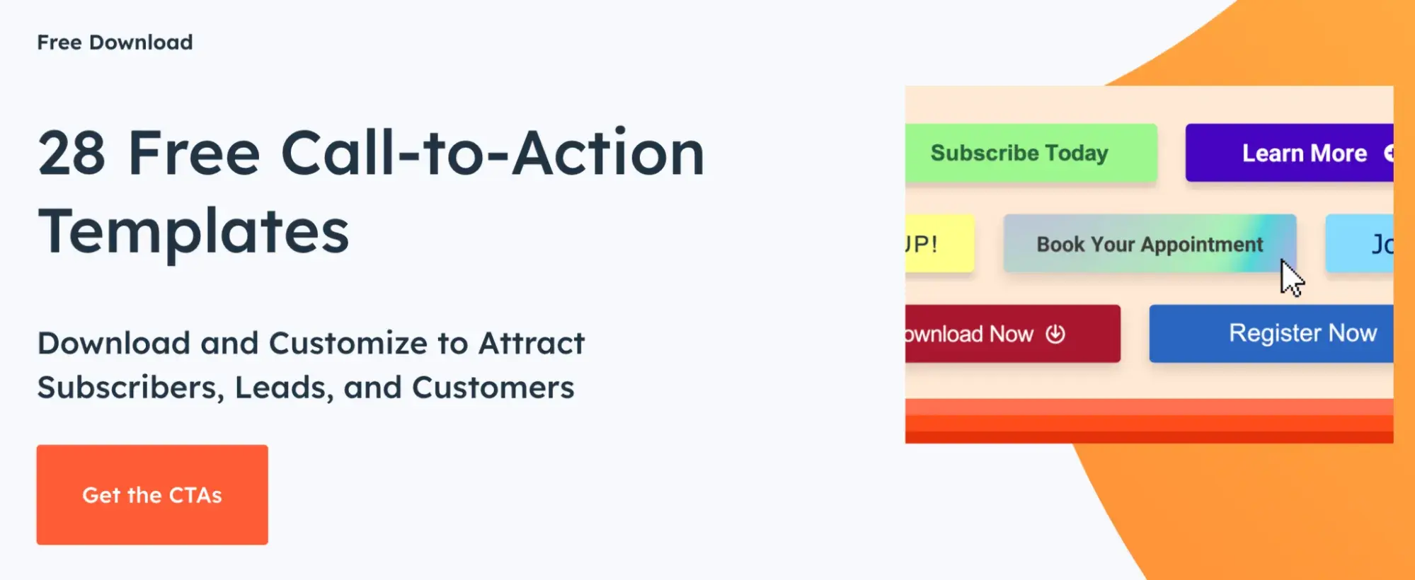
28 Free Call-to-Action Templates
Increase website conversions with these free templates.
- Bottom-of-Post CTAs
- Form Button CTAs
- Sidebar CTAs
- And More!
Download Free
All fields are required.
Types of CTAs
Not all marketing campaigns use the same types of CTAs since several tactics can be used to guide an audience in their journey.
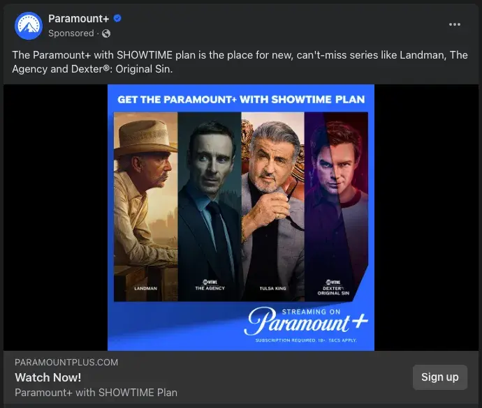
For instance, I work at Paramount on the Global Program Marketing team. When building marketing campaigns to support a new series or new season of a series coming to Paramount+, the goal is to encourage people to watch the series on Paramount+. Thus, our CTAs may be “Sign Up Now” for non-users and “Stream Now” for subscribers.
Below, I’ve listed common types of CTAs that are used in marketing. Every brand and audience is different, so it may be beneficial to A/B test CTA types and designs to determine which ones work best.
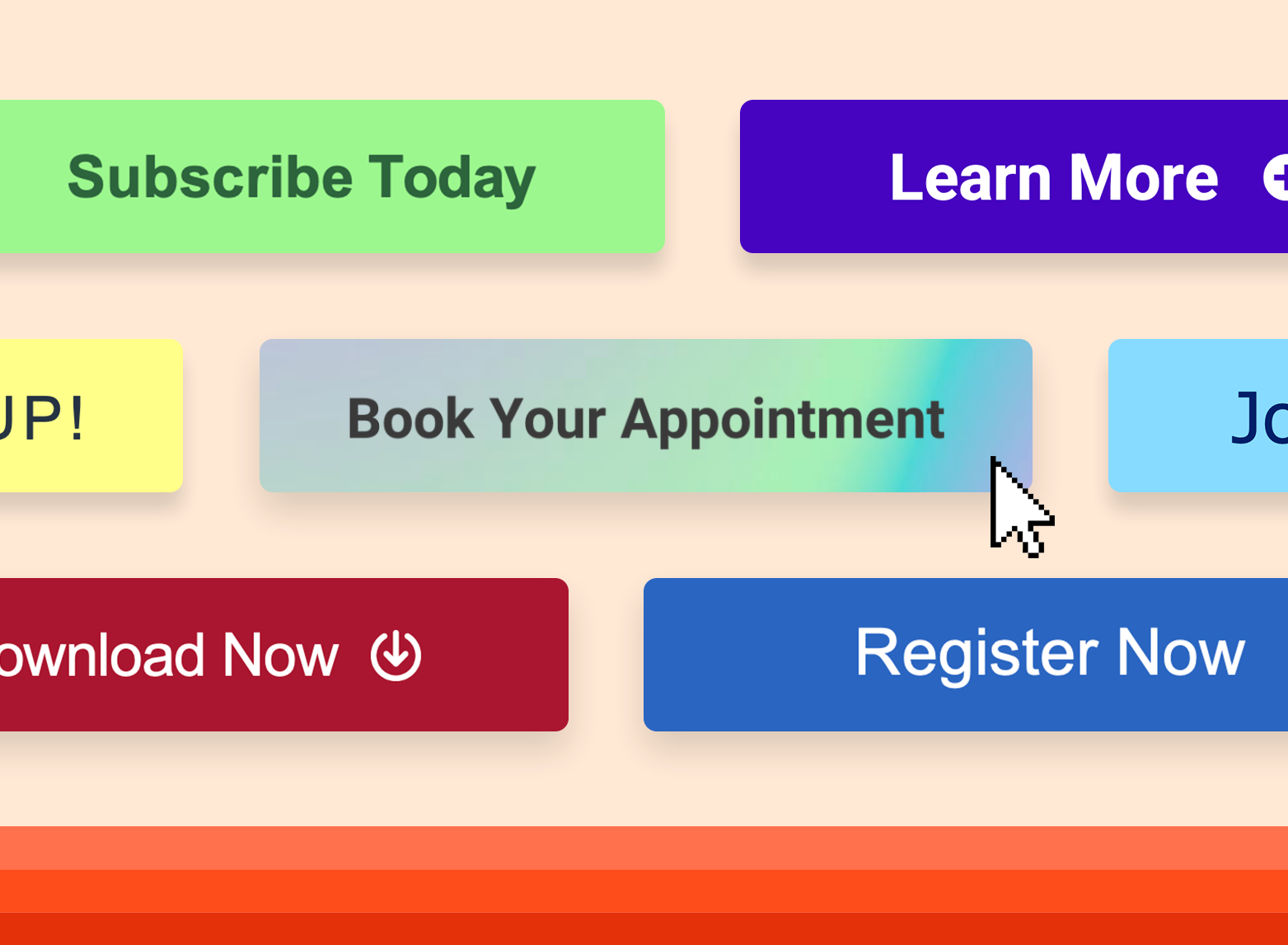
Buttons
Buttons are icons with an actionable phrase, such as “Sign up,” that entices users to click and take further action. A case study with a brand found that switching from a text-based CTA to a button CTA increased the clickthrough rate by 32.12%.
Button designs can vary based on the brand style and goal of the campaign, but generally, a button should have a high-contrast color. This allows the button to stand out against the background for a more pleasant visual experience and provides greater accessibility for people with visual impairment.
Welcome Gates
According to a Grow & Convert research study, welcome gates have the highest estimated conversion rate: 10-25%.
Welcome gates are CTAs that appear immediately upon entering a website, before a user can see the content of the page they clicked on. It is considered a “welcome” to the site, and is effective as it’s impossible to ignore.
Forms
Form submission CTAs convert site visitors into leads by offering visitors something in exchange for their contact information. Offers can include downloadable content, product quotes, service sign-ups, subscriptions, discounts, and more.
Banners
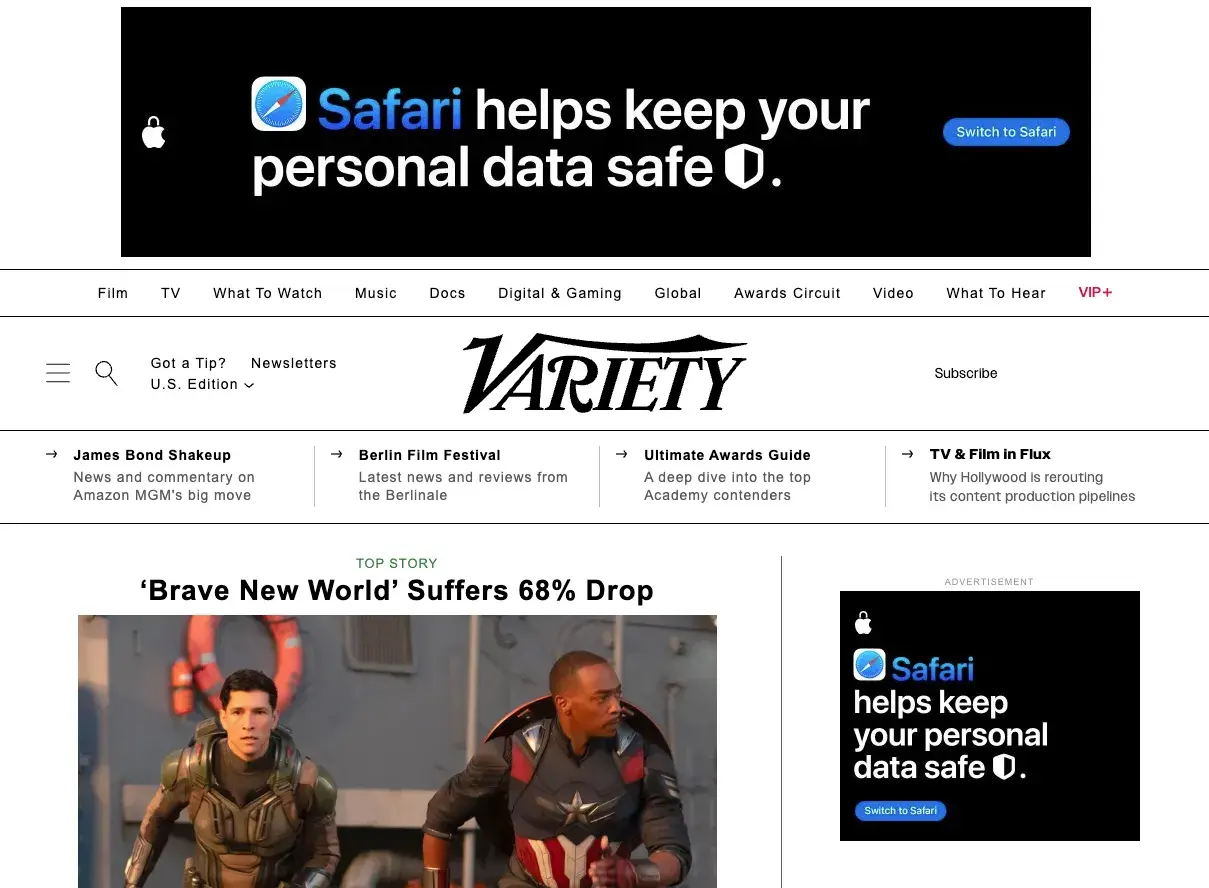
A CTA banner can be located along the top, bottom, or side of a web page. Banners typically include captivating copy and design that catches visitors’ eyes and encourages them to click on them.
Banner CTAs have an estimated 0.5-1.5% conversion rate when along the sidebar and 1-5% when they’re a bar spanning the width of the screen.
Contextual Links
Usually located within the body copy of a blog post or article, contextual links contain clickable text that directs users to a related landing page. This helps keep readers consuming more content within the same publication’s ecosystem.
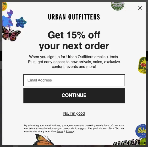
Pop-Ups
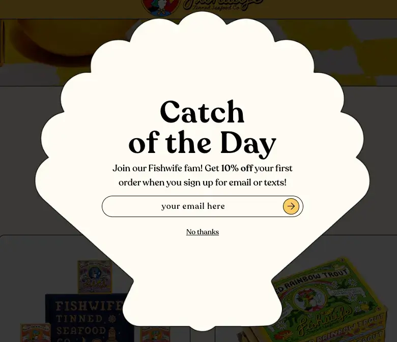
A pop-up is a CTA in a window that suddenly appears on the page. Since users often tune out static CTA buttons and forms, pop-ups can be a great way to capture attention, communicate an offer, and entice users to sign up for your service.
Many websites also use exit intent pop-ups, which are triggered when users are about to leave the site. Pop-ups have an estimated conversion rate of 1-8%.
Slide-Ins

Similar to pop-ups, slide-in CTAs capture the user's attention by “sliding in” from the bottom or sidebar. Slide-ins are a good alternative to pop-ups since they are less disruptive to the user experience.
These CTAs have an estimated conversion rate of 1-5%.
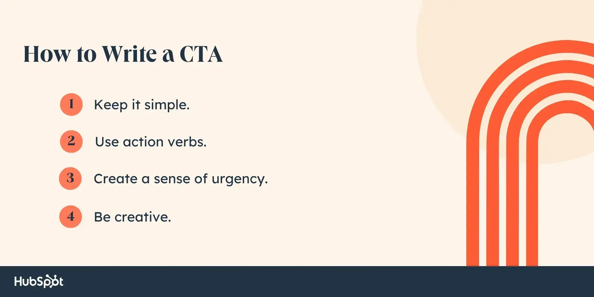
How to Write a CTA
- Keep it simple.
- Use action verbs.
- Create a sense of urgency.
- Be creative.
1. Keep it simple.
I find the most effective CTAs to be the most simple. A CTA that says “Download now” is clear — it tells the user that they can download related materials by clicking on the button.
When writing CTAs, I recommend using understandable and direct language that communicates what action you want the audience to take. Long sentences with jargon risk confusing readers, which misses out on a conversion.
Pro tip: More is less, right? The proverb is just as true when it comes to CTAs. Consider keeping CTAs to two to five words to pack a lot of punch concisely.
28 Free Call-to-Action Templates
Increase website conversions with these free templates.
- Bottom-of-Post CTAs
- Form Button CTAs
- Sidebar CTAs
- And More!
Download Free
All fields are required.
2. Use action verbs.
The most effective CTAs start with a strong action verb to encourage readers to take immediate action. Action verbs inject momentum, making them more vibrant and engaging. After all, using power words in a CTA can increase conversion rates by up to 12.7%.
For example, active CTAs like “Discover more” and “Start now” are more motivating than passive CTAs like “Continue” and “Next.”
Keep in mind that some action verbs are better suited for specific purposes. CTAs like “Get started” and “Sign up” are good for SaaS conversions, while CTAs like “Buy now” and “Add to cart” are better for ecommerce conversions.
Here’s a list of 25 action verbs, from old reliables to innovative new options, that can spice up your CTAs:
- Sign
- Start
- Try
- Join
- Learn
- Discover
- Explore
- Subscribe
- Download
- Watch
- Save
- Contact
- Join
- Shop
- Upgrade
- Unlock
- Activate
- Access
- Claim
- Transform
- Elevate
- Grow
- Optimize
- Reserve
- Launch
Pro tip: Consider what actions make sense for each customer segment. For example, if I worked at a magazine, I might use “Try for free” to grow awareness with new readers, “Sign up now” to convert them into regular readers, and “Upgrade now” to convert them into paid subscribers.
3. Create a sense of urgency.
Adding a time element to CTAs can help create a sense of urgency and encourage the audience to act promptly rather than procrastinate. When urging people to tune in to a new series on Paramount+, we might say, “Stream now,” even if the content will be available for months or years to come.
It can also foster a fear of missing out (FOMO), driving people to take action to avoid losing out on valuable opportunities or limited-time offers. Language like “Limited time offer,” “Last chance,” or “While supplies last” inspires this mentality.
Keep in mind that any urgency conveyed should be genuine. Overusing urgency tactics or creating false scarcity can erode audience trust and credibility.
Pro tip: To drive more sales, you can include a form CTA and have users submit their email address or phone number to be the first to hear when a product goes live or a service becomes available. This helps consumers feel exclusively in the know while also reminding them to return and make the purchase when the time comes.
4. Be creative.
CTAs don’t have to be so rigid and formulaic. When writing them, I suggest incorporating some personality and humor to stand out and make an impact — as long as it aligns with the overall brand voice and still drives action.
For example, a generic “Sign up” CTA can replace something exciting like “Take the leap.” While both examples encourage the audience to take action, the latter taps into the idea of taking chances and embracing new opportunities, making it more compelling and original.
The ultimate goal is to select a CTA that is compelling enough to encourage the action. Check out our checklist to ensure you’re crafting engaging calls to action.
Pro tip: Along with creativity in copy, I also recommend creativity in CTA design. If going with a classic CTA button, test various designs, dimensions, colors, and placements to see what prompts the most clicks and conversions.
Different Types of CTAs
CTAs all serve a designated purpose, but the language they use can vary. Ever creative, marketers everywhere have put unique spins on their CTAs to generate the leads their businesses depend on.
Below are a few examples of the types of CTA button copy you might use in marketing:

Some CTAs are more effective than others and perform better on different platforms. So, I’ve listed examples of CTAs below, from options that rock to ones that need work, that can help guide your call-to-action templates.
Best Call-to-Action Examples
Jump ahead: Software Website CTAs | Streaming Website CTAs | Retail Website CTAs | Service Website CTAs | Tech Website CTAs | Nonprofit Website CTAs | Facebook Ad CTAs | Instagram Ad CTAs | TikTok Ad CTAs | Email CTAs
Software Website CTAs
1. HubSpot
CTA: Get the CTAs
One of the perks of using HubSpot is the wealth of free resources we offer. The 28 free CTA templates that HubSpot offers on its website are very fitting for this article, with the ability to edit the imagery and wording to fit your business’s needs best.
What’s even better is that HubSpot research has found that personalized CTAs perform 202% better than basic CTAs, and businesses can easily customize their calls to action by using HubSpot’s CTA tool.
The “Get the CTAs” button is clever and unique. We could have easily used a “Download Now” or “Get Started” CTA, but “Get the CTAs” has more appeal. It tells users that they’re not just getting any old CTA templates but the CTAs that will transform their marketing.
How to Replicate This CTA
When offering a free resource or template, don’t shy away from making abundantly clear the CTA, as we do. Language like “Grab the resume template” or “Download your slides” is enticing because users know exactly what they will get when they click the button.
2. 310 Creative
CTA: Help Scale My Revenue
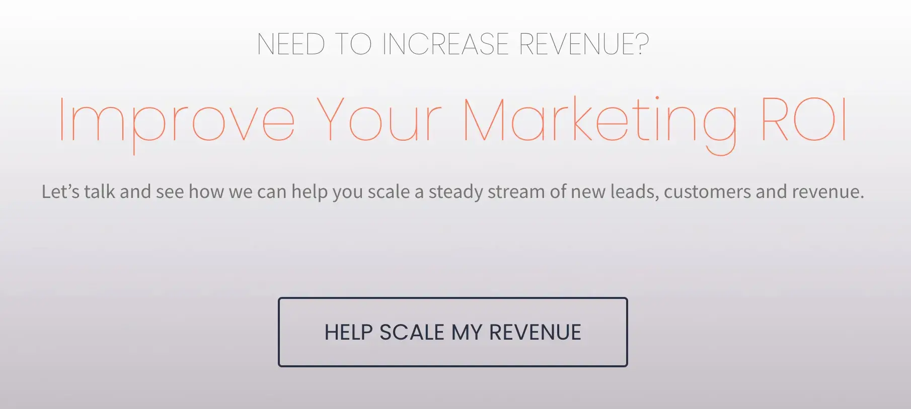
Growth agency and HubSpot partner 310 Creative aims to help B2B companies scale and refine the buyer’s journey to increase sales. Knowing that visitors to the site may not quite know what specific services they need, 310 Creative makes use of a CTA that removes confusion.
“Help Scale My Revenue” lays out exactly what 310 Creative intends to offer. It’s also an appealing offer that most businesses can benefit from.
How to Replicate This CTA
Demonstrate empathy for the visitor and remove barriers by clearly stating your services and offerings. Pairing a no-nonsense CTA button with “Let’s talk” language encourages the consumer to ask for that help.
3. Evernote
CTA: Get [Brand] free
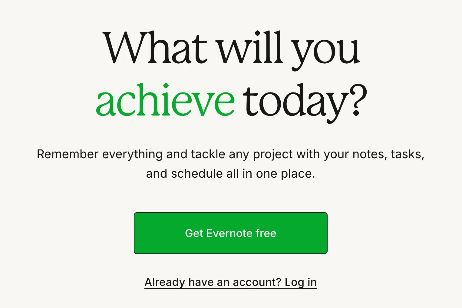
I love that the first thing you read on the Evernote website is, “What will you achieve today?” It immediately conveys that Evernote will solve problems and help users accomplish everything they dream of — and why wouldn’t you want something like that for free?
The design of Evernote's website makes it super simple for users to see the quick benefits of using the app and how to sign up to use it. Plus, the bright green pops against the lighter background, making the “Get Evernote free” CTA button clear.
How to Replicate This CTA
Consider using a bright color that contrasts well with the elements on your web page to make your CTA stand out. This can go a long way, even if your text is simple, like in the Evernote example.
4. Square
CTA: Get started
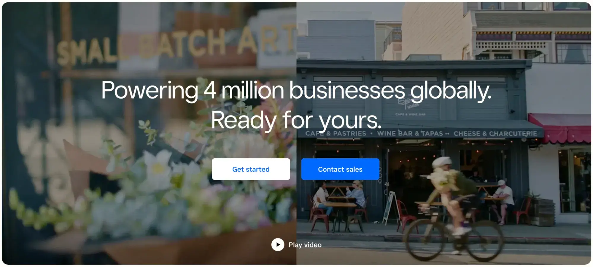
To achieve an effective CTA design, consider more than just the button itself. In my experience, it's also super important to consider elements like background color, surrounding images, and surrounding text.
I love that Square, a financial services and digital payments company, has selected eye-catching footage of real businesses to display around its CTA buttons. Where many homepages are static, Square brings it to life with movement, amidst which the stationary CTA buttons remain prominent.
Square has two CTA buttons: “Get started” and “Contact sales.” To avoid confusion, the brand has made them different colors.
How to Replicate This CTA
Are there images, videos, or other creative elements that can be placed behind or near the CTA buttons on your website to breathe life into the mundane? “A picture is worth a thousand words,” after all — and showcasing some of the best parts of a company via imagery can be the thing that convinces a user to click that CTA
5. OkCupid
CTA: Join [Brand]
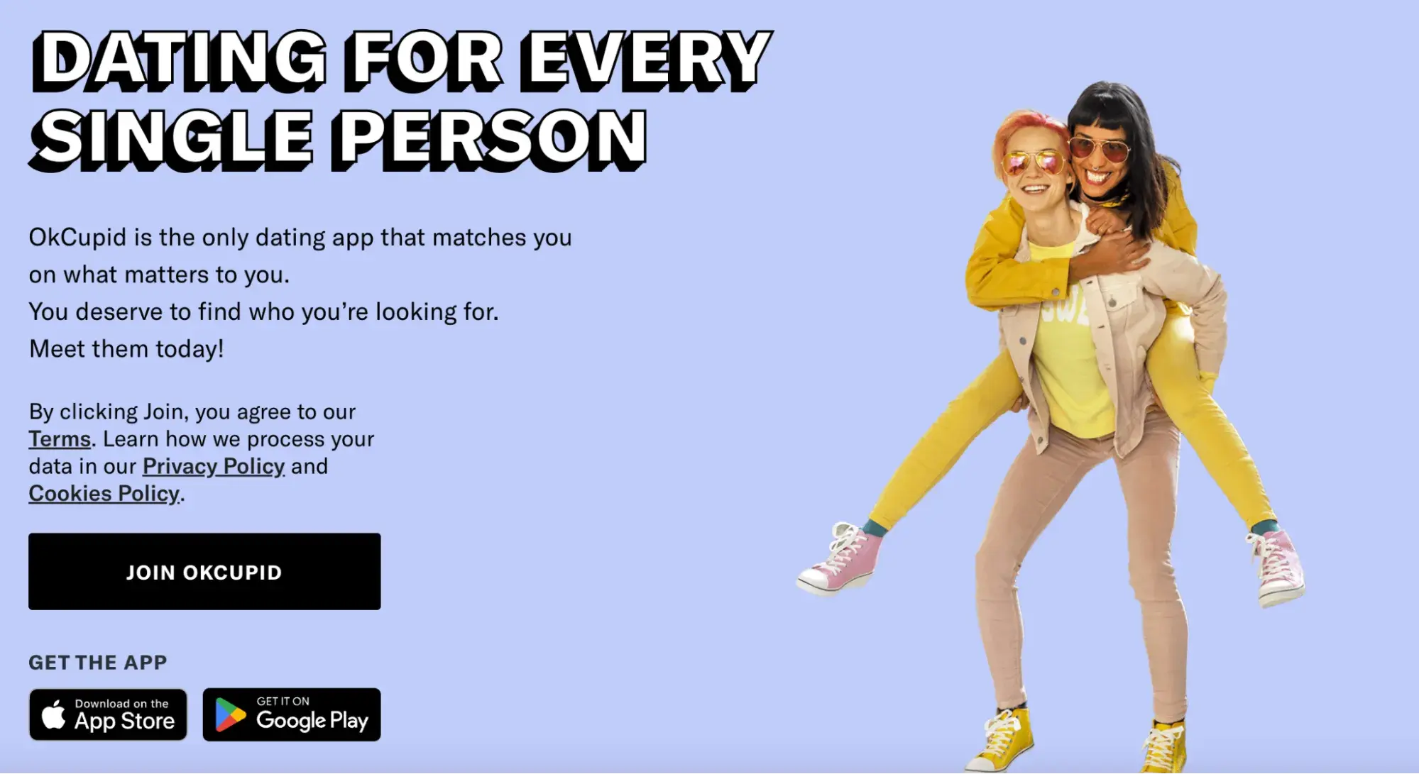
Online dating platform OkCupid‘s CTA doesn’t seem that impressive at first glance, but its brilliance is in the small details.
“Join OkCupid” is simple but wildly effective. After all, getting started can be the hardest step for someone putting themselves out there and creating a dating profile.
This CTA, therefore, works twofold: it reduces stress by giving users an easy first step (all you have to do for now is join!) and positions OkCupid as a welcoming community, rather than an intimidating, competitive place.
How to Replicate This CTA
Consider the obstacles holding a user back from wanting to sign up for your service. For a dating app, people may be wary due to fear of rejection, social stigma, and safety, among other concerns.
Be mindful of these and create a CTA that eases the user into the decision-making process, rather than demanding they “Sign up now.”
28 Free Call-to-Action Templates
Increase website conversions with these free templates.
- Bottom-of-Post CTAs
- Form Button CTAs
- Sidebar CTAs
- And More!
Download Free
All fields are required.
Streaming Website CTAs
6. Hulu
CTA: Get This Deal
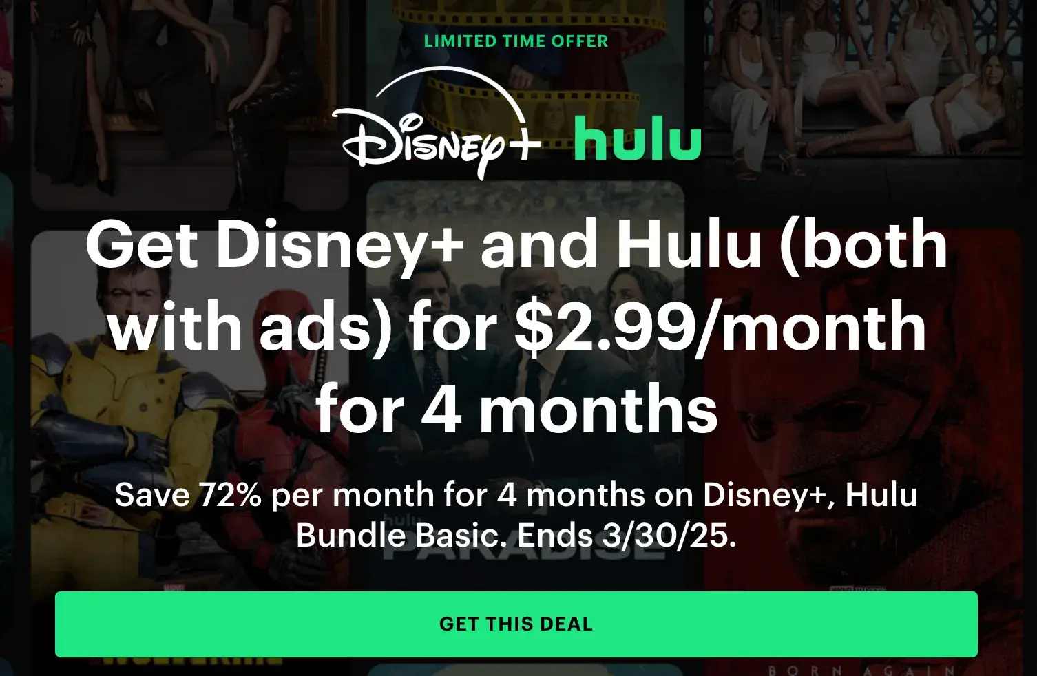
Streaming giant Hulu went for a dramatic approach with this CTA. The dimmed background shows off all its television and movie offerings, while the green and white text of the CTA draws your attention to the promotion.
I think it’s clever because it’s a sign-up and upsell in one, informing users that they can get a discount add-on with Disney+ and Hulu.
The CTA “Get This Deal” further emphasizes that this isn’t just another offering but a significant deal that relies on the notability of The Walt Disney Company.
How to Replicate This CTA
Entice visitors with the impression that they’re getting a special deal by offering a bundle, and emphasize providing value to get visitors to take action. For example, Hulu’s CTA button offers more possibilities than just “Sign up” would have.
7. Tidal
CTA: Start Free Trial
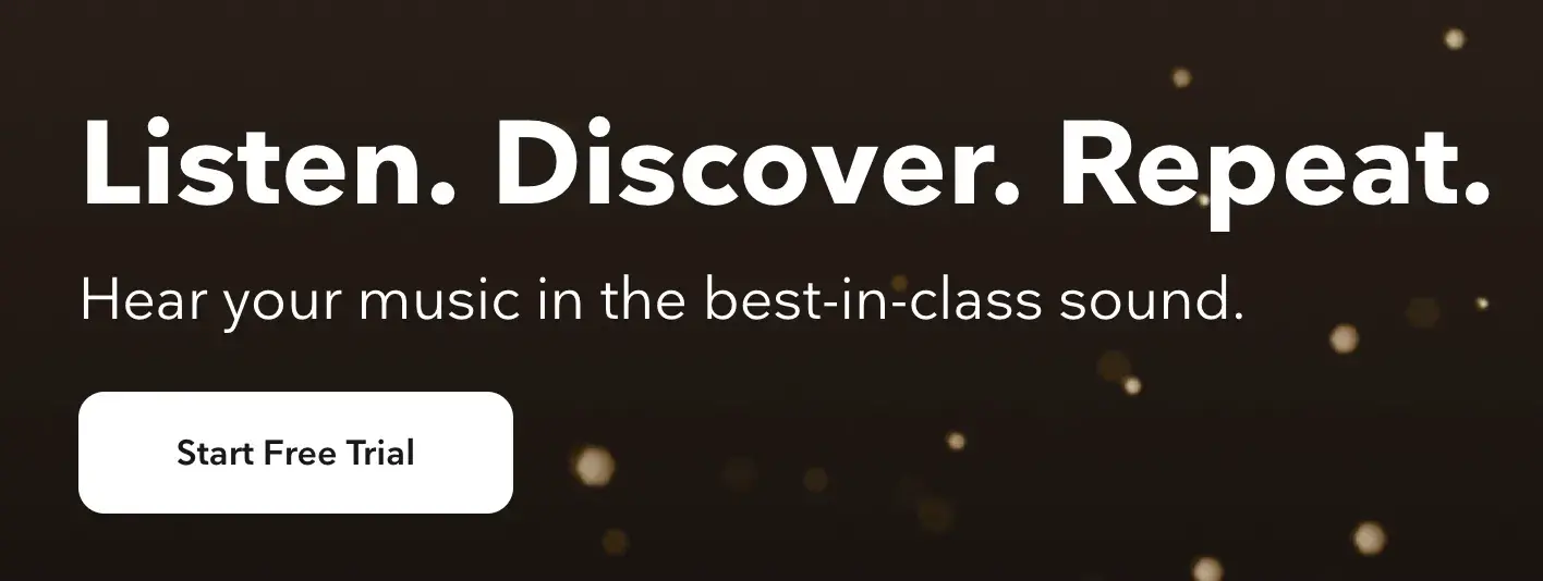
Less is more, and high-fidelity music streaming service Tidal accomplishes this. Tidal is known for offering high-class audio quality and exclusive artist content, and the gold sparkle backdrop on its website adds appropriate flair.
Tidal uses a strong action verb here with “Start.” The company isn’t encouraging users to “Try” it for free; it’s telling us to “Start” it now.
I also think the CTA is paired with the perfect amount of copy for those unfamiliar with the brand. I immediately understood the gist of the platform without being bogged down with unneeded industry jargon.
How to Replicate This CTA
This is a great reminder to test out different action verbs for distinct purposes. I think “Try it free” works great for companies pushing a more expensive product who don’t want to deter potential customers, while “Start free trial” is more confident and decisive.
8. Netflix
CTA: Get Started
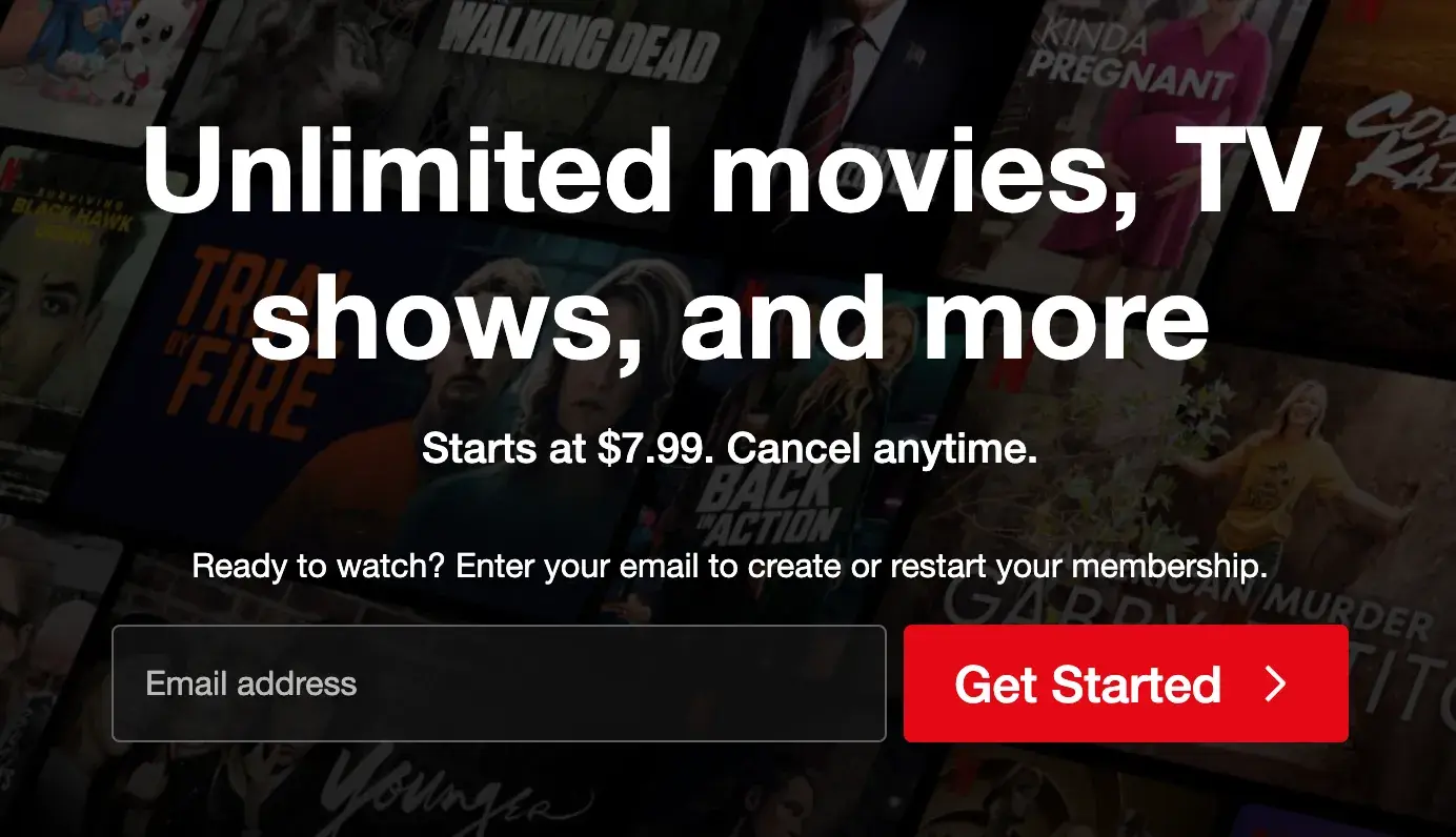
One big fear users have before committing to sign up for something? It’ll be a pain to cancel their subscription if they don’t end up liking it.
Netflix nips that fear in the bud with the “Cancel anytime” copy above the “Get Started” CTA. I’d venture a guess that reassurance alone has boosted signups. After all, addressing user doubt alongside a CTA has been proven to increase conversions by 124%.
“Get Started” is also a great option here, as it reassures the user that they will not be asked to immediately put down a payment.
How to Replicate This CTA
Netflix successfully pairs its low-pressure CTA with a key message: “Starts at $7.99. Cancel anytime.” If your company offers a free or low-cost subscription option, advertise it on the homepage alongside the CTA button.
9. SoundCloud
CTA: Try it free for 30 days
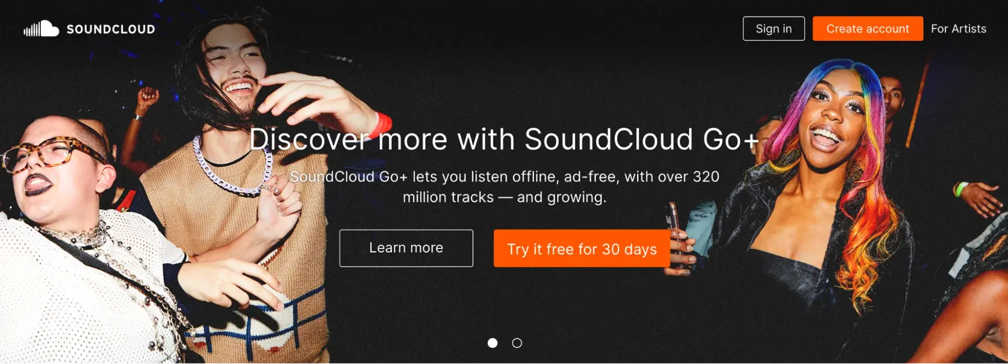
SoundCloud is an online audio platform that lets users stream and upload music and podcasts. While SoundCloud is free, the company also offers SoundCloud Go+, a premium service with ad-free listening, offline playback, and access to tracks unavailable on the free version.
This CTA is clever because it implies that there is not already a free version of SoundCloud, which makes the opportunity to try SoundCloud Go+ for free for an entire month even more enticing.
I don’t find this misleading, as the copy above the CTA specifically promotes the SoundCloud Go+ offering. Plus, there is a second CTA button that allows users to “Learn more.”
How to Replicate This CTA
Offering a free trial? Make it known by using a prominent CTA that pops and declares exactly how long this unique offer lasts.
Retail Website CTAs
10. Glossier
CTA: Claim offer
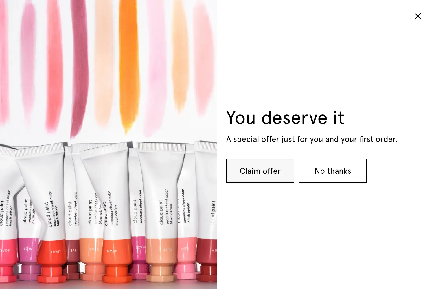
Beauty and skincare brand Glossier has its marketing image down pat, in my opinion, showcasing authentic images of women with different skin types and colors. Their focus is on enhancing natural beauty rather than covering it up.
A brand like Glossier relies on the idea of self-care, so it makes sense to display a copy like “You deserve it” on their website. This makes the “Claim offer” CTA even more special and personalized.
Clicking the “Claim offer” CTA button leads to a form submission CTA that requests an email address in exchange for a 15% discount.
How to Replicate This CTA
I see many brands with pop-up form submission CTAs that immediately display the first-order discount offer. I like that Glossier first piques user interest with a generic “Claim offer” CTA before revealing the special discount. This may incite more curious clicks.
11. Wool and the Gang
CTA: Choose A Kit
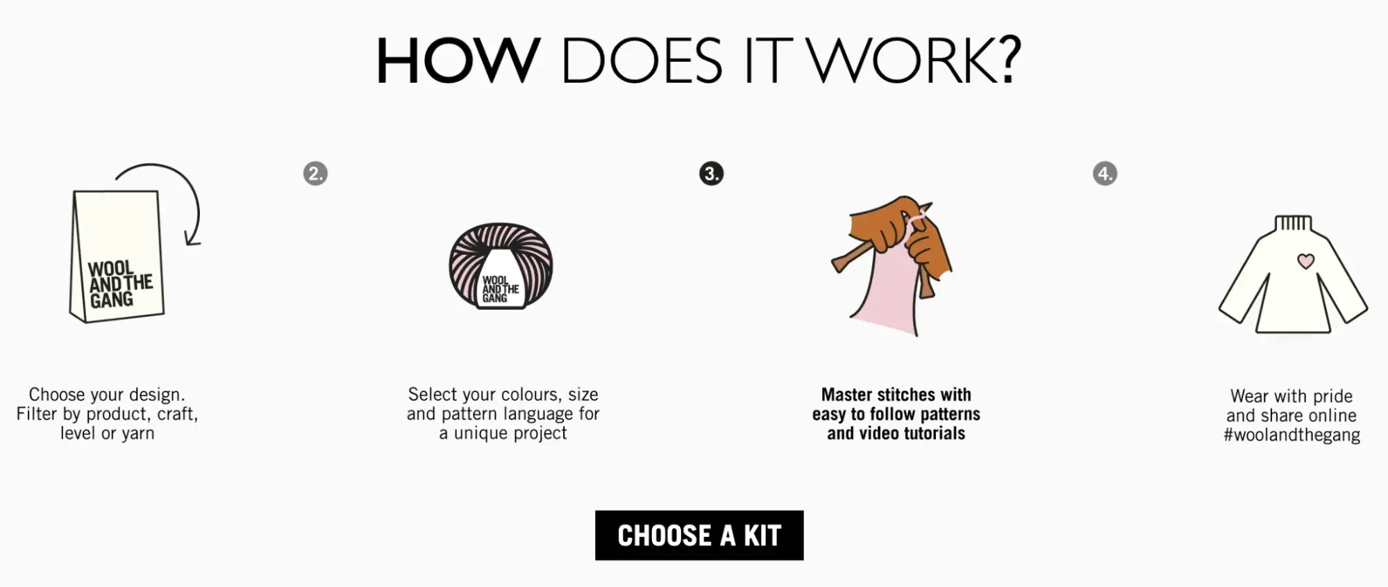
DIY-fashion brand Wool and the Gang is known for providing all the materials needed for knitting, crocheting, embroidery, and other fashion crafts. Customers interested in these kinds of crafts certainly appreciate the customization they offer.
Thus, leaning into their custom kits is a big draw. That’s what I love so much about the “Choose A Kit” CTA button. It’s paired with an animated, graphic-based 4-step process that lays out how their kits work.
How to Replicate This CTA
I’m a sucker for personalized products, and I know I’m more likely to purchase something if I get to design it exactly to my liking. Any company that offers personalization, such as HubSpot’s extensive CRM customization options, can benefit from promoting these in their CTA copy.
12. Madewell
CTA: See the story | Shop the edit

Madewell is a fashion brand known for high-quality denim and timeless, classic designs. I’ve always appreciated that Madewell seems to put real thought behind their fashion lines and trends, and that idea comes across in these CTA buttons.
They currently have a new Woven Leather line, and rather than just displaying the products on the homepage as “New,” they lean into ideas of transparency by offering to let users “See the story.”
Clicking this button leads to a page walking through quotes and inspiration from the Madewell style director about this texture and how to build it into an outfit. Once users get a sense of the versatility of this texture, they can navigate to the “Shop the edit” CTA, which allows them to browse products.
How to Replicate This CTA
Not every CTA needs to lead directly to sign-ups or sales. There are many ways brands can use a CTA button to create value for the user, which then builds brand trust and ultimately results in repeat purchases.
13. Barkbox
CTA: Get Barkbox
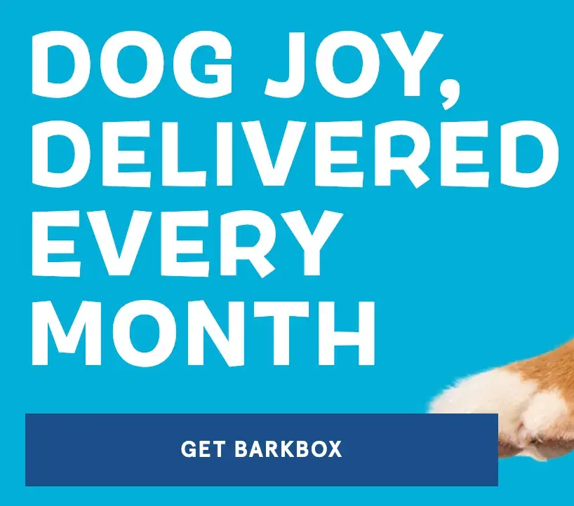
There is beauty in simplicity, and monthly dog subscription service Barkbox has mastered this. I counted a total of eight CTA buttons on their homepage, all saying “Get Barkbox” in the same color, font, and size.
If you find your way to Barkbox’s website, you’ll be hard-pressed to navigate away after being reminded many times to subscribe to Barkbox and make your dog(s) very happy.
How to Replicate This CTA
I see many company websites that display several different CTA buttons throughout their website, such as “Sign up for our newsletter,” “Shop now,” and “Claim offer.” This can be confusing as it’s asking users to complete various actions versus committing to one singular action, the way Barkbox does.
Research also shows that focusing on a single call-to-action can increase clicks by up to 371% and sales by up to 1617%.
14. Betabrand
CTA: Start Earning
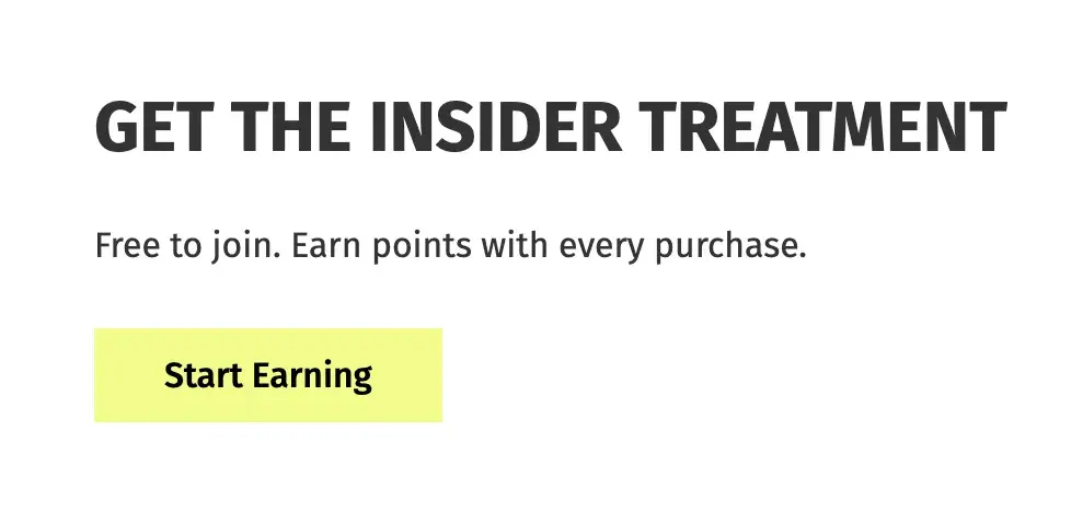
Betabrand is an online women’s clothing company specializing in its popular Dress Pant Yoga Pants. I can already tell from a sweep of their website that the brand excels at using quirky, confident CTAs.
Several retail brands offer free rewards programs or memberships to tempt customers to purchase more and rack up points. I’m used to seeing CTAs like “Sign up” or “Join now,” but “Start Earning” is a fun twist.
This CTA positions Betabrand’s insider program as a no-brainer to join. Why wouldn’t I want to “Start Earning” points and rewards with them?
How to Replicate This CTA
Consider how you can turn a CTA on its head to be less about the brand and more about the user. For instance, “Sign up now” could imply the customer is doing the brand a favor by signing up, whereas “Start earning” positions the same offer as a treat for the customer.
15. Diptyque
CTA: Add To Bag
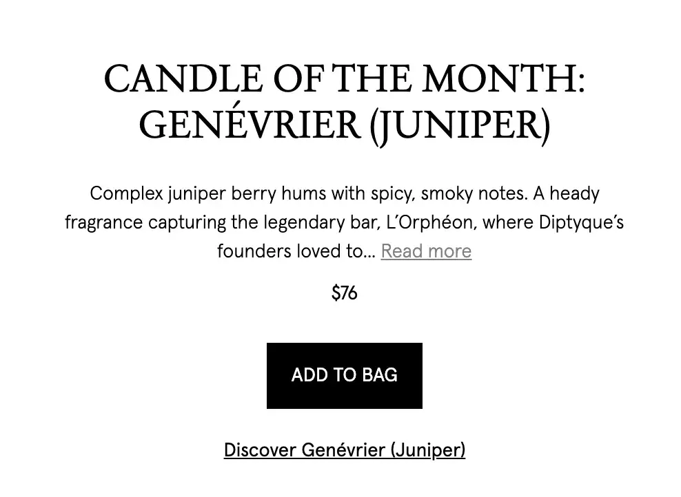
French luxury fragrance brand Diptyque produces high-quality candles, perfumes, and skincare products. I own one nearly empty Diptyque candle that I’ve been lighting for short bursts over the last two years to stretch its life.
As someone familiar with the brand, I know it’s hard to go wrong when shopping for scents. It seems Diptyque is aware of this too, as they display a candle of the month on their homepage and encourage users to directly “Add To Bag.”
This level of confidence doesn’t always go over well, but it works well here because it implies that the brand knows customers will love it. If the user wants to explore further before making a purchase, they can click the less bold CTA button below: “Discover Genévrier (Juniper).”
How to Replicate This CTA
The “Add To Bag” CTA is effective for several reasons. For the busy shopper, allowing users to add something to their cart directly from a website homepage helps ease some stress and save time. In addition, it can battle indecisiveness by encouraging users to make a quick purchasing decision.
28 Free Call-to-Action Templates
Increase website conversions with these free templates.
- Bottom-of-Post CTAs
- Form Button CTAs
- Sidebar CTAs
- And More!
Download Free
All fields are required.
Service Website CTAs
16. The Budgetnista
CTA: Take The 60 Sec Quiz

Run by personal financial educator and author Tiffany Aliche, The Budgetnista is a one-stop shop for personal finance. In addition to providing content that delights her audience, she's also a pro at creating inviting CTAs.
The copy above this CTA asks a simple question, but it also adds credibility to Aliche; if PBS and Netflix portrayed her, she can be trusted!
The “Take The 60 Sec Quiz” CTA is clever because we all know we have one minute to spare. This quiz is valuable as it tells the user if they are practicing financial wholeness, and the score on the quiz may dictate whether a user feels they re quire Aliche’s services.
How to Replicate This CTA
Time is valuable, and smart companies respect their customers’ time. Acknowledging how long a call-to-action will take shows their willingness to let their customers return to their normal lives soon while also stressing that this is a button they definitely have time to click on.
17. Full Bundle
CTA: Our Work
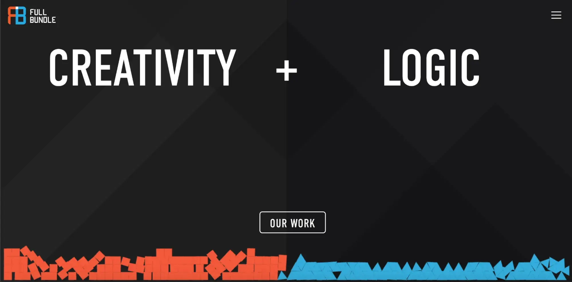
Full Bundle is another company that uses negative space to make their primary CTA pop. The white “Our Work” call-to-action stands out against the dark grays of the background. I think their choice of CTA is strategic, too.
Given that they primarily exist to build out clients’ online presences, they need to showcase their work — and that’s what most folks are going to their website for.
How to Replicate This CTA
Make creative use of negative space like Full Bundle's gray tones. In fact, research found that CTAs surrounded by more white space and less clutter increase conversion rates by up to 232%.
18. EPIC
CTA: Start A New Project With Us
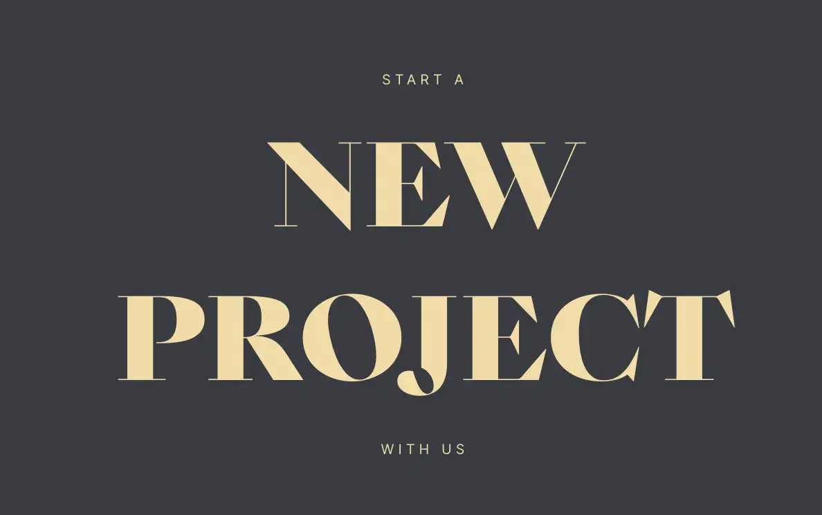
The folks at the agency EPIC use their homepage primarily to showcase their impressive design skills. When you arrive on the page, you’re greeted with a beautiful color scheme, examples of past projects, and an animated “About” section.
While there are plenty of other places users might click on their site — including their clients’ websites — the main call-to-action is inviting. It hints to users looking for a creative partner that EPIC is an especially great team to work with.
How to Replicate This CTA
Use inviting language. It’s easy to make a button that just says “Join us,” but that’s not convincing. Consider something friendlier like “Let's work together” or something specific to the service being offered.
19. IMPACT Branding & Design
CTA: Talk to us
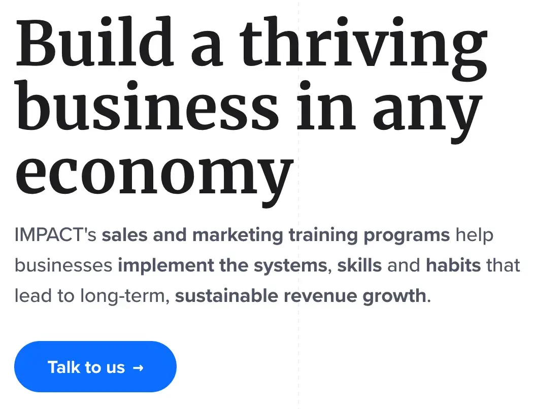
CTAs can feel robotic if the wrong, generic language is used. From the get-go, marketing and branding services company IMPACT gives the sense that any project with them will be a collaborative effort.
They’re not asking users to “Sign up” or “Contact us;” instead, they’re encouraging open conversation, which makes the user feel their questions and concerns will be heard and respected.
How to Replicate This CTA
If a user navigates to a branding services website, it likely means they require the services and are ready to make the leap. Therefore, a CTA like “Talk to us” or “Let’s chat” encourages the user to reach out immediately so the company can work on selling itself.
20. Hilton Hotels & Resorts
CTA: Get inspired
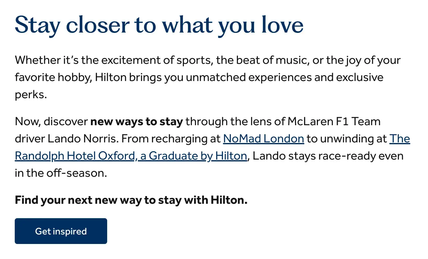
Popular hotel and resort giant Hilton is known for providing exceptional service to its guests. So, it’s no surprise that their website goes above and beyond sharing information about their rooms and amenities.
Hilton features an article about how popular McLaren F1 Team driver Lando Norris enjoys the personal touches and unique experiences that Hilton hotels offer. The CTA button that leads there reads “Get inspired,” which is a great message to potential guests.
It shows guests that Hilton does more than just provide accommodations for their travel. It offers ideas and inspiration to make their stay above and beyond expectations.
How to Replicate This CTA
“Get inspired” can work across many industries to show how a brand can provide a distinctive or exclusive opportunity compared to competitors. It’s a great way to show potential customers that, by investing in you, you’ll invest in them right back.
Tech Website CTAs
21. Lyft
CTA: Sign up to ride
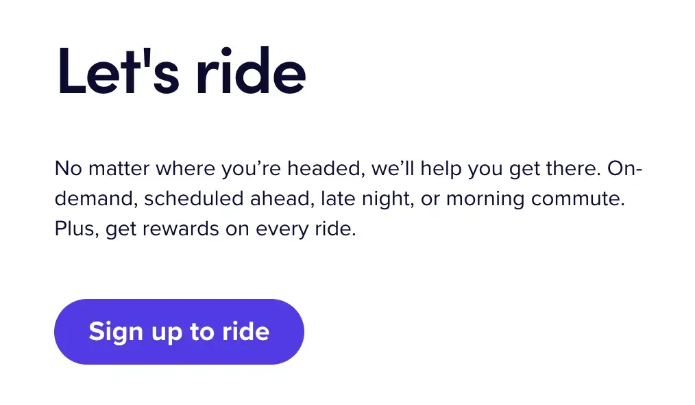
What I love about Lyft’s CTA is that it doesn’t overcomplicate its offerings. Lyft is a ridesharing company, and its CTA is plain and simple: “Sign up to ride.” It declares its intentions and makes it abundantly obvious that people should sign up.
The website has another CTA for drivers since Lyft is looking for both riders and drivers, but I like that it keeps these two sections separate.
How to Replicate This CTA
Targeting two types of customers? You can create simple, clear CTAs for each persona, similar to Lyft, which has “Sign up to ride” for riders and “Apply to drive” for drivers.
22. Pinterest
CTA: Explore
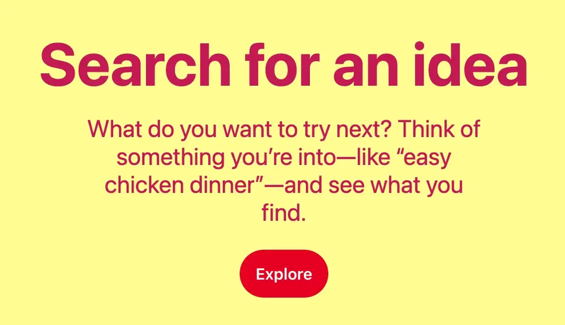
Pinterest is a discovery social media platform that allows users to “pin” images and videos into virtual pinboards. In middle school, like many young girls, I created dozens of pinboards, such as “Future Wedding,” with all sorts of visual inspiration (that I can assure you I won’t be referring back to).
A big part of Pinterest is the fun of exploring fun, new, and interesting ideas for future events and projects, so the “Explore” CTA is very suitable. It tells users this is a space to use their imagination and discover exciting new things.
How to Replicate This CTA
If you could summarize your company’s offerings into a single word, what would it be? Pinterest uses the “Explore” CTA button throughout its homepage, which helps the word become easily associated with the brand.
23. Apple
CTA: Get your estimate
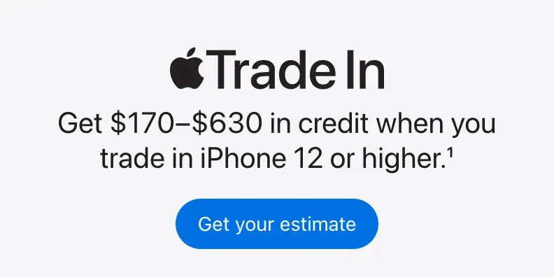
Tech giant Apple is known for channeling innovation, minimalism, and sophistication in its products and branding. The brand often utilizes a black-and-white color palette, which helps its bright blue CTA buttons pop.
In addition, I appreciate the “Get your estimate” CTA button because it plays into the human instinct to relate concepts to themselves.
Even if you weren’t originally on the Apple website to look into trading in an iPhone, aren’t you just a little curious what your estimate might be if you did?
How to Replicate This CTA
Using second-person pronouns “you” or “your” can increase clickthrough rates by 42%. Try throwing some of these words into CTAs to develop a more direct connection with the potential customer.
24. Grammarly
CTA: Sign up. It’s free | Sign up with Google
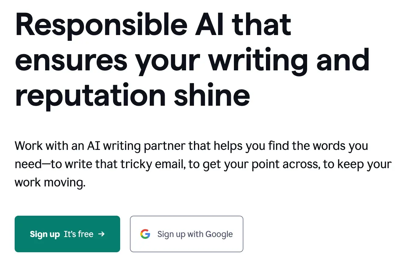
As a writer, my favorite AI tool is Grammarly, a writing, grammar, spelling, and punctuation partner. I’ve been using Grammarly since 2019, and while I don’t have access to all the features with the free version, it has still been advantageous.
Thus, the “Sign up It’s free” CTA button works well. It’s not like some tools, where it’s only technically free to sign up, and you’re probed to upgrade to use the services. This is 100% free forever unless you decide to adopt a premium version.
So, this is a great selling point for Grammarly to plug in its CTA, knowing it’ll tempt more users to sign up. Also, it’s helpful when paired with an option to “Sign up with Google,” which most users probably have and which makes signing up even more of a no-brainer.
How to Replicate This CTA
If your CTA copy of choice is “Sign up,” you might as well dress it up to be as inviting as possible. Try pairing it with other words or phrases, such as “Sign up and save,” to give a bit more context and drive more clicks.
Nonprofit Website CTAs
25. charity: water
CTA: Sign In | Give 💧
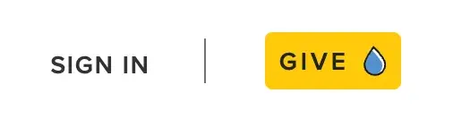
Charity: water‘s main goal is to get people to donate money to bring clean, safe water to all humans. Seems simple enough, right?
That’s what’s so powerful and smart about their CTA button: “Give 💧[water droplet].” Most people who end up on that website likely already have access to clean drinking water, and we wish it could be so easy as to simply give that water to communities in need.
But by saying “Give water,” the organization is really saying, “Donate money so we can give water.” That’s something the average site visitor should be able to and want to do.
How to Replicate This CTA
Cleverly using widely-recognizable emojis, symbols, and icons can go a long way. These can be used humorously or, like charity: water, to simplify a company or organization’s mission into its most basic, visual representation.
26. American Red Cross
CTA: Make An Appointment
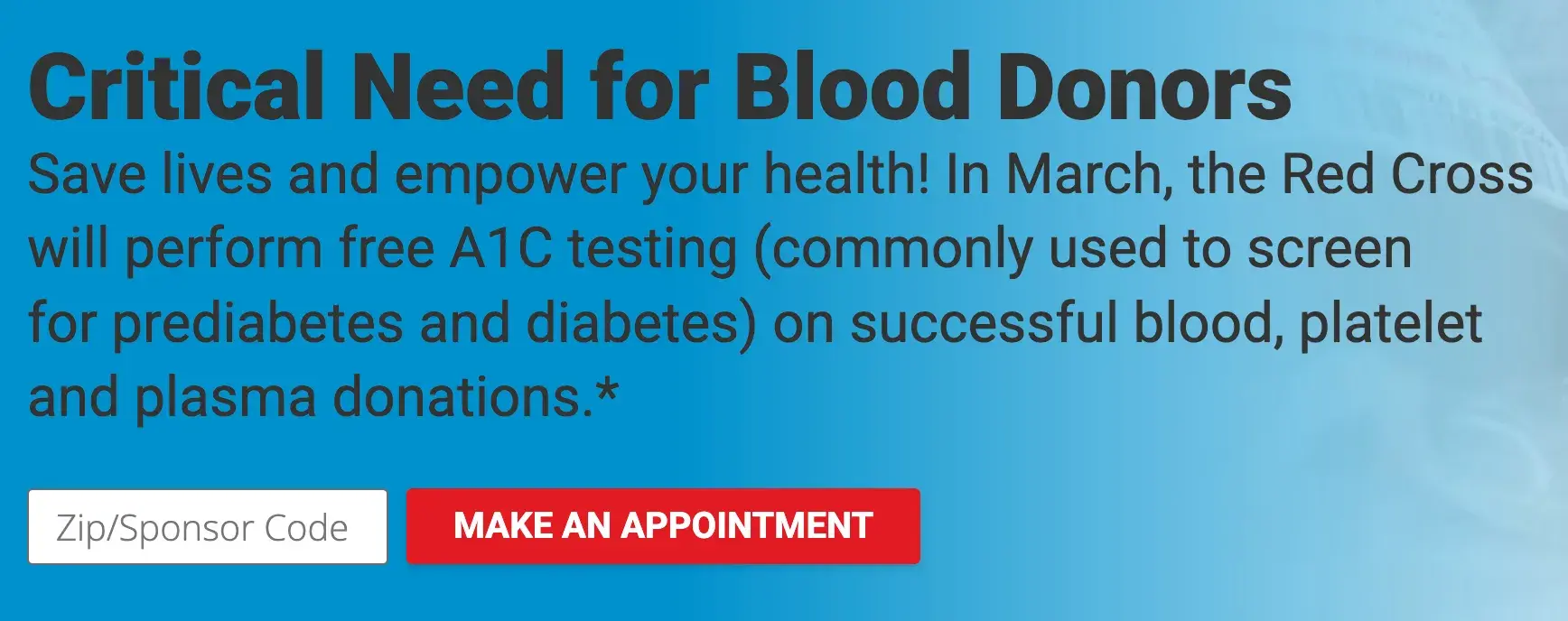
The major nonprofit American Red Cross is known for conducting humanitarian services, including blood banking and disaster relief. One thing I always recognize them for is promoting blood donations.
Sometimes, all it takes is a little push to take action. The organization could have used a “Learn More” CTA here to encourage users to learn more about blood donation.
However, using “Make An Appointment” is a powerful move. It drives even more urgency behind this critical need by saying, “There’s no time to waste. Make an appointment now.”
How to Replicate This CTA
There are many ways to encourage users to take swift action in a CTA, such as building FOMO, adding a strict end date to a sale or special offer, or nudging users to make an appointment or reservation.
27. Panthera
CTA: Get To Know Us
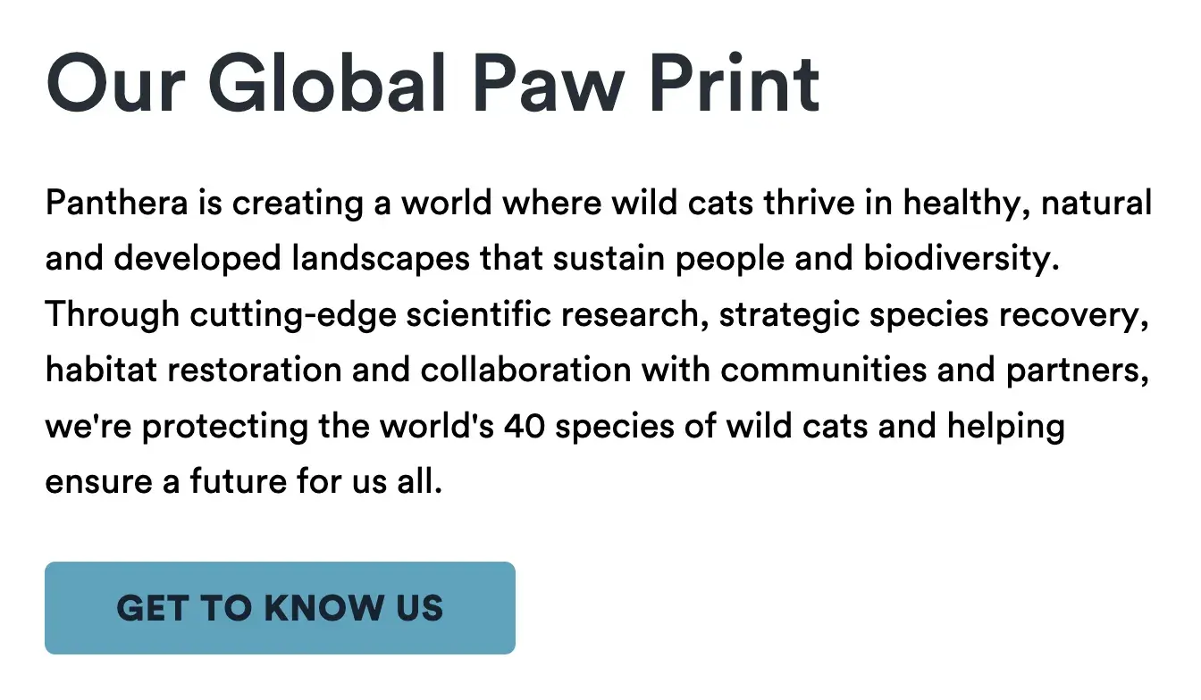
The folks at Panthera are looking for users who care about wild cats around the world and want to join a group of people who feel the same way.
As someone who loves supporting nonprofits but extensively reserches to ensure they’re legitimate, I appreciate that “Get To Know Us” is the first CTA button on the Panthera website.
It shows they are excited to share more about their efforts, are reliable, and have a lot of pride (no pun intended).
How to Replicate This CTA
Letting users get to know the brand on your terms helps establish a connection with them early on. And using softer, kinder language like “Get To Know Us” instead of “Learn More” makes the relationship feel more personal.
28. Feeding America
CTA: Join The Movement
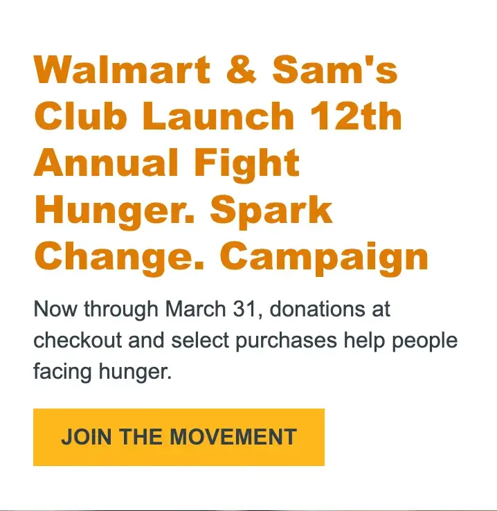
Feeding America is the largest hunger-relief organization in the U.S., providing billions of meals annually to people in need. With a network of more than 200 food banks and 60,000 meal programs, it has certainly created a movement.
So, rather than directly soliciting website visitors to “Donate,” the organization encourages users to “Join The Movement” by donating at checkout at certain stores. This is a more dynamic call-to-action that helps donors see themselves as part of something bigger.
How to Replicate This CTA
People often don’t like feeling like they are the first to try or test something out. Giving the impression of a larger community in a CTA can help ease the transition for new customers.
28 Free Call-to-Action Templates
Increase website conversions with these free templates.
- Bottom-of-Post CTAs
- Form Button CTAs
- Sidebar CTAs
- And More!
Download Free
All fields are required.
Facebook Ad CTAs
29. Heyday
CTA: Book now
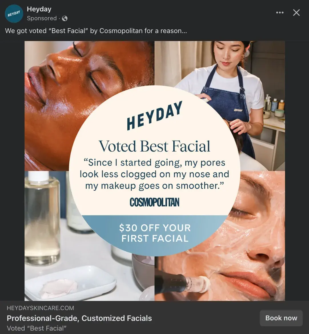
Heyday is a rebel in the facial industry. Its minimalist, no-frills approach has made it a favorite among those who want to see an aesthetician without the fuss and upselling.
What I love about this example is that it packs a lot of punch in a single image. Consumers can learn what HeyDay is — professional-grade, customized facials — see that HeyDay was voted “Best Facial” by Cosmopolitan, receive a positive customer review, and note the deal of $30 off your first facial.
This is all coupled with a simple CTA button: “Book now,” which is perfect for a service-based company.
How to Replicate This CTA
Incorporate accolades, positive reviews, and alluring first-timer discounts alongside a simple CTA button to stop Facebook users in their tracks and make them curious to read more.
30. Joybird
CTA: Shop now
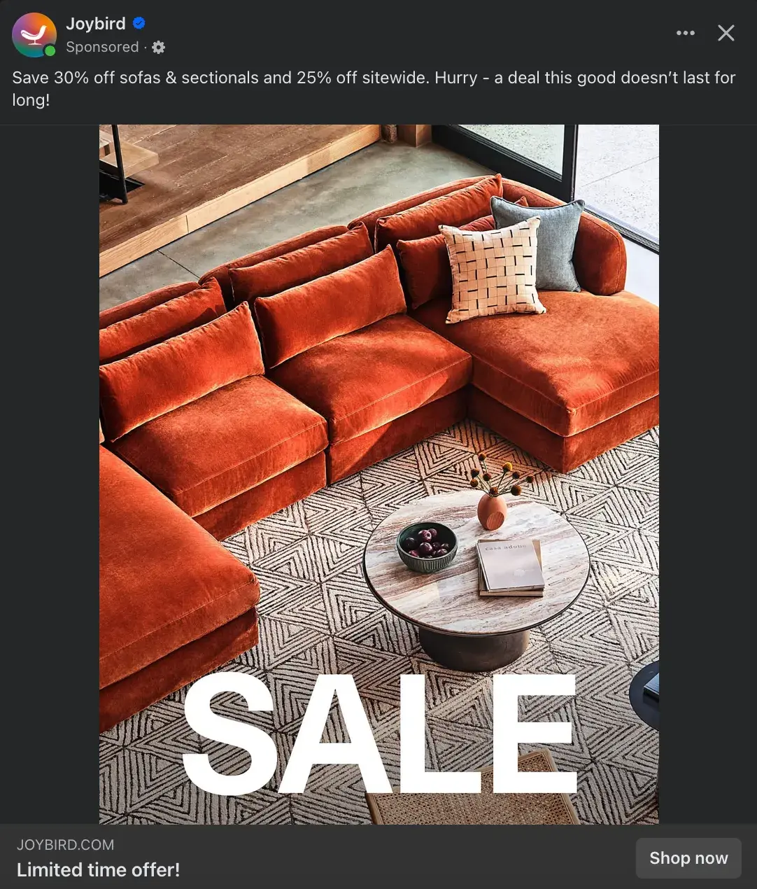
Joybird is a modern furniture and home decor company, and as someone who is currently moving apartments, I’m being targeted by a LOT of similar brands.
So, what piques the curiosity of a mindless social media scroller? The words “SALE” are in huge, all-caps letters. It’s the first thing I saw when I came upon this ad, followed closely by “Limited time offer!”
In a crowded retail landscape, the two things that can drive consumers to make an immediate purchase are knowing there’s a special sale and that the sale is fleeting. The “Shop now” CTA pairs well because it drives urgency to make a swift purchase.
How to Replicate This CTA
A lot of retail brands use “Shop now” CTA buttons on Facebook (it was the CTA I saw most frequently during my research). So, if you’re going to use it, it’s great to pair it with a reason for shopping now, such as a sitewide sale, limited-edition products, or special one-time offers.
31. The New York Times Cooking
CTA: Learn more
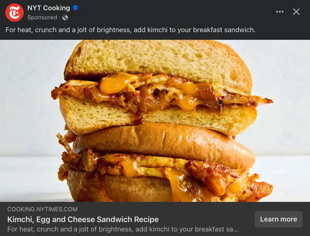
New York Times Cooking is a The New York Times’ subscription service that provides recipes, cooking advice, and meal inspiration. It has made me a much more creative and daring chef.
I think the “Learn more” CTA button works well here because the CTA is less about asking people to sign up for the service and more about encouraging Facebook users to learn more about this quirky recipe tip — adding kimchi to a breakfast sandwich.
How to Replicate This CTA
What sets your brand apart from competitors? What offers, advice, inspiration, or entertainment can you uniquely offer your customers? This is a great piece of information to pair with a “Learn more” CTA because it’s something users will truly want to learn more about.
32. The Farmer’s Dog
CTA: Get offer

Even the firmest cat lovers can’t deny the cuteness overload of the sleeping pup in this Facebook ad. While many owners want the best for their dogs, it can also take a lot of convincing to invest in a more expensive routine.
Therefore, the “Get offer” CTA button makes sense for The Farmer’s Dog, a subscription service that creates a personalized meal plan for each dog and delivers fresh dog food. The company is positioning their service, as well as this offer for 50% off the first box, as a special offer you get to have versus something you must invest in.
How to Replicate This CTA
When “Shop now” gets stale, “Get offer” is a great CTA button that attracts the interest of Facebook users. As a plus, offer and deal CTAs have a 12.1% conversion rate, on average.
However, ensure there is actually a solid offer to pair with the CTA button so as to not be misleading.
Instagram Ad CTAs
33. Aperol Spritz
CTA: Sign up
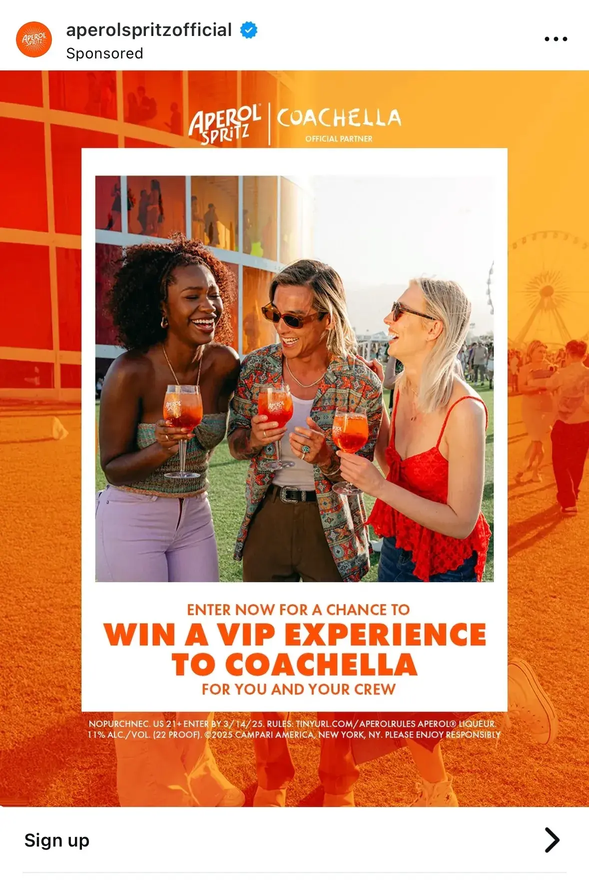
Aperol Spritz is a popular Italian aperitif drink that has developed into a global brand. The brand has positioned itself and the drink as the center of fun, exciting, stylish social gatherings and often partners with events, such as the annual music and arts festival Coachella.
This Instagram post promoting a contest is the perfect use case for a “Sign up” CTA button. Aperol Spritz is offering Instagram users the chance to win a VIP experience at Coachella, and users need to sign up to enter.
How to Replicate This CTA
I often see Instagram accounts promote contests, such as NPR Music’s 2025 Tiny Desk Contest. Most of these contests ask users to “like, follow, and tag a friend in the comments to enter” or to “head to the link in our bio to enter.”
Adding a “Sign up” CTA button to the contest post is a great way to drive more clicks and guide users directly to a contest entry form — which ideally lives in the company website.
34. Kalshi
CTA: Install now
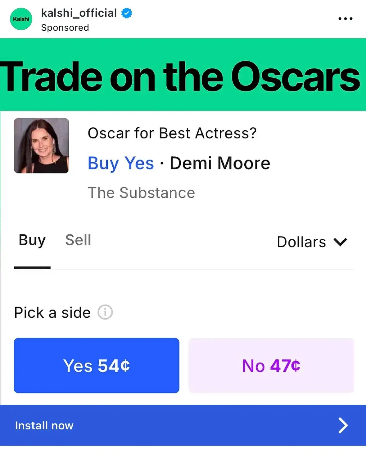
Kalshi is a regulated financial exchange and prediction market where users can trade on the outcome of real-world events, such as politics, entertainment, and weather.
This Instagram post is bare-bones but effective. It reflects a real example of a possible contract pre-Oscars and shows how users can trade on the event. As someone who had never heard of Kalshi before receiving this ad, I immediately understood exactly what it was and how it worked.
The “Install now” CTA button is a great option. Instagram users immediately understand this app will require spending money to earn it, and anyone whose curiosity is provoked can immediately click on the CTA button to navigate to the App Store.
How to Replicate This CTA
“Install now” works for brands promoting products, such as app downloads, desktop software, mobile games, or hardware products. It helps that content download CTAs are some of the most successful, with an average 13.6% conversion rate.
You should feel confident that the Instagram post accurately and wholly explains the product and why consumers will need it if it encourages users to install something immediately.
35. Equinox
CTA: Learn More
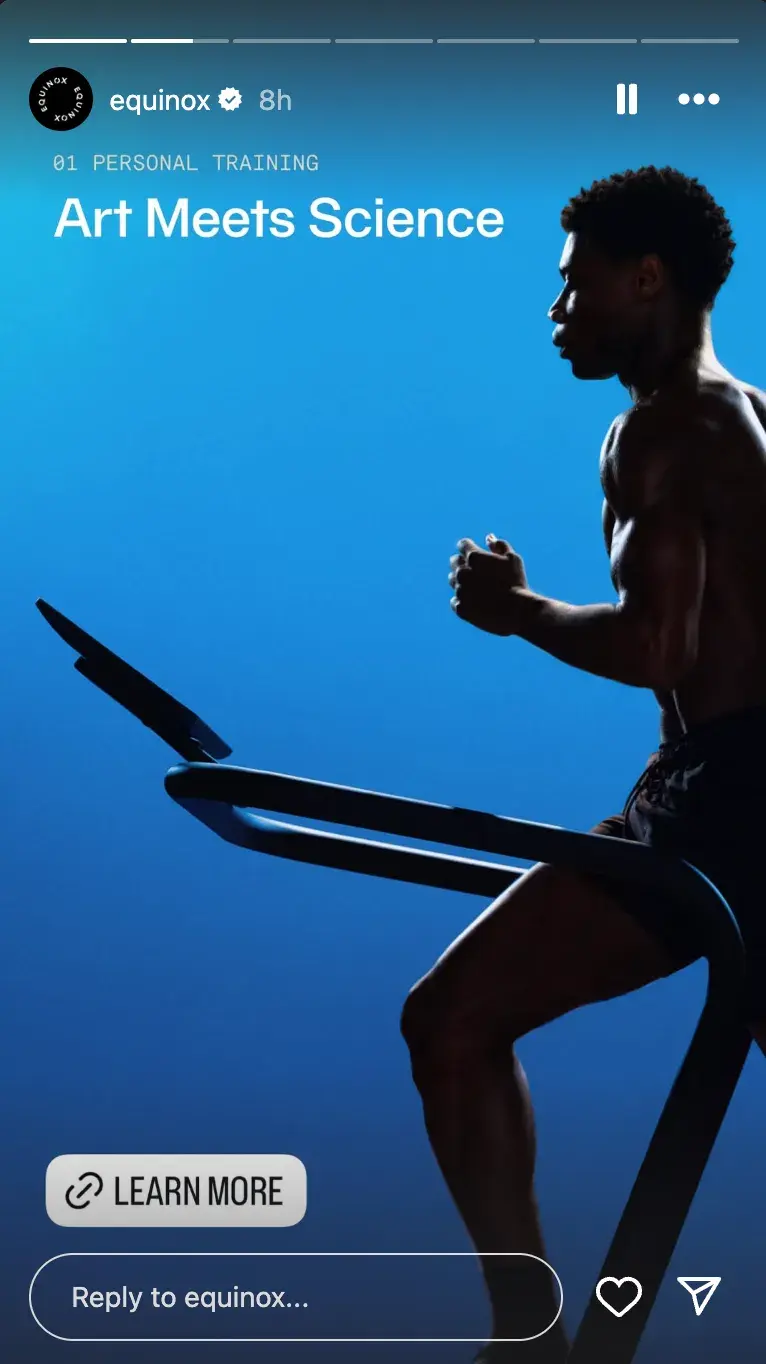
Luxury fitness club Equinox is known for being a premium, aspirational option for health and wellness commitment. It relies on a sleek, modern, minimalistic design aesthetic paired with athletic, luxurious models and its iconic slogan: “It’s Not Fitness, It’s Life.”
I like that Equinox uses CTA buttons in non-traditional ways, like in their Instagram Stories, which feel native to the platform and less like ads.
Also, Equinox regularly uses “Learn More” on many of its Stories, and I think the volume of CTA buttons makes it more likely that a hapless scroller will finally choose to click and learn more about Equinox and its services.
How to Replicate This CTA
Many brands prioritize CTA buttons in-feed, but utilizing the “Link” feature in Instagram Stories allows for endless CTA opportunities.
If you’re thinking of creating a carousel post, try posting the photos successively on your account’s Story, and use the same CTA button on each one to build intrigue.
36. Archero 2
CTA: Play game

Archero 2 is a roguelike mobile action game based on the success of its predecessor. This simple Instagram ad shows a snapshot of some gameplay that easily introduces new fans to the game and garners the interest of beloved fans of the first game.
Here is an example of how a simple yet unique CTA button can go far. Instagram users get to see exactly what the game is like and then are primed to “Play game” on their own.
While users do need to download the app to play, there is a bit of fun with this CTA that you don’t get with something more serious like “Download now.”
How to Replicate This CTA
Of course, “Play game” is very niche and can only be applied to brands promoting a game. However, I think it’s important for gaming companies to tread lightly when using this. It’s best to use this with free app downloads; otherwise, it’s misleading to imply that users can immediately play.
TikTok Ad CTAs
37. Coach
CTA: Shop now
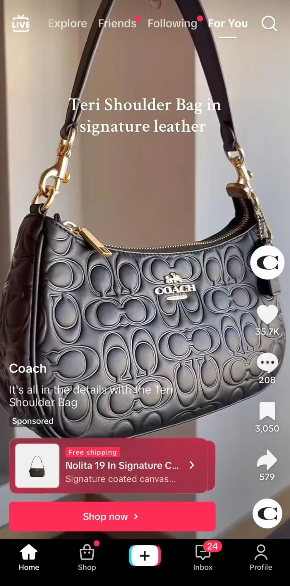
Coach is known for its high-quality leather goods and accessories, and it's a brand that effortlessly balances luxury and elegance with confidence and invitation.
Therefore, I don’t think Coach needs to play a lot of games when it comes to its calls to action. If a TikTok user is familiar with the brand and interested in the displayed product, they may only require a little push to explore further and “Shop now.”
How to Replicate This CTA
On TikTok, I think a “Shop now” CTA button works best when paired with a video that displays the product(s) the brand wants the users to purchase. You can work with a creator or simply show off the product in a well-edited video to build allure.
28 Free Call-to-Action Templates
Increase website conversions with these free templates.
- Bottom-of-Post CTAs
- Form Button CTAs
- Sidebar CTAs
- And More!
Download Free
All fields are required.
38. Nourish
CTA: View now
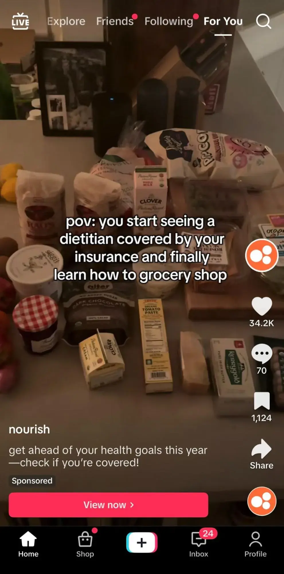
The best part about using a CTA button on a platform as intuitive as TikTok is that brands can make the ad feel much less like an ad and more like an authentic, creator-led video. Nourish, a telehealth company that connects users with dietitians, achieves this with this cozy sponsored TikTok.
The more passive “View now” CTA button makes sense since the description tells users to “check if you’re covered!” So, rather than immediately pushing users to book a dietician, Nourish encourages them to confirm their coverage first and see if it’s a good fit.
This builds trust with users, which leads to a stronger relationship in the future.
How to Replicate This CTA
As mentioned, “View” is a passive verb and may not have many relevant use cases. I recommend using this if you’re advertising something free for users to watch or stream or if your service is only available to some users (e.g., needs to be based in a specific location or have a certain insurance).
39. Starbrew Cafe
CTA: Check it out
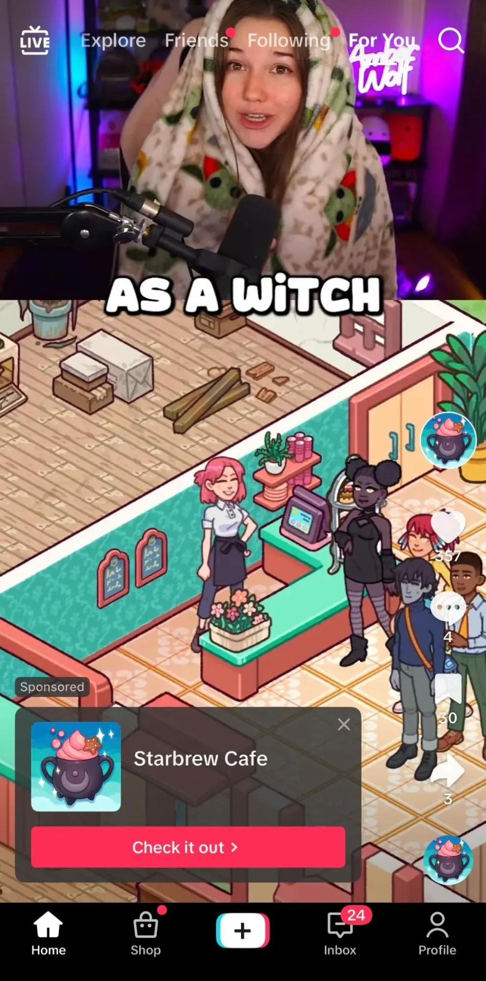
Starbrew Cafe is a mobile app game that allows users to serve customers, repair the cafe, and meet new friends. The game leans on its innate branding in its advertising — relaxing, cute, and cozy.
Therefore, the CTA “Check it out” feels appropriate. Starbrew Cafe partnered with a creator to create a video that walks through parts of the game, letting the game speak for itself.
The lower-pressure call-to-action pairs well with the video, inviting TikTok users to review the game further and decide if they want to play more.
How to Replicate This CTA
I think “Check it out” works well when paired with a creative that makes abundantly clear the draw for investing in the product or service.
It’s casual, saying, “We know you’ll love it, but check it out yourself.” So, produce an image or video that speaks volumes about your brand and even emits an air of FOMO that can’t be ignored.
40. BetterHelp
CTA: Learn more
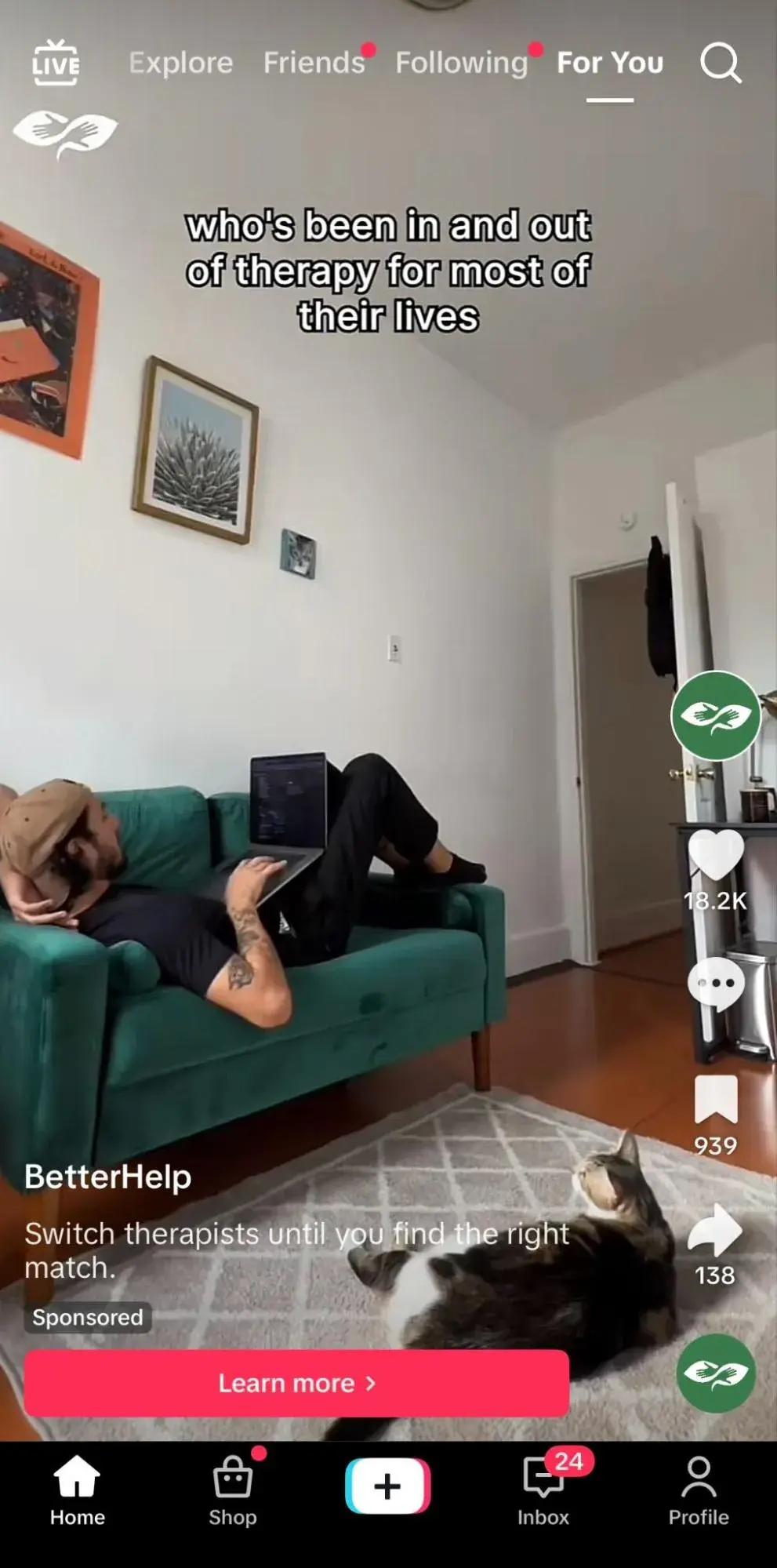
Online therapy platform BetterHelp is known for offering accessible, flexible, and virtual mental health services with licensed therapists. A brand like this benefits from treading lightly in its marketing, especially on social media.
Its authentic videos from the perspectives of both users and therapists pair well with the “Learn more” CTA. Exploring mental health services is a serious and sensitive subject, and it’s in bad taste to push TikTok users to “Sign up now.”
“Learn more” feels warm and welcoming, letting users embrace their journey and not feel pressured to make a decision.
How to Replicate This CTA
“Learn more” isn’t just for brands selling sensitive services that want to exercise caution. This CTA works well anytime a brand offers a more complex or expensive product or service that may require longer than a typical decision-making process.
This tells consumers they can express their questions and ensure their concerns are addressed before purchasing.
Email CTAs
41. Bala
CTA: Let’s Play
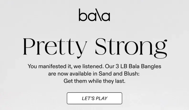
Bala is a movement company specializing in stylish, resistance-based fitness accessories, including their popular weighted wrist and ankle bands, Bala Bangles.
Their branding feels fashionable, colorful, and female-focused. I think it works well when they lean into this girly, playful aesthetic, so the “Let’s Play” CTA in an email I received resonated with me.
It shows that they recognize that fitness can be both functional and fun and want users to view their products as the perfect accessory for their individual fitness journeys.
How to Replicate This CTA
If an email promotes a new product or line of products, the brand clearly wants customers to “Shop now.” So, there is value in finding a clever phrase relevant to your brand while conveying that same message, like “Let’s play.”
42. OUAI
CTA: Beep Beep
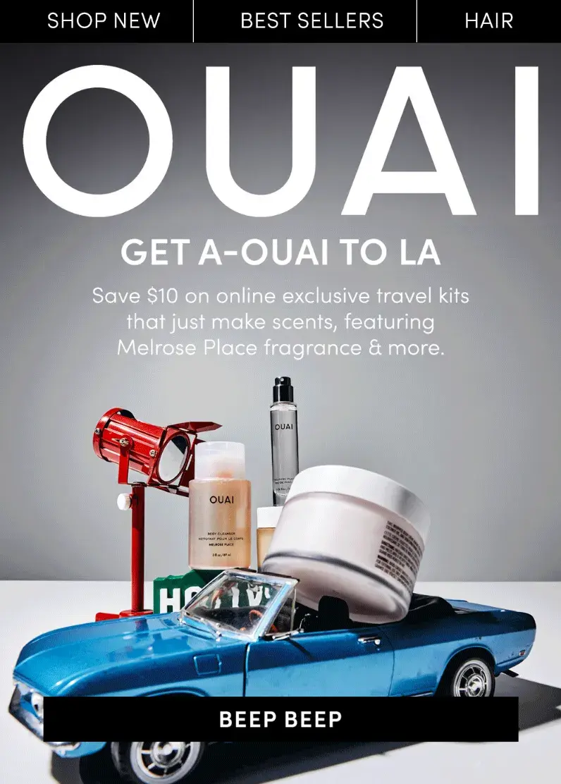
Speaking of witty, interesting CTA copy, haircare brand OUAI accomplishes this just as well as Bala.
Their latest email included a play on words: “Get a-OUAI to LA” with imagery depicting a car driving some of the brand’s products. To bring this all together is a CTA button with the silly copy “Beep beep.”
How to Replicate This CTA
If you want to change up the CTA copy with each email campaign rather than sticking to one branded key phrase, it’s wise to follow in OUAI’s footsteps.
Select a CTA message that cleverly aligns with the current campaign. For instance, if an apparel brand wants to promote its upcoming summer line, a fun CTA could be “Sunnier days await.”
43. Orangetheory
CTA: Claim Your First Month Free
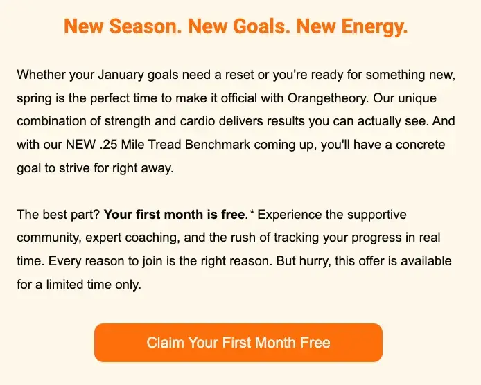
Boutique fitness studio Orangetheory is known by members for offering a first class free in many cities. This is a great opportunity for interested clients to test a class before committing to a full class or membership price.
I recently received this email promoting an even better deal: “Claim Your First Month Free.” I like that Orangetheory doesn’t just mention this in the copy but directly on the CTA button.
That way, the special, limited-time offer gets reiterated multiple times, is visible on the bright orange button, and entices email recipients to want to click.
How to Replicate This CTA
I often see brands display a special offer, discount, or sale in the copy around a CTA button but limit the CTA button to text such as “Shop now.” Don’t hide the most important selling point in a large block of text — display it proudly on your CTA button so no one misses it.
44. Kolkata Chai Co.
CTA: RSVP For 3/7!
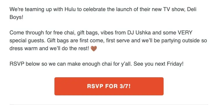
New York-based Kolkata Chai Co. provides authentic, high-quality masala chai and products with a modern, trendy aesthetic. I love that the company often partners with other Indian brands to host exclusive cultural events.
For instance, they put on a collab event with Hulu around the launch of the new show Deli Boys, and I received an email encouraging me to attend.
To ensure no recipients intended to go without RSVPing, the CTA button clearly says, “RSVP For 3/7!” It’s a great reminder to NOT show up unannounced, while keeping the tone of the email light-hearted.
How to Replicate This CTA
Use this format anytime your brand is putting on a special event. It’s great to reiterate the event date in the CTA button. Simply using “RSVP” or “RSVP now” as the CTA might risk users RSVPing without confirming they are available on the date.
Examples of Weak CTAs
45. Spotify
CTA: Sign up free
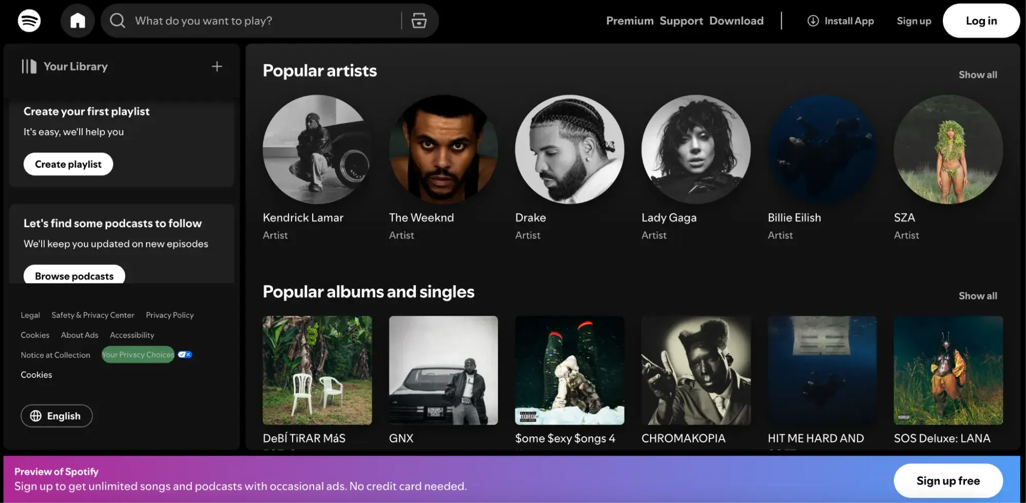
Don’t get me wrong — Spotify is one of my favorite monthly subscriptions (last year, I listened to 62,614 minutes, if that tells you anything). However, this is the homepage that brand-new users see, and I find it overwhelming.
While I love that it mimics the look of the real platform, this also adds confusion. It seems like you are ready to stream when you still need to sign up for an account first.
In addition, the main CTA, “Sign up free,” while a strong selling point, is hidden away at the bottom of the screen, where I nearly missed it.
The most important copy and CTAs should always be front and center, where the user can’t miss it. That’s why design plays such a crucial role in CTAs.
46. Abercrombie
CTA: Shop Now
Abercrombie underwent an admirable rebrand in 2015. It transitioned from being named America’s “most hated retail brand” in 2015 and a former elitist “cool kids brand” to a more grown-up inclusive brand.
However, I think this CTA button is a weak attempt for a brand that’s been performing so strongly. As I’m sure many do, I receive dozens of promotional emails daily, and a high volume of them contain the same CTA: “Shop now.”
There is no real drive for me to click this button. What pushes me to click on a CTA in an email is something out of the ordinary, like a huge sale, a limited-time offer, a unique new clothing line, or an innovative collaboration with another brand, celebrity, or influencer.
On top of all that, the CTA button is the same color as the background and does not stick out, so I nearly missed it. While brands like Abercrombie may want to maintain a trendy, monochromatic color scheme, it’s still essential to make CTA buttons visible.
47. Solidcore
CTA: Sign up
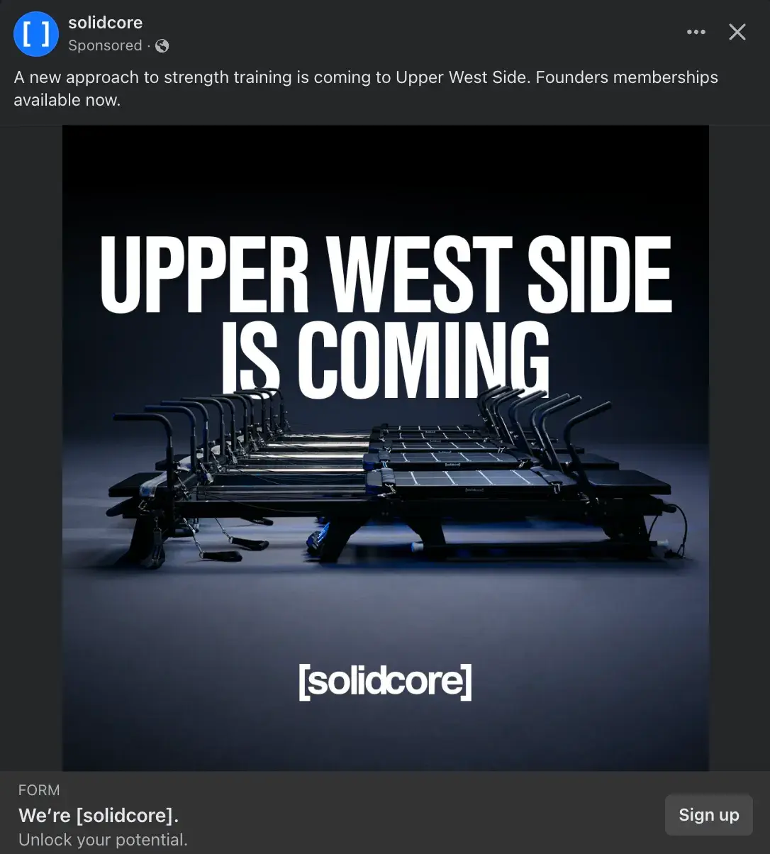
[solidcore] is a studio that offers a high-intensity, low-impact workout on a pilates-inspired reformer. The branding for [solidcore] has a sleek, modern, empowering aesthetic that leans on minimalism, and this ad does fit that vibe well.
However, I don’t think this CTA button works well. The average person who knows nothing about this brand gains little information from this ad. Therefore, what is the draw to immediately click a button that says “Sign up”?
This CTA would work better on platforms that better align with the [solidcore] demographic, predominantly females in their mid-20s to mid-30s. Meanwhile, Facebook has a majority of Gen X and Baby Boomer audience, which is nearly 57% male.
There is a lack of strong brand affinity on Facebook, coupled with a CTA that implies prior brand knowledge and immediate interest in signing up for a membership. The brand would have benefited from a CTA like “Learn more” or “Get offer” if willing to offer a free first class or discount on introductory membership.
28 Free Call-to-Action Templates
Increase website conversions with these free templates.
- Bottom-of-Post CTAs
- Form Button CTAs
- Sidebar CTAs
- And More!
Download Free
All fields are required.
48. Bed Bath & Beyond
CTA: Shop Now

I grew up collecting large coupons from home goods retailer Bed Bath & Beyond with my mom. It was a rite of passage since the store allowed coupon stacking across a large purchase, so I’m all too familiar with their usual discount offerings.
However, I wasn’t impressed with this CTA on the company’s homepage. I had no idea what Livabliss was until I Googled it — it’s a home goods brand featured at Bed Bath & Beyond.
While regular site visitors and customers might be familiar with that brand, it can’t be assumed that everyone will know it. Therefore, pairing that message with a “Shop Now” CTA button felt confusing.
I recommend the company swap the CTA button for a “Learn more” button to help users read more about Livabliss or “Shop bath & rugs,” which appear to be the brand’s key products.
49. Verizon
CTA: Order now
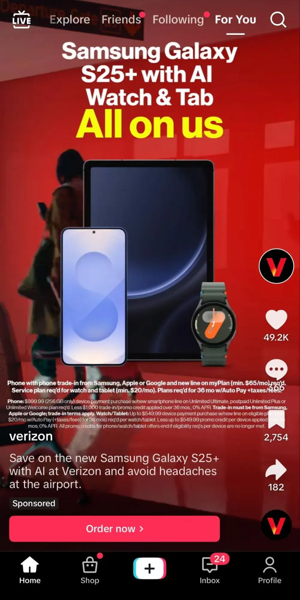
Verizon created a sponsored video on TikTok to promote the new Samsung Galaxy S25+ with AI and utilized an “Order now” CTA button.
I don’t love this CTA because it’s very forward. This implies that the average TikTok user can see a video about a smartphone — no less, on their current smartphone — that starts at $999 and simply order it right away. There is a lack of awareness about the audience here.
In addition, the video itself is confusing, with tons of text, and the CTA button gets lost. While there may be requirements to include extensive legal language in a sponsored ad like this, design is key to maximizing the efforts of a CTA button.
Good Call-to-Action Phrases You Should Be Using
It’s a no-brainer that using an engaging and well-thought-out CTA can be the difference between someone converting or not. That’s why I’ve created 12 workable phrases that you can use as a template for CTAs.
- Get Your Free Copy/Get Free Access: Free is a big power word, so this CTA works great, especially for emails and newsletters. Companies considering getting first-time users to subscribe to a newsletter service can use this terminology to draw them in.
- Start Your Free Trial for X Months/Join Free: Similar to the example above, this can be a good tactic to allow subscribers to join a platform. This way, they can understand whether they need the service rather than navigating away before trying.
- Request a Demo/Book a Demo/Schedule a Demo: SaaS companies can engage users by showing them around the platform. Demos are usually free, and I find that they help engage users without being too sales-y.
- Get “X%” Off/Claim $X: I don’t think anyone can resist a good deal, especially if you’ve been looking to purchase something and a discount code randomly pops up. This is also a great way to get users to subscribe to a business, since most of the time, users need to enter their email address for the code.
- Limited Stock Available/Buy Now — Before It Disappears: These CTAs can be quite effective when trying to drive urgency, especially when there is the added bonus of scarcity. These phrases will help drive customers to add to their carts.
- Meet our Team/Speak with Our Experts: Sometimes, audiences want to know more, but they’d like to go the extra mile to talk to a company representative. I find it more personal when a company offers to speak one-on-one about any questions or concerns.
- Complete My Purchase/Treat Yourself Today: As mentioned earlier, HubSpot research found that tailored CTAs convert 202% better than basic CTAs. So, adding words such as “my” and “yourself” adds a personal touch.
- Book or Reserve Your Spot Now: Want to add a touch of exclusivity when engaging the audience? Make them feel like a part of an exclusive club!
- Get a Quote/Request your Quote: This is another CTA that shows customers the value they’ll earn.
- Show Me X: In my experience, showing the product or service in action is always useful. This gives audiences a sneak peek of how it can benefit their own lives.
- Connect with Us/Follow Us: These phrases can drive audiences to engage with a company on social media.
- Get Inspired/Let’s Do This: Here, the key is connecting with audiences on a deeper level and helping them feel that taking this action will be transformative for them.
Pro tip: Modify the CTA according to the target funnel level when running adsl. You can also create CTAs with buttons to direct users along common paths when they're most likely to convert or prioritize certain actions.
Call Your Audience to Action
There are so many ways to build upon a generic CTA to personalize it for a specific audience or platform, add personality, and boost conversions through intrigue and urgency. Just make sure to test any of these CTA examples to ensure they resonate with your audience.
What was once a simple banner or button can become an iconic word or phrase that your brand lives by — and that inspires future customers to trust and invest in you.
Editor's note: This post was originally published in June 2014 and has been updated for comprehensiveness.
28 Free Call-to-Action Templates
Increase website conversions with these free templates.
- Bottom-of-Post CTAs
- Form Button CTAs
- Sidebar CTAs
- And More!
Download Free
All fields are required.
Calls to Action


![How to Make a Visual Call-to-Action for Social Media [Quick Tip]](https://53.fs1.hubspotusercontent-na1.net/hubfs/53/make-visual-cta-for-social_1-1.webp)